# Troop Themes Support: full text
> Every merchant guide and FAQ on support.troopthemes.com, one page per block. Each block starts with front matter naming its URL and, for theme guides, the theme and the theme styles it covers. Each theme style uses its theme's guide (Blockshop: Radiance, Stone, Valla; Maker: Bloom; Emerge: Cafe, Elements; Beyond: Fleur).
---
title: Getting started
url: https://support.troopthemes.com/
---
# Welcome to Troop Themes Support & Knowledge Base
## New to Shopify?
If you are setting up a store for the first time, start with the [Shopify Help Center](https://help.shopify.com/en) to learn how the admin, products, and checkout work. This site is for **Troop theme** settings, sections, and theme-specific limits, not Shopify checkout, payments, or inventory.
## New to your theme?
Choose your theme. Each guide walks through the settings and sections that will get you started and help you get the most from your storefront.
Each theme style uses its parent theme's guide: Radiance, Stone, and Valla use the Blockshop guide. Bloom uses the Maker guide. Cafe and Elements use the Emerge guide. Fleur uses the Beyond guide.
## Find answers about your theme on this site
Most questions are one of: a Theme settings path, a section choice, Shopify admin data, or an app.
- **Troubleshooting**: If something _used to work_ and no longer does, see [Troubleshooting](https://support.troopthemes.com/guide/troubleshooting/) first (isolate apps vs theme, then topic-specific guides).
- **FAQs**: Short answers on compatibility, metafields, performance, and common tasks. Browse the [FAQs](https://support.troopthemes.com/faqs/sections-on-pages/).
- **Apps**: Apps add functionality but often need to be reinstalled after a theme update. Before you rely on one, read [using apps with themes](https://support.troopthemes.com/guide/using-apps-with-themes/).
- **Updates**: Store themes do **not** auto-update. You install updates yourself when you are ready. You are entitled to free updates for your purchase. See [how to update your theme](https://support.troopthemes.com/guide/update-theme/) for the process and tips.
- **Licensing**: Themes are licensed for **one store** only. You may not transfer or resell a theme to another store. See [Understanding unlicensed themes](https://support.troopthemes.com/guide/unlicensed-themes/) for Troop licensing, transfers, and related steps. Legal wording is in [Shopify’s Terms of Service](https://www.shopify.com/legal/terms#ThemeStore) (Theme Store section).
- **Guide**: Theme settings, sections, products, imagery, marketing, and related how-tos. Open the [Guide](https://support.troopthemes.com/guide/blockshop/) tab in the navigation.
Still stuck? [Submit a support ticket](https://support.troopthemes.com/submit-a-support-ticket/). We reply Monday–Friday and aim to respond within 24 hours.
---
title: Troubleshooting
url: https://support.troopthemes.com/guide/troubleshooting/
---
# Troubleshooting
This page applies to all Troop themes: Blockshop, Maker, Emerge, and Beyond, including their styles (Radiance, Stone, and Valla are Blockshop; Bloom is Maker; Cafe and Elements are Emerge; Fleur is Beyond).
If something used to work and no longer does, identify the owner of the problem before you edit theme code. Most reported theme bugs are caused by an app embed, leftover app code, a setting on a single section, or Shopify admin data. Start here and follow the matching how-to. Do not start in the theme code editor.
> **Theme, Shopify, or an app?**
>
> **Theme**: storefront appearance. Theme settings, sections, and default theme text. See [When the issue is isolated to one topic](#when-the-issue-is-isolated-to-one-topic).
>
> **Shopify admin**: catalog and content, such as products, collections, pages, menus, and blog posts. The theme only displays this data. See [Catalog and content](#catalog-and-content-shopify-admin).
>
> **Outside the theme**: checkout, payments, shipping, and inventory live in Shopify **Settings** or **Products**, not Theme settings. See [Checkout, payments, shipping, and inventory](#checkout-payments-shipping-and-inventory). Collection filters use the **Search & Discovery** app. Email, reviews, and subscriptions come from apps.
## Outside the theme
Troop docs cover **Edit theme** settings and sections. The categories below never live in Theme settings, or only partly do. Use Shopify’s help centre first; use a Troop link when we explain how the theme connects.
### Checkout, payments, shipping, and inventory
- **Checkout look and fields**: Shopify [checkout customization](https://help.shopify.com/en/manual/checkout-settings)
- **Payment methods**: Shopify [payments](https://help.shopify.com/en/manual/payments)
- **Shipping rates and delivery profiles**: Shopify [shipping and delivery](https://help.shopify.com/en/manual/shipping)
- **Stock levels and “continue selling when out of stock”**: Shopify [inventory](https://help.shopify.com/en/manual/products/inventory) and [selling when out of stock](https://help.shopify.com/en/manual/products/inventory/setup/selling-when-out-of-stock)
### Catalog and content (Shopify admin)
The theme displays what you assign; it does not create the data.
- **Products**: Shopify [products](https://help.shopify.com/en/manual/products)
- **Collections**: Shopify [collections](https://help.shopify.com/en/manual/products/collections)
- **Pages**: Shopify [pages](https://help.shopify.com/en/manual/online-store/themes/theme-structure/pages)
- **Menus**: Shopify [menus and links](https://help.shopify.com/en/manual/online-store/menus-and-links). Then assign the menu in the theme. Setting up navigation: [Blockshop](https://support.troopthemes.com/guide/blockshop/creating-navigation/) · [Maker](https://support.troopthemes.com/guide/maker/creating-navigation/) · [Emerge](https://support.troopthemes.com/guide/emerge/creating-navigation/) · [Beyond](https://support.troopthemes.com/guide/beyond/creating-navigation/)
- **Blog posts**: Shopify [blog posts](https://help.shopify.com/en/manual/online-store/blogs/writing-blogs/working-with-blog-posts). The theme controls the blog layout. Customizing blogs: [Blockshop](https://support.troopthemes.com/guide/blockshop/customizing-blog/) · [Maker](https://support.troopthemes.com/guide/maker/customizing-blog/) · [Emerge](https://support.troopthemes.com/guide/emerge/customizing-blog/) · [Beyond](https://support.troopthemes.com/guide/beyond/customizing-blog/)
### Search, filters, and discovery
- **Collection filters and storefront search**: **Apps** → **Search & Discovery** → **Filters**. Shopify: [storefront filters](https://help.shopify.com/en/manual/online-store/themes/customizing-themes/common-customizations/storefront-filters). Troop: [Blockshop](https://support.troopthemes.com/guide/blockshop/setting-up-product-filters/) · [Maker](https://support.troopthemes.com/guide/maker/setting-up-product-filters/) · [Emerge](https://support.troopthemes.com/guide/emerge/setting-up-product-filters/) · [Beyond](https://support.troopthemes.com/guide/beyond/setting-up-product-filters/) (what the theme shows on collection pages).
### Markets, currency, and languages
- **Countries, currencies, Markets, and languages**: Shopify [Markets](https://help.shopify.com/en/manual/markets), [local currencies](https://help.shopify.com/en/manual/markets/customizations/local-currencies), and [localization and translation](https://help.shopify.com/en/manual/international/localization-and-translation). Troop: country, currency, and language selectors in your theme guide (see [Store](#store) below).
### Email, reviews, subscriptions, and other apps
Campaigns, reviews, subscriptions, and many popups come from **Apps**, not Theme settings.
- **Choosing, embedding, and removing apps**: [Using apps with your theme](https://support.troopthemes.com/guide/using-apps-with-themes/)
- **Shopify overview**: [Extending your theme with apps](https://help.shopify.com/en/manual/online-store/themes/customizing-themes/apps)
- **Newsletter forms → Customers list**: Troop signup forms add customers to **Customers** in admin; email campaigns need Klaviyo, Shopify Email, or similar. See **Mailing list & newsletters** under [Content](#content) below (pick your theme).
## Inside the theme
If the issue is on your storefront, in **Theme settings**, in a section, in custom code, or in an app embed, work through these steps in order. Stop when the store behaves correctly. The step where the issue disappears identifies the owner.
1. **Duplicate the theme** (Online Store → Themes → Duplicate) so you can test without touching the live store.
2. **Turn off app embeds**: **Edit theme** → **App embeds**, switch each one off, then preview. If the issue disappears, the app owns it. Contact that developer. See [Using apps with your theme](https://support.troopthemes.com/guide/using-apps-with-themes/).
3. **Install a fresh copy and preview it unpublished.** Open your theme's Theme Store listing and add the theme to your store, as described in [How to update your theme](https://support.troopthemes.com/guide/update-theme/#how-to-update). Do not publish it. If the issue is gone on the fresh copy, a customization or leftover app code in the live theme is the cause.
4. **Contact support if the fresh copy has the issue.** [Submit a support ticket](https://support.troopthemes.com/submit-a-support-ticket/) with the theme name, version, and a preview link. If you need an older theme version, ask for it in the same ticket.
> **Deleting apps**
>
> Many apps inject code into theme files. Deleting the app from **Apps** does not always remove that code. Ask the app developer how to uninstall completely. We can answer compatibility questions if you CC support.
## Rollback changes
If a developer (or you) edited theme files around the time the issue started, contact them before submitting a ticket. In the Shopify code editor, a circle appears beside templates that have been modified. You can [roll back a file](https://help.shopify.com/en/manual/online-store/themes/customizing-themes/edit-code).
## When the issue is isolated to one topic
If the problem is limited to a single feature, such as colors on one section, a newsletter form, or collection filters, you can skip the general steps above. Each guide ends with a **Troubleshooting** section for that topic alone. Links below jump straight there; where content differs by theme, pick yours.
### General
- [How to update your theme](https://support.troopthemes.com/guide/update-theme/#troubleshooting)
- [Using apps with your theme](https://support.troopthemes.com/guide/using-apps-with-themes/#troubleshooting)
### Appearance
- **Colors**: [Blockshop](https://support.troopthemes.com/guide/blockshop/colors/#troubleshooting) · [Maker](https://support.troopthemes.com/guide/maker/colors/#troubleshooting) · [Emerge](https://support.troopthemes.com/guide/emerge/colors/#troubleshooting) · [Beyond](https://support.troopthemes.com/guide/beyond/colors/#troubleshooting)
- **Typography**: [Blockshop](https://support.troopthemes.com/guide/blockshop/typography/#troubleshooting) · [Maker](https://support.troopthemes.com/guide/maker/typography/#troubleshooting) · [Emerge](https://support.troopthemes.com/guide/emerge/typography/#troubleshooting) · [Beyond](https://support.troopthemes.com/guide/beyond/typography/#troubleshooting)
- **Changing default theme text**: [Blockshop](https://support.troopthemes.com/guide/blockshop/change-default-text/#troubleshooting) · [Maker](https://support.troopthemes.com/guide/maker/change-default-text/#troubleshooting) · [Emerge](https://support.troopthemes.com/guide/emerge/change-default-text/#troubleshooting) · [Beyond](https://support.troopthemes.com/guide/beyond/change-default-text/#troubleshooting)
- **Spacing and layout**: [Blockshop](https://support.troopthemes.com/guide/blockshop/spacing-and-layout/#troubleshooting) · [Maker](https://support.troopthemes.com/guide/maker/spacing-and-layout/#troubleshooting) · [Emerge](https://support.troopthemes.com/guide/emerge/spacing-and-layout/#troubleshooting) · [Beyond](https://support.troopthemes.com/guide/beyond/spacing-and-layout/#troubleshooting)
- **Alignment and width**: [Blockshop](https://support.troopthemes.com/guide/blockshop/alignment-and-width/#troubleshooting) · [Maker](https://support.troopthemes.com/guide/maker/alignment-and-width/#troubleshooting) · [Emerge](https://support.troopthemes.com/guide/emerge/alignment-and-width/#troubleshooting) · [Beyond](https://support.troopthemes.com/guide/beyond/alignment-and-width/#troubleshooting)
- **Buttons & Inputs**: [Blockshop](https://support.troopthemes.com/guide/blockshop/buttons-inputs-and-links/#troubleshooting) · [Maker](https://support.troopthemes.com/guide/maker/buttons-and-inputs/#troubleshooting) · [Emerge](https://support.troopthemes.com/guide/emerge/buttons-and-inputs/#troubleshooting) · [Beyond](https://support.troopthemes.com/guide/beyond/buttons-and-inputs/#troubleshooting)
- **Images**: [Blockshop](https://support.troopthemes.com/guide/blockshop/images/#troubleshooting) · [Maker](https://support.troopthemes.com/guide/maker/images/#troubleshooting) · [Emerge](https://support.troopthemes.com/guide/emerge/images/#troubleshooting) · [Beyond](https://support.troopthemes.com/guide/beyond/images/#troubleshooting)
- **Social media**: [Blockshop](https://support.troopthemes.com/guide/blockshop/social-media/#troubleshooting) · [Maker](https://support.troopthemes.com/guide/maker/social-media/#troubleshooting) · [Emerge](https://support.troopthemes.com/guide/emerge/social-media/#troubleshooting) · [Beyond](https://support.troopthemes.com/guide/beyond/social-media/#troubleshooting)
- **Animations**: [Blockshop](https://support.troopthemes.com/guide/blockshop/animations/#troubleshooting) · [Maker](https://support.troopthemes.com/guide/maker/animations/#troubleshooting) · [Emerge](https://support.troopthemes.com/guide/emerge/animations/#troubleshooting) · [Beyond](https://support.troopthemes.com/guide/beyond/animations/#troubleshooting)
### Sections and templates
- **Section shapes** (Emerge only): [Troubleshooting](https://support.troopthemes.com/guide/emerge/section-shapes/#troubleshooting)
- **Brand and story sections** (Beyond only): [Troubleshooting](https://support.troopthemes.com/guide/beyond/brand-and-story-sections/#troubleshooting)
- **Designing with image sections**: [Blockshop](https://support.troopthemes.com/guide/blockshop/image-sections/#troubleshooting) · [Maker](https://support.troopthemes.com/guide/maker/image-sections/#troubleshooting) · [Emerge](https://support.troopthemes.com/guide/emerge/image-sections/#troubleshooting) · [Beyond](https://support.troopthemes.com/guide/beyond/image-sections/#troubleshooting)
- **Collection page promotions**: [Blockshop](https://support.troopthemes.com/guide/blockshop/collection-page-promotions/#troubleshooting) · [Maker](https://support.troopthemes.com/guide/maker/collection-page-promotions/#troubleshooting) · [Emerge](https://support.troopthemes.com/guide/emerge/collection-page-promotions/#troubleshooting) · [Beyond](https://support.troopthemes.com/guide/beyond/collection-page-promotions/#troubleshooting)
- **Setting up navigation**: [Blockshop](https://support.troopthemes.com/guide/blockshop/creating-navigation/#troubleshooting) · [Maker](https://support.troopthemes.com/guide/maker/creating-navigation/#troubleshooting) · [Emerge](https://support.troopthemes.com/guide/emerge/creating-navigation/#troubleshooting) · [Beyond](https://support.troopthemes.com/guide/beyond/creating-navigation/#troubleshooting)
- **Working with templates**: [Blockshop](https://support.troopthemes.com/guide/blockshop/working-with-templates/#troubleshooting) · [Maker](https://support.troopthemes.com/guide/maker/working-with-templates/#troubleshooting) · [Emerge](https://support.troopthemes.com/guide/emerge/working-with-templates/#troubleshooting) · [Beyond](https://support.troopthemes.com/guide/beyond/working-with-templates/#troubleshooting)
### Products
- **Product grid**: [Blockshop](https://support.troopthemes.com/guide/blockshop/product-grid/#troubleshooting) · [Maker](https://support.troopthemes.com/guide/maker/product-grid/#troubleshooting) · [Emerge](https://support.troopthemes.com/guide/emerge/product-grid/#troubleshooting) · [Beyond](https://support.troopthemes.com/guide/beyond/product-grid/#troubleshooting)
- **Quick add**: [Blockshop](https://support.troopthemes.com/guide/blockshop/quick-add/#troubleshooting) · [Emerge](https://support.troopthemes.com/guide/emerge/quick-add/#troubleshooting) · [Beyond](https://support.troopthemes.com/guide/beyond/quick-add/#troubleshooting) (Maker has no Quick add settings group)
- **Setting up product filters**: [Blockshop](https://support.troopthemes.com/guide/blockshop/setting-up-product-filters/#troubleshooting) · [Maker](https://support.troopthemes.com/guide/maker/setting-up-product-filters/#troubleshooting) · [Emerge](https://support.troopthemes.com/guide/emerge/setting-up-product-filters/#troubleshooting) · [Beyond](https://support.troopthemes.com/guide/beyond/setting-up-product-filters/#troubleshooting)
- **Search**: [Blockshop](https://support.troopthemes.com/guide/blockshop/search/#troubleshooting) · [Maker](https://support.troopthemes.com/guide/maker/search/#troubleshooting) · [Emerge](https://support.troopthemes.com/guide/emerge/search/#troubleshooting) · [Beyond](https://support.troopthemes.com/guide/beyond/search/#troubleshooting)
- **Color swatches**: [Blockshop](https://support.troopthemes.com/guide/blockshop/color-swatch-guide/#troubleshooting) · [Maker](https://support.troopthemes.com/guide/maker/color-swatch-guide/#troubleshooting) · [Emerge](https://support.troopthemes.com/guide/emerge/color-swatch-guide/#troubleshooting) · [Beyond](https://support.troopthemes.com/guide/beyond/color-swatch-guide/#troubleshooting)
- **Product size chart**: [Blockshop](https://support.troopthemes.com/guide/blockshop/product-size-chart/#troubleshooting) · [Maker](https://support.troopthemes.com/guide/maker/product-size-chart/#troubleshooting) · [Emerge](https://support.troopthemes.com/guide/emerge/product-size-chart/#troubleshooting) · [Beyond](https://support.troopthemes.com/guide/beyond/product-size-chart/#troubleshooting)
- **Out of stock notifications**: [Blockshop](https://support.troopthemes.com/guide/blockshop/out-of-stock-notifications/#troubleshooting) · [Maker](https://support.troopthemes.com/guide/maker/out-of-stock-notifications/#troubleshooting) · [Emerge](https://support.troopthemes.com/guide/emerge/out-of-stock-notifications/#troubleshooting) · [Beyond](https://support.troopthemes.com/guide/beyond/out-of-stock-notifications/#troubleshooting)
### Content
- **FAQ or Collapsible rows**: [Blockshop](https://support.troopthemes.com/guide/blockshop/setting-up-faq-or-collapsible-rows/#troubleshooting) · [Maker](https://support.troopthemes.com/guide/maker/setting-up-faq-or-collapsible-rows/#troubleshooting) · [Emerge](https://support.troopthemes.com/guide/emerge/setting-up-faq-or-collapsible-rows/#troubleshooting) · [Beyond](https://support.troopthemes.com/guide/beyond/setting-up-faq-or-collapsible-rows/#troubleshooting)
- **Customizing blogs**: [Blockshop](https://support.troopthemes.com/guide/blockshop/customizing-blog/#troubleshooting) · [Maker](https://support.troopthemes.com/guide/maker/customizing-blog/#troubleshooting) · [Emerge](https://support.troopthemes.com/guide/emerge/customizing-blog/#troubleshooting) · [Beyond](https://support.troopthemes.com/guide/beyond/customizing-blog/#troubleshooting)
- **Configuring the popup**: [Blockshop](https://support.troopthemes.com/guide/blockshop/configuring-the-popup/#troubleshooting) · [Maker](https://support.troopthemes.com/guide/maker/configuring-the-popup/#troubleshooting) · [Emerge](https://support.troopthemes.com/guide/emerge/configuring-the-popup/#troubleshooting) · [Beyond](https://support.troopthemes.com/guide/beyond/configuring-the-popup/#troubleshooting)
- **Mailing list & newsletters**: [Blockshop](https://support.troopthemes.com/guide/blockshop/newsletters/#troubleshooting) · [Maker](https://support.troopthemes.com/guide/maker/newsletters/#troubleshooting) · [Emerge](https://support.troopthemes.com/guide/emerge/newsletters/#troubleshooting) · [Beyond](https://support.troopthemes.com/guide/beyond/newsletters/#troubleshooting)
### Store
- **Country, currency, and language selectors**: [Blockshop](https://support.troopthemes.com/guide/blockshop/configure-country-currency-selectors/#troubleshooting) · [Maker](https://support.troopthemes.com/guide/maker/configure-country-currency-selectors/#troubleshooting) · [Emerge](https://support.troopthemes.com/guide/emerge/configure-country-currency-selectors/#troubleshooting) · [Beyond](https://support.troopthemes.com/guide/beyond/configure-country-currency-selectors/#troubleshooting)
- **Custom CSS and template code**: [Blockshop](https://support.troopthemes.com/guide/blockshop/adding-css-editing-template-code/#troubleshooting) · [Maker](https://support.troopthemes.com/guide/maker/adding-css-editing-template-code/#troubleshooting) · [Emerge](https://support.troopthemes.com/guide/emerge/adding-css-editing-template-code/#troubleshooting) · [Beyond](https://support.troopthemes.com/guide/beyond/adding-css-editing-template-code/#troubleshooting)
- **Cart**: [Blockshop](https://support.troopthemes.com/guide/blockshop/cart/#troubleshooting) · [Maker](https://support.troopthemes.com/guide/maker/cart/#troubleshooting) · [Emerge](https://support.troopthemes.com/guide/emerge/cart/#troubleshooting) · [Beyond](https://support.troopthemes.com/guide/beyond/cart/#troubleshooting)
- **Advanced settings**: [Blockshop](https://support.troopthemes.com/guide/blockshop/advanced-settings/#troubleshooting) · [Maker](https://support.troopthemes.com/guide/maker/advanced-settings/#troubleshooting) · [Emerge](https://support.troopthemes.com/guide/emerge/advanced-settings/#troubleshooting) · [Beyond](https://support.troopthemes.com/guide/beyond/advanced-settings/#troubleshooting)
---
title: How to update your theme
url: https://support.troopthemes.com/guide/update-theme/
---
# How to update your theme
Themes do **not** auto-update. You install a new copy, copy settings, then publish. App code pasted into files will not move unless you copy it or use an updater app.
Theme Store listing → add the latest version (unpublished); compare in **Edit theme**; then **Publish**.
Products, navigation, and checkout are unchanged. App embeds often need to be turned on again.
> **Info**
>
> Major theme updates with new features will require you to update the theme. Please contact our support if you have any questions about updating between versions.
>
> Visit Shopify's help centre for an extensive guide on [updating themes](https://help.shopify.com/en/manual/online-store/themes/managing-themes/updating-themes) via the [Shopify theme store](https://themes.shopify.com/themes).
## Why update?
We frequently update our themes to include new options and features, support for new Shopify updates, performance improvements and bug fixes.
You can compare your current theme to the release notes and update if there is a new version available:
* [Blockshop](https://support.troopthemes.com/release_notes/blockshop/)
* [Maker](https://support.troopthemes.com/release_notes/maker/)
* [Emerge](https://support.troopthemes.com/release_notes/emerge/)
* [Beyond](https://support.troopthemes.com/release_notes/beyond/)
## Which version am I running?
To find the version number for the theme, access the theme editor (Edit theme), then select the theme actions menu [···] from the top of the right of the menu bar. The version number is displayed here with two decimal points (e.g. Theme 1.0.0).
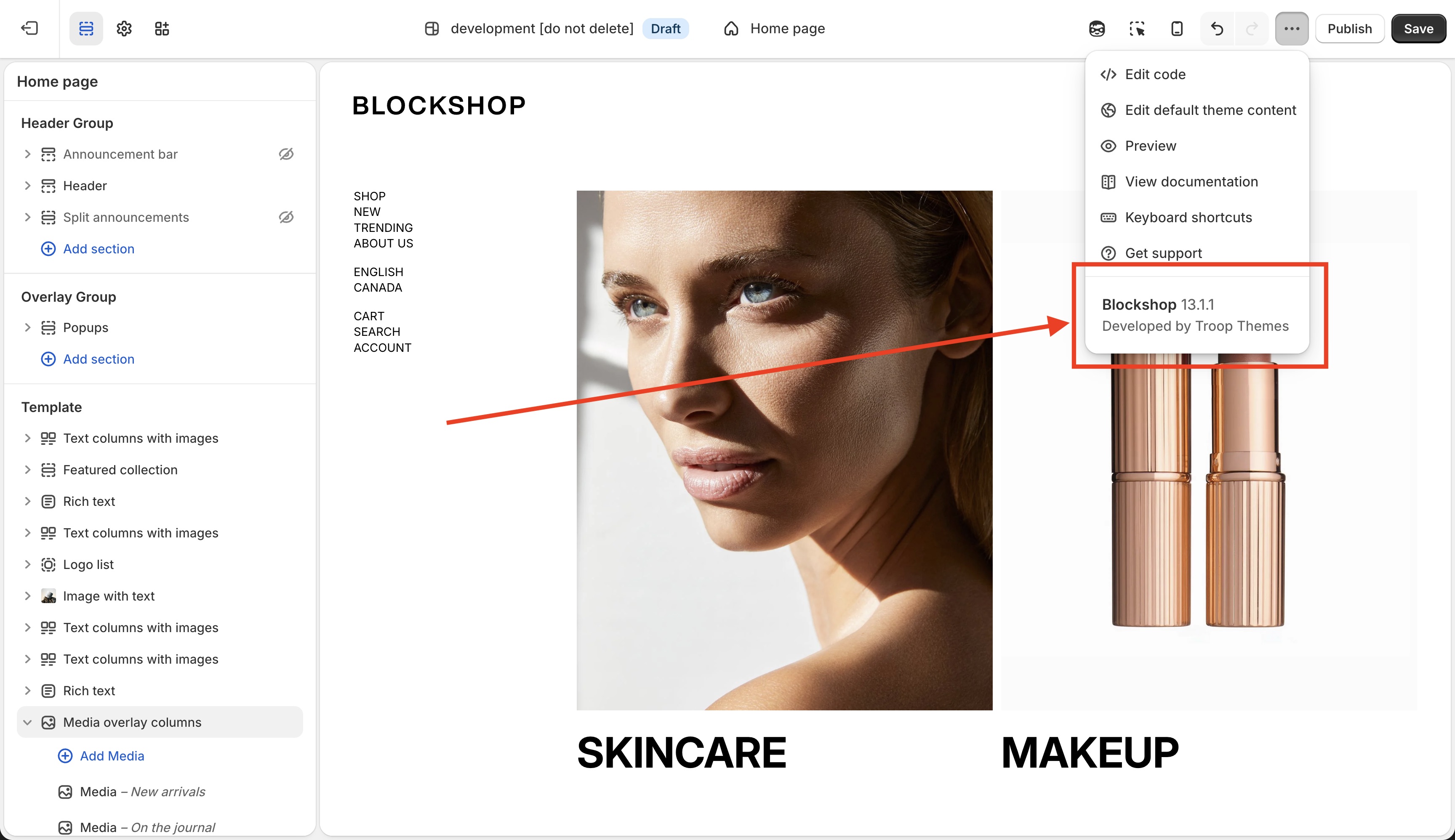
> **Why are there no automatic updates on themes in Shopify?**
>
> This is because themes are often customized by storeowners and automatic updates would overwrite those customizations. Software and apps can be routinely updated, but themes are designed to be customizable by you to suit your needs and reflect your brand. If we ran automatic updates on themes, you would lose all of your customizations.
## How to update
> **A few tips before you begin**
>
>
> **Do an app inventory**
>
> Run through your list of installed apps and third-party code that has been added in. You’ll want to have a list of all these to keep a record of what needs to be transferred over.
>
> **Download your theme**
>
> Download a copy of your theme. It's always a good idea to have a backup you can revert to if need be. To download your current theme, click the _Actions_ dropdown on your live theme and select the _Download theme file_ option.
**1. Download the latest version**
To download the latest version, navigate to the theme's listing page and click _Version X.Y.Z available_.
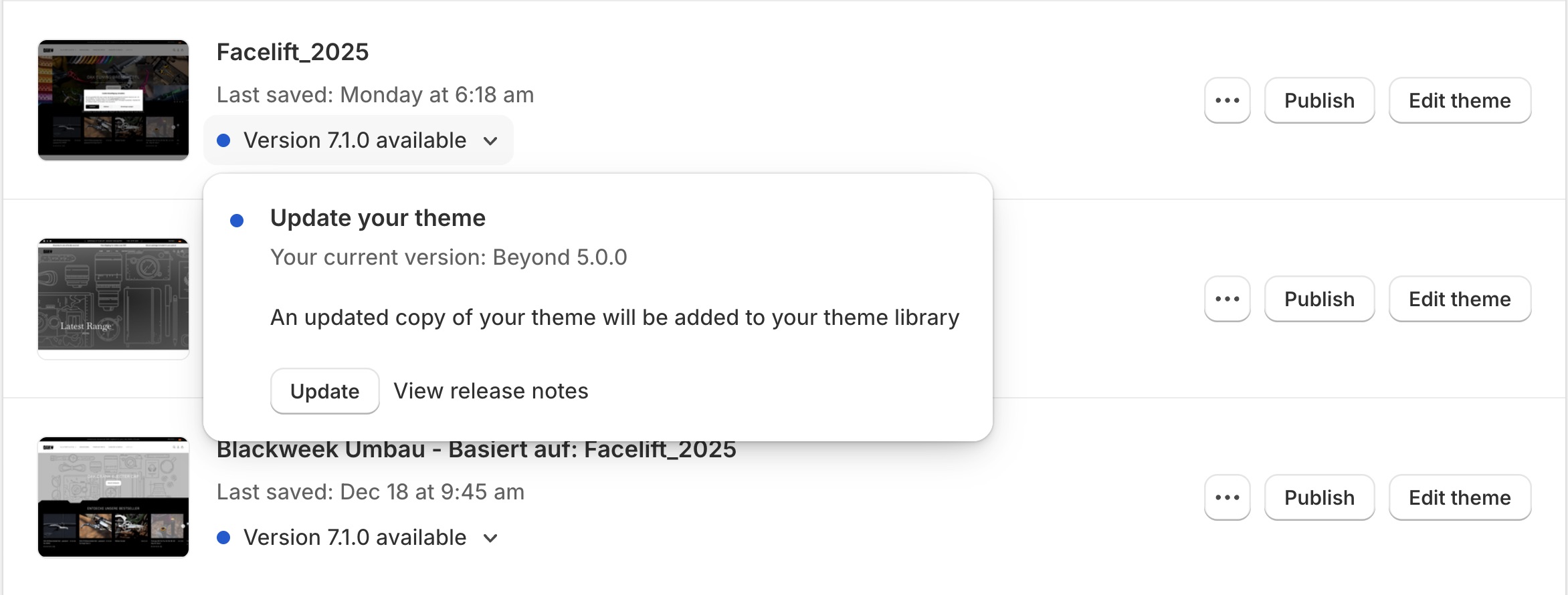
The theme will be added to the top of your Themes page in your store admin. If you are on the latest version or uploaded the theme directly, you will not see the _Version X.Y.Z available_ button.
**2. Update theme settings**
Now it's time to reapply your customizations made in the theme settings. To speed things up, open the theme editor for both the published (live) and unpublished versions in separate tabs or side-by-side windows. Go through the new theme section by section and match the settings from the old version. Comparing the two helps you to familiarize with and set up any new features and settings.
**3. Migrate custom code**
If you have made customizations to any of the theme's template files or added custom CSS via the template editor, you'll want to transfer those across. Styles in old Liquid files belong in **Theme settings** → **Custom CSS**, see "Add custom CSS or edit template code" for [Blockshop](https://support.troopthemes.com/guide/blockshop/adding-css-editing-template-code/), [Maker](https://support.troopthemes.com/guide/maker/adding-css-editing-template-code/), [Emerge](https://support.troopthemes.com/guide/emerge/adding-css-editing-template-code/), or [Beyond](https://support.troopthemes.com/guide/beyond/adding-css-editing-template-code/).
**4. Reinstall apps**
Apps that required you to add code to your theme’s files will need to be reinstalled. You’ll need to revisit the app documentation and follow the installation instructions on how to do this. If you’re unsure how, you can go to Apps and click 'View Details' to find the support email for that Shopify app.
**5. Publish theme**
Once you’ve migrated all your settings and custom code, you’re set to go.
When you publish the new version of the theme, the old version will be stored in your dashboard and you can revert back to it at any time.
## Update using “Theme Updater App”
Troop Themes has partnered with Pixel Union and Out of the Sandbox to bring support for our entire catalog of themes to the [Theme Updater app](https://apps.shopify.com/theme-updater-by-out-of-the-sandbox). This app is designed to make the process of updating your theme to the current version as easy as possible. In many cases, the app can even carry over simple changes you may have made directly to the theme code.
The app will apply all of the settings you configured in the theme editor automatically. Any customizations that you have made to the code will be attempted as well. As the number and type of customizations can vary greatly, we cannot guarantee that all customizations will automatically carry over.
The updater app will always create a duplicate theme that you can review to ensure your site looks great before publishing it to the live store.
## Troubleshooting
- **Settings didn’t copy**: Theme Store “add latest version” does not clone your look. Copy Theme settings and sections by eye, or use the Theme Updater app.
- **An app disappeared**: turn **App embeds** on again; reinstall apps that paste Liquid. See [Using apps with your theme](https://support.troopthemes.com/guide/using-apps-with-themes/).
- **Custom CSS is missing**: it lived in a file, not **Custom CSS**. See "Add custom CSS or edit template code" for [Blockshop](https://support.troopthemes.com/guide/blockshop/adding-css-editing-template-code/), [Maker](https://support.troopthemes.com/guide/maker/adding-css-editing-template-code/), [Emerge](https://support.troopthemes.com/guide/emerge/adding-css-editing-template-code/), or [Beyond](https://support.troopthemes.com/guide/beyond/adding-css-editing-template-code/).
- **The live store reverted**: you previewed the new theme but did not **Publish**. Unpublished themes do not affect the live store.
---
title: Using apps with your theme
url: https://support.troopthemes.com/guide/using-apps-with-themes/
---
# Using apps with your theme
Apps add features the theme does not ship (reviews, subscriptions, upsells, Klaviyo forms). The theme displays **app embeds** and **app blocks**; it does not make a random app “compatible” by editing Troop Liquid for you.
Shopify **Apps**; then **Edit theme** → **App embeds** and **Add block** / **Add section** for app blocks.
Theme settings (colors, type) are unchanged. If an app restyles the header, turn the embed off to test.
> **Info**
>
> Visit Shopify's help centre for an extensive guide on [extending your theme with apps](https://help.shopify.com/en/manual/online-store/themes/customizing-themes/apps). Some apps can be added in **Edit theme** as an [app block](https://help.shopify.com/en/manual/online-store/themes/customizing-themes/apps#app-blocks).
## Choosing apps
The majority of Shopify Apps are developed by third-party developers. Before committing to an app, it can be worthwhile reviewing the app documentation or contacting their support for information on how it integrates into themes.
As theme developers, we're unable to modify our code to make our themes compatible with any app because resolving one issue for one app often introduces errors in other theme functionality or other apps. Instead, we do offer app developers access to our code so they can make the necessary changes on their end to make their app work with our themes.
> **Apps and performance**
>
> Apps that edit or add elements to the frontend of the store often add javascript files that increase page load time. Try to limit apps that are added into themes to under 5 to reduce load times.
## Prefer embeds and blocks over theme file edits
- **App embed**: usually survives a theme update. Use for site-wide scripts (reviews widget, pixel, popup).
- **App block** / app section: yes, if you re-add it on the new theme. Use for a widget in one place.
- **Code pasted into `theme.liquid` or section files**: **no**, you must copy it by hand. Only if the app has no embed.
## Updating themes with apps
Adding apps to your store can help add new features and functionality, but can often make theme maintenance a little more complex.
Depending on the theme version you're running, some apps may require custom code to be added to theme template files. When updating your theme, these customizations will have to be added back in to the new version.
After an update: open **Edit theme** → **App embeds** and turn each app back on, then reinstall any app that still asks you to paste code. See [How to update your theme](https://support.troopthemes.com/guide/update-theme/).
## Troubleshooting
- **Something broke after installing an app**: turn off **App embeds** one by one. If the issue disappears, contact the app developer (CC Troop support if they need theme details).
- **Deleting the app didn’t fix it**: leftover code in theme files. Ask the app how to uninstall completely, or compare to a [fresh theme copy](https://support.troopthemes.com/guide/troubleshooting/).
- **An app restyled your buttons**: expected if it injects CSS. Disable the embed; do not fight it with Theme settings.
- **Need more than five storefront apps**: expect slower pages. See [store performance](https://support.troopthemes.com/faqs/what-do-store-performance-and-the-dashboard-mean/).
---
title: Understanding unlicensed themes
url: https://support.troopthemes.com/guide/unlicensed-themes/
---
# Understanding unlicensed themes on Shopify
If Shopify flags a theme as unlicensed, you may see an **Action required** notice in admin and lose access to some theme actions until it is resolved. This guide explains the merchant next steps in plain language.
**Online Store** → **Themes**, then Shopify’s license flow. Troop does not sell licenses outside the Theme Store.
Your products and theme settings are unchanged. Copying theme files to another store is not a transfer.
## Troop theme licensing
Troop themes are licensed **exclusively through Shopify**. We do not sell licenses through third-party marketplaces, resellers, or direct private downloads.
If you are using a paid Troop theme, the valid purchase path is the [Shopify Theme Store](https://themes.shopify.com).
## What "unlicensed" means
In most cases, Shopify can't verify that the store using the theme has a valid license.
Common reasons:
- The theme was downloaded from a source outside the Shopify Theme Store.
- The theme was purchased for a different store and copied over.
- The license details don't match the current store owner/account.
## How to fix it
If you receive an unlicensed-theme warning, start with this quick checklist:
1. Check **Online Store -> Themes** in admin for the exact theme name.
2. Confirm where and when that theme was purchased.
3. Keep all communication inside Shopify admin and official support channels.
Then choose one of these paths:
1. **Buy the theme license for this store**
- Purchase the theme from the [Shopify Theme Store](https://themes.shopify.com) for the exact store where it is used.
- For Troop themes, this is the only valid way to obtain a license.
2. **Remove the theme**
- Delete the flagged theme from your theme library if you do not plan to use it.
3. **Provide license details**
- Follow the instructions in Shopify's notice or email and share any requested proof of purchase.
4. **Move a paid theme to another store (transfer)**
- Shopify theme licenses are generally for one live store at a time.
- If you are changing stores, contact Shopify Support first to confirm transfer requirements for your case.
- Typical requirements include:
1. Both stores are owned by you.
2. The account ownership details align between stores.
3. The original store is no longer using the licensed theme.
> **Avoid scams**
>
> Only trust licensing notices that match what you see in your Shopify admin.
> If an email looks suspicious, do not click links.
> Contact Shopify Support directly and verify first.
## Shopify Plus
Shopify Plus does not use a separate theme-licensing policy for unlicensed theme notices. The same licensing rules and resolution steps apply across plans.
Many Plus merchants run multiple stores under one organization. Even in that setup, paid theme licenses are generally store-specific, and a theme can't be used as a licensed theme on multiple live stores at the same time.
If your Plus store is flagged, follow the same process above: verify your purchase, then purchase, remove, provide license details, or request a transfer with Shopify Support.
## Official Shopify reference
**Online Store** → **Themes**, then Shopify’s license flow. Troop does not sell licenses outside the Theme Store.
Your products or theme settings. Copying a theme file to another store is not a transfer.
For Shopify's full policy and latest wording, read:
[Understanding licensing and transferring themes on Shopify](https://help.shopify.com/en/manual/online-store/themes/managing-themes/unlicensed-themes)
---
title: Overview
url: https://support.troopthemes.com/guide/blockshop/
theme: Blockshop
theme_styles: Radiance, Stone, Valla
---
# Get the most from Blockshop
This guide is for merchants using **[Blockshop](https://themes.shopify.com/themes/blockshop/presets/blockshop)**, including [Radiance](https://themes.shopify.com/themes/blockshop/presets/radiance), [Stone](https://themes.shopify.com/themes/blockshop/presets/stone), and [Valla](https://themes.shopify.com/themes/blockshop/presets/valla). Blockshop is for high-end or luxury stores with spacious layouts, restrained typography, and rich media.
Radiance, Stone, and Valla are styles of Blockshop, not separate themes. If your store uses Radiance, Stone, or Valla, use this Blockshop guide.
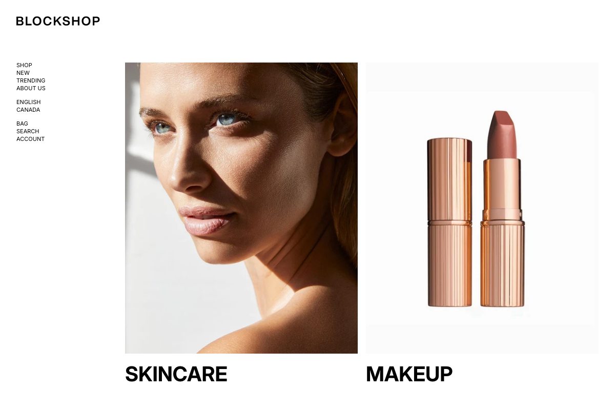
> **Theme, Shopify, or an app?**
>
> **Theme**: storefront look. Theme settings, sections, and [default theme text](https://support.troopthemes.com/guide/blockshop/change-default-text/).
>
> **Shopify admin**: catalog and content. [Products](https://help.shopify.com/en/manual/products), [Collections](https://help.shopify.com/en/manual/products/collections), [Pages](https://help.shopify.com/en/manual/online-store/themes/theme-structure/pages), and **Content** → [Menus](https://support.troopthemes.com/guide/blockshop/creating-navigation/) (the theme only displays the menu you assign) and [Blog posts](https://support.troopthemes.com/guide/blockshop/customizing-blog/).
>
> **Outside the theme**: [checkout and payments](https://support.troopthemes.com/guide/troubleshooting/#checkout-payments-shipping-and-inventory) (**Settings**), [collection filters](https://support.troopthemes.com/guide/troubleshooting/#search-filters-and-discovery) (**Search & Discovery**), and [email, reviews, or subscription apps](https://support.troopthemes.com/guide/troubleshooting/#email-reviews-subscriptions-and-other-apps).
## Theme settings to know (Blockshop)
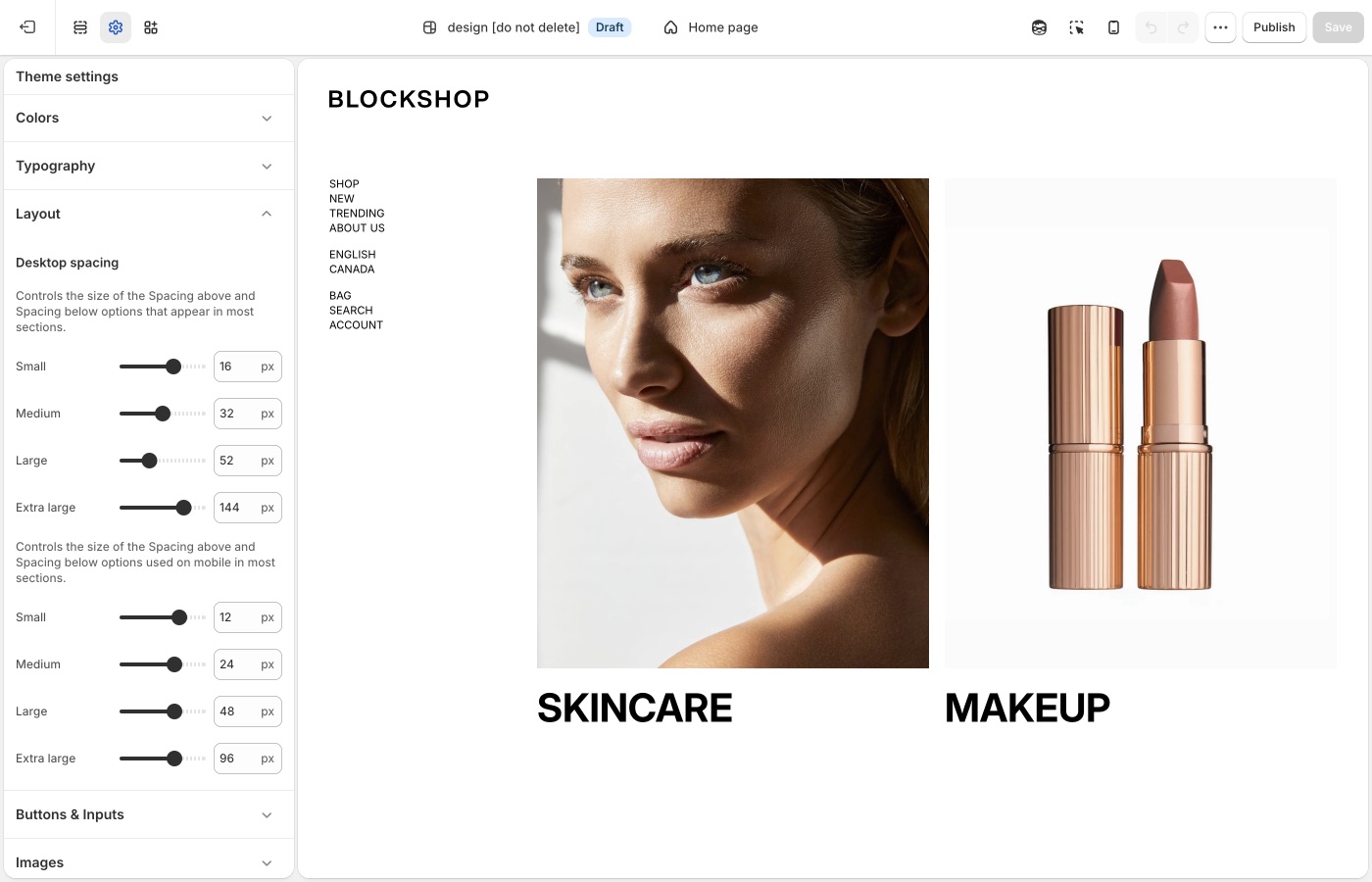
Open **Edit theme** → **Theme settings**. These groups in the left sidebar apply storewide.
### Colors (Blockshop)
Storewide palette: three accents, page and text colors, light and dark backgrounds, border opacity, and drop shadows. On each section, **Background color** and **Text color** pick from this list. See [Colors](https://support.troopthemes.com/guide/blockshop/colors/).
### Typography (Blockshop)
Heading, navigation, and body fonts; the type size ladder; link style and button label size. See [Typography](https://support.troopthemes.com/guide/blockshop/typography/).
### Layout (Blockshop)
**Theme settings** → **Layout** → **Desktop spacing** and **Mobile spacing** set the Small through Extra large sizes. On each section, **Spacing above** and **Spacing below** dropdowns pick None, Small, Medium, Large, or Extra large. See [Spacing and layout](https://support.troopthemes.com/guide/blockshop/spacing-and-layout/).
Reuse the same **Spacing above** / **Spacing below** dropdown on adjacent sections: Medium throughout the shop, or Large on a hero and Medium on what follows. Use **None** when two sections should sit flush. Add a **Divider** when you need a gap with no content. Keep mobile spacing smaller than desktop, and preview both after you change the scale in Layout.
Extra large spacing suits heroes and brand-story blocks; collection grids and dense catalogs usually sit on Medium or Large. A Stone-style homepage can rely on Extra large as rhythm, not on every section.
### Buttons & Inputs (Blockshop)
**Theme settings** → **Buttons & Inputs** defines button styles 1 through 4, input colors, and corner radii storewide. On each section, the **Button** block picks style 1–4. **Link style** is in **Typography** → **Buttons**. See [Buttons, inputs, and links](https://support.troopthemes.com/guide/blockshop/buttons-inputs-and-links/).
### Images (Blockshop)
Aspect ratios and corner radius for product, collection, and article images. See [Images](https://support.troopthemes.com/guide/blockshop/images/).
### Social media (Blockshop)
One place for every platform's icon and link, used by the footer, announcement bar, and other sections. See [Social media](https://support.troopthemes.com/guide/blockshop/social-media/).
### Animations (Blockshop)
Four storewide switches to turn off text, image, button hover, or other motion. See [Animations](https://support.troopthemes.com/guide/blockshop/animations/).
### Product grid (Blockshop)
Card labels, hover image, and heading/price type. **Text alignment** for product cards is set here, not on the collection section. See [Product grid](https://support.troopthemes.com/guide/blockshop/product-grid/).
### Cart (Blockshop)
**Cart type** (Page or Drawer), the checkout button style, order notes, and the free shipping progress message. See [Cart](https://support.troopthemes.com/guide/blockshop/cart/).
## On each section (Blockshop)
Open a section in **Edit theme**, not **Theme settings**:
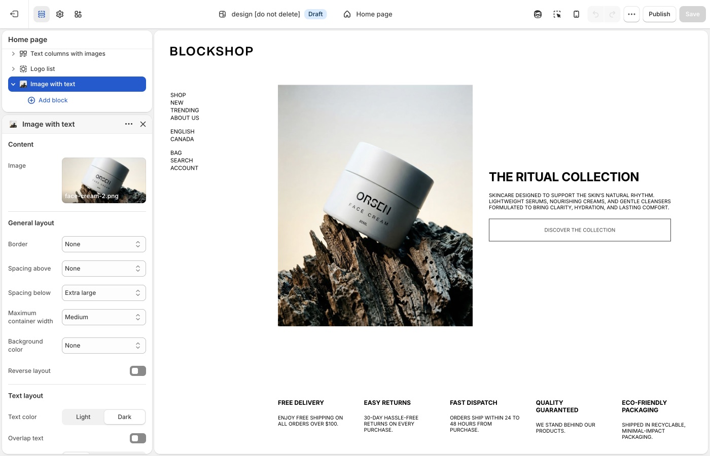
Pick a default **Text alignment** per template and keep supporting sections on it: **left** for catalogs and long copy, **center** for heroes and short announcements, then back to your default. **Mobile text alignment** is separate.
**Maximum container width** is on each section: contained for text-heavy blocks, **Full width** for slideshows and large photography. A useful rhythm is full-width hero → contained story → full-width collection.
See [Alignment and width](https://support.troopthemes.com/guide/blockshop/alignment-and-width/) for more details.
## Sections and templates (Blockshop)
**Edit theme** → **Add section**, plus menus and page layouts:
- [Section list](https://support.troopthemes.com/guide/blockshop/section-list/)
- [Image sections](https://support.troopthemes.com/guide/blockshop/image-sections/)
- [Collection page promotions](https://support.troopthemes.com/guide/blockshop/collection-page-promotions/)
- [Navigation](https://support.troopthemes.com/guide/blockshop/creating-navigation/)
- [Templates](https://support.troopthemes.com/guide/blockshop/working-with-templates/)
## Products (Blockshop)
Product data lives in Shopify admin. These guides cover how the theme displays it:
- [Product grid](https://support.troopthemes.com/guide/blockshop/product-grid/)
- [Quick add](https://support.troopthemes.com/guide/blockshop/quick-add/)
- [Swatches](https://support.troopthemes.com/guide/blockshop/color-swatch-guide/)
- [Filters](https://support.troopthemes.com/guide/blockshop/setting-up-product-filters/) (Search & Discovery app)
- [Search](https://support.troopthemes.com/guide/blockshop/search/)
## Content and store (Blockshop)
- [FAQ](https://support.troopthemes.com/guide/blockshop/setting-up-faq-or-collapsible-rows/)
- [Blog](https://support.troopthemes.com/guide/blockshop/customizing-blog/)
- [Marketing popup](https://support.troopthemes.com/guide/blockshop/configuring-the-popup/)
- [Newsletters](https://support.troopthemes.com/guide/blockshop/newsletters/)
- [Currencies & languages](https://support.troopthemes.com/guide/blockshop/configure-country-currency-selectors/)
- [Custom CSS](https://support.troopthemes.com/guide/blockshop/adding-css-editing-template-code/)
- [Advanced settings](https://support.troopthemes.com/guide/blockshop/advanced-settings/)
If something used to work and no longer does, start with [Troubleshooting](https://support.troopthemes.com/guide/troubleshooting/). For what changed recently, see the [Blockshop release notes](https://support.troopthemes.com/release_notes/blockshop/).
> **Want a different listing’s look?**
>
> A purchase of Blockshop includes all four styles. If you installed from one listing and want another (for example Stone instead of Blockshop), see [What are theme styles?](https://support.troopthemes.com/faqs/theme-styles/). Switching is optional. You do not need to switch styles to continue. For the exact settings that differ between listings, see the [Demo store reference](https://support.troopthemes.com/guide/blockshop/demo-store-reference/).
---
title: Demo store reference
url: https://support.troopthemes.com/guide/blockshop/demo-store-reference/
theme: Blockshop
theme_styles: Radiance, Stone, Valla
---
# Demo store reference in Blockshop
Blockshop ships as four Shopify Theme Store listings: **[Blockshop](https://themes.shopify.com/themes/blockshop/presets/blockshop)**, **[Radiance](https://themes.shopify.com/themes/blockshop/presets/radiance)**, **[Stone](https://themes.shopify.com/themes/blockshop/presets/stone)**, and **[Valla](https://themes.shopify.com/themes/blockshop/presets/valla)**. All four are the same theme code. The only difference is the starting values in **Theme settings**. This page lists what changes between them, so you can either pick the closer match before you buy, or dial your current store toward another look without switching.

## What changes between demos (Blockshop)
| Setting | Blockshop | Radiance | Stone | Valla |
| --- | --- | --- | --- | --- |
| Heading font | Inter, bold, uppercase | Nanum Myeongjo, sentence case | Host Grotesk, sentence case | Inter, bold, uppercase |
| Accent 1 | A rose or berry tone | A warm tan tone | The same warm tan tone as Radiance | A deep, near-black brown |
| Product image size | Natural | Portrait | The taller Portrait (2:3) crop | Natural |
| Product label shape (**Shape**, under **Product labels**) | Square | Round | Round | Square |
| Enable hover image | On | On | Off | Off |
Stone also runs its own **Desktop spacing** and **Mobile spacing** scale rather than the theme defaults; see [Spacing and layout](https://support.troopthemes.com/guide/blockshop/spacing-and-layout/#small) for the exact values and how Stone uses **Small** to keep shop sections nearly flush.
## Rebuilding a look (Blockshop)
Every row above is a normal Theme settings field. See [Colors](https://support.troopthemes.com/guide/blockshop/colors/) for accents, [Typography](https://support.troopthemes.com/guide/blockshop/typography/) for the heading font, [Images](https://support.troopthemes.com/guide/blockshop/images/) for **Product image size**, and [Product grid](https://support.troopthemes.com/guide/blockshop/product-grid/) for label **Shape** and **Enable hover image**.
> **Want a different listing's look?**
>
> A purchase of Blockshop includes all four styles. To switch the installed listing after purchase, see [What are theme styles?](https://support.troopthemes.com/faqs/theme-styles/). You do not need to switch styles to match the settings above; changing them directly has the same visual effect.
---
title: Colors
url: https://support.troopthemes.com/guide/blockshop/colors/
theme: Blockshop
theme_styles: Radiance, Stone, Valla
---
# Colors in Blockshop
**Edit theme** → **Theme settings** → **Colors**
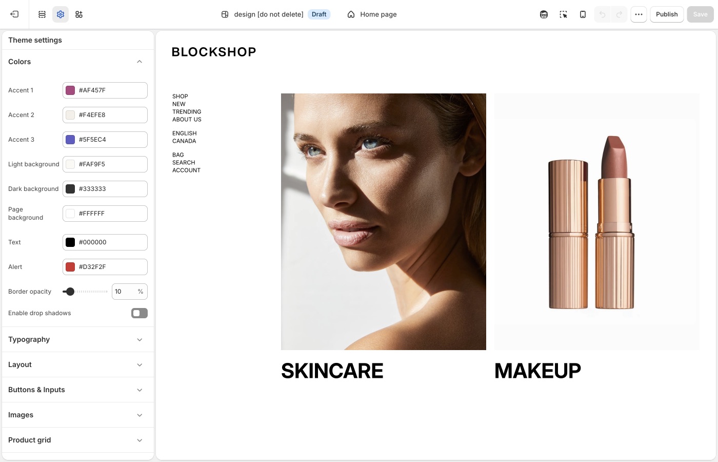
Set accents, page, text, light, and dark once. Most sections pick from this list. Keep the palette small.
## Theme settings (Blockshop)
### Accents (Blockshop)
Blockshop has **Accent 1**, **Accent 2**, and **Accent 3**. Set them once. On a section, the background and highlight dropdowns can use those accents instead of inventing a new hex each time.
Accents work well for:
- Section backgrounds that need to stand apart from the page
- Labels, highlights, and other repeating marks
### Page, text, light, and dark (Blockshop)
- **Page background**: the default canvas behind most pages
- **Text**: default body color
- **Light background** / **Dark background**: the Light and Dark options in section color pickers
- **Alert**: error and attention states (for example form errors)
Keep **Text** dark enough on **Page background**. If you lighten the page, check buttons, inputs, and overlays too.
Alternating section backgrounds in a 1–2–1–2 pattern creates rhythm without extra fonts or sections, for example page → accent → page → accent, or page → light → page.
> **Create rhythm with background color**
>
> Repeated color is easier to control than a new palette on every section. Alternate the page background with one accent or light background to create homepage visual rhythm.
### Borders and shadows (Blockshop)
- **Border opacity**: how strong hairline borders appear
- **Enable drop shadows**: on or off for the whole theme
When **Enable drop shadows** is on, shadows appear on:
- The sticky header
- Navigation dropdowns and megamenus
- Drawers (cart, search, mobile menu, filters, and similar panels)
- Popups and the newsletter signup
- Sticky bars (product add-to-cart, quick add, cart checkout, collection filters)
- Quantity buttons on the product form
- Shop the Look cards and Shop the Banner hotspots
- Layered images in Overlapping media
When shadows are off, the theme usually draws a **border** in their place instead, controlled by **Border opacity**. A few elements only lose the shadow (slideshow arrows, pagination on hover, country/region dropdowns). Turn shadows off for a flatter, print-like look, then raise border opacity if you want the grid of the page to show.
## On each section (Blockshop)
Sections include **Text color** and **Background color**.
Text color is **Auto**, **Light**, or **Dark**. Auto follows the other settings. For example, a box around text will pick dark type. Choose Light or Dark when Auto is wrong on a specific photo.
**Darken image** (and the related **Image darkness** slider in Typography) improves overlay text on pale photography. Prefer darkening the image over painting every heading white by hand.
> **A color that is not in Theme settings**
>
> Use [custom CSS](https://support.troopthemes.com/guide/blockshop/adding-css-editing-template-code/) only for one-off exceptions. Accents and section pickers should cover storewide color.
Button colors are in [Buttons, inputs, and links](https://support.troopthemes.com/guide/blockshop/buttons-inputs-and-links/). Checkout and apps are unchanged.
## Ask Sidekick  (Blockshop)
Open [Sidekick](https://help.shopify.com/en/manual/shopify-admin/productivity-tools/sidekick) from the theme editor toolbar (top right, next to the device preview icon), or press `⌘.` (`Ctrl+.` on Windows). Describe your brand or the mood you want and it'll suggest colors, previewed before anything is applied to Theme settings → Colors.
> "Suggest values for Accent 1, Accent 2, and Accent 3 for a warm, earthy candle store, plus a Page background and Text color that pair with them."
A fast way to get a starting palette, or a second opinion when you're stuck between two options, you still decide what to keep.

## Troubleshooting (Blockshop)
- **One section ignored the new palette**: that section has its own **Background color**. Open the section, not only Theme settings.
- **Buttons didn’t change**: those colors are in **Theme settings** → **Buttons & Inputs**.
- **Text disappeared on a photo**: set section **Text color** to Light or Dark, or raise **Image darkness** in Typography. Auto can select the wrong value on pale images.
- **Checkout is still Shopify’s colors**: checkout is not a theme setting.
---
title: Typography
url: https://support.troopthemes.com/guide/blockshop/typography/
theme: Blockshop
theme_styles: Radiance, Stone, Valla
---
# Typography in Blockshop
**Edit theme** → **Theme settings** → **Typography**
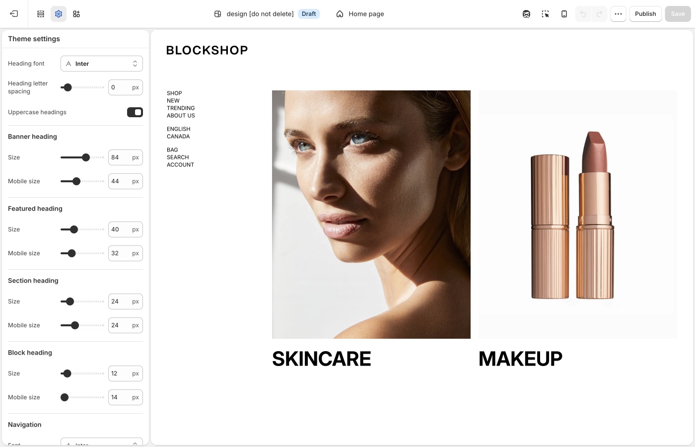
Heading, navigation, and body fonts, plus a type size ladder for each role.
## Theme settings → Typography (Blockshop)
### Fonts (Blockshop)
You pick three fonts:
- **Heading font**: banners, section titles, and other headings
- **Navigation font**: header and dropdown labels
- **Paragraph font**: body copy
Use one heading font and one body font. Navigation can match headings or paragraphs. Mixing three unrelated families makes the store feel busy.
> **A custom font**
>
> Shopify’s font picker covers most stores. To use a font file or a Google Font that the picker does not include, see [Custom fonts](#custom-fonts).
### Type roles (Blockshop)
Each role has a desktop size. Most also have a **Mobile size** so heroes do not overflow phones.
- **Banner heading**: slideshow and large hero titles
- **Featured heading**: campaign titles that sit below banner size
- **Section heading**: titles at the top of a section
- **Block heading**: titles on cards, columns, and blocks
- **Navigation**: header links
- **Sub navigation**: dropdown and nested links
- **Buttons**: button labels
- **Overline**: small labels above a heading
- **Paragraphs**: body copy
- **Featured paragraph**: body copy on top of images and video
Keep the ladder obvious: banner larger than featured, featured larger than section, section larger than block, block close to paragraph. If section headings and paragraphs are the same size, the page has no hierarchy.
> **Check mobile**
>
> After you set banner and featured sizes, resize the editor preview to mobile. If a title wraps into five lines, lower **Mobile size** rather than shrinking desktop type.
### Letter spacing and uppercase (Blockshop)
- **Heading letter spacing** and **Paragraph** / **Button letter spacing** open or tighten the letters.
- **Uppercase headings**, **Uppercase** on nav, buttons, overlines, and paragraphs change the voice of the brand.
Treat uppercase and wide tracking as a brand choice, not a default on every role. All-caps paragraphs are hard to read. Wide tracking on a huge banner can look elegant; the same tracking on body copy looks sparse.
### Links and buttons in type (Blockshop)
Blockshop adds type controls that sit with buttons:
- **Link style**: Underline or Arrow on text links
- **Match link size to block heading**: text links use the block heading size
- **Buttons → Size** and **Mobile size**: button label size on desktop and phones
Set link style here so it stays consistent storewide. Colors and hover for the four button styles live in [Buttons, inputs, and links](https://support.troopthemes.com/guide/blockshop/buttons-inputs-and-links/).
### Text on images (Blockshop)
Under **Text visibility**:
- **Image darkness**: storewide strength (0–100%) for dark overlays on photos and video
- **On the section**: **Darken image** or **Image overlay** turns the overlay on and picks the direction: entire image, top down, or bottom up. **None** on the section means this Typography slider has no effect there.
- **Text shadows**: storewide strength for **Oval shadow**
- **On the section**: **Text shadows** picks **None**, **Text shadow** (fixed glow on headings, copy, and buttons), or **Oval shadow** (soft gradient behind the text; the Typography slider controls how strong)
- **Translucent box around text**: softens the fill when **Text background color** is set (not Transparent)
- **Sections**: Slideshow, Image with text overlay, Video, Featured images, Testimonials, Image with text (overlap layout)
- **Blocks**: Grid with overlay tiles; Promotion blocks in Featured collection and Collection grid; megamenu blocks in Header
If overlay headings disappear on a pale photo, enable **Darken image** on the section first, then raise **Image darkness** in Typography, or set **Text shadows** to **Text shadow** or **Oval shadow**.
## Custom fonts (Blockshop)
Shopify’s font picker in **Theme settings** → **Typography** covers most stores. Add a custom font only when you need a licensed font file or a Google Font that the picker does not include. You must have a license to host the font files. Custom fonts do not change checkout.
A custom font loads from a **Custom liquid** section at the top of the header group. You can load the font in one of three ways:
1. Upload a font file in **Content** → **Files**
2. Use a public URL to a hosted font file (for example, `.woff2`, `.woff`, `.ttf`, or `.otf`)
3. Use a font from [Google Fonts](https://fonts.google.com/)
### Set up a Custom liquid section (Blockshop)
1. In **Edit theme**, add a **Custom liquid** section at the top of the header group.
2. In that section’s settings, set **Spacing above**, **Spacing below**, and the mobile spacing options to **None** so the section does not add extra space.
Each option below pastes its font code into this **Custom liquid** section.
### Option 1: Upload a font file (Blockshop)
1. In the Shopify admin, open **Content** → **Files** and use **Upload files** to add your font (for example, `custom-font.woff2`).
2. Note the uploaded file name, including the file extension. You use that exact name in the next step.
In the **Custom liquid** section, paste the following code. Set `custom_font_family` to your font’s name, and set `custom_font_file` to the uploaded file name (for example, `my-font.woff2`).
```liquid
{%- liquid
assign custom_font_family = 'Merchant Custom Sans'
assign custom_font_fallback = 'sans-serif'
assign custom_font_file = 'custom-font.woff2'
-%}
```
Click **Save** in the theme editor to apply the changes.
### Option 2: Use a URL to a hosted font (Blockshop)
Use this option when the font file is on a server or CDN and you have a direct `https://` link to the file.
In the **Custom liquid** section, paste the following code. Set `custom_font_family` to your font’s name, and set `custom_font_url` to the full address of the file (for example, `https://example.com/fonts/custom-font.woff2`).
```liquid
{%- liquid
assign custom_font_family = 'Merchant Custom Sans'
assign custom_font_fallback = 'sans-serif'
assign custom_font_url = 'https://example.com/fonts/custom-font.woff2'
-%}
```
Click **Save** in the theme editor to apply the changes.
### Option 3: Use Google Fonts (Blockshop)
On [Google Fonts](https://fonts.google.com/), pick a font, open **Get embed code**, and copy the stylesheet link. The link has the format `https://fonts.googleapis.com/css2?family=...&display=swap`.
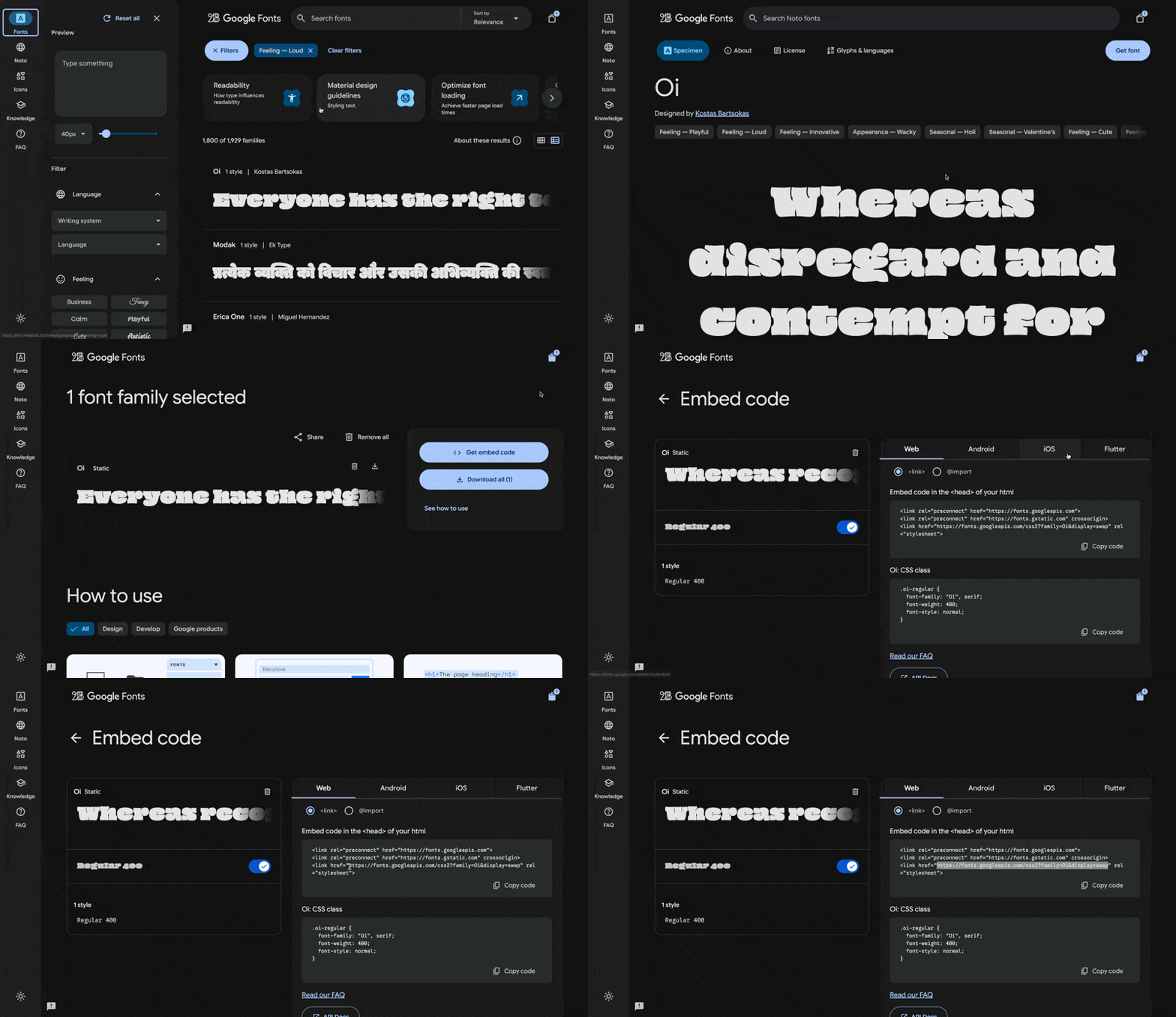
In the **Custom liquid** section, paste the following code. Set `custom_font_url` to the stylesheet link, and set `custom_font_family` to the font’s name as Google Fonts shows it. The example uses the font Oi.
```liquid
{%- liquid
assign custom_font_family = 'Oi'
assign custom_font_fallback = 'sans-serif'
assign custom_font_url = 'https://fonts.googleapis.com/css2?family=Oi&display=swap'
-%}
```
Click **Save** in the theme editor to apply the changes.
### Deprecated fonts in Shopify’s library (Blockshop)
Shopify sometimes deprecates fonts in its font library. A deprecated font can disappear from the font picker in **Theme settings** → **Typography** or stop loading as before. See [Deprecated fonts](https://shopify.dev/docs/storefronts/themes/architecture/settings/fonts#deprecated-fonts) in Shopify’s font documentation for the affected typefaces.
To replace a deprecated font, pick another font from the current library in **Theme settings** → **Typography**. To keep the same typeface, load it as a custom font with one of the options above.
## Ask Sidekick (Blockshop)
Open [Sidekick](https://help.shopify.com/en/manual/shopify-admin/productivity-tools/sidekick) from the theme editor toolbar (top right, next to the device preview icon), or press `⌘.` (`Ctrl+.` on Windows). Ask it for a font pairing that fits your brand.
> "Suggest a Heading font and Paragraph font pairing for a modern retail store, and whether Navigation should match the heading or the paragraph font."
It previews the pairing before you apply anything to Theme settings → Typography, faster than comparing font libraries by hand. If you're deciding whether a custom font is worth adding at all, it's also a reasonable place to ask.

## Troubleshooting (Blockshop)
- **Headings didn’t change**: you may have edited the wrong role. Banner headings only affect slideshows and large heroes; section titles use **Section heading**.
- **Product card titles didn’t change**: those sizes are **Heading type** in **Theme settings** → **Product grid**, not Typography.
- **A sentence in the header or cart is the wrong words**: that is [default theme content](https://support.troopthemes.com/guide/blockshop/change-default-text/), not a font setting.
- **Custom font did nothing**: the **Custom liquid** section must be first in the header group, with all spacing set to **None**. See [Custom fonts](#custom-fonts).
- **Custom font only changed some text**: the snippet sets the heading, navigation, and paragraph font variables together. Remove the `:root` lines for the roles you do not want to change.
- **Custom font file returns a 404**: `custom_font_file` must match the file name in **Content** → **Files** exactly, including the extension.
- **Checkout font is unchanged**: this is expected. Custom fonts do not apply to checkout.
---
title: Changing default theme text
url: https://support.troopthemes.com/guide/blockshop/change-default-text/
theme: Blockshop
theme_styles: Radiance, Stone, Valla
---
# Changing default theme text in Blockshop
If you cannot edit the wording in a section setting (a heading or button label you typed yourself), it is usually **default theme content**: “Add to cart”, “Sold out”, form placeholders, cart empty-state messages, and other built-in storefront wording.
**Online Store** → **Themes** → **…** → **Edit default theme content** (Languages).
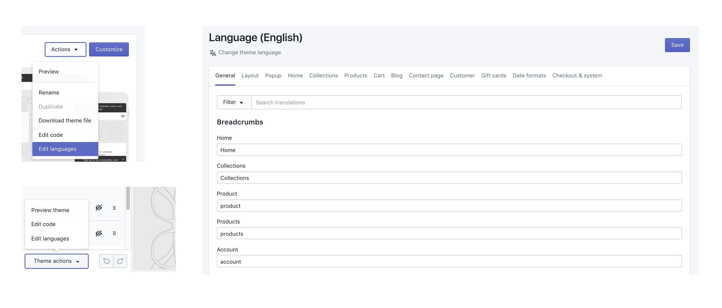
Product titles (**Products**), page bodies, blog bodies (**Content** → **Blog posts**), menu labels (**Content** → **Menus**), and checkout wording are edited elsewhere, not here.
> **Info**
>
> Visit Shopify's help centre for an extensive guide on [changing the wording in themes](https://help.shopify.com/en/manual/online-store/themes/customizing-themes/language).
## Which editor? (Blockshop)
### Edit theme (a section) (Blockshop)
For headings, overlay text, newsletter headlines, and other copy you added to a section: open that section in **Edit theme**.
### Edit default theme content (Blockshop)
For built-in storefront wording, “Add to cart”, “Sold out”, “Size chart”, form errors: **Edit theme** → **…** → **Edit default theme content**.
### Shopify admin (Blockshop)
- Product titles, descriptions, variant names: **Products**
- Menu item names: **Content** → **Menus**
- Blog post bodies: **Content** → **Blog posts**
- A whole About page: Online Store → **Pages**
### Checkout (Blockshop)
“Pay now” and other checkout labels: Shopify checkout / Markets language, not the theme.
Search in default theme content for the exact words you see on the storefront. If search finds nothing, you are in the wrong place (section setting or admin).
## Ask Sidekick (Blockshop)
Open [Sidekick](https://help.shopify.com/en/manual/shopify-admin/productivity-tools/sidekick) from the icon in your Shopify admin, then ask it to rewrite a batch of default theme content in your brand's voice, useful if it reads too formal, too casual, or just generic.
> "Make these button and form labels warmer and more casual: [paste your list]."
You still paste the results into **Edit default theme content** yourself, Sidekick doesn't edit theme content directly.
## Troubleshooting (Blockshop)
- **You changed a section heading and the button still says Add to cart**: that button is default theme content, not the section.
- **You changed default theme content and a product title didn’t move**: product titles are in Products.
- **A translation app overwrote your wording**: the app owns storefront language. Edit there, or disable the app embed to test.
- **Checkout is unchanged**: expected. See "Translating your store" in your theme's [country, currency, and language selectors guide](https://support.troopthemes.com/guide/troubleshooting/#store) for storefront vs checkout.
---
title: Spacing and layout
url: https://support.troopthemes.com/guide/blockshop/spacing-and-layout/
theme: Blockshop
theme_styles: Radiance, Stone, Valla
---
# Spacing and layout in Blockshop
Spacing works in two steps: In **Edit theme** → **Theme settings** → **Layout**, **Desktop spacing** and **Mobile spacing** define what Small through Extra large mean storewide. On each section, **Spacing above** and **Spacing below** pick from that scale: None, Small, Medium, Large, or Extra large. Changing a size in Layout updates every section that uses it.

## Theme settings → Layout (Blockshop)
### How the scale works (Blockshop)
**Desktop spacing** and **Mobile spacing** each set:
- Small
- Medium
- Large
- Extra large
The note in Layout is literal: these settings are the sizes used by the **Spacing above** and **Spacing below** dropdowns on most sections.
If Large is 72px on desktop, every section whose dropdown is set to Large uses 72px. Change a size in Layout and every matching section updates.
Set the scale to match the listing you installed, then reuse the same steps on every page. Do not set one section to Extra large and the next to Small unless you want a hard break.
### Small (Blockshop)
**Small** is the tightest named step on the scale. What it measures in pixels is set in **Theme settings** → **Layout**, not on each section.
The [Stone](https://themes.shopify.com/themes/blockshop/presets/stone) preset sets **Small** to **2px** on desktop and mobile (the theme default is 16px and 12px). Stone then picks **Small** on shop sections: the hero’s **Spacing below**, featured product rows, and collection media blocks. At 2px, those sections sit nearly flush so grids and photography read as one continuous shop flow.
That rhythm works because Stone saves **Extra large** for editorial pauses. If your catalog appears too airy, lower **Small** in Layout and set shop sections to **Small** rather than Medium. Text-heavy pages still need Medium or Large.
### Extra large (Blockshop)
Blockshop’s Extra large step is for spacious layouts: generous gaps around photography, heroes, and brand stories. The [Blockshop](https://themes.shopify.com/themes/blockshop/presets/blockshop) and [Radiance](https://themes.shopify.com/themes/blockshop/presets/radiance) presets set **Spacing below** to Extra large on most homepage sections: category columns, featured collections, and story blocks. The [Stone](https://themes.shopify.com/themes/blockshop/presets/stone) preset reserves Extra large for editorial pauses only and uses **Small** on the shop blocks in between.
Use Extra large as a rhythm, not on every section. A whole homepage of Extra large can feel empty; none at all can feel tight next to a generous listing.
### Desktop and mobile (Blockshop)
**Mobile spacing** is a separate scale. A Large gap that looks considered on desktop is often too tall on a phone. Keep mobile values smaller than desktop, and preview both after you change Layout.
Reuse the same **Spacing above** / **Spacing below** dropdown on adjacent sections: Medium throughout the shop, or Large on a hero and Medium on what follows. Use **None** when two sections should sit flush. Add a **Divider** when you need a gap with no content. Keep mobile spacing smaller than desktop, and preview both after you change the scale in Layout.
Extra large spacing suits heroes and brand-story blocks; collection grids usually sit on Medium or Large.
## On each section (Blockshop)
Most sections include **Spacing above** and **Spacing below** dropdowns (and the mobile pair). That is where you pick a named size, not where you invent new pixel values.
For a gap that is not tied to a content section, add a **Divider** from the section list. Empty sections and dummy headings are harder to maintain.
> **None is a setting**
>
> Set spacing to None when two sections should sit flush, for example a full-bleed image against a product grid, or a Custom liquid block in the header that should not add height. For custom fonts, that section is documented in [Custom fonts](https://support.troopthemes.com/guide/blockshop/typography/#custom-fonts).
## Ask Sidekick (Blockshop)
Open [Sidekick](https://help.shopify.com/en/manual/shopify-admin/productivity-tools/sidekick) from the theme editor toolbar (top right, next to the device preview icon), or press `⌘.` (`Ctrl+.` on Windows). If your pages feel cramped or overly loose and you can't tell which setting is responsible, describe the problem.
> "My homepage sections feel too tight on mobile, what Desktop spacing and Mobile spacing values should I use for Small through Extra large?"
It can point you toward the relevant spacing settings and suggest values, rather than you adjusting sliders section by section to find the right combination.

## Troubleshooting (Blockshop)
- **One section didn’t move**: change **Spacing above** / **Spacing below** on that section. Layout only defines what Small–Extra large *mean*.
- **The homepage feels empty**: too many sections are set to Extra large. Use Extra large on heroes and stories; Medium or Large on collections.
- **A tall gap on mobile only**: lower the **Mobile spacing** sizes in Layout. They are independent of desktop.
- **You need a gap with no content**: add a **Divider** section. Do not add an empty Rich text section.
---
title: Alignment and width
url: https://support.troopthemes.com/guide/blockshop/alignment-and-width/
theme: Blockshop
theme_styles: Radiance, Stone, Valla
---
# Alignment and width in Blockshop
Open a section in **Edit theme**, not **Theme settings**.

Pick a default **Text alignment** per template and keep supporting sections on it: **left** for catalogs and long copy, **center** for heroes and short announcements, then back to your default. **Mobile text alignment** is separate.
**Maximum container width** is on each section: contained for text-heavy blocks, **Full width** for slideshows and large photography. A useful rhythm is full-width hero → contained story → full-width collection.
## Text alignment (Blockshop)
Most sections let you align text left, center, or right on desktop, with a separate control for mobile.
Pick a default and keep it on a given page:
- **Left**: catalogs, product stories, long copy. Easy to scan.
- **Center**: heroes, short announcements, logo moments.
- **Right**: rare; use when a layout is mirrored on purpose.
Do not alternate left and center on every section. Customers notice inconsistent alignment even when they cannot name the cause.
## Maximum container width (Blockshop)
Options run from Extra small through Full width. They map to Blockshop’s content widths:
- Extra small through Extra large keep copy and media in a centered column
- Full width lets the section bleed to the edges
Use contained widths for text-heavy sections so lines do not run the full screen. Use Full width for slideshows, large photography, and grids that should feel edge-to-edge.
A useful rhythm is full-width hero → contained story → full-width collection. All contained or all full-width is simpler and also works.
## Mobile (Blockshop)
**Mobile text alignment** can differ from desktop, for example a left-aligned split layout that centers on a phone. Check the mobile preview whenever you change alignment. Width on small screens is already narrow; Full width vs Large matters less than whether type is left or centered.
> **One page, one habit**
>
> If the header and product grid are left-aligned, keep supporting sections left-aligned too. Center a single hero if you need a pause, then return to the page’s default.
## Product grid (Blockshop)
**Text alignment** for product cards is in **Theme settings** → **[Product grid](https://support.troopthemes.com/guide/blockshop/product-grid/)**, not the collection section.
## Ask Sidekick (Blockshop)
Open [Sidekick](https://help.shopify.com/en/manual/shopify-admin/productivity-tools/sidekick) from the theme editor toolbar (top right, next to the device preview icon), or press `⌘.` (`Ctrl+.` on Windows). Alignment and width choices are easy to second-guess in isolation, ask it how a layout choice reads.
> "Should my hero text be centered or left-aligned, and what Maximum container width fits a minimal, editorial look?"
It'll reason through the trade-off with you rather than you flipping the setting back and forth to compare.

## Troubleshooting (Blockshop)
- **Product cards didn’t follow the section**: card alignment is global under **Product grid**, not the collection section’s text alignment.
- **A slideshow still edge-to-edge**: many heroes default to Full width. Change **Maximum container width** on that section.
- **Mobile is centered but desktop is left**: that is **Mobile text alignment**, a separate control. Set both.
- **Header links didn’t move**: open the **Header** section, not Theme settings → Layout.
---
title: Buttons, inputs, and links
url: https://support.troopthemes.com/guide/blockshop/buttons-inputs-and-links/
theme: Blockshop
theme_styles: Radiance, Stone, Valla
---
# Buttons, inputs, and links in Blockshop
Buttons work in two steps:
In **Edit theme** → **Theme settings** → **Buttons & Inputs**, styles 1 through 4 define how buttons look storewide, including hover colors. Change a style here and every button that uses it updates.
On each section, the **Button** block picks style 1–4 from that set. Keep primary actions on style 1 storewide so customers can identify the primary control.
Text links are separate: **Typography** → **Buttons**.
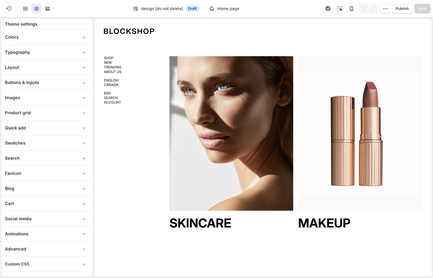
## Theme settings → Buttons & Inputs (Blockshop)
### Four button styles (Blockshop)
Each style has **Background**, **Text**, **Border**, **Hover background**, and **Hover text**.
A reliable split:
- **Style 1**: primary action (Add to cart, Shop the collection): solid fill
- **Style 2**: secondary action on a light background
- **Style 3**: outline on light surfaces
- **Style 4**: outline or ghost on dark or image backgrounds (light text and border)
Set hover colors that still contrast. A hover color that matches the page background removes button contrast.
**Buttons corner radius**: 0px is square; higher values round the pill. A 2px radius is the Blockshop default. A larger radius produces softer corners; 0px produces sharper corners.
### Link style (Blockshop)
In **Typography** → **Buttons**:
- **Link style**: Underline or Arrow on text links
- **Match link size to block heading**: optional; keeps text links aligned with card titles
**Size** and **Mobile size** on the same panel set button label size. See [Typography](https://support.troopthemes.com/guide/blockshop/typography/).
Underline is quieter. Arrow is more directional. Pick one and use it on every text link. Mixing both on one page creates inconsistent link styling.
> **Text links vs buttons**
>
> Use a button style for the main action on a section. Use a text link for a secondary step (Learn more, View all). If every control is a solid button, no single action is clearly primary.
### Inputs (Blockshop)
- **Inputs corner radius**: rounds newsletter fields, contact forms, search, and cart notes
- **Inputs background**: fill color behind the field
- **Inputs text**: color of the text customers type
Match input radius to button radius so forms and CTAs use consistent corner treatment.
## Ask Sidekick (Blockshop)
Open [Sidekick](https://help.shopify.com/en/manual/shopify-admin/productivity-tools/sidekick) from the theme editor toolbar (top right, next to the device preview icon), or press `⌘.` (`Ctrl+.` on Windows). Ask it to suggest a button style.
> "Suggest Background, Text, Border, Hover background, and Hover text values for Style 1 (primary) and Style 3 (outline) that fit a bold, confident retail brand."
It'll reason through contrast and hierarchy with you before you touch Theme settings → Buttons & Inputs. Useful when you have four button styles to fill in and aren't sure how to differentiate them.

## Troubleshooting (Blockshop)
- **Add to cart didn't change**: confirm you edited **Buttons & Inputs**, then that the product form is using style 1. App-injected cart buttons will not follow these colors.
- **Hover looks fine on desktop, gone on a phone**: phones have no hover. The rest state must contrast on its own.
- **Text links still underlined after you picked Arrow**: some app or custom CSS is forcing `text-decoration`. Isolate with [Troubleshooting](https://support.troopthemes.com/guide/troubleshooting/).
- **Checkout button is unchanged**: that is Shopify checkout, not the theme.
---
title: Images
url: https://support.troopthemes.com/guide/blockshop/images/
theme: Blockshop
theme_styles: Radiance, Stone, Valla
---
# Images in Blockshop
**Edit theme** → **Theme settings** → **Images**.
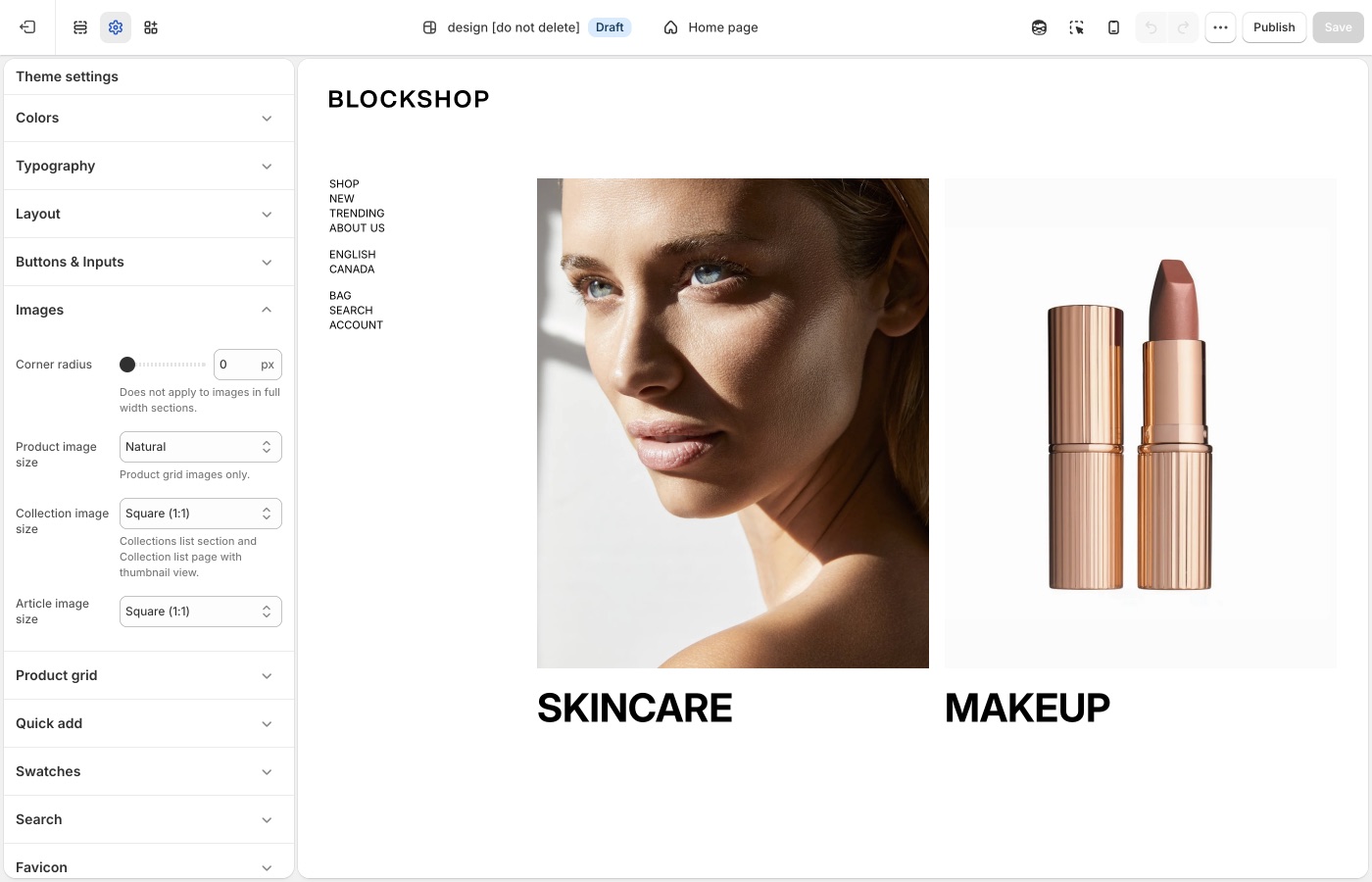
Crops for product, collection, and article images.
**Corner radius** is storewide. Besides photos, it rounds embedded videos, text blocks with a background color, the newsletter popup, and sections with **Outer background** off.
## Crops and radius (Blockshop)
- **Corner radius**: rounds product and content images, embedded videos, text blocks with a background color, the newsletter popup, and inset sections (**Outer background** off). Does **not** apply to images in full-width sections.
- **Product image size**: Natural, Square (1:1), Landscape (4:3), Portrait (4:5), or Portrait (2:3). This crop is for the product grid.
- **Collection image size**: same options, for collection lists and thumbnail views.
- **Article image size**: blog cards.
Natural keeps each file’s own ratio. Square and portrait force a consistent grid, which looks calmer when product photos were shot inconsistently.
For pixel dimensions when you export photos, see [What image sizes should I use?](https://support.troopthemes.com/faqs/what-image-sizes-should-i-use/).
> **Shoot for the crop**
>
> If you set product images to Square, photograph on a consistent canvas. Mixed lifestyle crops in a square grid will chop subjects. Natural is kinder to mixed photo sets; a fixed ratio is kinder to a studio pack.
## Ask Sidekick (Blockshop)
Open [Sidekick](https://help.shopify.com/en/manual/shopify-admin/productivity-tools/sidekick) from the theme editor toolbar (top right, next to the device preview icon), or press `⌘.` (`Ctrl+.` on Windows). Unsure whether Natural, Square, or Portrait crops will suit your product photography, or how consistent your existing photos actually are, describe your catalog.
> "My product photos are a mix of studio shots and lifestyle images, what Product image size should I use for the grid?"
It can help you reason through the trade-off before you commit the whole store to one crop, and point you to Shopify's [image size guidance](https://support.troopthemes.com/faqs/what-image-sizes-should-i-use/) if you're about to reshoot.

## Troubleshooting (Blockshop)
- **Images look cropped**: that is **Product image size**, not a bug. Switch to Natural, or shoot for the ratio you chose. Replacing the file in **Products** does not bypass the theme crop.
- **Corner radius ignored on a hero**: full-width section images are excluded on purpose.
---
title: Social media
url: https://support.troopthemes.com/guide/blockshop/social-media/
theme: Blockshop
theme_styles: Radiance, Stone, Valla
---
# Social media in Blockshop
**Edit theme** → **Theme settings** → **Social media**.
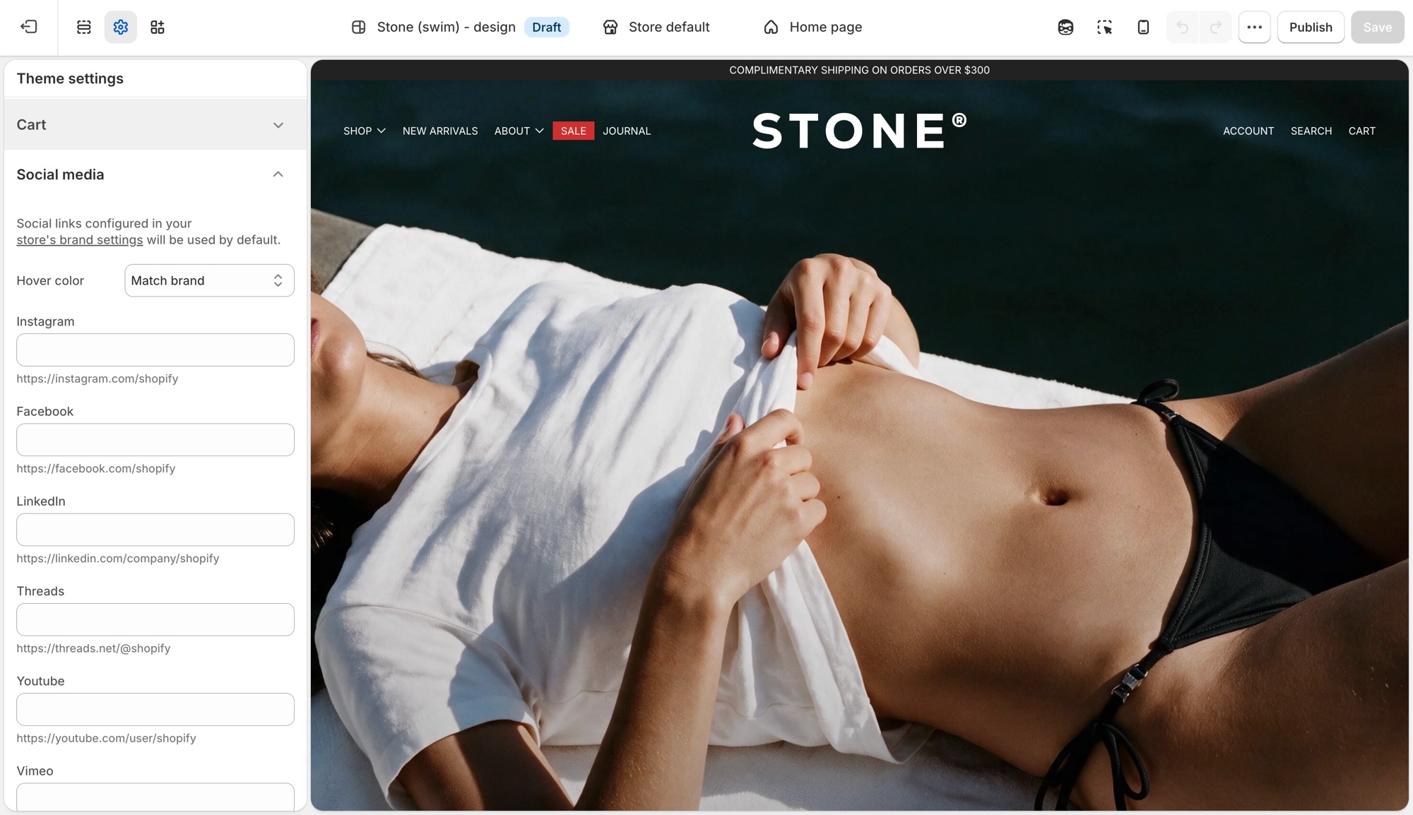
These settings control the social icons that appear in the footer, announcement bar, and other sections across the theme in one place, not per section.
## Theme settings → Social media (Blockshop)
- **Hover color**: **Match brand** (each platform's own color), **Opacity** (dims on hover), or **None**.
- One field per platform (Instagram, Facebook, LinkedIn, Threads, Youtube, Vimeo, Pinterest, 𝕏, TikTok, Tumblr, Snapchat, Bluesky): paste that profile's URL to show its icon.
Leave a platform blank and no icon shows for it. Sections do not need each icon toggled individually.
If you already added social links in Shopify's [brand assets](https://help.shopify.com/en/manual/promoting-marketing/managing-brand-assets) (**Settings** → **General** → **Brand assets** → **Social links**), the theme uses those by default and no further setup is needed here. A URL entered in **Theme settings** → **Social media** overrides the brand setting for that platform only. This is useful when a section-specific or seasonal account should differ from your main brand profile.
## Troubleshooting (Blockshop)
- **An icon is not showing**: that platform's URL field is empty here and in **Settings** → **Brand**.
- **The wrong URL is showing**: a value here always wins over **Settings** → **Brand** for that platform.
- **Icons do not change color on hover**: **Hover color** is set to **None**.
---
title: Animations
url: https://support.troopthemes.com/guide/blockshop/animations/
theme: Blockshop
theme_styles: Radiance, Stone, Valla
---
# Animations in Blockshop
**Edit theme** → **Theme settings** → **Animations**.
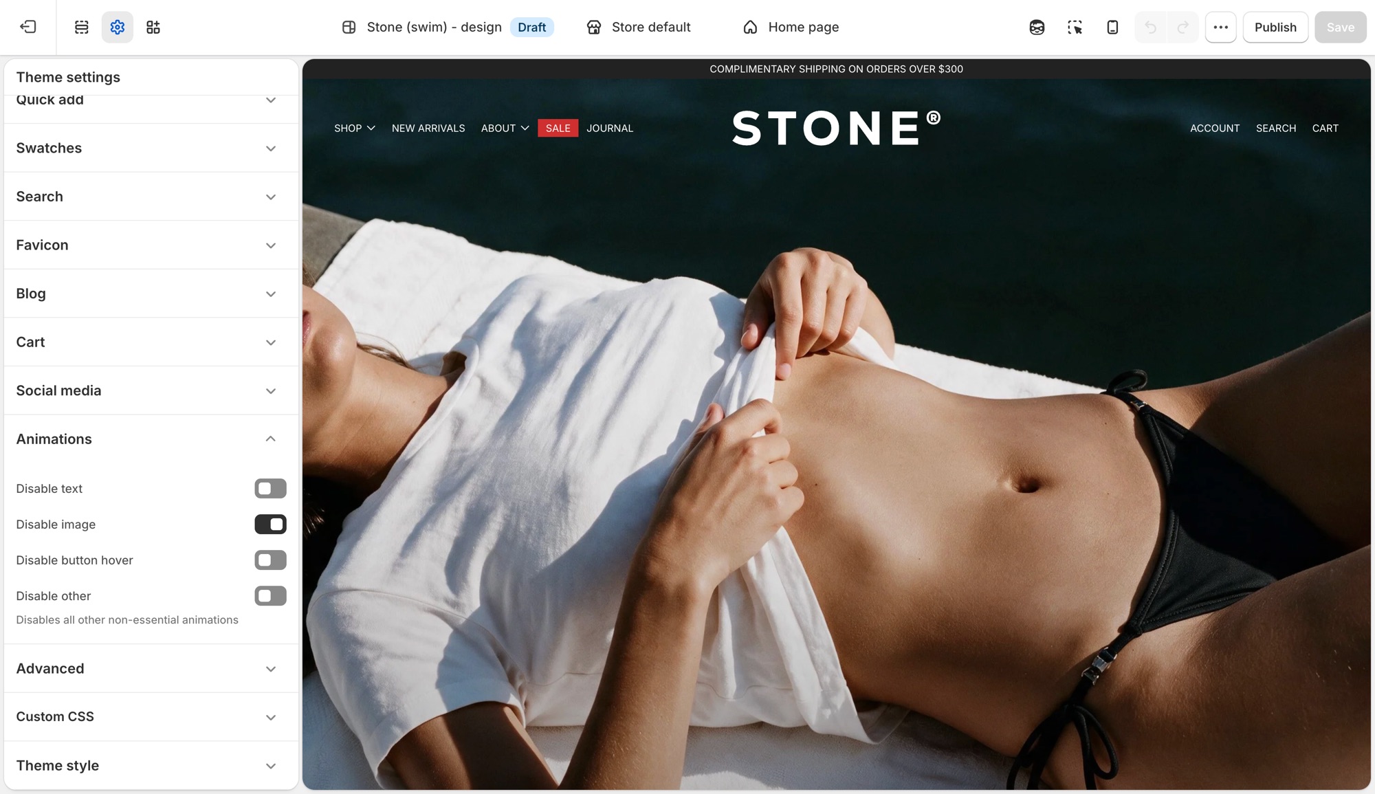
Four storewide switches, each one turns a category of motion off. There is nothing to turn on, animations ship on by default.
## Theme settings → Animations (Blockshop)
- **Disable text**: turns off text fade and reveal animations.
- **Disable image**: turns off image fade and reveal animations.
- **Disable button hover**: turns off button hover transitions.
- **Disable other**: turns off all other non-essential animation, a catch-all for anything the first three do not cover.
## Where each toggle applies (Blockshop)
- **Disable text**: the scroll-triggered fade/slide-in on headings, subheadings, text, buttons, and rich text, used in nearly every section, plus the animated stacked headline component where a section uses one.
- **Disable image**: the fade-in on section images, for example Image with text, Media with highlight, Shop the banner, Scrolling text on image, Grid with overlay, Featured collections, the collection banner, and menu images.
- **Disable button hover**: a single storewide switch. It is not checked per section, so it turns off hover transitions on every button, input, and link at once.
- **Disable other**: the widest switch, covering things that are not simple text or image reveals: product card image hover-swap and the shared transition into the product page, the cart drawer, predictive search results, dropdown/mega menus, accordions, grid reveals on collection/blog/search listing pages, and sections like Appointments, Logo list, Social highlights, and Testimonials.
## Troubleshooting (Blockshop)
- **A section still animates after I disabled text or image**: that motion may fall under **Disable other** instead, for example a slideshow transition or a decorative loop. Turn that on too.
- **I want most animation off but kept hover effects**: leave **Disable button hover** off and enable the other three.
---
title: Section list
url: https://support.troopthemes.com/guide/blockshop/section-list/
theme: Blockshop
theme_styles: Radiance, Stone, Valla
---
# Sections in Blockshop
**Edit theme** → **Add section**. Names in the editor match this list. Do not pick a section because the name sounds close; each one does a different job.
- **Materials, process, or making with collapsible rows**: use **Materials/craftsmanship**. Not **FAQ** (no media column).
- **Gift-guide links on a campaign image**: use **Gifts**. Not **Featured collection**.
- **Booking CTA that an app will fill**: use **Appointments**. Not **Contact form**.
- **Press logos in a row**: use **Logo list**. Not **Icons row** (those are trust marks, not logos).
For how to place image layouts, see [Designing with image sections](https://support.troopthemes.com/guide/blockshop/image-sections/).
## Which section for this goal? (Blockshop)
Each row names the section to use for a goal and a similar section that does a different job.
| Goal | Use | Do not use |
| --- | --- | --- |
| One static hero with text on the photo | **Image with text overlay** | **Slideshow** (that rotates) |
| Several rotating heroes | **Slideshow** | **Image with text overlay** |
| Photo beside copy | **Image with text** | **Image with text overlay** |
| Photo with copy underneath | **Image with text below** | **Image with text overlay** |
| A grid of images with captions on them | **Grid with overlay** | **Featured collection** |
| Up to three images or videos in a row | **Media row** | **Grid with overlay** (more tiles) or **Featured images** (exactly two) |
| Lifestyle photos that link to Instagram | **Social highlights** | **Grid with overlay** or **Logo list** |
| Materials, process, or making with collapsible rows | **Materials/craftsmanship** | **FAQ** |
| Gift-guide links on a campaign image | **Gifts** | **Featured collection** |
| Booking CTA that an app will fill | **Appointments** | **Contact form** |
| Press logos in a row | **Logo list** | **Icons row** |
| Products from one collection | **Featured collection** | **Featured products** (those are picked one by one) |
| A hand-picked set of products | **Featured products** | **Featured collection** |
| Clickable hotspots on one image | **Shop the look** or **Shop the banner** | **Image with text overlay** |
| FAQ / accordion | **FAQ** | **Rich text** |
| Email signup *on the page* | **Newsletter** section | **Popups** (the overlay that opens over the page) |
Jump to a group; these match the groups in **Add section**:
- [Storytelling](#storytelling)
- [Products](#products)
- [Brand Trust](#brand-trust)
- [Promotions](#promotions)
- [Signups](#signups)
- [Utilities & Layout](#utilities-layout)
---
## Storytelling (Blockshop)
Use these for brand narrative and visual-first layouts, home heroes, lookbooks, and landing pages where imagery leads.
- **Image with text below**: Image or video with heading and copy underneath, not overlaid. Good for product philosophy or care notes where the copy needs full-width legibility, not shrunk over a photo.
- **Materials/craftsmanship**: Media beside collapsible rows for materials, process, or making. Good for material breakdowns, sourcing notes, or a step-by-step process, photo alongside, unlike FAQ.
- **Featured images**: Two coordinated images with shared text and a call to action. Good for a campaign spotlight or category teaser where two images tell one story better than either alone.
- **Grid with overlay**: Image or video tiles with text overlays in a flexible grid. Good for a shop-by-category or shop-by-collection grid, each tile carrying its own label and link.
- **Image comparison**: Shoppers drag between before/after visuals in one frame. Good for before/after proof: skincare results, renovations, restorations, material finishes.
- **Image with text**: Image paired with copy in a split, side-by-side layout. Good for a feature or story explainer that needs room to breathe.
- **Image with text overlay**: Heading, text, and buttons directly on one image. Good for a single hero banner or campaign header, type sitting directly on the photo. Do not use for rotating slides (**Slideshow**) or copy beside the photo (**Image with text**).
- **Media overlay columns**: Several media columns, each with optional overlay text. Good for category callouts or campaign modules, each column its own labeled story card.
- **Media row**: Up to three images or videos in a row, with optional overlay text. Good for a short, light media strip: lookbook stills or campaign moments, not a full grid.
- **Media with highlight**: One featured media area plus supporting media blocks. Good for a launch page or content-first homepage: one lead visual plus supporting media.
- **Overlapping media**: Layered media for an editorial, depth-focused composition. Good for a premium, art-directed moment where a flat side-by-side layout would look plain.
- **Rich text**: Formatted text for intros, brand copy, or messaging blocks. Good for a plain-text intro, shipping note, or brand paragraph that does not need imagery.
- **Slideshow**: Rotating slides for heroes, announcements, or campaigns. Good for cycling multiple offers, looks, or promotions at the top of the homepage. Do not use for a single static banner (**Image with text overlay**).
- **Text columns with images**: Repeating image/text columns for features or pillars. Good for a "why shop with us" row: shipping, materials, guarantees.
- **Video**: One video with optional heading and copy. Good for a single product demo, brand film, or how-to as its own moment.
## Products (Blockshop)
Use these to feature collections, products, and shoppable images.
- **Collection with highlight**: A collection beside a highlighted story or content area. Good for pairing a shoppable collection with a story or lookbook teaser.
- **Collections list**: Several collections in a list or grid. Good for a shop-by-category landing block: shop by room, by size, by use.
- **Featured collection**: Products from one collection. Good for showing everything in one Shopify collection, like New arrivals or Best sellers. Do not use for a hand-picked set (**Featured products**).
- **Featured product**: One product with full merchandising details. Good for a flagship launch or hero item that deserves its own dedicated spot.
- **Featured products**: A curated set of individual products. Good for a hand-picked edit: staff picks, a gift guide, a bundle, regardless of collection. Do not use to show a whole collection (**Featured collection**).
- **Recent products**: Newly added products. Good for an always-current "just in" row that updates itself as you add inventory.
- **Shop the banner**: Clickable product hotspots on one hero-style image. Good for a lifestyle hero image where every visible product is tappable.
- **Shop the look**: Image hotspots with editorial text and campaign framing. Good for an outfit or room shot with shoppable hotspots plus campaign copy.
## Brand Trust (Blockshop)
Use these for FAQs, proof, press, and service details.
- **Logo list**: Logos or press quotes in a row. Good for "as seen in" press mentions or retailer and stockist logos.
- **Social highlights**: Lifestyle images with social icons and links; on mobile, one image per slide. Good for a curated Instagram-style grid that sends shoppers to your social channels, not a general image grid.
- **Blog posts**: Recent or selected articles. Good for surfacing editorial or how-to content that keeps shoppers browsing past the homepage.
- **FAQ**: Collapsible questions. Good for shipping, sizing, or policy questions shoppers need answered before checkout. See [Setting up FAQ or Collapsible rows](https://support.troopthemes.com/guide/blockshop/setting-up-faq-or-collapsible-rows/).
- **Icons row**: Trust markers such as shipping, returns, or support. Good for a quick reassurance strip under a hero: free shipping, easy returns, secure checkout.
- **Map**: Location and contact details with a map. Good for a physical storefront, showroom, or studio location.
- **Service list**: Services, menus, or policy highlights. Good for listing services, a café or restaurant menu, or policy summaries without building a custom page.
- **Testimonials**: Customer quotes. Good for social proof near a buying decision: reviews, quotes, press mentions.
## Promotions (Blockshop)
Use these for launches, gift guides, and time-sensitive campaigns.
- **Gifts**: A short gift-guide of links (for example For her, Under $500) on a campaign image. Good for a holiday or gift-guide block that routes shoppers by recipient or budget.
- **Countdown**: A timer for drops, events, or limited-time offers. Good for building urgency ahead of a launch, sale end, or restock.
- **Scrolling content**: Continuously moving content blocks for callouts. Good for a marquee strip of rotating callouts: press mentions, taglines, promo codes.
- **Scrolling text on image**: Animated text over an image. Good for a bold campaign banner where the moving message is the visual.
## Signups (Blockshop)
Use these to collect enquiries and emails.
- **Appointments**: Heading, copy, and a button, usually paired with a booking app via Custom liquid. Good for a consultation, fitting, or showroom booking CTA once a booking app is connected.
- **Contact form**: Direct customer enquiries from any page. Good for custom orders, wholesale enquiries, or support questions a help-desk app does not cover.
- **Newsletter**: Email signup. Good for building your list on the page itself, separate from the popup. See [Mailing list & newsletters](https://support.troopthemes.com/guide/blockshop/newsletters/).
## Utilities & Layout (Blockshop)
Use these for spacing, structure, and custom code.
- **Custom Liquid**: Custom Liquid output for apps and advanced integrations. Good for embedding an app widget or custom-coded block no standard section covers.
- **Custom content**: Mixed blocks for a simple custom layout. Good for a one-off layout that does not fit any other section, built from simple mixed blocks.
- **Divider**: Visual separation between sections. Good for breathing room between two sections without adding empty content.
---
title: Designing with image sections
url: https://support.troopthemes.com/guide/blockshop/image-sections/
theme: Blockshop
theme_styles: Radiance, Stone, Valla
---
# Designing with image sections in Blockshop
**Edit theme** → **Add section** → pick an image section. Don't pick one just because the name sounds close: **Image with text**, **Image with text overlay**, and **Slideshow** each do a different job.
For the full catalog (including product, FAQ, and utility sections), open the [section list](https://support.troopthemes.com/guide/blockshop/section-list/).
## Slideshow (Blockshop)
Use the Slideshow section when you want to rotate multiple messages, products, or promotions in a single section.
It is mobile-friendly by default, so customers can swipe through slides on touch devices, while desktop visitors can use drag controls or autoplay.
Each slide can display a single image or video, or two media items side by side. To display multiple media items, set `Media 2 type` to `image` or `video`. To display a single media item, set `Media 2 type` to `none`.
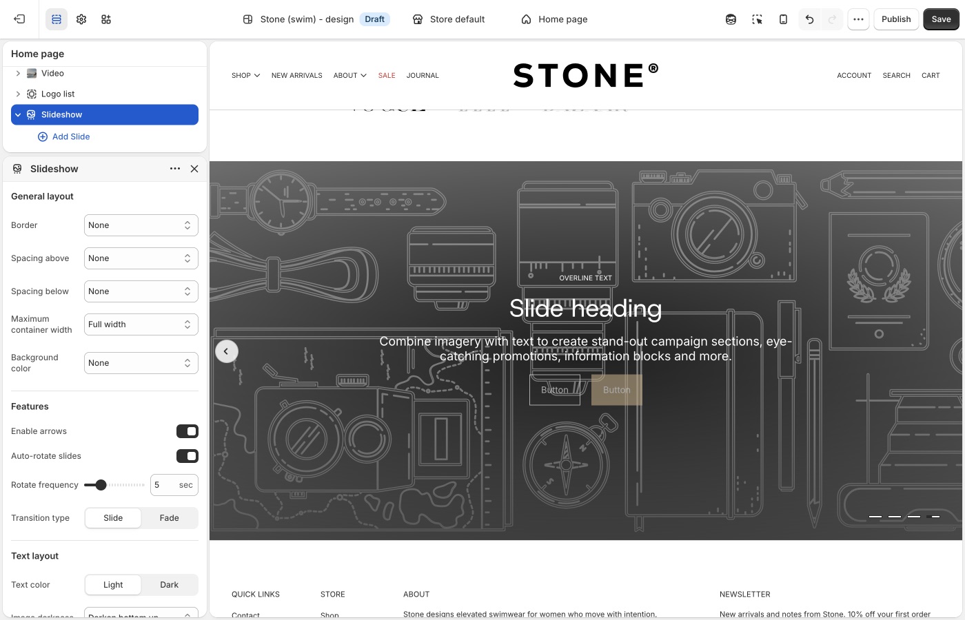
> **Legacy Slideshow**
>
> Please see the legacy slideshow features below for versions below 13.1.0.
Use `Blocks per slide for desktop` to control how many slides appear at once (1 to 4). A value of 1 creates a standard full-width slider, while higher values create a multi-card layout for collections, promotions, or featured content.
For saving images for your slides, read more about image sizes in our [What image sizes should I use?](https://support.troopthemes.com/faqs/what-image-sizes-should-i-use/).
---
## Image with text overlay (Blockshop)
Use the Image with text overlay section when you want to place text and calls to action directly on top of a single image.
This section works well for hero banners, campaign announcements, and brand storytelling where one strong image needs supporting copy. The image can be configured with different widths and aspect ratios to suit your layout:
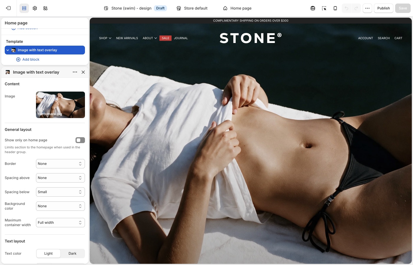
You build the text and calls to action with blocks (headings, descriptions, buttons, and more). For a general overview of blocks and what to expect in the theme editor, see [Blocks in image sections](#blocks-in-image-sections).
Use this section when your goal is to combine one image and one message in a single, high-impact banner that can be reused across key storefront pages.
> **Version availability**
>
> Image with text overlay is available in Blockshop versions 12.1.0 and up.
---
## Image with text (Blockshop)
Use the Image with text section when you want to pair an image with supporting content in a split layout.
This section works well for featured collections, product storytelling, and campaign moments where the visual and copy should sit side by side instead of stacking in a single banner.
The image can be configured to control presentation across desktop and mobile, and the layout can be reversed to place the image on either side. You can also use the overlap setting to adjust how text sits against the image:
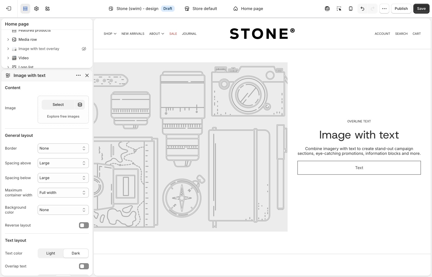
The copy beside the image is built with blocks, which you add and reorder in the section (for example headings, descriptions, and buttons). See [Blocks in image sections](#blocks-in-image-sections) for a general overview. Use the block list in the theme editor to see what this section includes.
Use this section when your goal is to combine one image and one message in a balanced, side-by-side layout that can be reused across key storefront pages.
> **Legacy Image with text**
>
> Please see the legacy image with text features below for versions below 12.1.0.
The Image with text section allows you to display images in various ratios , full width, three quarter or half width - to establish balance and visual rhythm in your page design.
`Parallax scrolling` can be enabled for images in this section to add action and depth. Parallax scrolling effects create movement and the illusion of depth by scrolling background elements at a slower pace than foreground elements. For best results, set the `text position` setting to `center`.
---
## Featured images (Blockshop)
Use the Featured images section when you want to present two visuals together with one shared message and call to action.
This section works well for campaign storytelling, category spotlights, or any moment where two complementary images create stronger impact than one alone.
Each image can be configured for desktop and mobile display, and mobile layout can be adjusted to show one image, stack both, or place them side by side.
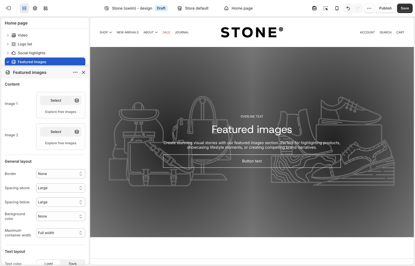
The shared message and call to action are built with blocks for text and related content. See [Blocks in image sections](#blocks-in-image-sections) for a general overview. Add blocks in the theme editor to see what this section offers.
Use this section when your goal is to tell one clear story across two images in a single, high-impact layout that can be reused across key storefront pages.
> **Version compatibility**
>
> Featured images is available in Blockshop versions 11.1.0 and up.
---
## Grid with overlay (Blockshop)
This section allows you to display content in simple fixed-aspect ratio grids, justified grids, or more freeform offset grids.
Configure individual block settings to specify how blocks fall within the grid and section settings to style text overlays to optimize readability.
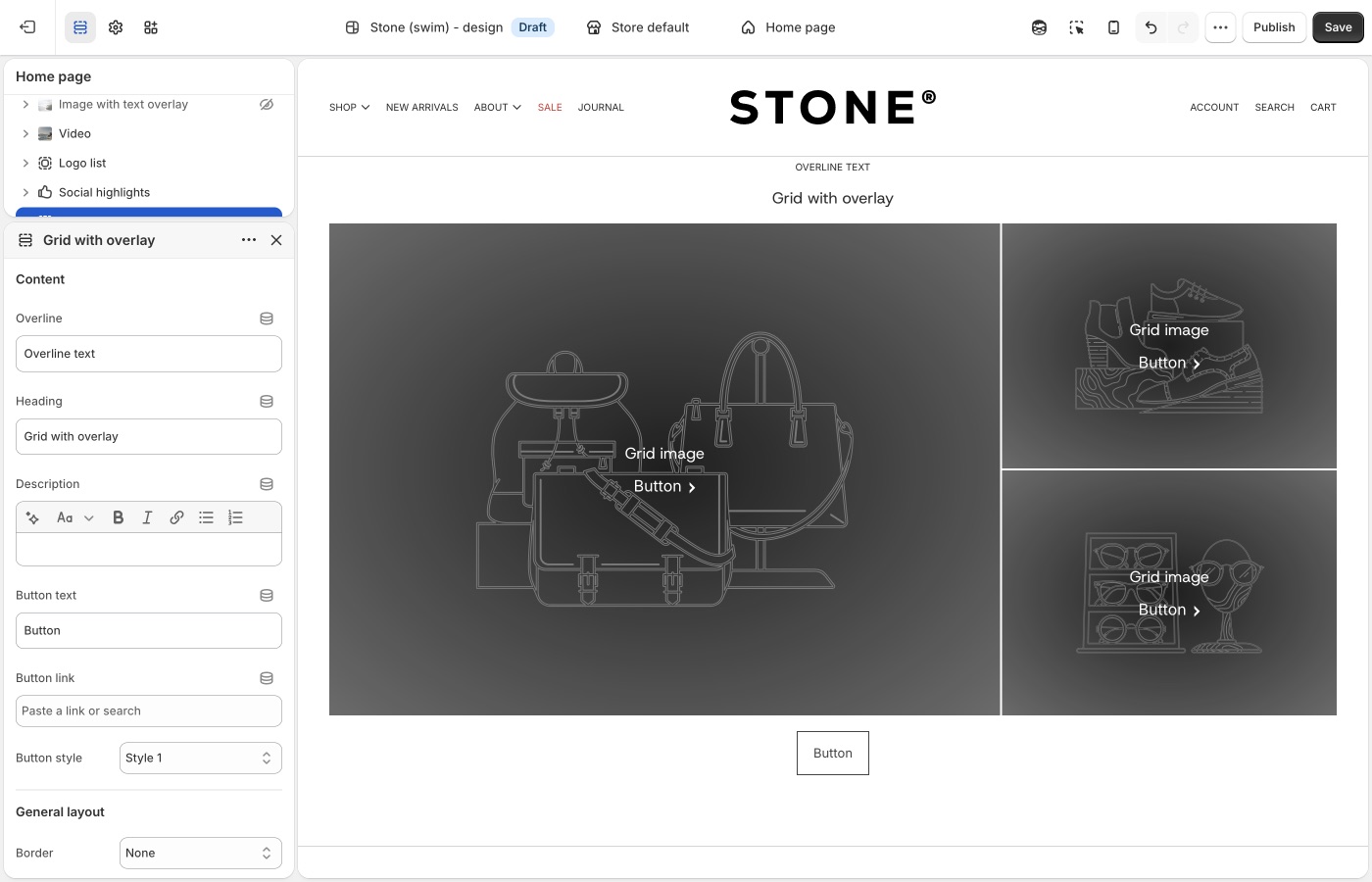
The `preserve image aspect ratio` block setting will display images at the ratio they're uploaded at, rather than justifying them into the grid. This will allow you to create more free-form, off-set grids with varying image heights.
---
## Text columns with images (Blockshop)
This flexible sections allows you to display a combination of image an text elements for a wide variety of uses.
> **Row of icons**
>
> If you want a horizontal row of icons (for example trust marks, shipping icons, or simple pictograms with optional short text), add the **Icons row** section instead of building that layout in **Text columns with images**. _Icons row_ is available in Blockshop versions 10.2.0 and up.
---
## Image comparison (Blockshop)
Use the Image comparison section when you want customers to interactively compare two visuals in the same frame (for example before/after edits, product variants, material finishes, or renovation stages).
This section is ideal when one image alone cannot communicate the difference clearly. Shoppers can drag the comparison handle to reveal more or less of each image, which makes visual changes easier to understand at a glance.
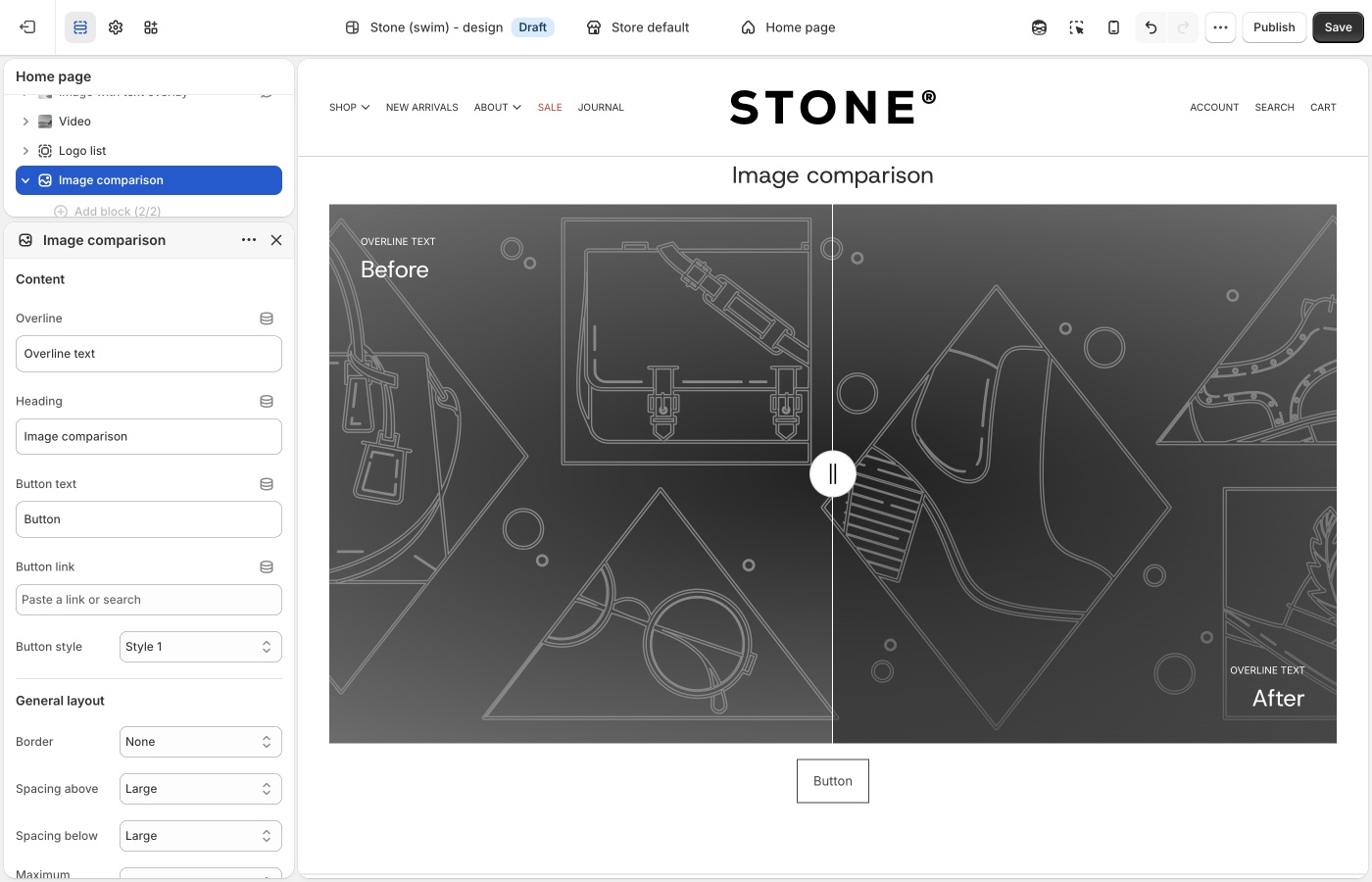
Add one Before block and one After block, then upload an image for each. You can optionally add mobile-specific images per block to improve cropping and composition on smaller screens.
Use this section when your goal is to show change, contrast, or improvement in a way that invites interaction instead of relying on static side-by-side images.
> **Version availability**
>
> Image comparison is available in Blockshop versions 9.2.0 and up.
---
## Shop the banner (Blockshop)
Use the Shop the banner section when you want to place clickable product dots on a single image and let customers jump straight from inspiration to product discovery.
This section works well for hero-style campaign visuals where one scene contains multiple products (for example a styled room, outfit, or collection shot). Add product dots to highlight items in context without breaking the visual flow.
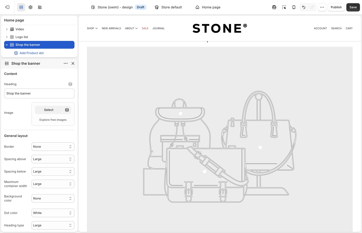
Set your main banner image, then add **Product dot** blocks and assign a product to each one. You can control dot placement separately for desktop and mobile, so hotspots stay accurate across screen sizes.
Use this section when your goal is to turn one strong branded image into an interactive shopping surface with minimal on-image text.
> **Version availability**
>
> Shop the banner is available in Blockshop versions 11.0.0 and up.
---
## Shop the look (Blockshop)
Use the Shop the look section when you want a guided, editorial shopping experience built around one curated image plus an optional call to action.
Like Shop the banner, this section supports product hotspots, but it also includes heading and button settings so you can frame the visual with a stronger campaign message.
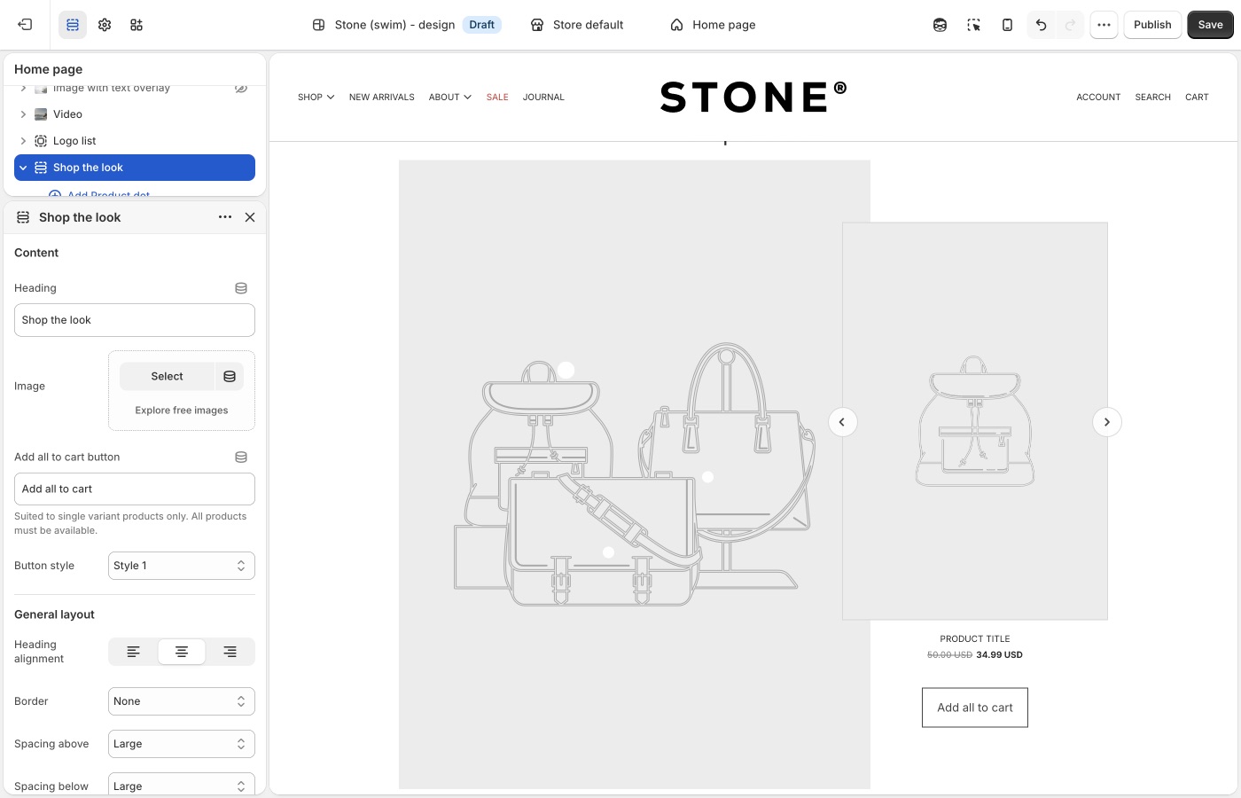
Add your image, create **Product dot** blocks, and position each hotspot for desktop and mobile. Use the heading alignment, container width, and hotspot style settings to match the section to the rest of your page design.
Use this section when your goal is to combine storytelling and conversion in one curated “look” module.
> **Version availability**
>
> Shop the look is available in Blockshop versions 9.2.0 and up.
---
## Scrolling text on image (Blockshop)
Use the Scrolling text on image section when you want animated headline-style text moving across an image background.
This section is ideal for brand statements, promotional phrases, or directional messaging that should feel dynamic and high-energy. You can add multiple text blocks, control scroll direction and speed, set spacing between phrases, and pause movement on hover.
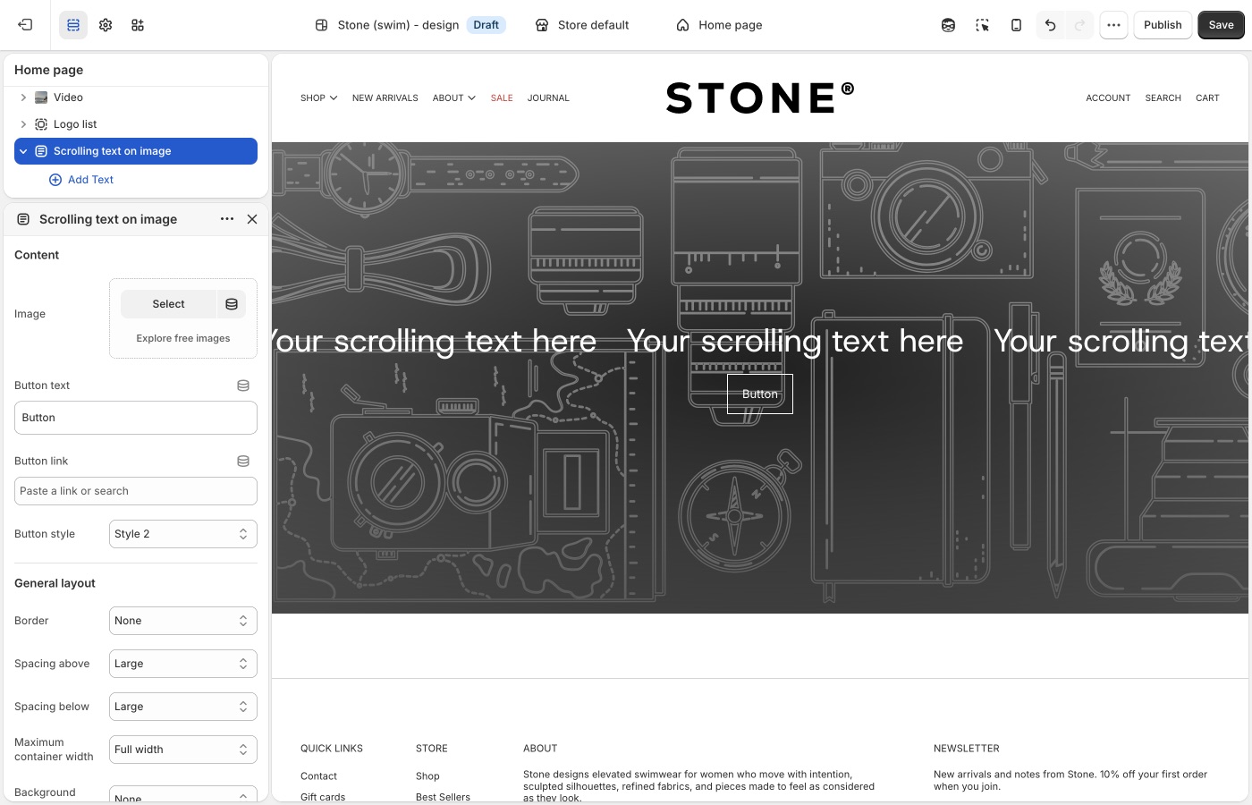
You can also choose whether text should span the full width and configure mobile-specific media to keep composition readable on smaller screens.
Use this section when your goal is to create motion-driven campaign messaging without building a full slideshow.
> **Version availability**
>
> Scrolling text on image is available in Blockshop versions 10.4.0 and up.
---
## Media with highlight (Blockshop)
Use the Media with highlight section when you want one primary feature area paired with a grid of supporting media items.
This section works well for launch pages, collection storytelling, and content-first merchandising where you need a lead narrative plus multiple secondary visuals. The main highlight area supports heading and rich text, while blocks can include images or video with optional titles.
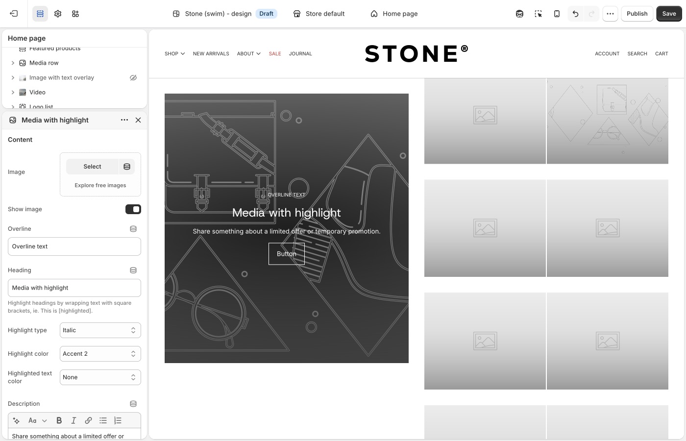
Control layout with blocks-per-row, vertical alignment, reverse layout, and display/aspect settings for both desktop and mobile. Overlay style and text options help maintain readability over busy imagery.
Use this section when your goal is to blend editorial storytelling and media-rich browsing in a single modular section.
> **Version availability**
>
> Media with highlight is available in Blockshop versions 11.0.0 and up.
---
## Media overlay columns (Blockshop)
Use the Media overlay columns section when you want a clean column layout where each media tile can carry overlaid text and optional links.
This section is useful for category callouts, campaign modules, or mixed media presentations where each column acts like a mini story card. Blocks can be image or video, with per-block overline, heading, and description content.
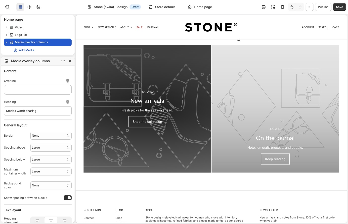
You can adjust spacing, aspect ratio, and text styling to control visual rhythm and readability across the grid.
Use this section when your goal is to present multiple media-driven messages side by side in a structured, scannable layout.
> **Version availability**
>
> Media overlay columns is available in Blockshop versions 13.1.0 and up.
---
## Media row (Blockshop)
Use the Media row section when you want **up to three** images or videos in a single row, with a shared height.
This is for a short, even band of media, lookbook stills, campaign stills, or mixed image/video, not a many-tile grid (**Grid with overlay**) and not a two-image story (**Featured images**). Add **Image** or **Video** blocks (maximum three). **Media height** sets the crop (Natural, Square, Landscape, or Portrait). Overlay heading and button are optional on each block.
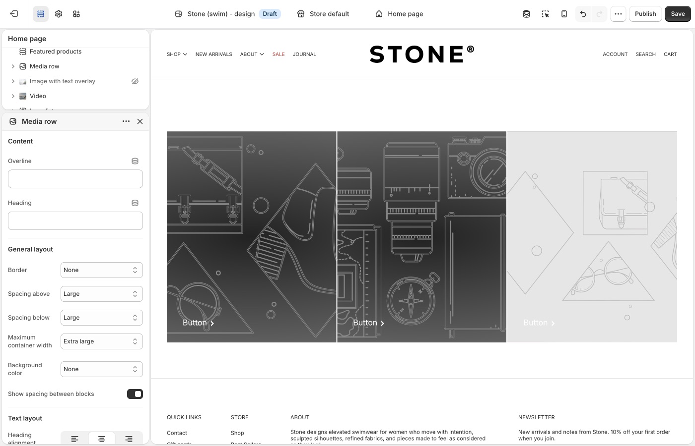
On mobile, choose whether the row stays a grid or stacks, and whether blocks go full width.
Use this section when the job is a simple 1–3 media strip with optional overlay text.
> **Version availability**
>
> Media row is available in Blockshop versions 13.3.0 and up.
---
## Social highlights (Blockshop)
Use the Social highlights section when lifestyle photos should send customers to Instagram or another social channel.
Each block is an image plus a platform icon, link text, and button style. Leave the block **Link** blank to use the matching URL from **Theme settings** → **Social media**. Desktop is a multi-column grid (2–4 blocks per row). On mobile, one image shows per slide.
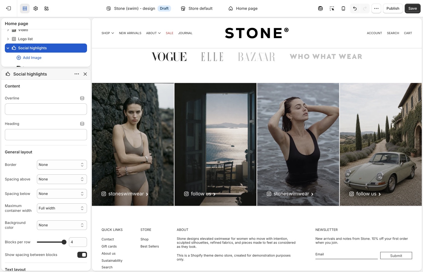
Do not use this for a general image grid (**Grid with overlay**) or a logo strip (**Logo list**).
Use this section when the job is a curated social grid, not a product collection.
> **Version availability**
>
> Social highlights is available in Blockshop versions 13.3.0 and up.
---
## Overlapping media (Blockshop)
Use the Overlapping media section when you want to layer two media items to create depth and a more art-directed visual composition.
This section works well for brand storytelling, product detail narratives, and campaign moments where a standard side-by-side layout would appear flat. Each media block can be image or video, and you can control overlap amount, animation behavior, and layout direction.
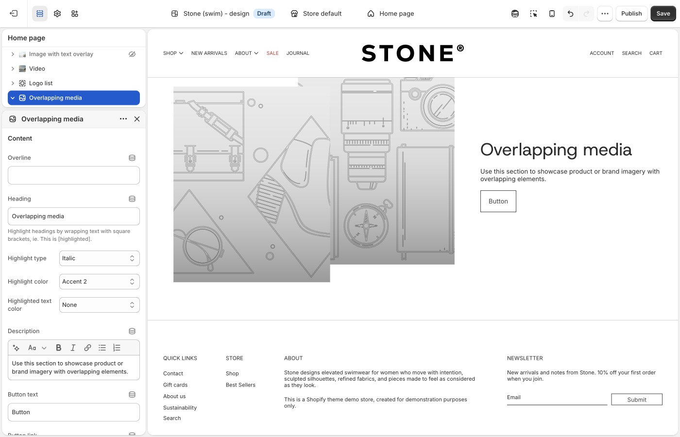
Text settings (heading style, alignment, description, and column width) let you pair the layered media with supporting copy while keeping balance between content and visuals.
Use this section when your goal is to create a premium, editorial look with intentional layering and motion.
> **Version availability**
>
> Overlapping media is available in Blockshop versions 11.0.0 and up.
---
## Blocks in image sections (Blockshop)
A **section** is one area of a page template (for example a hero or image band). **Blocks** are the pieces inside that section. In other parts of a theme, blocks can be all sorts of things, this guide focuses on **image sections**, where blocks are mostly for **copy**: overlines, headings, descriptions, buttons, and similar, paired with the image. The **image** itself is set in the section (or slide) settings, not as “body text.”
**Reorder blocks** in the left-hand section list to change the order of that copy on the page. Drag a block up or down to match the story you want (for example, overline, then heading, then button).
Shopify explains the overall model in [sections and blocks in the theme editor](https://help.shopify.com/en/manual/online-store/themes/theme-structure/sections-and-blocks). For a given section, only the block types in **Add block** apply; that list changes by section and theme version, so use another image section (or a newer version) if something is missing.
Common copy-related block types often include:
- Overline
- Heading
- Description
- Button
- Icons
- Custom Liquid
## Troubleshooting (Blockshop)
- **You added Slideshow but only have one image**: use **Image with text overlay**. Slideshow is for rotating slides.
- **Type sits on the photo and you wanted it beside**: use **Image with text**, not overlay.
- **Type sits beside the photo and you wanted it underneath**: use **Image with text below**.
- **Images look cropped**: that section’s aspect ratio setting, or [What image sizes should I use?](https://support.troopthemes.com/faqs/what-image-sizes-should-i-use/). Replacing the file in **Products** does not change a section’s crop.
- **You wanted three photos in a row and added Grid with overlay**: use **Media row** (max three blocks, shared height).
---
title: Add collection page promotions
url: https://support.troopthemes.com/guide/blockshop/collection-page-promotions/
theme: Blockshop
theme_styles: Radiance, Stone, Valla
---
# Add collection page promotions in Blockshop
Promotional tiles sit **inside the collection product grid**. Add them on the collection template, not in Theme settings → Colors.
**Edit theme** → collection template → **Collection grid** → **Add promotion**.
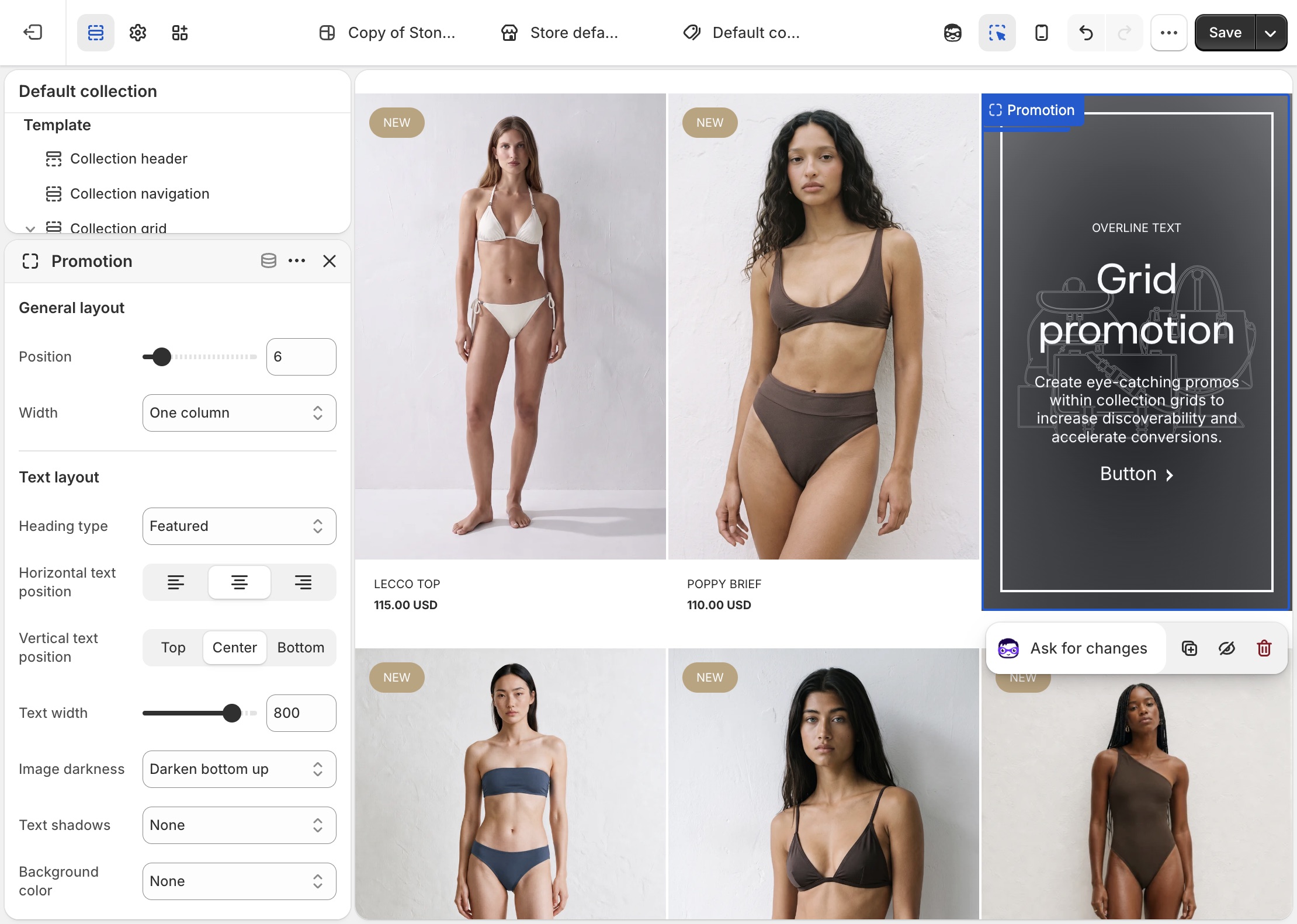
Which products are in the collection, discounts, and checkout are unchanged.
> **Compatibility**
>
> Collection promotions are available in Blockshop versions 7.0.0 and up.
Promotional blocks can be added into Collection page grids to promote sales, collections, product information and more.
To add a collection promotion, navigate to the collection page settings, under _Collection grid_ > _Add promotion_. Use the settings to configure the position, size and style of individual promotions.
> **Promotions that are too wide for the product grid**
>
> Be sure that promotions have enough space to render inside the product grid. For example, a promotion inside a grid that is two columns wide should have a maximum width of two. Although the promotion will render correctly if the width is wider than the space available, it could effect pagination.
## Troubleshooting (Blockshop)
- **Promo missing on one collection**: you added it on a different collection template, or that collection uses another template. Assign templates in the collection admin.
- **Grid looks broken / pagination jumps**: the promo is wider than the column count. Lower the promo width so it fits.
- **You wanted a banner above the grid**: use a section above the collection grid (Image with text overlay, etc.), not a grid promotion.
---
title: Setting up navigation
url: https://support.troopthemes.com/guide/blockshop/creating-navigation/
theme: Blockshop
theme_styles: Radiance, Stone, Valla
---
# Setting up navigation in Blockshop
Menus are created in Shopify admin. The theme only **displays** the menu you assign in the Header, Footer, or a section.
**Content** → **Menus** to create items. Assign the menu in **Edit theme** → **Header**, **Footer**, or the section.
Checkout, apps, and collection filters are unchanged.
> **Info**
>
> Visit Shopify's help centre for an extensive guide on setting up [menus and links](https://help.shopify.com/en/manual/online-store/menus-and-links).
Menus can display as a single dropdown or in multi-columns with nested items.
### Single dropdown menu (Blockshop)
To create a single dropdown menu, click the title of the menu that you would like to add a dropdown menu to.
In most cases, this is called _Main Menu_ unless it has been renamed to something else.
Next, you will need to add 'child' items to include in the new drop-down.
Click _Add menu item_, enter a name of the menu item and select a destination for the link.
Click and drag the menu items to nest below the 'parent' item.
Click _Save_ menu.
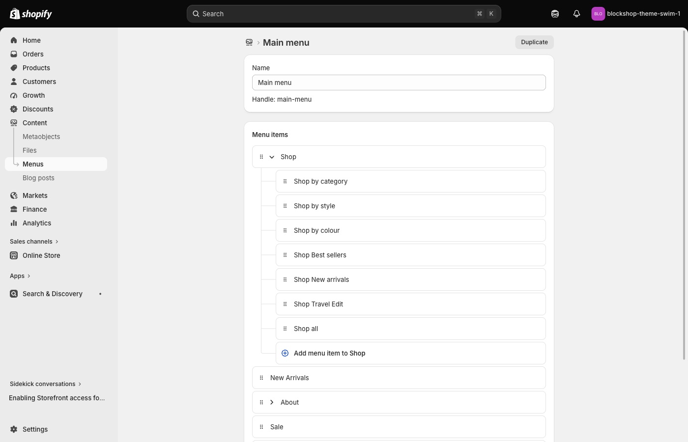
### Multi-column dropdown menu (Blockshop)
You can create multi-column drop-down menus up to three levels deep.
To create third-level menu items, repeat the process for creating a dropdown and nest them below a second-level menu item.
If a second-level menu item has no nested items, it is styled in a separate column (for example _New in_ and _Sale_).
## Creating other menus (Blockshop)
All other store menus can be configured in your store admin under **Content** → **Menus**.
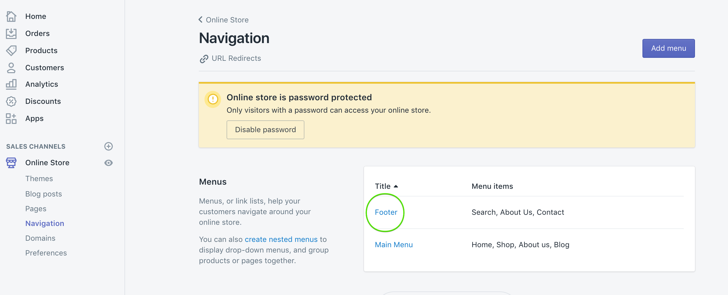
Once a menu is configured, assign it in **Edit theme** → **Header** (or Footer / the section).
## Troubleshooting (Blockshop)
- **You edited Menus and the header didn’t change**: the **Header** section is still assigned a different menu. Open Header and pick the menu you just edited.
- **A link 404s**: the menu item URL is wrong in **Content** → **Menus**, not a theme setting.
- **Mega-menu columns look wrong**: nesting depth in **Content** → **Menus** drives columns. Second-level items with no children become their own column (see _New in_ / _Sale_ above).
---
title: Working with templates
url: https://support.troopthemes.com/guide/blockshop/working-with-templates/
theme: Blockshop
theme_styles: Radiance, Stone, Valla
---
# Working with templates in Blockshop
A template is the set of sections for one kind of page (product, collection, page, blog). Create extras in **Edit theme**, then **assign** them in the Shopify admin. The default template is what anything without an assignment uses.
**Edit theme** → template selector → **Create template**; then assign it on the resource in admin → **Template** (right column, under Online store).
Product data, collection membership, and checkout are unchanged.
> **Info**
>
> Visit Shopify's help centre for an extensive guide on [templates](https://help.shopify.com/en/manual/online-store/themes/theme-structure/templates).
## What a template controls (Blockshop)
Templates can be created for:
- collections
- products
- blogs
- blog posts
- pages
Every type has a **Default** template. Pages still on Default pick up whatever sections you add there. An alternate template only applies after you assign it in the admin.
Open the template selector at the top of **Edit theme** to see which templates exist and how many pages use each one.
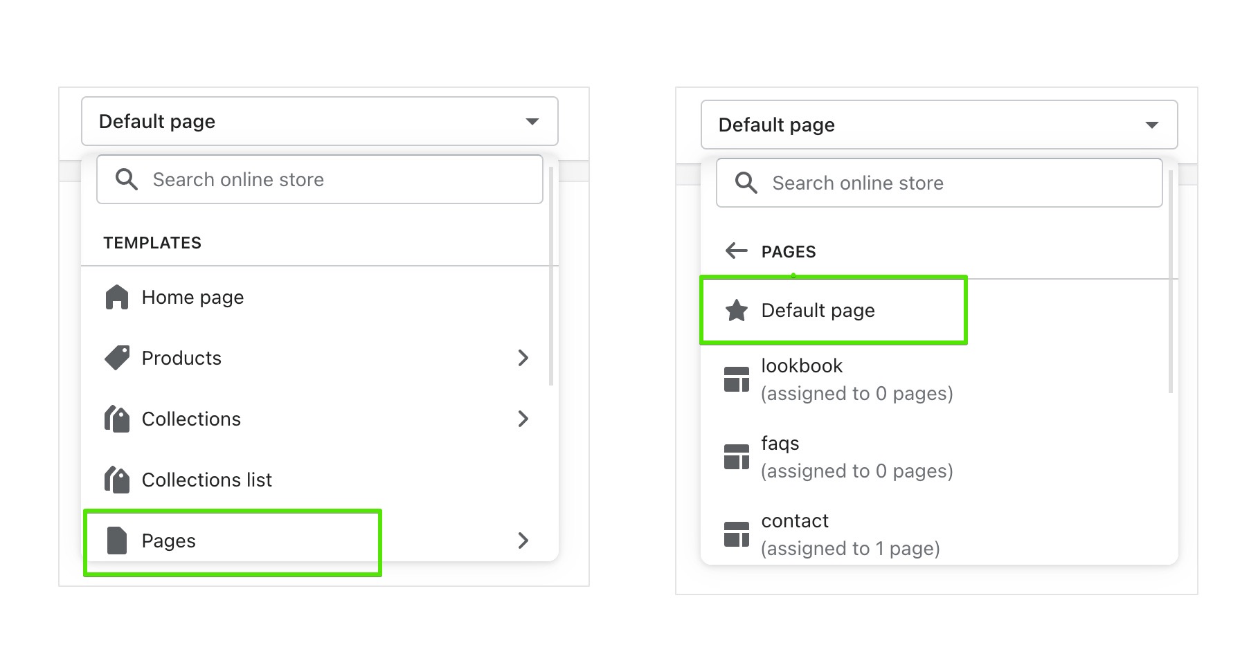
## Add sections to the default template (Blockshop)
**Edit theme** → template selector → the page type (for example **Pages**) → **Default page**.
Sections you add here appear on every page of that type that still uses Default.
## Create a new template (Blockshop)
1. **Edit theme** → template selector → open the page type (for example **Pages**).
2. Choose **Create template**.
3. Enter a **Name**, pick a template to copy in **Based on**, then **Create template**.
4. Add, remove, or rearrange sections on that template.
5. Assign it in the admin (next section). Creating it in **Edit theme** does not apply it.
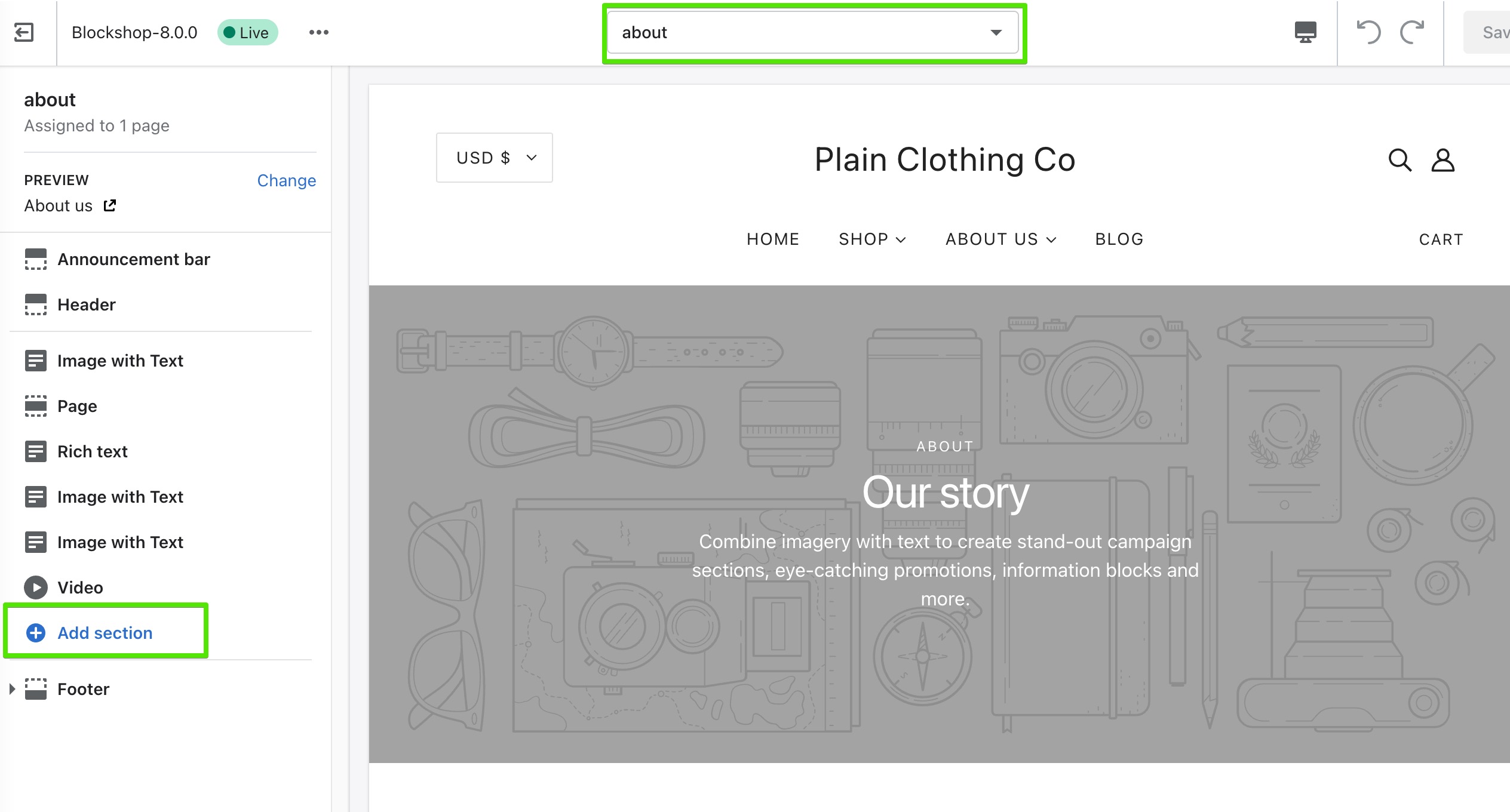
## Pre-built page templates (Blockshop)
Themes include **about**, **contact**, **faqs**, and **lookbook** under **Pages**. Open one in the template selector and change its sections; you do not need to create those from scratch.
## Assign a template (Blockshop)
Open the page, product, collection, blog, or article in the admin. In the right column, under **Online store**, choose it from **Template**.
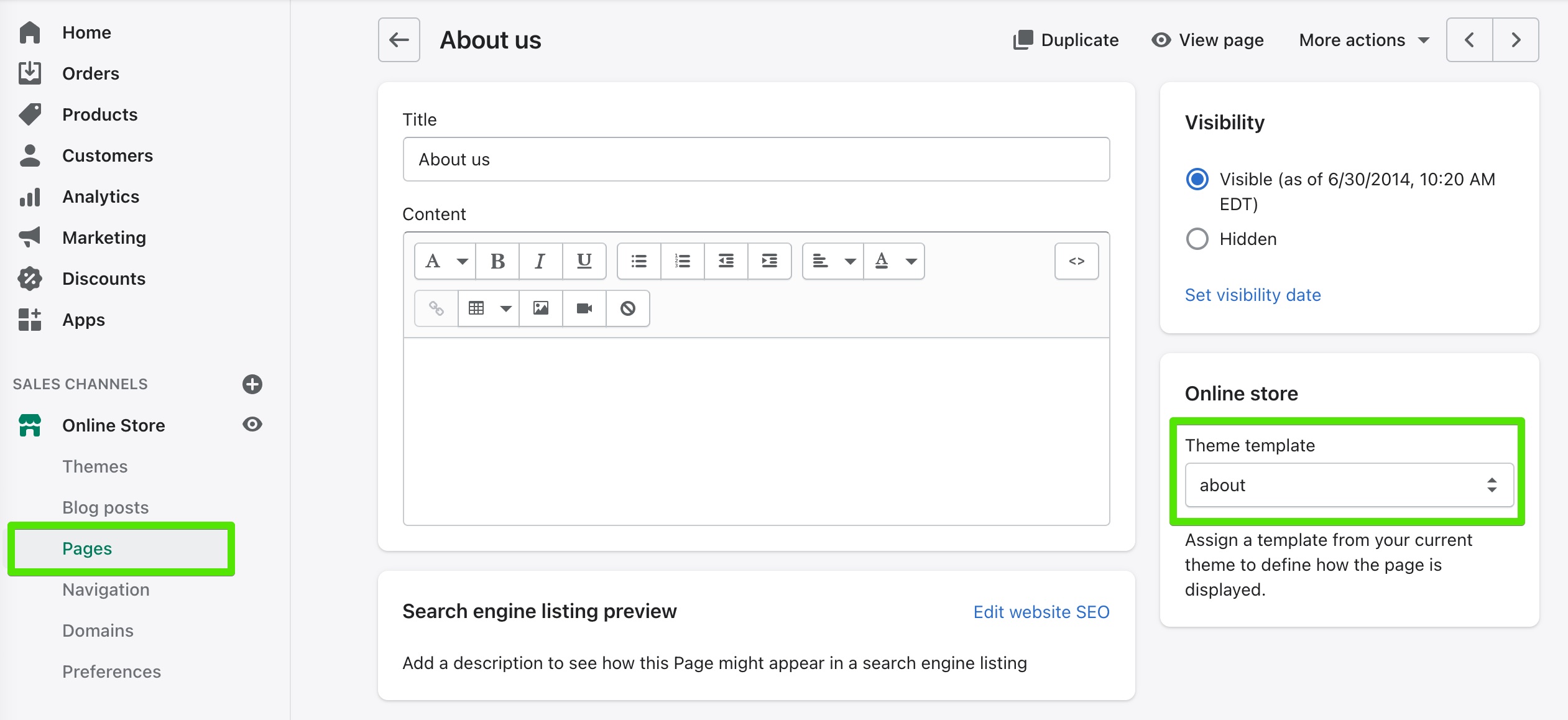
> **Note**
>
> Alternate templates only appear in the admin if that theme is **published**, or if you are assigning while previewing the unpublished theme those templates live on.
## Troubleshooting (Blockshop)
- **You created a template but the page didn’t change**: assign it on that page, product, or collection in the admin (**Template**, right column). Creating it in **Edit theme** is not enough.
- **Every product picked up the new layout**: you edited the **Default product** template. Create an alternate and assign it only to the products that need it.
- **Template missing in the admin dropdown**: the theme must be published, or you are editing a different unpublished theme than the one assigned.
---
title: Product grid
url: https://support.troopthemes.com/guide/blockshop/product-grid/
theme: Blockshop
theme_styles: Radiance, Stone, Valla
---
# Product grid in Blockshop
A **product card** is the tile that represents one product: the image, title, and price, plus optional extras such as vendor name, ratings, and hover effects.
Cards appear inside a **product grid**, a row-and-column layout of those tiles.
You will find product grids on:
- Collection pages
- Search results
- Product pages that show related or recommended products
- Templates that include **Featured collection**, **Featured products**, **Recent products**, or **Collection with highlight**
How cards look is set once in **Theme settings** → **Product grid**. How many columns the grid uses, and which products it shows, is set on the section or collection template.
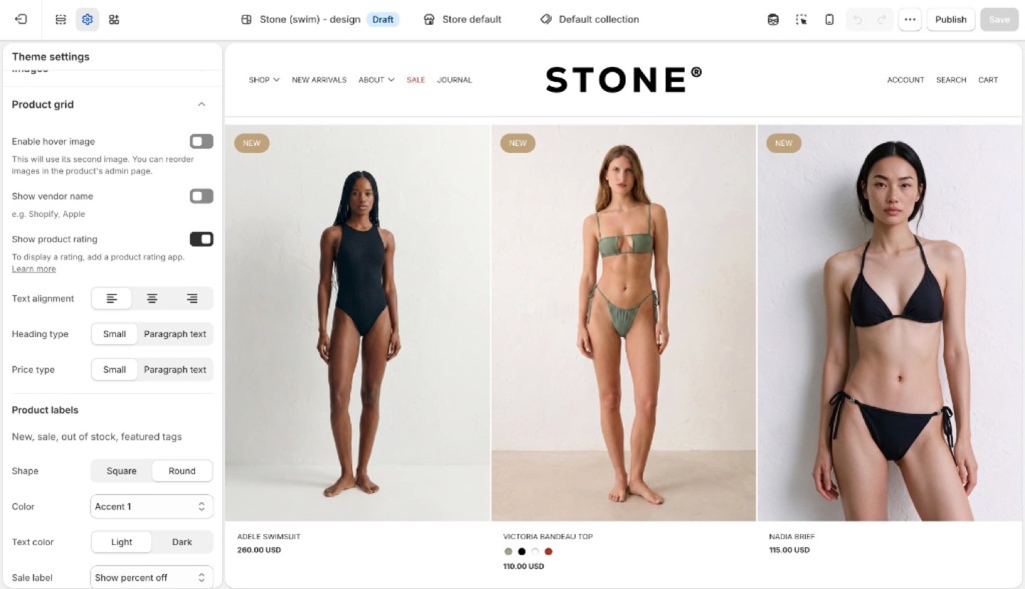
> **Info**
>
> **Product image size** (crop shape) and **Corner radius** are in **Theme settings** → **[Images](https://support.troopthemes.com/guide/blockshop/images/)**, not Product grid.
## Card layout (Blockshop)
- **Enable hover image**: shows the product’s second image on hover. Touch devices have no hover.
- **Show vendor name**
- **Show product rating**: displays star ratings on product cards when a reviews app has added rating data to the product. The theme does not collect reviews. See [How do I add product reviews or star ratings?](https://support.troopthemes.com/faqs/how-do-i-add-product-reviews-or-star-ratings/)
- **Text alignment**: left, center, or right on the card
- **Heading type** and **Price type**: Small (nav-sized) or Paragraph text
Keep heading and price on the same type role unless you want the price to recede.
## Product labels (Blockshop)
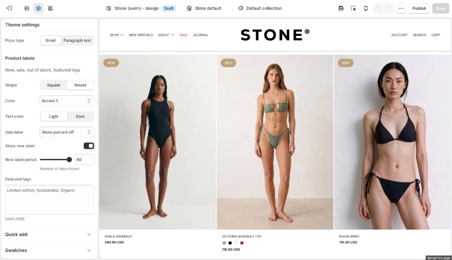
Product labels can show status (new, sale, sold out) on the collection grid. Featured labels add custom copy such as “Organic cotton” or “Limited edition” from tags.
Inventory, discounts, and checkout are unchanged. Labels are card markers, not Shopify discounts.
Under **Product labels**:
- **Shape**: Square or Round
- **Color** and **Text color**: Light, Dark, or an accent
- **Sale label**: hidden, text, or percent off
- **Show new label** and **New label period** (days)
- **Featured tags**: tags that render as labels
### Sale and new (Blockshop)
- **Sale**: the product needs a **Compare at price** higher than the price. The label can be hidden, text, or percent off.
- **New**: enable **Show new label** and set **New label period** (days since the product was created).
### Featured labels (Blockshop)
1. On the product in Shopify admin, add a tag (for example `organic-cotton`).
2. In **Theme settings** → **Product grid** → **Featured tags**, type that exact tag. Separate multiple tags with commas.
The tag in the admin and the string in Featured tags must match (including spelling). The storefront can hide the raw tag from other UIs; the label is what customers see.
## Ask Sidekick (Blockshop)
Open [Sidekick](https://help.shopify.com/en/manual/shopify-admin/productivity-tools/sidekick) from the theme editor toolbar (top right, next to the device preview icon), or press `⌘.` (`Ctrl+.` on Windows). If you're deciding between a denser grid with less detail or a spacious one with more (vendor name, rating, price emphasis), talk it through.
> "Should my product grid show vendor name and rating, and should Heading type and Price type be Small or Paragraph text?"
It can reason through what a customer browsing your specific catalog will actually want to see on the card, rather than you guessing at the combination of card layout settings.

## Troubleshooting (Blockshop)
- **Hover image never appears**: the product needs a second image in the admin. Touch devices have no hover.
- **Ratings missing**: **Show product rating** only displays data from a reviews app. Products with no reviews stay blank. See [How do I add product reviews or star ratings?](https://support.troopthemes.com/faqs/how-do-i-add-product-reviews-or-star-ratings/)
- **No sale label**: there is no compare-at price, or Sale is set to hidden.
- **No new label**: the product is older than **New label period**, or the checkbox is off.
- **Featured label missing**: tag spelling does not match Featured tags, or you tagged a variant in a way the product does not inherit. Tags are on the product.
- **Label on the product page but not the grid (or the reverse)**: Product grid labels are this setting. The product template may have its own badge blocks; check both.
---
title: Quick add
url: https://support.troopthemes.com/guide/blockshop/quick-add/
theme: Blockshop
theme_styles: Radiance, Stone, Valla
---
# Quick add in Blockshop
**Edit theme** → **Theme settings** → **Quick add**.
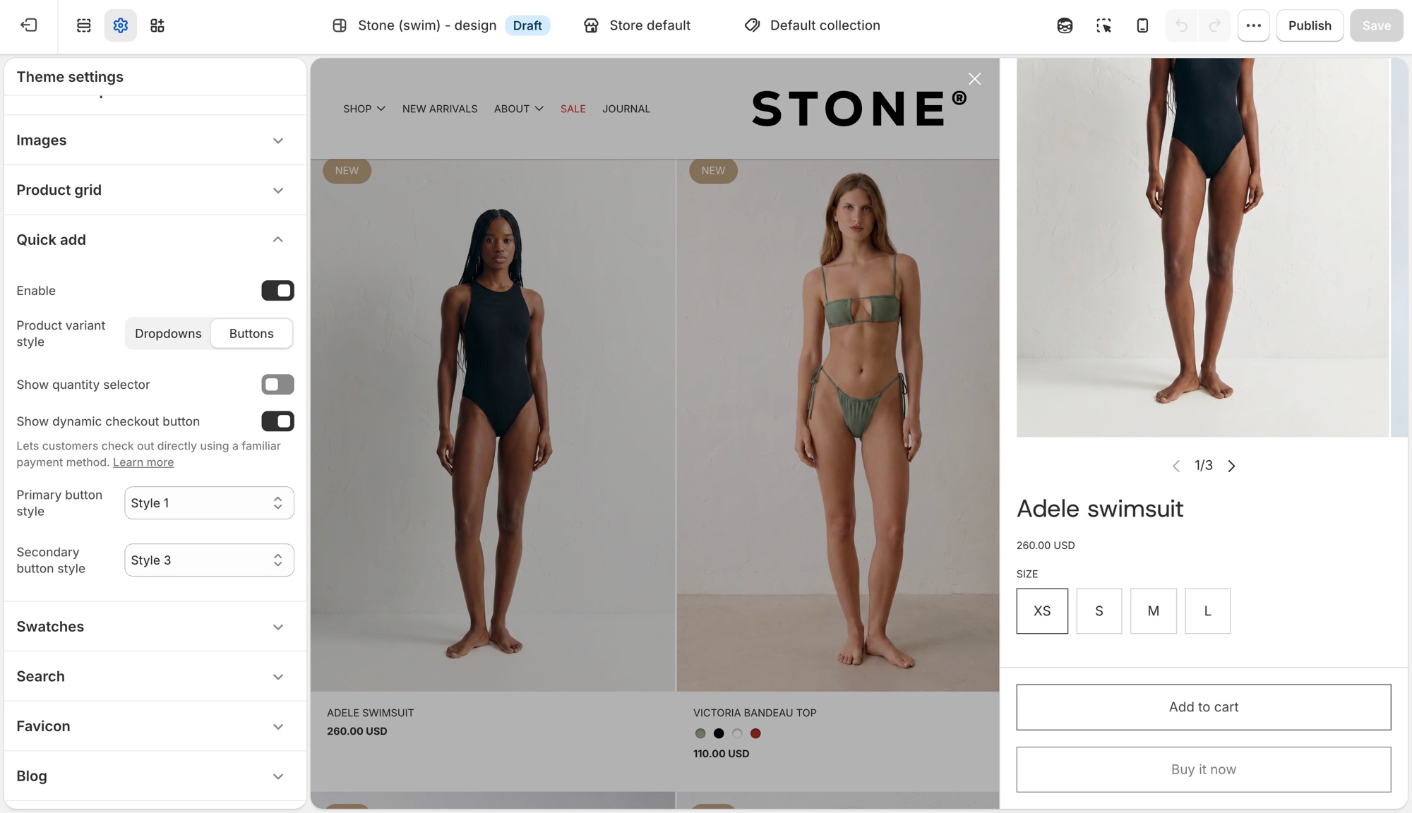
Quick add is the **+** button that appears on product cards in the grid. Hover (or tap) it to add the product to cart without leaving the collection page.
## Theme settings → Quick add (Blockshop)
- **Enable**: turns the button on or off storewide.
- **Product variant style**: **Dropdowns** or **Buttons** for choosing options in the quick add form.
- **Show quantity selector**: adds a quantity stepper to the quick add form.
- **Show dynamic checkout button**: adds a payment-method shortcut (Shop Pay, PayPal, and similar) next to the regular checkout option. See Shopify's [dynamic checkout](https://help.shopify.com/manual/using-themes/change-the-layout/dynamic-checkout) guide.
- **Primary button style** and **Secondary button style**: pick from your four button styles ([Buttons, inputs, and links](https://support.troopthemes.com/guide/blockshop/buttons-inputs-and-links/)). Secondary only shows when **Show dynamic checkout button** is on.
The button label reads **Quick add** for a product with one variant, or **Choose options** when the customer needs to pick a variant first.
## On the product card (Blockshop)
Quick add only appears for products that are in stock. A sold-out product's card has no button at all. This is expected behavior, not a setting to change.
## Troubleshooting (Blockshop)
- **No button on the card**: the product is sold out, or **Enable** is off in **Theme settings** → **Quick add**.
- **Button says "Choose options" instead of "Quick add"**: the product has more than one variant. That is automatic, not a setting.
- **No secondary button in the form**: **Show dynamic checkout button** is off, or the store has no dynamic checkout methods configured.
- **Checkout is unchanged**: expected. Checkout is not the theme.
---
title: Setting up product filters
url: https://support.troopthemes.com/guide/blockshop/setting-up-product-filters/
theme: Blockshop
theme_styles: Radiance, Stone, Valla
---
# Enabling product filtering in Blockshop
Collection filters on current Troop themes are Shopify’s native filters. You must install Shopify’s free [Search & Discovery](https://apps.shopify.com/search-and-discovery) app first. You configure filters in that app, not in Theme settings → Colors or a tag list.
Shopify admin → **Search & Discovery** app → **Filters**. The theme only displays what that app publishes.
Product tags alone do not create filters on current versions. Checkout and other apps are unchanged.
> **Info**
>
> For the full Shopify walkthrough, see [enable product filtering](https://help.shopify.com/en/manual/online-store/themes/customizing-themes/common-customizations/storefront-filters).
## Steps (Blockshop)
1. Install [Search & Discovery](https://apps.shopify.com/search-and-discovery) from the Shopify App Store if it is not already installed, then open the app in Shopify admin.
2. Open **Filters** and add the filters you want (for example Availability, Price, Color).
3. Save. Preview a **collection** page in **Edit theme**, not the homepage.
4. If the **Filter** button or drawer is missing, open the collection template in **Edit theme**, select **Collection navigation**, and turn on **Enable filtering**. You can also turn on **Enable sorting** and **Enable layout switcher** there. Filter tag **Shape** (Round or Square) is in the same section.
Filters need products that actually have those options or metafields. Empty filters do not appear.
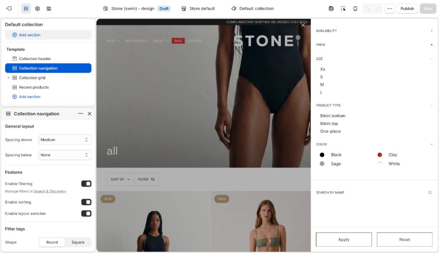
## Troubleshooting (Blockshop)
- **No filter UI at all**: Search & Discovery is not installed, you are previewing the homepage, or **Enable filtering** is off in **Collection navigation**. Open a collection template and turn it on.
- **A filter you added is missing**: no products in that collection have that option/metafield, or the filter is set not to show when empty.
- **You are still adding product tags expecting a Refine list**: current versions use Search & Discovery filters, not tag groups.
---
title: Search
url: https://support.troopthemes.com/guide/blockshop/search/
theme: Blockshop
theme_styles: Radiance, Stone, Valla
---
# Search in Blockshop
**Edit theme** → **Theme settings** → **Search**.
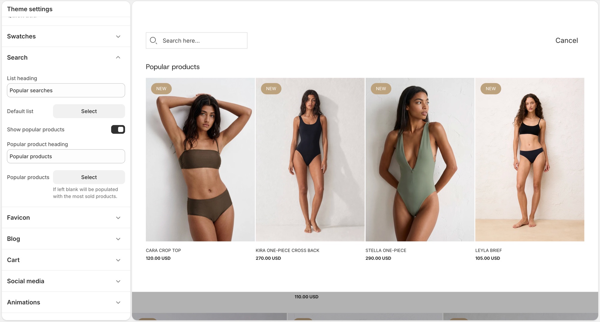
These settings control Shopify's [predictive search](https://help.shopify.com/en/manual/online-store/storefront-search/predictive-search) panel that opens as a customer types in the header search, not the full search results page layout.
## Theme settings → Search (Blockshop)
- **List heading**: label above the default suggestion list, for example "Popular searches."
- **Default list**: a menu of links shown before the customer types anything.
- **Show popular products**: turns on a product suggestions block in the empty search state.
- **Popular product heading**: label above that block, for example "Popular products."
- **Popular products**: up to 4 products to feature there. Leave it blank and the theme fills it with your best-selling products automatically.
## Troubleshooting (Blockshop)
- **Popular products showing products I did not pick**: the **Popular products** field is empty, the theme is filling it with best sellers. Add products there to override it.
- **Nothing shows before I type**: **Default list** has no menu assigned, or that menu has no links.
- **Search results page looks wrong**: that is a separate template (**Edit theme** → template selector → **Search**), not this settings group.
---
title: Add color swatches to products
url: https://support.troopthemes.com/guide/blockshop/color-swatch-guide/
theme: Blockshop
theme_styles: Radiance, Stone, Valla
---
# Using color swatches with your products in Blockshop
On current versions, swatches are Shopify’s native color entries (product category + category metafield). The theme only **turns them on** (Round or Square). You do not pick swatch hexes in Theme settings → Colors anymore.
**Products** → category and category metafields; then **Edit theme** → **Theme settings** → **Swatches**. You can also set swatches on the product section or Featured product.
Inventory, checkout, and filters (Search & Discovery) are unchanged.
To use Shopify native swatches, configure product categories and category metafields.
### Step One: Add a product category (Blockshop)
A product category is selected from the pre-defined categories in Shopify's Standard Product Taxonomy. This is essential for:
- Unlocking product attributes (category metafields) that map to each product category.
- Managing your products better within Shopify, aiding in automated collections or filtering.
- Ensuring accurate tax rates are applied at checkout based on product categorization.
**Example Category**: Apparel & Accessories > Clothing > Clothing Tops > Shirts. You can add color swatches for any category metafield with the color product attribute.
**To Add a Product Category**:
1. From your Shopify admin, click **Products**.
2. Click a product.
3. In the **Category** section, select **Apparel & Accessories > Clothing > Clothing Tops > Shirts** or another category with the color category metafield.
4. Click **Save**.
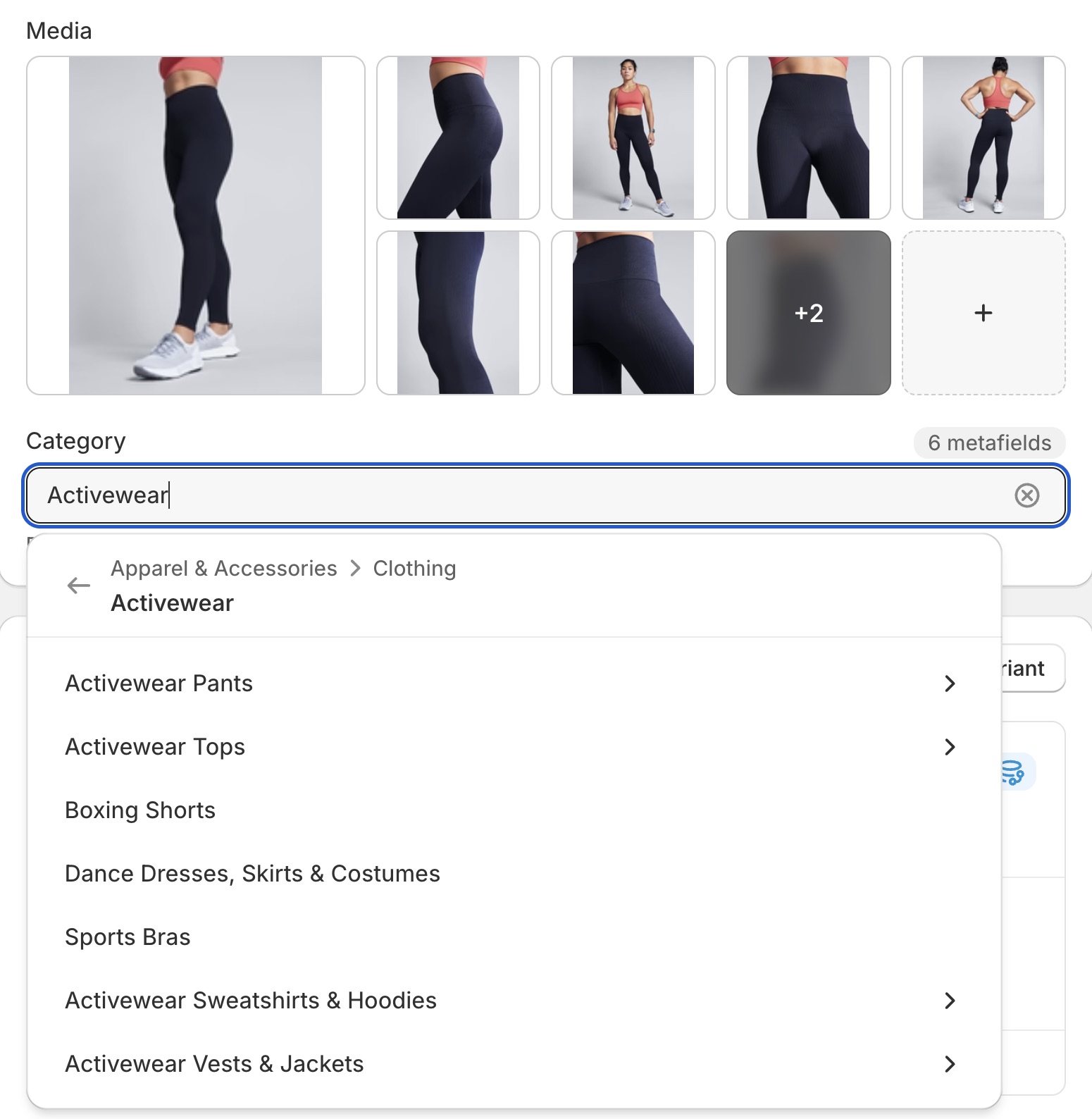
### Step Two: Add and edit entries for your category metafields (Blockshop)
After adding a product category, you can add entries for your product's variant option values.
**To Edit or Add Entries**:
1. From your Shopify admin, go to **Products**.
2. Click the product with the category metafields you want to edit or add.
3. **To Add an Entry from Default Entries**:
- In the **Category metafields** section, click the category metafield, then click the entry you want to edit.
- Edit the fields as needed.
- Click **Save**.
4. **To Add a Custom Entry**:
- In the **Category metafields** section, click the category metafield, then click **Add new entry**.
- Fill out the fields for the entry.
- Click **Save**.
### Step Three: Connect your category metafields to variant options (Blockshop)
In this step, you connect the category metafield for color (or any other category metafield as needed) to your product variants.
**To Connect Category Metafields**:
1. From your Shopify admin, go to **Products**.
2. Click the product you want to edit.
3. In the **Variants** section, click **+ Add options like size or color**.
4. If a category metafield is available to connect to, select it. The option values will auto-fill with any entries you've added to the category metafield.
5. **Optional**: To add custom option values, click **Edit**, then click **Add new entry**. Fill out the entry fields and click **Save**.
6. Click **Save** to save the product.
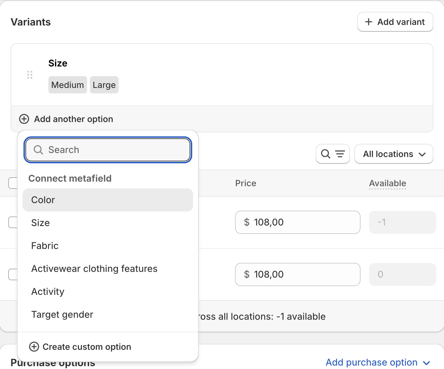
### Step Four: Enable swatches at the theme level (Blockshop)
Swatches can be enabled in **Edit theme** → **Theme settings** → **Swatches**. Choose **Circle** or **Square** (or **None** to turn them off). Size on the product form and on the grid are separate sliders in that same group.
You can also set swatch type on a product section or Featured product.
When enabled, the theme will turn configured options into clickable swatch selectors.
## Troubleshooting (Blockshop)
- **No chips, still a dropdown**: Swatches is set to **None** in Theme settings (and on the product section); or the variant option is not connected to the color category metafield.
- **Chips are the wrong colors**: edit the category metafield **entries** in the product admin, not Theme settings → Colors (current versions).
- **Grid has swatches, product page doesn’t (or the reverse)**: Theme settings → Swatches and the product section each have their own type control; set both.
- **You are on an older theme**: skip to [Legacy theme versions](#legacy-theme-versions). Hex lists in Colors or `swatch-colors.liquid` only apply there.
# Legacy theme versions
Color swatches can be enabled in multiple places:
- In the **Product Page(s)** under the **Sections** tab
- On the **Home Page**, inside the **Featured Product** section under the **Sections** tab
- In the **Theme Settings** tab, under the **Product Grid** section
When enabled, the theme will automatically turn an option titled "color" into clickable color swatches.
The default colors are set as standard CSS colors. For example, "gold" is defined as `#ffd700`. The complete
list of standard CSS colors [can be viewed on MDN.](https://developer.mozilla.org/en-US/docs/Web/CSS/Reference/Values/named-color)
> **Non-English themes**
>
> - "Color" will be translated according to your `locales/*.json` file. For example, if you desire "couleur" to be the option with swatches, be sure to translate any instance of "color" inside `locales/fr.json` to "couleur"
> - Non-english colors such as "rouge" will need to be added manually as defined below in [Adding custom colors](#adding-custom-colors)
## Adding custom colors (Blockshop)
Default colors can be overwritten with values defined by the store-owner. In addition, values not defined as a CSS color can be added.
> **Versions with swatch settings inside `Theme settings > color`**
>
> On Blockshop versions 9.0.0 to 10.0.1, swatch color settings can be found inside the _Color_ submenu inside the global theme settings.
If you want to assign the color value `deep red` to the color value `rgb(131, 45, 39)`, you'd add the following line to the `Color swatch configuration` textbox:
deep red: rgb(131, 45, 39)
> **Formatting must be exact**
>
> - each rule must be on a new line
> - the name and value are separated by a single colon (":") character
> - the value can be defined as either a hex or RGB value
> - colors that don't follow the above format will revert to their default values
- use a tool like [Adobe Color](https://color.adobe.com/create/image) if you need help determining which color value is appropriate for your product
---
title: Add a size chart to the product page
url: https://support.troopthemes.com/guide/blockshop/product-size-chart/
theme: Blockshop
theme_styles: Radiance, Stone, Valla
---
# Add a size chart to the product page in Blockshop
The theme can open a Shopify **page** from the product form. You write the chart on that page; the theme only links to it.
You can add a size chart on the _Product_ page or the _Featured product_ section in two ways:
- **Size guide button** block: a standalone button you place in the product form
- **Variant picker** block: a link beside a matching variant option (for example Size)
Create the chart page in **Online Store** → **Pages**. A size-chart app replaces this feature, disable the theme size guide if you use one.
## Chart page (Blockshop)
In the example below, we created a page called `Size chart` and referenced it in **Page content**. That page holds tables (and can hold images or other text).
To quickly create HTML tables for size charts, try a [responsive table generator](https://www.tablesgenerator.com/).
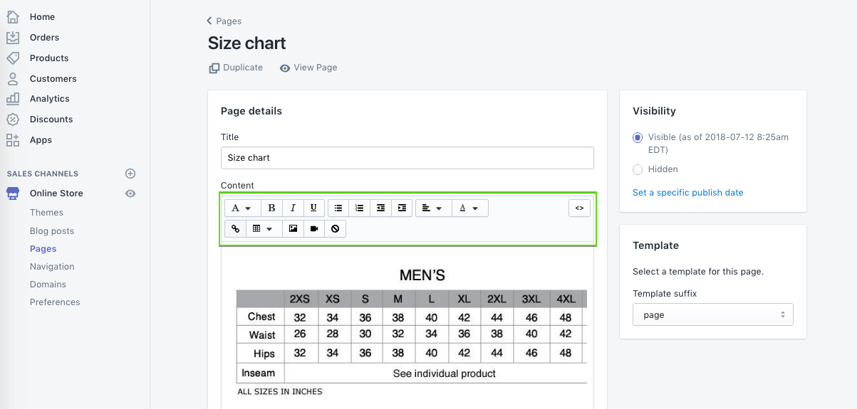
## Size guide button (Blockshop)
> **Version availability**
>
> The Size guide button block is available in Blockshop versions 13.3.0 and up.
**Edit theme** → product template or **Featured product** → **Add block** → **Size guide button**. If the block is already in the section, click the eye icon to show it. Select a page in **Page content**, then choose a **Button style**.
The button does not require a Size variant. Use it when you want a size chart on products without options, or when you want a full button instead of a link next to the picker.
If you use this block, turn off **Enable** under **Size guide** on the **Variant picker** block so two size-chart controls do not stack.
On these versions the chart opens in a drawer.
## Variant picker (Blockshop)
For the variant picker size chart to appear, the product must have at least one variant option. You can configure this in the Shopify admin product editor:
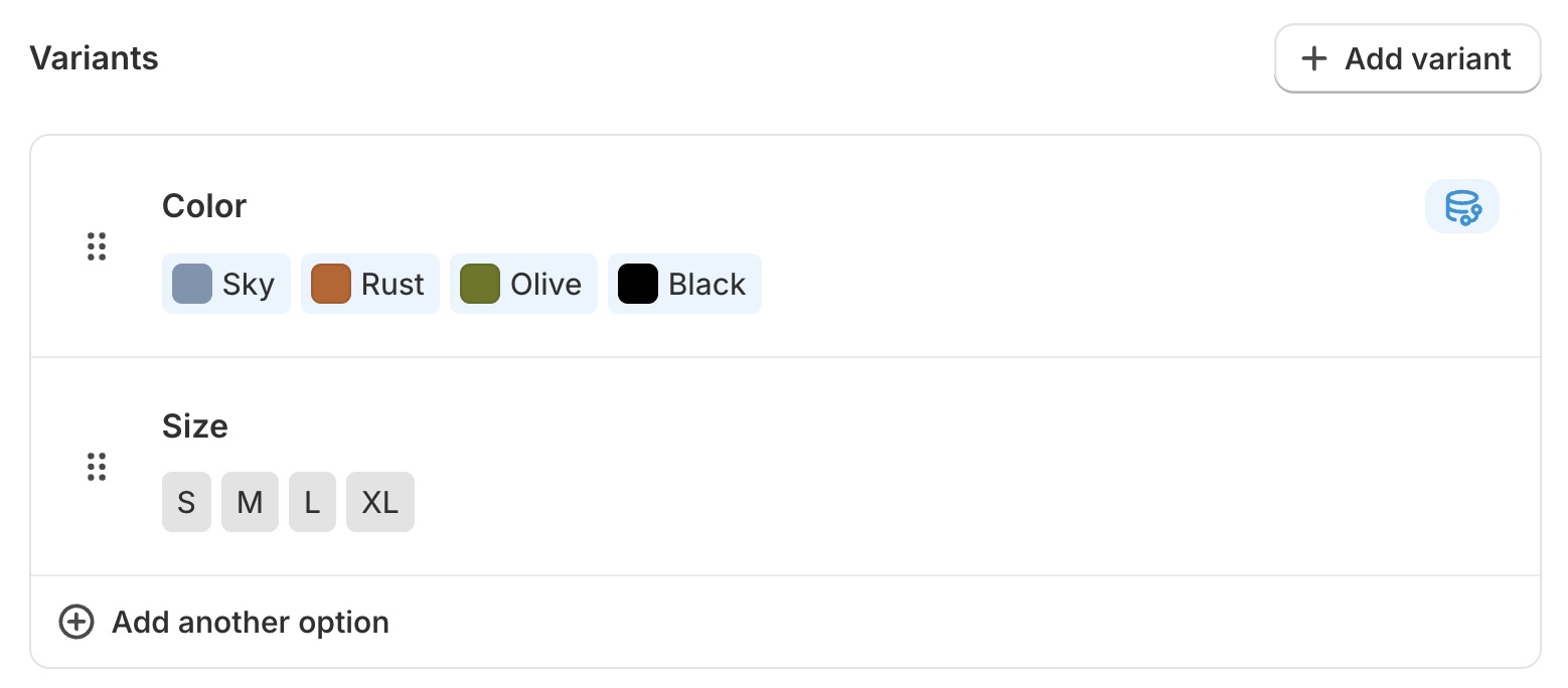
In the theme editor, open the _Product_ page or _Featured product_ section, expand the blocks list, and locate the **Variant picker** block. If it is hidden, click the eye icon to show it. If it is not there, click **Add block** and select **Variant picker**.
Match the variant option (for example, "Size") in the **Link from option** text field. Then select a page using the **Page content** setting.
**Edit theme** → product template → **Variant picker** block → **Link from option** and **Page content**.
Variant options are set in **Products**.
> **Change the size chart button text**
>
> You can change the size chart button text in _Edit default theme content > Products_.
>
> Read more about [changing default text](https://support.troopthemes.com/guide/blockshop/change-default-text/).
>
> 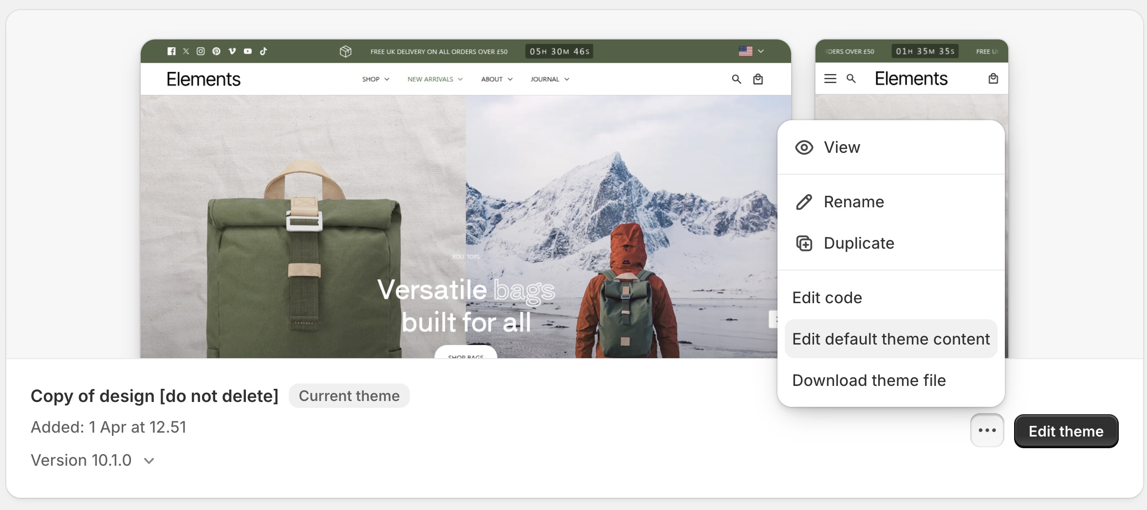
## Troubleshooting (Blockshop)
- **Size guide button is missing from Add block**: the theme is below the versions listed above. Use the **Variant picker** method, or [update the theme](https://support.troopthemes.com/guide/update-theme/).
- **No size chart link next to Size**: the product has no variants; **Link from option** does not match the option name (for example `Size` vs `Sizes`); **Enable** is off; or the Variant picker block is missing.
- **Wrong / empty drawer or popup**: **Page content** is unset, or the page has no body.
- **Two size charts appear**: both the **Size guide button** and the Variant picker **Size guide** are enabled. Turn one off.
- **An app chart appears instead**: disable the app embed, or turn off the theme’s size guide so they do not stack.
- **Button says the wrong words**: [default theme content](https://support.troopthemes.com/guide/blockshop/change-default-text/) → Products.
---
title: Add an out of stock notification form
url: https://support.troopthemes.com/guide/blockshop/out-of-stock-notifications/
theme: Blockshop
theme_styles: Radiance, Stone, Valla
---
# Add an out of stock notification form in Blockshop
The theme can show a “notify me” form on sold-out variants. Submissions email your store’s **Sender email**. The theme does **not** watch inventory or auto-send “back in stock” mail to the shopper.
This is Shopify’s contact form: it emails you. It does **not** create a customer in **Customers**, and it does not start a waitlist.
## Who owns this (Blockshop)
- **Show the form on the product page**: theme (the block below)
- **Sold-out vs available**: Shopify **Products** inventory
- **Where the request lands**: Settings → Notifications → Sender email
- **Email the shopper when stock returns**: a [back in stock app](https://apps.shopify.com/search?q=back%20in%20stock)
## Show the form (Blockshop)
**Edit theme** → product template (**Default product**) or **Featured product** → **Add block** → **Unavailable form**. If the block is already in the section, click the eye icon to show it.
Click the block to expand its settings. Preview a sold-out variant or the form stays hidden.
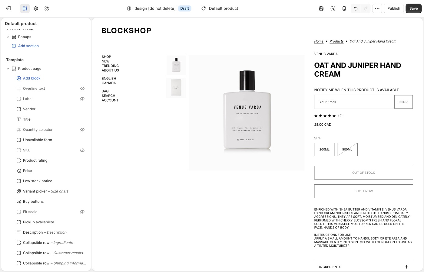
Form copy is [default theme content](https://support.troopthemes.com/guide/blockshop/change-default-text/). Search **notify** or **sold out**.
## Sold-out variants only (Blockshop)
The selected variant must be sold out, or the form stays hidden.
**Products** → the product → the variant → **Inventory**:
- **Inventory tracked** is on. If tracking is off, Shopify treats the item as available.
- **Available** is 0 or less at locations that fulfill **online** orders. Stock sitting only at a location that does not fulfill the online store still shows as sold out on the storefront.
- **Sell when out of stock** is **Off**. That control only appears when tracking is on.
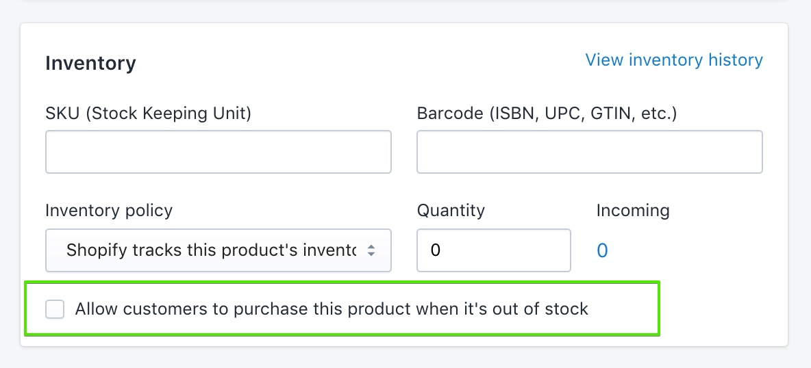
See Shopify’s [selling out of stock products](https://help.shopify.com/en/manual/products/inventory/setup/selling-when-out-of-stock) guide.
## Where the email goes (Blockshop)
Shopify delivers contact-form submissions to **Settings** → **Notifications** → **Sender email**. That is not **Settings** → **General** (**Store email** is for Shopify contacting you, and for exports).
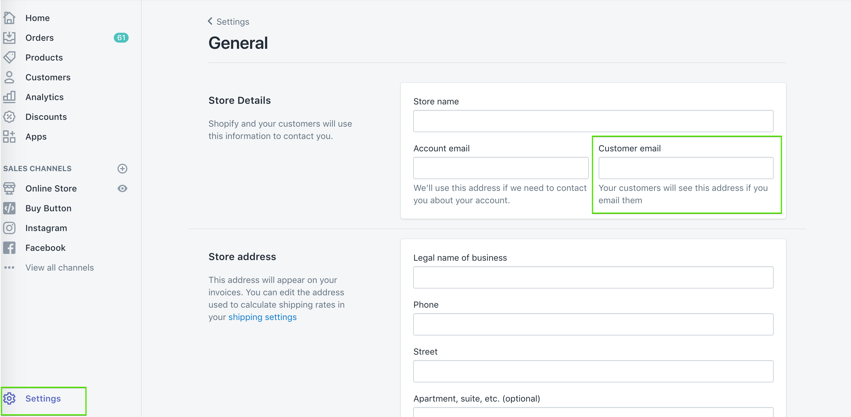
If you use a custom domain, authenticate it on the Notifications page or Shopify may rewrite the address. Submissions flagged by Shopify’s spam filter still arrive, with `[SPAM]` in the subject.
See Shopify’s [setting up your email](https://help.shopify.com/en/manual/intro-to-shopify/initial-setup/setup-your-email) and [contact form](https://help.shopify.com/en/manual/online-store/themes/customizing-themes/add-contact-page) guides.
## Automatic “back in stock” mail (Blockshop)
The theme cannot do this. Shopify does not send restock emails to customers on its own; their inventory docs point to a [back in stock app](https://apps.shopify.com/search?q=back%20in%20stock). Most of those apps add their own button, remove the theme’s **Unavailable form** block so they don’t stack.
Shopify Flow’s [Product variant back in stock](https://help.shopify.com/en/manual/shopify-flow/reference/triggers/variant-back-in-stock) trigger can notify *you* (Slack, staff email) or republish a product. It does not mail customers who submitted the theme form.
If you handle requests by hand:
- Tag or folder the incoming mail by product or variant.
- Keep a spreadsheet of email + variant, then send when you restock.
- Add addresses to a list in your email app and send that list when the item is back.
**Want to use an app?** [Using apps with themes](https://support.troopthemes.com/guide/using-apps-with-themes/).
## Ask Sidekick (Blockshop)
Open [Sidekick](https://help.shopify.com/en/manual/shopify-admin/productivity-tools/sidekick) from the icon in your Shopify admin, then ask it to draft the "back in stock" notification email in your brand's tone.
> "Write a short, friendly restock email with a sense of urgency."
Refine it before it goes live, faster than starting from Shopify's default template copy.
## Troubleshooting (Blockshop)
- **Form never shows**: the variant is still available, **Inventory tracked** is off, **Sell when out of stock** is on, or the **Unavailable form** block is missing or hidden on **Product page**.
- **Form shows but you still have stock**: the units may be at a location that does not fulfill online orders. Add stock to a location that does.
- **You expected an automatic email when stock returned**: the theme cannot do that. Use an inventory app and remove the theme block.
- **You didn’t get the request**: check **Settings** → **Notifications** → **Sender email**, spam (including `[SPAM]` in the subject), and domain authentication. The message goes to you, not to the shopper.
- **Form copy is wrong**: [default theme content](https://support.troopthemes.com/guide/blockshop/change-default-text/).
- **Two notify buttons**: an app embed plus the theme form. Turn one off.
---
title: Setting up FAQ or Collapsible rows
url: https://support.troopthemes.com/guide/blockshop/setting-up-faq-or-collapsible-rows/
theme: Blockshop
theme_styles: Radiance, Stone, Valla
---
# Setting up FAQ or Collapsible Rows sections in Blockshop
Add **FAQ** or **Collapsible rows** in **Edit theme** → **Add section**. Each row is a block with a heading plus rich text or a Shopify **page**.
Page bodies are edited in **Online Store** → **Pages**, not in the theme editor. Shopify Help Center, checkout, and metafield definitions are unchanged.
To add an FAQ or Collapsible rows section, open **Edit theme**, click **Add section**, and choose **FAQ** or **Collapsible rows**.
These sections use collapsible rows as blocks. Each row can include a heading and content. Add additional blocks to build a list of questions and answers, or to break down product details and materials.
## Content types (Blockshop)
Each block supports two content types:
1. Rich text
- Added through the "Text" setting. Enter text directly in the text area, including links and formatting.
2. Page content
- Added through the "Row content from page" setting. Select a page from the dropdown to display its content in the block. Pages can be created or edited in the Shopify admin, **not** in the theme editor.
### Dynamic content with metafields (Blockshop)
The first option, rich text, supports dynamic content with metafields. This lets you display content specific to the page you're viewing, or store-level information.
For example, on a product page, each product has a different name, description, and price. You can show that information in an _FAQ_ or _Collapsible rows_ section by connecting a metafield to the block.
You can add static text around metafield content for context, or display only the dynamic content. To learn more about metafields, visit [Shopify's guide](https://help.shopify.com/en/manual/custom-data/metafields).
## Ask Sidekick (Blockshop)
Open [Sidekick](https://help.shopify.com/en/manual/shopify-admin/productivity-tools/sidekick) from the theme editor toolbar (top right, next to the device preview icon), or press `⌘.` (`Ctrl+.` on Windows). Give it a topic and your products, and it drafts FAQ copy for you.
> "Write 5 FAQs about shipping and returns for a skincare store."
It produces question-and-answer pairs you can paste into rich text blocks or refine before publishing. Faster than writing every row from a blank field, you still edit and approve the final wording.

## Troubleshooting (Blockshop)
- **Row is empty**: you chose **Row content from page** but didn’t pick a page, or the page has no body.
- **Every product shows the same answer**: you typed static text. Connect a **metafield** if the answer should change per product.
- **You wanted this on one product only**: use an alternate [product template](https://support.troopthemes.com/guide/blockshop/working-with-templates/) and assign it to that product, or use metafields.
- **Materials with a photo beside the accordion**: Blockshop: **Materials/craftsmanship**, not FAQ.
---
title: Customizing blogs
url: https://support.troopthemes.com/guide/blockshop/customizing-blog/
theme: Blockshop
theme_styles: Radiance, Stone, Valla
---
# Customizing blogs in Blockshop
Blog posts, tags, excerpts, and featured images live in Shopify admin under **Content**. The theme controls how those posts appear: the blog grid, article page, and the **Blog posts** section you can add to other templates.
**Content** → **Blog posts** for writing and tagging. **Edit theme** → **Default blog** or **Default article** for layout.
Post body copy, checkout, and SEO titles are unchanged.
> **Info**
>
> Visit Shopify's help centre for an extensive guide on [adding and managing blog posts](https://help.shopify.com/en/manual/online-store/blogs/writing-blogs/working-with-blog-posts).
## Write and tag posts (Blockshop)
Open **Content** → **Blog posts**. Create or edit a post to set the title, body, excerpt, tags, and featured image.
Tags do two jobs in the theme:
- They appear in the blog page tag filter (if that filter is on).
- The **Blog posts** section can limit itself to articles that share one tag.
Use **Manage blogs** on that same admin page to rename a blog or turn comments on.
## Blog page (Blockshop)
**Edit theme** → template selector → **Blogs** → **Default blog** → **Blog**.
Posts list in reverse chronological order (newest first). Pagination appears when there are more posts than one page.
### Grid (Blockshop)
- **Columns**: 1 to 4 on desktop. On mobile, 1 or 2.
- **Row layout**: **Evenly spaced** keeps rows aligned. **Staggered** packs cards like masonry.
- **Maximum container width**: Extra small through Full width, same control as other sections. Full width lets the grid run edge to edge.
- **Full width** (under **Mobile**): lets cards bleed to the screen edge on small devices.
Card image crop is **Theme settings** → **Images** → **Article image size**, not this section. Natural keeps each featured image’s own ratio. A fixed ratio (Square, Landscape, or Portrait) makes a stricter grid.
For a uniform grid, shoot featured images to the same ratio as **Article image size**. Mixed ratios look calmer with Natural, or with **Staggered** row layout.
Export sizes: [What image sizes should I use?](https://support.troopthemes.com/faqs/what-image-sizes-should-i-use/).
### Title, filter, and RSS (Blockshop)
- **Show blog title**: the blog’s name from admin (for example Journal), not each article title.
- **Show tag filter**: a dropdown of article tags. Turn this off if you do not want customers to filter the index.
- **Show RSS**: a feed link in the blog footer.
To keep internal tags out of that filter, open **Theme settings** → **Blog** → **Hide tags from tag filter**. Enter a comma-separated list. The default is `featured, pinned`. Matching is not case-sensitive (`pinned` and `Pinned` both hide).
### What each card shows (Blockshop)
On the **Blog** section:
- **Show article heading**: the post title. **Article heading type** is Medium or Small.
- **Show blog date** and **Show author**
- **Show excerpt**: the excerpt from the post editor, or a short trim of the body if the excerpt is empty.
- **Show button**: the continue-reading link. That label is [default theme content](https://support.troopthemes.com/guide/blockshop/change-default-text/); search **continue**.
If **Show article heading** and **Show button** are both off, **Show excerpt** outputs the full article body on the blog page instead of a truncated excerpt. That is how an editorial index can read as captions under images, without a title or button on each card.
**Heading type** styles the blog title (Banner, Featured, Large, or Medium) when **Show blog title** is on.
Spacing above and below follows the same scale as other sections. See Spacing and layout in your theme guide.
## Blog posts section (Blockshop)
**Edit theme** → **Add section** → **Blog posts**. Add it to the homepage or any other template. This is not the blog index.
- **Choose blog**: which blog to pull from.
- **Filter by tag**: only articles with this tag appear (up to three). The default is `pinned`. Change the field, or tag posts to match it, in **Content** → **Blog posts**. If no posts have that tag, the section falls back to the latest three articles.
- **Show button**, **Show date**, and **Show excerpt** control the cards in this section.
- **Media layout** (under **Mobile**): Slideshow or Grid.
Tag spelling must match the filter field. `pinned` and `Pinned` are treated the same.
## Article page (Blockshop)
**Edit theme** → template selector → **Blog posts** → **Default article**.
The **Article** section shows the title, date, author, tags, sharing links, and the post body. It does not place the featured image.
The featured image still matters: blog cards use it, cropped by **Article image size**. To show it as a banner on the article page, add an image section (often **Image with text overlay**) above the **Article** section and connect the image to the article’s featured image. You can remove that section if you want a text-only article.
On the **Article** section:
- **Show title**, **Heading type**, and **Heading alignment**
- **Show article date** and **Show author**
- **Show article tags**: tags you hid in **Theme settings** → **Blog** stay hidden here too.
- Sharing: Facebook, 𝕏, Pinterest, email, and link. Turn each one off independently.
**Maximum container width** on this section has no Full width option (Extra small through Extra large). A narrower width keeps article copy readable.
The template can also include:
- **Recent articles**: nearby posts from the same blog.
- **Comments**: Shopify’s comment form, or Disqus if you enable it on the section. Comments must be turned on for that blog in **Content** → **Blog posts** → **Manage blogs**.
You can add other sections to the article template the same way as a page. See [Working with templates](https://support.troopthemes.com/guide/blockshop/working-with-templates/).
### Images in the post body (Blockshop)
When you insert an image in **Content** → **Blog posts**, set the size to **Original** so it spans the article column. Smaller presets can look cropped or undersized.
## Ask Sidekick (Blockshop)
Open [Sidekick](https://help.shopify.com/en/manual/shopify-admin/productivity-tools/sidekick) from the icon in your Shopify admin, then ask it to draft a blog post from a topic and a few notes.
> "Write a post about caring for our candles, aimed at new customers."
Use it for a first draft or when you're stuck on an opening paragraph, then edit it in your own voice before publishing, Sidekick's content generation is meant as a starting point, not a final draft.
## Troubleshooting (Blockshop)
- **Can't find Blog posts**: they are no longer under **Online Store**. Open **Content** → **Blog posts**. Use **Manage blogs** there to rename a blog or change comments.
- **Pinned posts missing from the homepage**: **Filter by tag** is on the **Blog posts** section, not the blog index. The tag on the article must match that field.
- **Tag still shows in the filter**: add it to **Theme settings** → **Blog** → **Hide tags from tag filter**, comma-separated. The blog section’s **Show tag filter** must be on for the dropdown to appear at all.
- **Grid looks uneven**: featured images have mixed ratios, or **Row layout** is **Staggered**. Use the same crop and **Evenly spaced** for a strict grid, or keep mixed ratios on purpose.
- **Cards look cropped**: **Theme settings** → **Images** → **Article image size**, not the post editor.
- **No featured image on the article page**: the **Article** section does not display it. Add an image section on the article template, or check that the post has a featured image in **Content** → **Blog posts**.
- **Embedded images look cropped**: in the article editor, set the image size to **Original**, not a small preset.
- **Comment form missing**: comments are off for that blog in **Manage blogs**, or the **Comments** section is hidden or removed from the article template.
- **Continue reading wording**: [default theme content](https://support.troopthemes.com/guide/blockshop/change-default-text/), not the Blog section.
---
title: Configuring the popup
url: https://support.troopthemes.com/guide/blockshop/configuring-the-popup/
theme: Blockshop
theme_styles: Radiance, Stone, Valla
---
# Configuring the popup in Blockshop
The popup lives in **Edit theme** → **Popups**, an overlay section that appears across the whole store. It is not the announcement bar (that's on the **Header** section), not checkout, and it does not send email campaigns by itself: Shopify Inbox, discount codes, and email delivery are all separate.
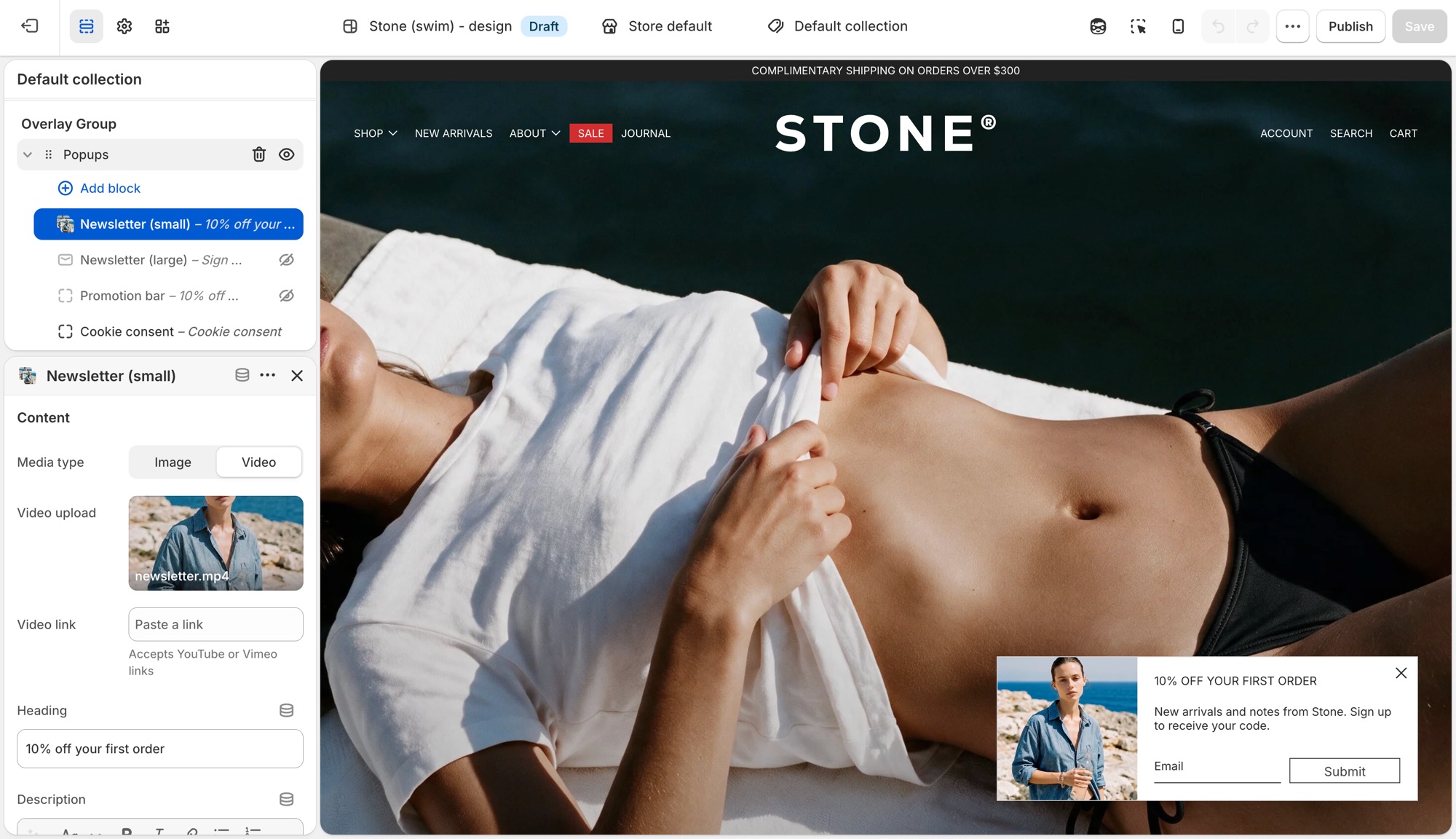
> **Compatibility**
>
> Image (and left/right or top placement) options on the **Newsletter (small)** and **Newsletter (large)** popup blocks require version 13.2.0 and up. Video media requires 13.3.0 and up.
## Popups section (Blockshop)
**Edit theme** → **Popups**. By default it already has a **Newsletter (small)**, **Promotion bar**, and **Cookie consent** block. Click a block's eye icon to show or hide it, or **Add block** for another type:
- **Newsletter (small)** – corner overlay with an email field.
- **Newsletter (large)** – centered overlay modal.
- **Promotion bar** – sticky bar with a message; can scroll like a ticker (**Scroll text**, with separate speed controls for desktop and mobile).
- **Cookie consent** – consent banner tied to Shopify's consent tracking API.
Heading, description, and button text live on each block, not in Theme settings.
### Newsletter (small) (Blockshop)
Corner overlay with an email field.
- **Media type**, **Image**, **Video upload**, **Video link**: shown when **Show media** is on; video accepts a Shopify upload or a YouTube/Vimeo link.
- **Heading**, **Description**: the popup's copy.
- **Show social icons**, **Social media title**: adds your [social icons](https://support.troopthemes.com/guide/blockshop/social-media/) below the form.
- **Background color**, **Translucent background**: card styling.
- **Popup width**: maximum width on larger screens (300–500px).
- **Show media**, **Media position** (**Left** or **Top**): whether an image or video shows, and where. Media is hidden on mobile to meet Google's guidelines against intrusive interstitials.
- **Heading type**, **Paragraph font size**, **Text color**, **Text alignment**: text styling.
- **Button text**, **Button style**: set the submit button's label and style. Leave **Button text** blank to show an arrow icon instead of a labeled button.
- Timing and targeting settings (**Popup delay**, **Show again after**, and so on) are shared with **Promotion bar**. See **Timing and frequency** below.
### Newsletter (large) (Blockshop)
Centered overlay modal, with the same settings as **Newsletter (small)** above, except:
- **Popup width** ranges wider (500–900px), since it's a centered modal rather than a corner card.
- **Media position** is **Left** or **Right** instead of Left/Top.
### Promotion bar (Blockshop)
Sticky bar with a message.
- **Description**: the bar's message text.
- **Background color**, **Translucent background**.
- **Scroll text**, **Scroll speed**: ticker effect on desktop, plus a separate **Scroll text**/**Scroll speed** pair under **Mobile** so the ticker can run independently (or not at all) per device.
- **Heading type**: **Medium** or **Small** text size.
- **Text color**.
- Timing and targeting settings are shared with the **Newsletter** blocks. See **Timing and frequency** below.
### Cookie consent (Blockshop)
Consent banner tied to Shopify's consent tracking API. See **When cookie consent shows** below for the conditions.
- **Heading**, **Description**.
- **Background color**, **Translucent background**.
- **Position**: **Left**, **Bottom**, or **Right**.
- **Text color**, **Text alignment**.
- **Accept button style**, **Decline button style**: each independently set to one of your four button styles, or a plain text **Link**.
## Timing and frequency (Blockshop)
**Newsletter** and **Promotion bar** blocks each have:
- **Popup delay** – seconds before it opens.
- **Show popup at bottom of page** – opens early if the visitor scrolls to the bottom first.
- **Show again after** – days before it reappears once dismissed. This is stored in the visitor's browser, not in Shopify, so it's per browser/device, not per customer.
- **Limit to specific referrer path** / **Limit to specific page** – restrict where it can appear.
The section's own **Limit to one popup per page load** setting controls whether only the first ready popup shows, or they queue one after another. **Cookie consent always takes priority** when it needs to appear.
## When cookie consent shows (Blockshop)
Cookie consent only shows where Shopify's consent tracking API determines a banner is required, and only if the visitor doesn't already have a stored choice. It won't show for everyone. Customer privacy tracking limits must also be turned on in your Shopify admin (**Settings** → **Customer privacy**), or it won't show at all. Position and the **Accept**/**Decline** button styles are configurable; it doesn't use the delay/frequency settings above.
## Previewing changes (Blockshop)
**Newsletter** and **Promotion bar** popups do **not** open automatically while you're editing. That's expected, not a bug. Preview them from the storefront (or **Preview**), ideally in a private/incognito window, since **Show again after** is remembered by that browser and will suppress a popup you've already dismissed while testing.
**Cookie consent** is the exception: click it in the block list to preview it live in the editor.
---
Where newsletter forms live (section, overlay, popup, footer, password page): [Setting up mailing lists and newsletters](https://support.troopthemes.com/guide/blockshop/newsletters/).
## Troubleshooting (Blockshop)
- **Popup never appears**: the block is hidden (eye icon); **Show again after** already fired for that browser (test in a private window); another popup is already showing and **Limit to one popup per page load** is on; or a separate app popup is competing. Turn off other popup app embeds.
- **Cookie consent doesn't show**: Customer privacy tracking isn't enabled in your Shopify admin, or the visitor's region/consent state doesn't require a banner.
- **It won't preview in the editor**: expected for **Newsletter** and **Promotion bar** blocks. Preview from the storefront instead.
- **Announcement bar isn't here**: that's on the **Header** section, not **Popups**.
- **Form emails don't reach Mailchimp/Klaviyo**: the popup only creates a Shopify customer (tagged `newsletter`). See [newsletters](https://support.troopthemes.com/guide/blockshop/newsletters/), or connect an [app](https://support.troopthemes.com/guide/using-apps-with-themes/).
---
title: Mailing list & newsletters
url: https://support.troopthemes.com/guide/blockshop/newsletters/
theme: Blockshop
theme_styles: Radiance, Stone, Valla
---
# Setting up mailing lists and newsletters in Blockshop
A Troop newsletter form adds the shopper to **Customers** in your Shopify admin, with **Customer accepts email marketing** checked. The theme does **not** send campaigns or sync Mailchimp/Klaviyo by itself.
Klaviyo, Mailchimp, and other ESP lists need an app or integration, the theme only collects addresses into **Customers**.
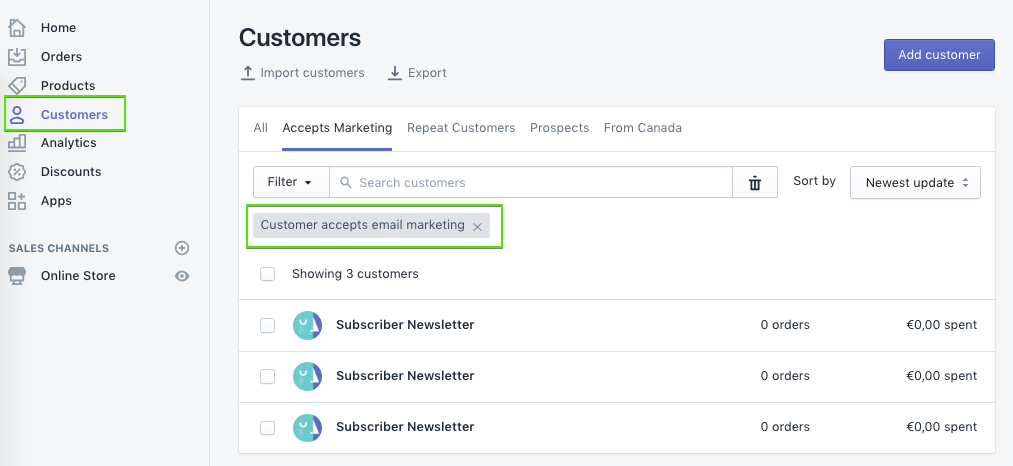
## Who owns the list (Blockshop)
- **Show a form on the storefront**: theme (the places below)
- **Store the address**: Shopify Customers
- **Send campaigns / sync to Mailchimp or Klaviyo**: an email app or integration
Blockshop can show a signup form in several places. You do not need all of them.
## Newsletter section (Blockshop)
**Edit theme** → **Add section** → **Newsletter**.
Add it to any template. Heading, description, and the form are blocks: **Overline**, **Heading**, **Description**, and **Newsletter form**. Optional image and **Custom liquid** (for an app embed) are on the section too.
## Image with text overlay (Blockshop)
**Edit theme** → **Image with text overlay** → **Add block** → **Newsletter form**.
Use this when the form should sit on a campaign image with the other overlay blocks (heading, description, buttons). The block has no heading of its own.
## Footer (Blockshop)
**Edit theme** → **Footer** → **Subscribe** block.
Heading, blurb, **Button text**, **Button style**, and **Show social icons** are on that block. Leave **Button text** blank for an arrow.
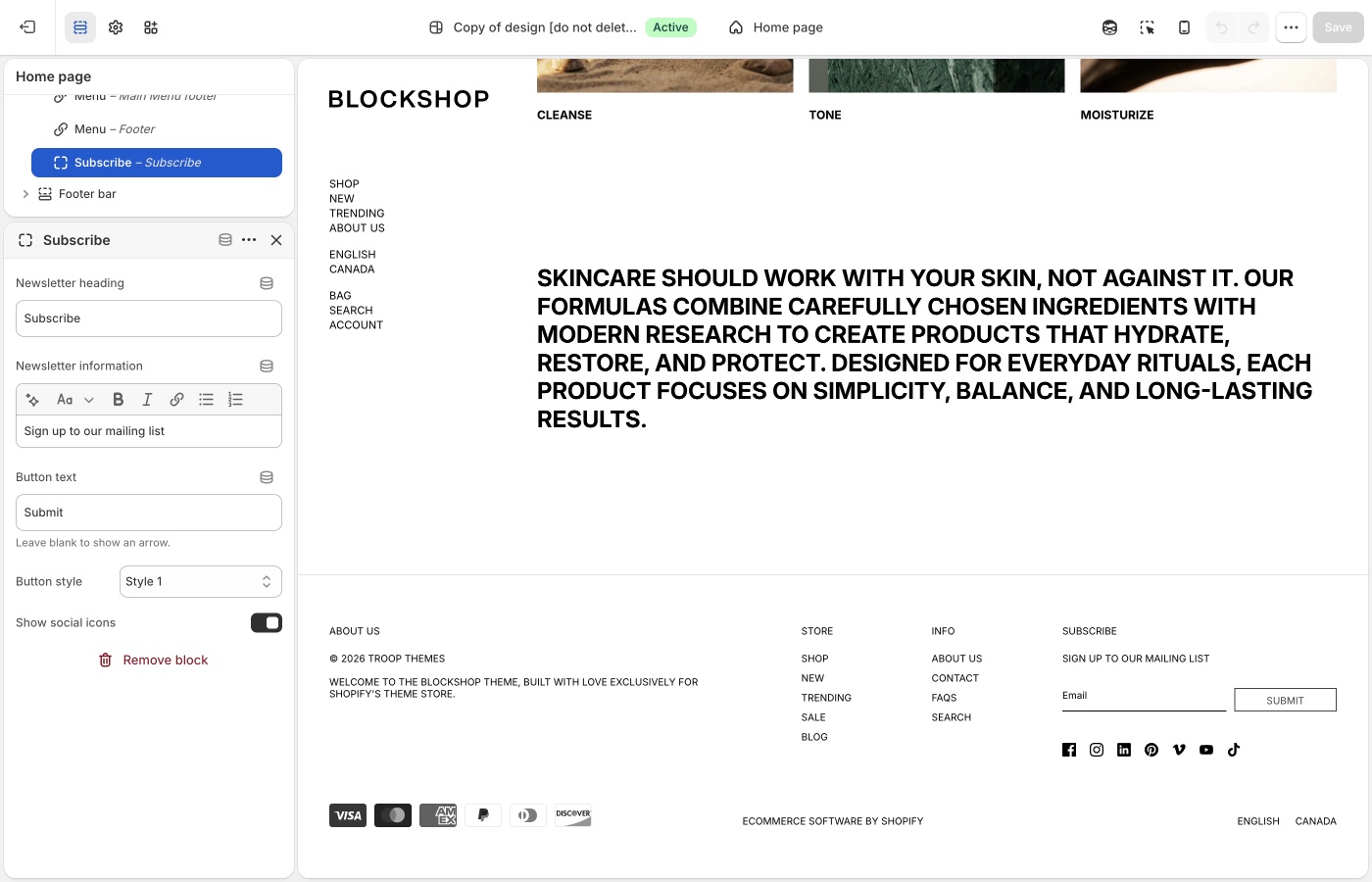
The Email placeholder is [default theme content](https://support.troopthemes.com/guide/blockshop/change-default-text/), search **mailing**.
## Footer bar (Blockshop)
**Edit theme** → **Footer bar** → add a **Subscribe form** block (one only).
This is a compact form in the bar under the footer, not the Subscribe column. It has **Button style** only. Default demos do not include it.
## Popup (Blockshop)
**Edit theme** → **Popups** → **Add block** → **Newsletter (small)** or **Newsletter (large)**. If the block is already in the section, click the eye icon to show it.
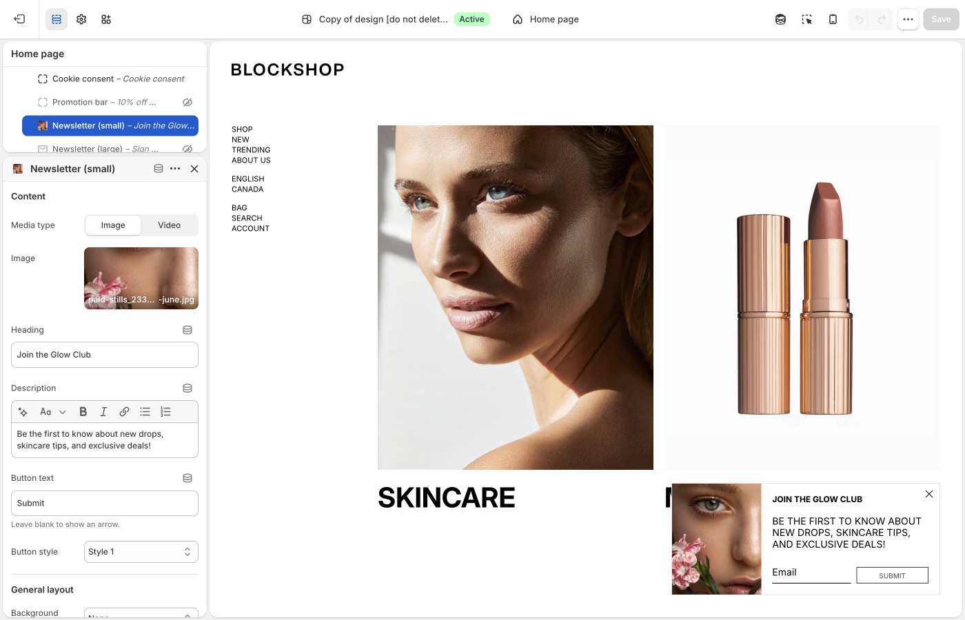
**Newsletter (small)** sits in a corner; **Newsletter (large)** is a centered overlay. Heading, description, **Button text**, and **Button style** are on the block. Leave **Button text** blank for an arrow.
Popup timing and frequency: [Configuring the popup](https://support.troopthemes.com/guide/blockshop/configuring-the-popup/).
## Password page (Blockshop)
**Edit theme**, open the **password** template → **Password page** → **Show form** and **Heading**.
## Connect with Mailchimp (Blockshop)
The theme only writes addresses to Shopify **Customers**. To get them into Mailchimp, install Mailchimp’s [Mailchimp for Shopify](https://apps.shopify.com/mailchimp) app and connect your audience.
See Mailchimp’s [connect Shopify](https://mailchimp.com/help/connect-shopify/) guide.
[Zapier](https://zapier.com/apps/mailchimp/integrations/shopify) is another option if you need a custom workflow.
## Ask Sidekick (Blockshop)
Open [Sidekick](https://help.shopify.com/en/manual/shopify-admin/productivity-tools/sidekick) from the theme editor toolbar (top right, next to the device preview icon), or press `⌘.` (`Ctrl+.` on Windows). It can draft the heading and blurb for your signup form, give it your brand and what subscribers get.
> "Write a short, warm newsletter blurb offering 10% off the first order."
It can also draft the welcome or campaign email itself if you're sending through Shopify Email.

## Troubleshooting (Blockshop)
- **No email in Customers**: the form may be an **app** form (Klaviyo, etc.), not the theme form. Check **Edit theme** → **App embeds**. App forms do not always create a Shopify customer.
- **Theme form works, Mailchimp is empty**: expected until you connect an integration. The theme only writes to Shopify Customers.
- **Popup never appears**: the **Popups** section must have a newsletter block that is not hidden; frequency may have already fired for that browser. Test in a private window. See [Configuring the popup](https://support.troopthemes.com/guide/blockshop/configuring-the-popup/).
- **Email placeholder didn’t change**: that string is [default theme content](https://support.troopthemes.com/guide/blockshop/change-default-text/). Search **mailing**.
- **Double forms**: a Newsletter section *and* an app embed *and* the popup (and footer, if you use it). Turn off the ones you do not want.
- **You added Subscribe form to Footer bar**: that is the compact bar form, not the footer column. Column signup is **Footer** → **Subscribe**.
---
title: Configure country, currency, and language selectors
url: https://support.troopthemes.com/guide/blockshop/configure-country-currency-selectors/
theme: Blockshop
theme_styles: Radiance, Stone, Valla
---
# Configure country, currency, and language selectors in Blockshop
Country, currency, and language selectors are Shopify Markets and Languages (and Shopify Payments), not a Troop currency converter or translator. The theme only **shows** a selector once Markets and/or Languages are set up.
Set up Shopify **Settings** → **Markets** (for country/currency) and **Settings** → **Languages** (for language) first. Then turn on **Show country/region selector** and/or **Show language selector** in the places below.
A selector only appears once Shopify has more than one country, currency, or language published.
Admin prices stay in store currency. Payment methods and rounding are Shopify settings. Translating your product and page content is a separate job, see [Translating your store](#translating-your-store) below.
Refer to Shopify’s [selling in multiple currencies](https://help.shopify.com/en/manual/markets/customizations/local-currencies) guide.
## Header (Blockshop)
**Edit theme** → **Header** → **Show country/region selector** and **Show language selector**.
On the **sidebar** header layout, selectors sit in the left sidebar with the menu. On other layouts they sit in the header bar on desktop. On phones they move into the menu.
## Announcement (Blockshop)
**Edit theme** → **Announcement** → **Show country/region selector** and **Show language selector**.
On desktop they sit on the right of the bar. On phones they move into the menu.
## Footer bar (Blockshop)
**Edit theme** → **Footer bar** → add a **Localization** block (one only). On that block, enable **Show country/region selector** and **Show language selector**.
The Footer bar also holds payment icons, social icons, Powered by, text, logo, menu, and subscribe form blocks, maximum three blocks.
## Translating your store (Blockshop)
Storefront language is Shopify Translate & Adapt (or a translation app) plus [Edit default theme content](https://support.troopthemes.com/guide/blockshop/change-default-text/) for theme chrome. The theme ships language files; it does not translate your products.
Shopify **Settings** → **Languages** for the languages themselves; Translate & Adapt (or an app) for product and page content; **Edit default theme content** for “Add to cart” and similar theme strings.
Checkout language is separate (Shopify checkout / Markets), and is not controlled by the theme. Typography is fonts, not language.
Refer to Shopify’s [localization and translation](https://help.shopify.com/en/manual/international/localization-and-translation) and [Translate & Adapt](https://help.shopify.com/en/manual/international/translate-adapt-app) guides.
## Troubleshooting (Blockshop)
- **No selector**: a second country, currency, or language is not published in Markets/Languages, or **Show country/region selector** / **Show language selector** is off on that section.
- **Selector shows but prices don’t change**: Shopify Payments and Markets must be configured. The theme cannot convert currency by itself.
- **You still have an old currency-app widget**: disable that app embed; it will fight the native selector.
- **Products still show the default language**: translate products and pages in Translate & Adapt (or your app). Default theme content only covers theme chrome, not product data.
- **Checkout is still the default language**: expected. Checkout language is translated in Shopify, not Theme settings.
- **A translation app overwrote your wording**: the app owns storefront language once installed. Edit there, or disable the app embed to test. See [changing default theme text](https://support.troopthemes.com/guide/blockshop/change-default-text/).
---
title: Cart
url: https://support.troopthemes.com/guide/blockshop/cart/
theme: Blockshop
theme_styles: Radiance, Stone, Valla
---
# Cart in Blockshop
**Edit theme** → **Theme settings** → **Cart**.
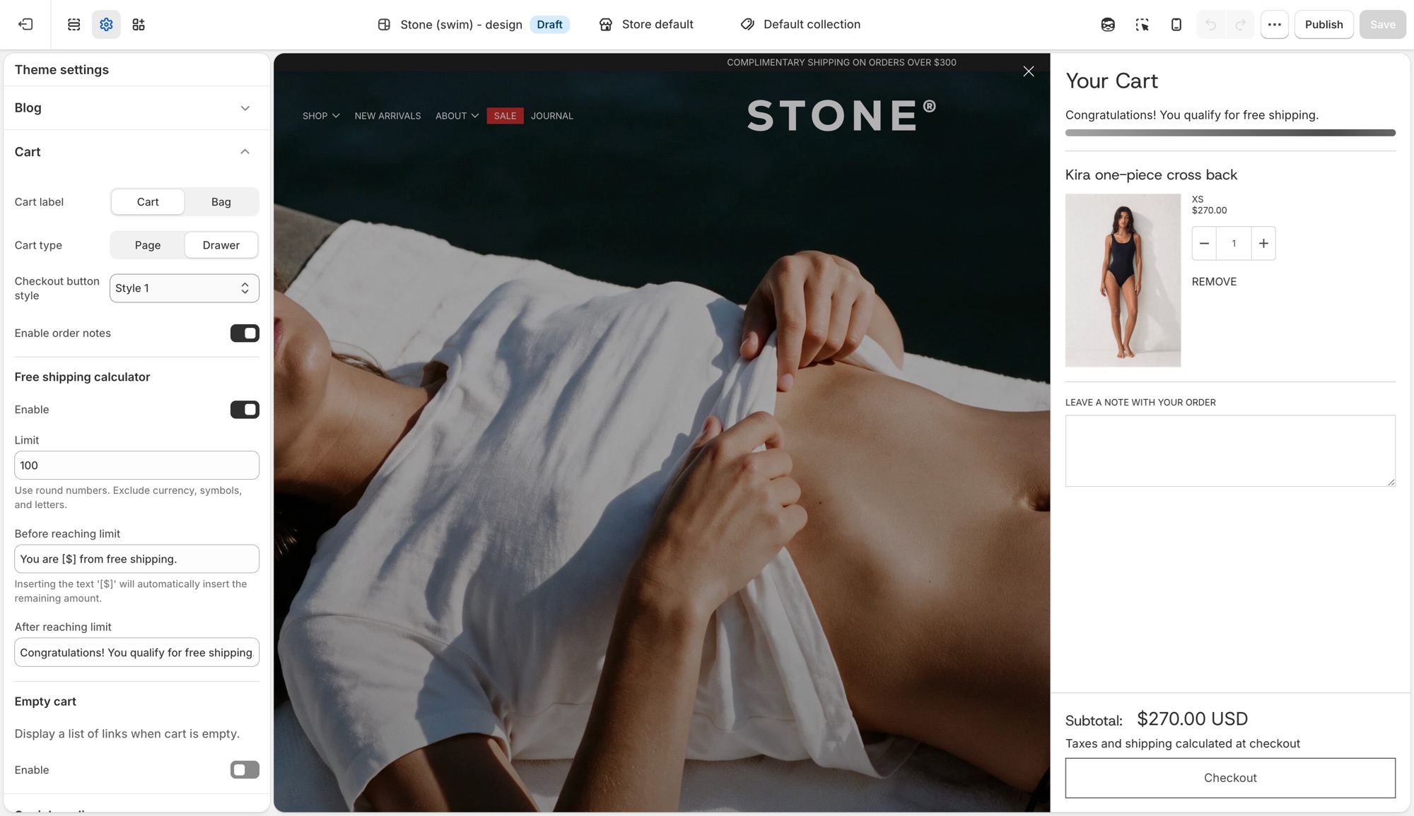
## Theme settings → Cart (Blockshop)
- **Cart label**: **Cart** or **Bag**, the icon and wording used for the cart trigger throughout the theme.
- **Cart type**: **Page** sends customers to a dedicated cart page. **Drawer** opens the cart in a slide-out panel without leaving the page.
- **Checkout button style**: pick from your four button styles ([Buttons, inputs, and links](https://support.troopthemes.com/guide/blockshop/buttons-inputs-and-links/)) for the cart's checkout button specifically.
- **Enable order notes**: adds a note field to the cart so customers can leave instructions. See Shopify's [order notes](https://help.shopify.com/en/manual/online-store/themes/customizing-themes/common-customizations/add-order-notes) guide for how this differs from cart attributes and line item properties.
### Free shipping calculator (Blockshop)
- **Enable**: turns the progress message on or off.
- **Limit**: the order subtotal that qualifies for free shipping. Numbers only, no currency symbol.
- **Before reaching limit**: message shown while under the limit. Insert `[$]` to show the remaining amount automatically.
- **After reaching limit**: message shown once the customer qualifies.
This calculator is a message only, it does not create or apply a shipping discount. Set up the matching rate in **Settings** → **Shipping and delivery**; see Shopify's [setting up shipping rates](https://help.shopify.com/en/manual/fulfillment/setup/shipping-rates/setting-up-shipping-rates) guide for how to configure a free-shipping rate that actually applies at checkout.
### Empty cart (Blockshop)
- **Enable**: shows a list of links when the cart has nothing in it.
- **Custom link list**: which menu to show. Dropdown items in that menu do not appear, top-level links only.
## Troubleshooting (Blockshop)
- **Cart opens as a drawer when I wanted a page (or the reverse)**: **Cart type** in **Theme settings** → **Cart**.
- **Free shipping message shows the wrong amount, or shows for everyone**: check **Limit**. It is a plain number, no currency symbol or letters.
- **Customers reached the limit but nothing changed at checkout**: this is expected. The free shipping bar is a message only. Create the actual free shipping rate in **Settings** → **Shipping and delivery**.
- **Empty cart shows the wrong links**: the assigned menu has the wrong links, or has dropdown items that are not appearing (expected, only top-level links show).
- **Checkout is unchanged**: expected. Checkout is not the theme.
---
title: Add custom CSS or edit template code
url: https://support.troopthemes.com/guide/blockshop/adding-css-editing-template-code/
theme: Blockshop
theme_styles: Radiance, Stone, Valla
---
# Add custom CSS or edit template code in Blockshop
Use **Theme settings** → **Custom CSS** (the whole store) or a section's own **Custom CSS** field (just that section) for one-off exceptions the settings do not cover. Do not start here for colors, type, spacing, or buttons, those have Theme settings.
Checkout is unchanged, custom CSS does not apply there. Prefer settings over CSS; prefer CSS over editing Liquid.
> **Before you begin**
>
> Modifying theme code in the template editor requires some basic knowledge of CSS, HTML and Liquid so be sure you're comfortable with those areas before attempting any.
>
> Check out Shopify's [guide to editing theme code](https://help.shopify.com/en/manual/online-store/themes/customizing-themes/edit-code).
>
> Visit [W3Schools](https://www.w3schools.com/Css/) for a quick CSS tutorial.
>
> Support can point you to the right field, but debugging your own CSS or Liquid is outside [what we can help with](https://support.troopthemes.com/submit-a-support-ticket/).
> **Create a backup**
>
> We recommend making your customizations on an unpublished version. Go to **Actions** → **Duplicate** first.
## Adding CSS to the whole store (Blockshop)
**Edit theme** → **Theme settings** → **Custom CSS** → add your code → **Save**.
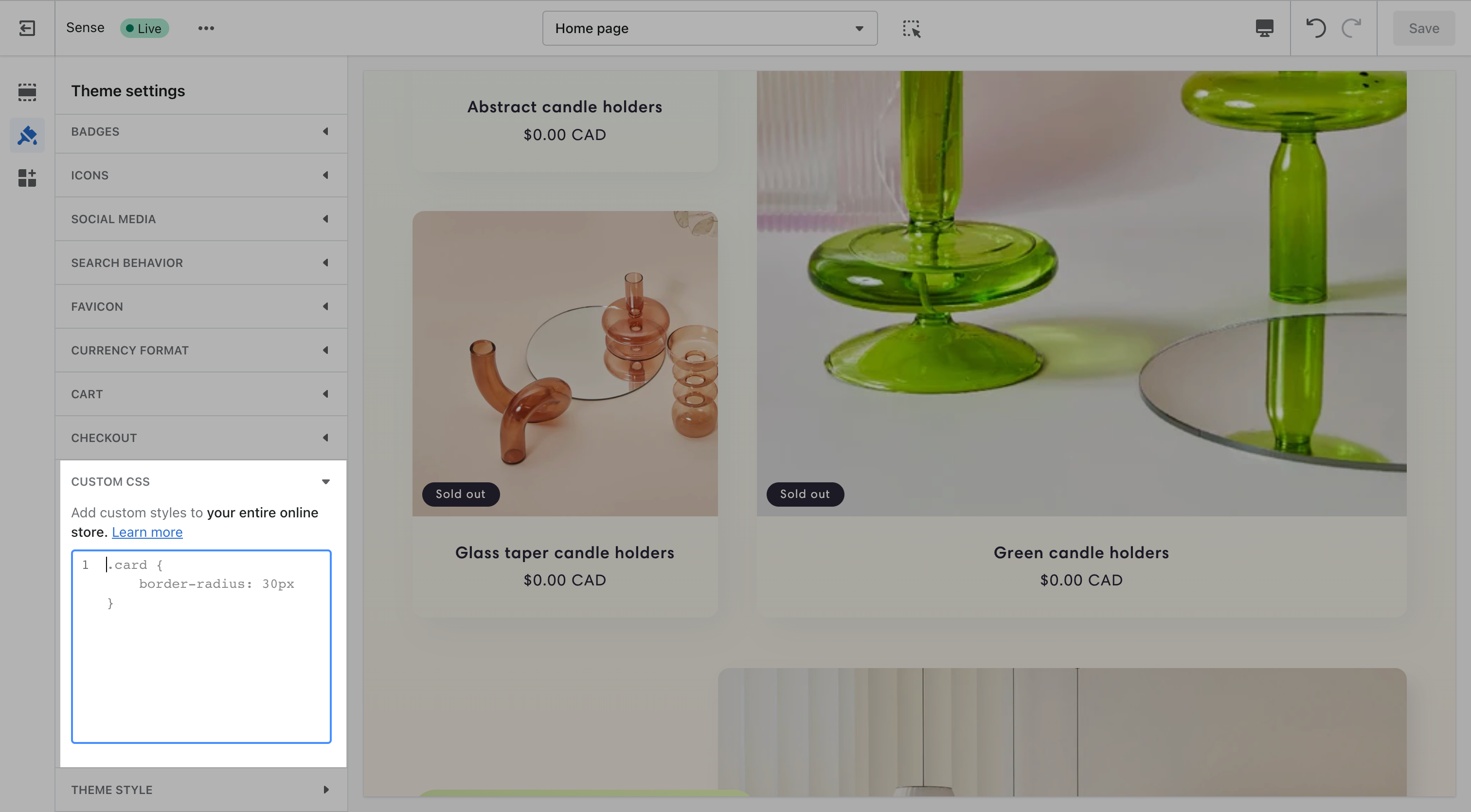
This applies everywhere on the storefront and is capped at 1,500 characters. If a change only needs to apply to one section, add it there instead, see below.
## Adding CSS to one section (Blockshop)
Select the section → scroll to the bottom of its settings panel → **Custom CSS** → add your code → **Save**.
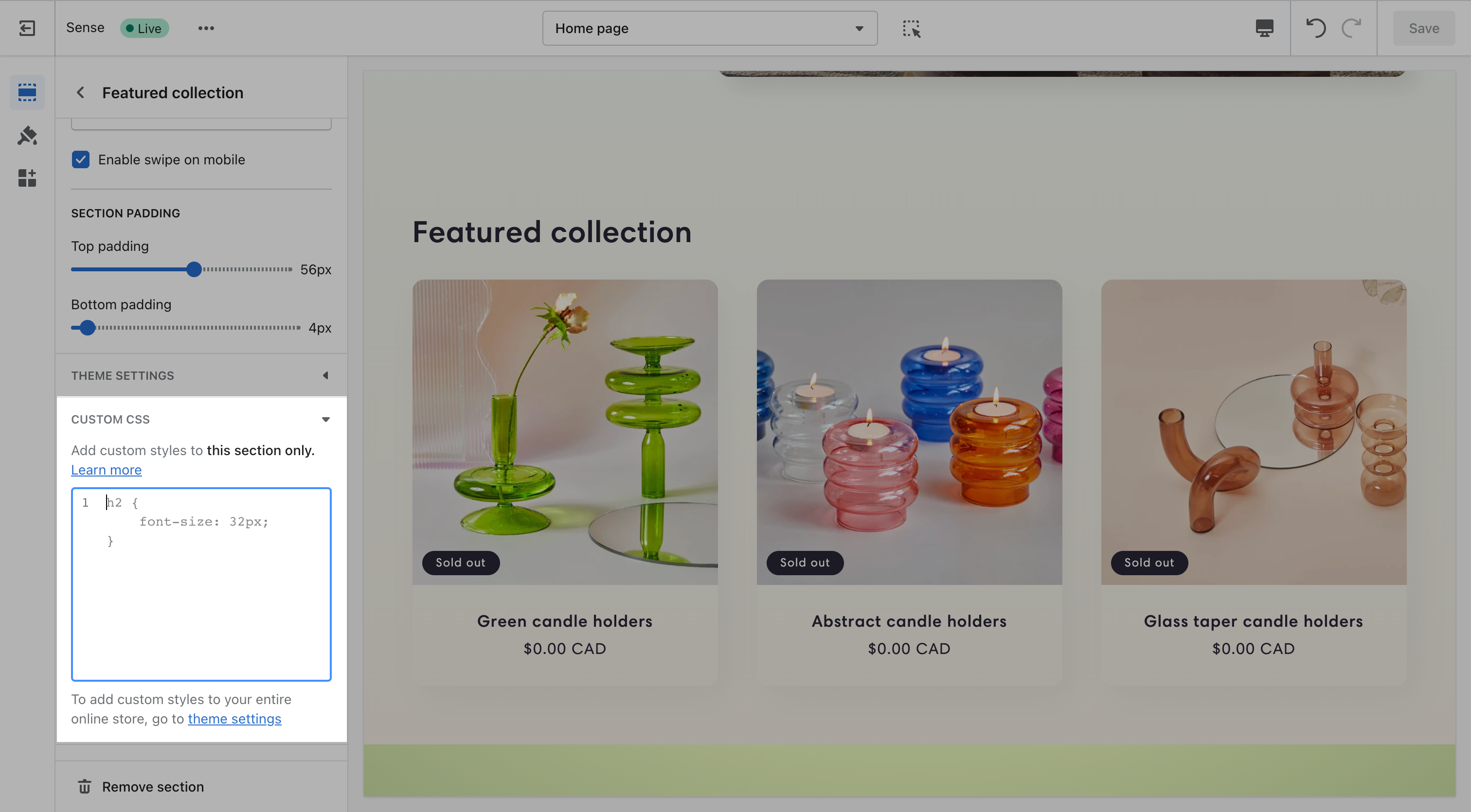
This applies to that section only, and is capped at 500 characters. Only the `@media`, `@container`, `@layer`, and `@supports` at-rules are allowed here.
## What custom CSS can't do (Blockshop)
- No `@import`, `@charset`, or `@namespace`, at either the theme or section level.
- No `content` property.
- Can't target the `shopify-section` wrapper element.
- Any URL you reference has to be on `https://cdn.shopify.com`.
- Custom CSS overrides your theme's built-in settings, it always wins, so a Theme setting and a Custom CSS rule that disagree will show the CSS.
- Not supported on the checkout page.
- Updating your theme can break selectors your CSS depends on, recheck custom CSS after an update.
## Advanced: editing CSS directly in template code (Blockshop)
These two options require editing Liquid files in the code editor, not just filling in a settings field. They're for merchants and developers comfortable working in the theme's code.
### custom-styles.liquid (Blockshop)
Every theme ships an empty `custom-styles.liquid` snippet in _Snippets_, rendered as a plain `
```
Click **Save** in the theme editor to apply the changes.
### Option 2: Use a URL to a hosted font (Maker)
Use this option when the font file is on a server or CDN and you have a direct `https://` link to the file.
In the **Custom liquid** section, paste the following code. Set `custom_font_family` to your font’s name, and set `custom_font_url` to the full address of the file (for example, `https://example.com/fonts/custom-font.woff2`).
```liquid
{%- liquid
assign custom_font_family = 'Merchant Custom Sans'
assign custom_font_fallback = 'sans-serif'
assign custom_font_url = 'https://example.com/fonts/custom-font.woff2'
-%}
```
Click **Save** in the theme editor to apply the changes.
### Option 3: Use Google Fonts (Maker)
On [Google Fonts](https://fonts.google.com/), pick a font, open **Get embed code**, and copy the stylesheet link. The link has the format `https://fonts.googleapis.com/css2?family=...&display=swap`.

In the **Custom liquid** section, paste the following code. Set `custom_font_url` to the stylesheet link, and set `custom_font_family` to the font’s name as Google Fonts shows it. The example uses the font Oi.
```liquid
{%- liquid
assign custom_font_family = 'Oi'
assign custom_font_fallback = 'sans-serif'
assign custom_font_url = 'https://fonts.googleapis.com/css2?family=Oi&display=swap'
-%}
```
Click **Save** in the theme editor to apply the changes.
### Deprecated fonts in Shopify’s library (Maker)
Shopify sometimes deprecates fonts in its font library. A deprecated font can disappear from the font picker in **Theme settings** → **Typography** or stop loading as before. See [Deprecated fonts](https://shopify.dev/docs/storefronts/themes/architecture/settings/fonts#deprecated-fonts) in Shopify’s font documentation for the affected typefaces.
To replace a deprecated font, pick another font from the current library in **Theme settings** → **Typography**. To keep the same typeface, load it as a custom font with one of the options above.
## Ask Sidekick (Maker)
Open [Sidekick](https://help.shopify.com/en/manual/shopify-admin/productivity-tools/sidekick) from the theme editor toolbar (top right, next to the device preview icon), or press `⌘.` (`Ctrl+.` on Windows). Ask it for a font pairing that fits your brand.
> "Suggest a Heading font and Paragraph font pairing for a handmade, craft-forward brand, keeping in mind Maker's borders are already a strong visual element."
It previews the pairing before you apply anything to Theme settings → Typography, faster than comparing font libraries by hand. If you're deciding whether a custom font is worth adding at all, it's also a reasonable place to ask.

## Troubleshooting (Maker)
- **Overlay titles are huge**: lower **Block heading**, not Banner heading. Cards use the block role.
- **Overlay titles are not readable on pale photos**: raise **Image darkness**, switch titles to **Below** in [Product grid](https://support.troopthemes.com/guide/maker/product-grid/), or strengthen the hover pane. Do not rely on hover alone; touch devices have no hover.
- **A header label is the wrong words**: [default theme content](https://support.troopthemes.com/guide/maker/change-default-text/), not Typography.
- **Custom font did nothing**: the **Custom liquid** section must be first in the header group, with all spacing set to **None**. See [Custom fonts](#custom-fonts).
- **Custom font only changed some text**: the snippet sets the heading, navigation, and paragraph font variables together. Remove the `:root` lines for the roles you do not want to change.
- **Custom font file returns a 404**: `custom_font_file` must match the file name in **Content** → **Files** exactly, including the extension.
- **Checkout font is unchanged**: this is expected. Custom fonts do not apply to checkout.
---
title: Changing default theme text
url: https://support.troopthemes.com/guide/maker/change-default-text/
theme: Maker
theme_styles: Bloom
---
# Changing default theme text in Maker
If you cannot edit the wording in a section setting (a heading or button label you typed yourself), it is usually **default theme content**: “Add to cart”, “Sold out”, form placeholders, cart empty-state messages, and other built-in storefront wording.
**Online Store** → **Themes** → **…** → **Edit default theme content** (Languages).

Product titles (**Products**), page bodies, blog bodies (**Content** → **Blog posts**), menu labels (**Content** → **Menus**), and checkout wording are edited elsewhere, not here.
> **Info**
>
> Visit Shopify's help centre for an extensive guide on [changing the wording in themes](https://help.shopify.com/en/manual/online-store/themes/customizing-themes/language).
## Which editor? (Maker)
### Edit theme (a section) (Maker)
For headings, overlay text, newsletter headlines, and other copy you added to a section: open that section in **Edit theme**.
### Edit default theme content (Maker)
For built-in storefront wording, “Add to cart”, “Sold out”, “Size chart”, form errors: **Edit theme** → **…** → **Edit default theme content**.
### Shopify admin (Maker)
- Product titles, descriptions, variant names: **Products**
- Menu item names: **Content** → **Menus**
- Blog post bodies: **Content** → **Blog posts**
- A whole About page: Online Store → **Pages**
### Checkout (Maker)
“Pay now” and other checkout labels: Shopify checkout / Markets language, not the theme.
Search in default theme content for the exact words you see on the storefront. If search finds nothing, you are in the wrong place (section setting or admin).
## Ask Sidekick (Maker)
Open [Sidekick](https://help.shopify.com/en/manual/shopify-admin/productivity-tools/sidekick) from the icon in your Shopify admin, then ask it to rewrite a batch of default theme content in your brand's voice, useful if it reads too formal, too casual, or just generic.
> "Make these button and form labels warmer and more casual: [paste your list]."
You still paste the results into **Edit default theme content** yourself, Sidekick doesn't edit theme content directly.
## Troubleshooting (Maker)
- **You changed a section heading and the button still says Add to cart**: that button is default theme content, not the section.
- **You changed default theme content and a product title didn’t move**: product titles are in Products.
- **A translation app overwrote your wording**: the app owns storefront language. Edit there, or disable the app embed to test.
- **Checkout is unchanged**: expected. See "Translating your store" in your theme's [country, currency, and language selectors guide](https://support.troopthemes.com/guide/troubleshooting/#store) for storefront vs checkout.
---
title: Spacing and layout
url: https://support.troopthemes.com/guide/maker/spacing-and-layout/
theme: Maker
theme_styles: Bloom
---
# Spacing and layout in Maker
**Edit theme** → **Theme settings** → **Layout**.
One panel sets both the border and the spacing scale for the whole store:
- **Border color** and **Border thickness** draw the stroke around every section and block.
- **Desktop spacing** and **Mobile spacing** define what Small, Medium, and Large mean storewide.
- On each section, **Spacing above** and **Spacing below** dropdowns pick from that scale: None, Small, Medium, or Large.
Changing a size in Layout updates every section that uses it.
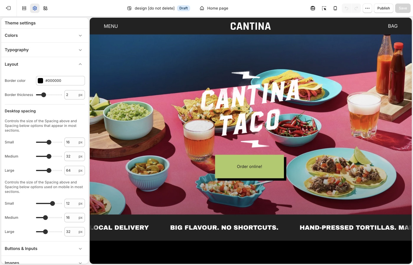
Spacing is the padding above and below a section; the border is the line between them, and often does the gutter's job already.
## Theme settings → Layout (Maker)
### Border color and thickness (Maker)
**Border color** is the stroke for the grid: section edges, many block divides, and the lines that make Maker look like a poster or catalog. Match it to **Text** for a structured, editorial store, or to an [accent](https://support.troopthemes.com/guide/maker/colors/) for a louder brand. A pale gray stroke recedes; a black stroke is the default Maker attitude.
**Border thickness** runs from 1px to 5px.
- 1px: fine, almost hairline; more type, less frame
- 2–3px: the usual Maker voice
- 4–5px: graphic, poster-like; pair with simpler photography
> **Maker's border-and-grid identity**
>
> This pair of settings creates Maker's identity: the same stroke frames every section and block, storewide, for a poster-and-catalog look. Set it first, then tune spacing. Change the Layout border, not each section. Override a section's own border only when it should break the system on purpose, like a full-bleed film still or a newsletter.
### Small, Medium, Large (Maker)
**Desktop spacing** and **Mobile spacing** each set Small, Medium, and Large.
Those values are what the **Spacing above** and **Spacing below** dropdowns use on most sections. Set Large once in Layout; every section whose dropdown is set to Large uses that size.
Because the border grid already separates blocks, Maker usually needs less vertical padding than a more open theme. Thick borders plus Large spacing can appear over-padded, while thick borders plus Small spacing makes a tight modular grid. Start with the listing's defaults. Increase Large if sections feel glued together; decrease it if the page feels stacked with empty bands.
### Desktop and mobile (Maker)
**Mobile spacing** is independent of desktop. Keep mobile values smaller than desktop. Preview both after you change Layout.
Reuse the same **Spacing above** / **Spacing below** dropdown on adjacent sections: Medium throughout the shop, or Large on a hero and Medium on what follows. Use **None** when two sections should sit flush. Add a **Divider** when you need a gap with no content. Keep mobile spacing smaller than desktop, and preview both after you change the scale in Layout.
## On each section (Maker)
Choose **None**, **Small**, **Medium**, or **Large** from the section **Spacing above** / **Spacing below** dropdowns. Use **None** when two sections should share a border edge-to-edge.
Many Maker sections can also show or hide their own block borders, and some include a section border, independent of the global Layout stroke. Use them consistently: either the homepage is a continuous grid, or only product areas are. Mixing borderless full-bleed photos with a heavy grid on the next section is a valid contrast when it is deliberate, not accidental.
A **Divider** section adds a break without fake empty content.
## Ask Sidekick (Maker)
Open [Sidekick](https://help.shopify.com/en/manual/shopify-admin/productivity-tools/sidekick) from the theme editor toolbar (top right, next to the device preview icon), or press `⌘.` (`Ctrl+.` on Windows). Corner radius, border weight, and spacing are small settings with an outsized effect on how "soft" or "sharp" a store appears, and on whether the grid appears open or tight. If your pages appear cramped or you cannot tell which setting is responsible, describe the problem.
> "My sections feel glued together on mobile. What Desktop spacing and Mobile spacing values should I use for Small, Medium, and Large? Should Border thickness change too?"
It can point you toward the relevant spacing and border settings and suggest values, rather than you adjusting sliders section by section to find the right combination.

## Troubleshooting (Maker)
- **One section didn't move**: change **Spacing above** / **Spacing below** on that section. Layout only defines the scale.
- **The page feels padded twice**: lower Large spacing, or thin **Border thickness**; thick border plus Large spacing fights itself.
- **You need a gap with no content**: add a **Divider**. Do not add an empty Rich text section.
- **Lines look doubled**: a section is showing block borders *and* the global stroke is thick. Hide block borders on that section, or lower **Border thickness**.
- **A hero has no line**: that section likely has borders turned off. Turn them back on, or leave them off on purpose for a full-bleed break.
- **You wanted drop shadows instead**: that's set per card, not storewide. Use card **Drop shadow color** in [Product grid](https://support.troopthemes.com/guide/maker/product-grid/).
---
title: Alignment and width
url: https://support.troopthemes.com/guide/maker/alignment-and-width/
theme: Maker
theme_styles: Bloom
---
# Alignment and width in Maker
Open a section in **Edit theme**, not **Theme settings**.
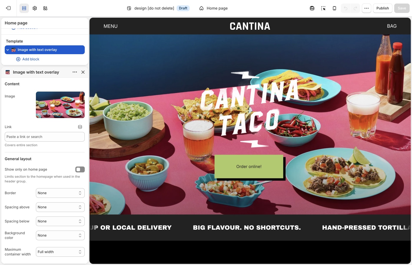
Pick a default **Text alignment** per template and keep supporting sections on it: **left** for catalogs and long copy, **center** for heroes and short announcements, then back to your default. **Mobile text alignment** is separate.
**Maximum container width** is on each section: contained for text-heavy blocks, **Full width** for slideshows and large photography. A useful rhythm is full-width hero → contained story → full-width collection.
## Text alignment (Maker)
Left, center, or right on desktop, with a mobile override.
Maker product titles can sit **on** the image ([Product grid](https://support.troopthemes.com/guide/maker/product-grid/)). Overlay titles are often centered or bottom-aligned in the card; page headings above a grid usually read better **left** so they share an edge with the border system.
Pick one page habit. A centered hero is fine; centered section titles above a left-edge grid look unmoored.
## Maximum container width (Maker)
Extra small through Full width. Full width lets the border grid run wall to wall, the Maker default. Contained widths inset the whole frame, which resembles a poster inside a margin.
Use Full width for grids, split banners, and collection pages. Use a contained width for long reading (about, FAQ) so lines do not span the monitor.
## Mobile (Maker)
On a phone the grid stacks. **Mobile text alignment** is the control that matters there. Center short banners; keep product and collection titles consistent with the card setting.
> **Follow the border**
>
> If a section shows block borders, align text to the same side the border emphasizes. Left text on a left-bound grid is the least surprising choice.
## Product grid (Maker)
**Title position** (overlay vs below) is in **Theme settings** → **Product grid**, not the section.
## Ask Sidekick (Maker)
Open [Sidekick](https://help.shopify.com/en/manual/shopify-admin/productivity-tools/sidekick) from the theme editor toolbar (top right, next to the device preview icon), or press `⌘.` (`Ctrl+.` on Windows). Alignment and width choices are easy to second-guess in isolation, ask it how a layout choice reads.
> "Should my section titles be left-aligned to share an edge with the border grid, and does Full width or a contained Maximum container width fit a handmade goods store?"
It'll reason through the trade-off with you rather than you flipping the setting back and forth to compare.

## Troubleshooting (Maker)
- **Cards didn’t follow the section**: overlay vs below and card hover are [Product grid](https://support.troopthemes.com/guide/maker/product-grid/).
- **A split banner looks inset**: set **Maximum container width** to Full width on that section.
- **Mobile is centered, desktop is left**: set **Mobile text alignment** as well as desktop.
---
title: Buttons and inputs
url: https://support.troopthemes.com/guide/maker/buttons-and-inputs/
theme: Maker
theme_styles: Bloom
---
# Buttons and inputs in Maker
Buttons work in two steps: In **Edit theme** → **Theme settings** → **Buttons & Inputs**, styles 1 through 4 define how buttons look storewide, each with its own **Shadow** for depth. On each section, the **Button** block picks style 1–4. Changing a style in Theme settings updates every button that uses it.
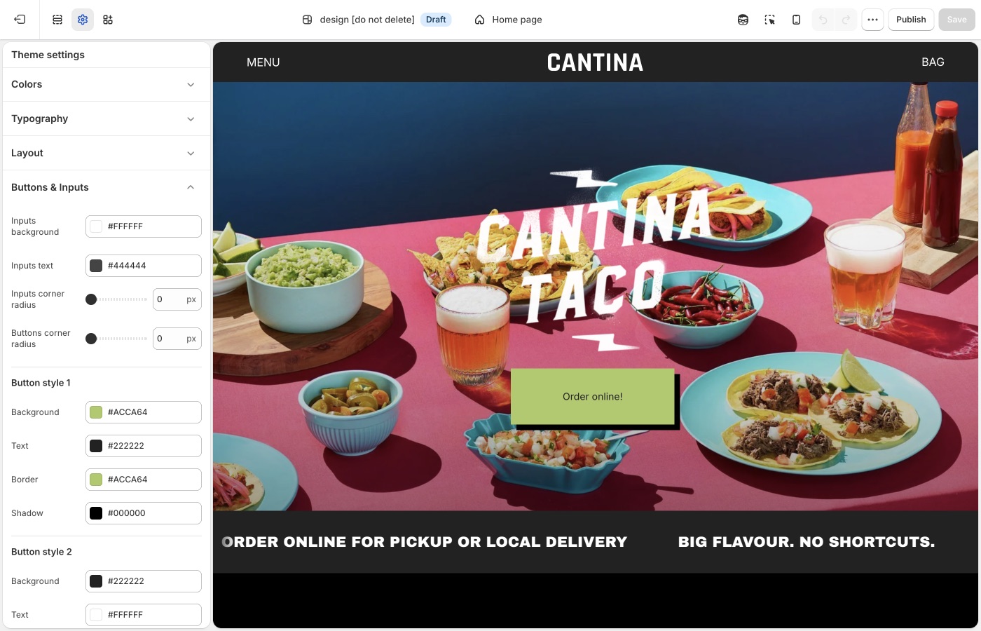
## Theme settings → Buttons & Inputs (Maker)
### Four button styles (Maker)
Each style has **Background**, **Text**, **Border**, and **Shadow**.
- **Style 1**: primary (Add to cart, Shop): solid fill
- **Style 2**: secondary on light backgrounds
- **Style 3**: outline on light surfaces
- **Style 4**: light outline or ghost on dark / image backgrounds
Assign the style on the button block in the section. Keep the primary action on style 1 everywhere.
Set **Shadow** to transparent (or the same as the page) if you want a flush button without depth. A visible shadow adds depth, which can match a thick [border grid](https://support.troopthemes.com/guide/maker/spacing-and-layout/#border-color-and-thickness).
**Buttons corner radius**: Maker’s default is a small radius. Square buttons (0px) lock to the grid. A large radius fights the straight border system unless the brand is intentionally soft.
### Inputs (Maker)
- **Inputs corner radius**: rounds newsletter fields, contact forms, search, and cart notes
- **Inputs background**: fill color behind the field
- **Inputs text**: color of the text customers type
Match input radius to button radius so forms sit cleanly on the grid.
> **Buttons vs overlay cards**
>
> Product cards can use hover panes and overlay titles ([Product grid](https://support.troopthemes.com/guide/maker/product-grid/)). Let the card be the shoppable object; keep buttons for cart, filters, and banners so the grid does not fill with competing CTAs.
## On each section (Maker)
The **Button** block picks style 1–4 from the set you defined in **Buttons & Inputs**. Keep Add to cart and Shop on style 1 storewide. **Shadow** is set per style in Theme settings, not on the section block.
## Ask Sidekick (Maker)
Open [Sidekick](https://help.shopify.com/en/manual/shopify-admin/productivity-tools/sidekick) from the theme editor toolbar (top right, next to the device preview icon), or press `⌘.` (`Ctrl+.` on Windows). Ask it to suggest a button style, each style includes a **Shadow** setting for depth.
> "Suggest Background, Text, Border, and Shadow values for Style 1 (primary) and Style 3 (outline) that fit a handmade, grid-forward brand."
It'll reason through contrast and hierarchy with you before you touch Theme settings → Buttons & Inputs. Useful when you have four button styles to fill in and aren't sure how to differentiate them.

## Troubleshooting (Maker)
- **No hover color setting**: that is expected, Maker uses **Shadow** for button depth instead. Phones will not show a hover state anyway.
- **Add to cart didn’t change**: confirm **Buttons & Inputs**, then that the product form uses style 1.
- **Buttons look round on a squared grid**: lower **Buttons corner radius** toward 0px.
- **Checkout is unchanged**: Shopify checkout, not the theme.
---
title: Images
url: https://support.troopthemes.com/guide/maker/images/
theme: Maker
theme_styles: Bloom
---
# Images in Maker
**Edit theme** → **Theme settings** → **Images**.
Product, collection, and article crops. Overlay titles and hover panes are in [Product grid](https://support.troopthemes.com/guide/maker/product-grid/).
## Image crop (Maker)
- **Product image size**: Natural, Square, Landscape, or Portrait. This crop is for the product grid.
- **Collection image size**: collection lists and thumbnails.
- **Article image size**: blog cards.
Natural keeps each file’s own ratio. A fixed ratio makes overlay titles easier to place. Export sizes: [What image sizes should I use?](https://support.troopthemes.com/faqs/what-image-sizes-should-i-use/).
> **Shoot for the crop**
>
> Overlay titles are easier on a consistent ratio. Mixed lifestyle crops in a square grid will chop subjects. Natural is kinder to mixed photo sets.
## Ask Sidekick (Maker)
Open [Sidekick](https://help.shopify.com/en/manual/shopify-admin/productivity-tools/sidekick) from the theme editor toolbar (top right, next to the device preview icon), or press `⌘.` (`Ctrl+.` on Windows). Unsure whether Natural, Square, or Portrait crops will suit your product photography, or how consistent your existing photos actually are, describe your catalog. Maker's card titles often overlay the image, so the crop needs to leave room for type.
> "My product photos are a mix of studio shots and lifestyle images, what Product image size gives overlay titles a clear area to sit in?"
It can help you reason through the trade-off before you commit the whole store to one crop, and point you to Shopify's [image size guidance](https://support.troopthemes.com/faqs/what-image-sizes-should-i-use/) if you're about to reshoot.

## Troubleshooting (Maker)
- **Images look cropped**: **Product image size**, not a broken upload. Switch to Natural, or shoot for the ratio you chose.
---
title: Social media
url: https://support.troopthemes.com/guide/maker/social-media/
theme: Maker
theme_styles: Bloom
---
# Social media in Maker
**Edit theme** → **Theme settings** → **Social media**.
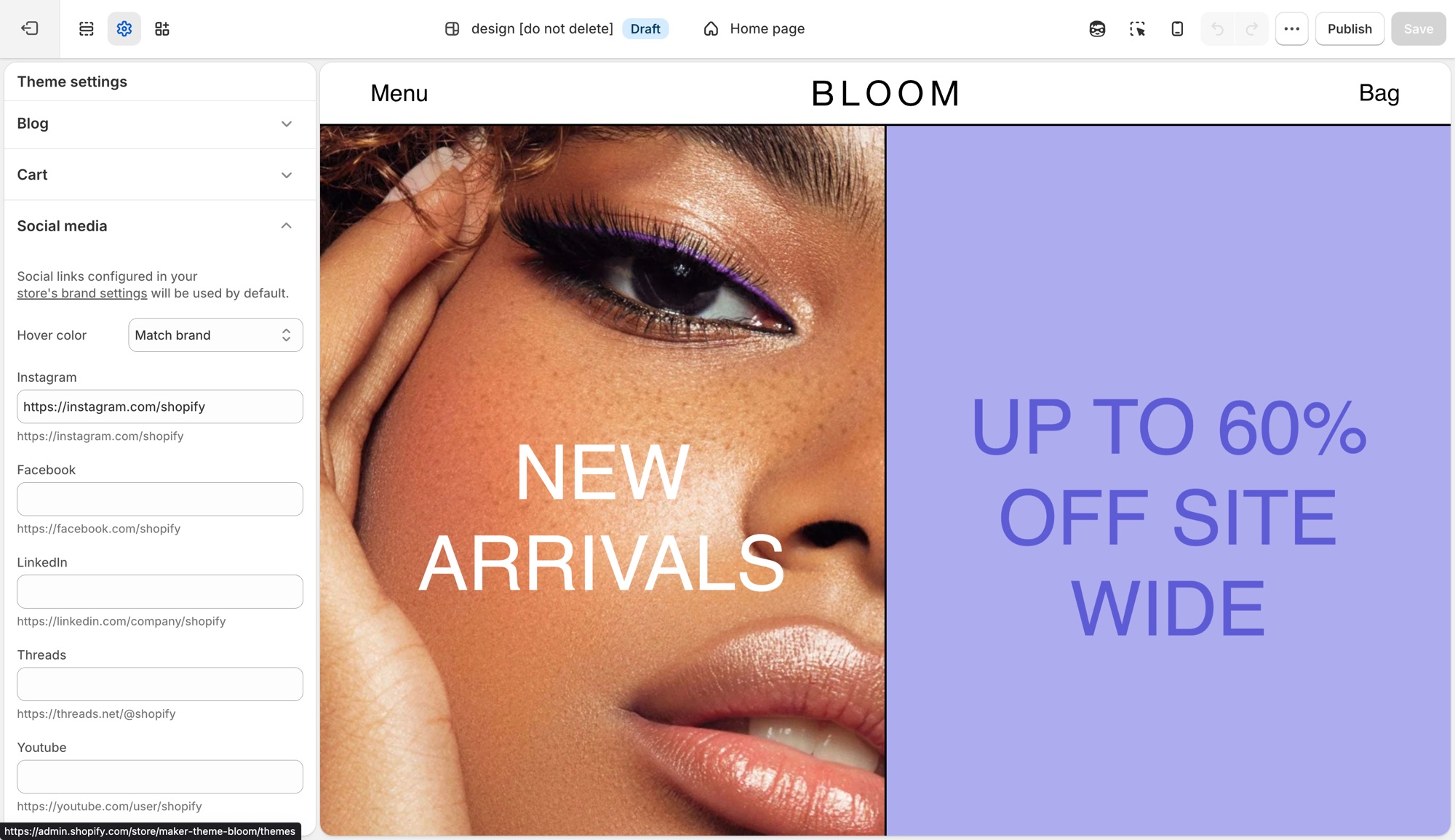
These settings control the social icons that appear in the footer, announcement bar, and other sections across the theme in one place, not per section.
## Theme settings → Social media (Maker)
- **Hover color**: **Match brand** (each platform's own color), **Opacity** (dims on hover), or **None**.
- One field per platform (Instagram, Facebook, LinkedIn, Threads, Youtube, Vimeo, Pinterest, 𝕏, TikTok, Tumblr, Snapchat, Bluesky): paste that profile's URL to show its icon.
Leave a platform blank and no icon shows for it. Sections do not need each icon toggled individually.
If you already added social links in Shopify's [brand assets](https://help.shopify.com/en/manual/promoting-marketing/managing-brand-assets) (**Settings** → **General** → **Brand assets** → **Social links**), the theme uses those by default and no further setup is needed here. A URL entered in **Theme settings** → **Social media** overrides the brand setting for that platform only. This is useful when a section-specific or seasonal account should differ from your main brand profile.
## Troubleshooting (Maker)
- **An icon is not showing**: that platform's URL field is empty here and in **Settings** → **Brand**.
- **The wrong URL is showing**: a value here always wins over **Settings** → **Brand** for that platform.
- **Icons do not change color on hover**: **Hover color** is set to **None**.
---
title: Animations
url: https://support.troopthemes.com/guide/maker/animations/
theme: Maker
theme_styles: Bloom
---
# Animations in Maker
**Edit theme** → **Theme settings** → **Animations**.
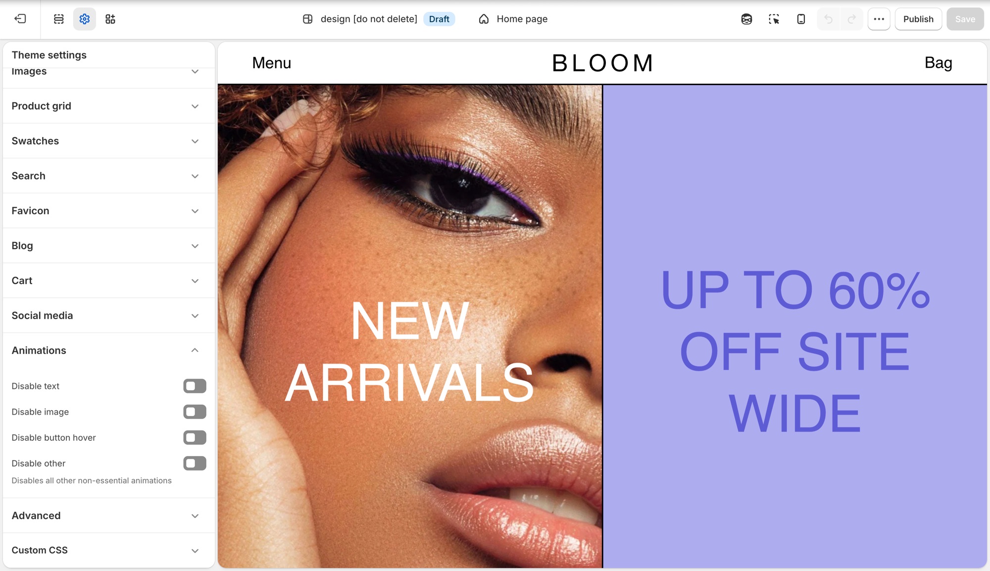
Four storewide switches, each one turns a category of motion off. There is nothing to turn on, animations ship on by default.
## Theme settings → Animations (Maker)
- **Disable text**: turns off text fade and reveal animations.
- **Disable image**: turns off image fade and reveal animations.
- **Disable button hover**: turns off button hover transitions.
- **Disable other**: turns off all other non-essential animation, a catch-all for anything the first three do not cover.
## Where each toggle applies (Maker)
- **Disable text**: the scroll-triggered fade/slide-in on headings, subheadings, text, buttons, and rich text, used in nearly every section, plus the animated stacked headline component where a section uses one.
- **Disable image**: the fade-in on section images, for example Image with text, Media with highlight, Shop the banner, Scrolling text on image, Grid with overlay, Featured collections, the collection banner, and menu images.
- **Disable button hover**: a single storewide switch. It is not checked per section, so it turns off hover transitions on every button, input, and link at once.
- **Disable other**: the widest switch, covering things that are not simple text or image reveals: product card image hover-swap and the shared transition into the product page, the cart drawer, predictive search results, dropdown/mega menus, accordions, grid reveals on collection/blog/search listing pages, and sections like Testimonials.
## Troubleshooting (Maker)
- **A section still animates after I disabled text or image**: that motion may fall under **Disable other** instead, for example a slideshow transition or a decorative loop. Turn that on too.
- **I want most animation off but kept hover effects**: leave **Disable button hover** off and enable the other three.
---
title: Section list
url: https://support.troopthemes.com/guide/maker/section-list/
theme: Maker
theme_styles: Bloom
---
# Sections in Maker
**Edit theme** → **Add section**. Names in the editor match this list. Do not pick a section because the name sounds close; each one does a different job.
- **Two panels (media + text) as a drawn split**: use **Split banner**. Not **Image with text overlay** (that sits type on one photo).
- **Copy under a photo**: use **Image with text** and stack on mobile.
- **Trust marks**: use **Icons row**.
- **Bookings you handle yourself**: use **Contact form**.
For how to place image layouts, see [Designing with image sections](https://support.troopthemes.com/guide/maker/image-sections/).
## Which section for this goal? (Maker)
Each row names the section to use for a goal and a similar section that does a different job.
| Goal | Use | Do not use |
| --- | --- | --- |
| One static hero with text on the photo | **Image with text overlay** | **Slideshow** (that rotates) |
| Several rotating heroes | **Slideshow** | **Image with text overlay** |
| Photo beside copy | **Image with text** | **Image with text overlay** |
| Copy under a photo | **Image with text** (stack on mobile) | **Image with text overlay** |
| Two panels (media + text) as a drawn split | **Split banner** | **Image with text overlay** |
| A grid of images with captions on them | **Grid with overlay** | **Featured collection** |
| Up to three images or videos in a row | **Media row** | **Grid with overlay** (more tiles) or **Featured images** (exactly two) |
| Trust marks (shipping, returns, support) | **Icons row** | **Testimonials** |
| Bookings you handle yourself | **Contact form** | **Newsletter** |
| Products from one collection | **Featured collection** | **Featured products** (those are picked one by one) |
| A hand-picked set of products | **Featured products** | **Featured collection** |
| Clickable hotspots on one image | **Shop the look** or **Shop the banner** | **Image with text overlay** |
| FAQ / accordion | **FAQ** | **Rich text** |
| Email signup *on the page* | **Newsletter** section | **Popups** (the overlay that opens over the page) |
Jump to a group; these match the groups in **Add section**:
- [Storytelling](#storytelling)
- [Products](#products)
- [Brand Trust](#brand-trust)
- [Promotions](#promotions)
- [Signups](#signups)
- [Utilities & Layout](#utilities-layout)
---
## Storytelling (Maker)
Use these for brand narrative and visual-first layouts. Split and overlay sections sit on the same grid as the rest of the page.
- **Split banner**: Two panels (typically media and text) in one banner. The layout is a hard split, not a soft overlay. Good for a values statement or feature callout that needs a clean, deliberate divide between image and copy.
- **Featured images**: Two coordinated images with shared text and a call to action. Good for a campaign spotlight or category teaser where two images tell one story better than either alone.
- **Grid with overlay**: Image or video tiles with text overlays in a flexible grid. Good for a shop-by-category or shop-by-collection grid, each tile carrying its own label and link.
- **Image comparison**: Shoppers drag between before/after visuals in one frame. Good for before/after proof: skincare results, renovations, restorations, material finishes.
- **Image with text**: Image paired with copy in a split, side-by-side layout. Good for a feature or story explainer that needs room to breathe.
- **Image with text overlay**: Heading, text, and buttons directly on one image. Good for a single hero banner or campaign header, type sitting directly on the photo. Do not use for rotating slides (**Slideshow**) or copy beside the photo (**Image with text**).
- **Media overlay columns**: Several media columns, each with optional overlay text. Good for category callouts or campaign modules, each column its own labeled story card.
- **Media row**: Up to three images or videos in a row, with optional overlay text. Good for a short, light media strip: lookbook stills or campaign moments, not a full grid.
- **Media with highlight**: One featured media area plus supporting media blocks. Good for a launch page or content-first homepage: one lead visual plus supporting media.
- **Overlapping media**: Layered media for an editorial, depth-focused composition. Good for a premium, art-directed moment where a flat side-by-side layout would look plain.
- **Rich text**: Formatted text for intros, brand copy, or messaging blocks. Good for a plain-text intro, shipping note, or brand paragraph that does not need imagery.
- **Slideshow**: Rotating slides for heroes, announcements, or campaigns. Good for cycling multiple offers, looks, or promotions at the top of the homepage. Do not use for a single static banner (**Image with text overlay**).
- **Text columns with images**: Repeating image/text columns for features or pillars. Good for a "why shop with us" row: shipping, materials, guarantees.
- **Video**: One video with optional heading and copy. Good for a single product demo, brand film, or how-to as its own moment.
## Products (Maker)
Use these to feature collections, products, and shoppable images. Card titles and hover panes are set globally in [Product grid](https://support.troopthemes.com/guide/maker/product-grid/).
- **Collection with highlight**: A collection beside a highlighted story or content area. Good for pairing a shoppable collection with a story or lookbook teaser.
- **Collections list**: Several collections in a list or grid. Good for a shop-by-category landing block: shop by room, by size, by use.
- **Featured collection**: Products from one collection. Good for showing everything in one Shopify collection, like New arrivals or Best sellers. Do not use for a hand-picked set (**Featured products**).
- **Featured product**: One product with full merchandising details. Good for a flagship launch or hero item that deserves its own dedicated spot.
- **Featured products**: A curated set of individual products. Good for a hand-picked edit: staff picks, a gift guide, a bundle, regardless of collection. Do not use to show a whole collection (**Featured collection**).
- **Recent products**: Newly added products. Good for an always-current "just in" row that updates itself as you add inventory.
- **Shop the banner**: Clickable product hotspots on one hero-style image. Good for a lifestyle hero image where every visible product is tappable.
- **Shop the look**: Image hotspots with editorial text and campaign framing. Good for an outfit or room shot with shoppable hotspots plus campaign copy.
## Brand Trust (Maker)
Use these for FAQs, proof, and service details.
- **Blog posts**: Recent or selected articles. Good for surfacing editorial or how-to content that keeps shoppers browsing past the homepage.
- **FAQ**: Collapsible questions. Good for shipping, sizing, or policy questions shoppers need answered before checkout. See [Setting up FAQ or Collapsible rows](https://support.troopthemes.com/guide/maker/setting-up-faq-or-collapsible-rows/).
- **Icons row**: Trust markers such as shipping, returns, or support. Good for a quick reassurance strip under a hero: free shipping, easy returns, secure checkout.
- **Map**: Location and contact details with a map. Good for a physical storefront, showroom, or studio location.
- **Service list**: Services, menus, or policy highlights. Good for listing services, a café or restaurant menu, or policy summaries without building a custom page.
- **Testimonials**: Customer quotes. Good for social proof near a buying decision: reviews, quotes, press mentions.
## Promotions (Maker)
Use these for launches and time-sensitive campaigns.
- **Countdown**: A timer for drops, events, or limited-time offers. Good for building urgency ahead of a launch, sale end, or restock.
- **Scrolling content**: Continuously moving content blocks for callouts. Good for a marquee strip of rotating callouts: press mentions, taglines, promo codes.
- **Scrolling text on image**: Animated text over an image. Good for a bold campaign banner where the moving message is the visual.
## Signups (Maker)
Use these to collect enquiries and emails.
- **Contact form**: Direct customer enquiries from any page. Good for custom orders, wholesale enquiries, or support questions a help-desk app does not cover.
- **Newsletter**: Email signup. Good for building your list on the page itself, separate from the popup. See [Mailing list & newsletters](https://support.troopthemes.com/guide/maker/newsletters/).
## Utilities & Layout (Maker)
Use these for spacing, structure, and custom code.
- **Custom Liquid**: Custom Liquid output for apps and advanced integrations. Good for embedding an app widget or custom-coded block no standard section covers.
- **Custom content**: Mixed blocks for a simple custom layout. Good for a one-off layout that does not fit any other section, built from simple mixed blocks.
- **Divider**: Visual separation between sections. Good for breathing room between two sections without adding empty content.
---
title: Designing with image sections
url: https://support.troopthemes.com/guide/maker/image-sections/
theme: Maker
theme_styles: Bloom
---
# Designing with image sections in Maker
Add an image section in **Edit theme** → **Add section**, then pick by the job: one static hero, rotating slides, photo beside copy, a drawn split, a short media row, or a grid of overlays. Section settings and blocks control crop, width, and where type sits.
Product media in the admin, collection images, and checkout are unchanged.
For the full catalog (including product, FAQ, and utility sections), open the [section list](https://support.troopthemes.com/guide/maker/section-list/).
## Slideshow (Maker)
Use the Slideshow section when you want to rotate multiple messages, products, or promotions in a single section.
It is mobile-friendly by default, so customers can swipe through slides on touch devices, while desktop visitors can use drag controls or autoplay.
Each slide can display a single image or video, or two media items side by side. To display multiple media items, set `Media 2 type` to `image` or `video`. To display a single media item, set `Media 2 type` to `none`.
> **Legacy Slideshow**
>
> Please see the legacy slideshow features below for Maker versions below 12.1.0.
Use `Blocks per slide for desktop` to control how many slides appear at once (1 to 4). A value of 1 creates a standard full-width slider, while higher values create a multi-card layout for collections, promotions, or featured content.
For saving images for your slides, read more about image sizes in our [What image sizes should I use?](https://support.troopthemes.com/faqs/what-image-sizes-should-i-use/).
---
## Image with text overlay (Maker)
Use the Image with text overlay section when you want to place text and calls to action directly on top of a single image.
This section works well for hero banners, campaign announcements, and brand storytelling where one strong image needs supporting copy. The image can be configured with different widths and aspect ratios to suit your layout:
You build the text and calls to action with blocks (headings, descriptions, buttons, and more). For a general overview of blocks and what to expect in the theme editor, see [Blocks in image sections](#blocks-in-image-sections).
Use this section when your goal is to combine one image and one message in a single, high-impact banner that can be reused across key storefront pages.
> **Version availability**
>
> Image with text overlay is available in Maker versions 11.1.0 and up.
---
## Image with text (Maker)
Use the Image with text section when you want to pair an image with supporting content in a split layout.
This section works well for featured collections, product storytelling, and campaign moments where the visual and copy should sit side by side instead of stacking in a single banner.
The image can be configured to control presentation across desktop and mobile, and the layout can be reversed to place the image on either side. You can also use the overlap setting to adjust how text sits against the image:
The copy beside the image is built with blocks, which you add and reorder in the section (for example headings, descriptions, and buttons). See [Blocks in image sections](#blocks-in-image-sections) for a general overview. Use the block list in the theme editor to see what this section includes.
Use this section when your goal is to combine one image and one message in a balanced, side-by-side layout that can be reused across key storefront pages.
> **Legacy Image with text**
>
> Please see the legacy image with text features below for Maker versions below 11.1.0.
The Image with text section allows you to display images in various ratios; full width, three quarter or half width - to establish balance and visual rhythm in your page design.
`Parallax scrolling` can be enabled for images in this section to add action and depth. Parallax scrolling effects create movement and the illusion of depth by scrolling background elements at a slower pace than foreground elements. For best results, set the `text position` setting to `center`.
---
## Featured images (Maker)
Use the Featured images section when you want to present two visuals together with one shared message and call to action.
This section works well for campaign storytelling, category spotlights, or any moment where two complementary images create stronger impact than one alone.
Each image can be configured for desktop and mobile display, and mobile layout can be adjusted to show one image, stack both, or place them side by side.
The shared message and call to action are built with blocks for text and related content. See [Blocks in image sections](#blocks-in-image-sections) for a general overview. Add blocks in the theme editor to see what this section offers.
Use this section when your goal is to tell one clear story across two images in a single, high-impact layout that can be reused across key storefront pages.
> **Version compatibility**
>
> Featured images is available in Maker versions 10.1.0 and up.
---
## Grid with overlay (Maker)
This section allows you to display content in simple fixed-aspect ratio grids, justified grids, or more freeform offset grids.
Configure individual block settings to specify how blocks fall within the grid and section settings to style text overlays to optimize readability.
The `preserve image aspect ratio` block setting will display images at the ratio they're uploaded at, rather than justifying them into the grid. This will allow you to create more free-form, off-set grids with varying image heights.
---
## Text columns with images (Maker)
This flexible sections allows you to display a combination of image an text elements for a wide variety of uses.
> **Row of icons**
>
> If you want a horizontal row of icons (for example trust marks, shipping icons, or simple pictograms with optional short text), add the **Icons row** section instead of building that layout in **Text columns with images**. _Icons row_ is available in Maker versions 9.2.0 and up.
---
## Image comparison (Maker)
Use the Image comparison section when you want customers to interactively compare two visuals in the same frame (for example before/after edits, product variants, material finishes, or renovation stages).
This section is ideal when one image alone cannot communicate the difference clearly. Shoppers can drag the comparison handle to reveal more or less of each image, which makes visual changes easier to understand at a glance.
Add one Before block and one After block, then upload an image for each. You can optionally add mobile-specific images per block to improve cropping and composition on smaller screens.
Use this section when your goal is to show change, contrast, or improvement in a way that invites interaction instead of relying on static side-by-side images.
> **Version availability**
>
> Image comparison is available in Maker versions 8.2.0 and up.
---
## Shop the banner (Maker)
Use the Shop the banner section when you want to place clickable product dots on a single image and let customers jump straight from inspiration to product discovery.
This section works well for hero-style campaign visuals where one scene contains multiple products (for example a styled room, outfit, or collection shot). Add product dots to highlight items in context without breaking the visual flow.
Set your main banner image, then add **Product dot** blocks and assign a product to each one. You can control dot placement separately for desktop and mobile, so hotspots stay accurate across screen sizes.
Use this section when your goal is to turn one strong branded image into an interactive shopping surface with minimal on-image text.
> **Version availability**
>
> Shop the banner is available in Maker versions 10.0.0 and up.
---
## Shop the look (Maker)
Use the Shop the look section when you want a guided, editorial shopping experience built around one curated image plus an optional call to action.
Like Shop the banner, this section supports product hotspots, but it also includes heading and button settings so you can frame the visual with a stronger campaign message.
Add your image, create **Product dot** blocks, and position each hotspot for desktop and mobile. Use the heading alignment, container width, and hotspot style settings to match the section to the rest of your page design.
Use this section when your goal is to combine storytelling and conversion in one curated “look” module.
> **Version availability**
>
> Shop the look is available in Maker versions 8.2.0 and up.
---
## Scrolling text on image (Maker)
Use the Scrolling text on image section when you want animated headline-style text moving across an image background.
This section is ideal for brand statements, promotional phrases, or directional messaging that should feel dynamic and high-energy. You can add multiple text blocks, control scroll direction and speed, set spacing between phrases, and pause movement on hover.
You can also choose whether text should span the full width and configure mobile-specific media to keep composition readable on smaller screens.
Use this section when your goal is to create motion-driven campaign messaging without building a full slideshow.
> **Version availability**
>
> Scrolling text on image is available in Maker versions 9.4.0 and up.
---
## Media with highlight (Maker)
Use the Media with highlight section when you want one primary feature area paired with a grid of supporting media items.
This section works well for launch pages, collection storytelling, and content-first merchandising where you need a lead narrative plus multiple secondary visuals. The main highlight area supports heading and rich text, while blocks can include images or video with optional titles.
Control layout with blocks-per-row, vertical alignment, reverse layout, and display/aspect settings for both desktop and mobile. Overlay style and text options help maintain readability over busy imagery.
Use this section when your goal is to blend editorial storytelling and media-rich browsing in a single modular section.
> **Version availability**
>
> Media with highlight is available in Maker versions 10.0.0 and up.
---
## Media overlay columns (Maker)
Use the Media overlay columns section when you want a clean column layout where each media tile can carry overlaid text and optional links.
This section is useful for category callouts, campaign modules, or mixed media presentations where each column acts like a mini story card. Blocks can be image or video, with per-block overline, heading, and description content.
You can adjust spacing, aspect ratio, and text styling to control visual rhythm and readability across the grid.
Use this section when your goal is to present multiple media-driven messages side by side in a structured, scannable layout.
> **Version availability**
>
> Media overlay columns is available in Maker versions 12.1.0 and up.
---
## Media row (Maker)
Use the Media row section when you want **up to three** images or videos in a single row, with a shared height.
This is for a short, even band of media, lookbook stills, campaign stills, or mixed image/video, not a many-tile grid (**Grid with overlay**) and not a two-image story (**Featured images**). Add **Image** or **Video** blocks (maximum three). **Media height** sets the crop (Natural, Square, Landscape, or Portrait). Overlay heading and button are optional on each block.
On mobile, choose whether the row stays a grid or stacks, and whether blocks go full width.
Use this section when the job is a simple 1–3 media strip with optional overlay text.
> **Version availability**
>
> Media row is available in Maker versions 12.3.0 and up.
---
## Overlapping media (Maker)
Use the Overlapping media section when you want to layer two media items to create depth and a more art-directed visual composition.
This section works well for brand storytelling, product detail narratives, and campaign moments where a standard side-by-side layout would appear flat. Each media block can be image or video, and you can control overlap amount, animation behavior, and layout direction.
Text settings (heading style, alignment, description, and column width) let you pair the layered media with supporting copy while keeping balance between content and visuals.
Use this section when your goal is to create a premium, editorial look with intentional layering and motion.
> **Version availability**
>
> Overlapping media is available in Maker versions 10.0.0 and up.
---
## Blocks in image sections (Maker)
A **section** is one area of a page template (for example a hero or image band). **Blocks** are the pieces inside that section. In other parts of a theme, blocks can be all sorts of things, this guide focuses on **image sections**, where blocks are mostly for **copy**: overlines, headings, descriptions, buttons, and similar, paired with the image. The **image** itself is set in the section (or slide) settings, not as “body text.”
**Reorder blocks** in the left-hand section list to change the order of that copy on the page. Drag a block up or down to match the story you want (for example, overline, then heading, then button).
Shopify explains the overall model in [sections and blocks in the theme editor](https://help.shopify.com/en/manual/online-store/themes/theme-structure/sections-and-blocks). For a given section, only the block types in **Add block** apply; that list changes by section and theme version, so use another image section (or a newer version) if something is missing.
Common copy-related block types often include:
**Edit theme** → **Add section**, then the section’s settings and blocks.
Product media in the admin, collection images, or checkout.
- Overline
- Heading
- Description
- Button
- Newsletter form
- Icons
- Custom Liquid
## Troubleshooting (Maker)
- **You added Slideshow but only have one image**: use **Image with text overlay**. Slideshow is for rotating slides.
- **Type sits on the photo and you wanted it beside**: use **Image with text**, not overlay.
- **Type sits beside the photo and you wanted it underneath**: use **Image with text** and stack on mobile.
- **You wanted two panels (media + text) as a drawn split**: use **Split banner**, not **Image with text overlay**.
- **Images look cropped**: that section’s aspect ratio setting, or [What image sizes should I use?](https://support.troopthemes.com/faqs/what-image-sizes-should-i-use/). Replacing the file in **Products** does not change a section’s crop.
- **You wanted three photos in a row and added Grid with overlay**: use **Media row** (max three blocks, shared height).
---
title: Add collection page promotions
url: https://support.troopthemes.com/guide/maker/collection-page-promotions/
theme: Maker
theme_styles: Bloom
---
# Add collection page promotions in Maker
Promotional tiles sit **inside the collection product grid**. Add them on the collection template, not in Theme settings → Colors.
**Edit theme** → collection template → **Collection grid** → **Add promotion**.
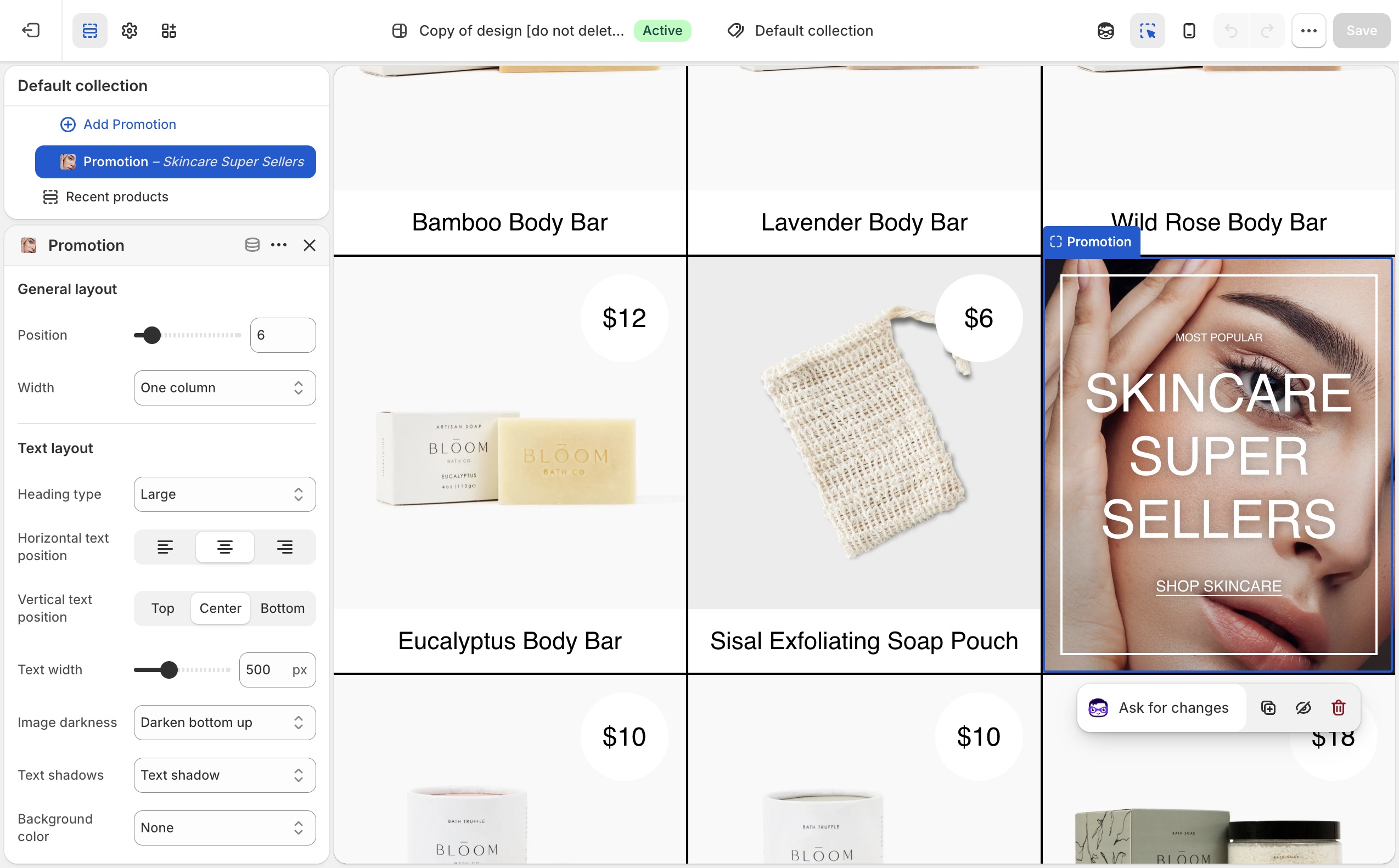
Which products are in the collection, discounts, and checkout are unchanged.
> **Compatibility**
>
> Collection promotions are available in Maker versions 6.0.0 and up.
Promotional blocks can be added into Collection page grids to promote sales, collections, product information and more.
To add a collection promotion, navigate to the collection page settings, under _Collection grid_ > _Add promotion_. Use the settings to configure the position, size and style of individual promotions.
> **Promotions that are too wide for the product grid**
>
> Be sure that promotions have enough space to render inside the product grid. For example, a promotion inside a grid that is two columns wide should have a maximum width of two. Although the promotion will render correctly if the width is wider than the space available, it could effect pagination.
## Troubleshooting (Maker)
- **Promo missing on one collection**: you added it on a different collection template, or that collection uses another template. Assign templates in the collection admin.
- **Grid looks broken / pagination jumps**: the promo is wider than the column count. Lower the promo width so it fits.
- **You wanted a banner above the grid**: use a section above the collection grid (Image with text overlay, etc.), not a grid promotion.
---
title: Setting up navigation
url: https://support.troopthemes.com/guide/maker/creating-navigation/
theme: Maker
theme_styles: Bloom
---
# Setting up navigation in Maker
Menus are created in Shopify admin. The theme only **displays** the menu you assign in the Header, Footer, or a section.
**Content** → **Menus** to create items. Assign the menu in **Edit theme** → **Header**, **Footer**, or the section.
Checkout, apps, and collection filters are unchanged.
> **Info**
>
> Visit Shopify's help centre for an extensive guide on setting up [menus and links](https://help.shopify.com/en/manual/online-store/menus-and-links).
Menus can display as a single dropdown or in multi-columns with nested items.
### Single dropdown menu (Maker)
To create a single dropdown menu, click the title of the menu that you would like to add a dropdown menu to.
In most cases, this is called _Main Menu_ unless it has been renamed to something else.
Next, you will need to add 'child' items to include in the new drop-down.
Click _Add menu item_, enter a name of the menu item and select a destination for the link.
Click and drag the menu items to nest below the 'parent' item.
Click _Save_ menu.

### Multi-column dropdown menu (Maker)
You can create multi-column drop-down menus up to three levels deep.
To create third-level menu items, repeat the process for creating a dropdown and nest them below a second-level menu item.
If a second-level menu item has no nested items, it is styled in a separate column (for example _New in_ and _Sale_).
## Creating other menus (Maker)
All other store menus can be configured in your store admin under **Content** → **Menus**.

Once a menu is configured, assign it in **Edit theme** → **Header** (or Footer / the section).
## Troubleshooting (Maker)
- **You edited Menus and the header didn’t change**: the **Header** section is still assigned a different menu. Open Header and pick the menu you just edited.
- **A link 404s**: the menu item URL is wrong in **Content** → **Menus**, not a theme setting.
- **Mega-menu columns look wrong**: nesting depth in **Content** → **Menus** drives columns. Second-level items with no children become their own column (see _New in_ / _Sale_ above).
---
title: Working with templates
url: https://support.troopthemes.com/guide/maker/working-with-templates/
theme: Maker
theme_styles: Bloom
---
# Working with templates in Maker
A template is the set of sections for one kind of page (product, collection, page, blog). Create extras in **Edit theme**, then **assign** them in the Shopify admin. The default template is what anything without an assignment uses.
**Edit theme** → template selector → **Create template**; then assign it on the resource in admin → **Template** (right column, under Online store).
Product data, collection membership, and checkout are unchanged.
> **Info**
>
> Visit Shopify's help centre for an extensive guide on [templates](https://help.shopify.com/en/manual/online-store/themes/theme-structure/templates).
## What a template controls (Maker)
Templates can be created for:
- collections
- products
- blogs
- blog posts
- pages
Every type has a **Default** template. Pages still on Default pick up whatever sections you add there. An alternate template only applies after you assign it in the admin.
Open the template selector at the top of **Edit theme** to see which templates exist and how many pages use each one.

## Add sections to the default template (Maker)
**Edit theme** → template selector → the page type (for example **Pages**) → **Default page**.
Sections you add here appear on every page of that type that still uses Default.
## Create a new template (Maker)
1. **Edit theme** → template selector → open the page type (for example **Pages**).
2. Choose **Create template**.
3. Enter a **Name**, pick a template to copy in **Based on**, then **Create template**.
4. Add, remove, or rearrange sections on that template.
5. Assign it in the admin (next section). Creating it in **Edit theme** does not apply it.

## Pre-built page templates (Maker)
Themes include **about**, **contact**, **faqs**, and **lookbook** under **Pages**. Open one in the template selector and change its sections; you do not need to create those from scratch.
## Assign a template (Maker)
Open the page, product, collection, blog, or article in the admin. In the right column, under **Online store**, choose it from **Template**.

> **Note**
>
> Alternate templates only appear in the admin if that theme is **published**, or if you are assigning while previewing the unpublished theme those templates live on.
## Troubleshooting (Maker)
- **You created a template but the page didn’t change**: assign it on that page, product, or collection in the admin (**Template**, right column). Creating it in **Edit theme** is not enough.
- **Every product picked up the new layout**: you edited the **Default product** template. Create an alternate and assign it only to the products that need it.
- **Template missing in the admin dropdown**: the theme must be published, or you are editing a different unpublished theme than the one assigned.
---
title: Product grid
url: https://support.troopthemes.com/guide/maker/product-grid/
theme: Maker
theme_styles: Bloom
---
# Product grid in Maker
A **product card** is the tile that represents one product: the image, title, and price, plus optional extras such as vendor name, ratings, and hover effects.
Cards appear inside a **product grid**, a row-and-column layout of those tiles.
You will find product grids on:
- Collection pages
- Search results
- Product pages that show related or recommended products
- Templates that include **Featured collection**, **Featured products**, **Recent products**, or **Collection with highlight**
How cards look is set once in **Theme settings** → **Product grid**. How many columns the grid uses, and which products it shows, is set on the section or collection template.
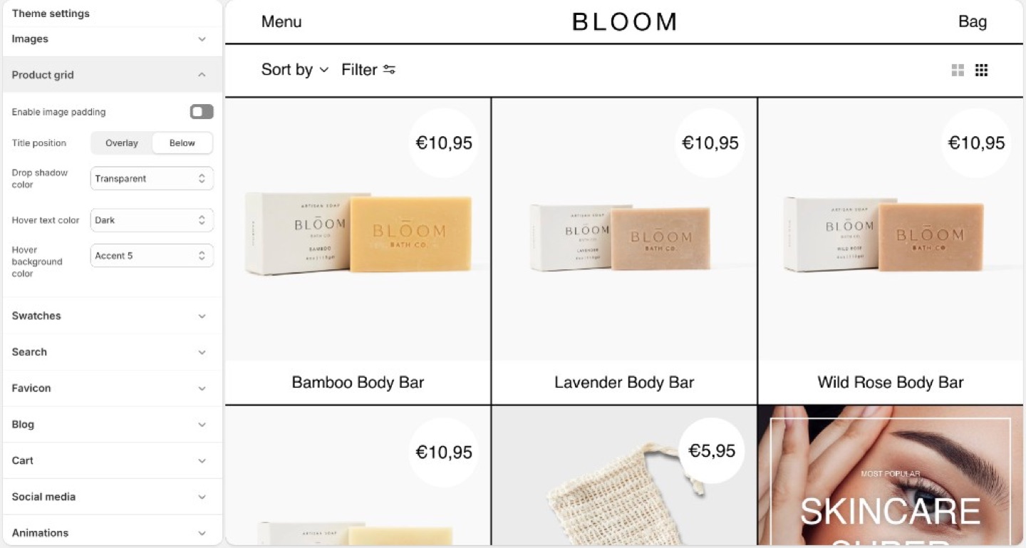
Overlay titles and hover panes are Maker’s default card model.
> **Info**
>
> **Product image size** (crop shape) is in **Theme settings** → **[Images](https://support.troopthemes.com/guide/maker/images/)**, not Product grid.
## Title position (Maker)
- **Overlay**: name (and often price) sit on the image. This is Maker’s default attitude.
- **Below**: classic caption under the photo.
Overlay needs photographs with a clear area for type, or a hover pane that supplies contrast. Below is safer for busy lifestyle shots.
## Image padding (Maker)
**Enable image padding** insets the photo inside the card so the [border grid](https://support.troopthemes.com/guide/maker/spacing-and-layout/#border-color-and-thickness) can frame it. Turn it off when the image should bleed to the stroke.
## Hover pane (Maker)
- **Hover text color**
- **Hover background color**
Both can use Light, Dark, Transparent, or any of the seven [accents](https://support.troopthemes.com/guide/maker/colors/). A hover background is how Maker can recolor a card without a second photo.
If overlay titles are hard to read at rest, do not rely on hover alone; touch devices have no hover. Use overlay plus image darkness, a below title, or a stronger rest-state contrast.
## Drop shadow color (Maker)
**Drop shadow color** on the card is Maker’s stand-in for a global shadow toggle. Transparent keeps cards flush to the grid. An accent or dark shadow lifts the card off the poster.
> **Shoot for overlay**
>
> Leave sky, wall, or negative space where the title will sit. Centered product-on-white with overlay type will collide unless the hover pane or a gradient is doing the work.
## Price badge (Maker)
On the collection grid, the circular badge is the price. If the product has a **Compare at price**, that badge shows percent off instead; on desktop hover it swaps back to the sale price.
The badge follows the card: rest colors at rest, **Hover text color** and **Hover background color** on desktop hover. **Drop shadow color** draws the offset on the badge and the title pane.
## Ask Sidekick (Maker)
Open [Sidekick](https://help.shopify.com/en/manual/shopify-admin/productivity-tools/sidekick) from the theme editor toolbar (top right, next to the device preview icon), or press `⌘.` (`Ctrl+.` on Windows). Maker's card title can sit as an Overlay on the image or Below it, talk through which fits your photography.
> "Should my product card titles use Overlay or Below position, and does my photography have a clear enough area for Overlay type to stay readable?"
It can reason through what your specific catalog needs, overlay appears more editorial but needs contrast; below is safer for busy lifestyle shots, rather than you guessing.

## Troubleshooting (Maker)
- **Titles unreadable on a touch device**: there is no hover. Switch to **Below**, raise image darkness, or pick photos with empty space. Do not “fix” this with a stronger hover pane.
- **Hover never appears**: you are on a touch device, or **Hover background color** is Transparent and matches the photo.
- **Padding creates a double frame**: turn off **Enable image padding**, or thin the [border](https://support.troopthemes.com/guide/maker/spacing-and-layout/#border-color-and-thickness).
- **No percent off on the grid**: there is no compare-at price, or the product is sold out. The badge only switches to percent off when the product is available and on sale.
- **Badge color looks wrong**: that is the card’s rest and hover colors.
---
title: Setting up product filters
url: https://support.troopthemes.com/guide/maker/setting-up-product-filters/
theme: Maker
theme_styles: Bloom
---
# Enabling product filtering in Maker
Collection filters on current Troop themes are Shopify’s native filters. You must install Shopify’s free [Search & Discovery](https://apps.shopify.com/search-and-discovery) app first. You configure filters in that app, not in Theme settings → Colors or a tag list.
Shopify admin → **Search & Discovery** app → **Filters**. The theme only displays what that app publishes.
Product tags alone do not create filters on current versions. Checkout and other apps are unchanged.
> **Info**
>
> For the full Shopify walkthrough, see [enable product filtering](https://help.shopify.com/en/manual/online-store/themes/customizing-themes/common-customizations/storefront-filters).
## Steps (Maker)
1. Install [Search & Discovery](https://apps.shopify.com/search-and-discovery) from the Shopify App Store if it is not already installed, then open the app in Shopify admin.
2. Open **Filters** and add the filters you want (for example Availability, Price, Color).
3. Save. Preview a **collection** page in **Edit theme**, not the homepage.
4. If the **Filter** button or drawer is missing, open the collection template in **Edit theme**, select **Collection navigation**, and turn on **Enable filtering**. You can also turn on **Enable sorting** and **Enable layout switcher** there. Filter tag **Shape** (Round or Square) is in the same section.
Filters need products that actually have those options or metafields. Empty filters do not appear.
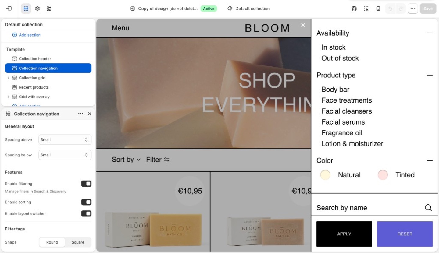
## Troubleshooting (Maker)
- **No filter UI at all**: Search & Discovery is not installed, you are previewing the homepage, or **Enable filtering** is off in **Collection navigation**. Open a collection template and turn it on.
- **A filter you added is missing**: no products in that collection have that option/metafield, or the filter is set not to show when empty.
- **You are still adding product tags expecting a Refine list**: current versions use Search & Discovery filters, not tag groups.
---
title: Search
url: https://support.troopthemes.com/guide/maker/search/
theme: Maker
theme_styles: Bloom
---
# Search in Maker
**Edit theme** → **Theme settings** → **Search**.
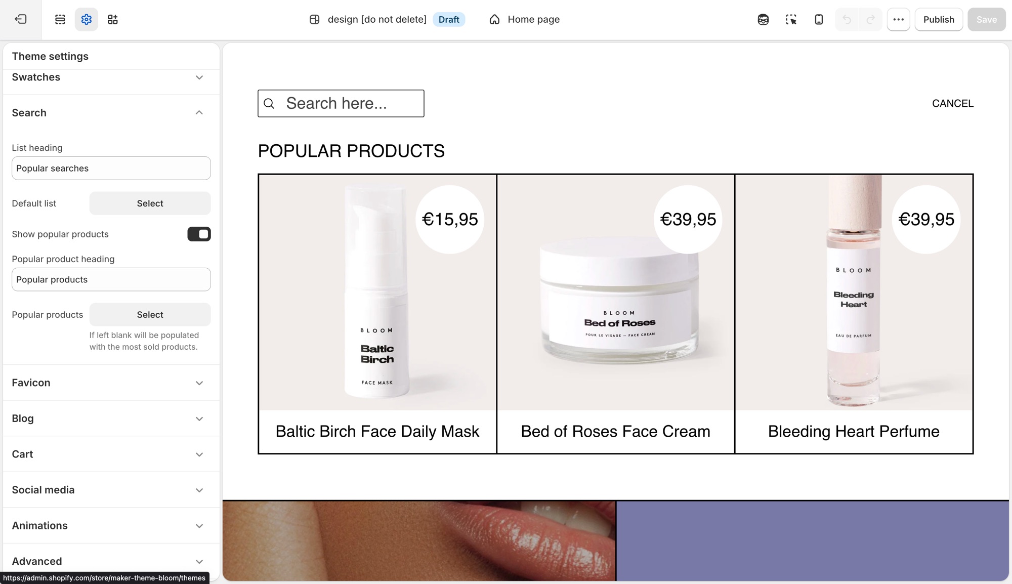
These settings control Shopify's [predictive search](https://help.shopify.com/en/manual/online-store/storefront-search/predictive-search) panel that opens as a customer types in the header search, not the full search results page layout.
## Theme settings → Search (Maker)
- **List heading**: label above the default suggestion list, for example "Popular searches."
- **Default list**: a menu of links shown before the customer types anything.
- **Show popular products**: turns on a product suggestions block in the empty search state.
- **Popular product heading**: label above that block, for example "Popular products."
- **Popular products**: up to 4 products to feature there. Leave it blank and the theme fills it with your best-selling products automatically.
## Troubleshooting (Maker)
- **Popular products showing products I did not pick**: the **Popular products** field is empty, the theme is filling it with best sellers. Add products there to override it.
- **Nothing shows before I type**: **Default list** has no menu assigned, or that menu has no links.
- **Search results page looks wrong**: that is a separate template (**Edit theme** → template selector → **Search**), not this settings group.
---
title: Add color swatches to products
url: https://support.troopthemes.com/guide/maker/color-swatch-guide/
theme: Maker
theme_styles: Bloom
---
# Using color swatches with your products in Maker
On current versions, swatches are Shopify’s native color entries (product category + category metafield). The theme only **turns them on** (Round or Square). You do not pick swatch hexes in Theme settings → Colors anymore.
**Products** → category and category metafields; then **Edit theme** → **Theme settings** → **Swatches**. You can also set swatches on the product section or Featured product.
Inventory, checkout, and filters (Search & Discovery) are unchanged.
To use Shopify native swatches, configure product categories and category metafields.
### Step One: Add a product category (Maker)
A product category is selected from the pre-defined categories in Shopify's Standard Product Taxonomy. This is essential for:
- Unlocking product attributes (category metafields) that map to each product category.
- Managing your products better within Shopify, aiding in automated collections or filtering.
- Ensuring accurate tax rates are applied at checkout based on product categorization.
**Example Category**: Apparel & Accessories > Clothing > Clothing Tops > Shirts. You can add color swatches for any category metafield with the color product attribute.
**To Add a Product Category**:
1. From your Shopify admin, click **Products**.
2. Click a product.
3. In the **Category** section, select **Apparel & Accessories > Clothing > Clothing Tops > Shirts** or another category with the color category metafield.
4. Click **Save**.

### Step Two: Add and edit entries for your category metafields (Maker)
After adding a product category, you can add entries for your product's variant option values.
**To Edit or Add Entries**:
1. From your Shopify admin, go to **Products**.
2. Click the product with the category metafields you want to edit or add.
3. **To Add an Entry from Default Entries**:
- In the **Category metafields** section, click the category metafield, then click the entry you want to edit.
- Edit the fields as needed.
- Click **Save**.
4. **To Add a Custom Entry**:
- In the **Category metafields** section, click the category metafield, then click **Add new entry**.
- Fill out the fields for the entry.
- Click **Save**.
### Step Three: Connect your category metafields to variant options (Maker)
In this step, you connect the category metafield for color (or any other category metafield as needed) to your product variants.
**To Connect Category Metafields**:
1. From your Shopify admin, go to **Products**.
2. Click the product you want to edit.
3. In the **Variants** section, click **+ Add options like size or color**.
4. If a category metafield is available to connect to, select it. The option values will auto-fill with any entries you've added to the category metafield.
5. **Optional**: To add custom option values, click **Edit**, then click **Add new entry**. Fill out the entry fields and click **Save**.
6. Click **Save** to save the product.

### Step Four: Enable swatches at the theme level (Maker)
Swatches can be enabled in **Edit theme** → **Theme settings** → **Swatches**. Choose **Circle** or **Square** (or **None** to turn them off). Size on the product form and on the grid are separate sliders in that same group.
You can also set swatch type on a product section or Featured product.
When enabled, the theme will turn configured options into clickable swatch selectors.
## Troubleshooting (Maker)
- **No chips, still a dropdown**: Swatches is set to **None** in Theme settings (and on the product section); or the variant option is not connected to the color category metafield.
- **Chips are the wrong colors**: edit the category metafield **entries** in the product admin, not Theme settings → Colors (current versions).
- **Grid has swatches, product page doesn’t (or the reverse)**: Theme settings → Swatches and the product section each have their own type control; set both.
- **You are on an older theme**: skip to [Legacy theme versions](#legacy-theme-versions). Hex lists in Colors or `swatch-colors.liquid` only apply there.
# Legacy theme versions
Color swatches can be enabled in multiple places:
- In the **Product Page(s)** under the **Sections** tab
- On the **Home Page**, inside the **Featured Product** section under the **Sections** tab
- In the **Theme Settings** tab, under the **Product Grid** section
When enabled, the theme will automatically turn an option titled "color" into clickable color swatches.
The default colors are set as standard CSS colors. For example, "gold" is defined as `#ffd700`. The complete
list of standard CSS colors [can be viewed on MDN.](https://developer.mozilla.org/en-US/docs/Web/CSS/Reference/Values/named-color)
> **Non-English themes**
>
> - "Color" will be translated according to your `locales/*.json` file. For example, if you desire "couleur" to be the option with swatches, be sure to translate any instance of "color" inside `locales/fr.json` to "couleur"
> - Non-english colors such as "rouge" will need to be added manually as defined below in [Adding custom colors](#adding-custom-colors)
## Adding custom colors (Maker)
Default colors can be overwritten with values defined by the store-owner. In addition, values not defined as a CSS color can be added.
> **Versions with swatch settings inside `Theme settings > color`**
>
> On Maker versions 8.0.0 to 9.0.1, swatch color settings can be found inside the _Color_ submenu inside the global theme settings.
If you want to assign the color value `deep red` to the color value `rgb(131, 45, 39)`, you'd add the following line to the `Color swatch configuration` textbox:
deep red: rgb(131, 45, 39)
> **Formatting must be exact**
>
> - each rule must be on a new line
> - the name and value are separated by a single colon (":") character
> - the value can be defined as either a hex or RGB value
> - colors that don't follow the above format will revert to their default values
- use a tool like [Adobe Color](https://color.adobe.com/create/image) if you need help determining which color value is appropriate for your product
---
title: Add a size chart to the product page
url: https://support.troopthemes.com/guide/maker/product-size-chart/
theme: Maker
theme_styles: Bloom
---
# Add a size chart to the product page in Maker
The theme can open a Shopify **page** from the product form. You write the chart on that page; the theme only links to it.
You can add a size chart on the _Product_ page or the _Featured product_ section in two ways:
- **Size guide button** block: a standalone button you place in the product form
- **Variant picker** block: a link beside a matching variant option (for example Size)
Create the chart page in **Online Store** → **Pages**. A size-chart app replaces this feature, disable the theme size guide if you use one.
## Chart page (Maker)
In the example below, we created a page called `Size chart` and referenced it in **Page content**. That page holds tables (and can hold images or other text).
To quickly create HTML tables for size charts, try a [responsive table generator](https://www.tablesgenerator.com/).

## Size guide button (Maker)
> **Version availability**
>
> The Size guide button block is available in Maker versions 13.3.0 and up.
**Edit theme** → product template or **Featured product** → **Add block** → **Size guide button**. If the block is already in the section, click the eye icon to show it. Select a page in **Page content**, then choose a **Button style**.
The button does not require a Size variant. Use it when you want a size chart on products without options, or when you want a full button instead of a link next to the picker.
If you use this block, turn off **Enable** under **Size guide** on the **Variant picker** block so two size-chart controls do not stack.
On these versions the chart opens in a drawer.
## Variant picker (Maker)
For the variant picker size chart to appear, the product must have at least one variant option. You can configure this in the Shopify admin product editor:

In the theme editor, open the _Product_ page or _Featured product_ section, expand the blocks list, and locate the **Variant picker** block. If it is hidden, click the eye icon to show it. If it is not there, click **Add block** and select **Variant picker**.
Match the variant option (for example, "Size") in the **Link from option** text field. Then select a page using the **Page content** setting.
**Edit theme** → product template → **Variant picker** block → **Link from option** and **Page content**.
Variant options are set in **Products**.
> **Change the size chart button text**
>
> You can change the size chart button text in _Edit default theme content > Products_.
>
> Read more about [changing default text](https://support.troopthemes.com/guide/maker/change-default-text/).
>
> 
## Troubleshooting (Maker)
- **Size guide button is missing from Add block**: the theme is below the versions listed above. Use the **Variant picker** method, or [update the theme](https://support.troopthemes.com/guide/update-theme/).
- **No size chart link next to Size**: the product has no variants; **Link from option** does not match the option name (for example `Size` vs `Sizes`); **Enable** is off; or the Variant picker block is missing.
- **Wrong / empty drawer or popup**: **Page content** is unset, or the page has no body.
- **Two size charts appear**: both the **Size guide button** and the Variant picker **Size guide** are enabled. Turn one off.
- **An app chart appears instead**: disable the app embed, or turn off the theme’s size guide so they do not stack.
- **Button says the wrong words**: [default theme content](https://support.troopthemes.com/guide/maker/change-default-text/) → Products.
---
title: Add an out of stock notification form
url: https://support.troopthemes.com/guide/maker/out-of-stock-notifications/
theme: Maker
theme_styles: Bloom
---
# Add an out of stock notification form in Maker
The theme can show a “notify me” form on sold-out variants. Submissions email your store’s **Sender email**. The theme does **not** watch inventory or auto-send “back in stock” mail to the shopper.
This is Shopify’s contact form: it emails you. It does **not** create a customer in **Customers**, and it does not start a waitlist.
## Who owns this (Maker)
- **Show the form on the product page**: theme (the block below)
- **Sold-out vs available**: Shopify **Products** inventory
- **Where the request lands**: Settings → Notifications → Sender email
- **Email the shopper when stock returns**: a [back in stock app](https://apps.shopify.com/search?q=back%20in%20stock)
## Show the form (Maker)
**Edit theme** → product template (**Default product**) or **Featured product** → **Add block** → **Unavailable form**. If the block is already in the section, click the eye icon to show it.
Click the block to expand its settings. Preview a sold-out variant or the form stays hidden.
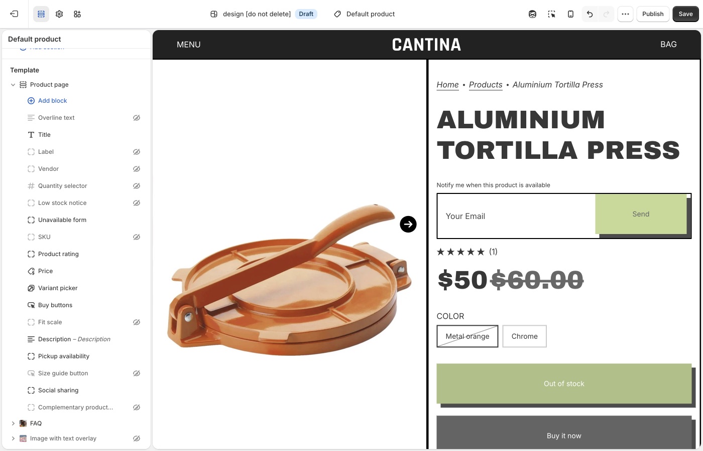
Form copy is [default theme content](https://support.troopthemes.com/guide/maker/change-default-text/). Search **notify** or **sold out**.
## Sold-out variants only (Maker)
The selected variant must be sold out, or the form stays hidden.
**Products** → the product → the variant → **Inventory**:
- **Inventory tracked** is on. If tracking is off, Shopify treats the item as available.
- **Available** is 0 or less at locations that fulfill **online** orders. Stock sitting only at a location that does not fulfill the online store still shows as sold out on the storefront.
- **Sell when out of stock** is **Off**. That control only appears when tracking is on.

See Shopify’s [selling out of stock products](https://help.shopify.com/en/manual/products/inventory/setup/selling-when-out-of-stock) guide.
## Where the email goes (Maker)
Shopify delivers contact-form submissions to **Settings** → **Notifications** → **Sender email**. That is not **Settings** → **General** (**Store email** is for Shopify contacting you, and for exports).

If you use a custom domain, authenticate it on the Notifications page or Shopify may rewrite the address. Submissions flagged by Shopify’s spam filter still arrive, with `[SPAM]` in the subject.
See Shopify’s [setting up your email](https://help.shopify.com/en/manual/intro-to-shopify/initial-setup/setup-your-email) and [contact form](https://help.shopify.com/en/manual/online-store/themes/customizing-themes/add-contact-page) guides.
## Automatic “back in stock” mail (Maker)
The theme cannot do this. Shopify does not send restock emails to customers on its own; their inventory docs point to a [back in stock app](https://apps.shopify.com/search?q=back%20in%20stock). Most of those apps add their own button, remove the theme’s **Unavailable form** block so they don’t stack.
Shopify Flow’s [Product variant back in stock](https://help.shopify.com/en/manual/shopify-flow/reference/triggers/variant-back-in-stock) trigger can notify *you* (Slack, staff email) or republish a product. It does not mail customers who submitted the theme form.
If you handle requests by hand:
- Tag or folder the incoming mail by product or variant.
- Keep a spreadsheet of email + variant, then send when you restock.
- Add addresses to a list in your email app and send that list when the item is back.
**Want to use an app?** [Using apps with themes](https://support.troopthemes.com/guide/using-apps-with-themes/).
## Ask Sidekick (Maker)
Open [Sidekick](https://help.shopify.com/en/manual/shopify-admin/productivity-tools/sidekick) from the icon in your Shopify admin, then ask it to draft the "back in stock" notification email in your brand's tone.
> "Write a short, friendly restock email with a sense of urgency."
Refine it before it goes live, faster than starting from Shopify's default template copy.
## Troubleshooting (Maker)
- **Form never shows**: the variant is still available, **Inventory tracked** is off, **Sell when out of stock** is on, or the **Unavailable form** block is missing or hidden on **Product page**.
- **Form shows but you still have stock**: the units may be at a location that does not fulfill online orders. Add stock to a location that does.
- **You expected an automatic email when stock returned**: the theme cannot do that. Use an inventory app and remove the theme block.
- **You didn’t get the request**: check **Settings** → **Notifications** → **Sender email**, spam (including `[SPAM]` in the subject), and domain authentication. The message goes to you, not to the shopper.
- **Form copy is wrong**: [default theme content](https://support.troopthemes.com/guide/maker/change-default-text/).
- **Two notify buttons**: an app embed plus the theme form. Turn one off.
---
title: Setting up FAQ or Collapsible rows
url: https://support.troopthemes.com/guide/maker/setting-up-faq-or-collapsible-rows/
theme: Maker
theme_styles: Bloom
---
# Setting up FAQ or Collapsible Rows sections in Maker
Add **FAQ** or **Collapsible rows** in **Edit theme** → **Add section**. Each row is a block with a heading plus rich text or a Shopify **page**.
Page bodies are edited in **Online Store** → **Pages**, not in the theme editor. Shopify Help Center, checkout, and metafield definitions are unchanged.
To add an FAQ or Collapsible rows section, open **Edit theme**, click **Add section**, and choose **FAQ** or **Collapsible rows**.
These sections use collapsible rows as blocks. Each row can include a heading and content. Add additional blocks to build a list of questions and answers, or to break down product details and materials.
## Content types (Maker)
Each block supports two content types:
1. Rich text
- Added through the "Text" setting. Enter text directly in the text area, including links and formatting.
2. Page content
- Added through the "Row content from page" setting. Select a page from the dropdown to display its content in the block. Pages can be created or edited in the Shopify admin, **not** in the theme editor.
### Dynamic content with metafields (Maker)
The first option, rich text, supports dynamic content with metafields. This lets you display content specific to the page you're viewing, or store-level information.
For example, on a product page, each product has a different name, description, and price. You can show that information in an _FAQ_ or _Collapsible rows_ section by connecting a metafield to the block.
You can add static text around metafield content for context, or display only the dynamic content. To learn more about metafields, visit [Shopify's guide](https://help.shopify.com/en/manual/custom-data/metafields).
## Ask Sidekick (Maker)
Open [Sidekick](https://help.shopify.com/en/manual/shopify-admin/productivity-tools/sidekick) from the theme editor toolbar (top right, next to the device preview icon), or press `⌘.` (`Ctrl+.` on Windows). Give it a topic and your products, and it drafts FAQ copy for you.
> "Write 5 FAQs about shipping and returns for a skincare store."
It produces question-and-answer pairs you can paste into rich text blocks or refine before publishing. Faster than writing every row from a blank field, you still edit and approve the final wording.

## Troubleshooting (Maker)
- **Row is empty**: you chose **Row content from page** but didn’t pick a page, or the page has no body.
- **Every product shows the same answer**: you typed static text. Connect a **metafield** if the answer should change per product.
- **You wanted this on one product only**: use an alternate [product template](https://support.troopthemes.com/guide/maker/working-with-templates/) and assign it to that product, or use metafields.
---
title: Customizing blogs
url: https://support.troopthemes.com/guide/maker/customizing-blog/
theme: Maker
theme_styles: Bloom
---
# Customizing blogs in Maker
Blog posts, tags, excerpts, and featured images live in Shopify admin under **Content**. The theme controls how those posts appear: the blog grid, article page, and the **Blog posts** section you can add to other templates.
**Content** → **Blog posts** for writing and tagging. **Edit theme** → **Default blog** or **Default article** for layout.
Post body copy, checkout, and SEO titles are unchanged.
> **Info**
>
> Visit Shopify's help centre for an extensive guide on [adding and managing blog posts](https://help.shopify.com/en/manual/online-store/blogs/writing-blogs/working-with-blog-posts).
## Write and tag posts (Maker)
Open **Content** → **Blog posts**. Create or edit a post to set the title, body, excerpt, tags, and featured image.
Tags do two jobs in the theme:
- They appear in the blog page tag filter (if that filter is on).
- The **Blog posts** section can limit itself to articles that share one tag.
Use **Manage blogs** on that same admin page to rename a blog or turn comments on.
## Blog page (Maker)
**Edit theme** → template selector → **Blogs** → **Default blog** → **Blog**.
Posts list in reverse chronological order (newest first). Pagination appears when there are more posts than one page.
### Grid (Maker)
- **Columns**: 1 to 4 on desktop. On mobile, 1 or 2.
- **Row layout**: **Evenly spaced** keeps rows aligned. **Staggered** packs cards like masonry.
- **Maximum container width**: Extra small through Full width, same control as other sections. Full width lets the grid run edge to edge.
- **Full width** (under **Mobile**): lets cards bleed to the screen edge on small devices.
Card image crop is **Theme settings** → **Images** → **Article image size**, not this section. Natural keeps each featured image’s own ratio. A fixed ratio (Square, Landscape, or Portrait) makes a stricter grid.
For a uniform grid, shoot featured images to the same ratio as **Article image size**. Mixed ratios look calmer with Natural, or with **Staggered** row layout.
Export sizes: [What image sizes should I use?](https://support.troopthemes.com/faqs/what-image-sizes-should-i-use/).
### Title, filter, and RSS (Maker)
- **Show blog title**: the blog’s name from admin (for example Journal), not each article title.
- **Show tag filter**: a dropdown of article tags. Turn this off if you do not want customers to filter the index.
- **Show RSS**: a feed link in the blog footer.
To keep internal tags out of that filter, open **Theme settings** → **Blog** → **Hide tags from tag filter**. Enter a comma-separated list. The default is `featured, pinned`. Matching is not case-sensitive (`pinned` and `Pinned` both hide).
### What each card shows (Maker)
On the **Blog** section:
- **Show article heading**: the post title. **Article heading type** is Medium or Small.
- **Show blog date** and **Show author**
- **Show excerpt**: the excerpt from the post editor, or a short trim of the body if the excerpt is empty.
- **Show button**: the continue-reading link. That label is [default theme content](https://support.troopthemes.com/guide/maker/change-default-text/); search **continue**.
If **Show article heading** and **Show button** are both off, **Show excerpt** outputs the full article body on the blog page instead of a truncated excerpt. That is how an editorial index can read as captions under images, without a title or button on each card.
**Heading type** styles the blog title (Banner, Featured, Large, or Medium) when **Show blog title** is on.
Spacing above and below follows the same scale as other sections. See Spacing and layout in your theme guide.
## Blog posts section (Maker)
**Edit theme** → **Add section** → **Blog posts**. Add it to the homepage or any other template. This is not the blog index.
- **Choose blog**: which blog to pull from.
- **Filter by tag**: only articles with this tag appear (up to three). The default is `pinned`. Change the field, or tag posts to match it, in **Content** → **Blog posts**. If no posts have that tag, the section falls back to the latest three articles.
- **Show button**, **Show date**, and **Show excerpt** control the cards in this section.
- **Media layout** (under **Mobile**): Slideshow or Grid.
Tag spelling must match the filter field. `pinned` and `Pinned` are treated the same.
## Article page (Maker)
**Edit theme** → template selector → **Blog posts** → **Default article**.
The **Article** section shows the title, date, author, tags, sharing links, and the post body. It does not place the featured image.
The featured image still matters: blog cards use it, cropped by **Article image size**. To show it as a banner on the article page, add an image section (often **Image with text overlay**) above the **Article** section and connect the image to the article’s featured image. You can remove that section if you want a text-only article.
On the **Article** section:
- **Show title**, **Heading type**, and **Heading alignment**
- **Show article date** and **Show author**
- **Show article tags**: tags you hid in **Theme settings** → **Blog** stay hidden here too.
- Sharing: Facebook, 𝕏, Pinterest, email, and link. Turn each one off independently.
**Maximum container width** on this section has no Full width option (Extra small through Extra large). A narrower width keeps article copy readable.
The template can also include:
- **Recent articles**: nearby posts from the same blog.
- **Comments**: Shopify’s comment form, or Disqus if you enable it on the section. Comments must be turned on for that blog in **Content** → **Blog posts** → **Manage blogs**.
You can add other sections to the article template the same way as a page. See [Working with templates](https://support.troopthemes.com/guide/maker/working-with-templates/).
### Images in the post body (Maker)
When you insert an image in **Content** → **Blog posts**, set the size to **Original** so it spans the article column. Smaller presets can look cropped or undersized.
## Ask Sidekick (Maker)
Open [Sidekick](https://help.shopify.com/en/manual/shopify-admin/productivity-tools/sidekick) from the icon in your Shopify admin, then ask it to draft a blog post from a topic and a few notes.
> "Write a post about caring for our candles, aimed at new customers."
Use it for a first draft or when you're stuck on an opening paragraph, then edit it in your own voice before publishing, Sidekick's content generation is meant as a starting point, not a final draft.
## Troubleshooting (Maker)
- **Can't find Blog posts**: they are no longer under **Online Store**. Open **Content** → **Blog posts**. Use **Manage blogs** there to rename a blog or change comments.
- **Pinned posts missing from the homepage**: **Filter by tag** is on the **Blog posts** section, not the blog index. The tag on the article must match that field.
- **Tag still shows in the filter**: add it to **Theme settings** → **Blog** → **Hide tags from tag filter**, comma-separated. The blog section’s **Show tag filter** must be on for the dropdown to appear at all.
- **Grid looks uneven**: featured images have mixed ratios, or **Row layout** is **Staggered**. Use the same crop and **Evenly spaced** for a strict grid, or keep mixed ratios on purpose.
- **Cards look cropped**: **Theme settings** → **Images** → **Article image size**, not the post editor.
- **No featured image on the article page**: the **Article** section does not display it. Add an image section on the article template, or check that the post has a featured image in **Content** → **Blog posts**.
- **Embedded images look cropped**: in the article editor, set the image size to **Original**, not a small preset.
- **Comment form missing**: comments are off for that blog in **Manage blogs**, or the **Comments** section is hidden or removed from the article template.
- **Continue reading wording**: [default theme content](https://support.troopthemes.com/guide/maker/change-default-text/), not the Blog section.
---
title: Configuring the popup
url: https://support.troopthemes.com/guide/maker/configuring-the-popup/
theme: Maker
theme_styles: Bloom
---
# Configuring the popup in Maker
The popup lives in **Edit theme** → **Popups**, an overlay section that appears across the whole store. It is not the announcement bar (that's on the **Header** section), not checkout, and it does not send email campaigns by itself: Shopify Inbox, discount codes, and email delivery are all separate.
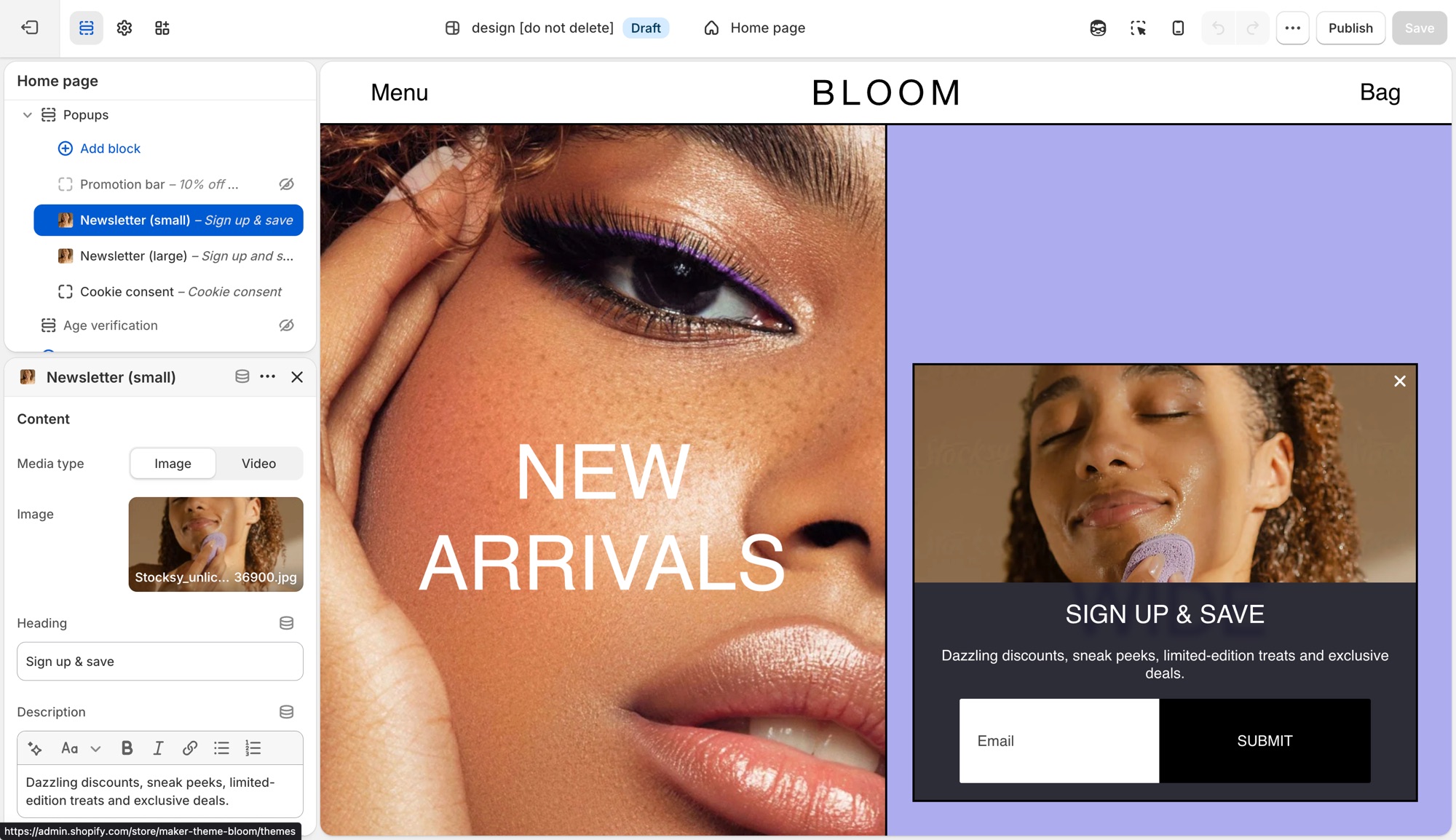
> **Compatibility**
>
> Image (and left/right or top placement) options on the **Newsletter (small)** and **Newsletter (large)** popup blocks require version 12.2.0 and up. Video media requires 12.3.0 and up.
## Popups section (Maker)
**Edit theme** → **Popups**. By default it already has a **Newsletter (small)**, **Promotion bar**, and **Cookie consent** block. Click a block's eye icon to show or hide it, or **Add block** for another type:
- **Newsletter (small)** – corner overlay with an email field.
- **Newsletter (large)** – centered overlay modal.
- **Promotion bar** – sticky bar with a message; can scroll like a ticker (**Scroll text**, with separate speed controls for desktop and mobile).
- **Cookie consent** – consent banner tied to Shopify's consent tracking API.
Heading and description live on each block, not in Theme settings.
### Newsletter (small) (Maker)
Corner overlay with an email field.
- **Media type**, **Image**, **Video upload**, **Video link**: shown when **Show media** is on; video accepts a Shopify upload or a YouTube/Vimeo link.
- **Heading**, **Description**: the popup's copy.
- **Show social icons**, **Social media title**: adds your [social icons](https://support.troopthemes.com/guide/maker/social-media/) below the form.
- **Background color**, **Translucent background**: card styling.
- **Popup width**: maximum width on larger screens (300–500px).
- **Show media**, **Media position** (**Left** or **Top**): whether an image or video shows, and where. Media is hidden on mobile to meet Google's guidelines against intrusive interstitials.
- **Heading type**, **Paragraph font size**, **Text color**, **Text alignment**: text styling.
- The submit button always shows as a labeled **Submit** button in your first button style here; there's no button text or style setting to configure.
- Timing and targeting settings (**Popup delay**, **Show again after**, and so on) are shared with **Promotion bar**. See **Timing and frequency** below.
### Newsletter (large) (Maker)
Centered overlay modal, with the same settings as **Newsletter (small)** above, except:
- **Popup width** ranges wider (500–900px), since it's a centered modal rather than a corner card.
- **Media position** is **Left** or **Right** instead of Left/Top.
### Promotion bar (Maker)
Sticky bar with a message.
- **Description**: the bar's message text.
- **Background color**, **Translucent background**.
- **Scroll text**, **Scroll speed**: ticker effect on desktop, plus a separate **Scroll text**/**Scroll speed** pair under **Mobile** so the ticker can run independently (or not at all) per device.
- **Heading type**: **Medium** or **Small** text size.
- **Text color**.
- Timing and targeting settings are shared with the **Newsletter** blocks. See **Timing and frequency** below.
### Cookie consent (Maker)
Consent banner tied to Shopify's consent tracking API. See **When cookie consent shows** below for the conditions.
- **Heading**, **Description**.
- **Background color**, **Translucent background**.
- **Position**: **Left**, **Bottom**, or **Right**.
- **Text color**, **Text alignment**.
- **Accept button style**, **Decline button style**: each independently set to one of your four button styles, or a plain text **Link**.
## Timing and frequency (Maker)
**Newsletter** and **Promotion bar** blocks each have:
- **Popup delay** – seconds before it opens.
- **Show popup at bottom of page** – opens early if the visitor scrolls to the bottom first.
- **Show again after** – days before it reappears once dismissed. This is stored in the visitor's browser, not in Shopify, so it's per browser/device, not per customer.
- **Limit to specific referrer path** / **Limit to specific page** – restrict where it can appear.
The section's own **Limit to one popup per page load** setting controls whether only the first ready popup shows, or they queue one after another. **Cookie consent always takes priority** when it needs to appear.
## When cookie consent shows (Maker)
Cookie consent only shows where Shopify's consent tracking API determines a banner is required, and only if the visitor doesn't already have a stored choice. It won't show for everyone. Customer privacy tracking limits must also be turned on in your Shopify admin (**Settings** → **Customer privacy**), or it won't show at all. Position and the **Accept**/**Decline** button styles are configurable; it doesn't use the delay/frequency settings above.
## Previewing changes (Maker)
**Newsletter** and **Promotion bar** popups do **not** open automatically while you're editing. That's expected, not a bug. Preview them from the storefront (or **Preview**), ideally in a private/incognito window, since **Show again after** is remembered by that browser and will suppress a popup you've already dismissed while testing.
**Cookie consent** is the exception: click it in the block list to preview it live in the editor.
---
Where newsletter forms live (section, overlay, popup, footer, password page): [Setting up mailing lists and newsletters](https://support.troopthemes.com/guide/maker/newsletters/).
## Troubleshooting (Maker)
- **Popup never appears**: the block is hidden (eye icon); **Show again after** already fired for that browser (test in a private window); another popup is already showing and **Limit to one popup per page load** is on; or a separate app popup is competing. Turn off other popup app embeds.
- **Cookie consent doesn't show**: Customer privacy tracking isn't enabled in your Shopify admin, or the visitor's region/consent state doesn't require a banner.
- **It won't preview in the editor**: expected for **Newsletter** and **Promotion bar** blocks. Preview from the storefront instead.
- **Announcement bar isn't here**: that's on the **Header** section, not **Popups**.
- **Form emails don't reach Mailchimp/Klaviyo**: the popup only creates a Shopify customer (tagged `newsletter`). See [newsletters](https://support.troopthemes.com/guide/maker/newsletters/), or connect an [app](https://support.troopthemes.com/guide/using-apps-with-themes/).
---
title: Mailing list & newsletters
url: https://support.troopthemes.com/guide/maker/newsletters/
theme: Maker
theme_styles: Bloom
---
# Setting up mailing lists and newsletters in Maker
A Troop newsletter form adds the shopper to **Customers** in your Shopify admin, with **Customer accepts email marketing** checked. The theme does **not** send campaigns or sync Mailchimp/Klaviyo by itself.
Klaviyo, Mailchimp, and other ESP lists need an app or integration, the theme only collects addresses into **Customers**.

## Who owns the list (Maker)
- **Show a form on the storefront**: theme (the places below)
- **Store the address**: Shopify Customers
- **Send campaigns / sync to Mailchimp or Klaviyo**: an email app or integration
Maker can show a signup form in several places. The Footer has **no** subscribe block, use a **Newsletter** section, a popup, or an overlay.
## Newsletter section (Maker)
**Edit theme** → **Add section** → **Newsletter**.
Add it to any template. The section holds up to two blocks: **Subscribe form** (heading, description, and the form) and an optional **Image**. Heading and description are on the **Subscribe form** block, not on the section. **Button style** is on that block too.
The Email placeholder and **Submit** label are [default theme content](https://support.troopthemes.com/guide/maker/change-default-text/), search **mailing**.
## Image with text overlay (Maker)
**Edit theme** → **Image with text overlay** → **Add block** → **Newsletter form**.
Use this when the form should sit on a campaign image with the other overlay blocks (heading, description, buttons). The block has no heading of its own.
## Popup (Maker)
**Edit theme** → **Popups** → **Add block** → **Newsletter (small)** or **Newsletter (large)**. If the block is already in the section, click the eye icon to show it.
**Newsletter (small)** sits in a corner; **Newsletter (large)** is a centered overlay. Heading and description are on the block.
Popup timing and frequency: [Configuring the popup](https://support.troopthemes.com/guide/maker/configuring-the-popup/).
## Password page (Maker)
**Edit theme**, open the **password** template → **Password page** → **Show form** and **Heading**.
## Connect with Mailchimp (Maker)
The theme only writes addresses to Shopify **Customers**. To get them into Mailchimp, install Mailchimp’s [Mailchimp for Shopify](https://apps.shopify.com/mailchimp) app and connect your audience.
See Mailchimp’s [connect Shopify](https://mailchimp.com/help/connect-shopify/) guide.
[Zapier](https://zapier.com/apps/mailchimp/integrations/shopify) is another option if you need a custom workflow.
## Ask Sidekick (Maker)
Open [Sidekick](https://help.shopify.com/en/manual/shopify-admin/productivity-tools/sidekick) from the theme editor toolbar (top right, next to the device preview icon), or press `⌘.` (`Ctrl+.` on Windows). It can draft the heading and blurb for your signup form, give it your brand and what subscribers get.
> "Write a short, warm newsletter blurb offering 10% off the first order."
It can also draft the welcome or campaign email itself if you're sending through Shopify Email.

## Troubleshooting (Maker)
- **No email in Customers**: the form may be an **app** form (Klaviyo, etc.), not the theme form. Check **Edit theme** → **App embeds**. App forms do not always create a Shopify customer.
- **Theme form works, Mailchimp is empty**: expected until you connect an integration. The theme only writes to Shopify Customers.
- **Popup never appears**: the **Popups** section must have a newsletter block that is not hidden; frequency may have already fired for that browser. Test in a private window. See [Configuring the popup](https://support.troopthemes.com/guide/maker/configuring-the-popup/).
- **Email placeholder didn’t change**: that string is [default theme content](https://support.troopthemes.com/guide/maker/change-default-text/). Search **mailing**.
- **Double forms**: a Newsletter section *and* an app embed *and* the popup (and footer, if you use it). Turn off the ones you do not want.
- **No form in the footer**: Maker’s Footer has no Subscribe block. Add a **Newsletter** section, use **Popups**, or put a **Newsletter form** on **Image with text overlay**.
---
title: Configure country, currency, and language selectors
url: https://support.troopthemes.com/guide/maker/configure-country-currency-selectors/
theme: Maker
theme_styles: Bloom
---
# Configure country, currency, and language selectors in Maker
Country, currency, and language selectors are Shopify Markets and Languages (and Shopify Payments), not a Troop currency converter or translator. The theme only **shows** a selector once Markets and/or Languages are set up.
Set up Shopify **Settings** → **Markets** (for country/currency) and **Settings** → **Languages** (for language) first. Then turn on **Show country/region selector** and/or **Show language selector** in the places below.
A selector only appears once Shopify has more than one country, currency, or language published.
Admin prices stay in store currency. Payment methods and rounding are Shopify settings. Translating your product and page content is a separate job, see [Translating your store](#translating-your-store) below.
Refer to Shopify’s [selling in multiple currencies](https://help.shopify.com/en/manual/markets/customizations/local-currencies) guide.
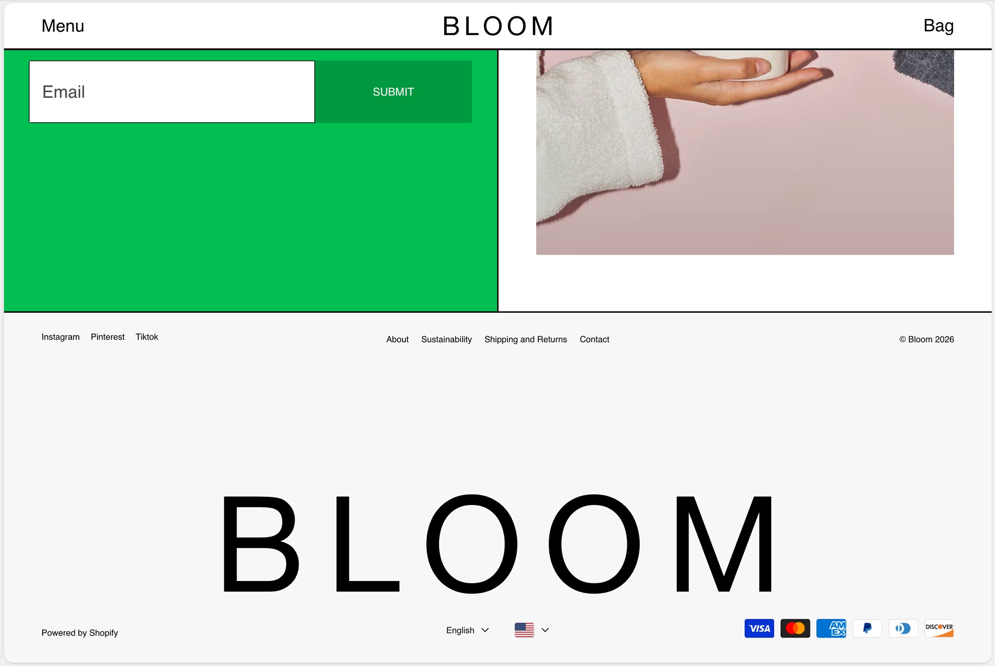
## Header (Maker)
**Edit theme** → **Header** → **Show country/region selector** and **Show language selector**.
Selectors sit in the header utility row on tablet and desktop. Header does not copy them into the mobile menu. Use **Announcement** or **Footer bar** if customers on phones need a selector.
## Announcement (Maker)
**Edit theme** → **Announcement** → **Show country/region selector** and **Show language selector**.
On desktop they sit on the right of the bar. On phones they move into the menu. Maker’s default announcement is often off, turn the section on if you want selectors there.
## Footer bar (Maker)
**Edit theme** → **Footer bar** → add a **Localization** block (one only). On that block, enable **Show country/region selector** and **Show language selector**.
The Footer bar also holds payment icons, social icons, Powered by, and text, maximum three blocks. This is the most reliable place for phones if Header is desktop-only.
## Translating your store (Maker)
Storefront language is Shopify Translate & Adapt (or a translation app) plus [Edit default theme content](https://support.troopthemes.com/guide/maker/change-default-text/) for theme chrome. The theme ships language files; it does not translate your products.
Shopify **Settings** → **Languages** for the languages themselves; Translate & Adapt (or an app) for product and page content; **Edit default theme content** for “Add to cart” and similar theme strings.
Checkout language is separate (Shopify checkout / Markets), and is not controlled by the theme. Typography is fonts, not language.
Refer to Shopify’s [localization and translation](https://help.shopify.com/en/manual/international/localization-and-translation) and [Translate & Adapt](https://help.shopify.com/en/manual/international/translate-adapt-app) guides.
## Troubleshooting (Maker)
- **No selector**: a second country, currency, or language is not published in Markets/Languages, or **Show country/region selector** / **Show language selector** is off on that section.
- **Selector shows but prices don’t change**: Shopify Payments and Markets must be configured. The theme cannot convert currency by itself.
- **You still have an old currency-app widget**: disable that app embed; it will fight the native selector.
- **Products still show the default language**: translate products and pages in Translate & Adapt (or your app). Default theme content only covers theme chrome, not product data.
- **Checkout is still the default language**: expected. Checkout language is translated in Shopify, not Theme settings.
- **A translation app overwrote your wording**: the app owns storefront language once installed. Edit there, or disable the app embed to test. See [changing default theme text](https://support.troopthemes.com/guide/maker/change-default-text/).
---
title: Cart
url: https://support.troopthemes.com/guide/maker/cart/
theme: Maker
theme_styles: Bloom
---
# Cart in Maker
**Edit theme** → **Theme settings** → **Cart**.
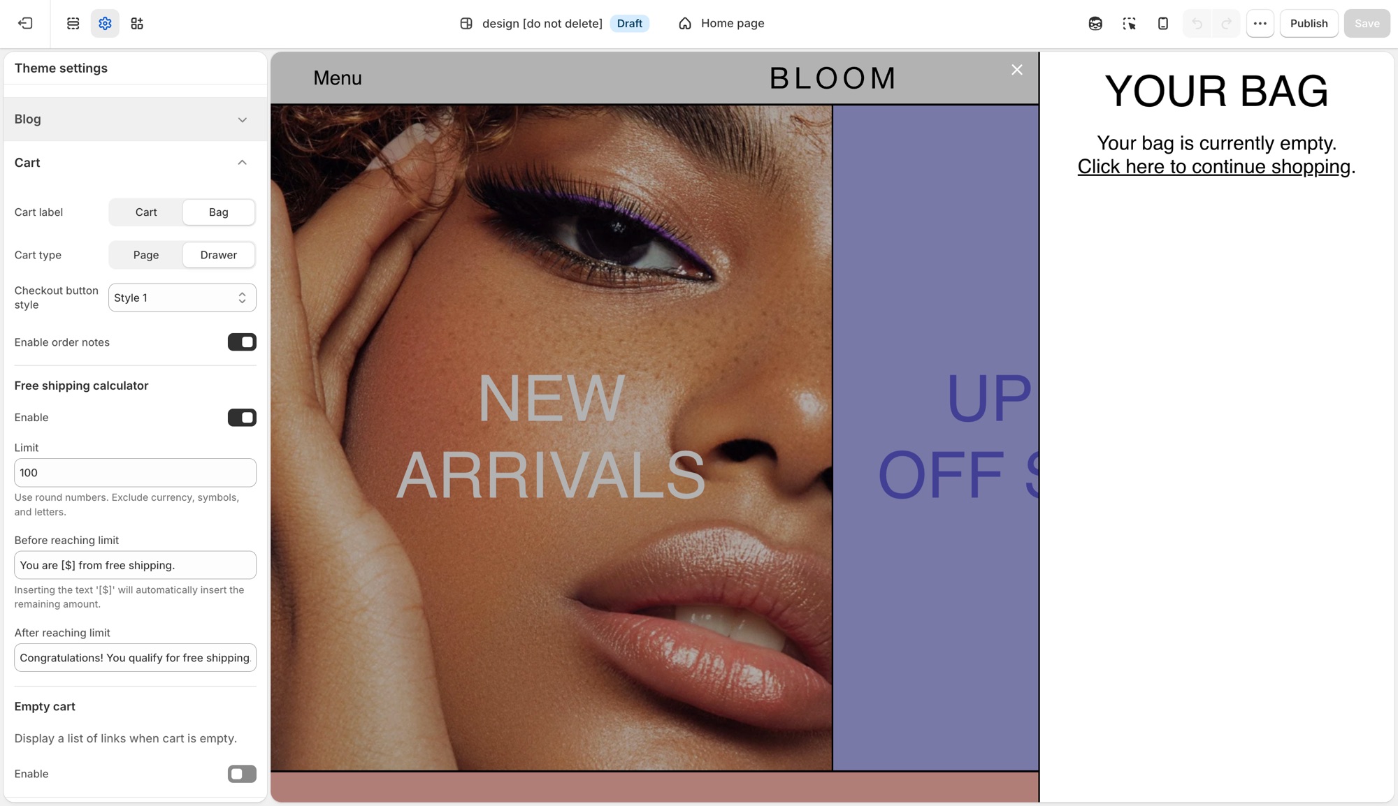
## Theme settings → Cart (Maker)
- **Cart label**: **Cart** or **Bag**, the icon and wording used for the cart trigger throughout the theme.
- **Cart type**: **Page** sends customers to a dedicated cart page. **Drawer** opens the cart in a slide-out panel without leaving the page.
- **Checkout button style**: pick from your four button styles ([Buttons and inputs](https://support.troopthemes.com/guide/maker/buttons-and-inputs/)) for the cart's checkout button specifically.
- **Enable order notes**: adds a note field to the cart so customers can leave instructions. See Shopify's [order notes](https://help.shopify.com/en/manual/online-store/themes/customizing-themes/common-customizations/add-order-notes) guide for how this differs from cart attributes and line item properties.
### Free shipping calculator (Maker)
- **Enable**: turns the progress message on or off.
- **Limit**: the order subtotal that qualifies for free shipping. Numbers only, no currency symbol.
- **Before reaching limit**: message shown while under the limit. Insert `[$]` to show the remaining amount automatically.
- **After reaching limit**: message shown once the customer qualifies.
This calculator is a message only, it does not create or apply a shipping discount. Set up the matching rate in **Settings** → **Shipping and delivery**; see Shopify's [setting up shipping rates](https://help.shopify.com/en/manual/fulfillment/setup/shipping-rates/setting-up-shipping-rates) guide for how to configure a free-shipping rate that actually applies at checkout.
### Empty cart (Maker)
- **Enable**: shows a list of links when the cart has nothing in it.
- **Custom link list**: which menu to show. Dropdown items in that menu do not appear, top-level links only.
## Troubleshooting (Maker)
- **Cart opens as a drawer when I wanted a page (or the reverse)**: **Cart type** in **Theme settings** → **Cart**.
- **Free shipping message shows the wrong amount, or shows for everyone**: check **Limit**. It is a plain number, no currency symbol or letters.
- **Customers reached the limit but nothing changed at checkout**: this is expected. The free shipping bar is a message only. Create the actual free shipping rate in **Settings** → **Shipping and delivery**.
- **Empty cart shows the wrong links**: the assigned menu has the wrong links, or has dropdown items that are not appearing (expected, only top-level links show).
- **Checkout is unchanged**: expected. Checkout is not the theme.
---
title: Add custom CSS or edit template code
url: https://support.troopthemes.com/guide/maker/adding-css-editing-template-code/
theme: Maker
theme_styles: Bloom
---
# Add custom CSS or edit template code in Maker
Use **Theme settings** → **Custom CSS** (the whole store) or a section's own **Custom CSS** field (just that section) for one-off exceptions the settings do not cover. Do not start here for colors, type, spacing, or buttons, those have Theme settings.
Checkout is unchanged, custom CSS does not apply there. Prefer settings over CSS; prefer CSS over editing Liquid.
> **Before you begin**
>
> Modifying theme code in the template editor requires some basic knowledge of CSS, HTML and Liquid so be sure you're comfortable with those areas before attempting any.
>
> Check out Shopify's [guide to editing theme code](https://help.shopify.com/en/manual/online-store/themes/customizing-themes/edit-code).
>
> Visit [W3Schools](https://www.w3schools.com/Css/) for a quick CSS tutorial.
>
> Support can point you to the right field, but debugging your own CSS or Liquid is outside [what we can help with](https://support.troopthemes.com/submit-a-support-ticket/).
> **Create a backup**
>
> We recommend making your customizations on an unpublished version. Go to **Actions** → **Duplicate** first.
## Adding CSS to the whole store (Maker)
**Edit theme** → **Theme settings** → **Custom CSS** → add your code → **Save**.

This applies everywhere on the storefront and is capped at 1,500 characters. If a change only needs to apply to one section, add it there instead, see below.
## Adding CSS to one section (Maker)
Select the section → scroll to the bottom of its settings panel → **Custom CSS** → add your code → **Save**.

This applies to that section only, and is capped at 500 characters. Only the `@media`, `@container`, `@layer`, and `@supports` at-rules are allowed here.
## What custom CSS can't do (Maker)
- No `@import`, `@charset`, or `@namespace`, at either the theme or section level.
- No `content` property.
- Can't target the `shopify-section` wrapper element.
- Any URL you reference has to be on `https://cdn.shopify.com`.
- Custom CSS overrides your theme's built-in settings, it always wins, so a Theme setting and a Custom CSS rule that disagree will show the CSS.
- Not supported on the checkout page.
- Updating your theme can break selectors your CSS depends on, recheck custom CSS after an update.
## Advanced: editing CSS directly in template code (Maker)
These two options require editing Liquid files in the code editor, not just filling in a settings field. They're for merchants and developers comfortable working in the theme's code.
### custom-styles.liquid (Maker)
Every theme ships an empty `custom-styles.liquid` snippet in _Snippets_, rendered as a plain `
```
Click **Save** in the theme editor to apply the changes.
### Option 2: Use a URL to a hosted font (Emerge)
Use this option when the font file is on a server or CDN and you have a direct `https://` link to the file.
In the **Custom liquid** section, paste the following code. Set `custom_font_family` to your font’s name, and set `custom_font_url` to the full address of the file (for example, `https://example.com/fonts/custom-font.woff2`).
```liquid
{%- liquid
assign custom_font_family = 'Merchant Custom Sans'
assign custom_font_fallback = 'sans-serif'
assign custom_font_url = 'https://example.com/fonts/custom-font.woff2'
-%}
```
Click **Save** in the theme editor to apply the changes.
### Option 3: Use Google Fonts (Emerge)
On [Google Fonts](https://fonts.google.com/), pick a font, open **Get embed code**, and copy the stylesheet link. The link has the format `https://fonts.googleapis.com/css2?family=...&display=swap`.

In the **Custom liquid** section, paste the following code. Set `custom_font_url` to the stylesheet link, and set `custom_font_family` to the font’s name as Google Fonts shows it. The example uses the font Oi.
```liquid
{%- liquid
assign custom_font_family = 'Oi'
assign custom_font_fallback = 'sans-serif'
assign custom_font_url = 'https://fonts.googleapis.com/css2?family=Oi&display=swap'
-%}
```
Click **Save** in the theme editor to apply the changes.
### Deprecated fonts in Shopify’s library (Emerge)
Shopify sometimes deprecates fonts in its font library. A deprecated font can disappear from the font picker in **Theme settings** → **Typography** or stop loading as before. See [Deprecated fonts](https://shopify.dev/docs/storefronts/themes/architecture/settings/fonts#deprecated-fonts) in Shopify’s font documentation for the affected typefaces.
To replace a deprecated font, pick another font from the current library in **Theme settings** → **Typography**. To keep the same typeface, load it as a custom font with one of the options above.
## Ask Sidekick (Emerge)
Open [Sidekick](https://help.shopify.com/en/manual/shopify-admin/productivity-tools/sidekick) from the theme editor toolbar (top right, next to the device preview icon), or press `⌘.` (`Ctrl+.` on Windows). Ask it for a font pairing that fits your brand.
> "Suggest a Heading font and Paragraph font pairing for a laid-back, cafe-style brand, and whether Navigation should match the heading or the paragraph font."
It previews the pairing before you apply anything to Theme settings → Typography, faster than comparing font libraries by hand. If you're deciding whether a custom font is worth adding at all, it's also a reasonable place to ask.
## Troubleshooting (Emerge)
- **Headings collide with a wave**: lower **Mobile size**, or put the shape on the *other* section’s edge. See [Section shapes](https://support.troopthemes.com/guide/emerge/section-shapes/).
- **Overlay type is not readable**: raise **Image darkness**. Shape color does not darken the photo.
- **A header label is the wrong words**: [default theme content](https://support.troopthemes.com/guide/emerge/change-default-text/).
- **Custom font did nothing**: the **Custom liquid** section must be first in the header group, with all spacing set to **None**. See [Custom fonts](#custom-fonts).
- **Custom font only changed some text**: the snippet sets the heading, navigation, and paragraph font variables together. Remove the `:root` lines for the roles you do not want to change.
- **Custom font file returns a 404**: `custom_font_file` must match the file name in **Content** → **Files** exactly, including the extension.
- **Checkout font is unchanged**: this is expected. Custom fonts do not apply to checkout.
---
title: Changing default theme text
url: https://support.troopthemes.com/guide/emerge/change-default-text/
theme: Emerge
theme_styles: Cafe, Elements
---
# Changing default theme text in Emerge
If you cannot edit the wording in a section setting (a heading or button label you typed yourself), it is usually **default theme content**: “Add to cart”, “Sold out”, form placeholders, cart empty-state messages, and other built-in storefront wording.
**Online Store** → **Themes** → **…** → **Edit default theme content** (Languages).

Product titles (**Products**), page bodies, blog bodies (**Content** → **Blog posts**), menu labels (**Content** → **Menus**), and checkout wording are edited elsewhere, not here.
> **Info**
>
> Visit Shopify's help centre for an extensive guide on [changing the wording in themes](https://help.shopify.com/en/manual/online-store/themes/customizing-themes/language).
## Which editor? (Emerge)
### Edit theme (a section) (Emerge)
For headings, overlay text, newsletter headlines, and other copy you added to a section: open that section in **Edit theme**.
### Edit default theme content (Emerge)
For built-in storefront wording, “Add to cart”, “Sold out”, “Size chart”, form errors: **Edit theme** → **…** → **Edit default theme content**.
### Shopify admin (Emerge)
- Product titles, descriptions, variant names: **Products**
- Menu item names: **Content** → **Menus**
- Blog post bodies: **Content** → **Blog posts**
- A whole About page: Online Store → **Pages**
### Checkout (Emerge)
“Pay now” and other checkout labels: Shopify checkout / Markets language, not the theme.
Search in default theme content for the exact words you see on the storefront. If search finds nothing, you are in the wrong place (section setting or admin).
## Ask Sidekick (Emerge)
Open [Sidekick](https://help.shopify.com/en/manual/shopify-admin/productivity-tools/sidekick) from the icon in your Shopify admin, then ask it to rewrite a batch of default theme content in your brand's voice, useful if it reads too formal, too casual, or just generic.
> "Make these button and form labels warmer and more casual: [paste your list]."
You still paste the results into **Edit default theme content** yourself, Sidekick doesn't edit theme content directly.
## Troubleshooting (Emerge)
- **You changed a section heading and the button still says Add to cart**: that button is default theme content, not the section.
- **You changed default theme content and a product title didn’t move**: product titles are in Products.
- **A translation app overwrote your wording**: the app owns storefront language. Edit there, or disable the app embed to test.
- **Checkout is unchanged**: expected. See "Translating your store" in your theme's [country, currency, and language selectors guide](https://support.troopthemes.com/guide/troubleshooting/#store) for storefront vs checkout.
---
title: Spacing and layout
url: https://support.troopthemes.com/guide/emerge/spacing-and-layout/
theme: Emerge
theme_styles: Cafe, Elements
---
# Spacing and layout in Emerge
Spacing works in two steps: In **Edit theme** → **Theme settings** → **Layout**, **Desktop spacing** and **Mobile spacing** define what Small through Extra large mean storewide. On each section, **Spacing above** and **Spacing below** pick from that scale: None, Small, Medium, Large, or Extra large. Changing a size in Layout updates every section that uses it.
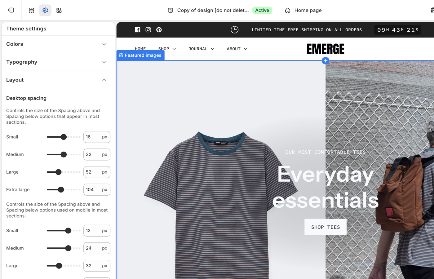
## Theme settings → Layout (Emerge)
### Small through Extra large (Emerge)
**Desktop spacing** and **Mobile spacing** each set Small, Medium, Large, and **Extra large**.
Those settings are the pixel values behind the **Spacing above** and **Spacing below** dropdowns on most sections. Extra large is for heroes, stories, and pauses, not for every block on a collection page.
### Desktop and mobile (Emerge)
Mobile Extra large is easy to overdo. Preview the phone layout after you raise Extra large in **Mobile spacing**.
Reuse the same **Spacing above** / **Spacing below** dropdown on adjacent sections: Medium throughout the shop, or Large on a hero and Medium on what follows. Use **None** when two sections should sit flush. Add a **Divider** when you need a gap with no content. Keep mobile spacing smaller than desktop, and preview both after you change the scale in Layout.
Shapes add height on their own, pair with Medium spacing, not double Extra large on both edges.
## Shapes use space too (Emerge)
A top or bottom [shape](https://support.troopthemes.com/guide/emerge/section-shapes/) is extra geometry between sections. If two sections both use Extra large **and** both use a tall wave, you will get a valley of empty color. Prefer a shape on one edge of a pair, or Medium spacing when both edges have shapes.
## On each section (Emerge)
Choose None through Extra large from the section dropdowns. Use **None** when a shape should sit flush against the next background. A **Divider** section is still the right tool for a simple gap with no shape.
> **Tune Layout, not one-off pixels**
>
> If everything feels tight, raise Large and Extra large in Theme settings. Changing twenty sections by hand is how stores drift out of rhythm.
## Ask Sidekick (Emerge)
Open [Sidekick](https://help.shopify.com/en/manual/shopify-admin/productivity-tools/sidekick) from the theme editor toolbar (top right, next to the device preview icon), or press `⌘.` (`Ctrl+.` on Windows). If your pages feel cramped or overly loose and you can't tell which setting is responsible, describe the problem.
> "My homepage sections feel too tight on mobile, what Desktop spacing and Mobile spacing values should I use for Small through Extra large?"
It can point you toward the relevant spacing settings and suggest values, rather than you adjusting sliders section by section to find the right combination.

## Troubleshooting (Emerge)
- **A tall empty band between sections**: both edges have a shape, or Extra large is stacked. Put a shape on one edge only, and drop spacing to Medium.
- **One section didn't move**: change **Spacing above** / **Spacing below** on that section.
- **Mobile feels endless**: lower **Mobile spacing** Extra large. Shapes add height on phones too.
---
title: Alignment and width
url: https://support.troopthemes.com/guide/emerge/alignment-and-width/
theme: Emerge
theme_styles: Cafe, Elements
---
# Alignment and width in Emerge
Open a section in **Edit theme**, not **Theme settings**.
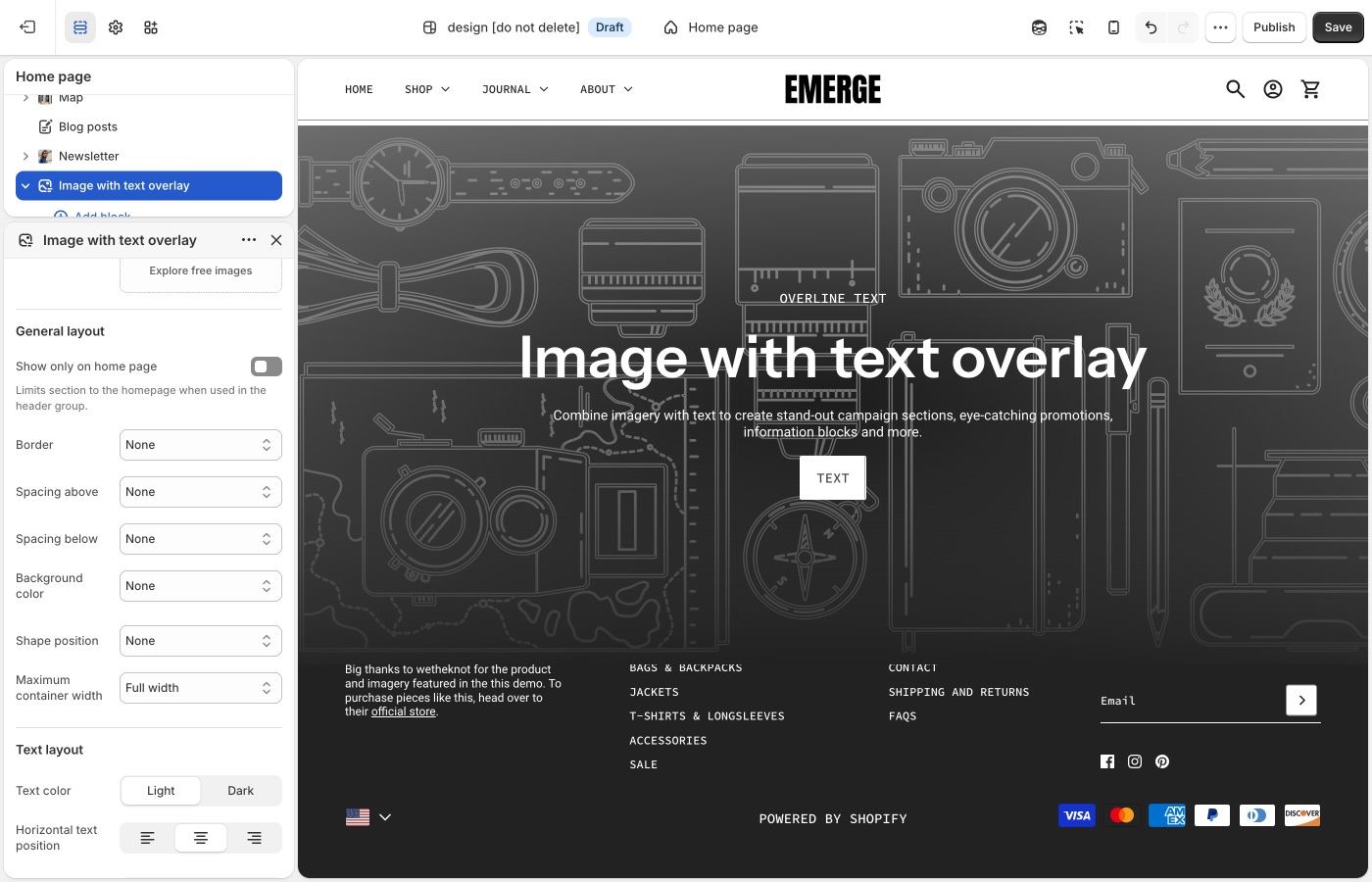
Pick a default **Text alignment** per template and keep supporting sections on it: **left** for catalogs and long copy, **center** for heroes and short announcements, then back to your default. **Mobile text alignment** is separate.
**Maximum container width** is on each section: contained for text-heavy blocks, **Full width** for slideshows and large photography. A useful rhythm is full-width hero → contained story → full-width collection.
## Text alignment (Emerge)
Left, center, or right, plus a mobile control.
Emerge heroes and Cafe-style banners often center. Collection grids and long copy usually read better left-aligned. Pick a default for each template (home vs collection vs page) and stick to it.
Product card alignment is global under **Theme settings** → **Product grid**.
## Maximum container width (Emerge)
Extra small through Full width.
Full width is natural for slideshows and image-with-text-overlay. Contained widths keep FAQ, rich text, and newsletters readable. A contained heading over a full-width [shape](https://support.troopthemes.com/guide/emerge/section-shapes/) is a common Emerge move: the color or wave goes edge to edge, the words stay in a column.
## Mobile (Emerge)
Center short banners on mobile even if desktop is left-aligned in a split layout. Check the preview; shapes plus large type plus center alignment can stack into a long scroll.
> **Width, then shape**
>
> Set container width before you pick a shape style. A close wave on a narrow contained section looks different from the same wave at Full width.
## Product grid (Emerge)
**Text alignment** for product cards is in **Theme settings** → **[Product grid](https://support.troopthemes.com/guide/emerge/product-grid/)**, not the collection section.
## Ask Sidekick (Emerge)
Open [Sidekick](https://help.shopify.com/en/manual/shopify-admin/productivity-tools/sidekick) from the theme editor toolbar (top right, next to the device preview icon), or press `⌘.` (`Ctrl+.` on Windows). Alignment and width choices are easy to second-guess in isolation, ask it how a layout choice reads.
> "Should my hero text be centered or left-aligned for a laid-back, cafe-style homepage, and what Maximum container width fits it?"
It'll reason through the trade-off with you rather than you flipping the setting back and forth to compare.

## Troubleshooting (Emerge)
- **The wave is full-bleed but the heading is a narrow column**: that can be correct. If it looks accidental, set **Maximum container width** to Full width, or put the shape on a neighboring full-width section.
- **Product cards didn’t follow**: **Product grid** text alignment, not this section.
- **Mobile is a long centered stack**: lower heading **Mobile size** in Typography, or drop Extra large spacing, before you turn the shape off.
---
title: Buttons and inputs
url: https://support.troopthemes.com/guide/emerge/buttons-and-inputs/
theme: Emerge
theme_styles: Cafe, Elements
---
# Buttons and inputs in Emerge
Buttons work in two steps: In **Edit theme** → **Theme settings** → **Buttons & Inputs**, styles 1 through 4 define how buttons look storewide, including hover colors. On each section, the **Button** block picks style 1–4. Changing a style in Theme settings updates every button that uses it.
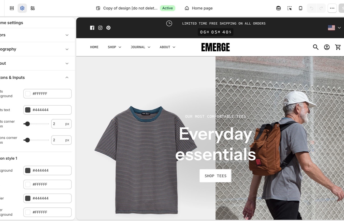
## Theme settings → Buttons & Inputs (Emerge)
### Four button styles (Emerge)
Each style has **Background**, **Text**, **Border**, **Hover background**, and **Hover text**.
- **Style 1**: primary: solid fill
- **Style 2**: secondary on light backgrounds
- **Style 3**: outline on light surfaces
- **Style 4**: light text and border on dark or image backgrounds
Keep primary actions on style 1. Hover colors should still pass contrast, especially on a colored [section shape](https://support.troopthemes.com/guide/emerge/section-shapes/) sitting behind a banner button.
**Buttons corner radius**: a small radius fits Emerge’s default. Rounder buttons can match a broad wave; square buttons contrast with it.
### Inputs (Emerge)
- **Inputs corner radius**: rounds newsletter fields, contact forms, search, and cart notes
- **Inputs background**: fill color behind the field
- **Inputs text**: color of the text customers type
Match input radius to button radius so forms do not look imported.
> **Buttons on shapes**
>
> Preview the hover state on a section that uses a top or bottom shape. If the hover fill matches the shape color, the button disappears into the wave. Change hover, not the whole palette.
## On each section (Emerge)
The **Button** block picks style 1–4 from the set you defined in **Buttons & Inputs**. Keep primary actions on style 1 storewide. Preview hover on sections with [shapes](https://support.troopthemes.com/guide/emerge/section-shapes/); hover fill can match the shape color.
## Ask Sidekick (Emerge)
Open [Sidekick](https://help.shopify.com/en/manual/shopify-admin/productivity-tools/sidekick) from the theme editor toolbar (top right, next to the device preview icon), or press `⌘.` (`Ctrl+.` on Windows). Ask it to suggest a button style.
> "Suggest Background, Text, Border, Hover background, and Hover text values for Style 1 (primary) and Style 3 (outline) that fit a laid-back, cafe-style brand."
It'll reason through contrast and hierarchy with you before you touch Theme settings → Buttons & Inputs. Useful when you have four button styles to fill in and aren't sure how to differentiate them.

## Troubleshooting (Emerge)
- **Hover removes button contrast**: hover fill matches the [shape color](https://support.troopthemes.com/guide/emerge/section-shapes/) or the section background. Change **Hover background**, not Colors.
- **Add to cart didn’t change**: confirm **Buttons & Inputs** and style 1 on the product form.
- **Checkout is unchanged**: Shopify checkout, not the theme.
---
title: Images
url: https://support.troopthemes.com/guide/emerge/images/
theme: Emerge
theme_styles: Cafe, Elements
---
# Images in Emerge
**Edit theme** → **Theme settings** → **Images**.
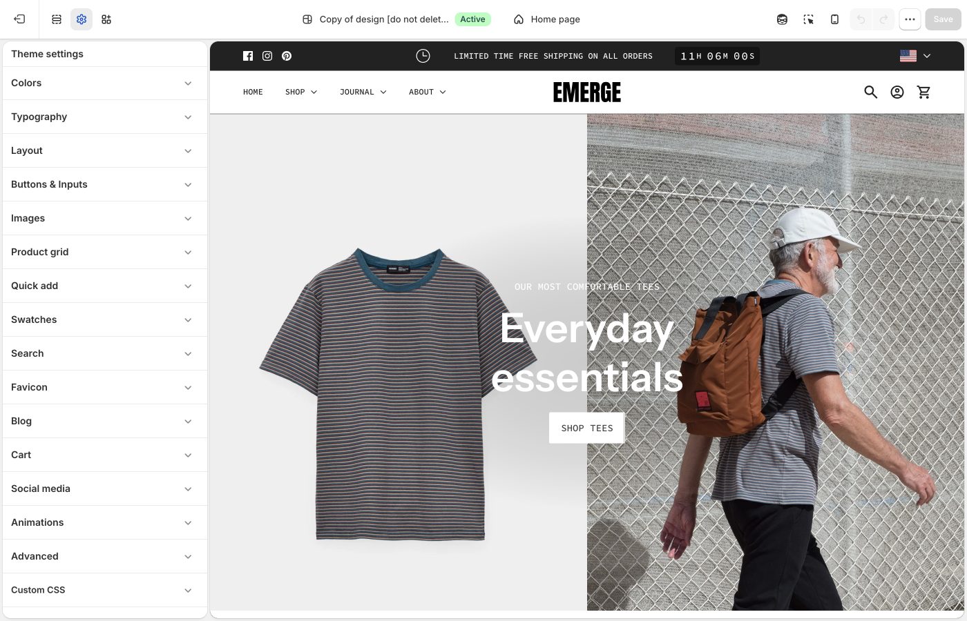
Crops for product, collection, and article images.
**Corner radius** is storewide. Besides photos, it rounds embedded videos, text blocks with a background color, the newsletter popup, and sections with **Outer background** off.
## Crops and radius (Emerge)
- **Corner radius**: rounds product and content images, embedded videos, text blocks with a background color, the newsletter popup, and inset sections (**Outer background** off). Not applied to full-width section images.
- **Product image size**: Natural, Square (1:1), Landscape (4:3), Portrait (4:5), Portrait (2:3)
- **Collection image size**: collection lists and thumbnails
- **Article image size**: blog cards
Natural keeps mixed photos honest. A fixed ratio makes Cafe- and Elements-style grids look catalogued. Export sizes: [What image sizes should I use?](https://support.troopthemes.com/faqs/what-image-sizes-should-i-use/).
## Ask Sidekick (Emerge)
Open [Sidekick](https://help.shopify.com/en/manual/shopify-admin/productivity-tools/sidekick) from the theme editor toolbar (top right, next to the device preview icon), or press `⌘.` (`Ctrl+.` on Windows). Unsure whether Natural, Square, or Portrait crops will suit your product photography, or how consistent your existing photos actually are, describe your catalog.
> "My product photos are a mix of studio shots and lifestyle images, what Product image size should I use for the grid?"
It can help you reason through the trade-off before you commit the whole store to one crop, and point you to Shopify's [image size guidance](https://support.troopthemes.com/faqs/what-image-sizes-should-i-use/) if you're about to reshoot.

## Troubleshooting (Emerge)
- **Images look cropped**: **Product image size**, not a broken file. Switch to Natural or shoot for the ratio.
- **Corner radius ignored on a hero**: full-width section images are excluded on purpose.
---
title: Social media
url: https://support.troopthemes.com/guide/emerge/social-media/
theme: Emerge
theme_styles: Cafe, Elements
---
# Social media in Emerge
**Edit theme** → **Theme settings** → **Social media**.
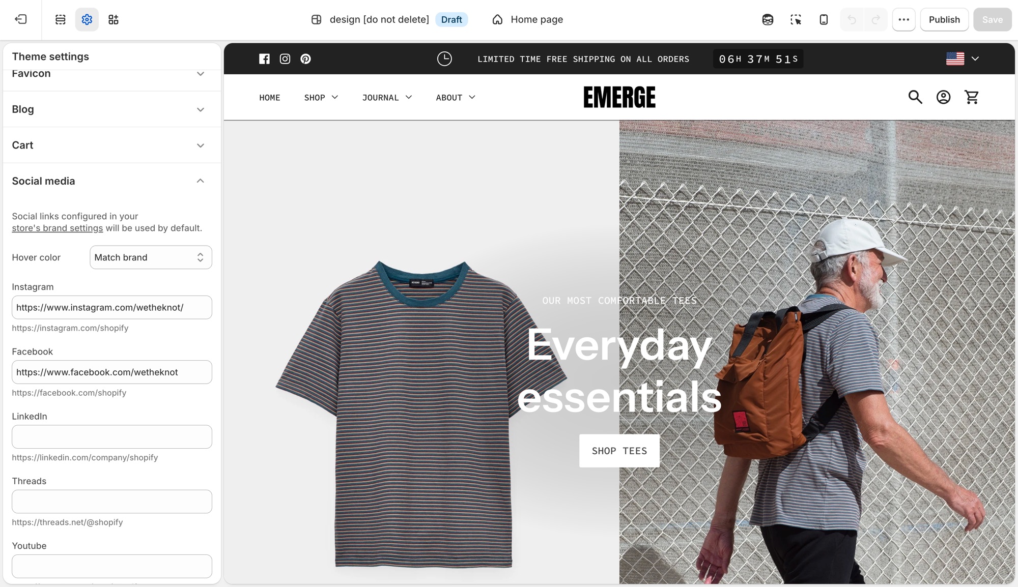
These settings control the social icons that appear in the footer, announcement bar, and other sections across the theme in one place, not per section.
## Theme settings → Social media (Emerge)
- **Hover color**: **Match brand** (each platform's own color), **Opacity** (dims on hover), or **None**.
- One field per platform (Instagram, Facebook, LinkedIn, Threads, Youtube, Vimeo, Pinterest, 𝕏, TikTok, Tumblr, Snapchat, Bluesky): paste that profile's URL to show its icon.
Leave a platform blank and no icon shows for it. Sections do not need each icon toggled individually.
If you already added social links in Shopify's [brand assets](https://help.shopify.com/en/manual/promoting-marketing/managing-brand-assets) (**Settings** → **General** → **Brand assets** → **Social links**), the theme uses those by default and no further setup is needed here. A URL entered in **Theme settings** → **Social media** overrides the brand setting for that platform only. This is useful when a section-specific or seasonal account should differ from your main brand profile.
## Troubleshooting (Emerge)
- **An icon is not showing**: that platform's URL field is empty here and in **Settings** → **Brand**.
- **The wrong URL is showing**: a value here always wins over **Settings** → **Brand** for that platform.
- **Icons do not change color on hover**: **Hover color** is set to **None**.
---
title: Animations
url: https://support.troopthemes.com/guide/emerge/animations/
theme: Emerge
theme_styles: Cafe, Elements
---
# Animations in Emerge
**Edit theme** → **Theme settings** → **Animations**.
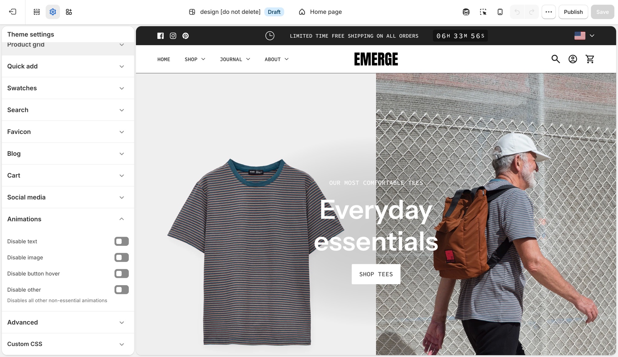
Four storewide switches, each one turns a category of motion off. There is nothing to turn on, animations ship on by default.
## Theme settings → Animations (Emerge)
- **Disable text**: turns off text fade and reveal animations.
- **Disable image**: turns off image fade and reveal animations.
- **Disable button hover**: turns off button hover transitions.
- **Disable other**: turns off all other non-essential animation, a catch-all for anything the first three do not cover.
## Where each toggle applies (Emerge)
- **Disable text**: the scroll-triggered fade/slide-in on headings, subheadings, text, buttons, and rich text, used in nearly every section, plus the animated stacked headline component where a section uses one.
- **Disable image**: the fade-in on section images, for example Image with text, Media with highlight, Shop the banner, Scrolling text on image, Grid with overlay, Featured collections, the collection banner, and menu images.
- **Disable button hover**: a single storewide switch. It is not checked per section, so it turns off hover transitions on every button, input, and link at once.
- **Disable other**: the widest switch, covering things that are not simple text or image reveals: product card image hover-swap and the shared transition into the product page, the cart drawer, predictive search results, dropdown/mega menus, accordions, grid reveals on collection/blog/search listing pages, and sections like Testimonials.
## Troubleshooting (Emerge)
- **A section still animates after I disabled text or image**: that motion may fall under **Disable other** instead, for example a slideshow transition or a decorative loop. Turn that on too.
- **I want most animation off but kept hover effects**: leave **Disable button hover** off and enable the other three.
---
title: Section shapes
url: https://support.troopthemes.com/guide/emerge/section-shapes/
theme: Emerge
theme_styles: Cafe, Elements
---
# Section shapes in Emerge
Open a section in **Edit theme**, not **Theme settings**. Look for **Shape position**, **Top shape style** / **Bottom shape style**, and **Top shape color** / **Bottom shape color**.
Pick a default **Text alignment** per template and keep supporting sections on it: **left** for catalogs and long copy, **center** for heroes and short announcements, then back to your default. **Mobile text alignment** is separate.
**Maximum container width** is on each section: contained for text-heavy blocks, **Full width** for slideshows and large photography. A useful rhythm is full-width hero → contained story → full-width collection.
Set **Maximum container width** before you pick a shape style. Full-width shapes with contained copy is a common Emerge layout.
## Position (Emerge)
- **Top**: shape on the incoming edge
- **Bottom**: shape on the outgoing edge
- **Both**: usually too much unless the section is a thin band
- **None**: a hard rectangular join
For two neighboring sections, put a shape on **one** shared edge. A bottom wave on section A plus a top wave on section B doubles the geometry.
## Style (Emerge)
Each edge can be:
- Broad wave
- Moderate wave
- Close wave
- Ripple wave
- Diagonal
Broad and moderate are the everyday choices. Close and ripple are more complex; use them on short sections. Diagonal is a single cut with a sharper, more architectural edge than wave styles.
## Color (Emerge)
Shape color can be **None**, **Light**, **Dark**, or **Accent 1–3**.
None lets the neighboring section’s background show through the cut. An accent fill makes the wave a stripe of brand color. Match the shape to the **next** section’s background when you want a seamless pour; mismatch it when the wave should be a stripe.
## Spacing and width (Emerge)
Shapes consume vertical space. Pair them with Medium [spacing](https://support.troopthemes.com/guide/emerge/spacing-and-layout/) unless the section is a hero that can afford Extra large. Full-width sections show the whole curve; a contained section clips the shape to the column.
> **One language per page**
>
> Pick one shape family per template: waves or diagonals. Mixing ripple, diagonal, and broad wave on the same homepage shows multiple shape styles without a consistent brand pattern.
Which section to add is in [Sections in Emerge](https://support.troopthemes.com/guide/emerge/section-list/).
## Ask Sidekick (Emerge)
Open [Sidekick](https://help.shopify.com/en/manual/shopify-admin/productivity-tools/sidekick) from the theme editor toolbar (top right, next to the device preview icon), or press `⌘.` (`Ctrl+.` on Windows). Shape choice and accent color are meant to work together, a wave that clashes with your palette appears accidental rather than intentional.
> "What shape and accent color combination fits a minimal skincare brand?"
If you're unsure which combination fits your brand, reason through the options before committing a section's **Top/Bottom shape color**.

## Troubleshooting (Emerge)
- **A double wave / valley of empty color**: both neighboring edges have a shape. Turn one off.
- **The next section’s cards sit in the wave**: the bottom shape color is filling behind them. Set the next section’s background, or put the shape only on the section that should own that color.
- **The curve is clipped**: the section is not Full width. Set **Maximum container width** to Full width, or accept a contained cut.
- **Type collides with the wave on mobile**: lower heading **Mobile size**, or drop Extra large spacing. Do not remove the shape first.
---
title: Section list
url: https://support.troopthemes.com/guide/emerge/section-list/
theme: Emerge
theme_styles: Cafe, Elements
---
# Sections in Emerge
**Edit theme** → **Add section**. Names in the editor match this list. Do not pick a section because the name sounds close; each one does a different job.
- **Copy under a photo**: use **Image with text** and stack on mobile.
- **Bookings**: use **Contact form** plus an app.
Put a shape on **one** shared edge between two sections so the join does not double up. See [Section shapes](https://support.troopthemes.com/guide/emerge/section-shapes/).
For how to place image layouts, see [Designing with image sections](https://support.troopthemes.com/guide/emerge/image-sections/).
## Which section for this goal? (Emerge)
Each row names the section to use for a goal and a similar section that does a different job.
| Goal | Use | Do not use |
| --- | --- | --- |
| One static hero with text on the photo | **Image with text overlay** | **Slideshow** (that rotates) |
| Several rotating heroes | **Slideshow** | **Image with text overlay** |
| Photo beside copy | **Image with text** | **Image with text overlay** |
| Copy under a photo | **Image with text** (stack on mobile) | **Image with text overlay** |
| A grid of images with captions on them | **Grid with overlay** | **Featured collection** |
| Up to three images or videos in a row | **Media row** | **Grid with overlay** (more tiles) or **Featured images** (exactly two) |
| Bookings | **Contact form** plus an app | **Newsletter** |
| Products from one collection | **Featured collection** | **Featured products** (those are picked one by one) |
| A hand-picked set of products | **Featured products** | **Featured collection** |
| Clickable hotspots on one image | **Shop the look** or **Shop the banner** | **Image with text overlay** |
| FAQ / accordion | **FAQ** | **Rich text** |
| Email signup *on the page* | **Newsletter** section | **Popups** (the overlay that opens over the page) |
Jump to a group; these match the groups in **Add section**:
- [Storytelling](#storytelling)
- [Products](#products)
- [Brand Trust](#brand-trust)
- [Promotions](#promotions)
- [Signups](#signups)
- [Utilities & Layout](#utilities-layout)
---
## Storytelling (Emerge)
Use these for brand narrative and visual-first layouts. Put a shape on **one** shared edge between two sections so the join does not double up.
- **Featured images**: Two coordinated images with shared text and a call to action. Good for a campaign spotlight or category teaser where two images tell one story better than either alone.
- **Grid with overlay**: Image or video tiles with text overlays in a flexible grid. Good for a shop-by-category or shop-by-collection grid, each tile carrying its own label and link.
- **Image comparison**: Shoppers drag between before/after visuals in one frame. Good for before/after proof: skincare results, renovations, restorations, material finishes.
- **Image with text**: Image paired with copy in a split, side-by-side layout. Good for a feature or story explainer that needs room to breathe.
- **Image with text overlay**: Heading, text, and buttons directly on one image. Good for a single hero banner or campaign header, type sitting directly on the photo. Do not use for rotating slides (**Slideshow**) or copy beside the photo (**Image with text**).
- **Media overlay columns**: Several media columns, each with optional overlay text. Good for category callouts or campaign modules, each column its own labeled story card.
- **Media row**: Up to three images or videos in a row, with optional overlay text. Good for a short, light media strip: lookbook stills or campaign moments, not a full grid.
- **Media with highlight**: One featured media area plus supporting media blocks. Good for a launch page or content-first homepage: one lead visual plus supporting media.
- **Overlapping media**: Layered media for an editorial, depth-focused composition. Good for a premium, art-directed moment where a flat side-by-side layout would look plain.
- **Rich text**: Formatted text for intros, brand copy, or messaging blocks. Good for a plain-text intro, shipping note, or brand paragraph that does not need imagery.
- **Slideshow**: Rotating slides for heroes, announcements, or campaigns. Good for cycling multiple offers, looks, or promotions at the top of the homepage. Do not use for a single static banner (**Image with text overlay**).
- **Text columns with images**: Repeating image/text columns for features or pillars. Good for a "why shop with us" row: shipping, materials, guarantees.
- **Video**: One video with optional heading and copy. Good for a single product demo, brand film, or how-to as its own moment.
## Products (Emerge)
Use these to feature collections, products, and shoppable images.
- **Collection with highlight**: A collection beside a highlighted story or content area. Good for pairing a shoppable collection with a story or lookbook teaser.
- **Collections list**: Several collections in a list or grid. Good for a shop-by-category landing block: shop by room, by size, by use.
- **Featured collection**: Products from one collection. Good for showing everything in one Shopify collection, like New arrivals or Best sellers. Do not use for a hand-picked set (**Featured products**).
- **Featured product**: One product with full merchandising details. Good for a flagship launch or hero item that deserves its own dedicated spot.
- **Featured products**: A curated set of individual products. Good for a hand-picked edit: staff picks, a gift guide, a bundle, regardless of collection. Do not use to show a whole collection (**Featured collection**).
- **Recent products**: Newly added products. Good for an always-current "just in" row that updates itself as you add inventory.
- **Shop the banner**: Clickable product hotspots on one hero-style image. Good for a lifestyle hero image where every visible product is tappable.
- **Shop the look**: Image hotspots with editorial text and campaign framing. Good for an outfit or room shot with shoppable hotspots plus campaign copy.
## Brand Trust (Emerge)
Use these for FAQs, proof, and service details.
- **Blog posts**: Recent or selected articles. Good for surfacing editorial or how-to content that keeps shoppers browsing past the homepage.
- **FAQ**: Collapsible questions. Good for shipping, sizing, or policy questions shoppers need answered before checkout. See [Setting up FAQ or Collapsible rows](https://support.troopthemes.com/guide/emerge/setting-up-faq-or-collapsible-rows/).
- **Icons row**: Trust markers such as shipping, returns, or support. Good for a quick reassurance strip under a hero: free shipping, easy returns, secure checkout.
- **Map**: Location and contact details with a map. Good for a physical storefront, showroom, or studio location.
- **Service list**: Services, menus, or policy highlights. Good for listing services, a café or restaurant menu, or policy summaries without building a custom page.
- **Testimonials**: Customer quotes. Good for social proof near a buying decision: reviews, quotes, press mentions.
## Promotions (Emerge)
Use these for launches and time-sensitive campaigns.
- **Countdown**: A timer for drops, events, or limited-time offers. Good for building urgency ahead of a launch, sale end, or restock.
- **Scrolling content**: Continuously moving content blocks for callouts. Good for a marquee strip of rotating callouts: press mentions, taglines, promo codes.
- **Scrolling text on image**: Animated text over an image. Good for a bold campaign banner where the moving message is the visual.
## Signups (Emerge)
Use these to collect enquiries and emails.
- **Contact form**: Direct customer enquiries from any page. Good for custom orders, wholesale enquiries, or support questions a help-desk app does not cover.
- **Newsletter**: Email signup. Good for building your list on the page itself, separate from the popup. See [Mailing list & newsletters](https://support.troopthemes.com/guide/emerge/newsletters/).
## Utilities & Layout (Emerge)
Use these for spacing, structure, and custom code.
- **Custom Liquid**: Custom Liquid output for apps and advanced integrations. Good for embedding an app widget or custom-coded block no standard section covers.
- **Custom content**: Mixed blocks for a simple custom layout. Good for a one-off layout that does not fit any other section, built from simple mixed blocks.
- **Divider**: Visual separation between sections. Good for breathing room between two sections without adding empty content.
---
title: Designing with image sections
url: https://support.troopthemes.com/guide/emerge/image-sections/
theme: Emerge
theme_styles: Cafe, Elements
---
# Designing with image sections in Emerge
Add an image section in **Edit theme** → **Add section**, then pick by the job: one static hero, rotating slides, photo beside copy, a short media row, or a grid of overlays. Section settings and blocks control crop, width, and where type sits.
Product media in the admin, collection images, and checkout are unchanged.
Put a shape on **one** shared edge between two sections so the join does not double up. See [Section shapes](https://support.troopthemes.com/guide/emerge/section-shapes/).
For the full catalog (including product, FAQ, and utility sections), open the [section list](https://support.troopthemes.com/guide/emerge/section-list/).
## Slideshow (Emerge)
Use the Slideshow section when you want to rotate multiple messages, products, or promotions in a single section.
It is mobile-friendly by default, so customers can swipe through slides on touch devices, while desktop visitors can use drag controls or autoplay.
Each slide can display a single image or video, or two media items side by side. To display multiple media items, set `Media 2 type` to `image` or `video`. To display a single media item, set `Media 2 type` to `none`.
> **Legacy Slideshow**
>
> Please see the legacy slideshow features below for Emerge versions below 10.1.0.
Use `Blocks per slide for desktop` to control how many slides appear at once (1 to 4). A value of 1 creates a standard full-width slider, while higher values create a multi-card layout for collections, promotions, or featured content.
For saving images for your slides, read more about image sizes in our [What image sizes should I use?](https://support.troopthemes.com/faqs/what-image-sizes-should-i-use/).
---
## Image with text overlay (Emerge)
Use the Image with text overlay section when you want to place text and calls to action directly on top of a single image.
This section works well for hero banners, campaign announcements, and brand storytelling where one strong image needs supporting copy. The image can be configured with different widths and aspect ratios to suit your layout:
You build the text and calls to action with blocks (headings, descriptions, buttons, and more). For a general overview of blocks and what to expect in the theme editor, see [Blocks in image sections](#blocks-in-image-sections).
Use this section when your goal is to combine one image and one message in a single, high-impact banner that can be reused across key storefront pages.
> **Version availability**
>
> Image with text overlay is available in Emerge versions 9.1.0 and up.
---
## Image with text (Emerge)
Use the Image with text section when you want to pair an image with supporting content in a split layout.
This section works well for featured collections, product storytelling, and campaign moments where the visual and copy should sit side by side instead of stacking in a single banner.
The image can be configured to control presentation across desktop and mobile, and the layout can be reversed to place the image on either side. You can also use the overlap setting to adjust how text sits against the image:
The copy beside the image is built with blocks, which you add and reorder in the section (for example headings, descriptions, and buttons). See [Blocks in image sections](#blocks-in-image-sections) for a general overview. Use the block list in the theme editor to see what this section includes.
Use this section when your goal is to combine one image and one message in a balanced, side-by-side layout that can be reused across key storefront pages.
> **Legacy Image with text**
>
> Please see the legacy image with text features below for Emerge versions below 9.1.0.
The Image with text section allows you to display images in various ratios , full width, three quarter or half width - to establish balance and visual rhythm in your page design.
`Parallax scrolling` can be enabled for images in this section to add action and depth. Parallax scrolling effects create movement and the illusion of depth by scrolling background elements at a slower pace than foreground elements. For best results, set the `text position` setting to `center`.
---
## Featured images (Emerge)
Use the Featured images section when you want to present two visuals together with one shared message and call to action.
This section works well for campaign storytelling, category spotlights, or any moment where two complementary images create stronger impact than one alone.
Each image can be configured for desktop and mobile display, and mobile layout can be adjusted to show one image, stack both, or place them side by side.
The shared message and call to action are built with blocks for text and related content. See [Blocks in image sections](#blocks-in-image-sections) for a general overview. Add blocks in the theme editor to see what this section offers.
Use this section when your goal is to tell one clear story across two images in a single, high-impact layout that can be reused across key storefront pages.
> **Version compatibility**
>
> Featured images is available in Emerge versions 8.1.0 and up.
---
## Grid with overlay (Emerge)
This section allows you to display content in simple fixed-aspect ratio grids, justified grids, or more freeform offset grids.
Configure individual block settings to specify how blocks fall within the grid and section settings to style text overlays to optimize readability.
The `preserve image aspect ratio` block setting will display images at the ratio they're uploaded at, rather than justifying them into the grid. This will allow you to create more free-form, off-set grids with varying image heights.
---
## Text columns with images (Emerge)
This flexible sections allows you to display a combination of image an text elements for a wide variety of uses.
> **Row of icons**
>
> If you want a horizontal row of icons (for example trust marks, shipping icons, or simple pictograms with optional short text), add the **Icons row** section instead of building that layout in **Text columns with images**. _Icons row_ is available in Emerge versions 7.2.0 and up.
---
## Image comparison (Emerge)
Use the Image comparison section when you want customers to interactively compare two visuals in the same frame (for example before/after edits, product variants, material finishes, or renovation stages).
This section is ideal when one image alone cannot communicate the difference clearly. Shoppers can drag the comparison handle to reveal more or less of each image, which makes visual changes easier to understand at a glance.
Add one Before block and one After block, then upload an image for each. You can optionally add mobile-specific images per block to improve cropping and composition on smaller screens.
Use this section when your goal is to show change, contrast, or improvement in a way that invites interaction instead of relying on static side-by-side images.
> **Version availability**
>
> Image comparison is available in Emerge versions 6.2.0 and up.
---
## Shop the banner (Emerge)
Use the Shop the banner section when you want to place clickable product dots on a single image and let customers jump straight from inspiration to product discovery.
This section works well for hero-style campaign visuals where one scene contains multiple products (for example a styled room, outfit, or collection shot). Add product dots to highlight items in context without breaking the visual flow.
Set your main banner image, then add **Product dot** blocks and assign a product to each one. You can control dot placement separately for desktop and mobile, so hotspots stay accurate across screen sizes.
Use this section when your goal is to turn one strong branded image into an interactive shopping surface with minimal on-image text.
> **Version availability**
>
> Shop the banner is available in Emerge versions 8.0.0 and up.
---
## Shop the look (Emerge)
Use the Shop the look section when you want a guided, editorial shopping experience built around one curated image plus an optional call to action.
Like Shop the banner, this section supports product hotspots, but it also includes heading and button settings so you can frame the visual with a stronger campaign message.
Add your image, create **Product dot** blocks, and position each hotspot for desktop and mobile. Use the heading alignment, container width, and hotspot style settings to match the section to the rest of your page design.
Use this section when your goal is to combine storytelling and conversion in one curated “look” module.
> **Version availability**
>
> Shop the look is available in Emerge versions 6.2.0 and up.
---
## Scrolling text on image (Emerge)
Use the Scrolling text on image section when you want animated headline-style text moving across an image background.
This section is ideal for brand statements, promotional phrases, or directional messaging that should feel dynamic and high-energy. You can add multiple text blocks, control scroll direction and speed, set spacing between phrases, and pause movement on hover.
You can also choose whether text should span the full width and configure mobile-specific media to keep composition readable on smaller screens.
Use this section when your goal is to create motion-driven campaign messaging without building a full slideshow.
> **Version availability**
>
> Scrolling text on image is available in Emerge versions 7.4.0 and up.
---
## Media with highlight (Emerge)
Use the Media with highlight section when you want one primary feature area paired with a grid of supporting media items.
This section works well for launch pages, collection storytelling, and content-first merchandising where you need a lead narrative plus multiple secondary visuals. The main highlight area supports heading and rich text, while blocks can include images or video with optional titles.
Control layout with blocks-per-row, vertical alignment, reverse layout, and display/aspect settings for both desktop and mobile. Overlay style and text options help maintain readability over busy imagery.
Use this section when your goal is to blend editorial storytelling and media-rich browsing in a single modular section.
> **Version availability**
>
> Media with highlight is available in Emerge versions 8.0.0 and up.
---
## Media overlay columns (Emerge)
Use the Media overlay columns section when you want a clean column layout where each media tile can carry overlaid text and optional links.
This section is useful for category callouts, campaign modules, or mixed media presentations where each column acts like a mini story card. Blocks can be image or video, with per-block overline, heading, and description content.
You can adjust spacing, aspect ratio, and text styling to control visual rhythm and readability across the grid.
Use this section when your goal is to present multiple media-driven messages side by side in a structured, scannable layout.
> **Version availability**
>
> Media overlay columns is available in Emerge versions 10.1.0 and up.
---
## Media row (Emerge)
Use the Media row section when you want **up to three** images or videos in a single row, with a shared height.
This is for a short, even band of media, lookbook stills, campaign stills, or mixed image/video, not a many-tile grid (**Grid with overlay**) and not a two-image story (**Featured images**). Add **Image** or **Video** blocks (maximum three). **Media height** sets the crop (Natural, Square, Landscape, or Portrait). Overlay heading and button are optional on each block.
On mobile, choose whether the row stays a grid or stacks, and whether blocks go full width.
Use this section when the job is a simple 1–3 media strip with optional overlay text.
> **Version availability**
>
> Media row is available in Emerge versions 10.3.0 and up.
---
## Overlapping media (Emerge)
Use the Overlapping media section when you want to layer two media items to create depth and a more art-directed visual composition.
This section works well for brand storytelling, product detail narratives, and campaign moments where a standard side-by-side layout would appear flat. Each media block can be image or video, and you can control overlap amount, animation behavior, and layout direction.
Text settings (heading style, alignment, description, and column width) let you pair the layered media with supporting copy while keeping balance between content and visuals.
Use this section when your goal is to create a premium, editorial look with intentional layering and motion.
> **Version availability**
>
> Overlapping media is available in Emerge versions 8.0.0 and up.
---
## Blocks in image sections (Emerge)
A **section** is one area of a page template (for example a hero or image band). **Blocks** are the pieces inside that section. In other parts of a theme, blocks can be all sorts of things, this guide focuses on **image sections**, where blocks are mostly for **copy**: overlines, headings, descriptions, buttons, and similar, paired with the image. The **image** itself is set in the section (or slide) settings, not as “body text.”
**Reorder blocks** in the left-hand section list to change the order of that copy on the page. Drag a block up or down to match the story you want (for example, overline, then heading, then button).
Shopify explains the overall model in [sections and blocks in the theme editor](https://help.shopify.com/en/manual/online-store/themes/theme-structure/sections-and-blocks). For a given section, only the block types in **Add block** apply; that list changes by section and theme version, so use another image section (or a newer version) if something is missing.
Common copy-related block types often include:
**Edit theme** → **Add section**, then the section’s settings and blocks.
Product media in the admin, collection images, or checkout.
- Overline
- Heading
- Description
- Button
- Newsletter form
- Icons
- Custom Liquid
## Troubleshooting (Emerge)
- **You added Slideshow but only have one image**: use **Image with text overlay**. Slideshow is for rotating slides.
- **Type sits on the photo and you wanted it beside**: use **Image with text**, not overlay.
- **Type sits beside the photo and you wanted it underneath**: use **Image with text** and stack on mobile.
- **Images look cropped**: that section’s aspect ratio setting, or [What image sizes should I use?](https://support.troopthemes.com/faqs/what-image-sizes-should-i-use/). Replacing the file in **Products** does not change a section’s crop.
- **You wanted three photos in a row and added Grid with overlay**: use **Media row** (max three blocks, shared height).
---
title: Add collection page promotions
url: https://support.troopthemes.com/guide/emerge/collection-page-promotions/
theme: Emerge
theme_styles: Cafe, Elements
---
# Add collection page promotions in Emerge
Promotional tiles sit **inside the collection product grid**. Add them on the collection template, not in Theme settings → Colors.
**Edit theme** → collection template → **Collection grid** → **Add promotion**.
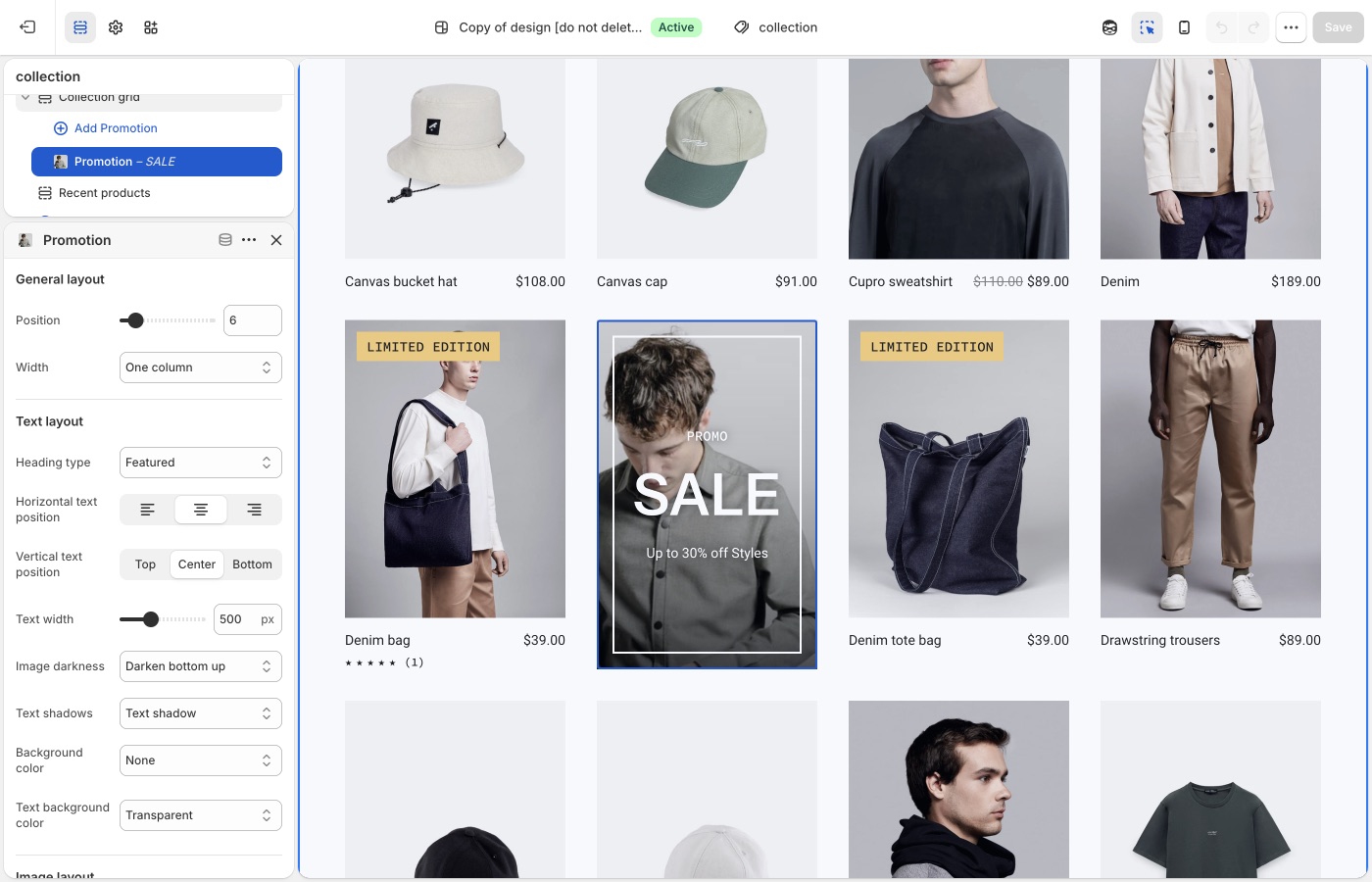
Which products are in the collection, discounts, and checkout are unchanged.
> **Compatibility**
>
> Collection promotions are available in Emerge versions 4.0.0 and up.
Promotional blocks can be added into Collection page grids to promote sales, collections, product information and more.
To add a collection promotion, navigate to the collection page settings, under _Collection grid_ > _Add promotion_. Use the settings to configure the position, size and style of individual promotions.
> **Promotions that are too wide for the product grid**
>
> Be sure that promotions have enough space to render inside the product grid. For example, a promotion inside a grid that is two columns wide should have a maximum width of two. Although the promotion will render correctly if the width is wider than the space available, it could effect pagination.
## Troubleshooting (Emerge)
- **Promo missing on one collection**: you added it on a different collection template, or that collection uses another template. Assign templates in the collection admin.
- **Grid looks broken / pagination jumps**: the promo is wider than the column count. Lower the promo width so it fits.
- **You wanted a banner above the grid**: use a section above the collection grid (Image with text overlay, etc.), not a grid promotion.
---
title: Setting up navigation
url: https://support.troopthemes.com/guide/emerge/creating-navigation/
theme: Emerge
theme_styles: Cafe, Elements
---
# Setting up navigation in Emerge
Menus are created in Shopify admin. The theme only **displays** the menu you assign in the Header, Footer, or a section.
**Content** → **Menus** to create items. Assign the menu in **Edit theme** → **Header**, **Footer**, or the section.
Checkout, apps, and collection filters are unchanged.
> **Info**
>
> Visit Shopify's help centre for an extensive guide on setting up [menus and links](https://help.shopify.com/en/manual/online-store/menus-and-links).
Menus can display as a single dropdown or in multi-columns with nested items.
### Single dropdown menu (Emerge)
To create a single dropdown menu, click the title of the menu that you would like to add a dropdown menu to.
In most cases, this is called _Main Menu_ unless it has been renamed to something else.
Next, you will need to add 'child' items to include in the new drop-down.
Click _Add menu item_, enter a name of the menu item and select a destination for the link.
Click and drag the menu items to nest below the 'parent' item.
Click _Save_ menu.

### Multi-column dropdown menu (Emerge)
You can create multi-column drop-down menus up to three levels deep.
To create third-level menu items, repeat the process for creating a dropdown and nest them below a second-level menu item.
If a second-level menu item has no nested items, it is styled in a separate column (for example _New in_ and _Sale_).
## Creating other menus (Emerge)
All other store menus can be configured in your store admin under **Content** → **Menus**.

Once a menu is configured, assign it in **Edit theme** → **Header** (or Footer / the section).
## Troubleshooting (Emerge)
- **You edited Menus and the header didn’t change**: the **Header** section is still assigned a different menu. Open Header and pick the menu you just edited.
- **A link 404s**: the menu item URL is wrong in **Content** → **Menus**, not a theme setting.
- **Mega-menu columns look wrong**: nesting depth in **Content** → **Menus** drives columns. Second-level items with no children become their own column (see _New in_ / _Sale_ above).
---
title: Working with templates
url: https://support.troopthemes.com/guide/emerge/working-with-templates/
theme: Emerge
theme_styles: Cafe, Elements
---
# Working with templates in Emerge
A template is the set of sections for one kind of page (product, collection, page, blog). Create extras in **Edit theme**, then **assign** them in the Shopify admin. The default template is what anything without an assignment uses.
**Edit theme** → template selector → **Create template**; then assign it on the resource in admin → **Template** (right column, under Online store).
Product data, collection membership, and checkout are unchanged.
> **Info**
>
> Visit Shopify's help centre for an extensive guide on [templates](https://help.shopify.com/en/manual/online-store/themes/theme-structure/templates).
## What a template controls (Emerge)
Templates can be created for:
- collections
- products
- blogs
- blog posts
- pages
Every type has a **Default** template. Pages still on Default pick up whatever sections you add there. An alternate template only applies after you assign it in the admin.
Open the template selector at the top of **Edit theme** to see which templates exist and how many pages use each one.

## Add sections to the default template (Emerge)
**Edit theme** → template selector → the page type (for example **Pages**) → **Default page**.
Sections you add here appear on every page of that type that still uses Default.
## Create a new template (Emerge)
1. **Edit theme** → template selector → open the page type (for example **Pages**).
2. Choose **Create template**.
3. Enter a **Name**, pick a template to copy in **Based on**, then **Create template**.
4. Add, remove, or rearrange sections on that template.
5. Assign it in the admin (next section). Creating it in **Edit theme** does not apply it.

## Pre-built page templates (Emerge)
Themes include **about**, **contact**, **faqs**, and **lookbook** under **Pages**. Open one in the template selector and change its sections; you do not need to create those from scratch.
## Assign a template (Emerge)
Open the page, product, collection, blog, or article in the admin. In the right column, under **Online store**, choose it from **Template**.

> **Note**
>
> Alternate templates only appear in the admin if that theme is **published**, or if you are assigning while previewing the unpublished theme those templates live on.
## Troubleshooting (Emerge)
- **You created a template but the page didn’t change**: assign it on that page, product, or collection in the admin (**Template**, right column). Creating it in **Edit theme** is not enough.
- **Every product picked up the new layout**: you edited the **Default product** template. Create an alternate and assign it only to the products that need it.
- **Template missing in the admin dropdown**: the theme must be published, or you are editing a different unpublished theme than the one assigned.
---
title: Product grid
url: https://support.troopthemes.com/guide/emerge/product-grid/
theme: Emerge
theme_styles: Cafe, Elements
---
# Product grid in Emerge
A **product card** is the tile that represents one product: the image, title, and price, plus optional extras such as vendor name, ratings, and hover effects.
Cards appear inside a **product grid**, a row-and-column layout of those tiles.
You will find product grids on:
- Collection pages
- Search results
- Product pages that show related or recommended products
- Templates that include **Featured collection**, **Featured products**, **Recent products**, or **Collection with highlight**
How cards look is set once in **Theme settings** → **Product grid**. How many columns the grid uses, and which products it shows, is set on the section or collection template.
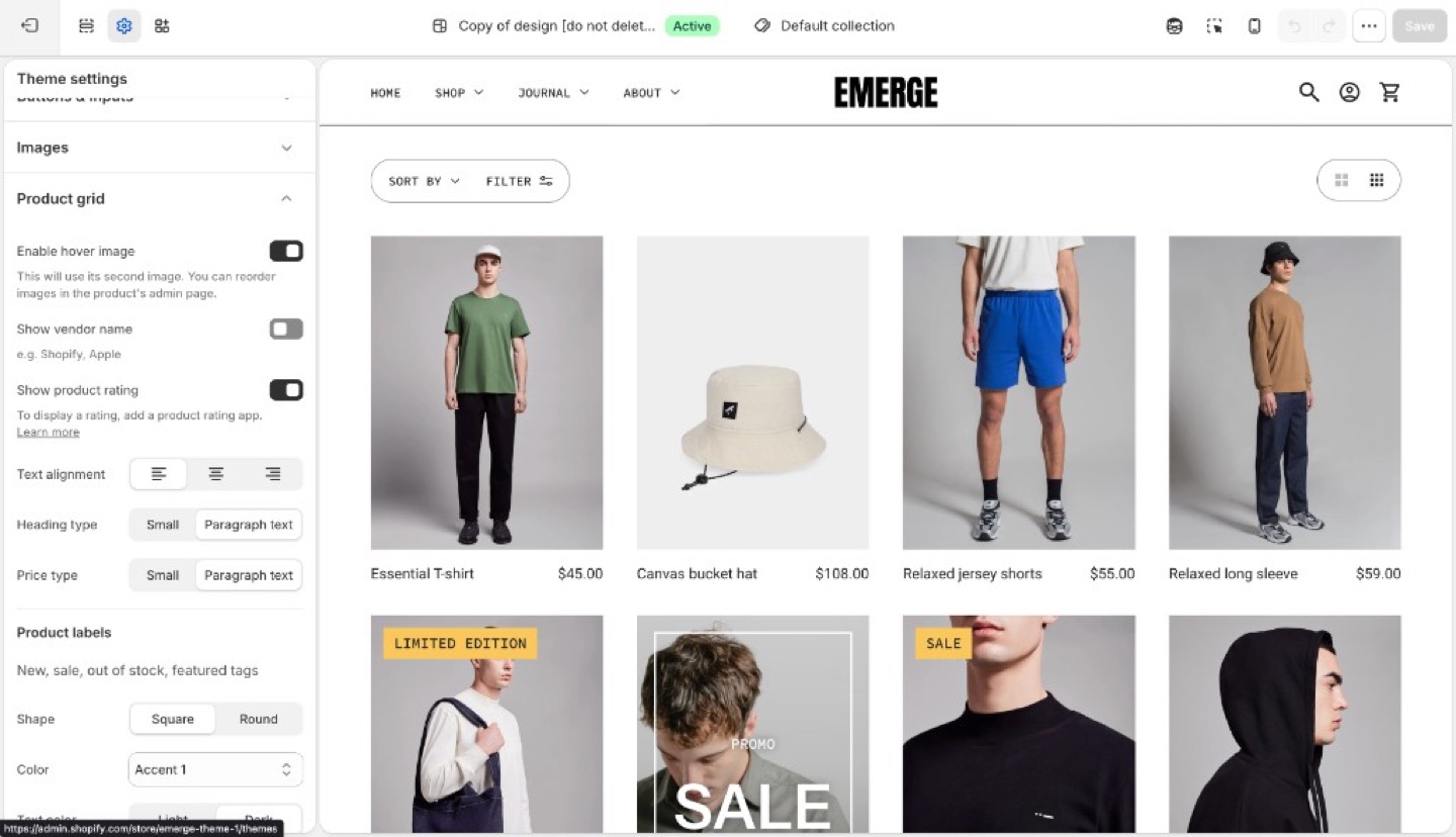
> **Info**
>
> **Product image size** (crop shape) and **Corner radius** are in **Theme settings** → **[Images](https://support.troopthemes.com/guide/emerge/images/)**, not Product grid.
## Card layout (Emerge)
- **Enable hover image**: second product image on hover. Touch devices have no hover.
- **Show vendor name**
- **Show product rating**: displays star ratings on product cards when a reviews app has added rating data to the product. The theme does not collect reviews. See [How do I add product reviews or star ratings?](https://support.troopthemes.com/faqs/how-do-i-add-product-reviews-or-star-ratings/)
- **Text alignment**
- **Heading type** and **Price type**: Small (nav-sized) or Paragraph text
> **Cards next to shapes**
>
> A product grid under a bottom wave will sit in the shape’s color. If cards need a clean white field, set the grid section background to Page or Light and put the wave on the *previous* section’s bottom edge only.
## Product labels (Emerge)
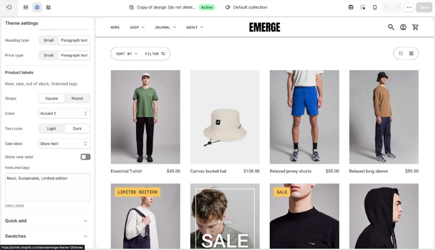
Product labels can show status (new, sale, sold out) on the collection grid. Featured labels add custom copy such as “Organic cotton” or “Limited edition” from tags.
Inventory, discounts, and checkout are unchanged. Labels are card markers, not Shopify discounts.
Under **Product labels**:
- **Shape**: Square or Round
- **Color** and **Text color**: Light, Dark, or an accent
- **Sale label**: hidden, text, or percent off
- **Show new label** and **New label period** (days)
- **Featured tags**: tags that render as labels
### Sale and new (Emerge)
- **Sale**: the product needs a **Compare at price** higher than the price. The label can be hidden, text, or percent off.
- **New**: enable **Show new label** and set **New label period** (days since the product was created).
### Featured labels (Emerge)
1. On the product in Shopify admin, add a tag (for example `organic-cotton`).
2. In **Theme settings** → **Product grid** → **Featured tags**, type that exact tag. Separate multiple tags with commas.
The tag in the admin and the string in Featured tags must match (including spelling). The storefront can hide the raw tag from other UIs; the label is what customers see.
## Ask Sidekick (Emerge)
Open [Sidekick](https://help.shopify.com/en/manual/shopify-admin/productivity-tools/sidekick) from the theme editor toolbar (top right, next to the device preview icon), or press `⌘.` (`Ctrl+.` on Windows). If you're deciding between a denser grid with less detail or a spacious one with more (vendor name, rating, price emphasis), talk it through.
> "Should my product grid show vendor name and rating, and should Heading type and Price type be Small or Paragraph text?"
It can reason through what a customer browsing your specific catalog will actually want to see on the card, rather than you guessing at the combination of card layout settings.

## Troubleshooting (Emerge)
- **Cards sit in a colored wave**: the previous section’s bottom shape is filling behind the grid. Move the shape, or set this section’s background to Page or Light. See [Section shapes](https://support.troopthemes.com/guide/emerge/section-shapes/).
- **Hover image missing**: needs a second product image; touch devices have no hover.
- **Ratings missing**: **Show product rating** only displays data from a reviews app. Products with no reviews stay blank. See [How do I add product reviews or star ratings?](https://support.troopthemes.com/faqs/how-do-i-add-product-reviews-or-star-ratings/)
- **No sale label**: there is no compare-at price, or Sale is set to hidden.
- **No new label**: the product is older than **New label period**, or the checkbox is off.
- **Featured label missing**: tag spelling does not match Featured tags, or you tagged a variant in a way the product does not inherit. Tags are on the product.
- **Label on the product page but not the grid (or the reverse)**: Product grid labels are this setting. The product template may have its own badge blocks; check both.
---
title: Quick add
url: https://support.troopthemes.com/guide/emerge/quick-add/
theme: Emerge
theme_styles: Cafe, Elements
---
# Quick add in Emerge
**Edit theme** → **Theme settings** → **Quick add**.
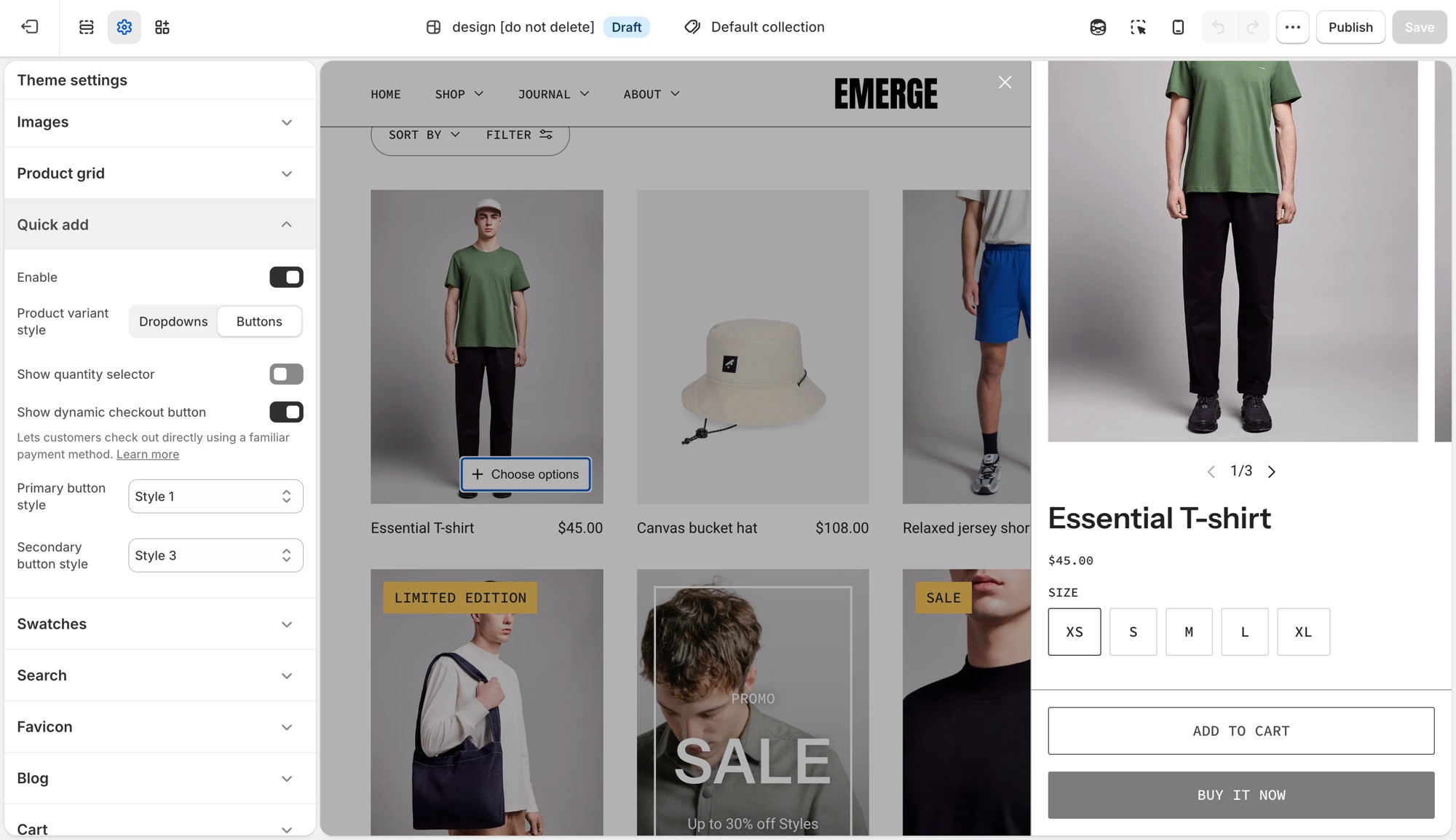
Quick add is the **+** button that appears on product cards in the grid. Hover (or tap) it to add the product to cart without leaving the collection page.
## Theme settings → Quick add (Emerge)
- **Enable**: turns the button on or off storewide.
- **Product variant style**: **Dropdowns** or **Buttons** for choosing options in the quick add form.
- **Show quantity selector**: adds a quantity stepper to the quick add form.
- **Show dynamic checkout button**: adds a payment-method shortcut (Shop Pay, PayPal, and similar) next to the regular checkout option. See Shopify's [dynamic checkout](https://help.shopify.com/manual/using-themes/change-the-layout/dynamic-checkout) guide.
- **Primary button style** and **Secondary button style**: pick from your four button styles ([Buttons and inputs](https://support.troopthemes.com/guide/emerge/buttons-and-inputs/)). Secondary only shows when **Show dynamic checkout button** is on.
The button label reads **Quick add** for a product with one variant, or **Choose options** when the customer needs to pick a variant first.
## On the product card (Emerge)
Quick add only appears for products that are in stock. A sold-out product's card has no button at all. This is expected behavior, not a setting to change.
## Troubleshooting (Emerge)
- **No button on the card**: the product is sold out, or **Enable** is off in **Theme settings** → **Quick add**.
- **Button says "Choose options" instead of "Quick add"**: the product has more than one variant. That is automatic, not a setting.
- **No secondary button in the form**: **Show dynamic checkout button** is off, or the store has no dynamic checkout methods configured.
- **Checkout is unchanged**: expected. Checkout is not the theme.
---
title: Setting up product filters
url: https://support.troopthemes.com/guide/emerge/setting-up-product-filters/
theme: Emerge
theme_styles: Cafe, Elements
---
# Enabling product filtering in Emerge
Collection filters on current Troop themes are Shopify’s native filters. You must install Shopify’s free [Search & Discovery](https://apps.shopify.com/search-and-discovery) app first. You configure filters in that app, not in Theme settings → Colors or a tag list.
Shopify admin → **Search & Discovery** app → **Filters**. The theme only displays what that app publishes.
Product tags alone do not create filters on current versions. Checkout and other apps are unchanged.
> **Info**
>
> For the full Shopify walkthrough, see [enable product filtering](https://help.shopify.com/en/manual/online-store/themes/customizing-themes/common-customizations/storefront-filters).
## Steps (Emerge)
1. Install [Search & Discovery](https://apps.shopify.com/search-and-discovery) from the Shopify App Store if it is not already installed, then open the app in Shopify admin.
2. Open **Filters** and add the filters you want (for example Availability, Price, Color).
3. Save. Preview a **collection** page in **Edit theme**, not the homepage.
4. If the **Filter** button or drawer is missing, open the collection template in **Edit theme**, select **Collection navigation**, and turn on **Enable filtering**. You can also turn on **Enable sorting** and **Enable layout switcher** there. Filter tag **Shape** (Round or Square) is in the same section.
Filters need products that actually have those options or metafields. Empty filters do not appear.
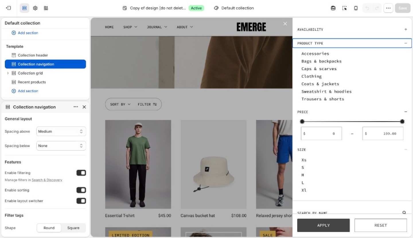
## Troubleshooting (Emerge)
- **No filter UI at all**: Search & Discovery is not installed, you are previewing the homepage, or **Enable filtering** is off in **Collection navigation**. Open a collection template and turn it on.
- **A filter you added is missing**: no products in that collection have that option/metafield, or the filter is set not to show when empty.
- **You are still adding product tags expecting a Refine list**: current versions use Search & Discovery filters, not tag groups.
---
title: Search
url: https://support.troopthemes.com/guide/emerge/search/
theme: Emerge
theme_styles: Cafe, Elements
---
# Search in Emerge
**Edit theme** → **Theme settings** → **Search**.
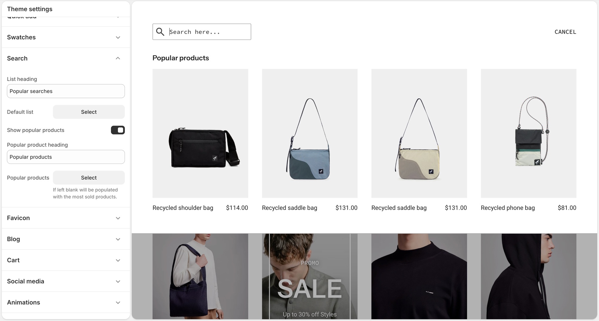
These settings control Shopify's [predictive search](https://help.shopify.com/en/manual/online-store/storefront-search/predictive-search) panel that opens as a customer types in the header search, not the full search results page layout.
## Theme settings → Search (Emerge)
- **List heading**: label above the default suggestion list, for example "Popular searches."
- **Default list**: a menu of links shown before the customer types anything.
- **Show popular products**: turns on a product suggestions block in the empty search state.
- **Popular product heading**: label above that block, for example "Popular products."
- **Popular products**: up to 4 products to feature there. Leave it blank and the theme fills it with your best-selling products automatically.
## Troubleshooting (Emerge)
- **Popular products showing products I did not pick**: the **Popular products** field is empty, the theme is filling it with best sellers. Add products there to override it.
- **Nothing shows before I type**: **Default list** has no menu assigned, or that menu has no links.
- **Search results page looks wrong**: that is a separate template (**Edit theme** → template selector → **Search**), not this settings group.
---
title: Add color swatches to products
url: https://support.troopthemes.com/guide/emerge/color-swatch-guide/
theme: Emerge
theme_styles: Cafe, Elements
---
# Using color swatches with your products in Emerge
On current versions, swatches are Shopify’s native color entries (product category + category metafield). The theme only **turns them on** (Round or Square). You do not pick swatch hexes in Theme settings → Colors anymore.
**Products** → category and category metafields; then **Edit theme** → **Theme settings** → **Swatches**. You can also set swatches on the product section or Featured product.
Inventory, checkout, and filters (Search & Discovery) are unchanged.
To use Shopify native swatches, configure product categories and category metafields.
### Step One: Add a product category (Emerge)
A product category is selected from the pre-defined categories in Shopify's Standard Product Taxonomy. This is essential for:
- Unlocking product attributes (category metafields) that map to each product category.
- Managing your products better within Shopify, aiding in automated collections or filtering.
- Ensuring accurate tax rates are applied at checkout based on product categorization.
**Example Category**: Apparel & Accessories > Clothing > Clothing Tops > Shirts. You can add color swatches for any category metafield with the color product attribute.
**To Add a Product Category**:
1. From your Shopify admin, click **Products**.
2. Click a product.
3. In the **Category** section, select **Apparel & Accessories > Clothing > Clothing Tops > Shirts** or another category with the color category metafield.
4. Click **Save**.

### Step Two: Add and edit entries for your category metafields (Emerge)
After adding a product category, you can add entries for your product's variant option values.
**To Edit or Add Entries**:
1. From your Shopify admin, go to **Products**.
2. Click the product with the category metafields you want to edit or add.
3. **To Add an Entry from Default Entries**:
- In the **Category metafields** section, click the category metafield, then click the entry you want to edit.
- Edit the fields as needed.
- Click **Save**.
4. **To Add a Custom Entry**:
- In the **Category metafields** section, click the category metafield, then click **Add new entry**.
- Fill out the fields for the entry.
- Click **Save**.
### Step Three: Connect your category metafields to variant options (Emerge)
In this step, you connect the category metafield for color (or any other category metafield as needed) to your product variants.
**To Connect Category Metafields**:
1. From your Shopify admin, go to **Products**.
2. Click the product you want to edit.
3. In the **Variants** section, click **+ Add options like size or color**.
4. If a category metafield is available to connect to, select it. The option values will auto-fill with any entries you've added to the category metafield.
5. **Optional**: To add custom option values, click **Edit**, then click **Add new entry**. Fill out the entry fields and click **Save**.
6. Click **Save** to save the product.

### Step Four: Enable swatches at the theme level (Emerge)
Swatches can be enabled in **Edit theme** → **Theme settings** → **Swatches**. Choose **Circle** or **Square** (or **None** to turn them off). Size on the product form and on the grid are separate sliders in that same group.
You can also set swatch type on a product section or Featured product.
When enabled, the theme will turn configured options into clickable swatch selectors.
## Troubleshooting (Emerge)
- **No chips, still a dropdown**: Swatches is set to **None** in Theme settings (and on the product section); or the variant option is not connected to the color category metafield.
- **Chips are the wrong colors**: edit the category metafield **entries** in the product admin, not Theme settings → Colors (current versions).
- **Grid has swatches, product page doesn’t (or the reverse)**: Theme settings → Swatches and the product section each have their own type control; set both.
- **You are on an older theme**: skip to [Legacy theme versions](#legacy-theme-versions). Hex lists in Colors or `swatch-colors.liquid` only apply there.
# Legacy theme versions
Color swatches can be enabled in multiple places:
- In the **Product Page(s)** under the **Sections** tab
- On the **Home Page**, inside the **Featured Product** section under the **Sections** tab
- In the **Theme Settings** tab, under the **Product Grid** section
When enabled, the theme will automatically turn an option titled "color" into clickable color swatches.
The default colors are set as standard CSS colors. For example, "gold" is defined as `#ffd700`. The complete
list of standard CSS colors [can be viewed on MDN.](https://developer.mozilla.org/en-US/docs/Web/CSS/Reference/Values/named-color)
> **Non-English themes**
>
> - "Color" will be translated according to your `locales/*.json` file. For example, if you desire "couleur" to be the option with swatches, be sure to translate any instance of "color" inside `locales/fr.json` to "couleur"
> - Non-english colors such as "rouge" will need to be added manually as defined below in [Adding custom colors](#adding-custom-colors)
## Adding custom colors (Emerge)
Default colors can be overwritten with values defined by the store-owner. In addition, values not defined as a CSS color can be added.
> **Versions with swatch settings inside `Theme settings > color`**
>
> On Emerge versions 6.0.0 to 7.0.1, swatch color settings can be found inside the _Color_ submenu inside the global theme settings.
If you want to assign the color value `deep red` to the color value `rgb(131, 45, 39)`, you'd add the following line to the `Color swatch configuration` textbox:
deep red: rgb(131, 45, 39)
> **Formatting must be exact**
>
> - each rule must be on a new line
> - the name and value are separated by a single colon (":") character
> - the value can be defined as either a hex or RGB value
> - colors that don't follow the above format will revert to their default values
- use a tool like [Adobe Color](https://color.adobe.com/create/image) if you need help determining which color value is appropriate for your product
---
title: Add a size chart to the product page
url: https://support.troopthemes.com/guide/emerge/product-size-chart/
theme: Emerge
theme_styles: Cafe, Elements
---
# Add a size chart to the product page in Emerge
The theme can open a Shopify **page** from the product form. You write the chart on that page; the theme only links to it.
You can add a size chart on the _Product_ page or the _Featured product_ section in two ways:
- **Size guide button** block: a standalone button you place in the product form
- **Variant picker** block: a link beside a matching variant option (for example Size)
Create the chart page in **Online Store** → **Pages**. A size-chart app replaces this feature, disable the theme size guide if you use one.
## Chart page (Emerge)
In the example below, we created a page called `Size chart` and referenced it in **Page content**. That page holds tables (and can hold images or other text).
To quickly create HTML tables for size charts, try a [responsive table generator](https://www.tablesgenerator.com/).

## Size guide button (Emerge)
> **Version availability**
>
> The Size guide button block is available in Emerge versions 10.3.0 and up.
**Edit theme** → product template or **Featured product** → **Add block** → **Size guide button**. If the block is already in the section, click the eye icon to show it. Select a page in **Page content**, then choose a **Button style**.
The button does not require a Size variant. Use it when you want a size chart on products without options, or when you want a full button instead of a link next to the picker.
If you use this block, turn off **Enable** under **Size guide** on the **Variant picker** block so two size-chart controls do not stack.
On these versions the chart opens in a drawer.
## Variant picker (Emerge)
For the variant picker size chart to appear, the product must have at least one variant option. You can configure this in the Shopify admin product editor:

In the theme editor, open the _Product_ page or _Featured product_ section, expand the blocks list, and locate the **Variant picker** block. If it is hidden, click the eye icon to show it. If it is not there, click **Add block** and select **Variant picker**.
Match the variant option (for example, "Size") in the **Link from option** text field. Then select a page using the **Page content** setting.
**Edit theme** → product template → **Variant picker** block → **Link from option** and **Page content**.
Variant options are set in **Products**.
> **Change the size chart button text**
>
> You can change the size chart button text in _Edit default theme content > Products_.
>
> Read more about [changing default text](https://support.troopthemes.com/guide/emerge/change-default-text/).
>
> 
## Troubleshooting (Emerge)
- **Size guide button is missing from Add block**: the theme is below the versions listed above. Use the **Variant picker** method, or [update the theme](https://support.troopthemes.com/guide/update-theme/).
- **No size chart link next to Size**: the product has no variants; **Link from option** does not match the option name (for example `Size` vs `Sizes`); **Enable** is off; or the Variant picker block is missing.
- **Wrong / empty drawer or popup**: **Page content** is unset, or the page has no body.
- **Two size charts appear**: both the **Size guide button** and the Variant picker **Size guide** are enabled. Turn one off.
- **An app chart appears instead**: disable the app embed, or turn off the theme’s size guide so they do not stack.
- **Button says the wrong words**: [default theme content](https://support.troopthemes.com/guide/emerge/change-default-text/) → Products.
---
title: Add an out of stock notification form
url: https://support.troopthemes.com/guide/emerge/out-of-stock-notifications/
theme: Emerge
theme_styles: Cafe, Elements
---
# Add an out of stock notification form in Emerge
The theme can show a “notify me” form on sold-out variants. Submissions email your store’s **Sender email**. The theme does **not** watch inventory or auto-send “back in stock” mail to the shopper.
This is Shopify’s contact form: it emails you. It does **not** create a customer in **Customers**, and it does not start a waitlist.
## Who owns this (Emerge)
- **Show the form on the product page**: theme (the block below)
- **Sold-out vs available**: Shopify **Products** inventory
- **Where the request lands**: Settings → Notifications → Sender email
- **Email the shopper when stock returns**: a [back in stock app](https://apps.shopify.com/search?q=back%20in%20stock)
## Show the form (Emerge)
**Edit theme** → product template (**Default product**) or **Featured product** → **Add block** → **Unavailable form**. If the block is already in the section, click the eye icon to show it.
Click the block to expand its settings. Preview a sold-out variant or the form stays hidden.
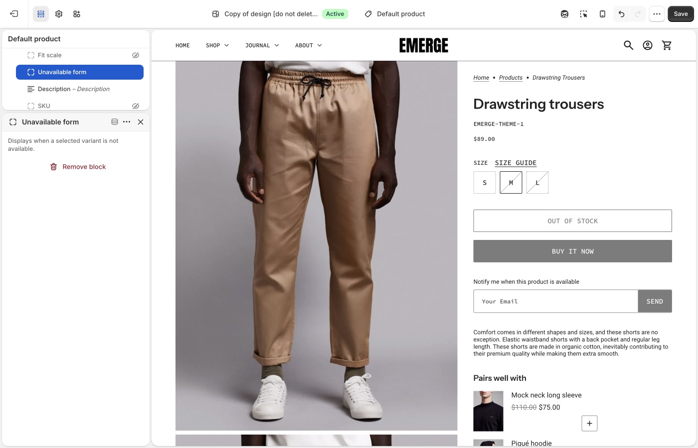
Form copy is [default theme content](https://support.troopthemes.com/guide/emerge/change-default-text/). Search **notify** or **sold out**.
## Sold-out variants only (Emerge)
The selected variant must be sold out, or the form stays hidden.
**Products** → the product → the variant → **Inventory**:
- **Inventory tracked** is on. If tracking is off, Shopify treats the item as available.
- **Available** is 0 or less at locations that fulfill **online** orders. Stock sitting only at a location that does not fulfill the online store still shows as sold out on the storefront.
- **Sell when out of stock** is **Off**. That control only appears when tracking is on.

See Shopify’s [selling out of stock products](https://help.shopify.com/en/manual/products/inventory/setup/selling-when-out-of-stock) guide.
## Where the email goes (Emerge)
Shopify delivers contact-form submissions to **Settings** → **Notifications** → **Sender email**. That is not **Settings** → **General** (**Store email** is for Shopify contacting you, and for exports).

If you use a custom domain, authenticate it on the Notifications page or Shopify may rewrite the address. Submissions flagged by Shopify’s spam filter still arrive, with `[SPAM]` in the subject.
See Shopify’s [setting up your email](https://help.shopify.com/en/manual/intro-to-shopify/initial-setup/setup-your-email) and [contact form](https://help.shopify.com/en/manual/online-store/themes/customizing-themes/add-contact-page) guides.
## Automatic “back in stock” mail (Emerge)
The theme cannot do this. Shopify does not send restock emails to customers on its own; their inventory docs point to a [back in stock app](https://apps.shopify.com/search?q=back%20in%20stock). Most of those apps add their own button, remove the theme’s **Unavailable form** block so they don’t stack.
Shopify Flow’s [Product variant back in stock](https://help.shopify.com/en/manual/shopify-flow/reference/triggers/variant-back-in-stock) trigger can notify *you* (Slack, staff email) or republish a product. It does not mail customers who submitted the theme form.
If you handle requests by hand:
- Tag or folder the incoming mail by product or variant.
- Keep a spreadsheet of email + variant, then send when you restock.
- Add addresses to a list in your email app and send that list when the item is back.
**Want to use an app?** [Using apps with themes](https://support.troopthemes.com/guide/using-apps-with-themes/).
## Ask Sidekick (Emerge)
Open [Sidekick](https://help.shopify.com/en/manual/shopify-admin/productivity-tools/sidekick) from the icon in your Shopify admin, then ask it to draft the "back in stock" notification email in your brand's tone.
> "Write a short, friendly restock email with a sense of urgency."
Refine it before it goes live, faster than starting from Shopify's default template copy.
## Troubleshooting (Emerge)
- **Form never shows**: the variant is still available, **Inventory tracked** is off, **Sell when out of stock** is on, or the **Unavailable form** block is missing or hidden on **Product page**.
- **Form shows but you still have stock**: the units may be at a location that does not fulfill online orders. Add stock to a location that does.
- **You expected an automatic email when stock returned**: the theme cannot do that. Use an inventory app and remove the theme block.
- **You didn’t get the request**: check **Settings** → **Notifications** → **Sender email**, spam (including `[SPAM]` in the subject), and domain authentication. The message goes to you, not to the shopper.
- **Form copy is wrong**: [default theme content](https://support.troopthemes.com/guide/emerge/change-default-text/).
- **Two notify buttons**: an app embed plus the theme form. Turn one off.
---
title: Setting up FAQ or Collapsible rows
url: https://support.troopthemes.com/guide/emerge/setting-up-faq-or-collapsible-rows/
theme: Emerge
theme_styles: Cafe, Elements
---
# Setting up FAQ or Collapsible Rows sections in Emerge
Add **FAQ** or **Collapsible rows** in **Edit theme** → **Add section**. Each row is a block with a heading plus rich text or a Shopify **page**.
Page bodies are edited in **Online Store** → **Pages**, not in the theme editor. Shopify Help Center, checkout, and metafield definitions are unchanged.
To add an FAQ or Collapsible rows section, open **Edit theme**, click **Add section**, and choose **FAQ** or **Collapsible rows**.
These sections use collapsible rows as blocks. Each row can include a heading and content. Add additional blocks to build a list of questions and answers, or to break down product details and materials.
## Content types (Emerge)
Each block supports two content types:
1. Rich text
- Added through the "Text" setting. Enter text directly in the text area, including links and formatting.
2. Page content
- Added through the "Row content from page" setting. Select a page from the dropdown to display its content in the block. Pages can be created or edited in the Shopify admin, **not** in the theme editor.
### Dynamic content with metafields (Emerge)
The first option, rich text, supports dynamic content with metafields. This lets you display content specific to the page you're viewing, or store-level information.
For example, on a product page, each product has a different name, description, and price. You can show that information in an _FAQ_ or _Collapsible rows_ section by connecting a metafield to the block.
You can add static text around metafield content for context, or display only the dynamic content. To learn more about metafields, visit [Shopify's guide](https://help.shopify.com/en/manual/custom-data/metafields).
## Ask Sidekick (Emerge)
Open [Sidekick](https://help.shopify.com/en/manual/shopify-admin/productivity-tools/sidekick) from the theme editor toolbar (top right, next to the device preview icon), or press `⌘.` (`Ctrl+.` on Windows). Give it a topic and your products, and it drafts FAQ copy for you.
> "Write 5 FAQs about shipping and returns for a skincare store."
It produces question-and-answer pairs you can paste into rich text blocks or refine before publishing. Faster than writing every row from a blank field, you still edit and approve the final wording.

## Troubleshooting (Emerge)
- **Row is empty**: you chose **Row content from page** but didn’t pick a page, or the page has no body.
- **Every product shows the same answer**: you typed static text. Connect a **metafield** if the answer should change per product.
- **You wanted this on one product only**: use an alternate [product template](https://support.troopthemes.com/guide/emerge/working-with-templates/) and assign it to that product, or use metafields.
---
title: Customizing blogs
url: https://support.troopthemes.com/guide/emerge/customizing-blog/
theme: Emerge
theme_styles: Cafe, Elements
---
# Customizing blogs in Emerge
Blog posts, tags, excerpts, and featured images live in Shopify admin under **Content**. The theme controls how those posts appear: the blog grid, article page, and the **Blog posts** section you can add to other templates.
**Content** → **Blog posts** for writing and tagging. **Edit theme** → **Default blog** or **Default article** for layout.
Post body copy, checkout, and SEO titles are unchanged.
> **Info**
>
> Visit Shopify's help centre for an extensive guide on [adding and managing blog posts](https://help.shopify.com/en/manual/online-store/blogs/writing-blogs/working-with-blog-posts).
## Write and tag posts (Emerge)
Open **Content** → **Blog posts**. Create or edit a post to set the title, body, excerpt, tags, and featured image.
Tags do two jobs in the theme:
- They appear in the blog page tag filter (if that filter is on).
- The **Blog posts** section can limit itself to articles that share one tag.
Use **Manage blogs** on that same admin page to rename a blog or turn comments on.
## Blog page (Emerge)
**Edit theme** → template selector → **Blogs** → **Default blog** → **Blog**.
Posts list in reverse chronological order (newest first). Pagination appears when there are more posts than one page.
### Grid (Emerge)
- **Columns**: 1 to 4 on desktop. On mobile, 1 or 2.
- **Row layout**: **Evenly spaced** keeps rows aligned. **Staggered** packs cards like masonry.
- **Maximum container width**: Extra small through Full width, same control as other sections. Full width lets the grid run edge to edge.
- **Full width** (under **Mobile**): lets cards bleed to the screen edge on small devices.
Card image crop is **Theme settings** → **Images** → **Article image size**, not this section. Natural keeps each featured image’s own ratio. A fixed ratio (Square, Landscape, or Portrait) makes a stricter grid.
For a uniform grid, shoot featured images to the same ratio as **Article image size**. Mixed ratios look calmer with Natural, or with **Staggered** row layout.
Export sizes: [What image sizes should I use?](https://support.troopthemes.com/faqs/what-image-sizes-should-i-use/).
### Title, filter, and RSS (Emerge)
- **Show blog title**: the blog’s name from admin (for example Journal), not each article title.
- **Show tag filter**: a dropdown of article tags. Turn this off if you do not want customers to filter the index.
- **Show RSS**: a feed link in the blog footer.
To keep internal tags out of that filter, open **Theme settings** → **Blog** → **Hide tags from tag filter**. Enter a comma-separated list. The default is `featured, pinned`. Matching is not case-sensitive (`pinned` and `Pinned` both hide).
### What each card shows (Emerge)
On the **Blog** section:
- **Show article heading**: the post title. **Article heading type** is Medium or Small.
- **Show blog date** and **Show author**
- **Show excerpt**: the excerpt from the post editor, or a short trim of the body if the excerpt is empty.
- **Show button**: the continue-reading link. That label is [default theme content](https://support.troopthemes.com/guide/emerge/change-default-text/); search **continue**.
If **Show article heading** and **Show button** are both off, **Show excerpt** outputs the full article body on the blog page instead of a truncated excerpt. That is how an editorial index can read as captions under images, without a title or button on each card.
**Heading type** styles the blog title (Banner, Featured, Large, or Medium) when **Show blog title** is on.
Spacing above and below follows the same scale as other sections. See Spacing and layout in your theme guide.
## Blog posts section (Emerge)
**Edit theme** → **Add section** → **Blog posts**. Add it to the homepage or any other template. This is not the blog index.
- **Choose blog**: which blog to pull from.
- **Filter by tag**: only articles with this tag appear (up to three). The default is `pinned`. Change the field, or tag posts to match it, in **Content** → **Blog posts**. If no posts have that tag, the section falls back to the latest three articles.
- **Show button**, **Show date**, and **Show excerpt** control the cards in this section.
- **Media layout** (under **Mobile**): Slideshow or Grid.
Tag spelling must match the filter field. `pinned` and `Pinned` are treated the same.
## Article page (Emerge)
**Edit theme** → template selector → **Blog posts** → **Default article**.
The **Article** section shows the title, date, author, tags, sharing links, and the post body. It does not place the featured image.
The featured image still matters: blog cards use it, cropped by **Article image size**. To show it as a banner on the article page, add an image section (often **Image with text overlay**) above the **Article** section and connect the image to the article’s featured image. You can remove that section if you want a text-only article.
On the **Article** section:
- **Show title**, **Heading type**, and **Heading alignment**
- **Show article date** and **Show author**
- **Show article tags**: tags you hid in **Theme settings** → **Blog** stay hidden here too.
- Sharing: Facebook, 𝕏, Pinterest, email, and link. Turn each one off independently.
**Maximum container width** on this section has no Full width option (Extra small through Extra large). A narrower width keeps article copy readable.
The template can also include:
- **Recent articles**: nearby posts from the same blog.
- **Comments**: Shopify’s comment form, or Disqus if you enable it on the section. Comments must be turned on for that blog in **Content** → **Blog posts** → **Manage blogs**.
You can add other sections to the article template the same way as a page. See [Working with templates](https://support.troopthemes.com/guide/emerge/working-with-templates/).
### Images in the post body (Emerge)
When you insert an image in **Content** → **Blog posts**, set the size to **Original** so it spans the article column. Smaller presets can look cropped or undersized.
## Ask Sidekick (Emerge)
Open [Sidekick](https://help.shopify.com/en/manual/shopify-admin/productivity-tools/sidekick) from the icon in your Shopify admin, then ask it to draft a blog post from a topic and a few notes.
> "Write a post about caring for our candles, aimed at new customers."
Use it for a first draft or when you're stuck on an opening paragraph, then edit it in your own voice before publishing, Sidekick's content generation is meant as a starting point, not a final draft.
## Troubleshooting (Emerge)
- **Can't find Blog posts**: they are no longer under **Online Store**. Open **Content** → **Blog posts**. Use **Manage blogs** there to rename a blog or change comments.
- **Pinned posts missing from the homepage**: **Filter by tag** is on the **Blog posts** section, not the blog index. The tag on the article must match that field.
- **Tag still shows in the filter**: add it to **Theme settings** → **Blog** → **Hide tags from tag filter**, comma-separated. The blog section’s **Show tag filter** must be on for the dropdown to appear at all.
- **Grid looks uneven**: featured images have mixed ratios, or **Row layout** is **Staggered**. Use the same crop and **Evenly spaced** for a strict grid, or keep mixed ratios on purpose.
- **Cards look cropped**: **Theme settings** → **Images** → **Article image size**, not the post editor.
- **No featured image on the article page**: the **Article** section does not display it. Add an image section on the article template, or check that the post has a featured image in **Content** → **Blog posts**.
- **Embedded images look cropped**: in the article editor, set the image size to **Original**, not a small preset.
- **Comment form missing**: comments are off for that blog in **Manage blogs**, or the **Comments** section is hidden or removed from the article template.
- **Continue reading wording**: [default theme content](https://support.troopthemes.com/guide/emerge/change-default-text/), not the Blog section.
---
title: Configuring the popup
url: https://support.troopthemes.com/guide/emerge/configuring-the-popup/
theme: Emerge
theme_styles: Cafe, Elements
---
# Configuring the popup in Emerge
The popup lives in **Edit theme** → **Popups**, an overlay section that appears across the whole store. It is not the announcement bar (that's on the **Header** section), not checkout, and it does not send email campaigns by itself: Shopify Inbox, discount codes, and email delivery are all separate.
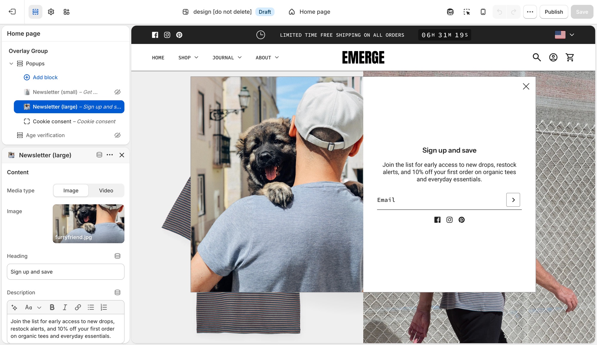
> **Compatibility**
>
> Image (and left/right or top placement) options on the **Newsletter (small)** and **Newsletter (large)** popup blocks require version 10.2.0 and up. Video media requires 10.3.0 and up.
## Popups section (Emerge)
**Edit theme** → **Popups**. By default it already has a **Newsletter (small)**, **Promotion bar**, and **Cookie consent** block. Click a block's eye icon to show or hide it, or **Add block** for another type:
- **Newsletter (small)** – corner overlay with an email field.
- **Newsletter (large)** – centered overlay modal.
- **Promotion bar** – sticky bar with a message; can scroll like a ticker (**Scroll text**, with separate speed controls for desktop and mobile).
- **Cookie consent** – consent banner tied to Shopify's consent tracking API.
Heading and description live on each block, not in Theme settings.
### Newsletter (small) (Emerge)
Corner overlay with an email field.
- **Media type**, **Image**, **Video upload**, **Video link**: shown when **Show media** is on; video accepts a Shopify upload or a YouTube/Vimeo link.
- **Heading**, **Description**: the popup's copy.
- **Show social icons**, **Social media title**: adds your [social icons](https://support.troopthemes.com/guide/emerge/social-media/) below the form.
- **Background color**, **Translucent background**: card styling.
- **Popup width**: maximum width on larger screens (300–500px).
- **Show media**, **Media position** (**Left** or **Top**): whether an image or video shows, and where. Media is hidden on mobile to meet Google's guidelines against intrusive interstitials.
- **Heading type**, **Paragraph font size**, **Text color**, **Text alignment**: text styling.
- The submit button always shows as an arrow icon here; there's no button text or style setting to configure.
- Timing and targeting settings (**Popup delay**, **Show again after**, and so on) are shared with **Promotion bar**. See **Timing and frequency** below.
### Newsletter (large) (Emerge)
Centered overlay modal, with the same settings as **Newsletter (small)** above, except:
- **Popup width** ranges wider (500–900px), since it's a centered modal rather than a corner card.
- **Media position** is **Left** or **Right** instead of Left/Top.
### Promotion bar (Emerge)
Sticky bar with a message.
- **Description**: the bar's message text.
- **Background color**, **Translucent background**.
- **Scroll text**, **Scroll speed**: ticker effect on desktop, plus a separate **Scroll text**/**Scroll speed** pair under **Mobile** so the ticker can run independently (or not at all) per device.
- **Heading type**: **Medium** or **Small** text size.
- **Text color**.
- Timing and targeting settings are shared with the **Newsletter** blocks. See **Timing and frequency** below.
### Cookie consent (Emerge)
Consent banner tied to Shopify's consent tracking API. See **When cookie consent shows** below for the conditions.
- **Heading**, **Description**.
- **Background color**, **Translucent background**.
- **Position**: **Left**, **Bottom**, or **Right**.
- **Text color**, **Text alignment**.
- **Accept button style**, **Decline button style**: each independently set to one of your four button styles, or a plain text **Link**.
## Timing and frequency (Emerge)
**Newsletter** and **Promotion bar** blocks each have:
- **Popup delay** – seconds before it opens.
- **Show popup at bottom of page** – opens early if the visitor scrolls to the bottom first.
- **Show again after** – days before it reappears once dismissed. This is stored in the visitor's browser, not in Shopify, so it's per browser/device, not per customer.
- **Limit to specific referrer path** / **Limit to specific page** – restrict where it can appear.
The section's own **Limit to one popup per page load** setting controls whether only the first ready popup shows, or they queue one after another. **Cookie consent always takes priority** when it needs to appear.
## When cookie consent shows (Emerge)
Cookie consent only shows where Shopify's consent tracking API determines a banner is required, and only if the visitor doesn't already have a stored choice. It won't show for everyone. Customer privacy tracking limits must also be turned on in your Shopify admin (**Settings** → **Customer privacy**), or it won't show at all. Position and the **Accept**/**Decline** button styles are configurable; it doesn't use the delay/frequency settings above.
## Previewing changes (Emerge)
**Newsletter** and **Promotion bar** popups do **not** open automatically while you're editing. That's expected, not a bug. Preview them from the storefront (or **Preview**), ideally in a private/incognito window, since **Show again after** is remembered by that browser and will suppress a popup you've already dismissed while testing.
**Cookie consent** is the exception: click it in the block list to preview it live in the editor.
---
Where newsletter forms live (section, overlay, popup, footer, password page): [Setting up mailing lists and newsletters](https://support.troopthemes.com/guide/emerge/newsletters/).
## Troubleshooting (Emerge)
- **Popup never appears**: the block is hidden (eye icon); **Show again after** already fired for that browser (test in a private window); another popup is already showing and **Limit to one popup per page load** is on; or a separate app popup is competing. Turn off other popup app embeds.
- **Cookie consent doesn't show**: Customer privacy tracking isn't enabled in your Shopify admin, or the visitor's region/consent state doesn't require a banner.
- **It won't preview in the editor**: expected for **Newsletter** and **Promotion bar** blocks. Preview from the storefront instead.
- **Announcement bar isn't here**: that's on the **Header** section, not **Popups**.
- **Form emails don't reach Mailchimp/Klaviyo**: the popup only creates a Shopify customer (tagged `newsletter`). See [newsletters](https://support.troopthemes.com/guide/emerge/newsletters/), or connect an [app](https://support.troopthemes.com/guide/using-apps-with-themes/).
---
title: Mailing list & newsletters
url: https://support.troopthemes.com/guide/emerge/newsletters/
theme: Emerge
theme_styles: Cafe, Elements
---
# Setting up mailing lists and newsletters in Emerge
A Troop newsletter form adds the shopper to **Customers** in your Shopify admin, with **Customer accepts email marketing** checked. The theme does **not** send campaigns or sync Mailchimp/Klaviyo by itself.
Klaviyo, Mailchimp, and other ESP lists need an app or integration, the theme only collects addresses into **Customers**.

## Who owns the list (Emerge)
- **Show a form on the storefront**: theme (the places below)
- **Store the address**: Shopify Customers
- **Send campaigns / sync to Mailchimp or Klaviyo**: an email app or integration
Emerge can show a signup form in several places. You do not need all of them.
## Newsletter section (Emerge)
**Edit theme** → **Add section** → **Newsletter**.
Add it to any template. Heading, description, and the form are blocks: **Overline**, **Heading**, **Description**, and **Newsletter form**. Optional image and **Custom liquid** (for an app embed) are on the section too.
## Image with text overlay (Emerge)
**Edit theme** → **Image with text overlay** → **Add block** → **Newsletter form**.
Use this when the form should sit on a campaign image with the other overlay blocks (heading, description, buttons). The block has no heading of its own.
## Footer (Emerge)
**Edit theme** → **Footer** → **Subscribe** block.
**Newsletter heading**, **Newsletter information**, **Show newsletter**, and **Show social icons** are on that block. Turn **Show newsletter** off if you want the heading and social icons without a form.
The Email placeholder is [default theme content](https://support.troopthemes.com/guide/emerge/change-default-text/), search **mailing**. The submit control is an arrow.
## Popup (Emerge)
**Edit theme** → **Popups** → **Add block** → **Newsletter (small)** or **Newsletter (large)**. If the block is already in the section, click the eye icon to show it.
**Newsletter (small)** sits in a corner; **Newsletter (large)** is a centered overlay. Heading and description are on the block.
Popup timing and frequency: [Configuring the popup](https://support.troopthemes.com/guide/emerge/configuring-the-popup/).
## Password page (Emerge)
**Edit theme**, open the **password** template → **Password page** → **Show form** and **Heading**.
## Connect with Mailchimp (Emerge)
The theme only writes addresses to Shopify **Customers**. To get them into Mailchimp, install Mailchimp’s [Mailchimp for Shopify](https://apps.shopify.com/mailchimp) app and connect your audience.
See Mailchimp’s [connect Shopify](https://mailchimp.com/help/connect-shopify/) guide.
[Zapier](https://zapier.com/apps/mailchimp/integrations/shopify) is another option if you need a custom workflow.
## Ask Sidekick (Emerge)
Open [Sidekick](https://help.shopify.com/en/manual/shopify-admin/productivity-tools/sidekick) from the theme editor toolbar (top right, next to the device preview icon), or press `⌘.` (`Ctrl+.` on Windows). It can draft the heading and blurb for your signup form, give it your brand and what subscribers get.
> "Write a short, warm newsletter blurb offering 10% off the first order."
It can also draft the welcome or campaign email itself if you're sending through Shopify Email.

## Troubleshooting (Emerge)
- **No email in Customers**: the form may be an **app** form (Klaviyo, etc.), not the theme form. Check **Edit theme** → **App embeds**. App forms do not always create a Shopify customer.
- **Theme form works, Mailchimp is empty**: expected until you connect an integration. The theme only writes to Shopify Customers.
- **Popup never appears**: the **Popups** section must have a newsletter block that is not hidden; frequency may have already fired for that browser. Test in a private window. See [Configuring the popup](https://support.troopthemes.com/guide/emerge/configuring-the-popup/).
- **Email placeholder didn’t change**: that string is [default theme content](https://support.troopthemes.com/guide/emerge/change-default-text/). Search **mailing**.
- **Double forms**: a Newsletter section *and* an app embed *and* the popup (and footer, if you use it). Turn off the ones you do not want.
- **Footer heading shows but no form**: the **Subscribe** block’s **Show newsletter** setting is off.
---
title: Configure country, currency, and language selectors
url: https://support.troopthemes.com/guide/emerge/configure-country-currency-selectors/
theme: Emerge
theme_styles: Cafe, Elements
---
# Configure country, currency, and language selectors in Emerge
Country, currency, and language selectors are Shopify Markets and Languages (and Shopify Payments), not a Troop currency converter or translator. The theme only **shows** a selector once Markets and/or Languages are set up.
Set up Shopify **Settings** → **Markets** (for country/currency) and **Settings** → **Languages** (for language) first. Then turn on **Show country/region selector** and/or **Show language selector** in the places below.
A selector only appears once Shopify has more than one country, currency, or language published.
Admin prices stay in store currency. Payment methods and rounding are Shopify settings. Translating your product and page content is a separate job, see [Translating your store](#translating-your-store) below.
Refer to Shopify’s [selling in multiple currencies](https://help.shopify.com/en/manual/markets/customizations/local-currencies) guide.
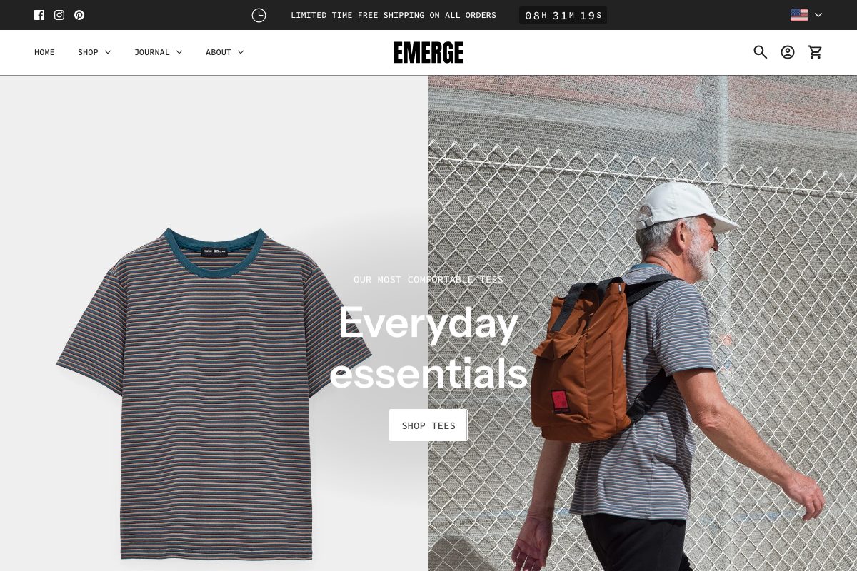
## Header (Emerge)
**Edit theme** → **Header** → **Show country/region selector** and **Show language selector**.
Selectors sit in the header bar on desktop. On phones they move into the menu.
## Announcement (Emerge)
**Edit theme** → **Announcement** → **Show country/region selector** and **Show language selector**.
On desktop they sit on the right of the bar (social icons, if shown, sit on the left). On phones they move into the menu. Emerge demos often show the country selector here.
## Footer bar (Emerge)
**Edit theme** → **Footer bar** → add a **Localization** block (one only). On that block, enable **Show country/region selector** and **Show language selector**.
The Footer bar also holds payment icons, social icons, Powered by, and text, maximum three blocks.
## Translating your store (Emerge)
Storefront language is Shopify Translate & Adapt (or a translation app) plus [Edit default theme content](https://support.troopthemes.com/guide/emerge/change-default-text/) for theme chrome. The theme ships language files; it does not translate your products.
Shopify **Settings** → **Languages** for the languages themselves; Translate & Adapt (or an app) for product and page content; **Edit default theme content** for “Add to cart” and similar theme strings.
Checkout language is separate (Shopify checkout / Markets), and is not controlled by the theme. Typography is fonts, not language.
Refer to Shopify’s [localization and translation](https://help.shopify.com/en/manual/international/localization-and-translation) and [Translate & Adapt](https://help.shopify.com/en/manual/international/translate-adapt-app) guides.
## Troubleshooting (Emerge)
- **No selector**: a second country, currency, or language is not published in Markets/Languages, or **Show country/region selector** / **Show language selector** is off on that section.
- **Selector shows but prices don’t change**: Shopify Payments and Markets must be configured. The theme cannot convert currency by itself.
- **You still have an old currency-app widget**: disable that app embed; it will fight the native selector.
- **Products still show the default language**: translate products and pages in Translate & Adapt (or your app). Default theme content only covers theme chrome, not product data.
- **Checkout is still the default language**: expected. Checkout language is translated in Shopify, not Theme settings.
- **A translation app overwrote your wording**: the app owns storefront language once installed. Edit there, or disable the app embed to test. See [changing default theme text](https://support.troopthemes.com/guide/emerge/change-default-text/).
---
title: Cart
url: https://support.troopthemes.com/guide/emerge/cart/
theme: Emerge
theme_styles: Cafe, Elements
---
# Cart in Emerge
**Edit theme** → **Theme settings** → **Cart**.
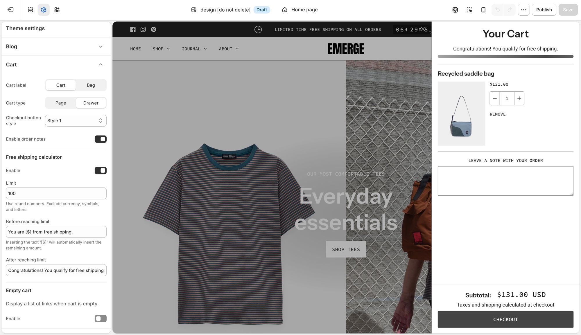
## Theme settings → Cart (Emerge)
- **Cart label**: **Cart** or **Bag**, the icon and wording used for the cart trigger throughout the theme.
- **Cart type**: **Page** sends customers to a dedicated cart page. **Drawer** opens the cart in a slide-out panel without leaving the page.
- **Checkout button style**: pick from your four button styles ([Buttons and inputs](https://support.troopthemes.com/guide/emerge/buttons-and-inputs/)) for the cart's checkout button specifically.
- **Enable order notes**: adds a note field to the cart so customers can leave instructions. See Shopify's [order notes](https://help.shopify.com/en/manual/online-store/themes/customizing-themes/common-customizations/add-order-notes) guide for how this differs from cart attributes and line item properties.
### Free shipping calculator (Emerge)
- **Enable**: turns the progress message on or off.
- **Limit**: the order subtotal that qualifies for free shipping. Numbers only, no currency symbol.
- **Before reaching limit**: message shown while under the limit. Insert `[$]` to show the remaining amount automatically.
- **After reaching limit**: message shown once the customer qualifies.
This calculator is a message only, it does not create or apply a shipping discount. Set up the matching rate in **Settings** → **Shipping and delivery**; see Shopify's [setting up shipping rates](https://help.shopify.com/en/manual/fulfillment/setup/shipping-rates/setting-up-shipping-rates) guide for how to configure a free-shipping rate that actually applies at checkout.
### Empty cart (Emerge)
- **Enable**: shows a list of links when the cart has nothing in it.
- **Custom link list**: which menu to show. Dropdown items in that menu do not appear, top-level links only.
## Troubleshooting (Emerge)
- **Cart opens as a drawer when I wanted a page (or the reverse)**: **Cart type** in **Theme settings** → **Cart**.
- **Free shipping message shows the wrong amount, or shows for everyone**: check **Limit**. It is a plain number, no currency symbol or letters.
- **Customers reached the limit but nothing changed at checkout**: this is expected. The free shipping bar is a message only. Create the actual free shipping rate in **Settings** → **Shipping and delivery**.
- **Empty cart shows the wrong links**: the assigned menu has the wrong links, or has dropdown items that are not appearing (expected, only top-level links show).
- **Checkout is unchanged**: expected. Checkout is not the theme.
---
title: Add custom CSS or edit template code
url: https://support.troopthemes.com/guide/emerge/adding-css-editing-template-code/
theme: Emerge
theme_styles: Cafe, Elements
---
# Add custom CSS or edit template code in Emerge
Use **Theme settings** → **Custom CSS** (the whole store) or a section's own **Custom CSS** field (just that section) for one-off exceptions the settings do not cover. Do not start here for colors, type, spacing, or buttons, those have Theme settings.
Checkout is unchanged, custom CSS does not apply there. Prefer settings over CSS; prefer CSS over editing Liquid.
> **Before you begin**
>
> Modifying theme code in the template editor requires some basic knowledge of CSS, HTML and Liquid so be sure you're comfortable with those areas before attempting any.
>
> Check out Shopify's [guide to editing theme code](https://help.shopify.com/en/manual/online-store/themes/customizing-themes/edit-code).
>
> Visit [W3Schools](https://www.w3schools.com/Css/) for a quick CSS tutorial.
>
> Support can point you to the right field, but debugging your own CSS or Liquid is outside [what we can help with](https://support.troopthemes.com/submit-a-support-ticket/).
> **Create a backup**
>
> We recommend making your customizations on an unpublished version. Go to **Actions** → **Duplicate** first.
## Adding CSS to the whole store (Emerge)
**Edit theme** → **Theme settings** → **Custom CSS** → add your code → **Save**.

This applies everywhere on the storefront and is capped at 1,500 characters. If a change only needs to apply to one section, add it there instead, see below.
## Adding CSS to one section (Emerge)
Select the section → scroll to the bottom of its settings panel → **Custom CSS** → add your code → **Save**.

This applies to that section only, and is capped at 500 characters. Only the `@media`, `@container`, `@layer`, and `@supports` at-rules are allowed here.
## What custom CSS can't do (Emerge)
- No `@import`, `@charset`, or `@namespace`, at either the theme or section level.
- No `content` property.
- Can't target the `shopify-section` wrapper element.
- Any URL you reference has to be on `https://cdn.shopify.com`.
- Custom CSS overrides your theme's built-in settings, it always wins, so a Theme setting and a Custom CSS rule that disagree will show the CSS.
- Not supported on the checkout page.
- Updating your theme can break selectors your CSS depends on, recheck custom CSS after an update.
## Advanced: editing CSS directly in template code (Emerge)
These two options require editing Liquid files in the code editor, not just filling in a settings field. They're for merchants and developers comfortable working in the theme's code.
### custom-styles.liquid (Emerge)
Every theme ships an empty `custom-styles.liquid` snippet in _Snippets_, rendered as a plain `
```
Click **Save** in the theme editor to apply the changes.
### Option 2: Use a URL to a hosted font (Beyond)
Use this option when the font file is on a server or CDN and you have a direct `https://` link to the file.
In the **Custom liquid** section, paste the following code. Set `custom_font_family` to your font’s name, and set `custom_font_url` to the full address of the file (for example, `https://example.com/fonts/custom-font.woff2`).
```liquid
{%- liquid
assign custom_font_family = 'Merchant Custom Sans'
assign custom_font_fallback = 'sans-serif'
assign custom_font_url = 'https://example.com/fonts/custom-font.woff2'
-%}
```
Click **Save** in the theme editor to apply the changes.
### Option 3: Use Google Fonts (Beyond)
On [Google Fonts](https://fonts.google.com/), pick a font, open **Get embed code**, and copy the stylesheet link. The link has the format `https://fonts.googleapis.com/css2?family=...&display=swap`.

In the **Custom liquid** section, paste the following code. Set `custom_font_url` to the stylesheet link, and set `custom_font_family` to the font’s name as Google Fonts shows it. The example uses the font Oi.
```liquid
{%- liquid
assign custom_font_family = 'Oi'
assign custom_font_fallback = 'sans-serif'
assign custom_font_url = 'https://fonts.googleapis.com/css2?family=Oi&display=swap'
-%}
```
Click **Save** in the theme editor to apply the changes.
### Deprecated fonts in Shopify’s library (Beyond)
Shopify sometimes deprecates fonts in its font library. A deprecated font can disappear from the font picker in **Theme settings** → **Typography** or stop loading as before. See [Deprecated fonts](https://shopify.dev/docs/storefronts/themes/architecture/settings/fonts#deprecated-fonts) in Shopify’s font documentation for the affected typefaces.
To replace a deprecated font, pick another font from the current library in **Theme settings** → **Typography**. To keep the same typeface, load it as a custom font with one of the options above.
## Ask Sidekick (Beyond)
Open [Sidekick](https://help.shopify.com/en/manual/shopify-admin/productivity-tools/sidekick) from the theme editor toolbar (top right, next to the device preview icon), or press `⌘.` (`Ctrl+.` on Windows). Ask it for a font pairing that fits your brand.
> "Suggest a Heading font and Paragraph font pairing for an editorial, story-led brand, and whether Navigation should match the heading or the paragraph font."
It previews the pairing before you apply anything to Theme settings → Typography, faster than comparing font libraries by hand. If you're deciding whether a custom font is worth adding at all, it's also a reasonable place to ask.

## Troubleshooting (Beyond)
- **Brand statement looks huge**: lower **Featured heading** or **Section heading**, not the section’s padding. See [Brand and story sections](https://support.troopthemes.com/guide/beyond/brand-and-story-sections/).
- **About us block titles are huge**: those use **Block heading**.
- **A manifesto fills the phone**: lower **Mobile size** on Featured or Section heading.
- **A header label is the wrong words**: [default theme content](https://support.troopthemes.com/guide/beyond/change-default-text/).
- **Custom font did nothing**: the **Custom liquid** section must be first in the header group, with all spacing set to **None**. See [Custom fonts](#custom-fonts).
- **Custom font only changed some text**: the snippet sets the heading, navigation, and paragraph font variables together. Remove the `:root` lines for the roles you do not want to change.
- **Custom font file returns a 404**: `custom_font_file` must match the file name in **Content** → **Files** exactly, including the extension.
- **Checkout font is unchanged**: this is expected. Custom fonts do not apply to checkout.
---
title: Changing default theme text
url: https://support.troopthemes.com/guide/beyond/change-default-text/
theme: Beyond
theme_styles: Fleur
---
# Changing default theme text in Beyond
If you cannot edit the wording in a section setting (a heading or button label you typed yourself), it is usually **default theme content**: “Add to cart”, “Sold out”, form placeholders, cart empty-state messages, and other built-in storefront wording.
**Online Store** → **Themes** → **…** → **Edit default theme content** (Languages).

Product titles (**Products**), page bodies, blog bodies (**Content** → **Blog posts**), menu labels (**Content** → **Menus**), and checkout wording are edited elsewhere, not here.
> **Info**
>
> Visit Shopify's help centre for an extensive guide on [changing the wording in themes](https://help.shopify.com/en/manual/online-store/themes/customizing-themes/language).
## Which editor? (Beyond)
### Edit theme (a section) (Beyond)
For headings, overlay text, newsletter headlines, and other copy you added to a section: open that section in **Edit theme**.
### Edit default theme content (Beyond)
For built-in storefront wording, “Add to cart”, “Sold out”, “Size chart”, form errors: **Edit theme** → **…** → **Edit default theme content**.
### Shopify admin (Beyond)
- Product titles, descriptions, variant names: **Products**
- Menu item names: **Content** → **Menus**
- Blog post bodies: **Content** → **Blog posts**
- A whole About page: Online Store → **Pages**
### Checkout (Beyond)
“Pay now” and other checkout labels: Shopify checkout / Markets language, not the theme.
Search in default theme content for the exact words you see on the storefront. If search finds nothing, you are in the wrong place (section setting or admin).
## Ask Sidekick (Beyond)
Open [Sidekick](https://help.shopify.com/en/manual/shopify-admin/productivity-tools/sidekick) from the icon in your Shopify admin, then ask it to rewrite a batch of default theme content in your brand's voice, useful if it reads too formal, too casual, or just generic.
> "Make these button and form labels warmer and more casual: [paste your list]."
You still paste the results into **Edit default theme content** yourself, Sidekick doesn't edit theme content directly.
## Troubleshooting (Beyond)
- **You changed a section heading and the button still says Add to cart**: that button is default theme content, not the section.
- **You changed default theme content and a product title didn’t move**: product titles are in Products.
- **A translation app overwrote your wording**: the app owns storefront language. Edit there, or disable the app embed to test.
- **Checkout is unchanged**: expected. See "Translating your store" in your theme's [country, currency, and language selectors guide](https://support.troopthemes.com/guide/troubleshooting/#store) for storefront vs checkout.
---
title: Spacing and layout
url: https://support.troopthemes.com/guide/beyond/spacing-and-layout/
theme: Beyond
theme_styles: Fleur
---
# Spacing and layout in Beyond
Spacing works in two steps: In **Edit theme** → **Theme settings** → **Layout**, **Desktop spacing** and **Mobile spacing** define what Small through Extra large mean storewide. On each section, **Spacing above** and **Spacing below** pick from that scale: None, Small, Medium, Large, or Extra large. Changing a size in Layout updates every section that uses it.
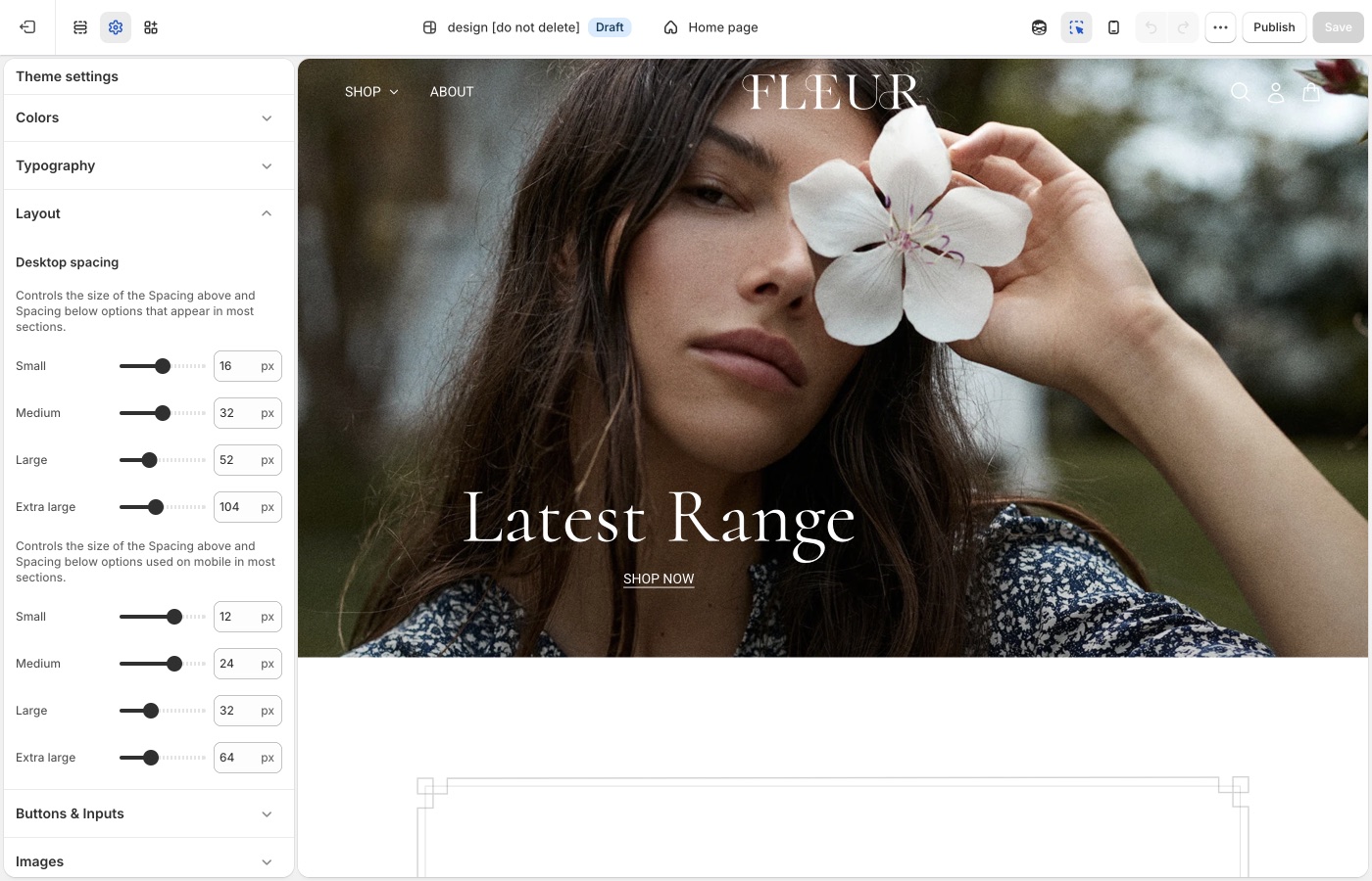
## Theme settings → Layout (Beyond)
### Small through Extra large (Beyond)
**Desktop spacing** and **Mobile spacing** each set Small, Medium, Large, and Extra large. Those settings are what the **Spacing above** and **Spacing below** dropdowns use on most sections.
Beyond’s Extra large is for Brand statement, About us, and other pauses. Collection grids and footers usually sit on Medium or Large. A homepage of only Extra large resembles a lookbook with no shop.
### Desktop and mobile (Beyond)
Keep mobile Extra large smaller than desktop. Story pages scroll long on a phone; stacked Extra large gaps add up.
Reuse the same **Spacing above** / **Spacing below** dropdown on adjacent sections: Medium throughout the shop, or Large on a hero and Medium on what follows. Use **None** when two sections should sit flush. Add a **Divider** when you need a gap with no content. Keep mobile spacing smaller than desktop, and preview both after you change the scale in Layout.
Extra large on **Brand statement** and **About us**; Medium or Large on collections and the footer.
## On each section (Beyond)
Choose None through Extra large from the section dropdowns. Use **None** between a hero and a brand statement that should read as one moment. Use a **Divider** when you need a gap with no story content.
> **Story, then shop**
>
> A useful homepage rhythm: Extra large around Brand statement and About us, Large or Medium around featured collections. The scale in Layout stays the same; only each section’s choice changes.
## Ask Sidekick (Beyond)
Open [Sidekick](https://help.shopify.com/en/manual/shopify-admin/productivity-tools/sidekick) from the theme editor toolbar (top right, next to the device preview icon), or press `⌘.` (`Ctrl+.` on Windows). If your pages feel cramped or overly loose and you can't tell which setting is responsible, describe the problem.
> "My Brand statement and About us sections feel too tight on mobile, what Desktop spacing and Mobile spacing values should I use for Small through Extra large?"
It can point you toward the relevant spacing settings and suggest values, rather than you adjusting sliders section by section to find the right combination.

## Troubleshooting (Beyond)
- **The homepage feels empty**: too many sections are Extra large. Keep Extra large on Brand statement and About us; Medium or Large on collections.
- **One section didn't move**: change **Spacing above** / **Spacing below** on that section.
- **Mobile story pages never end**: lower **Mobile spacing** Extra large.
---
title: Alignment and width
url: https://support.troopthemes.com/guide/beyond/alignment-and-width/
theme: Beyond
theme_styles: Fleur
---
# Alignment and width in Beyond
Open a section in **Edit theme**, not **Theme settings**.
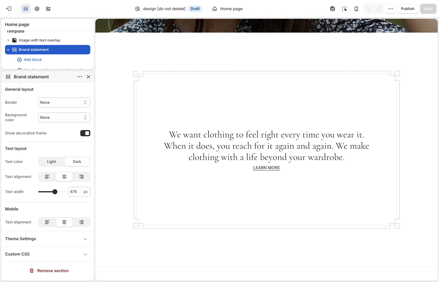
Pick a default **Text alignment** per template and keep supporting sections on it: **left** for catalogs and long copy, **center** for heroes and short announcements, then back to your default. **Mobile text alignment** is separate.
**Maximum container width** is on each section: contained for text-heavy blocks, **Full width** for slideshows and large photography. A useful rhythm is full-width hero → contained story → full-width collection.
## Text alignment (Beyond)
Brand statement and short manifesto lines usually **center**. About us rows and product grids usually **left**. Text menu can go either way; left matches a contents-like list, center matches a poster of words.
Product card alignment is global in **Theme settings** → **Product grid**. Keep it with the collection template, not with a centered homepage statement.
## Maximum container width (Beyond)
Extra small through Full width.
Brand statement often looks right at a **narrow** max width so a sentence stays a sentence. About us can go wider to hold media beside copy. Full width is for photography and collections.
If Brand statement is full width and the heading is a long paragraph, lines become hard to read. Prefer a contained width for copy-only story sections.
## Mobile (Beyond)
Center Brand statement on mobile even when a neighboring About us row is left-aligned on desktop. Check the preview so a left-aligned text menu does not look ragged on a narrow screen.
> **Width is part of the voice**
>
> Fleur-style pages often go narrower on words and wider on images. Beyond-style pages can do the reverse. Stay consistent inside one template.
## Product grid (Beyond)
**Text alignment** for product cards is in **Theme settings** → **[Product grid](https://support.troopthemes.com/guide/beyond/product-grid/)**, not the collection section.
## Ask Sidekick (Beyond)
Open [Sidekick](https://help.shopify.com/en/manual/shopify-admin/productivity-tools/sidekick) from the theme editor toolbar (top right, next to the device preview icon), or press `⌘.` (`Ctrl+.` on Windows). Alignment and width choices are easy to second-guess in isolation, ask it how a layout choice reads.
> "Should my Brand statement text be centered or left-aligned, and what Maximum container width keeps a short manifesto line reading like a sentence?"
It'll reason through the trade-off with you rather than you flipping the setting back and forth to compare.

## Troubleshooting (Beyond)
- **Brand statement is a long full-width paragraph**: set **Maximum container width** down (Extra small through Medium) and keep **Text alignment** centered.
- **Product cards centered like the manifesto**: change **Product grid** text alignment, not the homepage section.
- **Text menu looks ragged on a phone**: set **Mobile text alignment** to center, or shorten the lines.
---
title: Buttons and inputs
url: https://support.troopthemes.com/guide/beyond/buttons-and-inputs/
theme: Beyond
theme_styles: Fleur
---
# Buttons and inputs in Beyond
Buttons work in two steps: In **Edit theme** → **Theme settings** → **Buttons & Inputs**, styles 1 through 4 define how buttons look storewide, including hover colors. On each section, the **Button** block picks style 1–4. Changing a style in Theme settings updates every button that uses it.
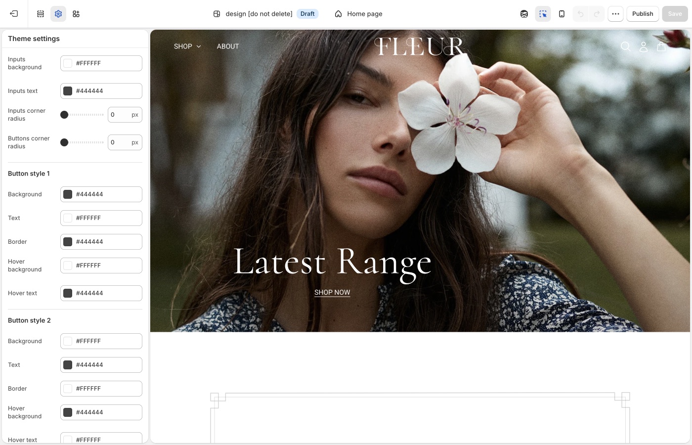
## Theme settings → Buttons & Inputs (Beyond)
### Four button styles (Beyond)
Each style has **Background**, **Text**, **Border**, **Hover background**, and **Hover text**.
- **Style 1**: primary: Shop, Add to cart
- **Style 2**: secondary on light backgrounds
- **Style 3**: outline on light surfaces
- **Style 4**: light text and border on dark or image backgrounds
Keep “Shop the collection” on style 1. Brand statement can use a quieter style 3 so the words stay primary.
**Buttons corner radius**: a small radius is the Beyond default; fully round buttons change the voice more than a new accent.
### Inputs (Beyond)
- **Inputs corner radius**: rounds newsletter fields, contact forms, search, and cart notes
- **Inputs background**: fill color behind the field
- **Inputs text**: color of the text customers type
Match input radius to button radius so newsletter fields on story pages match the buttons.
> **Fewer buttons on story pages**
>
> If About us, Brand statement, and a featured collection each have a solid button, the page is a list of CTAs. Prefer one shoppable button per view, and text links or no control on the story blocks.
## On each section (Beyond)
The **Button** block picks style 1–4 from the set you defined in **Buttons & Inputs**. Keep “Shop the collection” and Add to cart on style 1 storewide.
## Ask Sidekick (Beyond)
Open [Sidekick](https://help.shopify.com/en/manual/shopify-admin/productivity-tools/sidekick) from the theme editor toolbar (top right, next to the device preview icon), or press `⌘.` (`Ctrl+.` on Windows). Ask it to suggest a button style.
> "Suggest Background, Text, Border, Hover background, and Hover text values for Style 1 (primary) and Style 3 (outline) that fit an editorial, story-led brand."
It'll reason through contrast and hierarchy with you before you touch Theme settings → Buttons & Inputs. Useful when you have four button styles to fill in and aren't sure how to differentiate them.

## Troubleshooting (Beyond)
- **Too many solid buttons**: remove the button block from Brand statement or About us, or switch those to style 3. Keep style 1 for the collection.
- **Add to cart didn’t change**: confirm **Buttons & Inputs** and style 1 on the product form.
- **Checkout is unchanged**: Shopify checkout, not the theme.
---
title: Images
url: https://support.troopthemes.com/guide/beyond/images/
theme: Beyond
theme_styles: Fleur
---
# Images in Beyond
**Edit theme** → **Theme settings** → **Images**.
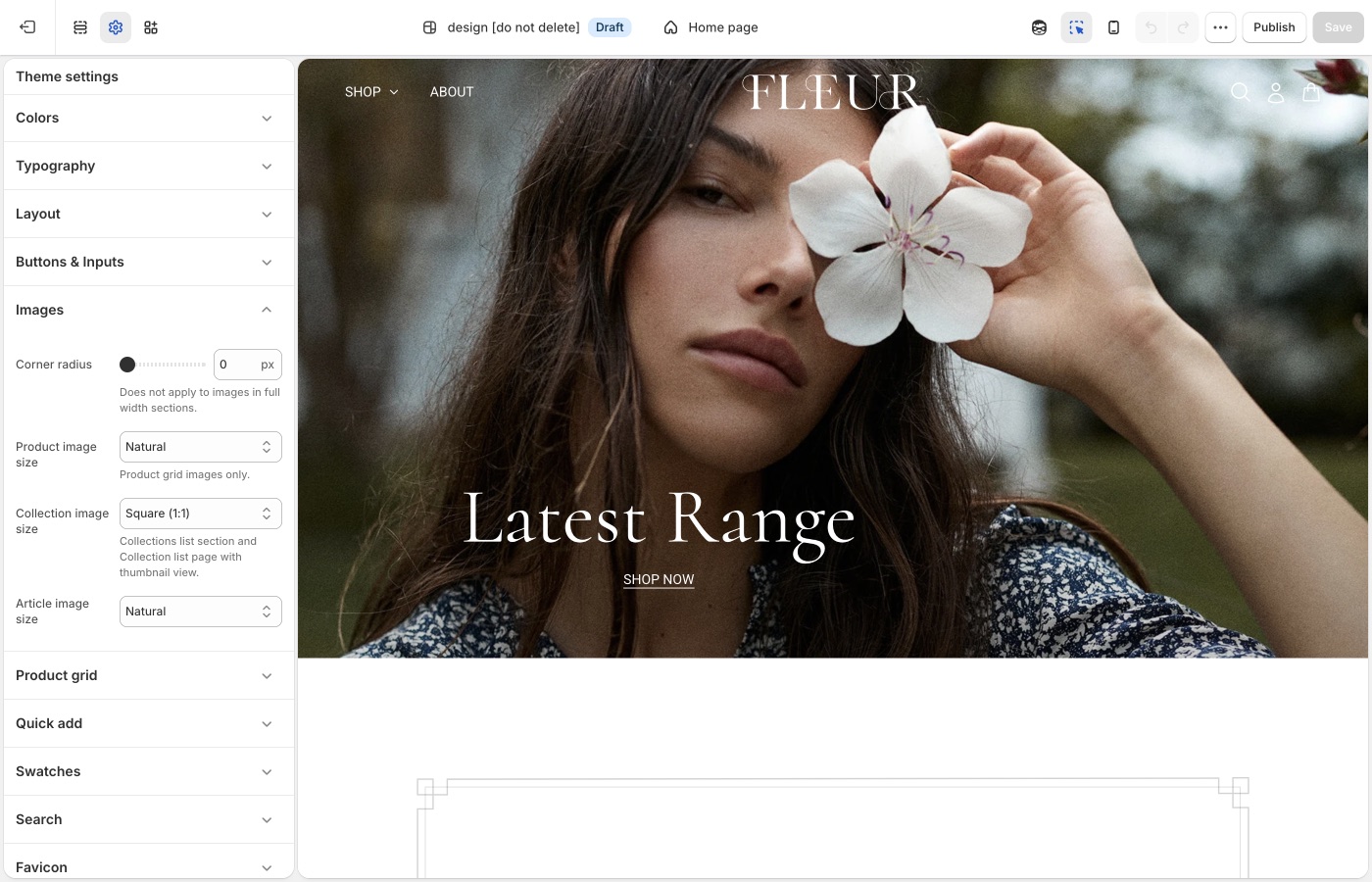
Crops for product, collection, and article images.
**Corner radius** is storewide. Besides photos, it rounds embedded videos, text blocks with a background color, the newsletter popup, and sections with **Outer background** off.
## Crops and radius (Beyond)
- **Corner radius**: rounds product and content images, embedded videos, text blocks with a background color, the newsletter popup, and inset sections (**Outer background** off). Not applied to full-width section images.
- **Product image size**: Natural, Square (1:1), Landscape (4:3), Portrait (4:5), Portrait (2:3)
- **Collection image size**: collection lists and thumbnails
- **Article image size**: blog cards
About us uses its own aspect ratio on the section. Product grid crop is the Images setting above. Export sizes: [What image sizes should I use?](https://support.troopthemes.com/faqs/what-image-sizes-should-i-use/).
> **Two photo languages**
>
> Lifestyle frames in About us can be messy and human. Product grid shots should still share a ratio and background so the shoppable part of the site feels reliable.
## Ask Sidekick (Beyond)
Open [Sidekick](https://help.shopify.com/en/manual/shopify-admin/productivity-tools/sidekick) from the theme editor toolbar (top right, next to the device preview icon), or press `⌘.` (`Ctrl+.` on Windows). Unsure whether Natural, Square, or Portrait crops will suit your product photography, or how consistent your existing photos actually are, describe your catalog.
> "My product photos are a mix of studio shots and lifestyle images, what Product image size should I use for the grid?"
It can help you reason through the trade-off before you commit the whole store to one crop, and point you to Shopify's [image size guidance](https://support.troopthemes.com/faqs/what-image-sizes-should-i-use/) if you're about to reshoot.

## Troubleshooting (Beyond)
- **Product cards look cropped, About us does not**: they use different controls. Grid crop is **Images** → **Product image size**. About us ratio is on that section.
- **Corner radius ignored on a hero**: full-width section images are excluded on purpose.
---
title: Social media
url: https://support.troopthemes.com/guide/beyond/social-media/
theme: Beyond
theme_styles: Fleur
---
# Social media in Beyond
**Edit theme** → **Theme settings** → **Social media**.
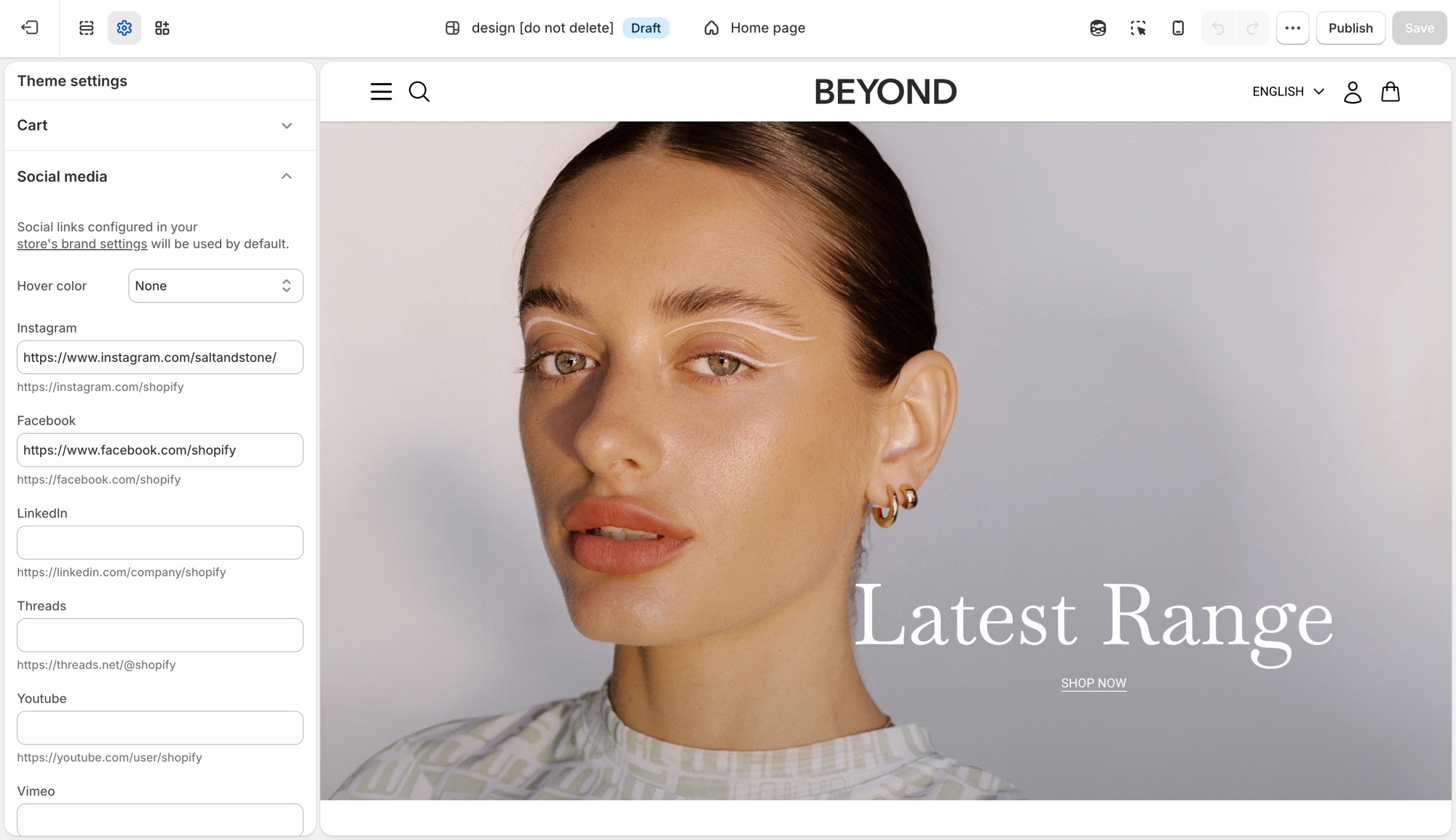
These settings control the social icons that appear in the footer, announcement bar, and other sections across the theme in one place, not per section.
## Theme settings → Social media (Beyond)
- **Hover color**: **Match brand** (each platform's own color), **Opacity** (dims on hover), or **None**.
- One field per platform (Instagram, Facebook, LinkedIn, Threads, Youtube, Vimeo, Pinterest, 𝕏, TikTok, Tumblr, Snapchat, Bluesky): paste that profile's URL to show its icon.
Leave a platform blank and no icon shows for it. Sections do not need each icon toggled individually.
If you already added social links in Shopify's [brand assets](https://help.shopify.com/en/manual/promoting-marketing/managing-brand-assets) (**Settings** → **General** → **Brand assets** → **Social links**), the theme uses those by default and no further setup is needed here. A URL entered in **Theme settings** → **Social media** overrides the brand setting for that platform only. This is useful when a section-specific or seasonal account should differ from your main brand profile.
## Troubleshooting (Beyond)
- **An icon is not showing**: that platform's URL field is empty here and in **Settings** → **Brand**.
- **The wrong URL is showing**: a value here always wins over **Settings** → **Brand** for that platform.
- **Icons do not change color on hover**: **Hover color** is set to **None**.
---
title: Animations
url: https://support.troopthemes.com/guide/beyond/animations/
theme: Beyond
theme_styles: Fleur
---
# Animations in Beyond
**Edit theme** → **Theme settings** → **Animations**.
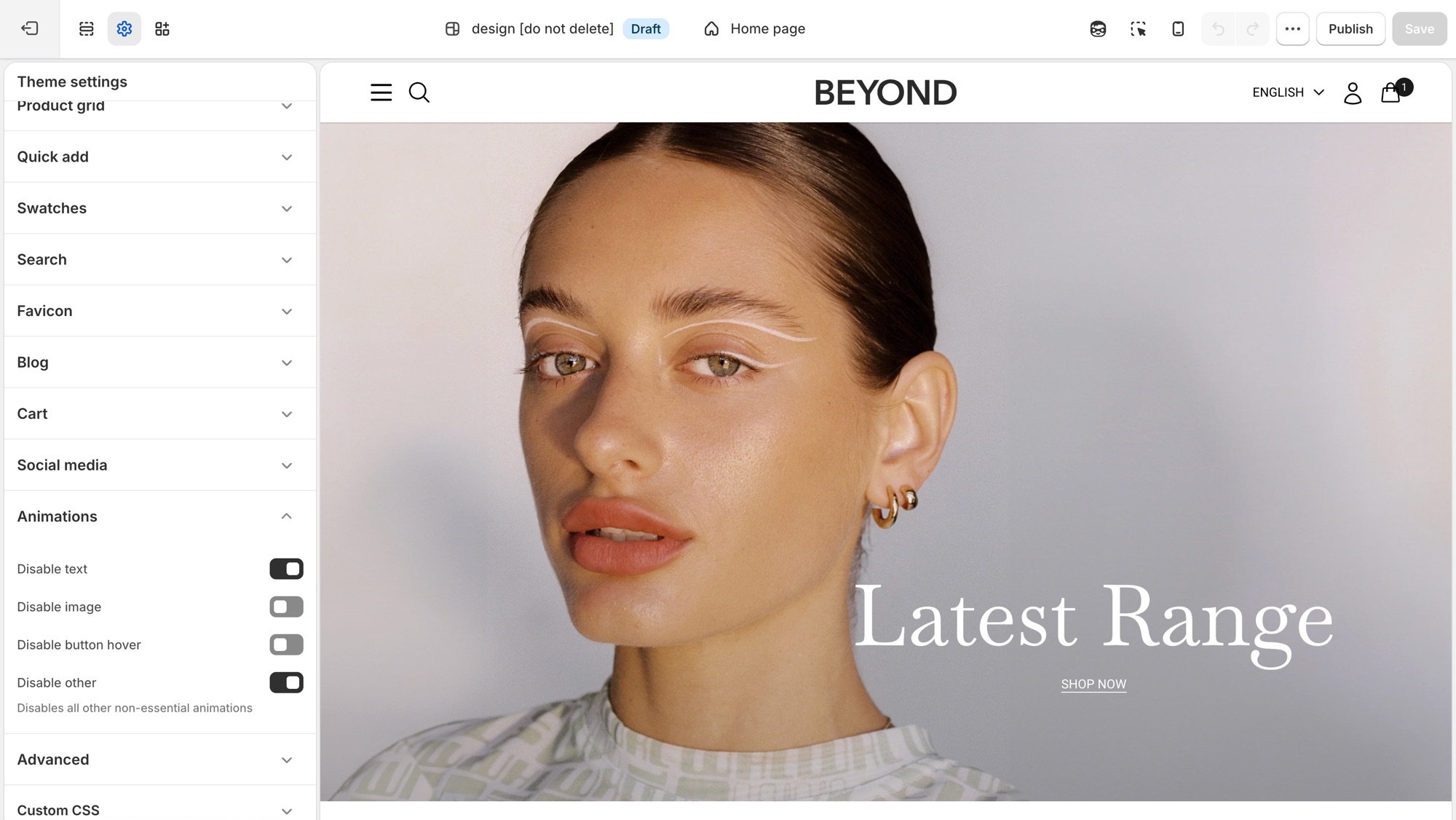
Four storewide switches, each one turns a category of motion off. There is nothing to turn on, animations ship on by default.
## Theme settings → Animations (Beyond)
- **Disable text**: turns off text fade and reveal animations.
- **Disable image**: turns off image fade and reveal animations.
- **Disable button hover**: turns off button hover transitions.
- **Disable other**: turns off all other non-essential animation, a catch-all for anything the first three do not cover.
## Where each toggle applies (Beyond)
- **Disable text**: the scroll-triggered fade/slide-in on headings, subheadings, text, buttons, and rich text, used in nearly every section, plus the animated stacked headline component where a section uses one.
- **Disable image**: the fade-in on section images, for example Image with text, Media with highlight, Shop the banner, Scrolling text on image, Grid with overlay, Featured collections, the collection banner, and menu images.
- **Disable button hover**: a single storewide switch. It is not checked per section, so it turns off hover transitions on every button, input, and link at once.
- **Disable other**: the widest switch, covering things that are not simple text or image reveals: product card image hover-swap and the shared transition into the product page, the cart drawer, predictive search results, dropdown/mega menus, accordions, grid reveals on collection/blog/search listing pages, and sections like Testimonials.
## Troubleshooting (Beyond)
- **A section still animates after I disabled text or image**: that motion may fall under **Disable other** instead, for example a slideshow transition or a decorative loop. Turn that on too.
- **I want most animation off but kept hover effects**: leave **Disable button hover** off and enable the other three.
---
title: Brand and story sections
url: https://support.troopthemes.com/guide/beyond/brand-and-story-sections/
theme: Beyond
theme_styles: Fleur
---
# Brand and story sections in Beyond
**Edit theme** → **Add section** → **Brand statement**, **About us**, or **Text menu**.
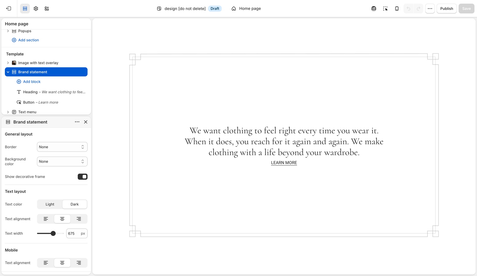
Long-form story sections, not a replacement for the shop or header menu.
## Brand statement (Beyond)
A focused block for a short manifesto: overline, heading, description, optional button or icon.
Do **not** use this for a photo beside copy, use About us or Image with text.
Useful settings:
- **Show decorative frame**: a frame around the statement
- **Text alignment** and **Text width**: keep the line length short
- **Mobile text alignment**
This is the “one idea” section.
## About us (Beyond)
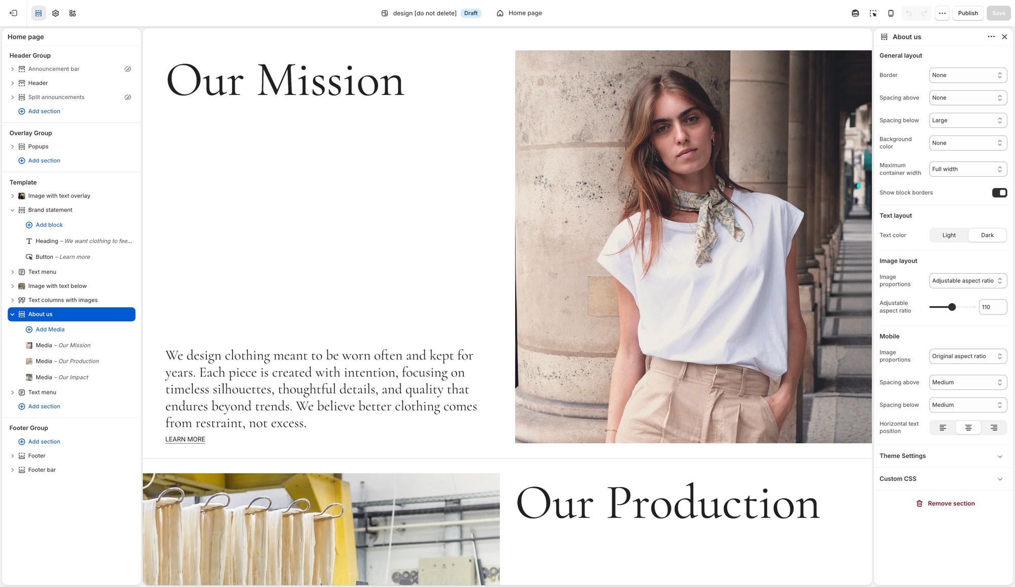
A repeating **Media** block: image or video with heading, description, and optional button. It is the biography or studio row.
Do **not** use this as a product grid or as a long FAQ.
Useful settings:
- **Show block borders**: lines between media blocks
- **Maximum container width**, spacing, background, text color
- Image display type and aspect ratio (desktop and mobile)
Use two or three blocks, not a dozen. Each block should be one chapter (the studio, the material, the founder).
## Text menu (Beyond)
A list of text items, contents, values, services, or a word-led nav that is not the header.
Do **not** use this as a replacement for [navigation](https://support.troopthemes.com/guide/beyond/creating-navigation/). Links in the header still come from **Content** → **Menus**.
Useful settings:
- **Show block borders**
- **Block spacing**: Small or Large between items
- Horizontal text alignment (desktop and mobile)
Use it when the words *are* the design (a list of principles, a table of contents for a long About page).
## How they sit on a homepage (Beyond)
A clear Beyond/Fleur rhythm:
1. Hero or slideshow
2. Brand statement (Extra large spacing, contained width)
3. Featured collection
4. About us (one or two media blocks)
5. Text menu or another collection
Do not stack Brand statement, About us, and Text menu with no products. The story sections should support the shop, not replace it.
The full list of sections you can add is in [Sections in Beyond](https://support.troopthemes.com/guide/beyond/section-list/).
> **Same type roles**
>
> Headings in these sections use the global type ladder. If Brand statement looks huge, lower **Featured heading** or **Section heading** in [Typography](https://support.troopthemes.com/guide/beyond/typography/), not the section’s padding.
## Ask Sidekick (Beyond)
On sections that support it, **Add block** also includes a **Generate** option, powered by Shopify's [Sidekick](https://help.shopify.com/en/manual/shopify-admin/productivity-tools/sidekick). Describe the block in plain language and it writes the Liquid, HTML, and settings for you, previewed in the theme editor before you keep it.
> "Add a block with an icon, a short heading, and a line of text for a shipping promise."
It's genuinely useful for a one-off block a Troop section doesn't already offer, rather than paying a developer for something small. Review what it generates, ask it to refine, or discard it, the usual editing risks still apply (see [Troubleshooting](#troubleshooting) below). Shopify's [guide to generating theme blocks](https://help.shopify.com/en/manual/online-store/themes/customizing-themes/theme-editor/shopify-magic/generate-blocks) covers eligibility and limits.

## Troubleshooting (Beyond)
- **Text menu didn’t change the header**: it is not the header. Edit **Content** → **Menus**, then assign that menu in the **Header** section.
- **Brand statement has too much text**: narrow **Maximum container width** / **Text width**, and keep one short idea.
- **About us has ten blocks**: split into two sections or cut to two or three chapters. More blocks read as a blog, not a studio row.
- **No products on the homepage**: add a **Featured collection** between story sections.
---
title: Section list
url: https://support.troopthemes.com/guide/beyond/section-list/
theme: Beyond
theme_styles: Fleur
---
# Sections in Beyond
**Edit theme** → **Add section**. Names in the editor match this list. Do not pick a section because the name sounds close; each one does a different job.
- **A short manifesto, no photo**: use **Brand statement**. Not **Rich text** or **About us**.
- **Studio / founder chapters with media**: use **About us**. Not **Brand statement** (no repeating media blocks).
- **A word-led list that is not the header**: use **Text menu**. Not the **Header** section / **Content** → **Menus**.
- **Photo with copy underneath**: use **Image with text below**. Not **Image with text overlay**.
**About us**, **Brand statement**, **Image with text below**, and **Text menu** are covered in more depth in [Brand and story sections](https://support.troopthemes.com/guide/beyond/brand-and-story-sections/).
For how to place image layouts, see [Designing with image sections](https://support.troopthemes.com/guide/beyond/image-sections/).
## Which section for this goal? (Beyond)
Each row names the section to use for a goal and a similar section that does a different job.
| Goal | Use | Do not use |
| --- | --- | --- |
| One static hero with text on the photo | **Image with text overlay** | **Slideshow** (that rotates) |
| Several rotating heroes | **Slideshow** | **Image with text overlay** |
| Photo beside copy | **Image with text** | **Image with text overlay** |
| Photo with copy underneath | **Image with text below** | **Image with text overlay** |
| A short manifesto, no photo | **Brand statement** | **Rich text** or **About us** |
| Studio / founder chapters with media | **About us** | **Brand statement** |
| A word-led list that is not the header | **Text menu** | **Header** / **Content** → **Menus** |
| A grid of images with captions on them | **Grid with overlay** | **Featured collection** |
| Up to three images or videos in a row | **Media row** | **Grid with overlay** (more tiles) or **Featured images** (exactly two) |
| Products from one collection | **Featured collection** | **Featured products** (those are picked one by one) |
| A hand-picked set of products | **Featured products** | **Featured collection** |
| Clickable hotspots on one image | **Shop the look** or **Shop the banner** | **Image with text overlay** |
| FAQ / accordion | **FAQ** | **Rich text** |
| Email signup *on the page* | **Newsletter** section | **Popups** (the overlay that opens over the page) |
Jump to a group; these match the groups in **Add section**:
- [Storytelling](#storytelling)
- [Products](#products)
- [Brand Trust](#brand-trust)
- [Promotions](#promotions)
- [Signups](#signups)
- [Utilities & Layout](#utilities-layout)
---
## Storytelling (Beyond)
Use these for brand narrative and visual-first layouts. Story sections work best when they alternate with products, not as a stack of statements.
- **About us**: Repeating media blocks (image or video with heading and copy) for studio, founder, or process chapters. Good for a founder or studio story told in two or three chapters, not a product grid or long FAQ.
- **Brand statement**: A short manifesto: overline, heading, description, optional button or frame. Good for one short manifesto: the single idea a shopper remembers, not a full story.
- **Image with text below**: Image or video with heading and copy underneath, not overlaid. Good for product philosophy or care notes where the copy needs full-width legibility, not shrunk over a photo.
- **Featured images**: Two coordinated images with shared text and a call to action. Good for a campaign spotlight or category teaser where two images tell one story better than either alone.
- **Grid with overlay**: Image or video tiles with text overlays in a flexible grid. Good for a shop-by-category or shop-by-collection grid, each tile carrying its own label and link.
- **Image comparison**: Shoppers drag between before/after visuals in one frame. Good for before/after proof: skincare results, renovations, restorations, material finishes.
- **Image with text**: Image paired with copy in a split, side-by-side layout. Good for a feature or story explainer that needs room to breathe.
- **Image with text overlay**: Heading, text, and buttons directly on one image. Good for a single hero banner or campaign header, type sitting directly on the photo. Do not use for rotating slides (**Slideshow**) or copy beside the photo (**Image with text**).
- **Media overlay columns**: Several media columns, each with optional overlay text. Good for category callouts or campaign modules, each column its own labeled story card.
- **Media row**: Up to three images or videos in a row, with optional overlay text. Good for a short, light media strip: lookbook stills or campaign moments, not a full grid.
- **Media with highlight**: One featured media area plus supporting media blocks. Good for a launch page or content-first homepage: one lead visual plus supporting media.
- **Overlapping media**: Layered media for an editorial, depth-focused composition. Good for a premium, art-directed moment where a flat side-by-side layout would look plain.
- **Rich text**: Formatted text for intros, brand copy, or messaging blocks. Good for a plain-text intro, shipping note, or brand paragraph that does not need imagery.
- **Slideshow**: Rotating slides for heroes, announcements, or campaigns. Good for cycling multiple offers, looks, or promotions at the top of the homepage. Do not use for a single static banner (**Image with text overlay**).
- **Text columns with images**: Repeating image/text columns for features or pillars. Good for a "why shop with us" row: shipping, materials, guarantees.
- **Video**: One video with optional heading and copy. Good for a single product demo, brand film, or how-to as its own moment.
## Products (Beyond)
Use these to feature collections, products, and shoppable images.
- **Collection with highlight**: A collection beside a highlighted story or content area. Good for pairing a shoppable collection with a story or lookbook teaser.
- **Collections list**: Several collections in a list or grid. Good for a shop-by-category landing block: shop by room, by size, by use.
- **Featured collection**: Products from one collection. Good for showing everything in one Shopify collection, like New arrivals or Best sellers. Do not use for a hand-picked set (**Featured products**).
- **Featured product**: One product with full merchandising details. Good for a flagship launch or hero item that deserves its own dedicated spot.
- **Featured products**: A curated set of individual products. Good for a hand-picked edit: staff picks, a gift guide, a bundle, regardless of collection. Do not use to show a whole collection (**Featured collection**).
- **Recent products**: Newly added products. Good for an always-current "just in" row that updates itself as you add inventory.
- **Shop the banner**: Clickable product hotspots on one hero-style image. Good for a lifestyle hero image where every visible product is tappable.
- **Shop the look**: Image hotspots with editorial text and campaign framing. Good for an outfit or room shot with shoppable hotspots plus campaign copy.
## Brand Trust (Beyond)
Use these for FAQs, proof, and service details.
- **Blog posts**: Recent or selected articles. Good for surfacing editorial or how-to content that keeps shoppers browsing past the homepage.
- **FAQ**: Collapsible questions. Good for shipping, sizing, or policy questions shoppers need answered before checkout. See [Setting up FAQ or Collapsible rows](https://support.troopthemes.com/guide/beyond/setting-up-faq-or-collapsible-rows/).
- **Icons row**: Trust markers such as shipping, returns, or support. Good for a quick reassurance strip under a hero: free shipping, easy returns, secure checkout.
- **Map**: Location and contact details with a map. Good for a physical storefront, showroom, or studio location.
- **Service list**: Services, menus, or policy highlights. Good for listing services, a café or restaurant menu, or policy summaries without building a custom page.
- **Testimonials**: Customer quotes. Good for social proof near a buying decision: reviews, quotes, press mentions.
## Promotions (Beyond)
Use these for launches, campaigns, and word-led lists.
- **Text menu**: A list of text items (contents, values, services). Good for a word-led list: principles or a table of contents, where the words are the design. Not a replacement for the header menu; in the editor it sits in this group. See [Brand and story sections](https://support.troopthemes.com/guide/beyond/brand-and-story-sections/).
- **Countdown**: A timer for drops, events, or limited-time offers. Good for building urgency ahead of a launch, sale end, or restock.
- **Scrolling content**: Continuously moving content blocks for callouts. Good for a marquee strip of rotating callouts: press mentions, taglines, promo codes.
- **Scrolling text on image**: Animated text over an image. Good for a bold campaign banner where the moving message is the visual.
## Signups (Beyond)
Use these to collect enquiries and emails.
- **Contact form**: Direct customer enquiries from any page. Good for custom orders, wholesale enquiries, or support questions a help-desk app does not cover.
- **Newsletter**: Email signup. Good for building your list on the page itself, separate from the popup. See [Mailing list & newsletters](https://support.troopthemes.com/guide/beyond/newsletters/).
## Utilities & Layout (Beyond)
Use these for spacing, structure, and custom code.
- **Custom Liquid**: Custom Liquid output for apps and advanced integrations. Good for embedding an app widget or custom-coded block no standard section covers.
- **Custom content**: Mixed blocks for a simple custom layout. Good for a one-off layout that does not fit any other section, built from simple mixed blocks.
- **Divider**: Visual separation between sections. Good for breathing room between two sections without adding empty content.
---
title: Designing with image sections
url: https://support.troopthemes.com/guide/beyond/image-sections/
theme: Beyond
theme_styles: Fleur
---
# Designing with image sections in Beyond
Add an image section in **Edit theme** → **Add section**, then pick by the job: one static hero, rotating slides, photo beside copy, copy underneath, a short media row, or a grid of overlays. Section settings and blocks control crop, width, and where type sits.
Product media in the admin, collection images, and checkout are unchanged.
For the full catalog (including product, FAQ, and utility sections), open the [section list](https://support.troopthemes.com/guide/beyond/section-list/). **About us**, **Brand statement**, and **Image with text below** are also covered in [Brand and story sections](https://support.troopthemes.com/guide/beyond/brand-and-story-sections/).
## Slideshow (Beyond)
Use the Slideshow section when you want to rotate multiple messages, products, or promotions in a single section.
It is mobile-friendly by default, so customers can swipe through slides on touch devices, while desktop visitors can use drag controls or autoplay.
Each slide can display a single image or video, or two media items side by side. To display multiple media items, set `Media 2 type` to `image` or `video`. To display a single media item, set `Media 2 type` to `none`.
> **Legacy Slideshow**
>
> Please see the legacy slideshow features below for Beyond versions below 7.1.0.
Use `Blocks per slide for desktop` to control how many slides appear at once (1 to 4). A value of 1 creates a standard full-width slider, while higher values create a multi-card layout for collections, promotions, or featured content.
For saving images for your slides, read more about image sizes in our [What image sizes should I use?](https://support.troopthemes.com/faqs/what-image-sizes-should-i-use/).
---
## Image with text overlay (Beyond)
Use the Image with text overlay section when you want to place text and calls to action directly on top of a single image.
This section works well for hero banners, campaign announcements, and brand storytelling where one strong image needs supporting copy. The image can be configured with different widths and aspect ratios to suit your layout:
You build the text and calls to action with blocks (headings, descriptions, buttons, and more). For a general overview of blocks and what to expect in the theme editor, see [Blocks in image sections](#blocks-in-image-sections).
Use this section when your goal is to combine one image and one message in a single, high-impact banner that can be reused across key storefront pages.
> **Version availability**
>
> Image with text overlay is available in Beyond versions 6.1.0 and up.
---
## Image with text (Beyond)
Use the Image with text section when you want to pair an image with supporting content in a split layout.
This section works well for featured collections, product storytelling, and campaign moments where the visual and copy should sit side by side instead of stacking in a single banner.
The image can be configured to control presentation across desktop and mobile, and the layout can be reversed to place the image on either side. You can also use the overlap setting to adjust how text sits against the image:
The copy beside the image is built with blocks, which you add and reorder in the section (for example headings, descriptions, and buttons). See [Blocks in image sections](#blocks-in-image-sections) for a general overview. Use the block list in the theme editor to see what this section includes.
Use this section when your goal is to combine one image and one message in a balanced, side-by-side layout that can be reused across key storefront pages.
> **Legacy Image with text**
>
> Please see the legacy image with text features below for Beyond versions below 6.1.0.
The Image with text section allows you to display images in various ratios , full width, three quarter or half width - to establish balance and visual rhythm in your page design.
`Parallax scrolling` can be enabled for images in this section to add action and depth. Parallax scrolling effects create movement and the illusion of depth by scrolling background elements at a slower pace than foreground elements. For best results, set the `text position` setting to `center`.
---
## Featured images (Beyond)
Use the Featured images section when you want to present two visuals together with one shared message and call to action.
This section works well for campaign storytelling, category spotlights, or any moment where two complementary images create stronger impact than one alone.
Each image can be configured for desktop and mobile display, and mobile layout can be adjusted to show one image, stack both, or place them side by side.
The shared message and call to action are built with blocks for text and related content. See [Blocks in image sections](#blocks-in-image-sections) for a general overview. Add blocks in the theme editor to see what this section offers.
Use this section when your goal is to tell one clear story across two images in a single, high-impact layout that can be reused across key storefront pages.
> **Version compatibility**
>
> Featured images is available in Beyond versions 5.1.0 and up.
---
## Grid with overlay (Beyond)
This section allows you to display content in simple fixed-aspect ratio grids, justified grids, or more freeform offset grids.
Configure individual block settings to specify how blocks fall within the grid and section settings to style text overlays to optimize readability.
The `preserve image aspect ratio` block setting will display images at the ratio they're uploaded at, rather than justifying them into the grid. This will allow you to create more free-form, off-set grids with varying image heights.
---
## Text columns with images (Beyond)
This flexible sections allows you to display a combination of image an text elements for a wide variety of uses.
> **Row of icons**
>
> If you want a horizontal row of icons (for example trust marks, shipping icons, or simple pictograms with optional short text), add the **Icons row** section instead of building that layout in **Text columns with images**. _Icons row_ is available in Beyond versions 4.2.0 and up.
---
## Image comparison (Beyond)
Use the Image comparison section when you want customers to interactively compare two visuals in the same frame (for example before/after edits, product variants, material finishes, or renovation stages).
This section is ideal when one image alone cannot communicate the difference clearly. Shoppers can drag the comparison handle to reveal more or less of each image, which makes visual changes easier to understand at a glance.
Add one Before block and one After block, then upload an image for each. You can optionally add mobile-specific images per block to improve cropping and composition on smaller screens.
Use this section when your goal is to show change, contrast, or improvement in a way that invites interaction instead of relying on static side-by-side images.
> **Version availability**
>
> Image comparison is available in Beyond versions 3.2.0 and up.
---
## Shop the banner (Beyond)
Use the Shop the banner section when you want to place clickable product dots on a single image and let customers jump straight from inspiration to product discovery.
This section works well for hero-style campaign visuals where one scene contains multiple products (for example a styled room, outfit, or collection shot). Add product dots to highlight items in context without breaking the visual flow.
Set your main banner image, then add **Product dot** blocks and assign a product to each one. You can control dot placement separately for desktop and mobile, so hotspots stay accurate across screen sizes.
Use this section when your goal is to turn one strong branded image into an interactive shopping surface with minimal on-image text.
> **Version availability**
>
> Shop the banner is available in Beyond versions 5.0.0 and up.
---
## Shop the look (Beyond)
Use the Shop the look section when you want a guided, editorial shopping experience built around one curated image plus an optional call to action.
Like Shop the banner, this section supports product hotspots, but it also includes heading and button settings so you can frame the visual with a stronger campaign message.
Add your image, create **Product dot** blocks, and position each hotspot for desktop and mobile. Use the heading alignment, container width, and hotspot style settings to match the section to the rest of your page design.
Use this section when your goal is to combine storytelling and conversion in one curated “look” module.
> **Version availability**
>
> Shop the look is available in Beyond versions 3.2.0 and up.
---
## Scrolling text on image (Beyond)
Use the Scrolling text on image section when you want animated headline-style text moving across an image background.
This section is ideal for brand statements, promotional phrases, or directional messaging that should feel dynamic and high-energy. You can add multiple text blocks, control scroll direction and speed, set spacing between phrases, and pause movement on hover.
You can also choose whether text should span the full width and configure mobile-specific media to keep composition readable on smaller screens.
Use this section when your goal is to create motion-driven campaign messaging without building a full slideshow.
> **Version availability**
>
> Scrolling text on image is available in Beyond versions 4.4.0 and up.
---
## Media with highlight (Beyond)
Use the Media with highlight section when you want one primary feature area paired with a grid of supporting media items.
This section works well for launch pages, collection storytelling, and content-first merchandising where you need a lead narrative plus multiple secondary visuals. The main highlight area supports heading and rich text, while blocks can include images or video with optional titles.
Control layout with blocks-per-row, vertical alignment, reverse layout, and display/aspect settings for both desktop and mobile. Overlay style and text options help maintain readability over busy imagery.
Use this section when your goal is to blend editorial storytelling and media-rich browsing in a single modular section.
> **Version availability**
>
> Media with highlight is available in Beyond versions 5.0.0 and up.
---
## Media overlay columns (Beyond)
Use the Media overlay columns section when you want a clean column layout where each media tile can carry overlaid text and optional links.
This section is useful for category callouts, campaign modules, or mixed media presentations where each column acts like a mini story card. Blocks can be image or video, with per-block overline, heading, and description content.
You can adjust spacing, aspect ratio, and text styling to control visual rhythm and readability across the grid.
Use this section when your goal is to present multiple media-driven messages side by side in a structured, scannable layout.
> **Version availability**
>
> Media overlay columns is available in Beyond versions 7.1.0 and up.
---
## Media row (Beyond)
Use the Media row section when you want **up to three** images or videos in a single row, with a shared height.
This is for a short, even band of media, lookbook stills, campaign stills, or mixed image/video, not a many-tile grid (**Grid with overlay**) and not a two-image story (**Featured images**). Add **Image** or **Video** blocks (maximum three). **Media height** sets the crop (Natural, Square, Landscape, or Portrait). Overlay heading and button are optional on each block.
On mobile, choose whether the row stays a grid or stacks, and whether blocks go full width.
Use this section when the job is a simple 1–3 media strip with optional overlay text.
> **Version availability**
>
> Media row is available in Beyond versions 7.3.0 and up.
---
## Overlapping media (Beyond)
Use the Overlapping media section when you want to layer two media items to create depth and a more art-directed visual composition.
This section works well for brand storytelling, product detail narratives, and campaign moments where a standard side-by-side layout would appear flat. Each media block can be image or video, and you can control overlap amount, animation behavior, and layout direction.
Text settings (heading style, alignment, description, and column width) let you pair the layered media with supporting copy while keeping balance between content and visuals.
Use this section when your goal is to create a premium, editorial look with intentional layering and motion.
> **Version availability**
>
> Overlapping media is available in Beyond versions 5.0.0 and up.
---
## Blocks in image sections (Beyond)
A **section** is one area of a page template (for example a hero or image band). **Blocks** are the pieces inside that section. In other parts of a theme, blocks can be all sorts of things, this guide focuses on **image sections**, where blocks are mostly for **copy**: overlines, headings, descriptions, buttons, and similar, paired with the image. The **image** itself is set in the section (or slide) settings, not as “body text.”
**Reorder blocks** in the left-hand section list to change the order of that copy on the page. Drag a block up or down to match the story you want (for example, overline, then heading, then button).
Shopify explains the overall model in [sections and blocks in the theme editor](https://help.shopify.com/en/manual/online-store/themes/theme-structure/sections-and-blocks). For a given section, only the block types in **Add block** apply; that list changes by section and theme version, so use another image section (or a newer version) if something is missing.
Common copy-related block types often include:
**Edit theme** → **Add section**, then the section’s settings and blocks.
Product media in the admin, collection images, or checkout.
- Overline
- Heading
- Description
- Button
- Newsletter form
- Icons
- Custom Liquid
## Troubleshooting (Beyond)
- **You added Slideshow but only have one image**: use **Image with text overlay**. Slideshow is for rotating slides.
- **Type sits on the photo and you wanted it beside**: use **Image with text**, not overlay.
- **Type sits beside the photo and you wanted it underneath**: use **Image with text below**.
- **Images look cropped**: that section’s aspect ratio setting, or [What image sizes should I use?](https://support.troopthemes.com/faqs/what-image-sizes-should-i-use/). Replacing the file in **Products** does not change a section’s crop.
- **You wanted three photos in a row and added Grid with overlay**: use **Media row** (max three blocks, shared height).
---
title: Add collection page promotions
url: https://support.troopthemes.com/guide/beyond/collection-page-promotions/
theme: Beyond
theme_styles: Fleur
---
# Add collection page promotions in Beyond
Promotional tiles sit **inside the collection product grid**. Add them on the collection template, not in Theme settings → Colors.
**Edit theme** → collection template → **Collection grid** → **Add promotion**.
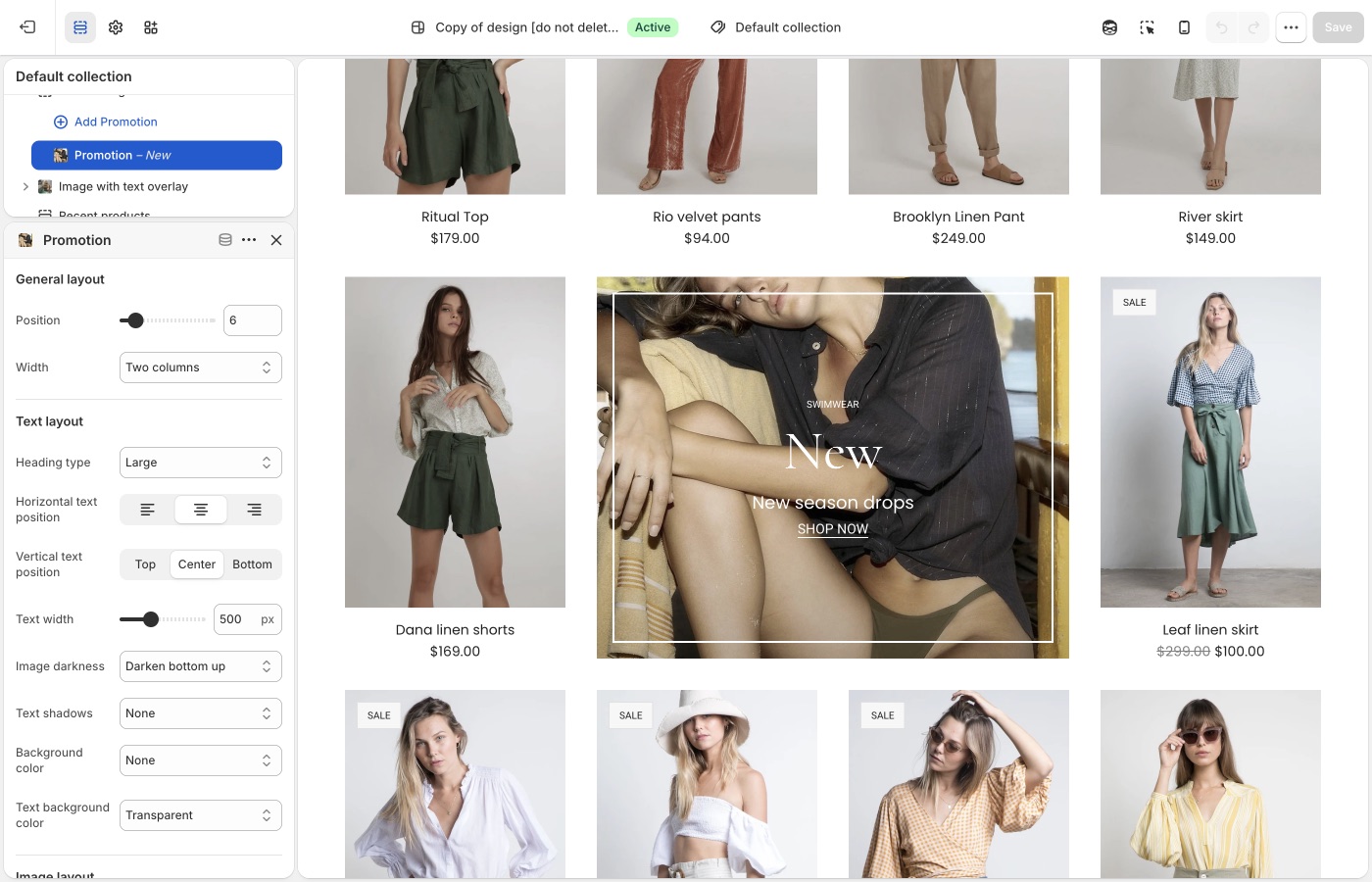
Which products are in the collection, discounts, and checkout are unchanged.
> **Compatibility**
>
> Collection promotions are available in Beyond versions 1.0.0 and up.
Promotional blocks can be added into Collection page grids to promote sales, collections, product information and more.
To add a collection promotion, navigate to the collection page settings, under _Collection grid_ > _Add promotion_. Use the settings to configure the position, size and style of individual promotions.
> **Promotions that are too wide for the product grid**
>
> Be sure that promotions have enough space to render inside the product grid. For example, a promotion inside a grid that is two columns wide should have a maximum width of two. Although the promotion will render correctly if the width is wider than the space available, it could effect pagination.
## Troubleshooting (Beyond)
- **Promo missing on one collection**: you added it on a different collection template, or that collection uses another template. Assign templates in the collection admin.
- **Grid looks broken / pagination jumps**: the promo is wider than the column count. Lower the promo width so it fits.
- **You wanted a banner above the grid**: use a section above the collection grid (Image with text overlay, etc.), not a grid promotion.
---
title: Setting up navigation
url: https://support.troopthemes.com/guide/beyond/creating-navigation/
theme: Beyond
theme_styles: Fleur
---
# Setting up navigation in Beyond
Menus are created in Shopify admin. The theme only **displays** the menu you assign in the Header, Footer, or a section.
**Content** → **Menus** to create items. Assign the menu in **Edit theme** → **Header**, **Footer**, or the section.
Checkout, apps, and collection filters are unchanged.
> **Info**
>
> Visit Shopify's help centre for an extensive guide on setting up [menus and links](https://help.shopify.com/en/manual/online-store/menus-and-links).
Menus can display as a single dropdown or in multi-columns with nested items.
### Single dropdown menu (Beyond)
To create a single dropdown menu, click the title of the menu that you would like to add a dropdown menu to.
In most cases, this is called _Main Menu_ unless it has been renamed to something else.
Next, you will need to add 'child' items to include in the new drop-down.
Click _Add menu item_, enter a name of the menu item and select a destination for the link.
Click and drag the menu items to nest below the 'parent' item.
Click _Save_ menu.

### Multi-column dropdown menu (Beyond)
You can create multi-column drop-down menus up to three levels deep.
To create third-level menu items, repeat the process for creating a dropdown and nest them below a second-level menu item.
If a second-level menu item has no nested items, it is styled in a separate column (for example _New in_ and _Sale_).
## Creating other menus (Beyond)
All other store menus can be configured in your store admin under **Content** → **Menus**.

Once a menu is configured, assign it in **Edit theme** → **Header** (or Footer / the section).
## Troubleshooting (Beyond)
- **You edited Menus and the header didn’t change**: the **Header** section is still assigned a different menu. Open Header and pick the menu you just edited.
- **A link 404s**: the menu item URL is wrong in **Content** → **Menus**, not a theme setting.
- **Mega-menu columns look wrong**: nesting depth in **Content** → **Menus** drives columns. Second-level items with no children become their own column (see _New in_ / _Sale_ above).
## Text menu (Beyond)
**Text menu** is a design section, not the header. It will not change header links. See [Brand and story sections](https://support.troopthemes.com/guide/beyond/brand-and-story-sections/).
---
title: Working with templates
url: https://support.troopthemes.com/guide/beyond/working-with-templates/
theme: Beyond
theme_styles: Fleur
---
# Working with templates in Beyond
A template is the set of sections for one kind of page (product, collection, page, blog). Create extras in **Edit theme**, then **assign** them in the Shopify admin. The default template is what anything without an assignment uses.
**Edit theme** → template selector → **Create template**; then assign it on the resource in admin → **Template** (right column, under Online store).
Product data, collection membership, and checkout are unchanged.
> **Info**
>
> Visit Shopify's help centre for an extensive guide on [templates](https://help.shopify.com/en/manual/online-store/themes/theme-structure/templates).
## What a template controls (Beyond)
Templates can be created for:
- collections
- products
- blogs
- blog posts
- pages
Every type has a **Default** template. Pages still on Default pick up whatever sections you add there. An alternate template only applies after you assign it in the admin.
Open the template selector at the top of **Edit theme** to see which templates exist and how many pages use each one.

## Add sections to the default template (Beyond)
**Edit theme** → template selector → the page type (for example **Pages**) → **Default page**.
Sections you add here appear on every page of that type that still uses Default.
## Create a new template (Beyond)
1. **Edit theme** → template selector → open the page type (for example **Pages**).
2. Choose **Create template**.
3. Enter a **Name**, pick a template to copy in **Based on**, then **Create template**.
4. Add, remove, or rearrange sections on that template.
5. Assign it in the admin (next section). Creating it in **Edit theme** does not apply it.

## Pre-built page templates (Beyond)
Themes include **about**, **contact**, **faqs**, and **lookbook** under **Pages**. Open one in the template selector and change its sections; you do not need to create those from scratch.
## Assign a template (Beyond)
Open the page, product, collection, blog, or article in the admin. In the right column, under **Online store**, choose it from **Template**.

> **Note**
>
> Alternate templates only appear in the admin if that theme is **published**, or if you are assigning while previewing the unpublished theme those templates live on.
## Troubleshooting (Beyond)
- **You created a template but the page didn’t change**: assign it on that page, product, or collection in the admin (**Template**, right column). Creating it in **Edit theme** is not enough.
- **Every product picked up the new layout**: you edited the **Default product** template. Create an alternate and assign it only to the products that need it.
- **Template missing in the admin dropdown**: the theme must be published, or you are editing a different unpublished theme than the one assigned.
---
title: Product grid
url: https://support.troopthemes.com/guide/beyond/product-grid/
theme: Beyond
theme_styles: Fleur
---
# Product grid in Beyond
A **product card** is the tile that represents one product: the image, title, and price, plus optional extras such as vendor name, ratings, and hover effects.
Cards appear inside a **product grid**, a row-and-column layout of those tiles.
You will find product grids on:
- Collection pages
- Search results
- Product pages that show related or recommended products
- Templates that include **Featured collection**, **Featured products**, **Recent products**, or **Collection with highlight**
How cards look is set once in **Theme settings** → **Product grid**. How many columns the grid uses, and which products it shows, is set on the section or collection template.
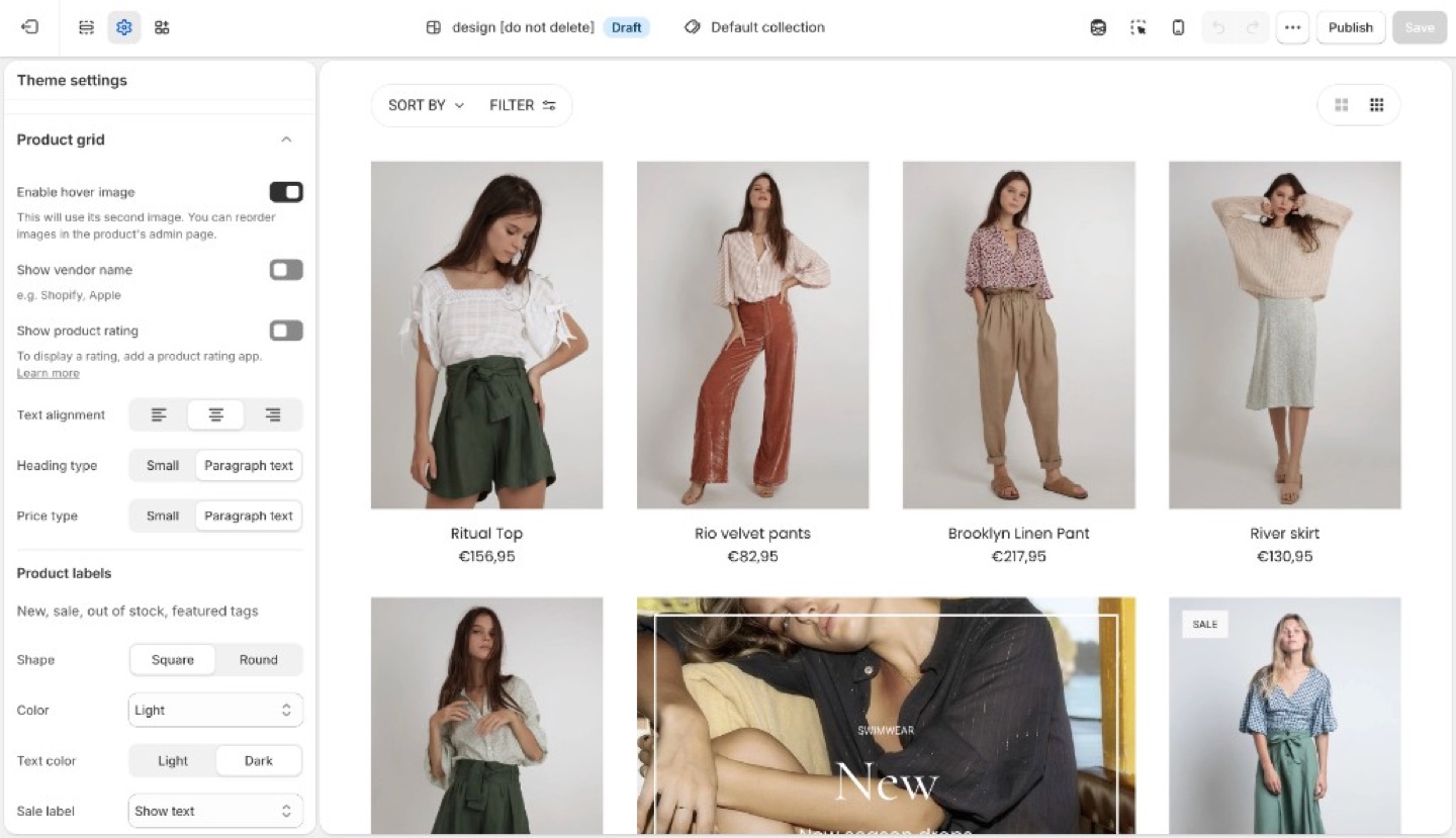
> **Info**
>
> **Product image size** (crop shape) and **Corner radius** are in **Theme settings** → **[Images](https://support.troopthemes.com/guide/beyond/images/)**, not Product grid.
## Card layout (Beyond)
- **Enable hover image**: second product image on hover. Touch devices have no hover.
- **Show vendor name**
- **Show product rating**: displays star ratings on product cards when a reviews app has added rating data to the product. The theme does not collect reviews. See [How do I add product reviews or star ratings?](https://support.troopthemes.com/faqs/how-do-i-add-product-reviews-or-star-ratings/)
- **Text alignment**
- **Heading type** and **Price type**: Small or Paragraph text
## Product labels (Beyond)
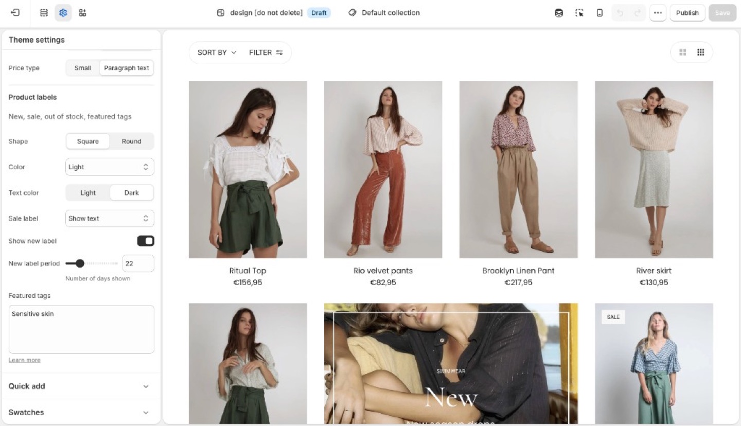
Product labels can show status (new, sale, sold out) on the collection grid. Featured labels add custom copy such as “Organic cotton” or “Limited edition” from tags.
Inventory, discounts, and checkout are unchanged. Labels are card markers, not Shopify discounts.
Under **Product labels**:
- **Shape**: Square or Round
- **Color** and **Text color**: Light, Dark, or an accent
- **Sale label**: hidden, text, or percent off
- **Show new label** and **New label period** (days)
- **Featured tags**: tags that render as labels
### Sale and new (Beyond)
- **Sale**: the product needs a **Compare at price** higher than the price. The label can be hidden, text, or percent off.
- **New**: enable **Show new label** and set **New label period** (days since the product was created).
### Featured labels (Beyond)
1. On the product in Shopify admin, add a tag (for example `organic-cotton`).
2. In **Theme settings** → **Product grid** → **Featured tags**, type that exact tag. Separate multiple tags with commas.
The tag in the admin and the string in Featured tags must match (including spelling). The storefront can hide the raw tag from other UIs; the label is what customers see.
## Ask Sidekick (Beyond)
Open [Sidekick](https://help.shopify.com/en/manual/shopify-admin/productivity-tools/sidekick) from the theme editor toolbar (top right, next to the device preview icon), or press `⌘.` (`Ctrl+.` on Windows). If you're deciding between a denser grid with less detail or a spacious one with more (vendor name, rating, price emphasis), talk it through.
> "Should my product grid show vendor name and rating, and should Heading type and Price type be Small or Paragraph text?"
It can reason through what a customer browsing your specific catalog will actually want to see on the card, rather than you guessing at the combination of card layout settings.

## Troubleshooting (Beyond)
- **Hover image missing**: needs a second product image; touch devices have no hover.
- **Ratings missing**: **Show product rating** only displays data from a reviews app. Products with no reviews stay blank. See [How do I add product reviews or star ratings?](https://support.troopthemes.com/faqs/how-do-i-add-product-reviews-or-star-ratings/)
- **No sale label**: there is no compare-at price, or Sale is set to hidden.
- **No new label**: the product is older than **New label period**, or the checkbox is off.
- **Featured label missing**: tag spelling does not match Featured tags, or you tagged a variant in a way the product does not inherit. Tags are on the product.
- **Label on the product page but not the grid (or the reverse)**: Product grid labels are this setting. The product template may have its own badge blocks; check both.
---
title: Quick add
url: https://support.troopthemes.com/guide/beyond/quick-add/
theme: Beyond
theme_styles: Fleur
---
# Quick add in Beyond
**Edit theme** → **Theme settings** → **Quick add**.
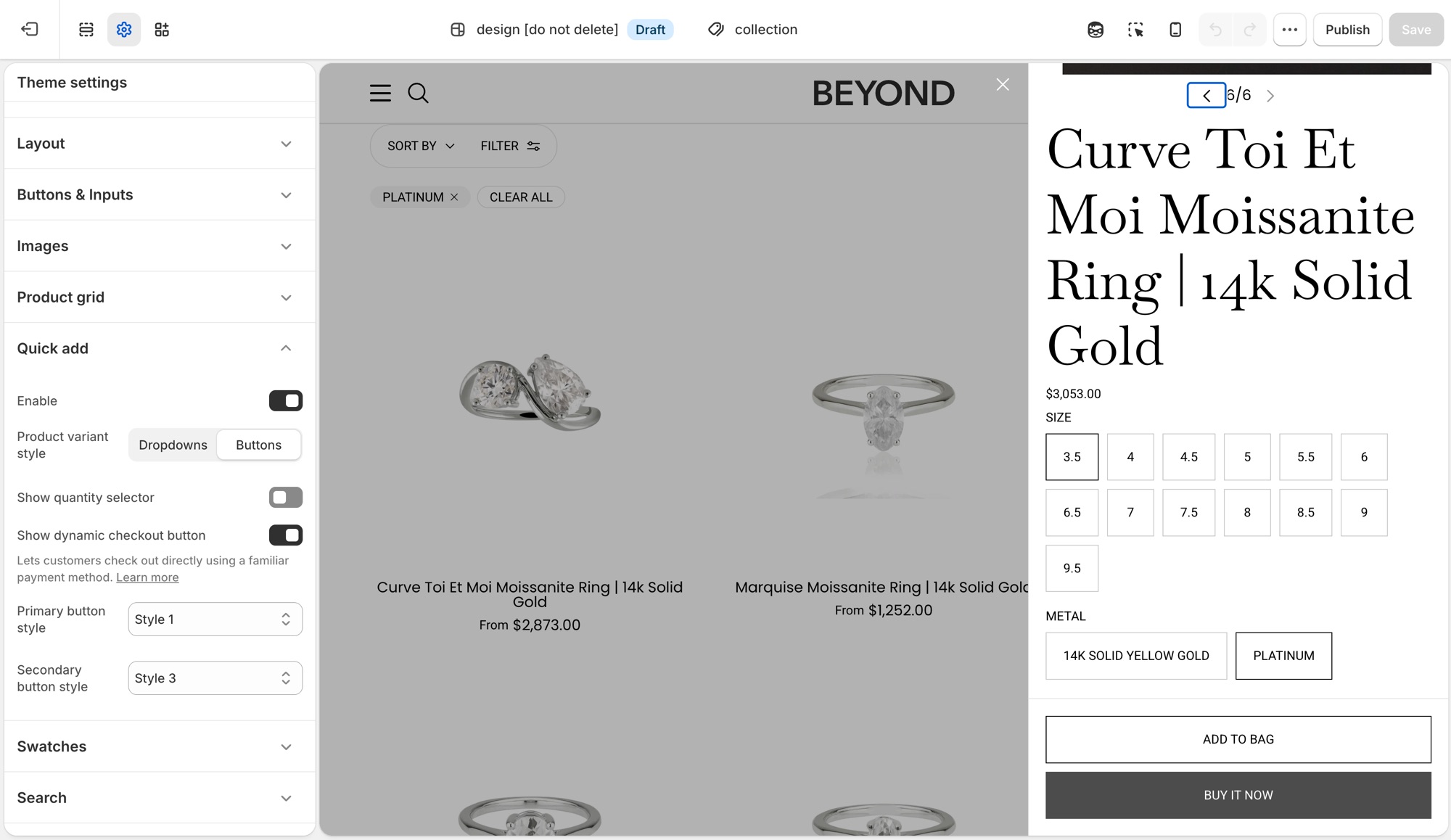
Quick add is the **+** button that appears on product cards in the grid. Hover (or tap) it to add the product to cart without leaving the collection page.
## Theme settings → Quick add (Beyond)
- **Enable**: turns the button on or off storewide.
- **Product variant style**: **Dropdowns** or **Buttons** for choosing options in the quick add form.
- **Show quantity selector**: adds a quantity stepper to the quick add form.
- **Show dynamic checkout button**: adds a payment-method shortcut (Shop Pay, PayPal, and similar) next to the regular checkout option. See Shopify's [dynamic checkout](https://help.shopify.com/manual/using-themes/change-the-layout/dynamic-checkout) guide.
- **Primary button style** and **Secondary button style**: pick from your four button styles ([Buttons and inputs](https://support.troopthemes.com/guide/beyond/buttons-and-inputs/)). Secondary only shows when **Show dynamic checkout button** is on.
The button label reads **Quick add** for a product with one variant, or **Choose options** when the customer needs to pick a variant first.
## On the product card (Beyond)
Quick add only appears for products that are in stock. A sold-out product's card has no button at all. This is expected behavior, not a setting to change.
## Troubleshooting (Beyond)
- **No button on the card**: the product is sold out, or **Enable** is off in **Theme settings** → **Quick add**.
- **Button says "Choose options" instead of "Quick add"**: the product has more than one variant. That is automatic, not a setting.
- **No secondary button in the form**: **Show dynamic checkout button** is off, or the store has no dynamic checkout methods configured.
- **Checkout is unchanged**: expected. Checkout is not the theme.
---
title: Setting up product filters
url: https://support.troopthemes.com/guide/beyond/setting-up-product-filters/
theme: Beyond
theme_styles: Fleur
---
# Enabling product filtering in Beyond
Collection filters on current Troop themes are Shopify's native filters. You must install Shopify's free [Search & Discovery](https://apps.shopify.com/search-and-discovery) app first. You configure filters in that app, not in Theme settings → Colors or a tag list.
Shopify admin → **Search & Discovery** app → **Filters**. The theme only displays what that app publishes.
Product tags alone do not create filters on current versions. Checkout and other apps are unchanged.
> **Info**
>
> For the full Shopify walkthrough, see [enable product filtering](https://help.shopify.com/en/manual/online-store/themes/customizing-themes/common-customizations/storefront-filters).
## Steps (Beyond)
1. Install [Search & Discovery](https://apps.shopify.com/search-and-discovery) from the Shopify App Store if it is not already installed, then open the app in Shopify admin.
2. Open **Filters** and add the filters you want (for example Availability, Price, Color).
3. Save. Preview a **collection** page in **Edit theme**, not the homepage.
4. If the **Filter** button or drawer is missing, open the collection template in **Edit theme**, select **Collection navigation**, and turn on **Enable filtering**. You can also turn on **Enable sorting** and **Enable layout switcher** there. Filter tag **Shape** (Round or Square) is in the same section.
Filters need products that actually have those options or metafields. Empty filters do not appear.
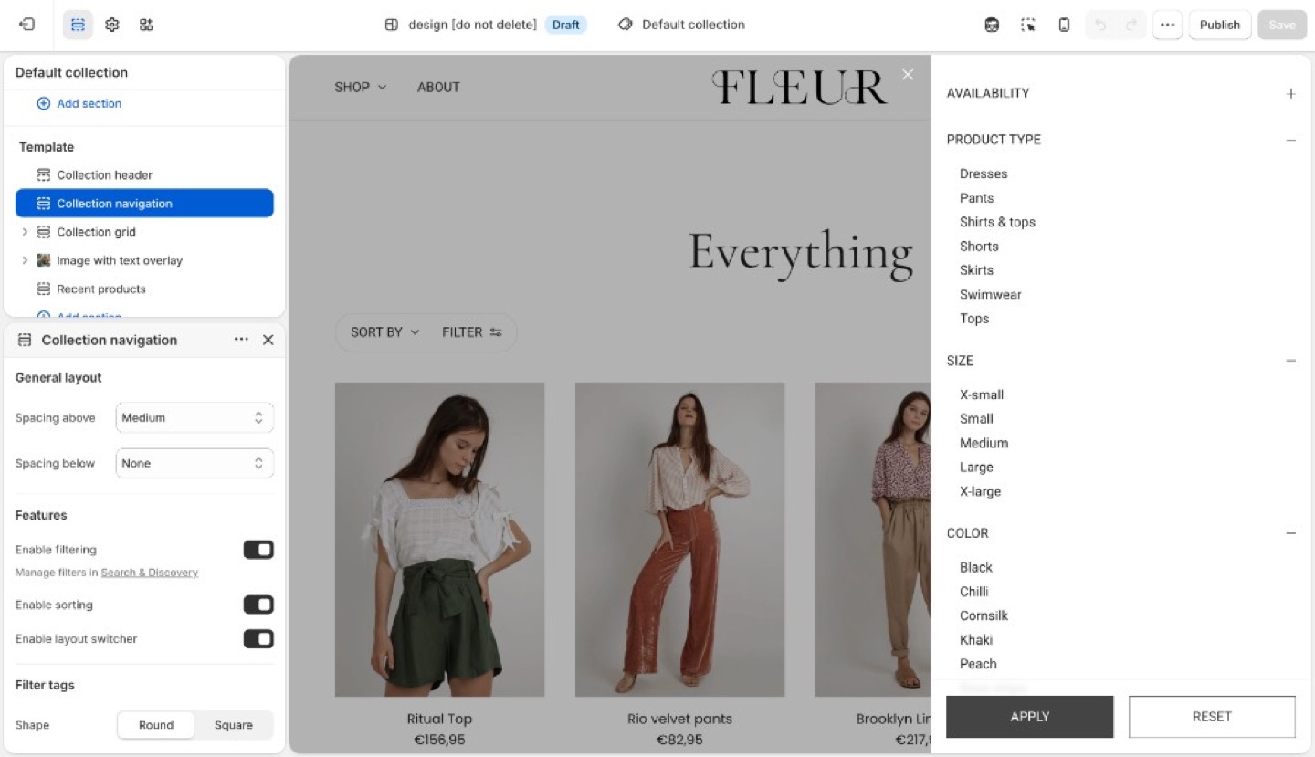
## Troubleshooting (Beyond)
- **No filter UI at all**: Search & Discovery is not installed, you are previewing the homepage, or **Enable filtering** is off in **Collection navigation**. Open a collection template and turn it on.
- **A filter you added is missing**: no products in that collection have that option/metafield, or the filter is set not to show when empty.
- **You are still adding product tags expecting a Refine list**: current versions use Search & Discovery filters, not tag groups.
---
title: Search
url: https://support.troopthemes.com/guide/beyond/search/
theme: Beyond
theme_styles: Fleur
---
# Search in Beyond
**Edit theme** → **Theme settings** → **Search**.
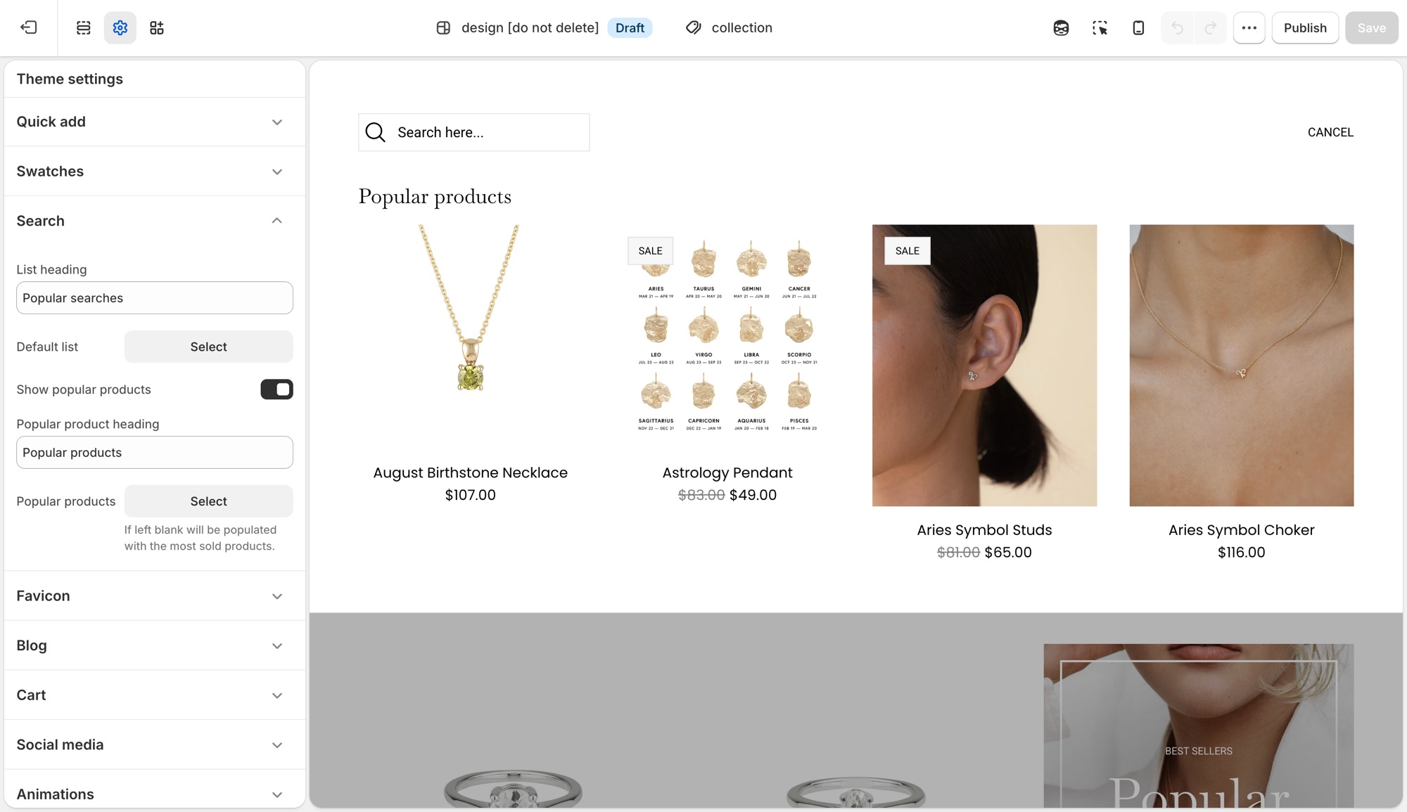
These settings control Shopify's [predictive search](https://help.shopify.com/en/manual/online-store/storefront-search/predictive-search) panel that opens as a customer types in the header search, not the full search results page layout.
## Theme settings → Search (Beyond)
- **List heading**: label above the default suggestion list, for example "Popular searches."
- **Default list**: a menu of links shown before the customer types anything.
- **Show popular products**: turns on a product suggestions block in the empty search state.
- **Popular product heading**: label above that block, for example "Popular products."
- **Popular products**: up to 4 products to feature there. Leave it blank and the theme fills it with your best-selling products automatically.
## Troubleshooting (Beyond)
- **Popular products showing products I did not pick**: the **Popular products** field is empty, the theme is filling it with best sellers. Add products there to override it.
- **Nothing shows before I type**: **Default list** has no menu assigned, or that menu has no links.
- **Search results page looks wrong**: that is a separate template (**Edit theme** → template selector → **Search**), not this settings group.
---
title: Add color swatches to products
url: https://support.troopthemes.com/guide/beyond/color-swatch-guide/
theme: Beyond
theme_styles: Fleur
---
# Using color swatches with your products in Beyond
On current versions, swatches are Shopify’s native color entries (product category + category metafield). The theme only **turns them on** (Round or Square). You do not pick swatch hexes in Theme settings → Colors anymore.
**Products** → category and category metafields; then **Edit theme** → **Theme settings** → **Swatches**. You can also set swatches on the product section or Featured product.
Inventory, checkout, and filters (Search & Discovery) are unchanged.
To use Shopify native swatches, configure product categories and category metafields.
### Step One: Add a product category (Beyond)
A product category is selected from the pre-defined categories in Shopify's Standard Product Taxonomy. This is essential for:
- Unlocking product attributes (category metafields) that map to each product category.
- Managing your products better within Shopify, aiding in automated collections or filtering.
- Ensuring accurate tax rates are applied at checkout based on product categorization.
**Example Category**: Apparel & Accessories > Clothing > Clothing Tops > Shirts. You can add color swatches for any category metafield with the color product attribute.
**To Add a Product Category**:
1. From your Shopify admin, click **Products**.
2. Click a product.
3. In the **Category** section, select **Apparel & Accessories > Clothing > Clothing Tops > Shirts** or another category with the color category metafield.
4. Click **Save**.

### Step Two: Add and edit entries for your category metafields (Beyond)
After adding a product category, you can add entries for your product's variant option values.
**To Edit or Add Entries**:
1. From your Shopify admin, go to **Products**.
2. Click the product with the category metafields you want to edit or add.
3. **To Add an Entry from Default Entries**:
- In the **Category metafields** section, click the category metafield, then click the entry you want to edit.
- Edit the fields as needed.
- Click **Save**.
4. **To Add a Custom Entry**:
- In the **Category metafields** section, click the category metafield, then click **Add new entry**.
- Fill out the fields for the entry.
- Click **Save**.
### Step Three: Connect your category metafields to variant options (Beyond)
In this step, you connect the category metafield for color (or any other category metafield as needed) to your product variants.
**To Connect Category Metafields**:
1. From your Shopify admin, go to **Products**.
2. Click the product you want to edit.
3. In the **Variants** section, click **+ Add options like size or color**.
4. If a category metafield is available to connect to, select it. The option values will auto-fill with any entries you've added to the category metafield.
5. **Optional**: To add custom option values, click **Edit**, then click **Add new entry**. Fill out the entry fields and click **Save**.
6. Click **Save** to save the product.

### Step Four: Enable swatches at the theme level (Beyond)
Swatches can be enabled in **Edit theme** → **Theme settings** → **Swatches**. Choose **Circle** or **Square** (or **None** to turn them off). Size on the product form and on the grid are separate sliders in that same group.
You can also set swatch type on a product section or Featured product.
When enabled, the theme will turn configured options into clickable swatch selectors.
## Troubleshooting (Beyond)
- **No chips, still a dropdown**: Swatches is set to **None** in Theme settings (and on the product section); or the variant option is not connected to the color category metafield.
- **Chips are the wrong colors**: edit the category metafield **entries** in the product admin, not Theme settings → Colors (current versions).
- **Grid has swatches, product page doesn’t (or the reverse)**: Theme settings → Swatches and the product section each have their own type control; set both.
- **You are on an older theme**: skip to [Legacy theme versions](#legacy-theme-versions). Hex lists in Colors or `swatch-colors.liquid` only apply there.
# Legacy theme versions
Color swatches can be enabled in multiple places:
- In the **Product Page(s)** under the **Sections** tab
- On the **Home Page**, inside the **Featured Product** section under the **Sections** tab
- In the **Theme Settings** tab, under the **Product Grid** section
When enabled, the theme will automatically turn an option titled "color" into clickable color swatches.
The default colors are set as standard CSS colors. For example, "gold" is defined as `#ffd700`. The complete
list of standard CSS colors [can be viewed on MDN.](https://developer.mozilla.org/en-US/docs/Web/CSS/Reference/Values/named-color)
> **Non-English themes**
>
> - "Color" will be translated according to your `locales/*.json` file. For example, if you desire "couleur" to be the option with swatches, be sure to translate any instance of "color" inside `locales/fr.json` to "couleur"
> - Non-english colors such as "rouge" will need to be added manually as defined below in [Adding custom colors](#adding-custom-colors)
## Adding custom colors (Beyond)
Default colors can be overwritten with values defined by the store-owner. In addition, values not defined as a CSS color can be added.
> **Versions with swatch settings inside `Theme settings > color`**
>
> On Beyond versions 3.0.0 to 4.0.1, swatch color settings can be found inside the _Color_ submenu inside the global theme settings.
If you want to assign the color value `deep red` to the color value `rgb(131, 45, 39)`, you'd add the following line to the `Color swatch configuration` textbox:
deep red: rgb(131, 45, 39)
> **Formatting must be exact**
>
> - each rule must be on a new line
> - the name and value are separated by a single colon (":") character
> - the value can be defined as either a hex or RGB value
> - colors that don't follow the above format will revert to their default values
- use a tool like [Adobe Color](https://color.adobe.com/create/image) if you need help determining which color value is appropriate for your product
---
title: Add a size chart to the product page
url: https://support.troopthemes.com/guide/beyond/product-size-chart/
theme: Beyond
theme_styles: Fleur
---
# Add a size chart to the product page in Beyond
The theme can open a Shopify **page** from the product form. You write the chart on that page; the theme only links to it.
You can add a size chart on the _Product_ page or the _Featured product_ section in two ways:
- **Size guide button** block: a standalone button you place in the product form
- **Variant picker** block: a link beside a matching variant option (for example Size)
Create the chart page in **Online Store** → **Pages**. A size-chart app replaces this feature, disable the theme size guide if you use one.
## Chart page (Beyond)
In the example below, we created a page called `Size chart` and referenced it in **Page content**. That page holds tables (and can hold images or other text).
To quickly create HTML tables for size charts, try a [responsive table generator](https://www.tablesgenerator.com/).

## Size guide button (Beyond)
> **Version availability**
>
> The Size guide button block is available in Beyond versions 13.3.0 and up.
**Edit theme** → product template or **Featured product** → **Add block** → **Size guide button**. If the block is already in the section, click the eye icon to show it. Select a page in **Page content**, then choose a **Button style**.
The button does not require a Size variant. Use it when you want a size chart on products without options, or when you want a full button instead of a link next to the picker.
If you use this block, turn off **Enable** under **Size guide** on the **Variant picker** block so two size-chart controls do not stack.
On these versions the chart opens in a drawer.
## Variant picker (Beyond)
For the variant picker size chart to appear, the product must have at least one variant option. You can configure this in the Shopify admin product editor:

In the theme editor, open the _Product_ page or _Featured product_ section, expand the blocks list, and locate the **Variant picker** block. If it is hidden, click the eye icon to show it. If it is not there, click **Add block** and select **Variant picker**.
Match the variant option (for example, "Size") in the **Link from option** text field. Then select a page using the **Page content** setting.
**Edit theme** → product template → **Variant picker** block → **Link from option** and **Page content**.
Variant options are set in **Products**.
> **Change the size chart button text**
>
> You can change the size chart button text in _Edit default theme content > Products_.
>
> Read more about [changing default text](https://support.troopthemes.com/guide/beyond/change-default-text/).
>
> 
## Troubleshooting (Beyond)
- **Size guide button is missing from Add block**: the theme is below the versions listed above. Use the **Variant picker** method, or [update the theme](https://support.troopthemes.com/guide/update-theme/).
- **No size chart link next to Size**: the product has no variants; **Link from option** does not match the option name (for example `Size` vs `Sizes`); **Enable** is off; or the Variant picker block is missing.
- **Wrong / empty drawer or popup**: **Page content** is unset, or the page has no body.
- **Two size charts appear**: both the **Size guide button** and the Variant picker **Size guide** are enabled. Turn one off.
- **An app chart appears instead**: disable the app embed, or turn off the theme’s size guide so they do not stack.
- **Button says the wrong words**: [default theme content](https://support.troopthemes.com/guide/beyond/change-default-text/) → Products.
---
title: Add an out of stock notification form
url: https://support.troopthemes.com/guide/beyond/out-of-stock-notifications/
theme: Beyond
theme_styles: Fleur
---
# Add an out of stock notification form in Beyond
The theme can show a “notify me” form on sold-out variants. Submissions email your store’s **Sender email**. The theme does **not** watch inventory or auto-send “back in stock” mail to the shopper.
This is Shopify’s contact form: it emails you. It does **not** create a customer in **Customers**, and it does not start a waitlist.
## Who owns this (Beyond)
- **Show the form on the product page**: theme (the block below)
- **Sold-out vs available**: Shopify **Products** inventory
- **Where the request lands**: Settings → Notifications → Sender email
- **Email the shopper when stock returns**: a [back in stock app](https://apps.shopify.com/search?q=back%20in%20stock)
## Show the form (Beyond)
**Edit theme** → product template (**Default product**) or **Featured product** → **Add block** → **Unavailable form**. If the block is already in the section, click the eye icon to show it.
Click the block to expand its settings. Preview a sold-out variant or the form stays hidden.
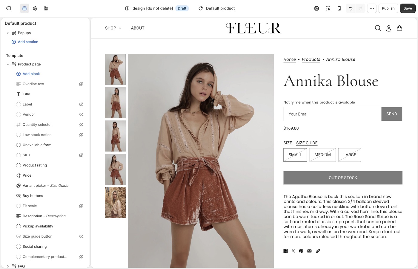
Form copy is [default theme content](https://support.troopthemes.com/guide/beyond/change-default-text/). Search **notify** or **sold out**.
## Sold-out variants only (Beyond)
The selected variant must be sold out, or the form stays hidden.
**Products** → the product → the variant → **Inventory**:
- **Inventory tracked** is on. If tracking is off, Shopify treats the item as available.
- **Available** is 0 or less at locations that fulfill **online** orders. Stock sitting only at a location that does not fulfill the online store still shows as sold out on the storefront.
- **Sell when out of stock** is **Off**. That control only appears when tracking is on.

See Shopify’s [selling out of stock products](https://help.shopify.com/en/manual/products/inventory/setup/selling-when-out-of-stock) guide.
## Where the email goes (Beyond)
Shopify delivers contact-form submissions to **Settings** → **Notifications** → **Sender email**. That is not **Settings** → **General** (**Store email** is for Shopify contacting you, and for exports).

If you use a custom domain, authenticate it on the Notifications page or Shopify may rewrite the address. Submissions flagged by Shopify’s spam filter still arrive, with `[SPAM]` in the subject.
See Shopify’s [setting up your email](https://help.shopify.com/en/manual/intro-to-shopify/initial-setup/setup-your-email) and [contact form](https://help.shopify.com/en/manual/online-store/themes/customizing-themes/add-contact-page) guides.
## Automatic “back in stock” mail (Beyond)
The theme cannot do this. Shopify does not send restock emails to customers on its own; their inventory docs point to a [back in stock app](https://apps.shopify.com/search?q=back%20in%20stock). Most of those apps add their own button, remove the theme’s **Unavailable form** block so they don’t stack.
Shopify Flow’s [Product variant back in stock](https://help.shopify.com/en/manual/shopify-flow/reference/triggers/variant-back-in-stock) trigger can notify *you* (Slack, staff email) or republish a product. It does not mail customers who submitted the theme form.
If you handle requests by hand:
- Tag or folder the incoming mail by product or variant.
- Keep a spreadsheet of email + variant, then send when you restock.
- Add addresses to a list in your email app and send that list when the item is back.
**Want to use an app?** [Using apps with themes](https://support.troopthemes.com/guide/using-apps-with-themes/).
## Ask Sidekick (Beyond)
Open [Sidekick](https://help.shopify.com/en/manual/shopify-admin/productivity-tools/sidekick) from the icon in your Shopify admin, then ask it to draft the "back in stock" notification email in your brand's tone.
> "Write a short, friendly restock email with a sense of urgency."
Refine it before it goes live, faster than starting from Shopify's default template copy.
## Troubleshooting (Beyond)
- **Form never shows**: the variant is still available, **Inventory tracked** is off, **Sell when out of stock** is on, or the **Unavailable form** block is missing or hidden on **Product page**.
- **Form shows but you still have stock**: the units may be at a location that does not fulfill online orders. Add stock to a location that does.
- **You expected an automatic email when stock returned**: the theme cannot do that. Use an inventory app and remove the theme block.
- **You didn’t get the request**: check **Settings** → **Notifications** → **Sender email**, spam (including `[SPAM]` in the subject), and domain authentication. The message goes to you, not to the shopper.
- **Form copy is wrong**: [default theme content](https://support.troopthemes.com/guide/beyond/change-default-text/).
- **Two notify buttons**: an app embed plus the theme form. Turn one off.
---
title: Setting up FAQ or Collapsible rows
url: https://support.troopthemes.com/guide/beyond/setting-up-faq-or-collapsible-rows/
theme: Beyond
theme_styles: Fleur
---
# Setting up FAQ or Collapsible Rows sections in Beyond
Add **FAQ** or **Collapsible rows** in **Edit theme** → **Add section**. Each row is a block with a heading plus rich text or a Shopify **page**.
Page bodies are edited in **Online Store** → **Pages**, not in the theme editor. Shopify Help Center, checkout, and metafield definitions are unchanged.
To add an FAQ or Collapsible rows section, open **Edit theme**, click **Add section**, and choose **FAQ** or **Collapsible rows**.
These sections use collapsible rows as blocks. Each row can include a heading and content. Add additional blocks to build a list of questions and answers, or to break down product details and materials.
## Content types (Beyond)
Each block supports two content types:
1. Rich text
- Added through the "Text" setting. Enter text directly in the text area, including links and formatting.
2. Page content
- Added through the "Row content from page" setting. Select a page from the dropdown to display its content in the block. Pages can be created or edited in the Shopify admin, **not** in the theme editor.
### Dynamic content with metafields (Beyond)
The first option, rich text, supports dynamic content with metafields. This lets you display content specific to the page you're viewing, or store-level information.
For example, on a product page, each product has a different name, description, and price. You can show that information in an _FAQ_ or _Collapsible rows_ section by connecting a metafield to the block.
You can add static text around metafield content for context, or display only the dynamic content. To learn more about metafields, visit [Shopify's guide](https://help.shopify.com/en/manual/custom-data/metafields).
## Ask Sidekick (Beyond)
Open [Sidekick](https://help.shopify.com/en/manual/shopify-admin/productivity-tools/sidekick) from the theme editor toolbar (top right, next to the device preview icon), or press `⌘.` (`Ctrl+.` on Windows). Give it a topic and your products, and it drafts FAQ copy for you.
> "Write 5 FAQs about shipping and returns for a skincare store."
It produces question-and-answer pairs you can paste into rich text blocks or refine before publishing. Faster than writing every row from a blank field, you still edit and approve the final wording.

## Troubleshooting (Beyond)
- **Row is empty**: you chose **Row content from page** but didn't pick a page, or the page has no body.
- **Every product shows the same answer**: you typed static text. Connect a **metafield** if the answer should change per product.
- **You wanted this on one product only**: use an alternate [product template](https://support.troopthemes.com/guide/beyond/working-with-templates/) and assign it to that product, or use metafields.
---
title: Customizing blogs
url: https://support.troopthemes.com/guide/beyond/customizing-blog/
theme: Beyond
theme_styles: Fleur
---
# Customizing blogs in Beyond
Blog posts, tags, excerpts, and featured images live in Shopify admin under **Content**. The theme controls how those posts appear: the blog grid, article page, and the **Blog posts** section you can add to other templates.
**Content** → **Blog posts** for writing and tagging. **Edit theme** → **Default blog** or **Default article** for layout.
Post body copy, checkout, and SEO titles are unchanged.
> **Info**
>
> Visit Shopify's help centre for an extensive guide on [adding and managing blog posts](https://help.shopify.com/en/manual/online-store/blogs/writing-blogs/working-with-blog-posts).
## Write and tag posts (Beyond)
Open **Content** → **Blog posts**. Create or edit a post to set the title, body, excerpt, tags, and featured image.
Tags do two jobs in the theme:
- They appear in the blog page tag filter (if that filter is on).
- The **Blog posts** section can limit itself to articles that share one tag.
Use **Manage blogs** on that same admin page to rename a blog or turn comments on.
## Blog page (Beyond)
**Edit theme** → template selector → **Blogs** → **Default blog** → **Blog**.
Posts list in reverse chronological order (newest first). Pagination appears when there are more posts than one page.
### Grid (Beyond)
- **Columns**: 1 to 4 on desktop. On mobile, 1 or 2.
- **Row layout**: **Evenly spaced** keeps rows aligned. **Staggered** packs cards like masonry.
- **Maximum container width**: Extra small through Full width, same control as other sections. Full width lets the grid run edge to edge.
- **Full width** (under **Mobile**): lets cards bleed to the screen edge on small devices.
Card image crop is **Theme settings** → **Images** → **Article image size**, not this section. Natural keeps each featured image’s own ratio. A fixed ratio (Square, Landscape, or Portrait) makes a stricter grid.
For a uniform grid, shoot featured images to the same ratio as **Article image size**. Mixed ratios look calmer with Natural, or with **Staggered** row layout.
Export sizes: [What image sizes should I use?](https://support.troopthemes.com/faqs/what-image-sizes-should-i-use/).
### Title, filter, and RSS (Beyond)
- **Show blog title**: the blog’s name from admin (for example Journal), not each article title.
- **Show tag filter**: a dropdown of article tags. Turn this off if you do not want customers to filter the index.
- **Show RSS**: a feed link in the blog footer.
To keep internal tags out of that filter, open **Theme settings** → **Blog** → **Hide tags from tag filter**. Enter a comma-separated list. The default is `featured, pinned`. Matching is not case-sensitive (`pinned` and `Pinned` both hide).
### What each card shows (Beyond)
On the **Blog** section:
- **Show article heading**: the post title. **Article heading type** is Medium or Small.
- **Show blog date** and **Show author**
- **Show excerpt**: the excerpt from the post editor, or a short trim of the body if the excerpt is empty.
- **Show button**: the continue-reading link. That label is [default theme content](https://support.troopthemes.com/guide/beyond/change-default-text/); search **continue**.
If **Show article heading** and **Show button** are both off, **Show excerpt** outputs the full article body on the blog page instead of a truncated excerpt. That is how an editorial index can read as captions under images, without a title or button on each card.
**Heading type** styles the blog title (Banner, Featured, Large, or Medium) when **Show blog title** is on.
Spacing above and below follows the same scale as other sections. See Spacing and layout in your theme guide.
## Blog posts section (Beyond)
**Edit theme** → **Add section** → **Blog posts**. Add it to the homepage or any other template. This is not the blog index.
- **Choose blog**: which blog to pull from.
- **Filter by tag**: only articles with this tag appear (up to three). The default is `pinned`. Change the field, or tag posts to match it, in **Content** → **Blog posts**. If no posts have that tag, the section falls back to the latest three articles.
- **Show button**, **Show date**, and **Show excerpt** control the cards in this section.
- **Media layout** (under **Mobile**): Slideshow or Grid.
Tag spelling must match the filter field. `pinned` and `Pinned` are treated the same.
## Article page (Beyond)
**Edit theme** → template selector → **Blog posts** → **Default article**.
The **Article** section shows the title, date, author, tags, sharing links, and the post body. It does not place the featured image.
The featured image still matters: blog cards use it, cropped by **Article image size**. To show it as a banner on the article page, add an image section (often **Image with text overlay**) above the **Article** section and connect the image to the article’s featured image. You can remove that section if you want a text-only article.
On the **Article** section:
- **Show title**, **Heading type**, and **Heading alignment**
- **Show article date** and **Show author**
- **Show article tags**: tags you hid in **Theme settings** → **Blog** stay hidden here too.
- Sharing: Facebook, 𝕏, Pinterest, email, and link. Turn each one off independently.
**Maximum container width** on this section has no Full width option (Extra small through Extra large). A narrower width keeps article copy readable.
The template can also include:
- **Recent articles**: nearby posts from the same blog.
- **Comments**: Shopify’s comment form, or Disqus if you enable it on the section. Comments must be turned on for that blog in **Content** → **Blog posts** → **Manage blogs**.
You can add other sections to the article template the same way as a page. See [Working with templates](https://support.troopthemes.com/guide/beyond/working-with-templates/).
### Images in the post body (Beyond)
When you insert an image in **Content** → **Blog posts**, set the size to **Original** so it spans the article column. Smaller presets can look cropped or undersized.
## Ask Sidekick (Beyond)
Open [Sidekick](https://help.shopify.com/en/manual/shopify-admin/productivity-tools/sidekick) from the icon in your Shopify admin, then ask it to draft a blog post from a topic and a few notes.
> "Write a post about caring for our candles, aimed at new customers."
Use it for a first draft or when you're stuck on an opening paragraph, then edit it in your own voice before publishing, Sidekick's content generation is meant as a starting point, not a final draft.
## Troubleshooting (Beyond)
- **Can't find Blog posts**: they are no longer under **Online Store**. Open **Content** → **Blog posts**. Use **Manage blogs** there to rename a blog or change comments.
- **Pinned posts missing from the homepage**: **Filter by tag** is on the **Blog posts** section, not the blog index. The tag on the article must match that field.
- **Tag still shows in the filter**: add it to **Theme settings** → **Blog** → **Hide tags from tag filter**, comma-separated. The blog section’s **Show tag filter** must be on for the dropdown to appear at all.
- **Grid looks uneven**: featured images have mixed ratios, or **Row layout** is **Staggered**. Use the same crop and **Evenly spaced** for a strict grid, or keep mixed ratios on purpose.
- **Cards look cropped**: **Theme settings** → **Images** → **Article image size**, not the post editor.
- **No featured image on the article page**: the **Article** section does not display it. Add an image section on the article template, or check that the post has a featured image in **Content** → **Blog posts**.
- **Embedded images look cropped**: in the article editor, set the image size to **Original**, not a small preset.
- **Comment form missing**: comments are off for that blog in **Manage blogs**, or the **Comments** section is hidden or removed from the article template.
- **Continue reading wording**: [default theme content](https://support.troopthemes.com/guide/beyond/change-default-text/), not the Blog section.
---
title: Configuring the popup
url: https://support.troopthemes.com/guide/beyond/configuring-the-popup/
theme: Beyond
theme_styles: Fleur
---
# Configuring the popup in Beyond
The popup lives in **Edit theme** → **Popups**, an overlay section that appears across the whole store. It is not the announcement bar (that's on the **Header** section), not checkout, and it does not send email campaigns by itself: Shopify Inbox, discount codes, and email delivery are all separate.
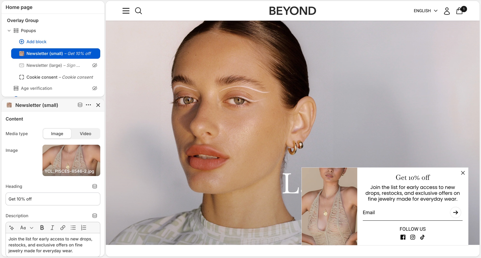
> **Compatibility**
>
> Image (and left/right or top placement) options on the **Newsletter (small)** and **Newsletter (large)** popup blocks require version 7.2.0 and up. Video media requires 7.3.0 and up.
## Popups section (Beyond)
**Edit theme** → **Popups**. By default it already has a **Newsletter (small)**, **Promotion bar**, and **Cookie consent** block. Click a block's eye icon to show or hide it, or **Add block** for another type:
- **Newsletter (small)** – corner overlay with an email field.
- **Newsletter (large)** – centered overlay modal.
- **Promotion bar** – sticky bar with a message; can scroll like a ticker (**Scroll text**, with separate speed controls for desktop and mobile).
- **Cookie consent** – consent banner tied to Shopify's consent tracking API.
Heading and description live on each block, not in Theme settings.
### Newsletter (small) (Beyond)
Corner overlay with an email field.
- **Media type**, **Image**, **Video upload**, **Video link**: shown when **Show media** is on; video accepts a Shopify upload or a YouTube/Vimeo link.
- **Heading**, **Description**: the popup's copy.
- **Show social icons**, **Social media title**: adds your [social icons](https://support.troopthemes.com/guide/beyond/social-media/) below the form.
- **Background color**, **Translucent background**: card styling.
- **Popup width**: maximum width on larger screens (300–500px).
- **Show media**, **Media position** (**Left** or **Top**): whether an image or video shows, and where. Media is hidden on mobile to meet Google's guidelines against intrusive interstitials.
- **Heading type**, **Paragraph font size**, **Text color**, **Text alignment**: text styling.
- The submit button always shows as an arrow icon here; there's no button text or style setting to configure.
- Timing and targeting settings (**Popup delay**, **Show again after**, and so on) are shared with **Promotion bar**. See **Timing and frequency** below.
### Newsletter (large) (Beyond)
Centered overlay modal, with the same settings as **Newsletter (small)** above, except:
- **Popup width** ranges wider (500–900px), since it's a centered modal rather than a corner card.
- **Media position** is **Left** or **Right** instead of Left/Top.
### Promotion bar (Beyond)
Sticky bar with a message.
- **Description**: the bar's message text.
- **Background color**, **Translucent background**.
- **Scroll text**, **Scroll speed**: ticker effect on desktop, plus a separate **Scroll text**/**Scroll speed** pair under **Mobile** so the ticker can run independently (or not at all) per device.
- **Heading type**: **Medium** or **Small** text size.
- **Text color**.
- Timing and targeting settings are shared with the **Newsletter** blocks. See **Timing and frequency** below.
### Cookie consent (Beyond)
Consent banner tied to Shopify's consent tracking API. See **When cookie consent shows** below for the conditions.
- **Heading**, **Description**.
- **Background color**, **Translucent background**.
- **Position**: **Left**, **Bottom**, or **Right**.
- **Text color**, **Text alignment**.
- **Accept button style**, **Decline button style**: each independently set to one of your four button styles, or a plain text **Link**.
## Timing and frequency (Beyond)
**Newsletter** and **Promotion bar** blocks each have:
- **Popup delay** – seconds before it opens.
- **Show popup at bottom of page** – opens early if the visitor scrolls to the bottom first.
- **Show again after** – days before it reappears once dismissed. This is stored in the visitor's browser, not in Shopify, so it's per browser/device, not per customer.
- **Limit to specific referrer path** / **Limit to specific page** – restrict where it can appear.
The section's own **Limit to one popup per page load** setting controls whether only the first ready popup shows, or they queue one after another. **Cookie consent always takes priority** when it needs to appear.
## When cookie consent shows (Beyond)
Cookie consent only shows where Shopify's consent tracking API determines a banner is required, and only if the visitor doesn't already have a stored choice. It won't show for everyone. Customer privacy tracking limits must also be turned on in your Shopify admin (**Settings** → **Customer privacy**), or it won't show at all. Position and the **Accept**/**Decline** button styles are configurable; it doesn't use the delay/frequency settings above.
## Previewing changes (Beyond)
**Newsletter** and **Promotion bar** popups do **not** open automatically while you're editing. That's expected, not a bug. Preview them from the storefront (or **Preview**), ideally in a private/incognito window, since **Show again after** is remembered by that browser and will suppress a popup you've already dismissed while testing.
**Cookie consent** is the exception: click it in the block list to preview it live in the editor.
---
Where newsletter forms live (section, overlay, popup, footer, password page): [Setting up mailing lists and newsletters](https://support.troopthemes.com/guide/beyond/newsletters/).
## Troubleshooting (Beyond)
- **Popup never appears**: the block is hidden (eye icon); **Show again after** already fired for that browser (test in a private window); another popup is already showing and **Limit to one popup per page load** is on; or a separate app popup is competing. Turn off other popup app embeds.
- **Cookie consent doesn't show**: Customer privacy tracking isn't enabled in your Shopify admin, or the visitor's region/consent state doesn't require a banner.
- **It won't preview in the editor**: expected for **Newsletter** and **Promotion bar** blocks. Preview from the storefront instead.
- **Announcement bar isn't here**: that's on the **Header** section, not **Popups**.
- **Form emails don't reach Mailchimp/Klaviyo**: the popup only creates a Shopify customer (tagged `newsletter`). See [newsletters](https://support.troopthemes.com/guide/beyond/newsletters/), or connect an [app](https://support.troopthemes.com/guide/using-apps-with-themes/).
---
title: Mailing list & newsletters
url: https://support.troopthemes.com/guide/beyond/newsletters/
theme: Beyond
theme_styles: Fleur
---
# Setting up mailing lists and newsletters in Beyond
A Troop newsletter form adds the shopper to **Customers** in your Shopify admin, with **Customer accepts email marketing** checked. The theme does **not** send campaigns or sync Mailchimp/Klaviyo by itself.
Klaviyo, Mailchimp, and other ESP lists need an app or integration, the theme only collects addresses into **Customers**.

## Who owns the list (Beyond)
- **Show a form on the storefront**: theme (the places below)
- **Store the address**: Shopify Customers
- **Send campaigns / sync to Mailchimp or Klaviyo**: an email app or integration
Beyond can show a signup form in several places. You do not need all of them.
## Newsletter section (Beyond)
**Edit theme** → **Add section** → **Newsletter**.
Add it to any template. Heading, description, and the form are blocks: **Overline**, **Heading**, **Description**, and **Newsletter form**. Optional image and **Custom liquid** (for an app embed) are on the section too.
## Image with text overlay (Beyond)
**Edit theme** → **Image with text overlay** → **Add block** → **Newsletter form**.
Use this when the form should sit on a campaign image with the other overlay blocks (heading, description, buttons). The block has no heading of its own.
## Footer (Beyond)
**Edit theme** → **Footer** → **Subscribe** block.
Heading, description, **Show newsletter**, **Show social icons**, and an optional image (with its own background and text color) are on that block. Turn **Show newsletter** off if you want the image, heading, and social icons without a form.
The Email placeholder is [default theme content](https://support.troopthemes.com/guide/beyond/change-default-text/), search **mailing**. The submit control is an arrow.
## Popup (Beyond)
**Edit theme** → **Popups** → **Add block** → **Newsletter (small)** or **Newsletter (large)**. If the block is already in the section, click the eye icon to show it.
**Newsletter (small)** sits in a corner; **Newsletter (large)** is a centered overlay. Heading and description are on the block.
Popup timing and frequency: [Configuring the popup](https://support.troopthemes.com/guide/beyond/configuring-the-popup/).
## Password page (Beyond)
**Edit theme**, open the **password** template → **Password page** → **Show form** and **Heading**.
## Connect with Mailchimp (Beyond)
The theme only writes addresses to Shopify **Customers**. To get them into Mailchimp, install Mailchimp’s [Mailchimp for Shopify](https://apps.shopify.com/mailchimp) app and connect your audience.
See Mailchimp’s [connect Shopify](https://mailchimp.com/help/connect-shopify/) guide.
[Zapier](https://zapier.com/apps/mailchimp/integrations/shopify) is another option if you need a custom workflow.
## Ask Sidekick (Beyond)
Open [Sidekick](https://help.shopify.com/en/manual/shopify-admin/productivity-tools/sidekick) from the theme editor toolbar (top right, next to the device preview icon), or press `⌘.` (`Ctrl+.` on Windows). It can draft the heading and blurb for your signup form, give it your brand and what subscribers get.
> "Write a short, warm newsletter blurb offering 10% off the first order."
It can also draft the welcome or campaign email itself if you're sending through Shopify Email.

## Troubleshooting (Beyond)
- **No email in Customers**: the form may be an **app** form (Klaviyo, etc.), not the theme form. Check **Edit theme** → **App embeds**. App forms do not always create a Shopify customer.
- **Theme form works, Mailchimp is empty**: expected until you connect an integration. The theme only writes to Shopify Customers.
- **Popup never appears**: the **Popups** section must have a newsletter block that is not hidden; frequency may have already fired for that browser. Test in a private window. See [Configuring the popup](https://support.troopthemes.com/guide/beyond/configuring-the-popup/).
- **Email placeholder didn’t change**: that string is [default theme content](https://support.troopthemes.com/guide/beyond/change-default-text/). Search **mailing**.
- **Double forms**: a Newsletter section *and* an app embed *and* the popup (and footer, if you use it). Turn off the ones you do not want.
- **Footer heading shows but no form**: the **Subscribe** block’s **Show newsletter** setting is off.
---
title: Configure country, currency, and language selectors
url: https://support.troopthemes.com/guide/beyond/configure-country-currency-selectors/
theme: Beyond
theme_styles: Fleur
---
# Configure country, currency, and language selectors in Beyond
Country, currency, and language selectors are Shopify Markets and Languages (and Shopify Payments), not a Troop currency converter or translator. The theme only **shows** a selector once Markets and/or Languages are set up.
Set up Shopify **Settings** → **Markets** (for country/currency) and **Settings** → **Languages** (for language) first. Then turn on **Show country/region selector** and/or **Show language selector** in the places below.
A selector only appears once Shopify has more than one country, currency, or language published.
Admin prices stay in store currency. Payment methods and rounding are Shopify settings. Translating your product and page content is a separate job, see [Translating your store](#translating-your-store) below.
Refer to Shopify’s [selling in multiple currencies](https://help.shopify.com/en/manual/markets/customizations/local-currencies) guide.
## Header (Beyond)
**Edit theme** → **Header** → **Show country/region selector** and **Show language selector**.
Selectors sit in the header bar on desktop. On phones they move into the menu. Several Beyond presets leave these Header checkboxes **off** and put selectors on Announcement instead.
## Announcement (Beyond)
**Edit theme** → **Announcement** → **Show country/region selector** and **Show language selector**.
On desktop they sit on the right of the bar. On phones they move into the menu. This is the usual place on Beyond demos.
## Footer bar (Beyond)
**Edit theme** → **Footer bar** → add a **Localization** block (one only). On that block, enable **Show country/region selector** and **Show language selector**.
The Footer bar also holds payment icons, social icons, Powered by, and text, maximum three blocks.
## Translating your store (Beyond)
Storefront language is Shopify Translate & Adapt (or a translation app) plus [Edit default theme content](https://support.troopthemes.com/guide/beyond/change-default-text/) for theme chrome. The theme ships language files; it does not translate your products.
Shopify **Settings** → **Languages** for the languages themselves; Translate & Adapt (or an app) for product and page content; **Edit default theme content** for “Add to cart” and similar theme strings.
Checkout language is separate (Shopify checkout / Markets), and is not controlled by the theme. Typography is fonts, not language.
Refer to Shopify’s [localization and translation](https://help.shopify.com/en/manual/international/localization-and-translation) and [Translate & Adapt](https://help.shopify.com/en/manual/international/translate-adapt-app) guides.
## Troubleshooting (Beyond)
- **No selector**: a second country, currency, or language is not published in Markets/Languages, or **Show country/region selector** / **Show language selector** is off on that section.
- **Selector shows but prices don’t change**: Shopify Payments and Markets must be configured. The theme cannot convert currency by itself.
- **You still have an old currency-app widget**: disable that app embed; it will fight the native selector.
- **Products still show the default language**: translate products and pages in Translate & Adapt (or your app). Default theme content only covers theme chrome, not product data.
- **Checkout is still the default language**: expected. Checkout language is translated in Shopify, not Theme settings.
- **A translation app overwrote your wording**: the app owns storefront language once installed. Edit there, or disable the app embed to test. See [changing default theme text](https://support.troopthemes.com/guide/beyond/change-default-text/).
---
title: Cart
url: https://support.troopthemes.com/guide/beyond/cart/
theme: Beyond
theme_styles: Fleur
---
# Cart in Beyond
**Edit theme** → **Theme settings** → **Cart**.
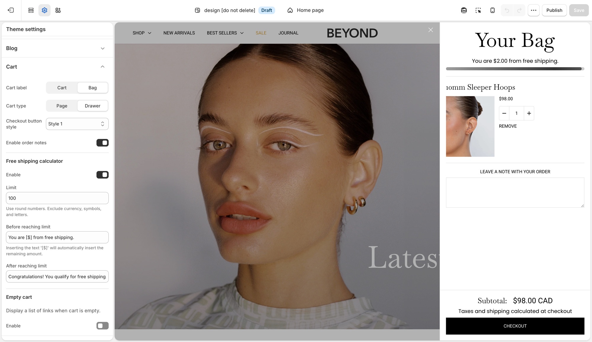
## Theme settings → Cart (Beyond)
- **Cart label**: **Cart** or **Bag**, the icon and wording used for the cart trigger throughout the theme.
- **Cart type**: **Page** sends customers to a dedicated cart page. **Drawer** opens the cart in a slide-out panel without leaving the page.
- **Checkout button style**: pick from your four button styles ([Buttons and inputs](https://support.troopthemes.com/guide/beyond/buttons-and-inputs/)) for the cart's checkout button specifically.
- **Enable order notes**: adds a note field to the cart so customers can leave instructions. See Shopify's [order notes](https://help.shopify.com/en/manual/online-store/themes/customizing-themes/common-customizations/add-order-notes) guide for how this differs from cart attributes and line item properties.
### Free shipping calculator (Beyond)
- **Enable**: turns the progress message on or off.
- **Limit**: the order subtotal that qualifies for free shipping. Numbers only, no currency symbol.
- **Before reaching limit**: message shown while under the limit. Insert `[$]` to show the remaining amount automatically.
- **After reaching limit**: message shown once the customer qualifies.
This calculator is a message only, it does not create or apply a shipping discount. Set up the matching rate in **Settings** → **Shipping and delivery**; see Shopify's [setting up shipping rates](https://help.shopify.com/en/manual/fulfillment/setup/shipping-rates/setting-up-shipping-rates) guide for how to configure a free-shipping rate that actually applies at checkout.
### Empty cart (Beyond)
- **Enable**: shows a list of links when the cart has nothing in it.
- **Custom link list**: which menu to show. Dropdown items in that menu do not appear, top-level links only.
## Troubleshooting (Beyond)
- **Cart opens as a drawer when I wanted a page (or the reverse)**: **Cart type** in **Theme settings** → **Cart**.
- **Free shipping message shows the wrong amount, or shows for everyone**: check **Limit**. It is a plain number, no currency symbol or letters.
- **Customers reached the limit but nothing changed at checkout**: this is expected. The free shipping bar is a message only. Create the actual free shipping rate in **Settings** → **Shipping and delivery**.
- **Empty cart shows the wrong links**: the assigned menu has the wrong links, or has dropdown items that are not appearing (expected, only top-level links show).
- **Checkout is unchanged**: expected. Checkout is not the theme.
---
title: Add custom CSS or edit template code
url: https://support.troopthemes.com/guide/beyond/adding-css-editing-template-code/
theme: Beyond
theme_styles: Fleur
---
# Add custom CSS or edit template code in Beyond
Use **Theme settings** → **Custom CSS** (the whole store) or a section's own **Custom CSS** field (just that section) for one-off exceptions the settings do not cover. Do not start here for colors, type, spacing, or buttons, those have Theme settings.
Checkout is unchanged, custom CSS does not apply there. Prefer settings over CSS; prefer CSS over editing Liquid.
> **Before you begin**
>
> Modifying theme code in the template editor requires some basic knowledge of CSS, HTML and Liquid so be sure you're comfortable with those areas before attempting any.
>
> Check out Shopify's [guide to editing theme code](https://help.shopify.com/en/manual/online-store/themes/customizing-themes/edit-code).
>
> Visit [W3Schools](https://www.w3schools.com/Css/) for a quick CSS tutorial.
>
> Support can point you to the right field, but debugging your own CSS or Liquid is outside [what we can help with](https://support.troopthemes.com/submit-a-support-ticket/).
> **Create a backup**
>
> We recommend making your customizations on an unpublished version. Go to **Actions** → **Duplicate** first.
## Adding CSS to the whole store (Beyond)
**Edit theme** → **Theme settings** → **Custom CSS** → add your code → **Save**.

This applies everywhere on the storefront and is capped at 1,500 characters. If a change only needs to apply to one section, add it there instead, see below.
## Adding CSS to one section (Beyond)
Select the section → scroll to the bottom of its settings panel → **Custom CSS** → add your code → **Save**.

This applies to that section only, and is capped at 500 characters. Only the `@media`, `@container`, `@layer`, and `@supports` at-rules are allowed here.
## What custom CSS can't do (Beyond)
- No `@import`, `@charset`, or `@namespace`, at either the theme or section level.
- No `content` property.
- Can't target the `shopify-section` wrapper element.
- Any URL you reference has to be on `https://cdn.shopify.com`.
- Custom CSS overrides your theme's built-in settings, it always wins, so a Theme setting and a Custom CSS rule that disagree will show the CSS.
- Not supported on the checkout page.
- Updating your theme can break selectors your CSS depends on, recheck custom CSS after an update.
## Advanced: editing CSS directly in template code (Beyond)
These two options require editing Liquid files in the code editor, not just filling in a settings field. They're for merchants and developers comfortable working in the theme's code.
### custom-styles.liquid (Beyond)
Every theme ships an empty `custom-styles.liquid` snippet in _Snippets_, rendered as a plain `
(Blockshop)
Open [Sidekick](https://help.shopify.com/en/manual/shopify-admin/productivity-tools/sidekick) from the theme editor toolbar (top right, next to the device preview icon), or press `⌘.` (`Ctrl+.` on Windows). Describe your brand or the mood you want and it'll suggest colors, previewed before anything is applied to Theme settings → Colors.
> "Suggest values for Accent 1, Accent 2, and Accent 3 for a warm, earthy candle store, plus a Page background and Text color that pair with them."
A fast way to get a starting palette, or a second opinion when you're stuck between two options, you still decide what to keep.

## Troubleshooting (Blockshop)
- **One section ignored the new palette**: that section has its own **Background color**. Open the section, not only Theme settings.
- **Buttons didn’t change**: those colors are in **Theme settings** → **Buttons & Inputs**.
- **Text disappeared on a photo**: set section **Text color** to Light or Dark, or raise **Image darkness** in Typography. Auto can select the wrong value on pale images.
- **Checkout is still Shopify’s colors**: checkout is not a theme setting.
---
title: Typography
url: https://support.troopthemes.com/guide/blockshop/typography/
theme: Blockshop
theme_styles: Radiance, Stone, Valla
---
# Typography in Blockshop
**Edit theme** → **Theme settings** → **Typography**

Heading, navigation, and body fonts, plus a type size ladder for each role.
## Theme settings → Typography (Blockshop)
### Fonts (Blockshop)
You pick three fonts:
- **Heading font**: banners, section titles, and other headings
- **Navigation font**: header and dropdown labels
- **Paragraph font**: body copy
Use one heading font and one body font. Navigation can match headings or paragraphs. Mixing three unrelated families makes the store feel busy.
> **A custom font**
>
> Shopify’s font picker covers most stores. To use a font file or a Google Font that the picker does not include, see [Custom fonts](#custom-fonts).
### Type roles (Blockshop)
Each role has a desktop size. Most also have a **Mobile size** so heroes do not overflow phones.
- **Banner heading**: slideshow and large hero titles
- **Featured heading**: campaign titles that sit below banner size
- **Section heading**: titles at the top of a section
- **Block heading**: titles on cards, columns, and blocks
- **Navigation**: header links
- **Sub navigation**: dropdown and nested links
- **Buttons**: button labels
- **Overline**: small labels above a heading
- **Paragraphs**: body copy
- **Featured paragraph**: body copy on top of images and video
Keep the ladder obvious: banner larger than featured, featured larger than section, section larger than block, block close to paragraph. If section headings and paragraphs are the same size, the page has no hierarchy.
> **Check mobile**
>
> After you set banner and featured sizes, resize the editor preview to mobile. If a title wraps into five lines, lower **Mobile size** rather than shrinking desktop type.
### Letter spacing and uppercase (Blockshop)
- **Heading letter spacing** and **Paragraph** / **Button letter spacing** open or tighten the letters.
- **Uppercase headings**, **Uppercase** on nav, buttons, overlines, and paragraphs change the voice of the brand.
Treat uppercase and wide tracking as a brand choice, not a default on every role. All-caps paragraphs are hard to read. Wide tracking on a huge banner can look elegant; the same tracking on body copy looks sparse.
### Links and buttons in type (Blockshop)
Blockshop adds type controls that sit with buttons:
- **Link style**: Underline or Arrow on text links
- **Match link size to block heading**: text links use the block heading size
- **Buttons → Size** and **Mobile size**: button label size on desktop and phones
Set link style here so it stays consistent storewide. Colors and hover for the four button styles live in [Buttons, inputs, and links](https://support.troopthemes.com/guide/blockshop/buttons-inputs-and-links/).
### Text on images (Blockshop)
Under **Text visibility**:
- **Image darkness**: storewide strength (0–100%) for dark overlays on photos and video
- **On the section**: **Darken image** or **Image overlay** turns the overlay on and picks the direction: entire image, top down, or bottom up. **None** on the section means this Typography slider has no effect there.
- **Text shadows**: storewide strength for **Oval shadow**
- **On the section**: **Text shadows** picks **None**, **Text shadow** (fixed glow on headings, copy, and buttons), or **Oval shadow** (soft gradient behind the text; the Typography slider controls how strong)
- **Translucent box around text**: softens the fill when **Text background color** is set (not Transparent)
- **Sections**: Slideshow, Image with text overlay, Video, Featured images, Testimonials, Image with text (overlap layout)
- **Blocks**: Grid with overlay tiles; Promotion blocks in Featured collection and Collection grid; megamenu blocks in Header
If overlay headings disappear on a pale photo, enable **Darken image** on the section first, then raise **Image darkness** in Typography, or set **Text shadows** to **Text shadow** or **Oval shadow**.
## Custom fonts (Blockshop)
Shopify’s font picker in **Theme settings** → **Typography** covers most stores. Add a custom font only when you need a licensed font file or a Google Font that the picker does not include. You must have a license to host the font files. Custom fonts do not change checkout.
A custom font loads from a **Custom liquid** section at the top of the header group. You can load the font in one of three ways:
1. Upload a font file in **Content** → **Files**
2. Use a public URL to a hosted font file (for example, `.woff2`, `.woff`, `.ttf`, or `.otf`)
3. Use a font from [Google Fonts](https://fonts.google.com/)
### Set up a Custom liquid section (Blockshop)
1. In **Edit theme**, add a **Custom liquid** section at the top of the header group.
2. In that section’s settings, set **Spacing above**, **Spacing below**, and the mobile spacing options to **None** so the section does not add extra space.
Each option below pastes its font code into this **Custom liquid** section.
### Option 1: Upload a font file (Blockshop)
1. In the Shopify admin, open **Content** → **Files** and use **Upload files** to add your font (for example, `custom-font.woff2`).
2. Note the uploaded file name, including the file extension. You use that exact name in the next step.
In the **Custom liquid** section, paste the following code. Set `custom_font_family` to your font’s name, and set `custom_font_file` to the uploaded file name (for example, `my-font.woff2`).
```liquid
{%- liquid
assign custom_font_family = 'Merchant Custom Sans'
assign custom_font_fallback = 'sans-serif'
assign custom_font_file = 'custom-font.woff2'
-%}
```
Click **Save** in the theme editor to apply the changes.
### Option 2: Use a URL to a hosted font (Blockshop)
Use this option when the font file is on a server or CDN and you have a direct `https://` link to the file.
In the **Custom liquid** section, paste the following code. Set `custom_font_family` to your font’s name, and set `custom_font_url` to the full address of the file (for example, `https://example.com/fonts/custom-font.woff2`).
```liquid
{%- liquid
assign custom_font_family = 'Merchant Custom Sans'
assign custom_font_fallback = 'sans-serif'
assign custom_font_url = 'https://example.com/fonts/custom-font.woff2'
-%}
```
Click **Save** in the theme editor to apply the changes.
### Option 3: Use Google Fonts (Blockshop)
On [Google Fonts](https://fonts.google.com/), pick a font, open **Get embed code**, and copy the stylesheet link. The link has the format `https://fonts.googleapis.com/css2?family=...&display=swap`.

In the **Custom liquid** section, paste the following code. Set `custom_font_url` to the stylesheet link, and set `custom_font_family` to the font’s name as Google Fonts shows it. The example uses the font Oi.
```liquid
{%- liquid
assign custom_font_family = 'Oi'
assign custom_font_fallback = 'sans-serif'
assign custom_font_url = 'https://fonts.googleapis.com/css2?family=Oi&display=swap'
-%}
```
Click **Save** in the theme editor to apply the changes.
### Deprecated fonts in Shopify’s library (Blockshop)
Shopify sometimes deprecates fonts in its font library. A deprecated font can disappear from the font picker in **Theme settings** → **Typography** or stop loading as before. See [Deprecated fonts](https://shopify.dev/docs/storefronts/themes/architecture/settings/fonts#deprecated-fonts) in Shopify’s font documentation for the affected typefaces.
To replace a deprecated font, pick another font from the current library in **Theme settings** → **Typography**. To keep the same typeface, load it as a custom font with one of the options above.
## Ask Sidekick (Blockshop)
Open [Sidekick](https://help.shopify.com/en/manual/shopify-admin/productivity-tools/sidekick) from the theme editor toolbar (top right, next to the device preview icon), or press `⌘.` (`Ctrl+.` on Windows). Ask it for a font pairing that fits your brand.
> "Suggest a Heading font and Paragraph font pairing for a modern retail store, and whether Navigation should match the heading or the paragraph font."
It previews the pairing before you apply anything to Theme settings → Typography, faster than comparing font libraries by hand. If you're deciding whether a custom font is worth adding at all, it's also a reasonable place to ask.

## Troubleshooting (Blockshop)
- **Headings didn’t change**: you may have edited the wrong role. Banner headings only affect slideshows and large heroes; section titles use **Section heading**.
- **Product card titles didn’t change**: those sizes are **Heading type** in **Theme settings** → **Product grid**, not Typography.
- **A sentence in the header or cart is the wrong words**: that is [default theme content](https://support.troopthemes.com/guide/blockshop/change-default-text/), not a font setting.
- **Custom font did nothing**: the **Custom liquid** section must be first in the header group, with all spacing set to **None**. See [Custom fonts](#custom-fonts).
- **Custom font only changed some text**: the snippet sets the heading, navigation, and paragraph font variables together. Remove the `:root` lines for the roles you do not want to change.
- **Custom font file returns a 404**: `custom_font_file` must match the file name in **Content** → **Files** exactly, including the extension.
- **Checkout font is unchanged**: this is expected. Custom fonts do not apply to checkout.
---
title: Changing default theme text
url: https://support.troopthemes.com/guide/blockshop/change-default-text/
theme: Blockshop
theme_styles: Radiance, Stone, Valla
---
# Changing default theme text in Blockshop
If you cannot edit the wording in a section setting (a heading or button label you typed yourself), it is usually **default theme content**: “Add to cart”, “Sold out”, form placeholders, cart empty-state messages, and other built-in storefront wording.
**Online Store** → **Themes** → **…** → **Edit default theme content** (Languages).

Product titles (**Products**), page bodies, blog bodies (**Content** → **Blog posts**), menu labels (**Content** → **Menus**), and checkout wording are edited elsewhere, not here.
> **Info**
>
> Visit Shopify's help centre for an extensive guide on [changing the wording in themes](https://help.shopify.com/en/manual/online-store/themes/customizing-themes/language).
## Which editor? (Blockshop)
### Edit theme (a section) (Blockshop)
For headings, overlay text, newsletter headlines, and other copy you added to a section: open that section in **Edit theme**.
### Edit default theme content (Blockshop)
For built-in storefront wording, “Add to cart”, “Sold out”, “Size chart”, form errors: **Edit theme** → **…** → **Edit default theme content**.
### Shopify admin (Blockshop)
- Product titles, descriptions, variant names: **Products**
- Menu item names: **Content** → **Menus**
- Blog post bodies: **Content** → **Blog posts**
- A whole About page: Online Store → **Pages**
### Checkout (Blockshop)
“Pay now” and other checkout labels: Shopify checkout / Markets language, not the theme.
Search in default theme content for the exact words you see on the storefront. If search finds nothing, you are in the wrong place (section setting or admin).
## Ask Sidekick (Blockshop)
Open [Sidekick](https://help.shopify.com/en/manual/shopify-admin/productivity-tools/sidekick) from the icon in your Shopify admin, then ask it to rewrite a batch of default theme content in your brand's voice, useful if it reads too formal, too casual, or just generic.
> "Make these button and form labels warmer and more casual: [paste your list]."
You still paste the results into **Edit default theme content** yourself, Sidekick doesn't edit theme content directly.
## Troubleshooting (Blockshop)
- **You changed a section heading and the button still says Add to cart**: that button is default theme content, not the section.
- **You changed default theme content and a product title didn’t move**: product titles are in Products.
- **A translation app overwrote your wording**: the app owns storefront language. Edit there, or disable the app embed to test.
- **Checkout is unchanged**: expected. See "Translating your store" in your theme's [country, currency, and language selectors guide](https://support.troopthemes.com/guide/troubleshooting/#store) for storefront vs checkout.
---
title: Spacing and layout
url: https://support.troopthemes.com/guide/blockshop/spacing-and-layout/
theme: Blockshop
theme_styles: Radiance, Stone, Valla
---
# Spacing and layout in Blockshop
Spacing works in two steps: In **Edit theme** → **Theme settings** → **Layout**, **Desktop spacing** and **Mobile spacing** define what Small through Extra large mean storewide. On each section, **Spacing above** and **Spacing below** pick from that scale: None, Small, Medium, Large, or Extra large. Changing a size in Layout updates every section that uses it.

## Theme settings → Layout (Blockshop)
### How the scale works (Blockshop)
**Desktop spacing** and **Mobile spacing** each set:
- Small
- Medium
- Large
- Extra large
The note in Layout is literal: these settings are the sizes used by the **Spacing above** and **Spacing below** dropdowns on most sections.
If Large is 72px on desktop, every section whose dropdown is set to Large uses 72px. Change a size in Layout and every matching section updates.
Set the scale to match the listing you installed, then reuse the same steps on every page. Do not set one section to Extra large and the next to Small unless you want a hard break.
### Small (Blockshop)
**Small** is the tightest named step on the scale. What it measures in pixels is set in **Theme settings** → **Layout**, not on each section.
The [Stone](https://themes.shopify.com/themes/blockshop/presets/stone) preset sets **Small** to **2px** on desktop and mobile (the theme default is 16px and 12px). Stone then picks **Small** on shop sections: the hero’s **Spacing below**, featured product rows, and collection media blocks. At 2px, those sections sit nearly flush so grids and photography read as one continuous shop flow.
That rhythm works because Stone saves **Extra large** for editorial pauses. If your catalog appears too airy, lower **Small** in Layout and set shop sections to **Small** rather than Medium. Text-heavy pages still need Medium or Large.
### Extra large (Blockshop)
Blockshop’s Extra large step is for spacious layouts: generous gaps around photography, heroes, and brand stories. The [Blockshop](https://themes.shopify.com/themes/blockshop/presets/blockshop) and [Radiance](https://themes.shopify.com/themes/blockshop/presets/radiance) presets set **Spacing below** to Extra large on most homepage sections: category columns, featured collections, and story blocks. The [Stone](https://themes.shopify.com/themes/blockshop/presets/stone) preset reserves Extra large for editorial pauses only and uses **Small** on the shop blocks in between.
Use Extra large as a rhythm, not on every section. A whole homepage of Extra large can feel empty; none at all can feel tight next to a generous listing.
### Desktop and mobile (Blockshop)
**Mobile spacing** is a separate scale. A Large gap that looks considered on desktop is often too tall on a phone. Keep mobile values smaller than desktop, and preview both after you change Layout.
Reuse the same **Spacing above** / **Spacing below** dropdown on adjacent sections: Medium throughout the shop, or Large on a hero and Medium on what follows. Use **None** when two sections should sit flush. Add a **Divider** when you need a gap with no content. Keep mobile spacing smaller than desktop, and preview both after you change the scale in Layout.
Extra large spacing suits heroes and brand-story blocks; collection grids usually sit on Medium or Large.
## On each section (Blockshop)
Most sections include **Spacing above** and **Spacing below** dropdowns (and the mobile pair). That is where you pick a named size, not where you invent new pixel values.
For a gap that is not tied to a content section, add a **Divider** from the section list. Empty sections and dummy headings are harder to maintain.
> **None is a setting**
>
> Set spacing to None when two sections should sit flush, for example a full-bleed image against a product grid, or a Custom liquid block in the header that should not add height. For custom fonts, that section is documented in [Custom fonts](https://support.troopthemes.com/guide/blockshop/typography/#custom-fonts).
## Ask Sidekick (Blockshop)
Open [Sidekick](https://help.shopify.com/en/manual/shopify-admin/productivity-tools/sidekick) from the theme editor toolbar (top right, next to the device preview icon), or press `⌘.` (`Ctrl+.` on Windows). If your pages feel cramped or overly loose and you can't tell which setting is responsible, describe the problem.
> "My homepage sections feel too tight on mobile, what Desktop spacing and Mobile spacing values should I use for Small through Extra large?"
It can point you toward the relevant spacing settings and suggest values, rather than you adjusting sliders section by section to find the right combination.

## Troubleshooting (Blockshop)
- **One section didn’t move**: change **Spacing above** / **Spacing below** on that section. Layout only defines what Small–Extra large *mean*.
- **The homepage feels empty**: too many sections are set to Extra large. Use Extra large on heroes and stories; Medium or Large on collections.
- **A tall gap on mobile only**: lower the **Mobile spacing** sizes in Layout. They are independent of desktop.
- **You need a gap with no content**: add a **Divider** section. Do not add an empty Rich text section.
---
title: Alignment and width
url: https://support.troopthemes.com/guide/blockshop/alignment-and-width/
theme: Blockshop
theme_styles: Radiance, Stone, Valla
---
# Alignment and width in Blockshop
Open a section in **Edit theme**, not **Theme settings**.

Pick a default **Text alignment** per template and keep supporting sections on it: **left** for catalogs and long copy, **center** for heroes and short announcements, then back to your default. **Mobile text alignment** is separate.
**Maximum container width** is on each section: contained for text-heavy blocks, **Full width** for slideshows and large photography. A useful rhythm is full-width hero → contained story → full-width collection.
## Text alignment (Blockshop)
Most sections let you align text left, center, or right on desktop, with a separate control for mobile.
Pick a default and keep it on a given page:
- **Left**: catalogs, product stories, long copy. Easy to scan.
- **Center**: heroes, short announcements, logo moments.
- **Right**: rare; use when a layout is mirrored on purpose.
Do not alternate left and center on every section. Customers notice inconsistent alignment even when they cannot name the cause.
## Maximum container width (Blockshop)
Options run from Extra small through Full width. They map to Blockshop’s content widths:
- Extra small through Extra large keep copy and media in a centered column
- Full width lets the section bleed to the edges
Use contained widths for text-heavy sections so lines do not run the full screen. Use Full width for slideshows, large photography, and grids that should feel edge-to-edge.
A useful rhythm is full-width hero → contained story → full-width collection. All contained or all full-width is simpler and also works.
## Mobile (Blockshop)
**Mobile text alignment** can differ from desktop, for example a left-aligned split layout that centers on a phone. Check the mobile preview whenever you change alignment. Width on small screens is already narrow; Full width vs Large matters less than whether type is left or centered.
> **One page, one habit**
>
> If the header and product grid are left-aligned, keep supporting sections left-aligned too. Center a single hero if you need a pause, then return to the page’s default.
## Product grid (Blockshop)
**Text alignment** for product cards is in **Theme settings** → **[Product grid](https://support.troopthemes.com/guide/blockshop/product-grid/)**, not the collection section.
## Ask Sidekick (Blockshop)
Open [Sidekick](https://help.shopify.com/en/manual/shopify-admin/productivity-tools/sidekick) from the theme editor toolbar (top right, next to the device preview icon), or press `⌘.` (`Ctrl+.` on Windows). Alignment and width choices are easy to second-guess in isolation, ask it how a layout choice reads.
> "Should my hero text be centered or left-aligned, and what Maximum container width fits a minimal, editorial look?"
It'll reason through the trade-off with you rather than you flipping the setting back and forth to compare.

## Troubleshooting (Blockshop)
- **Product cards didn’t follow the section**: card alignment is global under **Product grid**, not the collection section’s text alignment.
- **A slideshow still edge-to-edge**: many heroes default to Full width. Change **Maximum container width** on that section.
- **Mobile is centered but desktop is left**: that is **Mobile text alignment**, a separate control. Set both.
- **Header links didn’t move**: open the **Header** section, not Theme settings → Layout.
---
title: Buttons, inputs, and links
url: https://support.troopthemes.com/guide/blockshop/buttons-inputs-and-links/
theme: Blockshop
theme_styles: Radiance, Stone, Valla
---
# Buttons, inputs, and links in Blockshop
Buttons work in two steps:
In **Edit theme** → **Theme settings** → **Buttons & Inputs**, styles 1 through 4 define how buttons look storewide, including hover colors. Change a style here and every button that uses it updates.
On each section, the **Button** block picks style 1–4 from that set. Keep primary actions on style 1 storewide so customers can identify the primary control.
Text links are separate: **Typography** → **Buttons**.

## Theme settings → Buttons & Inputs (Blockshop)
### Four button styles (Blockshop)
Each style has **Background**, **Text**, **Border**, **Hover background**, and **Hover text**.
A reliable split:
- **Style 1**: primary action (Add to cart, Shop the collection): solid fill
- **Style 2**: secondary action on a light background
- **Style 3**: outline on light surfaces
- **Style 4**: outline or ghost on dark or image backgrounds (light text and border)
Set hover colors that still contrast. A hover color that matches the page background removes button contrast.
**Buttons corner radius**: 0px is square; higher values round the pill. A 2px radius is the Blockshop default. A larger radius produces softer corners; 0px produces sharper corners.
### Link style (Blockshop)
In **Typography** → **Buttons**:
- **Link style**: Underline or Arrow on text links
- **Match link size to block heading**: optional; keeps text links aligned with card titles
**Size** and **Mobile size** on the same panel set button label size. See [Typography](https://support.troopthemes.com/guide/blockshop/typography/).
Underline is quieter. Arrow is more directional. Pick one and use it on every text link. Mixing both on one page creates inconsistent link styling.
> **Text links vs buttons**
>
> Use a button style for the main action on a section. Use a text link for a secondary step (Learn more, View all). If every control is a solid button, no single action is clearly primary.
### Inputs (Blockshop)
- **Inputs corner radius**: rounds newsletter fields, contact forms, search, and cart notes
- **Inputs background**: fill color behind the field
- **Inputs text**: color of the text customers type
Match input radius to button radius so forms and CTAs use consistent corner treatment.
## Ask Sidekick (Blockshop)
Open [Sidekick](https://help.shopify.com/en/manual/shopify-admin/productivity-tools/sidekick) from the theme editor toolbar (top right, next to the device preview icon), or press `⌘.` (`Ctrl+.` on Windows). Ask it to suggest a button style.
> "Suggest Background, Text, Border, Hover background, and Hover text values for Style 1 (primary) and Style 3 (outline) that fit a bold, confident retail brand."
It'll reason through contrast and hierarchy with you before you touch Theme settings → Buttons & Inputs. Useful when you have four button styles to fill in and aren't sure how to differentiate them.

## Troubleshooting (Blockshop)
- **Add to cart didn't change**: confirm you edited **Buttons & Inputs**, then that the product form is using style 1. App-injected cart buttons will not follow these colors.
- **Hover looks fine on desktop, gone on a phone**: phones have no hover. The rest state must contrast on its own.
- **Text links still underlined after you picked Arrow**: some app or custom CSS is forcing `text-decoration`. Isolate with [Troubleshooting](https://support.troopthemes.com/guide/troubleshooting/).
- **Checkout button is unchanged**: that is Shopify checkout, not the theme.
---
title: Images
url: https://support.troopthemes.com/guide/blockshop/images/
theme: Blockshop
theme_styles: Radiance, Stone, Valla
---
# Images in Blockshop
**Edit theme** → **Theme settings** → **Images**.

Crops for product, collection, and article images.
**Corner radius** is storewide. Besides photos, it rounds embedded videos, text blocks with a background color, the newsletter popup, and sections with **Outer background** off.
## Crops and radius (Blockshop)
- **Corner radius**: rounds product and content images, embedded videos, text blocks with a background color, the newsletter popup, and inset sections (**Outer background** off). Does **not** apply to images in full-width sections.
- **Product image size**: Natural, Square (1:1), Landscape (4:3), Portrait (4:5), or Portrait (2:3). This crop is for the product grid.
- **Collection image size**: same options, for collection lists and thumbnail views.
- **Article image size**: blog cards.
Natural keeps each file’s own ratio. Square and portrait force a consistent grid, which looks calmer when product photos were shot inconsistently.
For pixel dimensions when you export photos, see [What image sizes should I use?](https://support.troopthemes.com/faqs/what-image-sizes-should-i-use/).
> **Shoot for the crop**
>
> If you set product images to Square, photograph on a consistent canvas. Mixed lifestyle crops in a square grid will chop subjects. Natural is kinder to mixed photo sets; a fixed ratio is kinder to a studio pack.
## Ask Sidekick (Blockshop)
Open [Sidekick](https://help.shopify.com/en/manual/shopify-admin/productivity-tools/sidekick) from the theme editor toolbar (top right, next to the device preview icon), or press `⌘.` (`Ctrl+.` on Windows). Unsure whether Natural, Square, or Portrait crops will suit your product photography, or how consistent your existing photos actually are, describe your catalog.
> "My product photos are a mix of studio shots and lifestyle images, what Product image size should I use for the grid?"
It can help you reason through the trade-off before you commit the whole store to one crop, and point you to Shopify's [image size guidance](https://support.troopthemes.com/faqs/what-image-sizes-should-i-use/) if you're about to reshoot.

## Troubleshooting (Blockshop)
- **Images look cropped**: that is **Product image size**, not a bug. Switch to Natural, or shoot for the ratio you chose. Replacing the file in **Products** does not bypass the theme crop.
- **Corner radius ignored on a hero**: full-width section images are excluded on purpose.
---
title: Social media
url: https://support.troopthemes.com/guide/blockshop/social-media/
theme: Blockshop
theme_styles: Radiance, Stone, Valla
---
# Social media in Blockshop
**Edit theme** → **Theme settings** → **Social media**.

These settings control the social icons that appear in the footer, announcement bar, and other sections across the theme in one place, not per section.
## Theme settings → Social media (Blockshop)
- **Hover color**: **Match brand** (each platform's own color), **Opacity** (dims on hover), or **None**.
- One field per platform (Instagram, Facebook, LinkedIn, Threads, Youtube, Vimeo, Pinterest, 𝕏, TikTok, Tumblr, Snapchat, Bluesky): paste that profile's URL to show its icon.
Leave a platform blank and no icon shows for it. Sections do not need each icon toggled individually.
If you already added social links in Shopify's [brand assets](https://help.shopify.com/en/manual/promoting-marketing/managing-brand-assets) (**Settings** → **General** → **Brand assets** → **Social links**), the theme uses those by default and no further setup is needed here. A URL entered in **Theme settings** → **Social media** overrides the brand setting for that platform only. This is useful when a section-specific or seasonal account should differ from your main brand profile.
## Troubleshooting (Blockshop)
- **An icon is not showing**: that platform's URL field is empty here and in **Settings** → **Brand**.
- **The wrong URL is showing**: a value here always wins over **Settings** → **Brand** for that platform.
- **Icons do not change color on hover**: **Hover color** is set to **None**.
---
title: Animations
url: https://support.troopthemes.com/guide/blockshop/animations/
theme: Blockshop
theme_styles: Radiance, Stone, Valla
---
# Animations in Blockshop
**Edit theme** → **Theme settings** → **Animations**.

Four storewide switches, each one turns a category of motion off. There is nothing to turn on, animations ship on by default.
## Theme settings → Animations (Blockshop)
- **Disable text**: turns off text fade and reveal animations.
- **Disable image**: turns off image fade and reveal animations.
- **Disable button hover**: turns off button hover transitions.
- **Disable other**: turns off all other non-essential animation, a catch-all for anything the first three do not cover.
## Where each toggle applies (Blockshop)
- **Disable text**: the scroll-triggered fade/slide-in on headings, subheadings, text, buttons, and rich text, used in nearly every section, plus the animated stacked headline component where a section uses one.
- **Disable image**: the fade-in on section images, for example Image with text, Media with highlight, Shop the banner, Scrolling text on image, Grid with overlay, Featured collections, the collection banner, and menu images.
- **Disable button hover**: a single storewide switch. It is not checked per section, so it turns off hover transitions on every button, input, and link at once.
- **Disable other**: the widest switch, covering things that are not simple text or image reveals: product card image hover-swap and the shared transition into the product page, the cart drawer, predictive search results, dropdown/mega menus, accordions, grid reveals on collection/blog/search listing pages, and sections like Appointments, Logo list, Social highlights, and Testimonials.
## Troubleshooting (Blockshop)
- **A section still animates after I disabled text or image**: that motion may fall under **Disable other** instead, for example a slideshow transition or a decorative loop. Turn that on too.
- **I want most animation off but kept hover effects**: leave **Disable button hover** off and enable the other three.
---
title: Section list
url: https://support.troopthemes.com/guide/blockshop/section-list/
theme: Blockshop
theme_styles: Radiance, Stone, Valla
---
# Sections in Blockshop
**Edit theme** → **Add section**. Names in the editor match this list. Do not pick a section because the name sounds close; each one does a different job.
- **Materials, process, or making with collapsible rows**: use **Materials/craftsmanship**. Not **FAQ** (no media column).
- **Gift-guide links on a campaign image**: use **Gifts**. Not **Featured collection**.
- **Booking CTA that an app will fill**: use **Appointments**. Not **Contact form**.
- **Press logos in a row**: use **Logo list**. Not **Icons row** (those are trust marks, not logos).
For how to place image layouts, see [Designing with image sections](https://support.troopthemes.com/guide/blockshop/image-sections/).
## Which section for this goal? (Blockshop)
Each row names the section to use for a goal and a similar section that does a different job.
| Goal | Use | Do not use |
| --- | --- | --- |
| One static hero with text on the photo | **Image with text overlay** | **Slideshow** (that rotates) |
| Several rotating heroes | **Slideshow** | **Image with text overlay** |
| Photo beside copy | **Image with text** | **Image with text overlay** |
| Photo with copy underneath | **Image with text below** | **Image with text overlay** |
| A grid of images with captions on them | **Grid with overlay** | **Featured collection** |
| Up to three images or videos in a row | **Media row** | **Grid with overlay** (more tiles) or **Featured images** (exactly two) |
| Lifestyle photos that link to Instagram | **Social highlights** | **Grid with overlay** or **Logo list** |
| Materials, process, or making with collapsible rows | **Materials/craftsmanship** | **FAQ** |
| Gift-guide links on a campaign image | **Gifts** | **Featured collection** |
| Booking CTA that an app will fill | **Appointments** | **Contact form** |
| Press logos in a row | **Logo list** | **Icons row** |
| Products from one collection | **Featured collection** | **Featured products** (those are picked one by one) |
| A hand-picked set of products | **Featured products** | **Featured collection** |
| Clickable hotspots on one image | **Shop the look** or **Shop the banner** | **Image with text overlay** |
| FAQ / accordion | **FAQ** | **Rich text** |
| Email signup *on the page* | **Newsletter** section | **Popups** (the overlay that opens over the page) |
Jump to a group; these match the groups in **Add section**:
- [Storytelling](#storytelling)
- [Products](#products)
- [Brand Trust](#brand-trust)
- [Promotions](#promotions)
- [Signups](#signups)
- [Utilities & Layout](#utilities-layout)
---
## Storytelling (Blockshop)
Use these for brand narrative and visual-first layouts, home heroes, lookbooks, and landing pages where imagery leads.
- **Image with text below**: Image or video with heading and copy underneath, not overlaid. Good for product philosophy or care notes where the copy needs full-width legibility, not shrunk over a photo.
- **Materials/craftsmanship**: Media beside collapsible rows for materials, process, or making. Good for material breakdowns, sourcing notes, or a step-by-step process, photo alongside, unlike FAQ.
- **Featured images**: Two coordinated images with shared text and a call to action. Good for a campaign spotlight or category teaser where two images tell one story better than either alone.
- **Grid with overlay**: Image or video tiles with text overlays in a flexible grid. Good for a shop-by-category or shop-by-collection grid, each tile carrying its own label and link.
- **Image comparison**: Shoppers drag between before/after visuals in one frame. Good for before/after proof: skincare results, renovations, restorations, material finishes.
- **Image with text**: Image paired with copy in a split, side-by-side layout. Good for a feature or story explainer that needs room to breathe.
- **Image with text overlay**: Heading, text, and buttons directly on one image. Good for a single hero banner or campaign header, type sitting directly on the photo. Do not use for rotating slides (**Slideshow**) or copy beside the photo (**Image with text**).
- **Media overlay columns**: Several media columns, each with optional overlay text. Good for category callouts or campaign modules, each column its own labeled story card.
- **Media row**: Up to three images or videos in a row, with optional overlay text. Good for a short, light media strip: lookbook stills or campaign moments, not a full grid.
- **Media with highlight**: One featured media area plus supporting media blocks. Good for a launch page or content-first homepage: one lead visual plus supporting media.
- **Overlapping media**: Layered media for an editorial, depth-focused composition. Good for a premium, art-directed moment where a flat side-by-side layout would look plain.
- **Rich text**: Formatted text for intros, brand copy, or messaging blocks. Good for a plain-text intro, shipping note, or brand paragraph that does not need imagery.
- **Slideshow**: Rotating slides for heroes, announcements, or campaigns. Good for cycling multiple offers, looks, or promotions at the top of the homepage. Do not use for a single static banner (**Image with text overlay**).
- **Text columns with images**: Repeating image/text columns for features or pillars. Good for a "why shop with us" row: shipping, materials, guarantees.
- **Video**: One video with optional heading and copy. Good for a single product demo, brand film, or how-to as its own moment.
## Products (Blockshop)
Use these to feature collections, products, and shoppable images.
- **Collection with highlight**: A collection beside a highlighted story or content area. Good for pairing a shoppable collection with a story or lookbook teaser.
- **Collections list**: Several collections in a list or grid. Good for a shop-by-category landing block: shop by room, by size, by use.
- **Featured collection**: Products from one collection. Good for showing everything in one Shopify collection, like New arrivals or Best sellers. Do not use for a hand-picked set (**Featured products**).
- **Featured product**: One product with full merchandising details. Good for a flagship launch or hero item that deserves its own dedicated spot.
- **Featured products**: A curated set of individual products. Good for a hand-picked edit: staff picks, a gift guide, a bundle, regardless of collection. Do not use to show a whole collection (**Featured collection**).
- **Recent products**: Newly added products. Good for an always-current "just in" row that updates itself as you add inventory.
- **Shop the banner**: Clickable product hotspots on one hero-style image. Good for a lifestyle hero image where every visible product is tappable.
- **Shop the look**: Image hotspots with editorial text and campaign framing. Good for an outfit or room shot with shoppable hotspots plus campaign copy.
## Brand Trust (Blockshop)
Use these for FAQs, proof, press, and service details.
- **Logo list**: Logos or press quotes in a row. Good for "as seen in" press mentions or retailer and stockist logos.
- **Social highlights**: Lifestyle images with social icons and links; on mobile, one image per slide. Good for a curated Instagram-style grid that sends shoppers to your social channels, not a general image grid.
- **Blog posts**: Recent or selected articles. Good for surfacing editorial or how-to content that keeps shoppers browsing past the homepage.
- **FAQ**: Collapsible questions. Good for shipping, sizing, or policy questions shoppers need answered before checkout. See [Setting up FAQ or Collapsible rows](https://support.troopthemes.com/guide/blockshop/setting-up-faq-or-collapsible-rows/).
- **Icons row**: Trust markers such as shipping, returns, or support. Good for a quick reassurance strip under a hero: free shipping, easy returns, secure checkout.
- **Map**: Location and contact details with a map. Good for a physical storefront, showroom, or studio location.
- **Service list**: Services, menus, or policy highlights. Good for listing services, a café or restaurant menu, or policy summaries without building a custom page.
- **Testimonials**: Customer quotes. Good for social proof near a buying decision: reviews, quotes, press mentions.
## Promotions (Blockshop)
Use these for launches, gift guides, and time-sensitive campaigns.
- **Gifts**: A short gift-guide of links (for example For her, Under $500) on a campaign image. Good for a holiday or gift-guide block that routes shoppers by recipient or budget.
- **Countdown**: A timer for drops, events, or limited-time offers. Good for building urgency ahead of a launch, sale end, or restock.
- **Scrolling content**: Continuously moving content blocks for callouts. Good for a marquee strip of rotating callouts: press mentions, taglines, promo codes.
- **Scrolling text on image**: Animated text over an image. Good for a bold campaign banner where the moving message is the visual.
## Signups (Blockshop)
Use these to collect enquiries and emails.
- **Appointments**: Heading, copy, and a button, usually paired with a booking app via Custom liquid. Good for a consultation, fitting, or showroom booking CTA once a booking app is connected.
- **Contact form**: Direct customer enquiries from any page. Good for custom orders, wholesale enquiries, or support questions a help-desk app does not cover.
- **Newsletter**: Email signup. Good for building your list on the page itself, separate from the popup. See [Mailing list & newsletters](https://support.troopthemes.com/guide/blockshop/newsletters/).
## Utilities & Layout (Blockshop)
Use these for spacing, structure, and custom code.
- **Custom Liquid**: Custom Liquid output for apps and advanced integrations. Good for embedding an app widget or custom-coded block no standard section covers.
- **Custom content**: Mixed blocks for a simple custom layout. Good for a one-off layout that does not fit any other section, built from simple mixed blocks.
- **Divider**: Visual separation between sections. Good for breathing room between two sections without adding empty content.
---
title: Designing with image sections
url: https://support.troopthemes.com/guide/blockshop/image-sections/
theme: Blockshop
theme_styles: Radiance, Stone, Valla
---
# Designing with image sections in Blockshop
**Edit theme** → **Add section** → pick an image section. Don't pick one just because the name sounds close: **Image with text**, **Image with text overlay**, and **Slideshow** each do a different job.
For the full catalog (including product, FAQ, and utility sections), open the [section list](https://support.troopthemes.com/guide/blockshop/section-list/).
## Slideshow (Blockshop)
Use the Slideshow section when you want to rotate multiple messages, products, or promotions in a single section.
It is mobile-friendly by default, so customers can swipe through slides on touch devices, while desktop visitors can use drag controls or autoplay.
Each slide can display a single image or video, or two media items side by side. To display multiple media items, set `Media 2 type` to `image` or `video`. To display a single media item, set `Media 2 type` to `none`.

> **Legacy Slideshow**
>
> Please see the legacy slideshow features below for versions below 13.1.0.
Use `Blocks per slide for desktop` to control how many slides appear at once (1 to 4). A value of 1 creates a standard full-width slider, while higher values create a multi-card layout for collections, promotions, or featured content.
For saving images for your slides, read more about image sizes in our [What image sizes should I use?](https://support.troopthemes.com/faqs/what-image-sizes-should-i-use/).
---
## Image with text overlay (Blockshop)
Use the Image with text overlay section when you want to place text and calls to action directly on top of a single image.
This section works well for hero banners, campaign announcements, and brand storytelling where one strong image needs supporting copy. The image can be configured with different widths and aspect ratios to suit your layout:

You build the text and calls to action with blocks (headings, descriptions, buttons, and more). For a general overview of blocks and what to expect in the theme editor, see [Blocks in image sections](#blocks-in-image-sections).
Use this section when your goal is to combine one image and one message in a single, high-impact banner that can be reused across key storefront pages.
> **Version availability**
>
> Image with text overlay is available in Blockshop versions 12.1.0 and up.
---
## Image with text (Blockshop)
Use the Image with text section when you want to pair an image with supporting content in a split layout.
This section works well for featured collections, product storytelling, and campaign moments where the visual and copy should sit side by side instead of stacking in a single banner.
The image can be configured to control presentation across desktop and mobile, and the layout can be reversed to place the image on either side. You can also use the overlap setting to adjust how text sits against the image:

The copy beside the image is built with blocks, which you add and reorder in the section (for example headings, descriptions, and buttons). See [Blocks in image sections](#blocks-in-image-sections) for a general overview. Use the block list in the theme editor to see what this section includes.
Use this section when your goal is to combine one image and one message in a balanced, side-by-side layout that can be reused across key storefront pages.
> **Legacy Image with text**
>
> Please see the legacy image with text features below for versions below 12.1.0.
The Image with text section allows you to display images in various ratios , full width, three quarter or half width - to establish balance and visual rhythm in your page design.
`Parallax scrolling` can be enabled for images in this section to add action and depth. Parallax scrolling effects create movement and the illusion of depth by scrolling background elements at a slower pace than foreground elements. For best results, set the `text position` setting to `center`.
---
## Featured images (Blockshop)
Use the Featured images section when you want to present two visuals together with one shared message and call to action.
This section works well for campaign storytelling, category spotlights, or any moment where two complementary images create stronger impact than one alone.
Each image can be configured for desktop and mobile display, and mobile layout can be adjusted to show one image, stack both, or place them side by side.

The shared message and call to action are built with blocks for text and related content. See [Blocks in image sections](#blocks-in-image-sections) for a general overview. Add blocks in the theme editor to see what this section offers.
Use this section when your goal is to tell one clear story across two images in a single, high-impact layout that can be reused across key storefront pages.
> **Version compatibility**
>
> Featured images is available in Blockshop versions 11.1.0 and up.
---
## Grid with overlay (Blockshop)
This section allows you to display content in simple fixed-aspect ratio grids, justified grids, or more freeform offset grids.
Configure individual block settings to specify how blocks fall within the grid and section settings to style text overlays to optimize readability.

The `preserve image aspect ratio` block setting will display images at the ratio they're uploaded at, rather than justifying them into the grid. This will allow you to create more free-form, off-set grids with varying image heights.
---
## Text columns with images (Blockshop)
This flexible sections allows you to display a combination of image an text elements for a wide variety of uses.
> **Row of icons**
>
> If you want a horizontal row of icons (for example trust marks, shipping icons, or simple pictograms with optional short text), add the **Icons row** section instead of building that layout in **Text columns with images**. _Icons row_ is available in Blockshop versions 10.2.0 and up.
---
## Image comparison (Blockshop)
Use the Image comparison section when you want customers to interactively compare two visuals in the same frame (for example before/after edits, product variants, material finishes, or renovation stages).
This section is ideal when one image alone cannot communicate the difference clearly. Shoppers can drag the comparison handle to reveal more or less of each image, which makes visual changes easier to understand at a glance.

Add one Before block and one After block, then upload an image for each. You can optionally add mobile-specific images per block to improve cropping and composition on smaller screens.
Use this section when your goal is to show change, contrast, or improvement in a way that invites interaction instead of relying on static side-by-side images.
> **Version availability**
>
> Image comparison is available in Blockshop versions 9.2.0 and up.
---
## Shop the banner (Blockshop)
Use the Shop the banner section when you want to place clickable product dots on a single image and let customers jump straight from inspiration to product discovery.
This section works well for hero-style campaign visuals where one scene contains multiple products (for example a styled room, outfit, or collection shot). Add product dots to highlight items in context without breaking the visual flow.

Set your main banner image, then add **Product dot** blocks and assign a product to each one. You can control dot placement separately for desktop and mobile, so hotspots stay accurate across screen sizes.
Use this section when your goal is to turn one strong branded image into an interactive shopping surface with minimal on-image text.
> **Version availability**
>
> Shop the banner is available in Blockshop versions 11.0.0 and up.
---
## Shop the look (Blockshop)
Use the Shop the look section when you want a guided, editorial shopping experience built around one curated image plus an optional call to action.
Like Shop the banner, this section supports product hotspots, but it also includes heading and button settings so you can frame the visual with a stronger campaign message.

Add your image, create **Product dot** blocks, and position each hotspot for desktop and mobile. Use the heading alignment, container width, and hotspot style settings to match the section to the rest of your page design.
Use this section when your goal is to combine storytelling and conversion in one curated “look” module.
> **Version availability**
>
> Shop the look is available in Blockshop versions 9.2.0 and up.
---
## Scrolling text on image (Blockshop)
Use the Scrolling text on image section when you want animated headline-style text moving across an image background.
This section is ideal for brand statements, promotional phrases, or directional messaging that should feel dynamic and high-energy. You can add multiple text blocks, control scroll direction and speed, set spacing between phrases, and pause movement on hover.

You can also choose whether text should span the full width and configure mobile-specific media to keep composition readable on smaller screens.
Use this section when your goal is to create motion-driven campaign messaging without building a full slideshow.
> **Version availability**
>
> Scrolling text on image is available in Blockshop versions 10.4.0 and up.
---
## Media with highlight (Blockshop)
Use the Media with highlight section when you want one primary feature area paired with a grid of supporting media items.
This section works well for launch pages, collection storytelling, and content-first merchandising where you need a lead narrative plus multiple secondary visuals. The main highlight area supports heading and rich text, while blocks can include images or video with optional titles.

Control layout with blocks-per-row, vertical alignment, reverse layout, and display/aspect settings for both desktop and mobile. Overlay style and text options help maintain readability over busy imagery.
Use this section when your goal is to blend editorial storytelling and media-rich browsing in a single modular section.
> **Version availability**
>
> Media with highlight is available in Blockshop versions 11.0.0 and up.
---
## Media overlay columns (Blockshop)
Use the Media overlay columns section when you want a clean column layout where each media tile can carry overlaid text and optional links.
This section is useful for category callouts, campaign modules, or mixed media presentations where each column acts like a mini story card. Blocks can be image or video, with per-block overline, heading, and description content.

You can adjust spacing, aspect ratio, and text styling to control visual rhythm and readability across the grid.
Use this section when your goal is to present multiple media-driven messages side by side in a structured, scannable layout.
> **Version availability**
>
> Media overlay columns is available in Blockshop versions 13.1.0 and up.
---
## Media row (Blockshop)
Use the Media row section when you want **up to three** images or videos in a single row, with a shared height.
This is for a short, even band of media, lookbook stills, campaign stills, or mixed image/video, not a many-tile grid (**Grid with overlay**) and not a two-image story (**Featured images**). Add **Image** or **Video** blocks (maximum three). **Media height** sets the crop (Natural, Square, Landscape, or Portrait). Overlay heading and button are optional on each block.

On mobile, choose whether the row stays a grid or stacks, and whether blocks go full width.
Use this section when the job is a simple 1–3 media strip with optional overlay text.
> **Version availability**
>
> Media row is available in Blockshop versions 13.3.0 and up.
---
## Social highlights (Blockshop)
Use the Social highlights section when lifestyle photos should send customers to Instagram or another social channel.
Each block is an image plus a platform icon, link text, and button style. Leave the block **Link** blank to use the matching URL from **Theme settings** → **Social media**. Desktop is a multi-column grid (2–4 blocks per row). On mobile, one image shows per slide.

Do not use this for a general image grid (**Grid with overlay**) or a logo strip (**Logo list**).
Use this section when the job is a curated social grid, not a product collection.
> **Version availability**
>
> Social highlights is available in Blockshop versions 13.3.0 and up.
---
## Overlapping media (Blockshop)
Use the Overlapping media section when you want to layer two media items to create depth and a more art-directed visual composition.
This section works well for brand storytelling, product detail narratives, and campaign moments where a standard side-by-side layout would appear flat. Each media block can be image or video, and you can control overlap amount, animation behavior, and layout direction.

Text settings (heading style, alignment, description, and column width) let you pair the layered media with supporting copy while keeping balance between content and visuals.
Use this section when your goal is to create a premium, editorial look with intentional layering and motion.
> **Version availability**
>
> Overlapping media is available in Blockshop versions 11.0.0 and up.
---
## Blocks in image sections (Blockshop)
A **section** is one area of a page template (for example a hero or image band). **Blocks** are the pieces inside that section. In other parts of a theme, blocks can be all sorts of things, this guide focuses on **image sections**, where blocks are mostly for **copy**: overlines, headings, descriptions, buttons, and similar, paired with the image. The **image** itself is set in the section (or slide) settings, not as “body text.”
**Reorder blocks** in the left-hand section list to change the order of that copy on the page. Drag a block up or down to match the story you want (for example, overline, then heading, then button).
Shopify explains the overall model in [sections and blocks in the theme editor](https://help.shopify.com/en/manual/online-store/themes/theme-structure/sections-and-blocks). For a given section, only the block types in **Add block** apply; that list changes by section and theme version, so use another image section (or a newer version) if something is missing.
Common copy-related block types often include:
- Overline
- Heading
- Description
- Button
- Icons
- Custom Liquid
## Troubleshooting (Blockshop)
- **You added Slideshow but only have one image**: use **Image with text overlay**. Slideshow is for rotating slides.
- **Type sits on the photo and you wanted it beside**: use **Image with text**, not overlay.
- **Type sits beside the photo and you wanted it underneath**: use **Image with text below**.
- **Images look cropped**: that section’s aspect ratio setting, or [What image sizes should I use?](https://support.troopthemes.com/faqs/what-image-sizes-should-i-use/). Replacing the file in **Products** does not change a section’s crop.
- **You wanted three photos in a row and added Grid with overlay**: use **Media row** (max three blocks, shared height).
---
title: Add collection page promotions
url: https://support.troopthemes.com/guide/blockshop/collection-page-promotions/
theme: Blockshop
theme_styles: Radiance, Stone, Valla
---
# Add collection page promotions in Blockshop
Promotional tiles sit **inside the collection product grid**. Add them on the collection template, not in Theme settings → Colors.
**Edit theme** → collection template → **Collection grid** → **Add promotion**.

Which products are in the collection, discounts, and checkout are unchanged.
> **Compatibility**
>
> Collection promotions are available in Blockshop versions 7.0.0 and up.
Promotional blocks can be added into Collection page grids to promote sales, collections, product information and more.
To add a collection promotion, navigate to the collection page settings, under _Collection grid_ > _Add promotion_. Use the settings to configure the position, size and style of individual promotions.
> **Promotions that are too wide for the product grid**
>
> Be sure that promotions have enough space to render inside the product grid. For example, a promotion inside a grid that is two columns wide should have a maximum width of two. Although the promotion will render correctly if the width is wider than the space available, it could effect pagination.
## Troubleshooting (Blockshop)
- **Promo missing on one collection**: you added it on a different collection template, or that collection uses another template. Assign templates in the collection admin.
- **Grid looks broken / pagination jumps**: the promo is wider than the column count. Lower the promo width so it fits.
- **You wanted a banner above the grid**: use a section above the collection grid (Image with text overlay, etc.), not a grid promotion.
---
title: Setting up navigation
url: https://support.troopthemes.com/guide/blockshop/creating-navigation/
theme: Blockshop
theme_styles: Radiance, Stone, Valla
---
# Setting up navigation in Blockshop
Menus are created in Shopify admin. The theme only **displays** the menu you assign in the Header, Footer, or a section.
**Content** → **Menus** to create items. Assign the menu in **Edit theme** → **Header**, **Footer**, or the section.
Checkout, apps, and collection filters are unchanged.
> **Info**
>
> Visit Shopify's help centre for an extensive guide on setting up [menus and links](https://help.shopify.com/en/manual/online-store/menus-and-links).
Menus can display as a single dropdown or in multi-columns with nested items.
### Single dropdown menu (Blockshop)
To create a single dropdown menu, click the title of the menu that you would like to add a dropdown menu to.
In most cases, this is called _Main Menu_ unless it has been renamed to something else.
Next, you will need to add 'child' items to include in the new drop-down.
Click _Add menu item_, enter a name of the menu item and select a destination for the link.
Click and drag the menu items to nest below the 'parent' item.
Click _Save_ menu.

### Multi-column dropdown menu (Blockshop)
You can create multi-column drop-down menus up to three levels deep.
To create third-level menu items, repeat the process for creating a dropdown and nest them below a second-level menu item.
If a second-level menu item has no nested items, it is styled in a separate column (for example _New in_ and _Sale_).
## Creating other menus (Blockshop)
All other store menus can be configured in your store admin under **Content** → **Menus**.

Once a menu is configured, assign it in **Edit theme** → **Header** (or Footer / the section).
## Troubleshooting (Blockshop)
- **You edited Menus and the header didn’t change**: the **Header** section is still assigned a different menu. Open Header and pick the menu you just edited.
- **A link 404s**: the menu item URL is wrong in **Content** → **Menus**, not a theme setting.
- **Mega-menu columns look wrong**: nesting depth in **Content** → **Menus** drives columns. Second-level items with no children become their own column (see _New in_ / _Sale_ above).
---
title: Working with templates
url: https://support.troopthemes.com/guide/blockshop/working-with-templates/
theme: Blockshop
theme_styles: Radiance, Stone, Valla
---
# Working with templates in Blockshop
A template is the set of sections for one kind of page (product, collection, page, blog). Create extras in **Edit theme**, then **assign** them in the Shopify admin. The default template is what anything without an assignment uses.
**Edit theme** → template selector → **Create template**; then assign it on the resource in admin → **Template** (right column, under Online store).
Product data, collection membership, and checkout are unchanged.
> **Info**
>
> Visit Shopify's help centre for an extensive guide on [templates](https://help.shopify.com/en/manual/online-store/themes/theme-structure/templates).
## What a template controls (Blockshop)
Templates can be created for:
- collections
- products
- blogs
- blog posts
- pages
Every type has a **Default** template. Pages still on Default pick up whatever sections you add there. An alternate template only applies after you assign it in the admin.
Open the template selector at the top of **Edit theme** to see which templates exist and how many pages use each one.

## Add sections to the default template (Blockshop)
**Edit theme** → template selector → the page type (for example **Pages**) → **Default page**.
Sections you add here appear on every page of that type that still uses Default.
## Create a new template (Blockshop)
1. **Edit theme** → template selector → open the page type (for example **Pages**).
2. Choose **Create template**.
3. Enter a **Name**, pick a template to copy in **Based on**, then **Create template**.
4. Add, remove, or rearrange sections on that template.
5. Assign it in the admin (next section). Creating it in **Edit theme** does not apply it.

## Pre-built page templates (Blockshop)
Themes include **about**, **contact**, **faqs**, and **lookbook** under **Pages**. Open one in the template selector and change its sections; you do not need to create those from scratch.
## Assign a template (Blockshop)
Open the page, product, collection, blog, or article in the admin. In the right column, under **Online store**, choose it from **Template**.

> **Note**
>
> Alternate templates only appear in the admin if that theme is **published**, or if you are assigning while previewing the unpublished theme those templates live on.
## Troubleshooting (Blockshop)
- **You created a template but the page didn’t change**: assign it on that page, product, or collection in the admin (**Template**, right column). Creating it in **Edit theme** is not enough.
- **Every product picked up the new layout**: you edited the **Default product** template. Create an alternate and assign it only to the products that need it.
- **Template missing in the admin dropdown**: the theme must be published, or you are editing a different unpublished theme than the one assigned.
---
title: Product grid
url: https://support.troopthemes.com/guide/blockshop/product-grid/
theme: Blockshop
theme_styles: Radiance, Stone, Valla
---
# Product grid in Blockshop
A **product card** is the tile that represents one product: the image, title, and price, plus optional extras such as vendor name, ratings, and hover effects.
Cards appear inside a **product grid**, a row-and-column layout of those tiles.
You will find product grids on:
- Collection pages
- Search results
- Product pages that show related or recommended products
- Templates that include **Featured collection**, **Featured products**, **Recent products**, or **Collection with highlight**
How cards look is set once in **Theme settings** → **Product grid**. How many columns the grid uses, and which products it shows, is set on the section or collection template.

> **Info**
>
> **Product image size** (crop shape) and **Corner radius** are in **Theme settings** → **[Images](https://support.troopthemes.com/guide/blockshop/images/)**, not Product grid.
## Card layout (Blockshop)
- **Enable hover image**: shows the product’s second image on hover. Touch devices have no hover.
- **Show vendor name**
- **Show product rating**: displays star ratings on product cards when a reviews app has added rating data to the product. The theme does not collect reviews. See [How do I add product reviews or star ratings?](https://support.troopthemes.com/faqs/how-do-i-add-product-reviews-or-star-ratings/)
- **Text alignment**: left, center, or right on the card
- **Heading type** and **Price type**: Small (nav-sized) or Paragraph text
Keep heading and price on the same type role unless you want the price to recede.
## Product labels (Blockshop)

Product labels can show status (new, sale, sold out) on the collection grid. Featured labels add custom copy such as “Organic cotton” or “Limited edition” from tags.
Inventory, discounts, and checkout are unchanged. Labels are card markers, not Shopify discounts.
Under **Product labels**:
- **Shape**: Square or Round
- **Color** and **Text color**: Light, Dark, or an accent
- **Sale label**: hidden, text, or percent off
- **Show new label** and **New label period** (days)
- **Featured tags**: tags that render as labels
### Sale and new (Blockshop)
- **Sale**: the product needs a **Compare at price** higher than the price. The label can be hidden, text, or percent off.
- **New**: enable **Show new label** and set **New label period** (days since the product was created).
### Featured labels (Blockshop)
1. On the product in Shopify admin, add a tag (for example `organic-cotton`).
2. In **Theme settings** → **Product grid** → **Featured tags**, type that exact tag. Separate multiple tags with commas.
The tag in the admin and the string in Featured tags must match (including spelling). The storefront can hide the raw tag from other UIs; the label is what customers see.
## Ask Sidekick (Blockshop)
Open [Sidekick](https://help.shopify.com/en/manual/shopify-admin/productivity-tools/sidekick) from the theme editor toolbar (top right, next to the device preview icon), or press `⌘.` (`Ctrl+.` on Windows). If you're deciding between a denser grid with less detail or a spacious one with more (vendor name, rating, price emphasis), talk it through.
> "Should my product grid show vendor name and rating, and should Heading type and Price type be Small or Paragraph text?"
It can reason through what a customer browsing your specific catalog will actually want to see on the card, rather than you guessing at the combination of card layout settings.

## Troubleshooting (Blockshop)
- **Hover image never appears**: the product needs a second image in the admin. Touch devices have no hover.
- **Ratings missing**: **Show product rating** only displays data from a reviews app. Products with no reviews stay blank. See [How do I add product reviews or star ratings?](https://support.troopthemes.com/faqs/how-do-i-add-product-reviews-or-star-ratings/)
- **No sale label**: there is no compare-at price, or Sale is set to hidden.
- **No new label**: the product is older than **New label period**, or the checkbox is off.
- **Featured label missing**: tag spelling does not match Featured tags, or you tagged a variant in a way the product does not inherit. Tags are on the product.
- **Label on the product page but not the grid (or the reverse)**: Product grid labels are this setting. The product template may have its own badge blocks; check both.
---
title: Quick add
url: https://support.troopthemes.com/guide/blockshop/quick-add/
theme: Blockshop
theme_styles: Radiance, Stone, Valla
---
# Quick add in Blockshop
**Edit theme** → **Theme settings** → **Quick add**.

Quick add is the **+** button that appears on product cards in the grid. Hover (or tap) it to add the product to cart without leaving the collection page.
## Theme settings → Quick add (Blockshop)
- **Enable**: turns the button on or off storewide.
- **Product variant style**: **Dropdowns** or **Buttons** for choosing options in the quick add form.
- **Show quantity selector**: adds a quantity stepper to the quick add form.
- **Show dynamic checkout button**: adds a payment-method shortcut (Shop Pay, PayPal, and similar) next to the regular checkout option. See Shopify's [dynamic checkout](https://help.shopify.com/manual/using-themes/change-the-layout/dynamic-checkout) guide.
- **Primary button style** and **Secondary button style**: pick from your four button styles ([Buttons, inputs, and links](https://support.troopthemes.com/guide/blockshop/buttons-inputs-and-links/)). Secondary only shows when **Show dynamic checkout button** is on.
The button label reads **Quick add** for a product with one variant, or **Choose options** when the customer needs to pick a variant first.
## On the product card (Blockshop)
Quick add only appears for products that are in stock. A sold-out product's card has no button at all. This is expected behavior, not a setting to change.
## Troubleshooting (Blockshop)
- **No button on the card**: the product is sold out, or **Enable** is off in **Theme settings** → **Quick add**.
- **Button says "Choose options" instead of "Quick add"**: the product has more than one variant. That is automatic, not a setting.
- **No secondary button in the form**: **Show dynamic checkout button** is off, or the store has no dynamic checkout methods configured.
- **Checkout is unchanged**: expected. Checkout is not the theme.
---
title: Setting up product filters
url: https://support.troopthemes.com/guide/blockshop/setting-up-product-filters/
theme: Blockshop
theme_styles: Radiance, Stone, Valla
---
# Enabling product filtering in Blockshop
Collection filters on current Troop themes are Shopify’s native filters. You must install Shopify’s free [Search & Discovery](https://apps.shopify.com/search-and-discovery) app first. You configure filters in that app, not in Theme settings → Colors or a tag list.
Shopify admin → **Search & Discovery** app → **Filters**. The theme only displays what that app publishes.
Product tags alone do not create filters on current versions. Checkout and other apps are unchanged.
> **Info**
>
> For the full Shopify walkthrough, see [enable product filtering](https://help.shopify.com/en/manual/online-store/themes/customizing-themes/common-customizations/storefront-filters).
## Steps (Blockshop)
1. Install [Search & Discovery](https://apps.shopify.com/search-and-discovery) from the Shopify App Store if it is not already installed, then open the app in Shopify admin.
2. Open **Filters** and add the filters you want (for example Availability, Price, Color).
3. Save. Preview a **collection** page in **Edit theme**, not the homepage.
4. If the **Filter** button or drawer is missing, open the collection template in **Edit theme**, select **Collection navigation**, and turn on **Enable filtering**. You can also turn on **Enable sorting** and **Enable layout switcher** there. Filter tag **Shape** (Round or Square) is in the same section.
Filters need products that actually have those options or metafields. Empty filters do not appear.

## Troubleshooting (Blockshop)
- **No filter UI at all**: Search & Discovery is not installed, you are previewing the homepage, or **Enable filtering** is off in **Collection navigation**. Open a collection template and turn it on.
- **A filter you added is missing**: no products in that collection have that option/metafield, or the filter is set not to show when empty.
- **You are still adding product tags expecting a Refine list**: current versions use Search & Discovery filters, not tag groups.
---
title: Search
url: https://support.troopthemes.com/guide/blockshop/search/
theme: Blockshop
theme_styles: Radiance, Stone, Valla
---
# Search in Blockshop
**Edit theme** → **Theme settings** → **Search**.

These settings control Shopify's [predictive search](https://help.shopify.com/en/manual/online-store/storefront-search/predictive-search) panel that opens as a customer types in the header search, not the full search results page layout.
## Theme settings → Search (Blockshop)
- **List heading**: label above the default suggestion list, for example "Popular searches."
- **Default list**: a menu of links shown before the customer types anything.
- **Show popular products**: turns on a product suggestions block in the empty search state.
- **Popular product heading**: label above that block, for example "Popular products."
- **Popular products**: up to 4 products to feature there. Leave it blank and the theme fills it with your best-selling products automatically.
## Troubleshooting (Blockshop)
- **Popular products showing products I did not pick**: the **Popular products** field is empty, the theme is filling it with best sellers. Add products there to override it.
- **Nothing shows before I type**: **Default list** has no menu assigned, or that menu has no links.
- **Search results page looks wrong**: that is a separate template (**Edit theme** → template selector → **Search**), not this settings group.
---
title: Add color swatches to products
url: https://support.troopthemes.com/guide/blockshop/color-swatch-guide/
theme: Blockshop
theme_styles: Radiance, Stone, Valla
---
# Using color swatches with your products in Blockshop
On current versions, swatches are Shopify’s native color entries (product category + category metafield). The theme only **turns them on** (Round or Square). You do not pick swatch hexes in Theme settings → Colors anymore.
**Products** → category and category metafields; then **Edit theme** → **Theme settings** → **Swatches**. You can also set swatches on the product section or Featured product.
Inventory, checkout, and filters (Search & Discovery) are unchanged.
To use Shopify native swatches, configure product categories and category metafields.
### Step One: Add a product category (Blockshop)
A product category is selected from the pre-defined categories in Shopify's Standard Product Taxonomy. This is essential for:
- Unlocking product attributes (category metafields) that map to each product category.
- Managing your products better within Shopify, aiding in automated collections or filtering.
- Ensuring accurate tax rates are applied at checkout based on product categorization.
**Example Category**: Apparel & Accessories > Clothing > Clothing Tops > Shirts. You can add color swatches for any category metafield with the color product attribute.
**To Add a Product Category**:
1. From your Shopify admin, click **Products**.
2. Click a product.
3. In the **Category** section, select **Apparel & Accessories > Clothing > Clothing Tops > Shirts** or another category with the color category metafield.
4. Click **Save**.

### Step Two: Add and edit entries for your category metafields (Blockshop)
After adding a product category, you can add entries for your product's variant option values.
**To Edit or Add Entries**:
1. From your Shopify admin, go to **Products**.
2. Click the product with the category metafields you want to edit or add.
3. **To Add an Entry from Default Entries**:
- In the **Category metafields** section, click the category metafield, then click the entry you want to edit.
- Edit the fields as needed.
- Click **Save**.
4. **To Add a Custom Entry**:
- In the **Category metafields** section, click the category metafield, then click **Add new entry**.
- Fill out the fields for the entry.
- Click **Save**.
### Step Three: Connect your category metafields to variant options (Blockshop)
In this step, you connect the category metafield for color (or any other category metafield as needed) to your product variants.
**To Connect Category Metafields**:
1. From your Shopify admin, go to **Products**.
2. Click the product you want to edit.
3. In the **Variants** section, click **+ Add options like size or color**.
4. If a category metafield is available to connect to, select it. The option values will auto-fill with any entries you've added to the category metafield.
5. **Optional**: To add custom option values, click **Edit**, then click **Add new entry**. Fill out the entry fields and click **Save**.
6. Click **Save** to save the product.

### Step Four: Enable swatches at the theme level (Blockshop)
Swatches can be enabled in **Edit theme** → **Theme settings** → **Swatches**. Choose **Circle** or **Square** (or **None** to turn them off). Size on the product form and on the grid are separate sliders in that same group.
You can also set swatch type on a product section or Featured product.
When enabled, the theme will turn configured options into clickable swatch selectors.
## Troubleshooting (Blockshop)
- **No chips, still a dropdown**: Swatches is set to **None** in Theme settings (and on the product section); or the variant option is not connected to the color category metafield.
- **Chips are the wrong colors**: edit the category metafield **entries** in the product admin, not Theme settings → Colors (current versions).
- **Grid has swatches, product page doesn’t (or the reverse)**: Theme settings → Swatches and the product section each have their own type control; set both.
- **You are on an older theme**: skip to [Legacy theme versions](#legacy-theme-versions). Hex lists in Colors or `swatch-colors.liquid` only apply there.
# Legacy theme versions
Color swatches can be enabled in multiple places:
- In the **Product Page(s)** under the **Sections** tab
- On the **Home Page**, inside the **Featured Product** section under the **Sections** tab
- In the **Theme Settings** tab, under the **Product Grid** section
When enabled, the theme will automatically turn an option titled "color" into clickable color swatches.
The default colors are set as standard CSS colors. For example, "gold" is defined as `#ffd700`. The complete
list of standard CSS colors [can be viewed on MDN.](https://developer.mozilla.org/en-US/docs/Web/CSS/Reference/Values/named-color)
> **Non-English themes**
>
> - "Color" will be translated according to your `locales/*.json` file. For example, if you desire "couleur" to be the option with swatches, be sure to translate any instance of "color" inside `locales/fr.json` to "couleur"
> - Non-english colors such as "rouge" will need to be added manually as defined below in [Adding custom colors](#adding-custom-colors)
## Adding custom colors (Blockshop)
Default colors can be overwritten with values defined by the store-owner. In addition, values not defined as a CSS color can be added.
> **Versions with swatch settings inside `Theme settings > color`**
>
> On Blockshop versions 9.0.0 to 10.0.1, swatch color settings can be found inside the _Color_ submenu inside the global theme settings.
If you want to assign the color value `deep red` to the color value `rgb(131, 45, 39)`, you'd add the following line to the `Color swatch configuration` textbox:
deep red: rgb(131, 45, 39)
> **Formatting must be exact**
>
> - each rule must be on a new line
> - the name and value are separated by a single colon (":") character
> - the value can be defined as either a hex or RGB value
> - colors that don't follow the above format will revert to their default values
- use a tool like [Adobe Color](https://color.adobe.com/create/image) if you need help determining which color value is appropriate for your product
---
title: Add a size chart to the product page
url: https://support.troopthemes.com/guide/blockshop/product-size-chart/
theme: Blockshop
theme_styles: Radiance, Stone, Valla
---
# Add a size chart to the product page in Blockshop
The theme can open a Shopify **page** from the product form. You write the chart on that page; the theme only links to it.
You can add a size chart on the _Product_ page or the _Featured product_ section in two ways:
- **Size guide button** block: a standalone button you place in the product form
- **Variant picker** block: a link beside a matching variant option (for example Size)
Create the chart page in **Online Store** → **Pages**. A size-chart app replaces this feature, disable the theme size guide if you use one.
## Chart page (Blockshop)
In the example below, we created a page called `Size chart` and referenced it in **Page content**. That page holds tables (and can hold images or other text).
To quickly create HTML tables for size charts, try a [responsive table generator](https://www.tablesgenerator.com/).

## Size guide button (Blockshop)
> **Version availability**
>
> The Size guide button block is available in Blockshop versions 13.3.0 and up.
**Edit theme** → product template or **Featured product** → **Add block** → **Size guide button**. If the block is already in the section, click the eye icon to show it. Select a page in **Page content**, then choose a **Button style**.
The button does not require a Size variant. Use it when you want a size chart on products without options, or when you want a full button instead of a link next to the picker.
If you use this block, turn off **Enable** under **Size guide** on the **Variant picker** block so two size-chart controls do not stack.
On these versions the chart opens in a drawer.
## Variant picker (Blockshop)
For the variant picker size chart to appear, the product must have at least one variant option. You can configure this in the Shopify admin product editor:

In the theme editor, open the _Product_ page or _Featured product_ section, expand the blocks list, and locate the **Variant picker** block. If it is hidden, click the eye icon to show it. If it is not there, click **Add block** and select **Variant picker**.
Match the variant option (for example, "Size") in the **Link from option** text field. Then select a page using the **Page content** setting.
**Edit theme** → product template → **Variant picker** block → **Link from option** and **Page content**.
Variant options are set in **Products**.
> **Change the size chart button text**
>
> You can change the size chart button text in _Edit default theme content > Products_.
>
> Read more about [changing default text](https://support.troopthemes.com/guide/blockshop/change-default-text/).
>
> 
## Troubleshooting (Blockshop)
- **Size guide button is missing from Add block**: the theme is below the versions listed above. Use the **Variant picker** method, or [update the theme](https://support.troopthemes.com/guide/update-theme/).
- **No size chart link next to Size**: the product has no variants; **Link from option** does not match the option name (for example `Size` vs `Sizes`); **Enable** is off; or the Variant picker block is missing.
- **Wrong / empty drawer or popup**: **Page content** is unset, or the page has no body.
- **Two size charts appear**: both the **Size guide button** and the Variant picker **Size guide** are enabled. Turn one off.
- **An app chart appears instead**: disable the app embed, or turn off the theme’s size guide so they do not stack.
- **Button says the wrong words**: [default theme content](https://support.troopthemes.com/guide/blockshop/change-default-text/) → Products.
---
title: Add an out of stock notification form
url: https://support.troopthemes.com/guide/blockshop/out-of-stock-notifications/
theme: Blockshop
theme_styles: Radiance, Stone, Valla
---
# Add an out of stock notification form in Blockshop
The theme can show a “notify me” form on sold-out variants. Submissions email your store’s **Sender email**. The theme does **not** watch inventory or auto-send “back in stock” mail to the shopper.
This is Shopify’s contact form: it emails you. It does **not** create a customer in **Customers**, and it does not start a waitlist.
## Who owns this (Blockshop)
- **Show the form on the product page**: theme (the block below)
- **Sold-out vs available**: Shopify **Products** inventory
- **Where the request lands**: Settings → Notifications → Sender email
- **Email the shopper when stock returns**: a [back in stock app](https://apps.shopify.com/search?q=back%20in%20stock)
## Show the form (Blockshop)
**Edit theme** → product template (**Default product**) or **Featured product** → **Add block** → **Unavailable form**. If the block is already in the section, click the eye icon to show it.
Click the block to expand its settings. Preview a sold-out variant or the form stays hidden.

Form copy is [default theme content](https://support.troopthemes.com/guide/blockshop/change-default-text/). Search **notify** or **sold out**.
## Sold-out variants only (Blockshop)
The selected variant must be sold out, or the form stays hidden.
**Products** → the product → the variant → **Inventory**:
- **Inventory tracked** is on. If tracking is off, Shopify treats the item as available.
- **Available** is 0 or less at locations that fulfill **online** orders. Stock sitting only at a location that does not fulfill the online store still shows as sold out on the storefront.
- **Sell when out of stock** is **Off**. That control only appears when tracking is on.

See Shopify’s [selling out of stock products](https://help.shopify.com/en/manual/products/inventory/setup/selling-when-out-of-stock) guide.
## Where the email goes (Blockshop)
Shopify delivers contact-form submissions to **Settings** → **Notifications** → **Sender email**. That is not **Settings** → **General** (**Store email** is for Shopify contacting you, and for exports).

If you use a custom domain, authenticate it on the Notifications page or Shopify may rewrite the address. Submissions flagged by Shopify’s spam filter still arrive, with `[SPAM]` in the subject.
See Shopify’s [setting up your email](https://help.shopify.com/en/manual/intro-to-shopify/initial-setup/setup-your-email) and [contact form](https://help.shopify.com/en/manual/online-store/themes/customizing-themes/add-contact-page) guides.
## Automatic “back in stock” mail (Blockshop)
The theme cannot do this. Shopify does not send restock emails to customers on its own; their inventory docs point to a [back in stock app](https://apps.shopify.com/search?q=back%20in%20stock). Most of those apps add their own button, remove the theme’s **Unavailable form** block so they don’t stack.
Shopify Flow’s [Product variant back in stock](https://help.shopify.com/en/manual/shopify-flow/reference/triggers/variant-back-in-stock) trigger can notify *you* (Slack, staff email) or republish a product. It does not mail customers who submitted the theme form.
If you handle requests by hand:
- Tag or folder the incoming mail by product or variant.
- Keep a spreadsheet of email + variant, then send when you restock.
- Add addresses to a list in your email app and send that list when the item is back.
**Want to use an app?** [Using apps with themes](https://support.troopthemes.com/guide/using-apps-with-themes/).
## Ask Sidekick (Blockshop)
Open [Sidekick](https://help.shopify.com/en/manual/shopify-admin/productivity-tools/sidekick) from the icon in your Shopify admin, then ask it to draft the "back in stock" notification email in your brand's tone.
> "Write a short, friendly restock email with a sense of urgency."
Refine it before it goes live, faster than starting from Shopify's default template copy.
## Troubleshooting (Blockshop)
- **Form never shows**: the variant is still available, **Inventory tracked** is off, **Sell when out of stock** is on, or the **Unavailable form** block is missing or hidden on **Product page**.
- **Form shows but you still have stock**: the units may be at a location that does not fulfill online orders. Add stock to a location that does.
- **You expected an automatic email when stock returned**: the theme cannot do that. Use an inventory app and remove the theme block.
- **You didn’t get the request**: check **Settings** → **Notifications** → **Sender email**, spam (including `[SPAM]` in the subject), and domain authentication. The message goes to you, not to the shopper.
- **Form copy is wrong**: [default theme content](https://support.troopthemes.com/guide/blockshop/change-default-text/).
- **Two notify buttons**: an app embed plus the theme form. Turn one off.
---
title: Setting up FAQ or Collapsible rows
url: https://support.troopthemes.com/guide/blockshop/setting-up-faq-or-collapsible-rows/
theme: Blockshop
theme_styles: Radiance, Stone, Valla
---
# Setting up FAQ or Collapsible Rows sections in Blockshop
Add **FAQ** or **Collapsible rows** in **Edit theme** → **Add section**. Each row is a block with a heading plus rich text or a Shopify **page**.
Page bodies are edited in **Online Store** → **Pages**, not in the theme editor. Shopify Help Center, checkout, and metafield definitions are unchanged.
To add an FAQ or Collapsible rows section, open **Edit theme**, click **Add section**, and choose **FAQ** or **Collapsible rows**.
These sections use collapsible rows as blocks. Each row can include a heading and content. Add additional blocks to build a list of questions and answers, or to break down product details and materials.
## Content types (Blockshop)
Each block supports two content types:
1. Rich text
- Added through the "Text" setting. Enter text directly in the text area, including links and formatting.
2. Page content
- Added through the "Row content from page" setting. Select a page from the dropdown to display its content in the block. Pages can be created or edited in the Shopify admin, **not** in the theme editor.
### Dynamic content with metafields (Blockshop)
The first option, rich text, supports dynamic content with metafields. This lets you display content specific to the page you're viewing, or store-level information.
For example, on a product page, each product has a different name, description, and price. You can show that information in an _FAQ_ or _Collapsible rows_ section by connecting a metafield to the block.
You can add static text around metafield content for context, or display only the dynamic content. To learn more about metafields, visit [Shopify's guide](https://help.shopify.com/en/manual/custom-data/metafields).
## Ask Sidekick (Blockshop)
Open [Sidekick](https://help.shopify.com/en/manual/shopify-admin/productivity-tools/sidekick) from the theme editor toolbar (top right, next to the device preview icon), or press `⌘.` (`Ctrl+.` on Windows). Give it a topic and your products, and it drafts FAQ copy for you.
> "Write 5 FAQs about shipping and returns for a skincare store."
It produces question-and-answer pairs you can paste into rich text blocks or refine before publishing. Faster than writing every row from a blank field, you still edit and approve the final wording.

## Troubleshooting (Blockshop)
- **Row is empty**: you chose **Row content from page** but didn’t pick a page, or the page has no body.
- **Every product shows the same answer**: you typed static text. Connect a **metafield** if the answer should change per product.
- **You wanted this on one product only**: use an alternate [product template](https://support.troopthemes.com/guide/blockshop/working-with-templates/) and assign it to that product, or use metafields.
- **Materials with a photo beside the accordion**: Blockshop: **Materials/craftsmanship**, not FAQ.
---
title: Customizing blogs
url: https://support.troopthemes.com/guide/blockshop/customizing-blog/
theme: Blockshop
theme_styles: Radiance, Stone, Valla
---
# Customizing blogs in Blockshop
Blog posts, tags, excerpts, and featured images live in Shopify admin under **Content**. The theme controls how those posts appear: the blog grid, article page, and the **Blog posts** section you can add to other templates.
**Content** → **Blog posts** for writing and tagging. **Edit theme** → **Default blog** or **Default article** for layout.
Post body copy, checkout, and SEO titles are unchanged.
> **Info**
>
> Visit Shopify's help centre for an extensive guide on [adding and managing blog posts](https://help.shopify.com/en/manual/online-store/blogs/writing-blogs/working-with-blog-posts).
## Write and tag posts (Blockshop)
Open **Content** → **Blog posts**. Create or edit a post to set the title, body, excerpt, tags, and featured image.
Tags do two jobs in the theme:
- They appear in the blog page tag filter (if that filter is on).
- The **Blog posts** section can limit itself to articles that share one tag.
Use **Manage blogs** on that same admin page to rename a blog or turn comments on.
## Blog page (Blockshop)
**Edit theme** → template selector → **Blogs** → **Default blog** → **Blog**.
Posts list in reverse chronological order (newest first). Pagination appears when there are more posts than one page.
### Grid (Blockshop)
- **Columns**: 1 to 4 on desktop. On mobile, 1 or 2.
- **Row layout**: **Evenly spaced** keeps rows aligned. **Staggered** packs cards like masonry.
- **Maximum container width**: Extra small through Full width, same control as other sections. Full width lets the grid run edge to edge.
- **Full width** (under **Mobile**): lets cards bleed to the screen edge on small devices.
Card image crop is **Theme settings** → **Images** → **Article image size**, not this section. Natural keeps each featured image’s own ratio. A fixed ratio (Square, Landscape, or Portrait) makes a stricter grid.
For a uniform grid, shoot featured images to the same ratio as **Article image size**. Mixed ratios look calmer with Natural, or with **Staggered** row layout.
Export sizes: [What image sizes should I use?](https://support.troopthemes.com/faqs/what-image-sizes-should-i-use/).
### Title, filter, and RSS (Blockshop)
- **Show blog title**: the blog’s name from admin (for example Journal), not each article title.
- **Show tag filter**: a dropdown of article tags. Turn this off if you do not want customers to filter the index.
- **Show RSS**: a feed link in the blog footer.
To keep internal tags out of that filter, open **Theme settings** → **Blog** → **Hide tags from tag filter**. Enter a comma-separated list. The default is `featured, pinned`. Matching is not case-sensitive (`pinned` and `Pinned` both hide).
### What each card shows (Blockshop)
On the **Blog** section:
- **Show article heading**: the post title. **Article heading type** is Medium or Small.
- **Show blog date** and **Show author**
- **Show excerpt**: the excerpt from the post editor, or a short trim of the body if the excerpt is empty.
- **Show button**: the continue-reading link. That label is [default theme content](https://support.troopthemes.com/guide/blockshop/change-default-text/); search **continue**.
If **Show article heading** and **Show button** are both off, **Show excerpt** outputs the full article body on the blog page instead of a truncated excerpt. That is how an editorial index can read as captions under images, without a title or button on each card.
**Heading type** styles the blog title (Banner, Featured, Large, or Medium) when **Show blog title** is on.
Spacing above and below follows the same scale as other sections. See Spacing and layout in your theme guide.
## Blog posts section (Blockshop)
**Edit theme** → **Add section** → **Blog posts**. Add it to the homepage or any other template. This is not the blog index.
- **Choose blog**: which blog to pull from.
- **Filter by tag**: only articles with this tag appear (up to three). The default is `pinned`. Change the field, or tag posts to match it, in **Content** → **Blog posts**. If no posts have that tag, the section falls back to the latest three articles.
- **Show button**, **Show date**, and **Show excerpt** control the cards in this section.
- **Media layout** (under **Mobile**): Slideshow or Grid.
Tag spelling must match the filter field. `pinned` and `Pinned` are treated the same.
## Article page (Blockshop)
**Edit theme** → template selector → **Blog posts** → **Default article**.
The **Article** section shows the title, date, author, tags, sharing links, and the post body. It does not place the featured image.
The featured image still matters: blog cards use it, cropped by **Article image size**. To show it as a banner on the article page, add an image section (often **Image with text overlay**) above the **Article** section and connect the image to the article’s featured image. You can remove that section if you want a text-only article.
On the **Article** section:
- **Show title**, **Heading type**, and **Heading alignment**
- **Show article date** and **Show author**
- **Show article tags**: tags you hid in **Theme settings** → **Blog** stay hidden here too.
- Sharing: Facebook, 𝕏, Pinterest, email, and link. Turn each one off independently.
**Maximum container width** on this section has no Full width option (Extra small through Extra large). A narrower width keeps article copy readable.
The template can also include:
- **Recent articles**: nearby posts from the same blog.
- **Comments**: Shopify’s comment form, or Disqus if you enable it on the section. Comments must be turned on for that blog in **Content** → **Blog posts** → **Manage blogs**.
You can add other sections to the article template the same way as a page. See [Working with templates](https://support.troopthemes.com/guide/blockshop/working-with-templates/).
### Images in the post body (Blockshop)
When you insert an image in **Content** → **Blog posts**, set the size to **Original** so it spans the article column. Smaller presets can look cropped or undersized.
## Ask Sidekick (Blockshop)
Open [Sidekick](https://help.shopify.com/en/manual/shopify-admin/productivity-tools/sidekick) from the icon in your Shopify admin, then ask it to draft a blog post from a topic and a few notes.
> "Write a post about caring for our candles, aimed at new customers."
Use it for a first draft or when you're stuck on an opening paragraph, then edit it in your own voice before publishing, Sidekick's content generation is meant as a starting point, not a final draft.
## Troubleshooting (Blockshop)
- **Can't find Blog posts**: they are no longer under **Online Store**. Open **Content** → **Blog posts**. Use **Manage blogs** there to rename a blog or change comments.
- **Pinned posts missing from the homepage**: **Filter by tag** is on the **Blog posts** section, not the blog index. The tag on the article must match that field.
- **Tag still shows in the filter**: add it to **Theme settings** → **Blog** → **Hide tags from tag filter**, comma-separated. The blog section’s **Show tag filter** must be on for the dropdown to appear at all.
- **Grid looks uneven**: featured images have mixed ratios, or **Row layout** is **Staggered**. Use the same crop and **Evenly spaced** for a strict grid, or keep mixed ratios on purpose.
- **Cards look cropped**: **Theme settings** → **Images** → **Article image size**, not the post editor.
- **No featured image on the article page**: the **Article** section does not display it. Add an image section on the article template, or check that the post has a featured image in **Content** → **Blog posts**.
- **Embedded images look cropped**: in the article editor, set the image size to **Original**, not a small preset.
- **Comment form missing**: comments are off for that blog in **Manage blogs**, or the **Comments** section is hidden or removed from the article template.
- **Continue reading wording**: [default theme content](https://support.troopthemes.com/guide/blockshop/change-default-text/), not the Blog section.
---
title: Configuring the popup
url: https://support.troopthemes.com/guide/blockshop/configuring-the-popup/
theme: Blockshop
theme_styles: Radiance, Stone, Valla
---
# Configuring the popup in Blockshop
The popup lives in **Edit theme** → **Popups**, an overlay section that appears across the whole store. It is not the announcement bar (that's on the **Header** section), not checkout, and it does not send email campaigns by itself: Shopify Inbox, discount codes, and email delivery are all separate.

> **Compatibility**
>
> Image (and left/right or top placement) options on the **Newsletter (small)** and **Newsletter (large)** popup blocks require version 13.2.0 and up. Video media requires 13.3.0 and up.
## Popups section (Blockshop)
**Edit theme** → **Popups**. By default it already has a **Newsletter (small)**, **Promotion bar**, and **Cookie consent** block. Click a block's eye icon to show or hide it, or **Add block** for another type:
- **Newsletter (small)** – corner overlay with an email field.
- **Newsletter (large)** – centered overlay modal.
- **Promotion bar** – sticky bar with a message; can scroll like a ticker (**Scroll text**, with separate speed controls for desktop and mobile).
- **Cookie consent** – consent banner tied to Shopify's consent tracking API.
Heading, description, and button text live on each block, not in Theme settings.
### Newsletter (small) (Blockshop)
Corner overlay with an email field.
- **Media type**, **Image**, **Video upload**, **Video link**: shown when **Show media** is on; video accepts a Shopify upload or a YouTube/Vimeo link.
- **Heading**, **Description**: the popup's copy.
- **Show social icons**, **Social media title**: adds your [social icons](https://support.troopthemes.com/guide/blockshop/social-media/) below the form.
- **Background color**, **Translucent background**: card styling.
- **Popup width**: maximum width on larger screens (300–500px).
- **Show media**, **Media position** (**Left** or **Top**): whether an image or video shows, and where. Media is hidden on mobile to meet Google's guidelines against intrusive interstitials.
- **Heading type**, **Paragraph font size**, **Text color**, **Text alignment**: text styling.
- **Button text**, **Button style**: set the submit button's label and style. Leave **Button text** blank to show an arrow icon instead of a labeled button.
- Timing and targeting settings (**Popup delay**, **Show again after**, and so on) are shared with **Promotion bar**. See **Timing and frequency** below.
### Newsletter (large) (Blockshop)
Centered overlay modal, with the same settings as **Newsletter (small)** above, except:
- **Popup width** ranges wider (500–900px), since it's a centered modal rather than a corner card.
- **Media position** is **Left** or **Right** instead of Left/Top.
### Promotion bar (Blockshop)
Sticky bar with a message.
- **Description**: the bar's message text.
- **Background color**, **Translucent background**.
- **Scroll text**, **Scroll speed**: ticker effect on desktop, plus a separate **Scroll text**/**Scroll speed** pair under **Mobile** so the ticker can run independently (or not at all) per device.
- **Heading type**: **Medium** or **Small** text size.
- **Text color**.
- Timing and targeting settings are shared with the **Newsletter** blocks. See **Timing and frequency** below.
### Cookie consent (Blockshop)
Consent banner tied to Shopify's consent tracking API. See **When cookie consent shows** below for the conditions.
- **Heading**, **Description**.
- **Background color**, **Translucent background**.
- **Position**: **Left**, **Bottom**, or **Right**.
- **Text color**, **Text alignment**.
- **Accept button style**, **Decline button style**: each independently set to one of your four button styles, or a plain text **Link**.
## Timing and frequency (Blockshop)
**Newsletter** and **Promotion bar** blocks each have:
- **Popup delay** – seconds before it opens.
- **Show popup at bottom of page** – opens early if the visitor scrolls to the bottom first.
- **Show again after** – days before it reappears once dismissed. This is stored in the visitor's browser, not in Shopify, so it's per browser/device, not per customer.
- **Limit to specific referrer path** / **Limit to specific page** – restrict where it can appear.
The section's own **Limit to one popup per page load** setting controls whether only the first ready popup shows, or they queue one after another. **Cookie consent always takes priority** when it needs to appear.
## When cookie consent shows (Blockshop)
Cookie consent only shows where Shopify's consent tracking API determines a banner is required, and only if the visitor doesn't already have a stored choice. It won't show for everyone. Customer privacy tracking limits must also be turned on in your Shopify admin (**Settings** → **Customer privacy**), or it won't show at all. Position and the **Accept**/**Decline** button styles are configurable; it doesn't use the delay/frequency settings above.
## Previewing changes (Blockshop)
**Newsletter** and **Promotion bar** popups do **not** open automatically while you're editing. That's expected, not a bug. Preview them from the storefront (or **Preview**), ideally in a private/incognito window, since **Show again after** is remembered by that browser and will suppress a popup you've already dismissed while testing.
**Cookie consent** is the exception: click it in the block list to preview it live in the editor.
---
Where newsletter forms live (section, overlay, popup, footer, password page): [Setting up mailing lists and newsletters](https://support.troopthemes.com/guide/blockshop/newsletters/).
## Troubleshooting (Blockshop)
- **Popup never appears**: the block is hidden (eye icon); **Show again after** already fired for that browser (test in a private window); another popup is already showing and **Limit to one popup per page load** is on; or a separate app popup is competing. Turn off other popup app embeds.
- **Cookie consent doesn't show**: Customer privacy tracking isn't enabled in your Shopify admin, or the visitor's region/consent state doesn't require a banner.
- **It won't preview in the editor**: expected for **Newsletter** and **Promotion bar** blocks. Preview from the storefront instead.
- **Announcement bar isn't here**: that's on the **Header** section, not **Popups**.
- **Form emails don't reach Mailchimp/Klaviyo**: the popup only creates a Shopify customer (tagged `newsletter`). See [newsletters](https://support.troopthemes.com/guide/blockshop/newsletters/), or connect an [app](https://support.troopthemes.com/guide/using-apps-with-themes/).
---
title: Mailing list & newsletters
url: https://support.troopthemes.com/guide/blockshop/newsletters/
theme: Blockshop
theme_styles: Radiance, Stone, Valla
---
# Setting up mailing lists and newsletters in Blockshop
A Troop newsletter form adds the shopper to **Customers** in your Shopify admin, with **Customer accepts email marketing** checked. The theme does **not** send campaigns or sync Mailchimp/Klaviyo by itself.
Klaviyo, Mailchimp, and other ESP lists need an app or integration, the theme only collects addresses into **Customers**.

## Who owns the list (Blockshop)
- **Show a form on the storefront**: theme (the places below)
- **Store the address**: Shopify Customers
- **Send campaigns / sync to Mailchimp or Klaviyo**: an email app or integration
Blockshop can show a signup form in several places. You do not need all of them.
## Newsletter section (Blockshop)
**Edit theme** → **Add section** → **Newsletter**.
Add it to any template. Heading, description, and the form are blocks: **Overline**, **Heading**, **Description**, and **Newsletter form**. Optional image and **Custom liquid** (for an app embed) are on the section too.
## Image with text overlay (Blockshop)
**Edit theme** → **Image with text overlay** → **Add block** → **Newsletter form**.
Use this when the form should sit on a campaign image with the other overlay blocks (heading, description, buttons). The block has no heading of its own.
## Footer (Blockshop)
**Edit theme** → **Footer** → **Subscribe** block.
Heading, blurb, **Button text**, **Button style**, and **Show social icons** are on that block. Leave **Button text** blank for an arrow.

The Email placeholder is [default theme content](https://support.troopthemes.com/guide/blockshop/change-default-text/), search **mailing**.
## Footer bar (Blockshop)
**Edit theme** → **Footer bar** → add a **Subscribe form** block (one only).
This is a compact form in the bar under the footer, not the Subscribe column. It has **Button style** only. Default demos do not include it.
## Popup (Blockshop)
**Edit theme** → **Popups** → **Add block** → **Newsletter (small)** or **Newsletter (large)**. If the block is already in the section, click the eye icon to show it.

**Newsletter (small)** sits in a corner; **Newsletter (large)** is a centered overlay. Heading, description, **Button text**, and **Button style** are on the block. Leave **Button text** blank for an arrow.
Popup timing and frequency: [Configuring the popup](https://support.troopthemes.com/guide/blockshop/configuring-the-popup/).
## Password page (Blockshop)
**Edit theme**, open the **password** template → **Password page** → **Show form** and **Heading**.
## Connect with Mailchimp (Blockshop)
The theme only writes addresses to Shopify **Customers**. To get them into Mailchimp, install Mailchimp’s [Mailchimp for Shopify](https://apps.shopify.com/mailchimp) app and connect your audience.
See Mailchimp’s [connect Shopify](https://mailchimp.com/help/connect-shopify/) guide.
[Zapier](https://zapier.com/apps/mailchimp/integrations/shopify) is another option if you need a custom workflow.
## Ask Sidekick (Blockshop)
Open [Sidekick](https://help.shopify.com/en/manual/shopify-admin/productivity-tools/sidekick) from the theme editor toolbar (top right, next to the device preview icon), or press `⌘.` (`Ctrl+.` on Windows). It can draft the heading and blurb for your signup form, give it your brand and what subscribers get.
> "Write a short, warm newsletter blurb offering 10% off the first order."
It can also draft the welcome or campaign email itself if you're sending through Shopify Email.

## Troubleshooting (Blockshop)
- **No email in Customers**: the form may be an **app** form (Klaviyo, etc.), not the theme form. Check **Edit theme** → **App embeds**. App forms do not always create a Shopify customer.
- **Theme form works, Mailchimp is empty**: expected until you connect an integration. The theme only writes to Shopify Customers.
- **Popup never appears**: the **Popups** section must have a newsletter block that is not hidden; frequency may have already fired for that browser. Test in a private window. See [Configuring the popup](https://support.troopthemes.com/guide/blockshop/configuring-the-popup/).
- **Email placeholder didn’t change**: that string is [default theme content](https://support.troopthemes.com/guide/blockshop/change-default-text/). Search **mailing**.
- **Double forms**: a Newsletter section *and* an app embed *and* the popup (and footer, if you use it). Turn off the ones you do not want.
- **You added Subscribe form to Footer bar**: that is the compact bar form, not the footer column. Column signup is **Footer** → **Subscribe**.
---
title: Configure country, currency, and language selectors
url: https://support.troopthemes.com/guide/blockshop/configure-country-currency-selectors/
theme: Blockshop
theme_styles: Radiance, Stone, Valla
---
# Configure country, currency, and language selectors in Blockshop
Country, currency, and language selectors are Shopify Markets and Languages (and Shopify Payments), not a Troop currency converter or translator. The theme only **shows** a selector once Markets and/or Languages are set up.
Set up Shopify **Settings** → **Markets** (for country/currency) and **Settings** → **Languages** (for language) first. Then turn on **Show country/region selector** and/or **Show language selector** in the places below.
A selector only appears once Shopify has more than one country, currency, or language published.
Admin prices stay in store currency. Payment methods and rounding are Shopify settings. Translating your product and page content is a separate job, see [Translating your store](#translating-your-store) below.
Refer to Shopify’s [selling in multiple currencies](https://help.shopify.com/en/manual/markets/customizations/local-currencies) guide.

## Header (Blockshop)
**Edit theme** → **Header** → **Show country/region selector** and **Show language selector**.
On the **sidebar** header layout, selectors sit in the left sidebar with the menu. On other layouts they sit in the header bar on desktop. On phones they move into the menu.
## Announcement (Blockshop)
**Edit theme** → **Announcement** → **Show country/region selector** and **Show language selector**.
On desktop they sit on the right of the bar. On phones they move into the menu.
## Footer bar (Blockshop)
**Edit theme** → **Footer bar** → add a **Localization** block (one only). On that block, enable **Show country/region selector** and **Show language selector**.
The Footer bar also holds payment icons, social icons, Powered by, text, logo, menu, and subscribe form blocks, maximum three blocks.
## Translating your store (Blockshop)
Storefront language is Shopify Translate & Adapt (or a translation app) plus [Edit default theme content](https://support.troopthemes.com/guide/blockshop/change-default-text/) for theme chrome. The theme ships language files; it does not translate your products.
Shopify **Settings** → **Languages** for the languages themselves; Translate & Adapt (or an app) for product and page content; **Edit default theme content** for “Add to cart” and similar theme strings.
Checkout language is separate (Shopify checkout / Markets), and is not controlled by the theme. Typography is fonts, not language.
Refer to Shopify’s [localization and translation](https://help.shopify.com/en/manual/international/localization-and-translation) and [Translate & Adapt](https://help.shopify.com/en/manual/international/translate-adapt-app) guides.
## Troubleshooting (Blockshop)
- **No selector**: a second country, currency, or language is not published in Markets/Languages, or **Show country/region selector** / **Show language selector** is off on that section.
- **Selector shows but prices don’t change**: Shopify Payments and Markets must be configured. The theme cannot convert currency by itself.
- **You still have an old currency-app widget**: disable that app embed; it will fight the native selector.
- **Products still show the default language**: translate products and pages in Translate & Adapt (or your app). Default theme content only covers theme chrome, not product data.
- **Checkout is still the default language**: expected. Checkout language is translated in Shopify, not Theme settings.
- **A translation app overwrote your wording**: the app owns storefront language once installed. Edit there, or disable the app embed to test. See [changing default theme text](https://support.troopthemes.com/guide/blockshop/change-default-text/).
---
title: Cart
url: https://support.troopthemes.com/guide/blockshop/cart/
theme: Blockshop
theme_styles: Radiance, Stone, Valla
---
# Cart in Blockshop
**Edit theme** → **Theme settings** → **Cart**.

## Theme settings → Cart (Blockshop)
- **Cart label**: **Cart** or **Bag**, the icon and wording used for the cart trigger throughout the theme.
- **Cart type**: **Page** sends customers to a dedicated cart page. **Drawer** opens the cart in a slide-out panel without leaving the page.
- **Checkout button style**: pick from your four button styles ([Buttons, inputs, and links](https://support.troopthemes.com/guide/blockshop/buttons-inputs-and-links/)) for the cart's checkout button specifically.
- **Enable order notes**: adds a note field to the cart so customers can leave instructions. See Shopify's [order notes](https://help.shopify.com/en/manual/online-store/themes/customizing-themes/common-customizations/add-order-notes) guide for how this differs from cart attributes and line item properties.
### Free shipping calculator (Blockshop)
- **Enable**: turns the progress message on or off.
- **Limit**: the order subtotal that qualifies for free shipping. Numbers only, no currency symbol.
- **Before reaching limit**: message shown while under the limit. Insert `[$]` to show the remaining amount automatically.
- **After reaching limit**: message shown once the customer qualifies.
This calculator is a message only, it does not create or apply a shipping discount. Set up the matching rate in **Settings** → **Shipping and delivery**; see Shopify's [setting up shipping rates](https://help.shopify.com/en/manual/fulfillment/setup/shipping-rates/setting-up-shipping-rates) guide for how to configure a free-shipping rate that actually applies at checkout.
### Empty cart (Blockshop)
- **Enable**: shows a list of links when the cart has nothing in it.
- **Custom link list**: which menu to show. Dropdown items in that menu do not appear, top-level links only.
## Troubleshooting (Blockshop)
- **Cart opens as a drawer when I wanted a page (or the reverse)**: **Cart type** in **Theme settings** → **Cart**.
- **Free shipping message shows the wrong amount, or shows for everyone**: check **Limit**. It is a plain number, no currency symbol or letters.
- **Customers reached the limit but nothing changed at checkout**: this is expected. The free shipping bar is a message only. Create the actual free shipping rate in **Settings** → **Shipping and delivery**.
- **Empty cart shows the wrong links**: the assigned menu has the wrong links, or has dropdown items that are not appearing (expected, only top-level links show).
- **Checkout is unchanged**: expected. Checkout is not the theme.
---
title: Add custom CSS or edit template code
url: https://support.troopthemes.com/guide/blockshop/adding-css-editing-template-code/
theme: Blockshop
theme_styles: Radiance, Stone, Valla
---
# Add custom CSS or edit template code in Blockshop
Use **Theme settings** → **Custom CSS** (the whole store) or a section's own **Custom CSS** field (just that section) for one-off exceptions the settings do not cover. Do not start here for colors, type, spacing, or buttons, those have Theme settings.
Checkout is unchanged, custom CSS does not apply there. Prefer settings over CSS; prefer CSS over editing Liquid.
> **Before you begin**
>
> Modifying theme code in the template editor requires some basic knowledge of CSS, HTML and Liquid so be sure you're comfortable with those areas before attempting any.
>
> Check out Shopify's [guide to editing theme code](https://help.shopify.com/en/manual/online-store/themes/customizing-themes/edit-code).
>
> Visit [W3Schools](https://www.w3schools.com/Css/) for a quick CSS tutorial.
>
> Support can point you to the right field, but debugging your own CSS or Liquid is outside [what we can help with](https://support.troopthemes.com/submit-a-support-ticket/).
> **Create a backup**
>
> We recommend making your customizations on an unpublished version. Go to **Actions** → **Duplicate** first.
## Adding CSS to the whole store (Blockshop)
**Edit theme** → **Theme settings** → **Custom CSS** → add your code → **Save**.

This applies everywhere on the storefront and is capped at 1,500 characters. If a change only needs to apply to one section, add it there instead, see below.
## Adding CSS to one section (Blockshop)
Select the section → scroll to the bottom of its settings panel → **Custom CSS** → add your code → **Save**.

This applies to that section only, and is capped at 500 characters. Only the `@media`, `@container`, `@layer`, and `@supports` at-rules are allowed here.
## What custom CSS can't do (Blockshop)
- No `@import`, `@charset`, or `@namespace`, at either the theme or section level.
- No `content` property.
- Can't target the `shopify-section` wrapper element.
- Any URL you reference has to be on `https://cdn.shopify.com`.
- Custom CSS overrides your theme's built-in settings, it always wins, so a Theme setting and a Custom CSS rule that disagree will show the CSS.
- Not supported on the checkout page.
- Updating your theme can break selectors your CSS depends on, recheck custom CSS after an update.
## Advanced: editing CSS directly in template code (Blockshop)
These two options require editing Liquid files in the code editor, not just filling in a settings field. They're for merchants and developers comfortable working in the theme's code.
### custom-styles.liquid (Blockshop)
Every theme ships an empty `custom-styles.liquid` snippet in _Snippets_, rendered as a plain `
```
Click **Save** in the theme editor to apply the changes.
### Option 2: Use a URL to a hosted font (Maker)
Use this option when the font file is on a server or CDN and you have a direct `https://` link to the file.
In the **Custom liquid** section, paste the following code. Set `custom_font_family` to your font’s name, and set `custom_font_url` to the full address of the file (for example, `https://example.com/fonts/custom-font.woff2`).
```liquid
{%- liquid
assign custom_font_family = 'Merchant Custom Sans'
assign custom_font_fallback = 'sans-serif'
assign custom_font_url = 'https://example.com/fonts/custom-font.woff2'
-%}
```
Click **Save** in the theme editor to apply the changes.
### Option 3: Use Google Fonts (Maker)
On [Google Fonts](https://fonts.google.com/), pick a font, open **Get embed code**, and copy the stylesheet link. The link has the format `https://fonts.googleapis.com/css2?family=...&display=swap`.

In the **Custom liquid** section, paste the following code. Set `custom_font_url` to the stylesheet link, and set `custom_font_family` to the font’s name as Google Fonts shows it. The example uses the font Oi.
```liquid
{%- liquid
assign custom_font_family = 'Oi'
assign custom_font_fallback = 'sans-serif'
assign custom_font_url = 'https://fonts.googleapis.com/css2?family=Oi&display=swap'
-%}
```
Click **Save** in the theme editor to apply the changes.
### Deprecated fonts in Shopify’s library (Maker)
Shopify sometimes deprecates fonts in its font library. A deprecated font can disappear from the font picker in **Theme settings** → **Typography** or stop loading as before. See [Deprecated fonts](https://shopify.dev/docs/storefronts/themes/architecture/settings/fonts#deprecated-fonts) in Shopify’s font documentation for the affected typefaces.
To replace a deprecated font, pick another font from the current library in **Theme settings** → **Typography**. To keep the same typeface, load it as a custom font with one of the options above.
## Ask Sidekick (Maker)
Open [Sidekick](https://help.shopify.com/en/manual/shopify-admin/productivity-tools/sidekick) from the theme editor toolbar (top right, next to the device preview icon), or press `⌘.` (`Ctrl+.` on Windows). Ask it for a font pairing that fits your brand.
> "Suggest a Heading font and Paragraph font pairing for a handmade, craft-forward brand, keeping in mind Maker's borders are already a strong visual element."
It previews the pairing before you apply anything to Theme settings → Typography, faster than comparing font libraries by hand. If you're deciding whether a custom font is worth adding at all, it's also a reasonable place to ask.

## Troubleshooting (Maker)
- **Overlay titles are huge**: lower **Block heading**, not Banner heading. Cards use the block role.
- **Overlay titles are not readable on pale photos**: raise **Image darkness**, switch titles to **Below** in [Product grid](https://support.troopthemes.com/guide/maker/product-grid/), or strengthen the hover pane. Do not rely on hover alone; touch devices have no hover.
- **A header label is the wrong words**: [default theme content](https://support.troopthemes.com/guide/maker/change-default-text/), not Typography.
- **Custom font did nothing**: the **Custom liquid** section must be first in the header group, with all spacing set to **None**. See [Custom fonts](#custom-fonts).
- **Custom font only changed some text**: the snippet sets the heading, navigation, and paragraph font variables together. Remove the `:root` lines for the roles you do not want to change.
- **Custom font file returns a 404**: `custom_font_file` must match the file name in **Content** → **Files** exactly, including the extension.
- **Checkout font is unchanged**: this is expected. Custom fonts do not apply to checkout.
---
title: Changing default theme text
url: https://support.troopthemes.com/guide/maker/change-default-text/
theme: Maker
theme_styles: Bloom
---
# Changing default theme text in Maker
If you cannot edit the wording in a section setting (a heading or button label you typed yourself), it is usually **default theme content**: “Add to cart”, “Sold out”, form placeholders, cart empty-state messages, and other built-in storefront wording.
**Online Store** → **Themes** → **…** → **Edit default theme content** (Languages).

Product titles (**Products**), page bodies, blog bodies (**Content** → **Blog posts**), menu labels (**Content** → **Menus**), and checkout wording are edited elsewhere, not here.
> **Info**
>
> Visit Shopify's help centre for an extensive guide on [changing the wording in themes](https://help.shopify.com/en/manual/online-store/themes/customizing-themes/language).
## Which editor? (Maker)
### Edit theme (a section) (Maker)
For headings, overlay text, newsletter headlines, and other copy you added to a section: open that section in **Edit theme**.
### Edit default theme content (Maker)
For built-in storefront wording, “Add to cart”, “Sold out”, “Size chart”, form errors: **Edit theme** → **…** → **Edit default theme content**.
### Shopify admin (Maker)
- Product titles, descriptions, variant names: **Products**
- Menu item names: **Content** → **Menus**
- Blog post bodies: **Content** → **Blog posts**
- A whole About page: Online Store → **Pages**
### Checkout (Maker)
“Pay now” and other checkout labels: Shopify checkout / Markets language, not the theme.
Search in default theme content for the exact words you see on the storefront. If search finds nothing, you are in the wrong place (section setting or admin).
## Ask Sidekick (Maker)
Open [Sidekick](https://help.shopify.com/en/manual/shopify-admin/productivity-tools/sidekick) from the icon in your Shopify admin, then ask it to rewrite a batch of default theme content in your brand's voice, useful if it reads too formal, too casual, or just generic.
> "Make these button and form labels warmer and more casual: [paste your list]."
You still paste the results into **Edit default theme content** yourself, Sidekick doesn't edit theme content directly.
## Troubleshooting (Maker)
- **You changed a section heading and the button still says Add to cart**: that button is default theme content, not the section.
- **You changed default theme content and a product title didn’t move**: product titles are in Products.
- **A translation app overwrote your wording**: the app owns storefront language. Edit there, or disable the app embed to test.
- **Checkout is unchanged**: expected. See "Translating your store" in your theme's [country, currency, and language selectors guide](https://support.troopthemes.com/guide/troubleshooting/#store) for storefront vs checkout.
---
title: Spacing and layout
url: https://support.troopthemes.com/guide/maker/spacing-and-layout/
theme: Maker
theme_styles: Bloom
---
# Spacing and layout in Maker
**Edit theme** → **Theme settings** → **Layout**.
One panel sets both the border and the spacing scale for the whole store:
- **Border color** and **Border thickness** draw the stroke around every section and block.
- **Desktop spacing** and **Mobile spacing** define what Small, Medium, and Large mean storewide.
- On each section, **Spacing above** and **Spacing below** dropdowns pick from that scale: None, Small, Medium, or Large.
Changing a size in Layout updates every section that uses it.

Spacing is the padding above and below a section; the border is the line between them, and often does the gutter's job already.
## Theme settings → Layout (Maker)
### Border color and thickness (Maker)
**Border color** is the stroke for the grid: section edges, many block divides, and the lines that make Maker look like a poster or catalog. Match it to **Text** for a structured, editorial store, or to an [accent](https://support.troopthemes.com/guide/maker/colors/) for a louder brand. A pale gray stroke recedes; a black stroke is the default Maker attitude.
**Border thickness** runs from 1px to 5px.
- 1px: fine, almost hairline; more type, less frame
- 2–3px: the usual Maker voice
- 4–5px: graphic, poster-like; pair with simpler photography
> **Maker's border-and-grid identity**
>
> This pair of settings creates Maker's identity: the same stroke frames every section and block, storewide, for a poster-and-catalog look. Set it first, then tune spacing. Change the Layout border, not each section. Override a section's own border only when it should break the system on purpose, like a full-bleed film still or a newsletter.
### Small, Medium, Large (Maker)
**Desktop spacing** and **Mobile spacing** each set Small, Medium, and Large.
Those values are what the **Spacing above** and **Spacing below** dropdowns use on most sections. Set Large once in Layout; every section whose dropdown is set to Large uses that size.
Because the border grid already separates blocks, Maker usually needs less vertical padding than a more open theme. Thick borders plus Large spacing can appear over-padded, while thick borders plus Small spacing makes a tight modular grid. Start with the listing's defaults. Increase Large if sections feel glued together; decrease it if the page feels stacked with empty bands.
### Desktop and mobile (Maker)
**Mobile spacing** is independent of desktop. Keep mobile values smaller than desktop. Preview both after you change Layout.
Reuse the same **Spacing above** / **Spacing below** dropdown on adjacent sections: Medium throughout the shop, or Large on a hero and Medium on what follows. Use **None** when two sections should sit flush. Add a **Divider** when you need a gap with no content. Keep mobile spacing smaller than desktop, and preview both after you change the scale in Layout.
## On each section (Maker)
Choose **None**, **Small**, **Medium**, or **Large** from the section **Spacing above** / **Spacing below** dropdowns. Use **None** when two sections should share a border edge-to-edge.
Many Maker sections can also show or hide their own block borders, and some include a section border, independent of the global Layout stroke. Use them consistently: either the homepage is a continuous grid, or only product areas are. Mixing borderless full-bleed photos with a heavy grid on the next section is a valid contrast when it is deliberate, not accidental.

A **Divider** section adds a break without fake empty content.
## Ask Sidekick (Maker)
Open [Sidekick](https://help.shopify.com/en/manual/shopify-admin/productivity-tools/sidekick) from the theme editor toolbar (top right, next to the device preview icon), or press `⌘.` (`Ctrl+.` on Windows). Corner radius, border weight, and spacing are small settings with an outsized effect on how "soft" or "sharp" a store appears, and on whether the grid appears open or tight. If your pages appear cramped or you cannot tell which setting is responsible, describe the problem.
> "My sections feel glued together on mobile. What Desktop spacing and Mobile spacing values should I use for Small, Medium, and Large? Should Border thickness change too?"
It can point you toward the relevant spacing and border settings and suggest values, rather than you adjusting sliders section by section to find the right combination.

## Troubleshooting (Maker)
- **One section didn't move**: change **Spacing above** / **Spacing below** on that section. Layout only defines the scale.
- **The page feels padded twice**: lower Large spacing, or thin **Border thickness**; thick border plus Large spacing fights itself.
- **You need a gap with no content**: add a **Divider**. Do not add an empty Rich text section.
- **Lines look doubled**: a section is showing block borders *and* the global stroke is thick. Hide block borders on that section, or lower **Border thickness**.
- **A hero has no line**: that section likely has borders turned off. Turn them back on, or leave them off on purpose for a full-bleed break.
- **You wanted drop shadows instead**: that's set per card, not storewide. Use card **Drop shadow color** in [Product grid](https://support.troopthemes.com/guide/maker/product-grid/).
---
title: Alignment and width
url: https://support.troopthemes.com/guide/maker/alignment-and-width/
theme: Maker
theme_styles: Bloom
---
# Alignment and width in Maker
Open a section in **Edit theme**, not **Theme settings**.

Pick a default **Text alignment** per template and keep supporting sections on it: **left** for catalogs and long copy, **center** for heroes and short announcements, then back to your default. **Mobile text alignment** is separate.
**Maximum container width** is on each section: contained for text-heavy blocks, **Full width** for slideshows and large photography. A useful rhythm is full-width hero → contained story → full-width collection.
## Text alignment (Maker)
Left, center, or right on desktop, with a mobile override.
Maker product titles can sit **on** the image ([Product grid](https://support.troopthemes.com/guide/maker/product-grid/)). Overlay titles are often centered or bottom-aligned in the card; page headings above a grid usually read better **left** so they share an edge with the border system.
Pick one page habit. A centered hero is fine; centered section titles above a left-edge grid look unmoored.
## Maximum container width (Maker)
Extra small through Full width. Full width lets the border grid run wall to wall, the Maker default. Contained widths inset the whole frame, which resembles a poster inside a margin.
Use Full width for grids, split banners, and collection pages. Use a contained width for long reading (about, FAQ) so lines do not span the monitor.
## Mobile (Maker)
On a phone the grid stacks. **Mobile text alignment** is the control that matters there. Center short banners; keep product and collection titles consistent with the card setting.
> **Follow the border**
>
> If a section shows block borders, align text to the same side the border emphasizes. Left text on a left-bound grid is the least surprising choice.
## Product grid (Maker)
**Title position** (overlay vs below) is in **Theme settings** → **Product grid**, not the section.
## Ask Sidekick (Maker)
Open [Sidekick](https://help.shopify.com/en/manual/shopify-admin/productivity-tools/sidekick) from the theme editor toolbar (top right, next to the device preview icon), or press `⌘.` (`Ctrl+.` on Windows). Alignment and width choices are easy to second-guess in isolation, ask it how a layout choice reads.
> "Should my section titles be left-aligned to share an edge with the border grid, and does Full width or a contained Maximum container width fit a handmade goods store?"
It'll reason through the trade-off with you rather than you flipping the setting back and forth to compare.

## Troubleshooting (Maker)
- **Cards didn’t follow the section**: overlay vs below and card hover are [Product grid](https://support.troopthemes.com/guide/maker/product-grid/).
- **A split banner looks inset**: set **Maximum container width** to Full width on that section.
- **Mobile is centered, desktop is left**: set **Mobile text alignment** as well as desktop.
---
title: Buttons and inputs
url: https://support.troopthemes.com/guide/maker/buttons-and-inputs/
theme: Maker
theme_styles: Bloom
---
# Buttons and inputs in Maker
Buttons work in two steps: In **Edit theme** → **Theme settings** → **Buttons & Inputs**, styles 1 through 4 define how buttons look storewide, each with its own **Shadow** for depth. On each section, the **Button** block picks style 1–4. Changing a style in Theme settings updates every button that uses it.

## Theme settings → Buttons & Inputs (Maker)
### Four button styles (Maker)
Each style has **Background**, **Text**, **Border**, and **Shadow**.
- **Style 1**: primary (Add to cart, Shop): solid fill
- **Style 2**: secondary on light backgrounds
- **Style 3**: outline on light surfaces
- **Style 4**: light outline or ghost on dark / image backgrounds
Assign the style on the button block in the section. Keep the primary action on style 1 everywhere.
Set **Shadow** to transparent (or the same as the page) if you want a flush button without depth. A visible shadow adds depth, which can match a thick [border grid](https://support.troopthemes.com/guide/maker/spacing-and-layout/#border-color-and-thickness).
**Buttons corner radius**: Maker’s default is a small radius. Square buttons (0px) lock to the grid. A large radius fights the straight border system unless the brand is intentionally soft.
### Inputs (Maker)
- **Inputs corner radius**: rounds newsletter fields, contact forms, search, and cart notes
- **Inputs background**: fill color behind the field
- **Inputs text**: color of the text customers type
Match input radius to button radius so forms sit cleanly on the grid.
> **Buttons vs overlay cards**
>
> Product cards can use hover panes and overlay titles ([Product grid](https://support.troopthemes.com/guide/maker/product-grid/)). Let the card be the shoppable object; keep buttons for cart, filters, and banners so the grid does not fill with competing CTAs.
## On each section (Maker)
The **Button** block picks style 1–4 from the set you defined in **Buttons & Inputs**. Keep Add to cart and Shop on style 1 storewide. **Shadow** is set per style in Theme settings, not on the section block.
## Ask Sidekick (Maker)
Open [Sidekick](https://help.shopify.com/en/manual/shopify-admin/productivity-tools/sidekick) from the theme editor toolbar (top right, next to the device preview icon), or press `⌘.` (`Ctrl+.` on Windows). Ask it to suggest a button style, each style includes a **Shadow** setting for depth.
> "Suggest Background, Text, Border, and Shadow values for Style 1 (primary) and Style 3 (outline) that fit a handmade, grid-forward brand."
It'll reason through contrast and hierarchy with you before you touch Theme settings → Buttons & Inputs. Useful when you have four button styles to fill in and aren't sure how to differentiate them.

## Troubleshooting (Maker)
- **No hover color setting**: that is expected, Maker uses **Shadow** for button depth instead. Phones will not show a hover state anyway.
- **Add to cart didn’t change**: confirm **Buttons & Inputs**, then that the product form uses style 1.
- **Buttons look round on a squared grid**: lower **Buttons corner radius** toward 0px.
- **Checkout is unchanged**: Shopify checkout, not the theme.
---
title: Images
url: https://support.troopthemes.com/guide/maker/images/
theme: Maker
theme_styles: Bloom
---
# Images in Maker
**Edit theme** → **Theme settings** → **Images**.

Product, collection, and article crops. Overlay titles and hover panes are in [Product grid](https://support.troopthemes.com/guide/maker/product-grid/).
## Image crop (Maker)
- **Product image size**: Natural, Square, Landscape, or Portrait. This crop is for the product grid.
- **Collection image size**: collection lists and thumbnails.
- **Article image size**: blog cards.
Natural keeps each file’s own ratio. A fixed ratio makes overlay titles easier to place. Export sizes: [What image sizes should I use?](https://support.troopthemes.com/faqs/what-image-sizes-should-i-use/).
> **Shoot for the crop**
>
> Overlay titles are easier on a consistent ratio. Mixed lifestyle crops in a square grid will chop subjects. Natural is kinder to mixed photo sets.
## Ask Sidekick (Maker)
Open [Sidekick](https://help.shopify.com/en/manual/shopify-admin/productivity-tools/sidekick) from the theme editor toolbar (top right, next to the device preview icon), or press `⌘.` (`Ctrl+.` on Windows). Unsure whether Natural, Square, or Portrait crops will suit your product photography, or how consistent your existing photos actually are, describe your catalog. Maker's card titles often overlay the image, so the crop needs to leave room for type.
> "My product photos are a mix of studio shots and lifestyle images, what Product image size gives overlay titles a clear area to sit in?"
It can help you reason through the trade-off before you commit the whole store to one crop, and point you to Shopify's [image size guidance](https://support.troopthemes.com/faqs/what-image-sizes-should-i-use/) if you're about to reshoot.

## Troubleshooting (Maker)
- **Images look cropped**: **Product image size**, not a broken upload. Switch to Natural, or shoot for the ratio you chose.
---
title: Social media
url: https://support.troopthemes.com/guide/maker/social-media/
theme: Maker
theme_styles: Bloom
---
# Social media in Maker
**Edit theme** → **Theme settings** → **Social media**.

These settings control the social icons that appear in the footer, announcement bar, and other sections across the theme in one place, not per section.
## Theme settings → Social media (Maker)
- **Hover color**: **Match brand** (each platform's own color), **Opacity** (dims on hover), or **None**.
- One field per platform (Instagram, Facebook, LinkedIn, Threads, Youtube, Vimeo, Pinterest, 𝕏, TikTok, Tumblr, Snapchat, Bluesky): paste that profile's URL to show its icon.
Leave a platform blank and no icon shows for it. Sections do not need each icon toggled individually.
If you already added social links in Shopify's [brand assets](https://help.shopify.com/en/manual/promoting-marketing/managing-brand-assets) (**Settings** → **General** → **Brand assets** → **Social links**), the theme uses those by default and no further setup is needed here. A URL entered in **Theme settings** → **Social media** overrides the brand setting for that platform only. This is useful when a section-specific or seasonal account should differ from your main brand profile.
## Troubleshooting (Maker)
- **An icon is not showing**: that platform's URL field is empty here and in **Settings** → **Brand**.
- **The wrong URL is showing**: a value here always wins over **Settings** → **Brand** for that platform.
- **Icons do not change color on hover**: **Hover color** is set to **None**.
---
title: Animations
url: https://support.troopthemes.com/guide/maker/animations/
theme: Maker
theme_styles: Bloom
---
# Animations in Maker
**Edit theme** → **Theme settings** → **Animations**.

Four storewide switches, each one turns a category of motion off. There is nothing to turn on, animations ship on by default.
## Theme settings → Animations (Maker)
- **Disable text**: turns off text fade and reveal animations.
- **Disable image**: turns off image fade and reveal animations.
- **Disable button hover**: turns off button hover transitions.
- **Disable other**: turns off all other non-essential animation, a catch-all for anything the first three do not cover.
## Where each toggle applies (Maker)
- **Disable text**: the scroll-triggered fade/slide-in on headings, subheadings, text, buttons, and rich text, used in nearly every section, plus the animated stacked headline component where a section uses one.
- **Disable image**: the fade-in on section images, for example Image with text, Media with highlight, Shop the banner, Scrolling text on image, Grid with overlay, Featured collections, the collection banner, and menu images.
- **Disable button hover**: a single storewide switch. It is not checked per section, so it turns off hover transitions on every button, input, and link at once.
- **Disable other**: the widest switch, covering things that are not simple text or image reveals: product card image hover-swap and the shared transition into the product page, the cart drawer, predictive search results, dropdown/mega menus, accordions, grid reveals on collection/blog/search listing pages, and sections like Testimonials.
## Troubleshooting (Maker)
- **A section still animates after I disabled text or image**: that motion may fall under **Disable other** instead, for example a slideshow transition or a decorative loop. Turn that on too.
- **I want most animation off but kept hover effects**: leave **Disable button hover** off and enable the other three.
---
title: Section list
url: https://support.troopthemes.com/guide/maker/section-list/
theme: Maker
theme_styles: Bloom
---
# Sections in Maker
**Edit theme** → **Add section**. Names in the editor match this list. Do not pick a section because the name sounds close; each one does a different job.
- **Two panels (media + text) as a drawn split**: use **Split banner**. Not **Image with text overlay** (that sits type on one photo).
- **Copy under a photo**: use **Image with text** and stack on mobile.
- **Trust marks**: use **Icons row**.
- **Bookings you handle yourself**: use **Contact form**.
For how to place image layouts, see [Designing with image sections](https://support.troopthemes.com/guide/maker/image-sections/).
## Which section for this goal? (Maker)
Each row names the section to use for a goal and a similar section that does a different job.
| Goal | Use | Do not use |
| --- | --- | --- |
| One static hero with text on the photo | **Image with text overlay** | **Slideshow** (that rotates) |
| Several rotating heroes | **Slideshow** | **Image with text overlay** |
| Photo beside copy | **Image with text** | **Image with text overlay** |
| Copy under a photo | **Image with text** (stack on mobile) | **Image with text overlay** |
| Two panels (media + text) as a drawn split | **Split banner** | **Image with text overlay** |
| A grid of images with captions on them | **Grid with overlay** | **Featured collection** |
| Up to three images or videos in a row | **Media row** | **Grid with overlay** (more tiles) or **Featured images** (exactly two) |
| Trust marks (shipping, returns, support) | **Icons row** | **Testimonials** |
| Bookings you handle yourself | **Contact form** | **Newsletter** |
| Products from one collection | **Featured collection** | **Featured products** (those are picked one by one) |
| A hand-picked set of products | **Featured products** | **Featured collection** |
| Clickable hotspots on one image | **Shop the look** or **Shop the banner** | **Image with text overlay** |
| FAQ / accordion | **FAQ** | **Rich text** |
| Email signup *on the page* | **Newsletter** section | **Popups** (the overlay that opens over the page) |
Jump to a group; these match the groups in **Add section**:
- [Storytelling](#storytelling)
- [Products](#products)
- [Brand Trust](#brand-trust)
- [Promotions](#promotions)
- [Signups](#signups)
- [Utilities & Layout](#utilities-layout)
---
## Storytelling (Maker)
Use these for brand narrative and visual-first layouts. Split and overlay sections sit on the same grid as the rest of the page.
- **Split banner**: Two panels (typically media and text) in one banner. The layout is a hard split, not a soft overlay. Good for a values statement or feature callout that needs a clean, deliberate divide between image and copy.
- **Featured images**: Two coordinated images with shared text and a call to action. Good for a campaign spotlight or category teaser where two images tell one story better than either alone.
- **Grid with overlay**: Image or video tiles with text overlays in a flexible grid. Good for a shop-by-category or shop-by-collection grid, each tile carrying its own label and link.
- **Image comparison**: Shoppers drag between before/after visuals in one frame. Good for before/after proof: skincare results, renovations, restorations, material finishes.
- **Image with text**: Image paired with copy in a split, side-by-side layout. Good for a feature or story explainer that needs room to breathe.
- **Image with text overlay**: Heading, text, and buttons directly on one image. Good for a single hero banner or campaign header, type sitting directly on the photo. Do not use for rotating slides (**Slideshow**) or copy beside the photo (**Image with text**).
- **Media overlay columns**: Several media columns, each with optional overlay text. Good for category callouts or campaign modules, each column its own labeled story card.
- **Media row**: Up to three images or videos in a row, with optional overlay text. Good for a short, light media strip: lookbook stills or campaign moments, not a full grid.
- **Media with highlight**: One featured media area plus supporting media blocks. Good for a launch page or content-first homepage: one lead visual plus supporting media.
- **Overlapping media**: Layered media for an editorial, depth-focused composition. Good for a premium, art-directed moment where a flat side-by-side layout would look plain.
- **Rich text**: Formatted text for intros, brand copy, or messaging blocks. Good for a plain-text intro, shipping note, or brand paragraph that does not need imagery.
- **Slideshow**: Rotating slides for heroes, announcements, or campaigns. Good for cycling multiple offers, looks, or promotions at the top of the homepage. Do not use for a single static banner (**Image with text overlay**).
- **Text columns with images**: Repeating image/text columns for features or pillars. Good for a "why shop with us" row: shipping, materials, guarantees.
- **Video**: One video with optional heading and copy. Good for a single product demo, brand film, or how-to as its own moment.
## Products (Maker)
Use these to feature collections, products, and shoppable images. Card titles and hover panes are set globally in [Product grid](https://support.troopthemes.com/guide/maker/product-grid/).
- **Collection with highlight**: A collection beside a highlighted story or content area. Good for pairing a shoppable collection with a story or lookbook teaser.
- **Collections list**: Several collections in a list or grid. Good for a shop-by-category landing block: shop by room, by size, by use.
- **Featured collection**: Products from one collection. Good for showing everything in one Shopify collection, like New arrivals or Best sellers. Do not use for a hand-picked set (**Featured products**).
- **Featured product**: One product with full merchandising details. Good for a flagship launch or hero item that deserves its own dedicated spot.
- **Featured products**: A curated set of individual products. Good for a hand-picked edit: staff picks, a gift guide, a bundle, regardless of collection. Do not use to show a whole collection (**Featured collection**).
- **Recent products**: Newly added products. Good for an always-current "just in" row that updates itself as you add inventory.
- **Shop the banner**: Clickable product hotspots on one hero-style image. Good for a lifestyle hero image where every visible product is tappable.
- **Shop the look**: Image hotspots with editorial text and campaign framing. Good for an outfit or room shot with shoppable hotspots plus campaign copy.
## Brand Trust (Maker)
Use these for FAQs, proof, and service details.
- **Blog posts**: Recent or selected articles. Good for surfacing editorial or how-to content that keeps shoppers browsing past the homepage.
- **FAQ**: Collapsible questions. Good for shipping, sizing, or policy questions shoppers need answered before checkout. See [Setting up FAQ or Collapsible rows](https://support.troopthemes.com/guide/maker/setting-up-faq-or-collapsible-rows/).
- **Icons row**: Trust markers such as shipping, returns, or support. Good for a quick reassurance strip under a hero: free shipping, easy returns, secure checkout.
- **Map**: Location and contact details with a map. Good for a physical storefront, showroom, or studio location.
- **Service list**: Services, menus, or policy highlights. Good for listing services, a café or restaurant menu, or policy summaries without building a custom page.
- **Testimonials**: Customer quotes. Good for social proof near a buying decision: reviews, quotes, press mentions.
## Promotions (Maker)
Use these for launches and time-sensitive campaigns.
- **Countdown**: A timer for drops, events, or limited-time offers. Good for building urgency ahead of a launch, sale end, or restock.
- **Scrolling content**: Continuously moving content blocks for callouts. Good for a marquee strip of rotating callouts: press mentions, taglines, promo codes.
- **Scrolling text on image**: Animated text over an image. Good for a bold campaign banner where the moving message is the visual.
## Signups (Maker)
Use these to collect enquiries and emails.
- **Contact form**: Direct customer enquiries from any page. Good for custom orders, wholesale enquiries, or support questions a help-desk app does not cover.
- **Newsletter**: Email signup. Good for building your list on the page itself, separate from the popup. See [Mailing list & newsletters](https://support.troopthemes.com/guide/maker/newsletters/).
## Utilities & Layout (Maker)
Use these for spacing, structure, and custom code.
- **Custom Liquid**: Custom Liquid output for apps and advanced integrations. Good for embedding an app widget or custom-coded block no standard section covers.
- **Custom content**: Mixed blocks for a simple custom layout. Good for a one-off layout that does not fit any other section, built from simple mixed blocks.
- **Divider**: Visual separation between sections. Good for breathing room between two sections without adding empty content.
---
title: Designing with image sections
url: https://support.troopthemes.com/guide/maker/image-sections/
theme: Maker
theme_styles: Bloom
---
# Designing with image sections in Maker
Add an image section in **Edit theme** → **Add section**, then pick by the job: one static hero, rotating slides, photo beside copy, a drawn split, a short media row, or a grid of overlays. Section settings and blocks control crop, width, and where type sits.
Product media in the admin, collection images, and checkout are unchanged.
For the full catalog (including product, FAQ, and utility sections), open the [section list](https://support.troopthemes.com/guide/maker/section-list/).
## Slideshow (Maker)
Use the Slideshow section when you want to rotate multiple messages, products, or promotions in a single section.
It is mobile-friendly by default, so customers can swipe through slides on touch devices, while desktop visitors can use drag controls or autoplay.
Each slide can display a single image or video, or two media items side by side. To display multiple media items, set `Media 2 type` to `image` or `video`. To display a single media item, set `Media 2 type` to `none`.
> **Legacy Slideshow**
>
> Please see the legacy slideshow features below for Maker versions below 12.1.0.
Use `Blocks per slide for desktop` to control how many slides appear at once (1 to 4). A value of 1 creates a standard full-width slider, while higher values create a multi-card layout for collections, promotions, or featured content.
For saving images for your slides, read more about image sizes in our [What image sizes should I use?](https://support.troopthemes.com/faqs/what-image-sizes-should-i-use/).
---
## Image with text overlay (Maker)
Use the Image with text overlay section when you want to place text and calls to action directly on top of a single image.
This section works well for hero banners, campaign announcements, and brand storytelling where one strong image needs supporting copy. The image can be configured with different widths and aspect ratios to suit your layout:
You build the text and calls to action with blocks (headings, descriptions, buttons, and more). For a general overview of blocks and what to expect in the theme editor, see [Blocks in image sections](#blocks-in-image-sections).
Use this section when your goal is to combine one image and one message in a single, high-impact banner that can be reused across key storefront pages.
> **Version availability**
>
> Image with text overlay is available in Maker versions 11.1.0 and up.
---
## Image with text (Maker)
Use the Image with text section when you want to pair an image with supporting content in a split layout.
This section works well for featured collections, product storytelling, and campaign moments where the visual and copy should sit side by side instead of stacking in a single banner.
The image can be configured to control presentation across desktop and mobile, and the layout can be reversed to place the image on either side. You can also use the overlap setting to adjust how text sits against the image:
The copy beside the image is built with blocks, which you add and reorder in the section (for example headings, descriptions, and buttons). See [Blocks in image sections](#blocks-in-image-sections) for a general overview. Use the block list in the theme editor to see what this section includes.
Use this section when your goal is to combine one image and one message in a balanced, side-by-side layout that can be reused across key storefront pages.
> **Legacy Image with text**
>
> Please see the legacy image with text features below for Maker versions below 11.1.0.
The Image with text section allows you to display images in various ratios; full width, three quarter or half width - to establish balance and visual rhythm in your page design.
`Parallax scrolling` can be enabled for images in this section to add action and depth. Parallax scrolling effects create movement and the illusion of depth by scrolling background elements at a slower pace than foreground elements. For best results, set the `text position` setting to `center`.
---
## Featured images (Maker)
Use the Featured images section when you want to present two visuals together with one shared message and call to action.
This section works well for campaign storytelling, category spotlights, or any moment where two complementary images create stronger impact than one alone.
Each image can be configured for desktop and mobile display, and mobile layout can be adjusted to show one image, stack both, or place them side by side.
The shared message and call to action are built with blocks for text and related content. See [Blocks in image sections](#blocks-in-image-sections) for a general overview. Add blocks in the theme editor to see what this section offers.
Use this section when your goal is to tell one clear story across two images in a single, high-impact layout that can be reused across key storefront pages.
> **Version compatibility**
>
> Featured images is available in Maker versions 10.1.0 and up.
---
## Grid with overlay (Maker)
This section allows you to display content in simple fixed-aspect ratio grids, justified grids, or more freeform offset grids.
Configure individual block settings to specify how blocks fall within the grid and section settings to style text overlays to optimize readability.
The `preserve image aspect ratio` block setting will display images at the ratio they're uploaded at, rather than justifying them into the grid. This will allow you to create more free-form, off-set grids with varying image heights.
---
## Text columns with images (Maker)
This flexible sections allows you to display a combination of image an text elements for a wide variety of uses.
> **Row of icons**
>
> If you want a horizontal row of icons (for example trust marks, shipping icons, or simple pictograms with optional short text), add the **Icons row** section instead of building that layout in **Text columns with images**. _Icons row_ is available in Maker versions 9.2.0 and up.
---
## Image comparison (Maker)
Use the Image comparison section when you want customers to interactively compare two visuals in the same frame (for example before/after edits, product variants, material finishes, or renovation stages).
This section is ideal when one image alone cannot communicate the difference clearly. Shoppers can drag the comparison handle to reveal more or less of each image, which makes visual changes easier to understand at a glance.
Add one Before block and one After block, then upload an image for each. You can optionally add mobile-specific images per block to improve cropping and composition on smaller screens.
Use this section when your goal is to show change, contrast, or improvement in a way that invites interaction instead of relying on static side-by-side images.
> **Version availability**
>
> Image comparison is available in Maker versions 8.2.0 and up.
---
## Shop the banner (Maker)
Use the Shop the banner section when you want to place clickable product dots on a single image and let customers jump straight from inspiration to product discovery.
This section works well for hero-style campaign visuals where one scene contains multiple products (for example a styled room, outfit, or collection shot). Add product dots to highlight items in context without breaking the visual flow.
Set your main banner image, then add **Product dot** blocks and assign a product to each one. You can control dot placement separately for desktop and mobile, so hotspots stay accurate across screen sizes.
Use this section when your goal is to turn one strong branded image into an interactive shopping surface with minimal on-image text.
> **Version availability**
>
> Shop the banner is available in Maker versions 10.0.0 and up.
---
## Shop the look (Maker)
Use the Shop the look section when you want a guided, editorial shopping experience built around one curated image plus an optional call to action.
Like Shop the banner, this section supports product hotspots, but it also includes heading and button settings so you can frame the visual with a stronger campaign message.
Add your image, create **Product dot** blocks, and position each hotspot for desktop and mobile. Use the heading alignment, container width, and hotspot style settings to match the section to the rest of your page design.
Use this section when your goal is to combine storytelling and conversion in one curated “look” module.
> **Version availability**
>
> Shop the look is available in Maker versions 8.2.0 and up.
---
## Scrolling text on image (Maker)
Use the Scrolling text on image section when you want animated headline-style text moving across an image background.
This section is ideal for brand statements, promotional phrases, or directional messaging that should feel dynamic and high-energy. You can add multiple text blocks, control scroll direction and speed, set spacing between phrases, and pause movement on hover.
You can also choose whether text should span the full width and configure mobile-specific media to keep composition readable on smaller screens.
Use this section when your goal is to create motion-driven campaign messaging without building a full slideshow.
> **Version availability**
>
> Scrolling text on image is available in Maker versions 9.4.0 and up.
---
## Media with highlight (Maker)
Use the Media with highlight section when you want one primary feature area paired with a grid of supporting media items.
This section works well for launch pages, collection storytelling, and content-first merchandising where you need a lead narrative plus multiple secondary visuals. The main highlight area supports heading and rich text, while blocks can include images or video with optional titles.
Control layout with blocks-per-row, vertical alignment, reverse layout, and display/aspect settings for both desktop and mobile. Overlay style and text options help maintain readability over busy imagery.
Use this section when your goal is to blend editorial storytelling and media-rich browsing in a single modular section.
> **Version availability**
>
> Media with highlight is available in Maker versions 10.0.0 and up.
---
## Media overlay columns (Maker)
Use the Media overlay columns section when you want a clean column layout where each media tile can carry overlaid text and optional links.
This section is useful for category callouts, campaign modules, or mixed media presentations where each column acts like a mini story card. Blocks can be image or video, with per-block overline, heading, and description content.
You can adjust spacing, aspect ratio, and text styling to control visual rhythm and readability across the grid.
Use this section when your goal is to present multiple media-driven messages side by side in a structured, scannable layout.
> **Version availability**
>
> Media overlay columns is available in Maker versions 12.1.0 and up.
---
## Media row (Maker)
Use the Media row section when you want **up to three** images or videos in a single row, with a shared height.
This is for a short, even band of media, lookbook stills, campaign stills, or mixed image/video, not a many-tile grid (**Grid with overlay**) and not a two-image story (**Featured images**). Add **Image** or **Video** blocks (maximum three). **Media height** sets the crop (Natural, Square, Landscape, or Portrait). Overlay heading and button are optional on each block.
On mobile, choose whether the row stays a grid or stacks, and whether blocks go full width.
Use this section when the job is a simple 1–3 media strip with optional overlay text.
> **Version availability**
>
> Media row is available in Maker versions 12.3.0 and up.
---
## Overlapping media (Maker)
Use the Overlapping media section when you want to layer two media items to create depth and a more art-directed visual composition.
This section works well for brand storytelling, product detail narratives, and campaign moments where a standard side-by-side layout would appear flat. Each media block can be image or video, and you can control overlap amount, animation behavior, and layout direction.
Text settings (heading style, alignment, description, and column width) let you pair the layered media with supporting copy while keeping balance between content and visuals.
Use this section when your goal is to create a premium, editorial look with intentional layering and motion.
> **Version availability**
>
> Overlapping media is available in Maker versions 10.0.0 and up.
---
## Blocks in image sections (Maker)
A **section** is one area of a page template (for example a hero or image band). **Blocks** are the pieces inside that section. In other parts of a theme, blocks can be all sorts of things, this guide focuses on **image sections**, where blocks are mostly for **copy**: overlines, headings, descriptions, buttons, and similar, paired with the image. The **image** itself is set in the section (or slide) settings, not as “body text.”
**Reorder blocks** in the left-hand section list to change the order of that copy on the page. Drag a block up or down to match the story you want (for example, overline, then heading, then button).
Shopify explains the overall model in [sections and blocks in the theme editor](https://help.shopify.com/en/manual/online-store/themes/theme-structure/sections-and-blocks). For a given section, only the block types in **Add block** apply; that list changes by section and theme version, so use another image section (or a newer version) if something is missing.
Common copy-related block types often include:
**Edit theme** → **Add section**, then the section’s settings and blocks.
Product media in the admin, collection images, or checkout.
- Overline
- Heading
- Description
- Button
- Newsletter form
- Icons
- Custom Liquid
## Troubleshooting (Maker)
- **You added Slideshow but only have one image**: use **Image with text overlay**. Slideshow is for rotating slides.
- **Type sits on the photo and you wanted it beside**: use **Image with text**, not overlay.
- **Type sits beside the photo and you wanted it underneath**: use **Image with text** and stack on mobile.
- **You wanted two panels (media + text) as a drawn split**: use **Split banner**, not **Image with text overlay**.
- **Images look cropped**: that section’s aspect ratio setting, or [What image sizes should I use?](https://support.troopthemes.com/faqs/what-image-sizes-should-i-use/). Replacing the file in **Products** does not change a section’s crop.
- **You wanted three photos in a row and added Grid with overlay**: use **Media row** (max three blocks, shared height).
---
title: Add collection page promotions
url: https://support.troopthemes.com/guide/maker/collection-page-promotions/
theme: Maker
theme_styles: Bloom
---
# Add collection page promotions in Maker
Promotional tiles sit **inside the collection product grid**. Add them on the collection template, not in Theme settings → Colors.
**Edit theme** → collection template → **Collection grid** → **Add promotion**.

Which products are in the collection, discounts, and checkout are unchanged.
> **Compatibility**
>
> Collection promotions are available in Maker versions 6.0.0 and up.
Promotional blocks can be added into Collection page grids to promote sales, collections, product information and more.
To add a collection promotion, navigate to the collection page settings, under _Collection grid_ > _Add promotion_. Use the settings to configure the position, size and style of individual promotions.
> **Promotions that are too wide for the product grid**
>
> Be sure that promotions have enough space to render inside the product grid. For example, a promotion inside a grid that is two columns wide should have a maximum width of two. Although the promotion will render correctly if the width is wider than the space available, it could effect pagination.
## Troubleshooting (Maker)
- **Promo missing on one collection**: you added it on a different collection template, or that collection uses another template. Assign templates in the collection admin.
- **Grid looks broken / pagination jumps**: the promo is wider than the column count. Lower the promo width so it fits.
- **You wanted a banner above the grid**: use a section above the collection grid (Image with text overlay, etc.), not a grid promotion.
---
title: Setting up navigation
url: https://support.troopthemes.com/guide/maker/creating-navigation/
theme: Maker
theme_styles: Bloom
---
# Setting up navigation in Maker
Menus are created in Shopify admin. The theme only **displays** the menu you assign in the Header, Footer, or a section.
**Content** → **Menus** to create items. Assign the menu in **Edit theme** → **Header**, **Footer**, or the section.
Checkout, apps, and collection filters are unchanged.
> **Info**
>
> Visit Shopify's help centre for an extensive guide on setting up [menus and links](https://help.shopify.com/en/manual/online-store/menus-and-links).
Menus can display as a single dropdown or in multi-columns with nested items.
### Single dropdown menu (Maker)
To create a single dropdown menu, click the title of the menu that you would like to add a dropdown menu to.
In most cases, this is called _Main Menu_ unless it has been renamed to something else.
Next, you will need to add 'child' items to include in the new drop-down.
Click _Add menu item_, enter a name of the menu item and select a destination for the link.
Click and drag the menu items to nest below the 'parent' item.
Click _Save_ menu.

### Multi-column dropdown menu (Maker)
You can create multi-column drop-down menus up to three levels deep.
To create third-level menu items, repeat the process for creating a dropdown and nest them below a second-level menu item.
If a second-level menu item has no nested items, it is styled in a separate column (for example _New in_ and _Sale_).
## Creating other menus (Maker)
All other store menus can be configured in your store admin under **Content** → **Menus**.

Once a menu is configured, assign it in **Edit theme** → **Header** (or Footer / the section).
## Troubleshooting (Maker)
- **You edited Menus and the header didn’t change**: the **Header** section is still assigned a different menu. Open Header and pick the menu you just edited.
- **A link 404s**: the menu item URL is wrong in **Content** → **Menus**, not a theme setting.
- **Mega-menu columns look wrong**: nesting depth in **Content** → **Menus** drives columns. Second-level items with no children become their own column (see _New in_ / _Sale_ above).
---
title: Working with templates
url: https://support.troopthemes.com/guide/maker/working-with-templates/
theme: Maker
theme_styles: Bloom
---
# Working with templates in Maker
A template is the set of sections for one kind of page (product, collection, page, blog). Create extras in **Edit theme**, then **assign** them in the Shopify admin. The default template is what anything without an assignment uses.
**Edit theme** → template selector → **Create template**; then assign it on the resource in admin → **Template** (right column, under Online store).
Product data, collection membership, and checkout are unchanged.
> **Info**
>
> Visit Shopify's help centre for an extensive guide on [templates](https://help.shopify.com/en/manual/online-store/themes/theme-structure/templates).
## What a template controls (Maker)
Templates can be created for:
- collections
- products
- blogs
- blog posts
- pages
Every type has a **Default** template. Pages still on Default pick up whatever sections you add there. An alternate template only applies after you assign it in the admin.
Open the template selector at the top of **Edit theme** to see which templates exist and how many pages use each one.

## Add sections to the default template (Maker)
**Edit theme** → template selector → the page type (for example **Pages**) → **Default page**.
Sections you add here appear on every page of that type that still uses Default.
## Create a new template (Maker)
1. **Edit theme** → template selector → open the page type (for example **Pages**).
2. Choose **Create template**.
3. Enter a **Name**, pick a template to copy in **Based on**, then **Create template**.
4. Add, remove, or rearrange sections on that template.
5. Assign it in the admin (next section). Creating it in **Edit theme** does not apply it.

## Pre-built page templates (Maker)
Themes include **about**, **contact**, **faqs**, and **lookbook** under **Pages**. Open one in the template selector and change its sections; you do not need to create those from scratch.
## Assign a template (Maker)
Open the page, product, collection, blog, or article in the admin. In the right column, under **Online store**, choose it from **Template**.

> **Note**
>
> Alternate templates only appear in the admin if that theme is **published**, or if you are assigning while previewing the unpublished theme those templates live on.
## Troubleshooting (Maker)
- **You created a template but the page didn’t change**: assign it on that page, product, or collection in the admin (**Template**, right column). Creating it in **Edit theme** is not enough.
- **Every product picked up the new layout**: you edited the **Default product** template. Create an alternate and assign it only to the products that need it.
- **Template missing in the admin dropdown**: the theme must be published, or you are editing a different unpublished theme than the one assigned.
---
title: Product grid
url: https://support.troopthemes.com/guide/maker/product-grid/
theme: Maker
theme_styles: Bloom
---
# Product grid in Maker
A **product card** is the tile that represents one product: the image, title, and price, plus optional extras such as vendor name, ratings, and hover effects.
Cards appear inside a **product grid**, a row-and-column layout of those tiles.
You will find product grids on:
- Collection pages
- Search results
- Product pages that show related or recommended products
- Templates that include **Featured collection**, **Featured products**, **Recent products**, or **Collection with highlight**
How cards look is set once in **Theme settings** → **Product grid**. How many columns the grid uses, and which products it shows, is set on the section or collection template.

Overlay titles and hover panes are Maker’s default card model.
> **Info**
>
> **Product image size** (crop shape) is in **Theme settings** → **[Images](https://support.troopthemes.com/guide/maker/images/)**, not Product grid.
## Title position (Maker)
- **Overlay**: name (and often price) sit on the image. This is Maker’s default attitude.
- **Below**: classic caption under the photo.
Overlay needs photographs with a clear area for type, or a hover pane that supplies contrast. Below is safer for busy lifestyle shots.
## Image padding (Maker)
**Enable image padding** insets the photo inside the card so the [border grid](https://support.troopthemes.com/guide/maker/spacing-and-layout/#border-color-and-thickness) can frame it. Turn it off when the image should bleed to the stroke.
## Hover pane (Maker)
- **Hover text color**
- **Hover background color**
Both can use Light, Dark, Transparent, or any of the seven [accents](https://support.troopthemes.com/guide/maker/colors/). A hover background is how Maker can recolor a card without a second photo.
If overlay titles are hard to read at rest, do not rely on hover alone; touch devices have no hover. Use overlay plus image darkness, a below title, or a stronger rest-state contrast.
## Drop shadow color (Maker)
**Drop shadow color** on the card is Maker’s stand-in for a global shadow toggle. Transparent keeps cards flush to the grid. An accent or dark shadow lifts the card off the poster.
> **Shoot for overlay**
>
> Leave sky, wall, or negative space where the title will sit. Centered product-on-white with overlay type will collide unless the hover pane or a gradient is doing the work.
## Price badge (Maker)
On the collection grid, the circular badge is the price. If the product has a **Compare at price**, that badge shows percent off instead; on desktop hover it swaps back to the sale price.
The badge follows the card: rest colors at rest, **Hover text color** and **Hover background color** on desktop hover. **Drop shadow color** draws the offset on the badge and the title pane.
## Ask Sidekick (Maker)
Open [Sidekick](https://help.shopify.com/en/manual/shopify-admin/productivity-tools/sidekick) from the theme editor toolbar (top right, next to the device preview icon), or press `⌘.` (`Ctrl+.` on Windows). Maker's card title can sit as an Overlay on the image or Below it, talk through which fits your photography.
> "Should my product card titles use Overlay or Below position, and does my photography have a clear enough area for Overlay type to stay readable?"
It can reason through what your specific catalog needs, overlay appears more editorial but needs contrast; below is safer for busy lifestyle shots, rather than you guessing.

## Troubleshooting (Maker)
- **Titles unreadable on a touch device**: there is no hover. Switch to **Below**, raise image darkness, or pick photos with empty space. Do not “fix” this with a stronger hover pane.
- **Hover never appears**: you are on a touch device, or **Hover background color** is Transparent and matches the photo.
- **Padding creates a double frame**: turn off **Enable image padding**, or thin the [border](https://support.troopthemes.com/guide/maker/spacing-and-layout/#border-color-and-thickness).
- **No percent off on the grid**: there is no compare-at price, or the product is sold out. The badge only switches to percent off when the product is available and on sale.
- **Badge color looks wrong**: that is the card’s rest and hover colors.
---
title: Setting up product filters
url: https://support.troopthemes.com/guide/maker/setting-up-product-filters/
theme: Maker
theme_styles: Bloom
---
# Enabling product filtering in Maker
Collection filters on current Troop themes are Shopify’s native filters. You must install Shopify’s free [Search & Discovery](https://apps.shopify.com/search-and-discovery) app first. You configure filters in that app, not in Theme settings → Colors or a tag list.
Shopify admin → **Search & Discovery** app → **Filters**. The theme only displays what that app publishes.
Product tags alone do not create filters on current versions. Checkout and other apps are unchanged.
> **Info**
>
> For the full Shopify walkthrough, see [enable product filtering](https://help.shopify.com/en/manual/online-store/themes/customizing-themes/common-customizations/storefront-filters).
## Steps (Maker)
1. Install [Search & Discovery](https://apps.shopify.com/search-and-discovery) from the Shopify App Store if it is not already installed, then open the app in Shopify admin.
2. Open **Filters** and add the filters you want (for example Availability, Price, Color).
3. Save. Preview a **collection** page in **Edit theme**, not the homepage.
4. If the **Filter** button or drawer is missing, open the collection template in **Edit theme**, select **Collection navigation**, and turn on **Enable filtering**. You can also turn on **Enable sorting** and **Enable layout switcher** there. Filter tag **Shape** (Round or Square) is in the same section.
Filters need products that actually have those options or metafields. Empty filters do not appear.

## Troubleshooting (Maker)
- **No filter UI at all**: Search & Discovery is not installed, you are previewing the homepage, or **Enable filtering** is off in **Collection navigation**. Open a collection template and turn it on.
- **A filter you added is missing**: no products in that collection have that option/metafield, or the filter is set not to show when empty.
- **You are still adding product tags expecting a Refine list**: current versions use Search & Discovery filters, not tag groups.
---
title: Search
url: https://support.troopthemes.com/guide/maker/search/
theme: Maker
theme_styles: Bloom
---
# Search in Maker
**Edit theme** → **Theme settings** → **Search**.

These settings control Shopify's [predictive search](https://help.shopify.com/en/manual/online-store/storefront-search/predictive-search) panel that opens as a customer types in the header search, not the full search results page layout.
## Theme settings → Search (Maker)
- **List heading**: label above the default suggestion list, for example "Popular searches."
- **Default list**: a menu of links shown before the customer types anything.
- **Show popular products**: turns on a product suggestions block in the empty search state.
- **Popular product heading**: label above that block, for example "Popular products."
- **Popular products**: up to 4 products to feature there. Leave it blank and the theme fills it with your best-selling products automatically.
## Troubleshooting (Maker)
- **Popular products showing products I did not pick**: the **Popular products** field is empty, the theme is filling it with best sellers. Add products there to override it.
- **Nothing shows before I type**: **Default list** has no menu assigned, or that menu has no links.
- **Search results page looks wrong**: that is a separate template (**Edit theme** → template selector → **Search**), not this settings group.
---
title: Add color swatches to products
url: https://support.troopthemes.com/guide/maker/color-swatch-guide/
theme: Maker
theme_styles: Bloom
---
# Using color swatches with your products in Maker
On current versions, swatches are Shopify’s native color entries (product category + category metafield). The theme only **turns them on** (Round or Square). You do not pick swatch hexes in Theme settings → Colors anymore.
**Products** → category and category metafields; then **Edit theme** → **Theme settings** → **Swatches**. You can also set swatches on the product section or Featured product.
Inventory, checkout, and filters (Search & Discovery) are unchanged.
To use Shopify native swatches, configure product categories and category metafields.
### Step One: Add a product category (Maker)
A product category is selected from the pre-defined categories in Shopify's Standard Product Taxonomy. This is essential for:
- Unlocking product attributes (category metafields) that map to each product category.
- Managing your products better within Shopify, aiding in automated collections or filtering.
- Ensuring accurate tax rates are applied at checkout based on product categorization.
**Example Category**: Apparel & Accessories > Clothing > Clothing Tops > Shirts. You can add color swatches for any category metafield with the color product attribute.
**To Add a Product Category**:
1. From your Shopify admin, click **Products**.
2. Click a product.
3. In the **Category** section, select **Apparel & Accessories > Clothing > Clothing Tops > Shirts** or another category with the color category metafield.
4. Click **Save**.

### Step Two: Add and edit entries for your category metafields (Maker)
After adding a product category, you can add entries for your product's variant option values.
**To Edit or Add Entries**:
1. From your Shopify admin, go to **Products**.
2. Click the product with the category metafields you want to edit or add.
3. **To Add an Entry from Default Entries**:
- In the **Category metafields** section, click the category metafield, then click the entry you want to edit.
- Edit the fields as needed.
- Click **Save**.
4. **To Add a Custom Entry**:
- In the **Category metafields** section, click the category metafield, then click **Add new entry**.
- Fill out the fields for the entry.
- Click **Save**.
### Step Three: Connect your category metafields to variant options (Maker)
In this step, you connect the category metafield for color (or any other category metafield as needed) to your product variants.
**To Connect Category Metafields**:
1. From your Shopify admin, go to **Products**.
2. Click the product you want to edit.
3. In the **Variants** section, click **+ Add options like size or color**.
4. If a category metafield is available to connect to, select it. The option values will auto-fill with any entries you've added to the category metafield.
5. **Optional**: To add custom option values, click **Edit**, then click **Add new entry**. Fill out the entry fields and click **Save**.
6. Click **Save** to save the product.

### Step Four: Enable swatches at the theme level (Maker)
Swatches can be enabled in **Edit theme** → **Theme settings** → **Swatches**. Choose **Circle** or **Square** (or **None** to turn them off). Size on the product form and on the grid are separate sliders in that same group.
You can also set swatch type on a product section or Featured product.
When enabled, the theme will turn configured options into clickable swatch selectors.
## Troubleshooting (Maker)
- **No chips, still a dropdown**: Swatches is set to **None** in Theme settings (and on the product section); or the variant option is not connected to the color category metafield.
- **Chips are the wrong colors**: edit the category metafield **entries** in the product admin, not Theme settings → Colors (current versions).
- **Grid has swatches, product page doesn’t (or the reverse)**: Theme settings → Swatches and the product section each have their own type control; set both.
- **You are on an older theme**: skip to [Legacy theme versions](#legacy-theme-versions). Hex lists in Colors or `swatch-colors.liquid` only apply there.
# Legacy theme versions
Color swatches can be enabled in multiple places:
- In the **Product Page(s)** under the **Sections** tab
- On the **Home Page**, inside the **Featured Product** section under the **Sections** tab
- In the **Theme Settings** tab, under the **Product Grid** section
When enabled, the theme will automatically turn an option titled "color" into clickable color swatches.
The default colors are set as standard CSS colors. For example, "gold" is defined as `#ffd700`. The complete
list of standard CSS colors [can be viewed on MDN.](https://developer.mozilla.org/en-US/docs/Web/CSS/Reference/Values/named-color)
> **Non-English themes**
>
> - "Color" will be translated according to your `locales/*.json` file. For example, if you desire "couleur" to be the option with swatches, be sure to translate any instance of "color" inside `locales/fr.json` to "couleur"
> - Non-english colors such as "rouge" will need to be added manually as defined below in [Adding custom colors](#adding-custom-colors)
## Adding custom colors (Maker)
Default colors can be overwritten with values defined by the store-owner. In addition, values not defined as a CSS color can be added.
> **Versions with swatch settings inside `Theme settings > color`**
>
> On Maker versions 8.0.0 to 9.0.1, swatch color settings can be found inside the _Color_ submenu inside the global theme settings.
If you want to assign the color value `deep red` to the color value `rgb(131, 45, 39)`, you'd add the following line to the `Color swatch configuration` textbox:
deep red: rgb(131, 45, 39)
> **Formatting must be exact**
>
> - each rule must be on a new line
> - the name and value are separated by a single colon (":") character
> - the value can be defined as either a hex or RGB value
> - colors that don't follow the above format will revert to their default values
- use a tool like [Adobe Color](https://color.adobe.com/create/image) if you need help determining which color value is appropriate for your product
---
title: Add a size chart to the product page
url: https://support.troopthemes.com/guide/maker/product-size-chart/
theme: Maker
theme_styles: Bloom
---
# Add a size chart to the product page in Maker
The theme can open a Shopify **page** from the product form. You write the chart on that page; the theme only links to it.
You can add a size chart on the _Product_ page or the _Featured product_ section in two ways:
- **Size guide button** block: a standalone button you place in the product form
- **Variant picker** block: a link beside a matching variant option (for example Size)
Create the chart page in **Online Store** → **Pages**. A size-chart app replaces this feature, disable the theme size guide if you use one.
## Chart page (Maker)
In the example below, we created a page called `Size chart` and referenced it in **Page content**. That page holds tables (and can hold images or other text).
To quickly create HTML tables for size charts, try a [responsive table generator](https://www.tablesgenerator.com/).

## Size guide button (Maker)
> **Version availability**
>
> The Size guide button block is available in Maker versions 13.3.0 and up.
**Edit theme** → product template or **Featured product** → **Add block** → **Size guide button**. If the block is already in the section, click the eye icon to show it. Select a page in **Page content**, then choose a **Button style**.
The button does not require a Size variant. Use it when you want a size chart on products without options, or when you want a full button instead of a link next to the picker.
If you use this block, turn off **Enable** under **Size guide** on the **Variant picker** block so two size-chart controls do not stack.
On these versions the chart opens in a drawer.
## Variant picker (Maker)
For the variant picker size chart to appear, the product must have at least one variant option. You can configure this in the Shopify admin product editor:

In the theme editor, open the _Product_ page or _Featured product_ section, expand the blocks list, and locate the **Variant picker** block. If it is hidden, click the eye icon to show it. If it is not there, click **Add block** and select **Variant picker**.
Match the variant option (for example, "Size") in the **Link from option** text field. Then select a page using the **Page content** setting.
**Edit theme** → product template → **Variant picker** block → **Link from option** and **Page content**.
Variant options are set in **Products**.
> **Change the size chart button text**
>
> You can change the size chart button text in _Edit default theme content > Products_.
>
> Read more about [changing default text](https://support.troopthemes.com/guide/maker/change-default-text/).
>
> 
## Troubleshooting (Maker)
- **Size guide button is missing from Add block**: the theme is below the versions listed above. Use the **Variant picker** method, or [update the theme](https://support.troopthemes.com/guide/update-theme/).
- **No size chart link next to Size**: the product has no variants; **Link from option** does not match the option name (for example `Size` vs `Sizes`); **Enable** is off; or the Variant picker block is missing.
- **Wrong / empty drawer or popup**: **Page content** is unset, or the page has no body.
- **Two size charts appear**: both the **Size guide button** and the Variant picker **Size guide** are enabled. Turn one off.
- **An app chart appears instead**: disable the app embed, or turn off the theme’s size guide so they do not stack.
- **Button says the wrong words**: [default theme content](https://support.troopthemes.com/guide/maker/change-default-text/) → Products.
---
title: Add an out of stock notification form
url: https://support.troopthemes.com/guide/maker/out-of-stock-notifications/
theme: Maker
theme_styles: Bloom
---
# Add an out of stock notification form in Maker
The theme can show a “notify me” form on sold-out variants. Submissions email your store’s **Sender email**. The theme does **not** watch inventory or auto-send “back in stock” mail to the shopper.
This is Shopify’s contact form: it emails you. It does **not** create a customer in **Customers**, and it does not start a waitlist.
## Who owns this (Maker)
- **Show the form on the product page**: theme (the block below)
- **Sold-out vs available**: Shopify **Products** inventory
- **Where the request lands**: Settings → Notifications → Sender email
- **Email the shopper when stock returns**: a [back in stock app](https://apps.shopify.com/search?q=back%20in%20stock)
## Show the form (Maker)
**Edit theme** → product template (**Default product**) or **Featured product** → **Add block** → **Unavailable form**. If the block is already in the section, click the eye icon to show it.
Click the block to expand its settings. Preview a sold-out variant or the form stays hidden.

Form copy is [default theme content](https://support.troopthemes.com/guide/maker/change-default-text/). Search **notify** or **sold out**.
## Sold-out variants only (Maker)
The selected variant must be sold out, or the form stays hidden.
**Products** → the product → the variant → **Inventory**:
- **Inventory tracked** is on. If tracking is off, Shopify treats the item as available.
- **Available** is 0 or less at locations that fulfill **online** orders. Stock sitting only at a location that does not fulfill the online store still shows as sold out on the storefront.
- **Sell when out of stock** is **Off**. That control only appears when tracking is on.

See Shopify’s [selling out of stock products](https://help.shopify.com/en/manual/products/inventory/setup/selling-when-out-of-stock) guide.
## Where the email goes (Maker)
Shopify delivers contact-form submissions to **Settings** → **Notifications** → **Sender email**. That is not **Settings** → **General** (**Store email** is for Shopify contacting you, and for exports).

If you use a custom domain, authenticate it on the Notifications page or Shopify may rewrite the address. Submissions flagged by Shopify’s spam filter still arrive, with `[SPAM]` in the subject.
See Shopify’s [setting up your email](https://help.shopify.com/en/manual/intro-to-shopify/initial-setup/setup-your-email) and [contact form](https://help.shopify.com/en/manual/online-store/themes/customizing-themes/add-contact-page) guides.
## Automatic “back in stock” mail (Maker)
The theme cannot do this. Shopify does not send restock emails to customers on its own; their inventory docs point to a [back in stock app](https://apps.shopify.com/search?q=back%20in%20stock). Most of those apps add their own button, remove the theme’s **Unavailable form** block so they don’t stack.
Shopify Flow’s [Product variant back in stock](https://help.shopify.com/en/manual/shopify-flow/reference/triggers/variant-back-in-stock) trigger can notify *you* (Slack, staff email) or republish a product. It does not mail customers who submitted the theme form.
If you handle requests by hand:
- Tag or folder the incoming mail by product or variant.
- Keep a spreadsheet of email + variant, then send when you restock.
- Add addresses to a list in your email app and send that list when the item is back.
**Want to use an app?** [Using apps with themes](https://support.troopthemes.com/guide/using-apps-with-themes/).
## Ask Sidekick (Maker)
Open [Sidekick](https://help.shopify.com/en/manual/shopify-admin/productivity-tools/sidekick) from the icon in your Shopify admin, then ask it to draft the "back in stock" notification email in your brand's tone.
> "Write a short, friendly restock email with a sense of urgency."
Refine it before it goes live, faster than starting from Shopify's default template copy.
## Troubleshooting (Maker)
- **Form never shows**: the variant is still available, **Inventory tracked** is off, **Sell when out of stock** is on, or the **Unavailable form** block is missing or hidden on **Product page**.
- **Form shows but you still have stock**: the units may be at a location that does not fulfill online orders. Add stock to a location that does.
- **You expected an automatic email when stock returned**: the theme cannot do that. Use an inventory app and remove the theme block.
- **You didn’t get the request**: check **Settings** → **Notifications** → **Sender email**, spam (including `[SPAM]` in the subject), and domain authentication. The message goes to you, not to the shopper.
- **Form copy is wrong**: [default theme content](https://support.troopthemes.com/guide/maker/change-default-text/).
- **Two notify buttons**: an app embed plus the theme form. Turn one off.
---
title: Setting up FAQ or Collapsible rows
url: https://support.troopthemes.com/guide/maker/setting-up-faq-or-collapsible-rows/
theme: Maker
theme_styles: Bloom
---
# Setting up FAQ or Collapsible Rows sections in Maker
Add **FAQ** or **Collapsible rows** in **Edit theme** → **Add section**. Each row is a block with a heading plus rich text or a Shopify **page**.
Page bodies are edited in **Online Store** → **Pages**, not in the theme editor. Shopify Help Center, checkout, and metafield definitions are unchanged.
To add an FAQ or Collapsible rows section, open **Edit theme**, click **Add section**, and choose **FAQ** or **Collapsible rows**.
These sections use collapsible rows as blocks. Each row can include a heading and content. Add additional blocks to build a list of questions and answers, or to break down product details and materials.
## Content types (Maker)
Each block supports two content types:
1. Rich text
- Added through the "Text" setting. Enter text directly in the text area, including links and formatting.
2. Page content
- Added through the "Row content from page" setting. Select a page from the dropdown to display its content in the block. Pages can be created or edited in the Shopify admin, **not** in the theme editor.
### Dynamic content with metafields (Maker)
The first option, rich text, supports dynamic content with metafields. This lets you display content specific to the page you're viewing, or store-level information.
For example, on a product page, each product has a different name, description, and price. You can show that information in an _FAQ_ or _Collapsible rows_ section by connecting a metafield to the block.
You can add static text around metafield content for context, or display only the dynamic content. To learn more about metafields, visit [Shopify's guide](https://help.shopify.com/en/manual/custom-data/metafields).
## Ask Sidekick (Maker)
Open [Sidekick](https://help.shopify.com/en/manual/shopify-admin/productivity-tools/sidekick) from the theme editor toolbar (top right, next to the device preview icon), or press `⌘.` (`Ctrl+.` on Windows). Give it a topic and your products, and it drafts FAQ copy for you.
> "Write 5 FAQs about shipping and returns for a skincare store."
It produces question-and-answer pairs you can paste into rich text blocks or refine before publishing. Faster than writing every row from a blank field, you still edit and approve the final wording.

## Troubleshooting (Maker)
- **Row is empty**: you chose **Row content from page** but didn’t pick a page, or the page has no body.
- **Every product shows the same answer**: you typed static text. Connect a **metafield** if the answer should change per product.
- **You wanted this on one product only**: use an alternate [product template](https://support.troopthemes.com/guide/maker/working-with-templates/) and assign it to that product, or use metafields.
---
title: Customizing blogs
url: https://support.troopthemes.com/guide/maker/customizing-blog/
theme: Maker
theme_styles: Bloom
---
# Customizing blogs in Maker
Blog posts, tags, excerpts, and featured images live in Shopify admin under **Content**. The theme controls how those posts appear: the blog grid, article page, and the **Blog posts** section you can add to other templates.
**Content** → **Blog posts** for writing and tagging. **Edit theme** → **Default blog** or **Default article** for layout.
Post body copy, checkout, and SEO titles are unchanged.
> **Info**
>
> Visit Shopify's help centre for an extensive guide on [adding and managing blog posts](https://help.shopify.com/en/manual/online-store/blogs/writing-blogs/working-with-blog-posts).
## Write and tag posts (Maker)
Open **Content** → **Blog posts**. Create or edit a post to set the title, body, excerpt, tags, and featured image.
Tags do two jobs in the theme:
- They appear in the blog page tag filter (if that filter is on).
- The **Blog posts** section can limit itself to articles that share one tag.
Use **Manage blogs** on that same admin page to rename a blog or turn comments on.
## Blog page (Maker)
**Edit theme** → template selector → **Blogs** → **Default blog** → **Blog**.
Posts list in reverse chronological order (newest first). Pagination appears when there are more posts than one page.
### Grid (Maker)
- **Columns**: 1 to 4 on desktop. On mobile, 1 or 2.
- **Row layout**: **Evenly spaced** keeps rows aligned. **Staggered** packs cards like masonry.
- **Maximum container width**: Extra small through Full width, same control as other sections. Full width lets the grid run edge to edge.
- **Full width** (under **Mobile**): lets cards bleed to the screen edge on small devices.
Card image crop is **Theme settings** → **Images** → **Article image size**, not this section. Natural keeps each featured image’s own ratio. A fixed ratio (Square, Landscape, or Portrait) makes a stricter grid.
For a uniform grid, shoot featured images to the same ratio as **Article image size**. Mixed ratios look calmer with Natural, or with **Staggered** row layout.
Export sizes: [What image sizes should I use?](https://support.troopthemes.com/faqs/what-image-sizes-should-i-use/).
### Title, filter, and RSS (Maker)
- **Show blog title**: the blog’s name from admin (for example Journal), not each article title.
- **Show tag filter**: a dropdown of article tags. Turn this off if you do not want customers to filter the index.
- **Show RSS**: a feed link in the blog footer.
To keep internal tags out of that filter, open **Theme settings** → **Blog** → **Hide tags from tag filter**. Enter a comma-separated list. The default is `featured, pinned`. Matching is not case-sensitive (`pinned` and `Pinned` both hide).
### What each card shows (Maker)
On the **Blog** section:
- **Show article heading**: the post title. **Article heading type** is Medium or Small.
- **Show blog date** and **Show author**
- **Show excerpt**: the excerpt from the post editor, or a short trim of the body if the excerpt is empty.
- **Show button**: the continue-reading link. That label is [default theme content](https://support.troopthemes.com/guide/maker/change-default-text/); search **continue**.
If **Show article heading** and **Show button** are both off, **Show excerpt** outputs the full article body on the blog page instead of a truncated excerpt. That is how an editorial index can read as captions under images, without a title or button on each card.
**Heading type** styles the blog title (Banner, Featured, Large, or Medium) when **Show blog title** is on.
Spacing above and below follows the same scale as other sections. See Spacing and layout in your theme guide.
## Blog posts section (Maker)
**Edit theme** → **Add section** → **Blog posts**. Add it to the homepage or any other template. This is not the blog index.
- **Choose blog**: which blog to pull from.
- **Filter by tag**: only articles with this tag appear (up to three). The default is `pinned`. Change the field, or tag posts to match it, in **Content** → **Blog posts**. If no posts have that tag, the section falls back to the latest three articles.
- **Show button**, **Show date**, and **Show excerpt** control the cards in this section.
- **Media layout** (under **Mobile**): Slideshow or Grid.
Tag spelling must match the filter field. `pinned` and `Pinned` are treated the same.
## Article page (Maker)
**Edit theme** → template selector → **Blog posts** → **Default article**.
The **Article** section shows the title, date, author, tags, sharing links, and the post body. It does not place the featured image.
The featured image still matters: blog cards use it, cropped by **Article image size**. To show it as a banner on the article page, add an image section (often **Image with text overlay**) above the **Article** section and connect the image to the article’s featured image. You can remove that section if you want a text-only article.
On the **Article** section:
- **Show title**, **Heading type**, and **Heading alignment**
- **Show article date** and **Show author**
- **Show article tags**: tags you hid in **Theme settings** → **Blog** stay hidden here too.
- Sharing: Facebook, 𝕏, Pinterest, email, and link. Turn each one off independently.
**Maximum container width** on this section has no Full width option (Extra small through Extra large). A narrower width keeps article copy readable.
The template can also include:
- **Recent articles**: nearby posts from the same blog.
- **Comments**: Shopify’s comment form, or Disqus if you enable it on the section. Comments must be turned on for that blog in **Content** → **Blog posts** → **Manage blogs**.
You can add other sections to the article template the same way as a page. See [Working with templates](https://support.troopthemes.com/guide/maker/working-with-templates/).
### Images in the post body (Maker)
When you insert an image in **Content** → **Blog posts**, set the size to **Original** so it spans the article column. Smaller presets can look cropped or undersized.
## Ask Sidekick (Maker)
Open [Sidekick](https://help.shopify.com/en/manual/shopify-admin/productivity-tools/sidekick) from the icon in your Shopify admin, then ask it to draft a blog post from a topic and a few notes.
> "Write a post about caring for our candles, aimed at new customers."
Use it for a first draft or when you're stuck on an opening paragraph, then edit it in your own voice before publishing, Sidekick's content generation is meant as a starting point, not a final draft.
## Troubleshooting (Maker)
- **Can't find Blog posts**: they are no longer under **Online Store**. Open **Content** → **Blog posts**. Use **Manage blogs** there to rename a blog or change comments.
- **Pinned posts missing from the homepage**: **Filter by tag** is on the **Blog posts** section, not the blog index. The tag on the article must match that field.
- **Tag still shows in the filter**: add it to **Theme settings** → **Blog** → **Hide tags from tag filter**, comma-separated. The blog section’s **Show tag filter** must be on for the dropdown to appear at all.
- **Grid looks uneven**: featured images have mixed ratios, or **Row layout** is **Staggered**. Use the same crop and **Evenly spaced** for a strict grid, or keep mixed ratios on purpose.
- **Cards look cropped**: **Theme settings** → **Images** → **Article image size**, not the post editor.
- **No featured image on the article page**: the **Article** section does not display it. Add an image section on the article template, or check that the post has a featured image in **Content** → **Blog posts**.
- **Embedded images look cropped**: in the article editor, set the image size to **Original**, not a small preset.
- **Comment form missing**: comments are off for that blog in **Manage blogs**, or the **Comments** section is hidden or removed from the article template.
- **Continue reading wording**: [default theme content](https://support.troopthemes.com/guide/maker/change-default-text/), not the Blog section.
---
title: Configuring the popup
url: https://support.troopthemes.com/guide/maker/configuring-the-popup/
theme: Maker
theme_styles: Bloom
---
# Configuring the popup in Maker
The popup lives in **Edit theme** → **Popups**, an overlay section that appears across the whole store. It is not the announcement bar (that's on the **Header** section), not checkout, and it does not send email campaigns by itself: Shopify Inbox, discount codes, and email delivery are all separate.

> **Compatibility**
>
> Image (and left/right or top placement) options on the **Newsletter (small)** and **Newsletter (large)** popup blocks require version 12.2.0 and up. Video media requires 12.3.0 and up.
## Popups section (Maker)
**Edit theme** → **Popups**. By default it already has a **Newsletter (small)**, **Promotion bar**, and **Cookie consent** block. Click a block's eye icon to show or hide it, or **Add block** for another type:
- **Newsletter (small)** – corner overlay with an email field.
- **Newsletter (large)** – centered overlay modal.
- **Promotion bar** – sticky bar with a message; can scroll like a ticker (**Scroll text**, with separate speed controls for desktop and mobile).
- **Cookie consent** – consent banner tied to Shopify's consent tracking API.
Heading and description live on each block, not in Theme settings.
### Newsletter (small) (Maker)
Corner overlay with an email field.
- **Media type**, **Image**, **Video upload**, **Video link**: shown when **Show media** is on; video accepts a Shopify upload or a YouTube/Vimeo link.
- **Heading**, **Description**: the popup's copy.
- **Show social icons**, **Social media title**: adds your [social icons](https://support.troopthemes.com/guide/maker/social-media/) below the form.
- **Background color**, **Translucent background**: card styling.
- **Popup width**: maximum width on larger screens (300–500px).
- **Show media**, **Media position** (**Left** or **Top**): whether an image or video shows, and where. Media is hidden on mobile to meet Google's guidelines against intrusive interstitials.
- **Heading type**, **Paragraph font size**, **Text color**, **Text alignment**: text styling.
- The submit button always shows as a labeled **Submit** button in your first button style here; there's no button text or style setting to configure.
- Timing and targeting settings (**Popup delay**, **Show again after**, and so on) are shared with **Promotion bar**. See **Timing and frequency** below.
### Newsletter (large) (Maker)
Centered overlay modal, with the same settings as **Newsletter (small)** above, except:
- **Popup width** ranges wider (500–900px), since it's a centered modal rather than a corner card.
- **Media position** is **Left** or **Right** instead of Left/Top.
### Promotion bar (Maker)
Sticky bar with a message.
- **Description**: the bar's message text.
- **Background color**, **Translucent background**.
- **Scroll text**, **Scroll speed**: ticker effect on desktop, plus a separate **Scroll text**/**Scroll speed** pair under **Mobile** so the ticker can run independently (or not at all) per device.
- **Heading type**: **Medium** or **Small** text size.
- **Text color**.
- Timing and targeting settings are shared with the **Newsletter** blocks. See **Timing and frequency** below.
### Cookie consent (Maker)
Consent banner tied to Shopify's consent tracking API. See **When cookie consent shows** below for the conditions.
- **Heading**, **Description**.
- **Background color**, **Translucent background**.
- **Position**: **Left**, **Bottom**, or **Right**.
- **Text color**, **Text alignment**.
- **Accept button style**, **Decline button style**: each independently set to one of your four button styles, or a plain text **Link**.
## Timing and frequency (Maker)
**Newsletter** and **Promotion bar** blocks each have:
- **Popup delay** – seconds before it opens.
- **Show popup at bottom of page** – opens early if the visitor scrolls to the bottom first.
- **Show again after** – days before it reappears once dismissed. This is stored in the visitor's browser, not in Shopify, so it's per browser/device, not per customer.
- **Limit to specific referrer path** / **Limit to specific page** – restrict where it can appear.
The section's own **Limit to one popup per page load** setting controls whether only the first ready popup shows, or they queue one after another. **Cookie consent always takes priority** when it needs to appear.
## When cookie consent shows (Maker)
Cookie consent only shows where Shopify's consent tracking API determines a banner is required, and only if the visitor doesn't already have a stored choice. It won't show for everyone. Customer privacy tracking limits must also be turned on in your Shopify admin (**Settings** → **Customer privacy**), or it won't show at all. Position and the **Accept**/**Decline** button styles are configurable; it doesn't use the delay/frequency settings above.
## Previewing changes (Maker)
**Newsletter** and **Promotion bar** popups do **not** open automatically while you're editing. That's expected, not a bug. Preview them from the storefront (or **Preview**), ideally in a private/incognito window, since **Show again after** is remembered by that browser and will suppress a popup you've already dismissed while testing.
**Cookie consent** is the exception: click it in the block list to preview it live in the editor.
---
Where newsletter forms live (section, overlay, popup, footer, password page): [Setting up mailing lists and newsletters](https://support.troopthemes.com/guide/maker/newsletters/).
## Troubleshooting (Maker)
- **Popup never appears**: the block is hidden (eye icon); **Show again after** already fired for that browser (test in a private window); another popup is already showing and **Limit to one popup per page load** is on; or a separate app popup is competing. Turn off other popup app embeds.
- **Cookie consent doesn't show**: Customer privacy tracking isn't enabled in your Shopify admin, or the visitor's region/consent state doesn't require a banner.
- **It won't preview in the editor**: expected for **Newsletter** and **Promotion bar** blocks. Preview from the storefront instead.
- **Announcement bar isn't here**: that's on the **Header** section, not **Popups**.
- **Form emails don't reach Mailchimp/Klaviyo**: the popup only creates a Shopify customer (tagged `newsletter`). See [newsletters](https://support.troopthemes.com/guide/maker/newsletters/), or connect an [app](https://support.troopthemes.com/guide/using-apps-with-themes/).
---
title: Mailing list & newsletters
url: https://support.troopthemes.com/guide/maker/newsletters/
theme: Maker
theme_styles: Bloom
---
# Setting up mailing lists and newsletters in Maker
A Troop newsletter form adds the shopper to **Customers** in your Shopify admin, with **Customer accepts email marketing** checked. The theme does **not** send campaigns or sync Mailchimp/Klaviyo by itself.
Klaviyo, Mailchimp, and other ESP lists need an app or integration, the theme only collects addresses into **Customers**.

## Who owns the list (Maker)
- **Show a form on the storefront**: theme (the places below)
- **Store the address**: Shopify Customers
- **Send campaigns / sync to Mailchimp or Klaviyo**: an email app or integration
Maker can show a signup form in several places. The Footer has **no** subscribe block, use a **Newsletter** section, a popup, or an overlay.
## Newsletter section (Maker)
**Edit theme** → **Add section** → **Newsletter**.
Add it to any template. The section holds up to two blocks: **Subscribe form** (heading, description, and the form) and an optional **Image**. Heading and description are on the **Subscribe form** block, not on the section. **Button style** is on that block too.
The Email placeholder and **Submit** label are [default theme content](https://support.troopthemes.com/guide/maker/change-default-text/), search **mailing**.
## Image with text overlay (Maker)
**Edit theme** → **Image with text overlay** → **Add block** → **Newsletter form**.
Use this when the form should sit on a campaign image with the other overlay blocks (heading, description, buttons). The block has no heading of its own.
## Popup (Maker)
**Edit theme** → **Popups** → **Add block** → **Newsletter (small)** or **Newsletter (large)**. If the block is already in the section, click the eye icon to show it.
**Newsletter (small)** sits in a corner; **Newsletter (large)** is a centered overlay. Heading and description are on the block.
Popup timing and frequency: [Configuring the popup](https://support.troopthemes.com/guide/maker/configuring-the-popup/).
## Password page (Maker)
**Edit theme**, open the **password** template → **Password page** → **Show form** and **Heading**.
## Connect with Mailchimp (Maker)
The theme only writes addresses to Shopify **Customers**. To get them into Mailchimp, install Mailchimp’s [Mailchimp for Shopify](https://apps.shopify.com/mailchimp) app and connect your audience.
See Mailchimp’s [connect Shopify](https://mailchimp.com/help/connect-shopify/) guide.
[Zapier](https://zapier.com/apps/mailchimp/integrations/shopify) is another option if you need a custom workflow.
## Ask Sidekick (Maker)
Open [Sidekick](https://help.shopify.com/en/manual/shopify-admin/productivity-tools/sidekick) from the theme editor toolbar (top right, next to the device preview icon), or press `⌘.` (`Ctrl+.` on Windows). It can draft the heading and blurb for your signup form, give it your brand and what subscribers get.
> "Write a short, warm newsletter blurb offering 10% off the first order."
It can also draft the welcome or campaign email itself if you're sending through Shopify Email.

## Troubleshooting (Maker)
- **No email in Customers**: the form may be an **app** form (Klaviyo, etc.), not the theme form. Check **Edit theme** → **App embeds**. App forms do not always create a Shopify customer.
- **Theme form works, Mailchimp is empty**: expected until you connect an integration. The theme only writes to Shopify Customers.
- **Popup never appears**: the **Popups** section must have a newsletter block that is not hidden; frequency may have already fired for that browser. Test in a private window. See [Configuring the popup](https://support.troopthemes.com/guide/maker/configuring-the-popup/).
- **Email placeholder didn’t change**: that string is [default theme content](https://support.troopthemes.com/guide/maker/change-default-text/). Search **mailing**.
- **Double forms**: a Newsletter section *and* an app embed *and* the popup (and footer, if you use it). Turn off the ones you do not want.
- **No form in the footer**: Maker’s Footer has no Subscribe block. Add a **Newsletter** section, use **Popups**, or put a **Newsletter form** on **Image with text overlay**.
---
title: Configure country, currency, and language selectors
url: https://support.troopthemes.com/guide/maker/configure-country-currency-selectors/
theme: Maker
theme_styles: Bloom
---
# Configure country, currency, and language selectors in Maker
Country, currency, and language selectors are Shopify Markets and Languages (and Shopify Payments), not a Troop currency converter or translator. The theme only **shows** a selector once Markets and/or Languages are set up.
Set up Shopify **Settings** → **Markets** (for country/currency) and **Settings** → **Languages** (for language) first. Then turn on **Show country/region selector** and/or **Show language selector** in the places below.
A selector only appears once Shopify has more than one country, currency, or language published.
Admin prices stay in store currency. Payment methods and rounding are Shopify settings. Translating your product and page content is a separate job, see [Translating your store](#translating-your-store) below.
Refer to Shopify’s [selling in multiple currencies](https://help.shopify.com/en/manual/markets/customizations/local-currencies) guide.

## Header (Maker)
**Edit theme** → **Header** → **Show country/region selector** and **Show language selector**.
Selectors sit in the header utility row on tablet and desktop. Header does not copy them into the mobile menu. Use **Announcement** or **Footer bar** if customers on phones need a selector.
## Announcement (Maker)
**Edit theme** → **Announcement** → **Show country/region selector** and **Show language selector**.
On desktop they sit on the right of the bar. On phones they move into the menu. Maker’s default announcement is often off, turn the section on if you want selectors there.
## Footer bar (Maker)
**Edit theme** → **Footer bar** → add a **Localization** block (one only). On that block, enable **Show country/region selector** and **Show language selector**.
The Footer bar also holds payment icons, social icons, Powered by, and text, maximum three blocks. This is the most reliable place for phones if Header is desktop-only.
## Translating your store (Maker)
Storefront language is Shopify Translate & Adapt (or a translation app) plus [Edit default theme content](https://support.troopthemes.com/guide/maker/change-default-text/) for theme chrome. The theme ships language files; it does not translate your products.
Shopify **Settings** → **Languages** for the languages themselves; Translate & Adapt (or an app) for product and page content; **Edit default theme content** for “Add to cart” and similar theme strings.
Checkout language is separate (Shopify checkout / Markets), and is not controlled by the theme. Typography is fonts, not language.
Refer to Shopify’s [localization and translation](https://help.shopify.com/en/manual/international/localization-and-translation) and [Translate & Adapt](https://help.shopify.com/en/manual/international/translate-adapt-app) guides.
## Troubleshooting (Maker)
- **No selector**: a second country, currency, or language is not published in Markets/Languages, or **Show country/region selector** / **Show language selector** is off on that section.
- **Selector shows but prices don’t change**: Shopify Payments and Markets must be configured. The theme cannot convert currency by itself.
- **You still have an old currency-app widget**: disable that app embed; it will fight the native selector.
- **Products still show the default language**: translate products and pages in Translate & Adapt (or your app). Default theme content only covers theme chrome, not product data.
- **Checkout is still the default language**: expected. Checkout language is translated in Shopify, not Theme settings.
- **A translation app overwrote your wording**: the app owns storefront language once installed. Edit there, or disable the app embed to test. See [changing default theme text](https://support.troopthemes.com/guide/maker/change-default-text/).
---
title: Cart
url: https://support.troopthemes.com/guide/maker/cart/
theme: Maker
theme_styles: Bloom
---
# Cart in Maker
**Edit theme** → **Theme settings** → **Cart**.

## Theme settings → Cart (Maker)
- **Cart label**: **Cart** or **Bag**, the icon and wording used for the cart trigger throughout the theme.
- **Cart type**: **Page** sends customers to a dedicated cart page. **Drawer** opens the cart in a slide-out panel without leaving the page.
- **Checkout button style**: pick from your four button styles ([Buttons and inputs](https://support.troopthemes.com/guide/maker/buttons-and-inputs/)) for the cart's checkout button specifically.
- **Enable order notes**: adds a note field to the cart so customers can leave instructions. See Shopify's [order notes](https://help.shopify.com/en/manual/online-store/themes/customizing-themes/common-customizations/add-order-notes) guide for how this differs from cart attributes and line item properties.
### Free shipping calculator (Maker)
- **Enable**: turns the progress message on or off.
- **Limit**: the order subtotal that qualifies for free shipping. Numbers only, no currency symbol.
- **Before reaching limit**: message shown while under the limit. Insert `[$]` to show the remaining amount automatically.
- **After reaching limit**: message shown once the customer qualifies.
This calculator is a message only, it does not create or apply a shipping discount. Set up the matching rate in **Settings** → **Shipping and delivery**; see Shopify's [setting up shipping rates](https://help.shopify.com/en/manual/fulfillment/setup/shipping-rates/setting-up-shipping-rates) guide for how to configure a free-shipping rate that actually applies at checkout.
### Empty cart (Maker)
- **Enable**: shows a list of links when the cart has nothing in it.
- **Custom link list**: which menu to show. Dropdown items in that menu do not appear, top-level links only.
## Troubleshooting (Maker)
- **Cart opens as a drawer when I wanted a page (or the reverse)**: **Cart type** in **Theme settings** → **Cart**.
- **Free shipping message shows the wrong amount, or shows for everyone**: check **Limit**. It is a plain number, no currency symbol or letters.
- **Customers reached the limit but nothing changed at checkout**: this is expected. The free shipping bar is a message only. Create the actual free shipping rate in **Settings** → **Shipping and delivery**.
- **Empty cart shows the wrong links**: the assigned menu has the wrong links, or has dropdown items that are not appearing (expected, only top-level links show).
- **Checkout is unchanged**: expected. Checkout is not the theme.
---
title: Add custom CSS or edit template code
url: https://support.troopthemes.com/guide/maker/adding-css-editing-template-code/
theme: Maker
theme_styles: Bloom
---
# Add custom CSS or edit template code in Maker
Use **Theme settings** → **Custom CSS** (the whole store) or a section's own **Custom CSS** field (just that section) for one-off exceptions the settings do not cover. Do not start here for colors, type, spacing, or buttons, those have Theme settings.
Checkout is unchanged, custom CSS does not apply there. Prefer settings over CSS; prefer CSS over editing Liquid.
> **Before you begin**
>
> Modifying theme code in the template editor requires some basic knowledge of CSS, HTML and Liquid so be sure you're comfortable with those areas before attempting any.
>
> Check out Shopify's [guide to editing theme code](https://help.shopify.com/en/manual/online-store/themes/customizing-themes/edit-code).
>
> Visit [W3Schools](https://www.w3schools.com/Css/) for a quick CSS tutorial.
>
> Support can point you to the right field, but debugging your own CSS or Liquid is outside [what we can help with](https://support.troopthemes.com/submit-a-support-ticket/).
> **Create a backup**
>
> We recommend making your customizations on an unpublished version. Go to **Actions** → **Duplicate** first.
## Adding CSS to the whole store (Maker)
**Edit theme** → **Theme settings** → **Custom CSS** → add your code → **Save**.

This applies everywhere on the storefront and is capped at 1,500 characters. If a change only needs to apply to one section, add it there instead, see below.
## Adding CSS to one section (Maker)
Select the section → scroll to the bottom of its settings panel → **Custom CSS** → add your code → **Save**.

This applies to that section only, and is capped at 500 characters. Only the `@media`, `@container`, `@layer`, and `@supports` at-rules are allowed here.
## What custom CSS can't do (Maker)
- No `@import`, `@charset`, or `@namespace`, at either the theme or section level.
- No `content` property.
- Can't target the `shopify-section` wrapper element.
- Any URL you reference has to be on `https://cdn.shopify.com`.
- Custom CSS overrides your theme's built-in settings, it always wins, so a Theme setting and a Custom CSS rule that disagree will show the CSS.
- Not supported on the checkout page.
- Updating your theme can break selectors your CSS depends on, recheck custom CSS after an update.
## Advanced: editing CSS directly in template code (Maker)
These two options require editing Liquid files in the code editor, not just filling in a settings field. They're for merchants and developers comfortable working in the theme's code.
### custom-styles.liquid (Maker)
Every theme ships an empty `custom-styles.liquid` snippet in _Snippets_, rendered as a plain `
```
Click **Save** in the theme editor to apply the changes.
### Option 2: Use a URL to a hosted font (Emerge)
Use this option when the font file is on a server or CDN and you have a direct `https://` link to the file.
In the **Custom liquid** section, paste the following code. Set `custom_font_family` to your font’s name, and set `custom_font_url` to the full address of the file (for example, `https://example.com/fonts/custom-font.woff2`).
```liquid
{%- liquid
assign custom_font_family = 'Merchant Custom Sans'
assign custom_font_fallback = 'sans-serif'
assign custom_font_url = 'https://example.com/fonts/custom-font.woff2'
-%}
```
Click **Save** in the theme editor to apply the changes.
### Option 3: Use Google Fonts (Emerge)
On [Google Fonts](https://fonts.google.com/), pick a font, open **Get embed code**, and copy the stylesheet link. The link has the format `https://fonts.googleapis.com/css2?family=...&display=swap`.

In the **Custom liquid** section, paste the following code. Set `custom_font_url` to the stylesheet link, and set `custom_font_family` to the font’s name as Google Fonts shows it. The example uses the font Oi.
```liquid
{%- liquid
assign custom_font_family = 'Oi'
assign custom_font_fallback = 'sans-serif'
assign custom_font_url = 'https://fonts.googleapis.com/css2?family=Oi&display=swap'
-%}
```
Click **Save** in the theme editor to apply the changes.
### Deprecated fonts in Shopify’s library (Emerge)
Shopify sometimes deprecates fonts in its font library. A deprecated font can disappear from the font picker in **Theme settings** → **Typography** or stop loading as before. See [Deprecated fonts](https://shopify.dev/docs/storefronts/themes/architecture/settings/fonts#deprecated-fonts) in Shopify’s font documentation for the affected typefaces.
To replace a deprecated font, pick another font from the current library in **Theme settings** → **Typography**. To keep the same typeface, load it as a custom font with one of the options above.
## Ask Sidekick (Emerge)
Open [Sidekick](https://help.shopify.com/en/manual/shopify-admin/productivity-tools/sidekick) from the theme editor toolbar (top right, next to the device preview icon), or press `⌘.` (`Ctrl+.` on Windows). Ask it for a font pairing that fits your brand.
> "Suggest a Heading font and Paragraph font pairing for a laid-back, cafe-style brand, and whether Navigation should match the heading or the paragraph font."
It previews the pairing before you apply anything to Theme settings → Typography, faster than comparing font libraries by hand. If you're deciding whether a custom font is worth adding at all, it's also a reasonable place to ask.

## Troubleshooting (Emerge)
- **Headings collide with a wave**: lower **Mobile size**, or put the shape on the *other* section’s edge. See [Section shapes](https://support.troopthemes.com/guide/emerge/section-shapes/).
- **Overlay type is not readable**: raise **Image darkness**. Shape color does not darken the photo.
- **A header label is the wrong words**: [default theme content](https://support.troopthemes.com/guide/emerge/change-default-text/).
- **Custom font did nothing**: the **Custom liquid** section must be first in the header group, with all spacing set to **None**. See [Custom fonts](#custom-fonts).
- **Custom font only changed some text**: the snippet sets the heading, navigation, and paragraph font variables together. Remove the `:root` lines for the roles you do not want to change.
- **Custom font file returns a 404**: `custom_font_file` must match the file name in **Content** → **Files** exactly, including the extension.
- **Checkout font is unchanged**: this is expected. Custom fonts do not apply to checkout.
---
title: Changing default theme text
url: https://support.troopthemes.com/guide/emerge/change-default-text/
theme: Emerge
theme_styles: Cafe, Elements
---
# Changing default theme text in Emerge
If you cannot edit the wording in a section setting (a heading or button label you typed yourself), it is usually **default theme content**: “Add to cart”, “Sold out”, form placeholders, cart empty-state messages, and other built-in storefront wording.
**Online Store** → **Themes** → **…** → **Edit default theme content** (Languages).

Product titles (**Products**), page bodies, blog bodies (**Content** → **Blog posts**), menu labels (**Content** → **Menus**), and checkout wording are edited elsewhere, not here.
> **Info**
>
> Visit Shopify's help centre for an extensive guide on [changing the wording in themes](https://help.shopify.com/en/manual/online-store/themes/customizing-themes/language).
## Which editor? (Emerge)
### Edit theme (a section) (Emerge)
For headings, overlay text, newsletter headlines, and other copy you added to a section: open that section in **Edit theme**.
### Edit default theme content (Emerge)
For built-in storefront wording, “Add to cart”, “Sold out”, “Size chart”, form errors: **Edit theme** → **…** → **Edit default theme content**.
### Shopify admin (Emerge)
- Product titles, descriptions, variant names: **Products**
- Menu item names: **Content** → **Menus**
- Blog post bodies: **Content** → **Blog posts**
- A whole About page: Online Store → **Pages**
### Checkout (Emerge)
“Pay now” and other checkout labels: Shopify checkout / Markets language, not the theme.
Search in default theme content for the exact words you see on the storefront. If search finds nothing, you are in the wrong place (section setting or admin).
## Ask Sidekick (Emerge)
Open [Sidekick](https://help.shopify.com/en/manual/shopify-admin/productivity-tools/sidekick) from the icon in your Shopify admin, then ask it to rewrite a batch of default theme content in your brand's voice, useful if it reads too formal, too casual, or just generic.
> "Make these button and form labels warmer and more casual: [paste your list]."
You still paste the results into **Edit default theme content** yourself, Sidekick doesn't edit theme content directly.
## Troubleshooting (Emerge)
- **You changed a section heading and the button still says Add to cart**: that button is default theme content, not the section.
- **You changed default theme content and a product title didn’t move**: product titles are in Products.
- **A translation app overwrote your wording**: the app owns storefront language. Edit there, or disable the app embed to test.
- **Checkout is unchanged**: expected. See "Translating your store" in your theme's [country, currency, and language selectors guide](https://support.troopthemes.com/guide/troubleshooting/#store) for storefront vs checkout.
---
title: Spacing and layout
url: https://support.troopthemes.com/guide/emerge/spacing-and-layout/
theme: Emerge
theme_styles: Cafe, Elements
---
# Spacing and layout in Emerge
Spacing works in two steps: In **Edit theme** → **Theme settings** → **Layout**, **Desktop spacing** and **Mobile spacing** define what Small through Extra large mean storewide. On each section, **Spacing above** and **Spacing below** pick from that scale: None, Small, Medium, Large, or Extra large. Changing a size in Layout updates every section that uses it.

## Theme settings → Layout (Emerge)
### Small through Extra large (Emerge)
**Desktop spacing** and **Mobile spacing** each set Small, Medium, Large, and **Extra large**.
Those settings are the pixel values behind the **Spacing above** and **Spacing below** dropdowns on most sections. Extra large is for heroes, stories, and pauses, not for every block on a collection page.
### Desktop and mobile (Emerge)
Mobile Extra large is easy to overdo. Preview the phone layout after you raise Extra large in **Mobile spacing**.
Reuse the same **Spacing above** / **Spacing below** dropdown on adjacent sections: Medium throughout the shop, or Large on a hero and Medium on what follows. Use **None** when two sections should sit flush. Add a **Divider** when you need a gap with no content. Keep mobile spacing smaller than desktop, and preview both after you change the scale in Layout.
Shapes add height on their own, pair with Medium spacing, not double Extra large on both edges.
## Shapes use space too (Emerge)
A top or bottom [shape](https://support.troopthemes.com/guide/emerge/section-shapes/) is extra geometry between sections. If two sections both use Extra large **and** both use a tall wave, you will get a valley of empty color. Prefer a shape on one edge of a pair, or Medium spacing when both edges have shapes.
## On each section (Emerge)
Choose None through Extra large from the section dropdowns. Use **None** when a shape should sit flush against the next background. A **Divider** section is still the right tool for a simple gap with no shape.
> **Tune Layout, not one-off pixels**
>
> If everything feels tight, raise Large and Extra large in Theme settings. Changing twenty sections by hand is how stores drift out of rhythm.
## Ask Sidekick (Emerge)
Open [Sidekick](https://help.shopify.com/en/manual/shopify-admin/productivity-tools/sidekick) from the theme editor toolbar (top right, next to the device preview icon), or press `⌘.` (`Ctrl+.` on Windows). If your pages feel cramped or overly loose and you can't tell which setting is responsible, describe the problem.
> "My homepage sections feel too tight on mobile, what Desktop spacing and Mobile spacing values should I use for Small through Extra large?"
It can point you toward the relevant spacing settings and suggest values, rather than you adjusting sliders section by section to find the right combination.

## Troubleshooting (Emerge)
- **A tall empty band between sections**: both edges have a shape, or Extra large is stacked. Put a shape on one edge only, and drop spacing to Medium.
- **One section didn't move**: change **Spacing above** / **Spacing below** on that section.
- **Mobile feels endless**: lower **Mobile spacing** Extra large. Shapes add height on phones too.
---
title: Alignment and width
url: https://support.troopthemes.com/guide/emerge/alignment-and-width/
theme: Emerge
theme_styles: Cafe, Elements
---
# Alignment and width in Emerge
Open a section in **Edit theme**, not **Theme settings**.

Pick a default **Text alignment** per template and keep supporting sections on it: **left** for catalogs and long copy, **center** for heroes and short announcements, then back to your default. **Mobile text alignment** is separate.
**Maximum container width** is on each section: contained for text-heavy blocks, **Full width** for slideshows and large photography. A useful rhythm is full-width hero → contained story → full-width collection.
## Text alignment (Emerge)
Left, center, or right, plus a mobile control.
Emerge heroes and Cafe-style banners often center. Collection grids and long copy usually read better left-aligned. Pick a default for each template (home vs collection vs page) and stick to it.
Product card alignment is global under **Theme settings** → **Product grid**.
## Maximum container width (Emerge)
Extra small through Full width.
Full width is natural for slideshows and image-with-text-overlay. Contained widths keep FAQ, rich text, and newsletters readable. A contained heading over a full-width [shape](https://support.troopthemes.com/guide/emerge/section-shapes/) is a common Emerge move: the color or wave goes edge to edge, the words stay in a column.
## Mobile (Emerge)
Center short banners on mobile even if desktop is left-aligned in a split layout. Check the preview; shapes plus large type plus center alignment can stack into a long scroll.
> **Width, then shape**
>
> Set container width before you pick a shape style. A close wave on a narrow contained section looks different from the same wave at Full width.
## Product grid (Emerge)
**Text alignment** for product cards is in **Theme settings** → **[Product grid](https://support.troopthemes.com/guide/emerge/product-grid/)**, not the collection section.
## Ask Sidekick (Emerge)
Open [Sidekick](https://help.shopify.com/en/manual/shopify-admin/productivity-tools/sidekick) from the theme editor toolbar (top right, next to the device preview icon), or press `⌘.` (`Ctrl+.` on Windows). Alignment and width choices are easy to second-guess in isolation, ask it how a layout choice reads.
> "Should my hero text be centered or left-aligned for a laid-back, cafe-style homepage, and what Maximum container width fits it?"
It'll reason through the trade-off with you rather than you flipping the setting back and forth to compare.

## Troubleshooting (Emerge)
- **The wave is full-bleed but the heading is a narrow column**: that can be correct. If it looks accidental, set **Maximum container width** to Full width, or put the shape on a neighboring full-width section.
- **Product cards didn’t follow**: **Product grid** text alignment, not this section.
- **Mobile is a long centered stack**: lower heading **Mobile size** in Typography, or drop Extra large spacing, before you turn the shape off.
---
title: Buttons and inputs
url: https://support.troopthemes.com/guide/emerge/buttons-and-inputs/
theme: Emerge
theme_styles: Cafe, Elements
---
# Buttons and inputs in Emerge
Buttons work in two steps: In **Edit theme** → **Theme settings** → **Buttons & Inputs**, styles 1 through 4 define how buttons look storewide, including hover colors. On each section, the **Button** block picks style 1–4. Changing a style in Theme settings updates every button that uses it.

## Theme settings → Buttons & Inputs (Emerge)
### Four button styles (Emerge)
Each style has **Background**, **Text**, **Border**, **Hover background**, and **Hover text**.
- **Style 1**: primary: solid fill
- **Style 2**: secondary on light backgrounds
- **Style 3**: outline on light surfaces
- **Style 4**: light text and border on dark or image backgrounds
Keep primary actions on style 1. Hover colors should still pass contrast, especially on a colored [section shape](https://support.troopthemes.com/guide/emerge/section-shapes/) sitting behind a banner button.
**Buttons corner radius**: a small radius fits Emerge’s default. Rounder buttons can match a broad wave; square buttons contrast with it.
### Inputs (Emerge)
- **Inputs corner radius**: rounds newsletter fields, contact forms, search, and cart notes
- **Inputs background**: fill color behind the field
- **Inputs text**: color of the text customers type
Match input radius to button radius so forms do not look imported.
> **Buttons on shapes**
>
> Preview the hover state on a section that uses a top or bottom shape. If the hover fill matches the shape color, the button disappears into the wave. Change hover, not the whole palette.
## On each section (Emerge)
The **Button** block picks style 1–4 from the set you defined in **Buttons & Inputs**. Keep primary actions on style 1 storewide. Preview hover on sections with [shapes](https://support.troopthemes.com/guide/emerge/section-shapes/); hover fill can match the shape color.
## Ask Sidekick (Emerge)
Open [Sidekick](https://help.shopify.com/en/manual/shopify-admin/productivity-tools/sidekick) from the theme editor toolbar (top right, next to the device preview icon), or press `⌘.` (`Ctrl+.` on Windows). Ask it to suggest a button style.
> "Suggest Background, Text, Border, Hover background, and Hover text values for Style 1 (primary) and Style 3 (outline) that fit a laid-back, cafe-style brand."
It'll reason through contrast and hierarchy with you before you touch Theme settings → Buttons & Inputs. Useful when you have four button styles to fill in and aren't sure how to differentiate them.

## Troubleshooting (Emerge)
- **Hover removes button contrast**: hover fill matches the [shape color](https://support.troopthemes.com/guide/emerge/section-shapes/) or the section background. Change **Hover background**, not Colors.
- **Add to cart didn’t change**: confirm **Buttons & Inputs** and style 1 on the product form.
- **Checkout is unchanged**: Shopify checkout, not the theme.
---
title: Images
url: https://support.troopthemes.com/guide/emerge/images/
theme: Emerge
theme_styles: Cafe, Elements
---
# Images in Emerge
**Edit theme** → **Theme settings** → **Images**.

Crops for product, collection, and article images.
**Corner radius** is storewide. Besides photos, it rounds embedded videos, text blocks with a background color, the newsletter popup, and sections with **Outer background** off.
## Crops and radius (Emerge)
- **Corner radius**: rounds product and content images, embedded videos, text blocks with a background color, the newsletter popup, and inset sections (**Outer background** off). Not applied to full-width section images.
- **Product image size**: Natural, Square (1:1), Landscape (4:3), Portrait (4:5), Portrait (2:3)
- **Collection image size**: collection lists and thumbnails
- **Article image size**: blog cards
Natural keeps mixed photos honest. A fixed ratio makes Cafe- and Elements-style grids look catalogued. Export sizes: [What image sizes should I use?](https://support.troopthemes.com/faqs/what-image-sizes-should-i-use/).
## Ask Sidekick (Emerge)
Open [Sidekick](https://help.shopify.com/en/manual/shopify-admin/productivity-tools/sidekick) from the theme editor toolbar (top right, next to the device preview icon), or press `⌘.` (`Ctrl+.` on Windows). Unsure whether Natural, Square, or Portrait crops will suit your product photography, or how consistent your existing photos actually are, describe your catalog.
> "My product photos are a mix of studio shots and lifestyle images, what Product image size should I use for the grid?"
It can help you reason through the trade-off before you commit the whole store to one crop, and point you to Shopify's [image size guidance](https://support.troopthemes.com/faqs/what-image-sizes-should-i-use/) if you're about to reshoot.

## Troubleshooting (Emerge)
- **Images look cropped**: **Product image size**, not a broken file. Switch to Natural or shoot for the ratio.
- **Corner radius ignored on a hero**: full-width section images are excluded on purpose.
---
title: Social media
url: https://support.troopthemes.com/guide/emerge/social-media/
theme: Emerge
theme_styles: Cafe, Elements
---
# Social media in Emerge
**Edit theme** → **Theme settings** → **Social media**.

These settings control the social icons that appear in the footer, announcement bar, and other sections across the theme in one place, not per section.
## Theme settings → Social media (Emerge)
- **Hover color**: **Match brand** (each platform's own color), **Opacity** (dims on hover), or **None**.
- One field per platform (Instagram, Facebook, LinkedIn, Threads, Youtube, Vimeo, Pinterest, 𝕏, TikTok, Tumblr, Snapchat, Bluesky): paste that profile's URL to show its icon.
Leave a platform blank and no icon shows for it. Sections do not need each icon toggled individually.
If you already added social links in Shopify's [brand assets](https://help.shopify.com/en/manual/promoting-marketing/managing-brand-assets) (**Settings** → **General** → **Brand assets** → **Social links**), the theme uses those by default and no further setup is needed here. A URL entered in **Theme settings** → **Social media** overrides the brand setting for that platform only. This is useful when a section-specific or seasonal account should differ from your main brand profile.
## Troubleshooting (Emerge)
- **An icon is not showing**: that platform's URL field is empty here and in **Settings** → **Brand**.
- **The wrong URL is showing**: a value here always wins over **Settings** → **Brand** for that platform.
- **Icons do not change color on hover**: **Hover color** is set to **None**.
---
title: Animations
url: https://support.troopthemes.com/guide/emerge/animations/
theme: Emerge
theme_styles: Cafe, Elements
---
# Animations in Emerge
**Edit theme** → **Theme settings** → **Animations**.

Four storewide switches, each one turns a category of motion off. There is nothing to turn on, animations ship on by default.
## Theme settings → Animations (Emerge)
- **Disable text**: turns off text fade and reveal animations.
- **Disable image**: turns off image fade and reveal animations.
- **Disable button hover**: turns off button hover transitions.
- **Disable other**: turns off all other non-essential animation, a catch-all for anything the first three do not cover.
## Where each toggle applies (Emerge)
- **Disable text**: the scroll-triggered fade/slide-in on headings, subheadings, text, buttons, and rich text, used in nearly every section, plus the animated stacked headline component where a section uses one.
- **Disable image**: the fade-in on section images, for example Image with text, Media with highlight, Shop the banner, Scrolling text on image, Grid with overlay, Featured collections, the collection banner, and menu images.
- **Disable button hover**: a single storewide switch. It is not checked per section, so it turns off hover transitions on every button, input, and link at once.
- **Disable other**: the widest switch, covering things that are not simple text or image reveals: product card image hover-swap and the shared transition into the product page, the cart drawer, predictive search results, dropdown/mega menus, accordions, grid reveals on collection/blog/search listing pages, and sections like Testimonials.
## Troubleshooting (Emerge)
- **A section still animates after I disabled text or image**: that motion may fall under **Disable other** instead, for example a slideshow transition or a decorative loop. Turn that on too.
- **I want most animation off but kept hover effects**: leave **Disable button hover** off and enable the other three.
---
title: Section shapes
url: https://support.troopthemes.com/guide/emerge/section-shapes/
theme: Emerge
theme_styles: Cafe, Elements
---
# Section shapes in Emerge
Open a section in **Edit theme**, not **Theme settings**. Look for **Shape position**, **Top shape style** / **Bottom shape style**, and **Top shape color** / **Bottom shape color**.
Pick a default **Text alignment** per template and keep supporting sections on it: **left** for catalogs and long copy, **center** for heroes and short announcements, then back to your default. **Mobile text alignment** is separate.
**Maximum container width** is on each section: contained for text-heavy blocks, **Full width** for slideshows and large photography. A useful rhythm is full-width hero → contained story → full-width collection.
Set **Maximum container width** before you pick a shape style. Full-width shapes with contained copy is a common Emerge layout.
## Position (Emerge)
- **Top**: shape on the incoming edge
- **Bottom**: shape on the outgoing edge
- **Both**: usually too much unless the section is a thin band
- **None**: a hard rectangular join
For two neighboring sections, put a shape on **one** shared edge. A bottom wave on section A plus a top wave on section B doubles the geometry.
## Style (Emerge)
Each edge can be:
- Broad wave
- Moderate wave
- Close wave
- Ripple wave
- Diagonal
Broad and moderate are the everyday choices. Close and ripple are more complex; use them on short sections. Diagonal is a single cut with a sharper, more architectural edge than wave styles.
## Color (Emerge)
Shape color can be **None**, **Light**, **Dark**, or **Accent 1–3**.
None lets the neighboring section’s background show through the cut. An accent fill makes the wave a stripe of brand color. Match the shape to the **next** section’s background when you want a seamless pour; mismatch it when the wave should be a stripe.
## Spacing and width (Emerge)
Shapes consume vertical space. Pair them with Medium [spacing](https://support.troopthemes.com/guide/emerge/spacing-and-layout/) unless the section is a hero that can afford Extra large. Full-width sections show the whole curve; a contained section clips the shape to the column.
> **One language per page**
>
> Pick one shape family per template: waves or diagonals. Mixing ripple, diagonal, and broad wave on the same homepage shows multiple shape styles without a consistent brand pattern.
Which section to add is in [Sections in Emerge](https://support.troopthemes.com/guide/emerge/section-list/).
## Ask Sidekick (Emerge)
Open [Sidekick](https://help.shopify.com/en/manual/shopify-admin/productivity-tools/sidekick) from the theme editor toolbar (top right, next to the device preview icon), or press `⌘.` (`Ctrl+.` on Windows). Shape choice and accent color are meant to work together, a wave that clashes with your palette appears accidental rather than intentional.
> "What shape and accent color combination fits a minimal skincare brand?"
If you're unsure which combination fits your brand, reason through the options before committing a section's **Top/Bottom shape color**.

## Troubleshooting (Emerge)
- **A double wave / valley of empty color**: both neighboring edges have a shape. Turn one off.
- **The next section’s cards sit in the wave**: the bottom shape color is filling behind them. Set the next section’s background, or put the shape only on the section that should own that color.
- **The curve is clipped**: the section is not Full width. Set **Maximum container width** to Full width, or accept a contained cut.
- **Type collides with the wave on mobile**: lower heading **Mobile size**, or drop Extra large spacing. Do not remove the shape first.
---
title: Section list
url: https://support.troopthemes.com/guide/emerge/section-list/
theme: Emerge
theme_styles: Cafe, Elements
---
# Sections in Emerge
**Edit theme** → **Add section**. Names in the editor match this list. Do not pick a section because the name sounds close; each one does a different job.
- **Copy under a photo**: use **Image with text** and stack on mobile.
- **Bookings**: use **Contact form** plus an app.
Put a shape on **one** shared edge between two sections so the join does not double up. See [Section shapes](https://support.troopthemes.com/guide/emerge/section-shapes/).
For how to place image layouts, see [Designing with image sections](https://support.troopthemes.com/guide/emerge/image-sections/).
## Which section for this goal? (Emerge)
Each row names the section to use for a goal and a similar section that does a different job.
| Goal | Use | Do not use |
| --- | --- | --- |
| One static hero with text on the photo | **Image with text overlay** | **Slideshow** (that rotates) |
| Several rotating heroes | **Slideshow** | **Image with text overlay** |
| Photo beside copy | **Image with text** | **Image with text overlay** |
| Copy under a photo | **Image with text** (stack on mobile) | **Image with text overlay** |
| A grid of images with captions on them | **Grid with overlay** | **Featured collection** |
| Up to three images or videos in a row | **Media row** | **Grid with overlay** (more tiles) or **Featured images** (exactly two) |
| Bookings | **Contact form** plus an app | **Newsletter** |
| Products from one collection | **Featured collection** | **Featured products** (those are picked one by one) |
| A hand-picked set of products | **Featured products** | **Featured collection** |
| Clickable hotspots on one image | **Shop the look** or **Shop the banner** | **Image with text overlay** |
| FAQ / accordion | **FAQ** | **Rich text** |
| Email signup *on the page* | **Newsletter** section | **Popups** (the overlay that opens over the page) |
Jump to a group; these match the groups in **Add section**:
- [Storytelling](#storytelling)
- [Products](#products)
- [Brand Trust](#brand-trust)
- [Promotions](#promotions)
- [Signups](#signups)
- [Utilities & Layout](#utilities-layout)
---
## Storytelling (Emerge)
Use these for brand narrative and visual-first layouts. Put a shape on **one** shared edge between two sections so the join does not double up.
- **Featured images**: Two coordinated images with shared text and a call to action. Good for a campaign spotlight or category teaser where two images tell one story better than either alone.
- **Grid with overlay**: Image or video tiles with text overlays in a flexible grid. Good for a shop-by-category or shop-by-collection grid, each tile carrying its own label and link.
- **Image comparison**: Shoppers drag between before/after visuals in one frame. Good for before/after proof: skincare results, renovations, restorations, material finishes.
- **Image with text**: Image paired with copy in a split, side-by-side layout. Good for a feature or story explainer that needs room to breathe.
- **Image with text overlay**: Heading, text, and buttons directly on one image. Good for a single hero banner or campaign header, type sitting directly on the photo. Do not use for rotating slides (**Slideshow**) or copy beside the photo (**Image with text**).
- **Media overlay columns**: Several media columns, each with optional overlay text. Good for category callouts or campaign modules, each column its own labeled story card.
- **Media row**: Up to three images or videos in a row, with optional overlay text. Good for a short, light media strip: lookbook stills or campaign moments, not a full grid.
- **Media with highlight**: One featured media area plus supporting media blocks. Good for a launch page or content-first homepage: one lead visual plus supporting media.
- **Overlapping media**: Layered media for an editorial, depth-focused composition. Good for a premium, art-directed moment where a flat side-by-side layout would look plain.
- **Rich text**: Formatted text for intros, brand copy, or messaging blocks. Good for a plain-text intro, shipping note, or brand paragraph that does not need imagery.
- **Slideshow**: Rotating slides for heroes, announcements, or campaigns. Good for cycling multiple offers, looks, or promotions at the top of the homepage. Do not use for a single static banner (**Image with text overlay**).
- **Text columns with images**: Repeating image/text columns for features or pillars. Good for a "why shop with us" row: shipping, materials, guarantees.
- **Video**: One video with optional heading and copy. Good for a single product demo, brand film, or how-to as its own moment.
## Products (Emerge)
Use these to feature collections, products, and shoppable images.
- **Collection with highlight**: A collection beside a highlighted story or content area. Good for pairing a shoppable collection with a story or lookbook teaser.
- **Collections list**: Several collections in a list or grid. Good for a shop-by-category landing block: shop by room, by size, by use.
- **Featured collection**: Products from one collection. Good for showing everything in one Shopify collection, like New arrivals or Best sellers. Do not use for a hand-picked set (**Featured products**).
- **Featured product**: One product with full merchandising details. Good for a flagship launch or hero item that deserves its own dedicated spot.
- **Featured products**: A curated set of individual products. Good for a hand-picked edit: staff picks, a gift guide, a bundle, regardless of collection. Do not use to show a whole collection (**Featured collection**).
- **Recent products**: Newly added products. Good for an always-current "just in" row that updates itself as you add inventory.
- **Shop the banner**: Clickable product hotspots on one hero-style image. Good for a lifestyle hero image where every visible product is tappable.
- **Shop the look**: Image hotspots with editorial text and campaign framing. Good for an outfit or room shot with shoppable hotspots plus campaign copy.
## Brand Trust (Emerge)
Use these for FAQs, proof, and service details.
- **Blog posts**: Recent or selected articles. Good for surfacing editorial or how-to content that keeps shoppers browsing past the homepage.
- **FAQ**: Collapsible questions. Good for shipping, sizing, or policy questions shoppers need answered before checkout. See [Setting up FAQ or Collapsible rows](https://support.troopthemes.com/guide/emerge/setting-up-faq-or-collapsible-rows/).
- **Icons row**: Trust markers such as shipping, returns, or support. Good for a quick reassurance strip under a hero: free shipping, easy returns, secure checkout.
- **Map**: Location and contact details with a map. Good for a physical storefront, showroom, or studio location.
- **Service list**: Services, menus, or policy highlights. Good for listing services, a café or restaurant menu, or policy summaries without building a custom page.
- **Testimonials**: Customer quotes. Good for social proof near a buying decision: reviews, quotes, press mentions.
## Promotions (Emerge)
Use these for launches and time-sensitive campaigns.
- **Countdown**: A timer for drops, events, or limited-time offers. Good for building urgency ahead of a launch, sale end, or restock.
- **Scrolling content**: Continuously moving content blocks for callouts. Good for a marquee strip of rotating callouts: press mentions, taglines, promo codes.
- **Scrolling text on image**: Animated text over an image. Good for a bold campaign banner where the moving message is the visual.
## Signups (Emerge)
Use these to collect enquiries and emails.
- **Contact form**: Direct customer enquiries from any page. Good for custom orders, wholesale enquiries, or support questions a help-desk app does not cover.
- **Newsletter**: Email signup. Good for building your list on the page itself, separate from the popup. See [Mailing list & newsletters](https://support.troopthemes.com/guide/emerge/newsletters/).
## Utilities & Layout (Emerge)
Use these for spacing, structure, and custom code.
- **Custom Liquid**: Custom Liquid output for apps and advanced integrations. Good for embedding an app widget or custom-coded block no standard section covers.
- **Custom content**: Mixed blocks for a simple custom layout. Good for a one-off layout that does not fit any other section, built from simple mixed blocks.
- **Divider**: Visual separation between sections. Good for breathing room between two sections without adding empty content.
---
title: Designing with image sections
url: https://support.troopthemes.com/guide/emerge/image-sections/
theme: Emerge
theme_styles: Cafe, Elements
---
# Designing with image sections in Emerge
Add an image section in **Edit theme** → **Add section**, then pick by the job: one static hero, rotating slides, photo beside copy, a short media row, or a grid of overlays. Section settings and blocks control crop, width, and where type sits.
Product media in the admin, collection images, and checkout are unchanged.
Put a shape on **one** shared edge between two sections so the join does not double up. See [Section shapes](https://support.troopthemes.com/guide/emerge/section-shapes/).
For the full catalog (including product, FAQ, and utility sections), open the [section list](https://support.troopthemes.com/guide/emerge/section-list/).
## Slideshow (Emerge)
Use the Slideshow section when you want to rotate multiple messages, products, or promotions in a single section.
It is mobile-friendly by default, so customers can swipe through slides on touch devices, while desktop visitors can use drag controls or autoplay.
Each slide can display a single image or video, or two media items side by side. To display multiple media items, set `Media 2 type` to `image` or `video`. To display a single media item, set `Media 2 type` to `none`.
> **Legacy Slideshow**
>
> Please see the legacy slideshow features below for Emerge versions below 10.1.0.
Use `Blocks per slide for desktop` to control how many slides appear at once (1 to 4). A value of 1 creates a standard full-width slider, while higher values create a multi-card layout for collections, promotions, or featured content.
For saving images for your slides, read more about image sizes in our [What image sizes should I use?](https://support.troopthemes.com/faqs/what-image-sizes-should-i-use/).
---
## Image with text overlay (Emerge)
Use the Image with text overlay section when you want to place text and calls to action directly on top of a single image.
This section works well for hero banners, campaign announcements, and brand storytelling where one strong image needs supporting copy. The image can be configured with different widths and aspect ratios to suit your layout:
You build the text and calls to action with blocks (headings, descriptions, buttons, and more). For a general overview of blocks and what to expect in the theme editor, see [Blocks in image sections](#blocks-in-image-sections).
Use this section when your goal is to combine one image and one message in a single, high-impact banner that can be reused across key storefront pages.
> **Version availability**
>
> Image with text overlay is available in Emerge versions 9.1.0 and up.
---
## Image with text (Emerge)
Use the Image with text section when you want to pair an image with supporting content in a split layout.
This section works well for featured collections, product storytelling, and campaign moments where the visual and copy should sit side by side instead of stacking in a single banner.
The image can be configured to control presentation across desktop and mobile, and the layout can be reversed to place the image on either side. You can also use the overlap setting to adjust how text sits against the image:
The copy beside the image is built with blocks, which you add and reorder in the section (for example headings, descriptions, and buttons). See [Blocks in image sections](#blocks-in-image-sections) for a general overview. Use the block list in the theme editor to see what this section includes.
Use this section when your goal is to combine one image and one message in a balanced, side-by-side layout that can be reused across key storefront pages.
> **Legacy Image with text**
>
> Please see the legacy image with text features below for Emerge versions below 9.1.0.
The Image with text section allows you to display images in various ratios , full width, three quarter or half width - to establish balance and visual rhythm in your page design.
`Parallax scrolling` can be enabled for images in this section to add action and depth. Parallax scrolling effects create movement and the illusion of depth by scrolling background elements at a slower pace than foreground elements. For best results, set the `text position` setting to `center`.
---
## Featured images (Emerge)
Use the Featured images section when you want to present two visuals together with one shared message and call to action.
This section works well for campaign storytelling, category spotlights, or any moment where two complementary images create stronger impact than one alone.
Each image can be configured for desktop and mobile display, and mobile layout can be adjusted to show one image, stack both, or place them side by side.
The shared message and call to action are built with blocks for text and related content. See [Blocks in image sections](#blocks-in-image-sections) for a general overview. Add blocks in the theme editor to see what this section offers.
Use this section when your goal is to tell one clear story across two images in a single, high-impact layout that can be reused across key storefront pages.
> **Version compatibility**
>
> Featured images is available in Emerge versions 8.1.0 and up.
---
## Grid with overlay (Emerge)
This section allows you to display content in simple fixed-aspect ratio grids, justified grids, or more freeform offset grids.
Configure individual block settings to specify how blocks fall within the grid and section settings to style text overlays to optimize readability.
The `preserve image aspect ratio` block setting will display images at the ratio they're uploaded at, rather than justifying them into the grid. This will allow you to create more free-form, off-set grids with varying image heights.
---
## Text columns with images (Emerge)
This flexible sections allows you to display a combination of image an text elements for a wide variety of uses.
> **Row of icons**
>
> If you want a horizontal row of icons (for example trust marks, shipping icons, or simple pictograms with optional short text), add the **Icons row** section instead of building that layout in **Text columns with images**. _Icons row_ is available in Emerge versions 7.2.0 and up.
---
## Image comparison (Emerge)
Use the Image comparison section when you want customers to interactively compare two visuals in the same frame (for example before/after edits, product variants, material finishes, or renovation stages).
This section is ideal when one image alone cannot communicate the difference clearly. Shoppers can drag the comparison handle to reveal more or less of each image, which makes visual changes easier to understand at a glance.
Add one Before block and one After block, then upload an image for each. You can optionally add mobile-specific images per block to improve cropping and composition on smaller screens.
Use this section when your goal is to show change, contrast, or improvement in a way that invites interaction instead of relying on static side-by-side images.
> **Version availability**
>
> Image comparison is available in Emerge versions 6.2.0 and up.
---
## Shop the banner (Emerge)
Use the Shop the banner section when you want to place clickable product dots on a single image and let customers jump straight from inspiration to product discovery.
This section works well for hero-style campaign visuals where one scene contains multiple products (for example a styled room, outfit, or collection shot). Add product dots to highlight items in context without breaking the visual flow.
Set your main banner image, then add **Product dot** blocks and assign a product to each one. You can control dot placement separately for desktop and mobile, so hotspots stay accurate across screen sizes.
Use this section when your goal is to turn one strong branded image into an interactive shopping surface with minimal on-image text.
> **Version availability**
>
> Shop the banner is available in Emerge versions 8.0.0 and up.
---
## Shop the look (Emerge)
Use the Shop the look section when you want a guided, editorial shopping experience built around one curated image plus an optional call to action.
Like Shop the banner, this section supports product hotspots, but it also includes heading and button settings so you can frame the visual with a stronger campaign message.
Add your image, create **Product dot** blocks, and position each hotspot for desktop and mobile. Use the heading alignment, container width, and hotspot style settings to match the section to the rest of your page design.
Use this section when your goal is to combine storytelling and conversion in one curated “look” module.
> **Version availability**
>
> Shop the look is available in Emerge versions 6.2.0 and up.
---
## Scrolling text on image (Emerge)
Use the Scrolling text on image section when you want animated headline-style text moving across an image background.
This section is ideal for brand statements, promotional phrases, or directional messaging that should feel dynamic and high-energy. You can add multiple text blocks, control scroll direction and speed, set spacing between phrases, and pause movement on hover.
You can also choose whether text should span the full width and configure mobile-specific media to keep composition readable on smaller screens.
Use this section when your goal is to create motion-driven campaign messaging without building a full slideshow.
> **Version availability**
>
> Scrolling text on image is available in Emerge versions 7.4.0 and up.
---
## Media with highlight (Emerge)
Use the Media with highlight section when you want one primary feature area paired with a grid of supporting media items.
This section works well for launch pages, collection storytelling, and content-first merchandising where you need a lead narrative plus multiple secondary visuals. The main highlight area supports heading and rich text, while blocks can include images or video with optional titles.
Control layout with blocks-per-row, vertical alignment, reverse layout, and display/aspect settings for both desktop and mobile. Overlay style and text options help maintain readability over busy imagery.
Use this section when your goal is to blend editorial storytelling and media-rich browsing in a single modular section.
> **Version availability**
>
> Media with highlight is available in Emerge versions 8.0.0 and up.
---
## Media overlay columns (Emerge)
Use the Media overlay columns section when you want a clean column layout where each media tile can carry overlaid text and optional links.
This section is useful for category callouts, campaign modules, or mixed media presentations where each column acts like a mini story card. Blocks can be image or video, with per-block overline, heading, and description content.
You can adjust spacing, aspect ratio, and text styling to control visual rhythm and readability across the grid.
Use this section when your goal is to present multiple media-driven messages side by side in a structured, scannable layout.
> **Version availability**
>
> Media overlay columns is available in Emerge versions 10.1.0 and up.
---
## Media row (Emerge)
Use the Media row section when you want **up to three** images or videos in a single row, with a shared height.
This is for a short, even band of media, lookbook stills, campaign stills, or mixed image/video, not a many-tile grid (**Grid with overlay**) and not a two-image story (**Featured images**). Add **Image** or **Video** blocks (maximum three). **Media height** sets the crop (Natural, Square, Landscape, or Portrait). Overlay heading and button are optional on each block.
On mobile, choose whether the row stays a grid or stacks, and whether blocks go full width.
Use this section when the job is a simple 1–3 media strip with optional overlay text.
> **Version availability**
>
> Media row is available in Emerge versions 10.3.0 and up.
---
## Overlapping media (Emerge)
Use the Overlapping media section when you want to layer two media items to create depth and a more art-directed visual composition.
This section works well for brand storytelling, product detail narratives, and campaign moments where a standard side-by-side layout would appear flat. Each media block can be image or video, and you can control overlap amount, animation behavior, and layout direction.
Text settings (heading style, alignment, description, and column width) let you pair the layered media with supporting copy while keeping balance between content and visuals.
Use this section when your goal is to create a premium, editorial look with intentional layering and motion.
> **Version availability**
>
> Overlapping media is available in Emerge versions 8.0.0 and up.
---
## Blocks in image sections (Emerge)
A **section** is one area of a page template (for example a hero or image band). **Blocks** are the pieces inside that section. In other parts of a theme, blocks can be all sorts of things, this guide focuses on **image sections**, where blocks are mostly for **copy**: overlines, headings, descriptions, buttons, and similar, paired with the image. The **image** itself is set in the section (or slide) settings, not as “body text.”
**Reorder blocks** in the left-hand section list to change the order of that copy on the page. Drag a block up or down to match the story you want (for example, overline, then heading, then button).
Shopify explains the overall model in [sections and blocks in the theme editor](https://help.shopify.com/en/manual/online-store/themes/theme-structure/sections-and-blocks). For a given section, only the block types in **Add block** apply; that list changes by section and theme version, so use another image section (or a newer version) if something is missing.
Common copy-related block types often include:
**Edit theme** → **Add section**, then the section’s settings and blocks.
Product media in the admin, collection images, or checkout.
- Overline
- Heading
- Description
- Button
- Newsletter form
- Icons
- Custom Liquid
## Troubleshooting (Emerge)
- **You added Slideshow but only have one image**: use **Image with text overlay**. Slideshow is for rotating slides.
- **Type sits on the photo and you wanted it beside**: use **Image with text**, not overlay.
- **Type sits beside the photo and you wanted it underneath**: use **Image with text** and stack on mobile.
- **Images look cropped**: that section’s aspect ratio setting, or [What image sizes should I use?](https://support.troopthemes.com/faqs/what-image-sizes-should-i-use/). Replacing the file in **Products** does not change a section’s crop.
- **You wanted three photos in a row and added Grid with overlay**: use **Media row** (max three blocks, shared height).
---
title: Add collection page promotions
url: https://support.troopthemes.com/guide/emerge/collection-page-promotions/
theme: Emerge
theme_styles: Cafe, Elements
---
# Add collection page promotions in Emerge
Promotional tiles sit **inside the collection product grid**. Add them on the collection template, not in Theme settings → Colors.
**Edit theme** → collection template → **Collection grid** → **Add promotion**.

Which products are in the collection, discounts, and checkout are unchanged.
> **Compatibility**
>
> Collection promotions are available in Emerge versions 4.0.0 and up.
Promotional blocks can be added into Collection page grids to promote sales, collections, product information and more.
To add a collection promotion, navigate to the collection page settings, under _Collection grid_ > _Add promotion_. Use the settings to configure the position, size and style of individual promotions.
> **Promotions that are too wide for the product grid**
>
> Be sure that promotions have enough space to render inside the product grid. For example, a promotion inside a grid that is two columns wide should have a maximum width of two. Although the promotion will render correctly if the width is wider than the space available, it could effect pagination.
## Troubleshooting (Emerge)
- **Promo missing on one collection**: you added it on a different collection template, or that collection uses another template. Assign templates in the collection admin.
- **Grid looks broken / pagination jumps**: the promo is wider than the column count. Lower the promo width so it fits.
- **You wanted a banner above the grid**: use a section above the collection grid (Image with text overlay, etc.), not a grid promotion.
---
title: Setting up navigation
url: https://support.troopthemes.com/guide/emerge/creating-navigation/
theme: Emerge
theme_styles: Cafe, Elements
---
# Setting up navigation in Emerge
Menus are created in Shopify admin. The theme only **displays** the menu you assign in the Header, Footer, or a section.
**Content** → **Menus** to create items. Assign the menu in **Edit theme** → **Header**, **Footer**, or the section.
Checkout, apps, and collection filters are unchanged.
> **Info**
>
> Visit Shopify's help centre for an extensive guide on setting up [menus and links](https://help.shopify.com/en/manual/online-store/menus-and-links).
Menus can display as a single dropdown or in multi-columns with nested items.
### Single dropdown menu (Emerge)
To create a single dropdown menu, click the title of the menu that you would like to add a dropdown menu to.
In most cases, this is called _Main Menu_ unless it has been renamed to something else.
Next, you will need to add 'child' items to include in the new drop-down.
Click _Add menu item_, enter a name of the menu item and select a destination for the link.
Click and drag the menu items to nest below the 'parent' item.
Click _Save_ menu.

### Multi-column dropdown menu (Emerge)
You can create multi-column drop-down menus up to three levels deep.
To create third-level menu items, repeat the process for creating a dropdown and nest them below a second-level menu item.
If a second-level menu item has no nested items, it is styled in a separate column (for example _New in_ and _Sale_).
## Creating other menus (Emerge)
All other store menus can be configured in your store admin under **Content** → **Menus**.

Once a menu is configured, assign it in **Edit theme** → **Header** (or Footer / the section).
## Troubleshooting (Emerge)
- **You edited Menus and the header didn’t change**: the **Header** section is still assigned a different menu. Open Header and pick the menu you just edited.
- **A link 404s**: the menu item URL is wrong in **Content** → **Menus**, not a theme setting.
- **Mega-menu columns look wrong**: nesting depth in **Content** → **Menus** drives columns. Second-level items with no children become their own column (see _New in_ / _Sale_ above).
---
title: Working with templates
url: https://support.troopthemes.com/guide/emerge/working-with-templates/
theme: Emerge
theme_styles: Cafe, Elements
---
# Working with templates in Emerge
A template is the set of sections for one kind of page (product, collection, page, blog). Create extras in **Edit theme**, then **assign** them in the Shopify admin. The default template is what anything without an assignment uses.
**Edit theme** → template selector → **Create template**; then assign it on the resource in admin → **Template** (right column, under Online store).
Product data, collection membership, and checkout are unchanged.
> **Info**
>
> Visit Shopify's help centre for an extensive guide on [templates](https://help.shopify.com/en/manual/online-store/themes/theme-structure/templates).
## What a template controls (Emerge)
Templates can be created for:
- collections
- products
- blogs
- blog posts
- pages
Every type has a **Default** template. Pages still on Default pick up whatever sections you add there. An alternate template only applies after you assign it in the admin.
Open the template selector at the top of **Edit theme** to see which templates exist and how many pages use each one.

## Add sections to the default template (Emerge)
**Edit theme** → template selector → the page type (for example **Pages**) → **Default page**.
Sections you add here appear on every page of that type that still uses Default.
## Create a new template (Emerge)
1. **Edit theme** → template selector → open the page type (for example **Pages**).
2. Choose **Create template**.
3. Enter a **Name**, pick a template to copy in **Based on**, then **Create template**.
4. Add, remove, or rearrange sections on that template.
5. Assign it in the admin (next section). Creating it in **Edit theme** does not apply it.

## Pre-built page templates (Emerge)
Themes include **about**, **contact**, **faqs**, and **lookbook** under **Pages**. Open one in the template selector and change its sections; you do not need to create those from scratch.
## Assign a template (Emerge)
Open the page, product, collection, blog, or article in the admin. In the right column, under **Online store**, choose it from **Template**.

> **Note**
>
> Alternate templates only appear in the admin if that theme is **published**, or if you are assigning while previewing the unpublished theme those templates live on.
## Troubleshooting (Emerge)
- **You created a template but the page didn’t change**: assign it on that page, product, or collection in the admin (**Template**, right column). Creating it in **Edit theme** is not enough.
- **Every product picked up the new layout**: you edited the **Default product** template. Create an alternate and assign it only to the products that need it.
- **Template missing in the admin dropdown**: the theme must be published, or you are editing a different unpublished theme than the one assigned.
---
title: Product grid
url: https://support.troopthemes.com/guide/emerge/product-grid/
theme: Emerge
theme_styles: Cafe, Elements
---
# Product grid in Emerge
A **product card** is the tile that represents one product: the image, title, and price, plus optional extras such as vendor name, ratings, and hover effects.
Cards appear inside a **product grid**, a row-and-column layout of those tiles.
You will find product grids on:
- Collection pages
- Search results
- Product pages that show related or recommended products
- Templates that include **Featured collection**, **Featured products**, **Recent products**, or **Collection with highlight**
How cards look is set once in **Theme settings** → **Product grid**. How many columns the grid uses, and which products it shows, is set on the section or collection template.

> **Info**
>
> **Product image size** (crop shape) and **Corner radius** are in **Theme settings** → **[Images](https://support.troopthemes.com/guide/emerge/images/)**, not Product grid.
## Card layout (Emerge)
- **Enable hover image**: second product image on hover. Touch devices have no hover.
- **Show vendor name**
- **Show product rating**: displays star ratings on product cards when a reviews app has added rating data to the product. The theme does not collect reviews. See [How do I add product reviews or star ratings?](https://support.troopthemes.com/faqs/how-do-i-add-product-reviews-or-star-ratings/)
- **Text alignment**
- **Heading type** and **Price type**: Small (nav-sized) or Paragraph text
> **Cards next to shapes**
>
> A product grid under a bottom wave will sit in the shape’s color. If cards need a clean white field, set the grid section background to Page or Light and put the wave on the *previous* section’s bottom edge only.
## Product labels (Emerge)

Product labels can show status (new, sale, sold out) on the collection grid. Featured labels add custom copy such as “Organic cotton” or “Limited edition” from tags.
Inventory, discounts, and checkout are unchanged. Labels are card markers, not Shopify discounts.
Under **Product labels**:
- **Shape**: Square or Round
- **Color** and **Text color**: Light, Dark, or an accent
- **Sale label**: hidden, text, or percent off
- **Show new label** and **New label period** (days)
- **Featured tags**: tags that render as labels
### Sale and new (Emerge)
- **Sale**: the product needs a **Compare at price** higher than the price. The label can be hidden, text, or percent off.
- **New**: enable **Show new label** and set **New label period** (days since the product was created).
### Featured labels (Emerge)
1. On the product in Shopify admin, add a tag (for example `organic-cotton`).
2. In **Theme settings** → **Product grid** → **Featured tags**, type that exact tag. Separate multiple tags with commas.
The tag in the admin and the string in Featured tags must match (including spelling). The storefront can hide the raw tag from other UIs; the label is what customers see.
## Ask Sidekick (Emerge)
Open [Sidekick](https://help.shopify.com/en/manual/shopify-admin/productivity-tools/sidekick) from the theme editor toolbar (top right, next to the device preview icon), or press `⌘.` (`Ctrl+.` on Windows). If you're deciding between a denser grid with less detail or a spacious one with more (vendor name, rating, price emphasis), talk it through.
> "Should my product grid show vendor name and rating, and should Heading type and Price type be Small or Paragraph text?"
It can reason through what a customer browsing your specific catalog will actually want to see on the card, rather than you guessing at the combination of card layout settings.

## Troubleshooting (Emerge)
- **Cards sit in a colored wave**: the previous section’s bottom shape is filling behind the grid. Move the shape, or set this section’s background to Page or Light. See [Section shapes](https://support.troopthemes.com/guide/emerge/section-shapes/).
- **Hover image missing**: needs a second product image; touch devices have no hover.
- **Ratings missing**: **Show product rating** only displays data from a reviews app. Products with no reviews stay blank. See [How do I add product reviews or star ratings?](https://support.troopthemes.com/faqs/how-do-i-add-product-reviews-or-star-ratings/)
- **No sale label**: there is no compare-at price, or Sale is set to hidden.
- **No new label**: the product is older than **New label period**, or the checkbox is off.
- **Featured label missing**: tag spelling does not match Featured tags, or you tagged a variant in a way the product does not inherit. Tags are on the product.
- **Label on the product page but not the grid (or the reverse)**: Product grid labels are this setting. The product template may have its own badge blocks; check both.
---
title: Quick add
url: https://support.troopthemes.com/guide/emerge/quick-add/
theme: Emerge
theme_styles: Cafe, Elements
---
# Quick add in Emerge
**Edit theme** → **Theme settings** → **Quick add**.

Quick add is the **+** button that appears on product cards in the grid. Hover (or tap) it to add the product to cart without leaving the collection page.
## Theme settings → Quick add (Emerge)
- **Enable**: turns the button on or off storewide.
- **Product variant style**: **Dropdowns** or **Buttons** for choosing options in the quick add form.
- **Show quantity selector**: adds a quantity stepper to the quick add form.
- **Show dynamic checkout button**: adds a payment-method shortcut (Shop Pay, PayPal, and similar) next to the regular checkout option. See Shopify's [dynamic checkout](https://help.shopify.com/manual/using-themes/change-the-layout/dynamic-checkout) guide.
- **Primary button style** and **Secondary button style**: pick from your four button styles ([Buttons and inputs](https://support.troopthemes.com/guide/emerge/buttons-and-inputs/)). Secondary only shows when **Show dynamic checkout button** is on.
The button label reads **Quick add** for a product with one variant, or **Choose options** when the customer needs to pick a variant first.
## On the product card (Emerge)
Quick add only appears for products that are in stock. A sold-out product's card has no button at all. This is expected behavior, not a setting to change.
## Troubleshooting (Emerge)
- **No button on the card**: the product is sold out, or **Enable** is off in **Theme settings** → **Quick add**.
- **Button says "Choose options" instead of "Quick add"**: the product has more than one variant. That is automatic, not a setting.
- **No secondary button in the form**: **Show dynamic checkout button** is off, or the store has no dynamic checkout methods configured.
- **Checkout is unchanged**: expected. Checkout is not the theme.
---
title: Setting up product filters
url: https://support.troopthemes.com/guide/emerge/setting-up-product-filters/
theme: Emerge
theme_styles: Cafe, Elements
---
# Enabling product filtering in Emerge
Collection filters on current Troop themes are Shopify’s native filters. You must install Shopify’s free [Search & Discovery](https://apps.shopify.com/search-and-discovery) app first. You configure filters in that app, not in Theme settings → Colors or a tag list.
Shopify admin → **Search & Discovery** app → **Filters**. The theme only displays what that app publishes.
Product tags alone do not create filters on current versions. Checkout and other apps are unchanged.
> **Info**
>
> For the full Shopify walkthrough, see [enable product filtering](https://help.shopify.com/en/manual/online-store/themes/customizing-themes/common-customizations/storefront-filters).
## Steps (Emerge)
1. Install [Search & Discovery](https://apps.shopify.com/search-and-discovery) from the Shopify App Store if it is not already installed, then open the app in Shopify admin.
2. Open **Filters** and add the filters you want (for example Availability, Price, Color).
3. Save. Preview a **collection** page in **Edit theme**, not the homepage.
4. If the **Filter** button or drawer is missing, open the collection template in **Edit theme**, select **Collection navigation**, and turn on **Enable filtering**. You can also turn on **Enable sorting** and **Enable layout switcher** there. Filter tag **Shape** (Round or Square) is in the same section.
Filters need products that actually have those options or metafields. Empty filters do not appear.

## Troubleshooting (Emerge)
- **No filter UI at all**: Search & Discovery is not installed, you are previewing the homepage, or **Enable filtering** is off in **Collection navigation**. Open a collection template and turn it on.
- **A filter you added is missing**: no products in that collection have that option/metafield, or the filter is set not to show when empty.
- **You are still adding product tags expecting a Refine list**: current versions use Search & Discovery filters, not tag groups.
---
title: Search
url: https://support.troopthemes.com/guide/emerge/search/
theme: Emerge
theme_styles: Cafe, Elements
---
# Search in Emerge
**Edit theme** → **Theme settings** → **Search**.

These settings control Shopify's [predictive search](https://help.shopify.com/en/manual/online-store/storefront-search/predictive-search) panel that opens as a customer types in the header search, not the full search results page layout.
## Theme settings → Search (Emerge)
- **List heading**: label above the default suggestion list, for example "Popular searches."
- **Default list**: a menu of links shown before the customer types anything.
- **Show popular products**: turns on a product suggestions block in the empty search state.
- **Popular product heading**: label above that block, for example "Popular products."
- **Popular products**: up to 4 products to feature there. Leave it blank and the theme fills it with your best-selling products automatically.
## Troubleshooting (Emerge)
- **Popular products showing products I did not pick**: the **Popular products** field is empty, the theme is filling it with best sellers. Add products there to override it.
- **Nothing shows before I type**: **Default list** has no menu assigned, or that menu has no links.
- **Search results page looks wrong**: that is a separate template (**Edit theme** → template selector → **Search**), not this settings group.
---
title: Add color swatches to products
url: https://support.troopthemes.com/guide/emerge/color-swatch-guide/
theme: Emerge
theme_styles: Cafe, Elements
---
# Using color swatches with your products in Emerge
On current versions, swatches are Shopify’s native color entries (product category + category metafield). The theme only **turns them on** (Round or Square). You do not pick swatch hexes in Theme settings → Colors anymore.
**Products** → category and category metafields; then **Edit theme** → **Theme settings** → **Swatches**. You can also set swatches on the product section or Featured product.
Inventory, checkout, and filters (Search & Discovery) are unchanged.
To use Shopify native swatches, configure product categories and category metafields.
### Step One: Add a product category (Emerge)
A product category is selected from the pre-defined categories in Shopify's Standard Product Taxonomy. This is essential for:
- Unlocking product attributes (category metafields) that map to each product category.
- Managing your products better within Shopify, aiding in automated collections or filtering.
- Ensuring accurate tax rates are applied at checkout based on product categorization.
**Example Category**: Apparel & Accessories > Clothing > Clothing Tops > Shirts. You can add color swatches for any category metafield with the color product attribute.
**To Add a Product Category**:
1. From your Shopify admin, click **Products**.
2. Click a product.
3. In the **Category** section, select **Apparel & Accessories > Clothing > Clothing Tops > Shirts** or another category with the color category metafield.
4. Click **Save**.

### Step Two: Add and edit entries for your category metafields (Emerge)
After adding a product category, you can add entries for your product's variant option values.
**To Edit or Add Entries**:
1. From your Shopify admin, go to **Products**.
2. Click the product with the category metafields you want to edit or add.
3. **To Add an Entry from Default Entries**:
- In the **Category metafields** section, click the category metafield, then click the entry you want to edit.
- Edit the fields as needed.
- Click **Save**.
4. **To Add a Custom Entry**:
- In the **Category metafields** section, click the category metafield, then click **Add new entry**.
- Fill out the fields for the entry.
- Click **Save**.
### Step Three: Connect your category metafields to variant options (Emerge)
In this step, you connect the category metafield for color (or any other category metafield as needed) to your product variants.
**To Connect Category Metafields**:
1. From your Shopify admin, go to **Products**.
2. Click the product you want to edit.
3. In the **Variants** section, click **+ Add options like size or color**.
4. If a category metafield is available to connect to, select it. The option values will auto-fill with any entries you've added to the category metafield.
5. **Optional**: To add custom option values, click **Edit**, then click **Add new entry**. Fill out the entry fields and click **Save**.
6. Click **Save** to save the product.

### Step Four: Enable swatches at the theme level (Emerge)
Swatches can be enabled in **Edit theme** → **Theme settings** → **Swatches**. Choose **Circle** or **Square** (or **None** to turn them off). Size on the product form and on the grid are separate sliders in that same group.
You can also set swatch type on a product section or Featured product.
When enabled, the theme will turn configured options into clickable swatch selectors.
## Troubleshooting (Emerge)
- **No chips, still a dropdown**: Swatches is set to **None** in Theme settings (and on the product section); or the variant option is not connected to the color category metafield.
- **Chips are the wrong colors**: edit the category metafield **entries** in the product admin, not Theme settings → Colors (current versions).
- **Grid has swatches, product page doesn’t (or the reverse)**: Theme settings → Swatches and the product section each have their own type control; set both.
- **You are on an older theme**: skip to [Legacy theme versions](#legacy-theme-versions). Hex lists in Colors or `swatch-colors.liquid` only apply there.
# Legacy theme versions
Color swatches can be enabled in multiple places:
- In the **Product Page(s)** under the **Sections** tab
- On the **Home Page**, inside the **Featured Product** section under the **Sections** tab
- In the **Theme Settings** tab, under the **Product Grid** section
When enabled, the theme will automatically turn an option titled "color" into clickable color swatches.
The default colors are set as standard CSS colors. For example, "gold" is defined as `#ffd700`. The complete
list of standard CSS colors [can be viewed on MDN.](https://developer.mozilla.org/en-US/docs/Web/CSS/Reference/Values/named-color)
> **Non-English themes**
>
> - "Color" will be translated according to your `locales/*.json` file. For example, if you desire "couleur" to be the option with swatches, be sure to translate any instance of "color" inside `locales/fr.json` to "couleur"
> - Non-english colors such as "rouge" will need to be added manually as defined below in [Adding custom colors](#adding-custom-colors)
## Adding custom colors (Emerge)
Default colors can be overwritten with values defined by the store-owner. In addition, values not defined as a CSS color can be added.
> **Versions with swatch settings inside `Theme settings > color`**
>
> On Emerge versions 6.0.0 to 7.0.1, swatch color settings can be found inside the _Color_ submenu inside the global theme settings.
If you want to assign the color value `deep red` to the color value `rgb(131, 45, 39)`, you'd add the following line to the `Color swatch configuration` textbox:
deep red: rgb(131, 45, 39)
> **Formatting must be exact**
>
> - each rule must be on a new line
> - the name and value are separated by a single colon (":") character
> - the value can be defined as either a hex or RGB value
> - colors that don't follow the above format will revert to their default values
- use a tool like [Adobe Color](https://color.adobe.com/create/image) if you need help determining which color value is appropriate for your product
---
title: Add a size chart to the product page
url: https://support.troopthemes.com/guide/emerge/product-size-chart/
theme: Emerge
theme_styles: Cafe, Elements
---
# Add a size chart to the product page in Emerge
The theme can open a Shopify **page** from the product form. You write the chart on that page; the theme only links to it.
You can add a size chart on the _Product_ page or the _Featured product_ section in two ways:
- **Size guide button** block: a standalone button you place in the product form
- **Variant picker** block: a link beside a matching variant option (for example Size)
Create the chart page in **Online Store** → **Pages**. A size-chart app replaces this feature, disable the theme size guide if you use one.
## Chart page (Emerge)
In the example below, we created a page called `Size chart` and referenced it in **Page content**. That page holds tables (and can hold images or other text).
To quickly create HTML tables for size charts, try a [responsive table generator](https://www.tablesgenerator.com/).

## Size guide button (Emerge)
> **Version availability**
>
> The Size guide button block is available in Emerge versions 10.3.0 and up.
**Edit theme** → product template or **Featured product** → **Add block** → **Size guide button**. If the block is already in the section, click the eye icon to show it. Select a page in **Page content**, then choose a **Button style**.
The button does not require a Size variant. Use it when you want a size chart on products without options, or when you want a full button instead of a link next to the picker.
If you use this block, turn off **Enable** under **Size guide** on the **Variant picker** block so two size-chart controls do not stack.
On these versions the chart opens in a drawer.
## Variant picker (Emerge)
For the variant picker size chart to appear, the product must have at least one variant option. You can configure this in the Shopify admin product editor:

In the theme editor, open the _Product_ page or _Featured product_ section, expand the blocks list, and locate the **Variant picker** block. If it is hidden, click the eye icon to show it. If it is not there, click **Add block** and select **Variant picker**.
Match the variant option (for example, "Size") in the **Link from option** text field. Then select a page using the **Page content** setting.
**Edit theme** → product template → **Variant picker** block → **Link from option** and **Page content**.
Variant options are set in **Products**.
> **Change the size chart button text**
>
> You can change the size chart button text in _Edit default theme content > Products_.
>
> Read more about [changing default text](https://support.troopthemes.com/guide/emerge/change-default-text/).
>
> 
## Troubleshooting (Emerge)
- **Size guide button is missing from Add block**: the theme is below the versions listed above. Use the **Variant picker** method, or [update the theme](https://support.troopthemes.com/guide/update-theme/).
- **No size chart link next to Size**: the product has no variants; **Link from option** does not match the option name (for example `Size` vs `Sizes`); **Enable** is off; or the Variant picker block is missing.
- **Wrong / empty drawer or popup**: **Page content** is unset, or the page has no body.
- **Two size charts appear**: both the **Size guide button** and the Variant picker **Size guide** are enabled. Turn one off.
- **An app chart appears instead**: disable the app embed, or turn off the theme’s size guide so they do not stack.
- **Button says the wrong words**: [default theme content](https://support.troopthemes.com/guide/emerge/change-default-text/) → Products.
---
title: Add an out of stock notification form
url: https://support.troopthemes.com/guide/emerge/out-of-stock-notifications/
theme: Emerge
theme_styles: Cafe, Elements
---
# Add an out of stock notification form in Emerge
The theme can show a “notify me” form on sold-out variants. Submissions email your store’s **Sender email**. The theme does **not** watch inventory or auto-send “back in stock” mail to the shopper.
This is Shopify’s contact form: it emails you. It does **not** create a customer in **Customers**, and it does not start a waitlist.
## Who owns this (Emerge)
- **Show the form on the product page**: theme (the block below)
- **Sold-out vs available**: Shopify **Products** inventory
- **Where the request lands**: Settings → Notifications → Sender email
- **Email the shopper when stock returns**: a [back in stock app](https://apps.shopify.com/search?q=back%20in%20stock)
## Show the form (Emerge)
**Edit theme** → product template (**Default product**) or **Featured product** → **Add block** → **Unavailable form**. If the block is already in the section, click the eye icon to show it.
Click the block to expand its settings. Preview a sold-out variant or the form stays hidden.

Form copy is [default theme content](https://support.troopthemes.com/guide/emerge/change-default-text/). Search **notify** or **sold out**.
## Sold-out variants only (Emerge)
The selected variant must be sold out, or the form stays hidden.
**Products** → the product → the variant → **Inventory**:
- **Inventory tracked** is on. If tracking is off, Shopify treats the item as available.
- **Available** is 0 or less at locations that fulfill **online** orders. Stock sitting only at a location that does not fulfill the online store still shows as sold out on the storefront.
- **Sell when out of stock** is **Off**. That control only appears when tracking is on.

See Shopify’s [selling out of stock products](https://help.shopify.com/en/manual/products/inventory/setup/selling-when-out-of-stock) guide.
## Where the email goes (Emerge)
Shopify delivers contact-form submissions to **Settings** → **Notifications** → **Sender email**. That is not **Settings** → **General** (**Store email** is for Shopify contacting you, and for exports).

If you use a custom domain, authenticate it on the Notifications page or Shopify may rewrite the address. Submissions flagged by Shopify’s spam filter still arrive, with `[SPAM]` in the subject.
See Shopify’s [setting up your email](https://help.shopify.com/en/manual/intro-to-shopify/initial-setup/setup-your-email) and [contact form](https://help.shopify.com/en/manual/online-store/themes/customizing-themes/add-contact-page) guides.
## Automatic “back in stock” mail (Emerge)
The theme cannot do this. Shopify does not send restock emails to customers on its own; their inventory docs point to a [back in stock app](https://apps.shopify.com/search?q=back%20in%20stock). Most of those apps add their own button, remove the theme’s **Unavailable form** block so they don’t stack.
Shopify Flow’s [Product variant back in stock](https://help.shopify.com/en/manual/shopify-flow/reference/triggers/variant-back-in-stock) trigger can notify *you* (Slack, staff email) or republish a product. It does not mail customers who submitted the theme form.
If you handle requests by hand:
- Tag or folder the incoming mail by product or variant.
- Keep a spreadsheet of email + variant, then send when you restock.
- Add addresses to a list in your email app and send that list when the item is back.
**Want to use an app?** [Using apps with themes](https://support.troopthemes.com/guide/using-apps-with-themes/).
## Ask Sidekick (Emerge)
Open [Sidekick](https://help.shopify.com/en/manual/shopify-admin/productivity-tools/sidekick) from the icon in your Shopify admin, then ask it to draft the "back in stock" notification email in your brand's tone.
> "Write a short, friendly restock email with a sense of urgency."
Refine it before it goes live, faster than starting from Shopify's default template copy.
## Troubleshooting (Emerge)
- **Form never shows**: the variant is still available, **Inventory tracked** is off, **Sell when out of stock** is on, or the **Unavailable form** block is missing or hidden on **Product page**.
- **Form shows but you still have stock**: the units may be at a location that does not fulfill online orders. Add stock to a location that does.
- **You expected an automatic email when stock returned**: the theme cannot do that. Use an inventory app and remove the theme block.
- **You didn’t get the request**: check **Settings** → **Notifications** → **Sender email**, spam (including `[SPAM]` in the subject), and domain authentication. The message goes to you, not to the shopper.
- **Form copy is wrong**: [default theme content](https://support.troopthemes.com/guide/emerge/change-default-text/).
- **Two notify buttons**: an app embed plus the theme form. Turn one off.
---
title: Setting up FAQ or Collapsible rows
url: https://support.troopthemes.com/guide/emerge/setting-up-faq-or-collapsible-rows/
theme: Emerge
theme_styles: Cafe, Elements
---
# Setting up FAQ or Collapsible Rows sections in Emerge
Add **FAQ** or **Collapsible rows** in **Edit theme** → **Add section**. Each row is a block with a heading plus rich text or a Shopify **page**.
Page bodies are edited in **Online Store** → **Pages**, not in the theme editor. Shopify Help Center, checkout, and metafield definitions are unchanged.
To add an FAQ or Collapsible rows section, open **Edit theme**, click **Add section**, and choose **FAQ** or **Collapsible rows**.
These sections use collapsible rows as blocks. Each row can include a heading and content. Add additional blocks to build a list of questions and answers, or to break down product details and materials.
## Content types (Emerge)
Each block supports two content types:
1. Rich text
- Added through the "Text" setting. Enter text directly in the text area, including links and formatting.
2. Page content
- Added through the "Row content from page" setting. Select a page from the dropdown to display its content in the block. Pages can be created or edited in the Shopify admin, **not** in the theme editor.
### Dynamic content with metafields (Emerge)
The first option, rich text, supports dynamic content with metafields. This lets you display content specific to the page you're viewing, or store-level information.
For example, on a product page, each product has a different name, description, and price. You can show that information in an _FAQ_ or _Collapsible rows_ section by connecting a metafield to the block.
You can add static text around metafield content for context, or display only the dynamic content. To learn more about metafields, visit [Shopify's guide](https://help.shopify.com/en/manual/custom-data/metafields).
## Ask Sidekick (Emerge)
Open [Sidekick](https://help.shopify.com/en/manual/shopify-admin/productivity-tools/sidekick) from the theme editor toolbar (top right, next to the device preview icon), or press `⌘.` (`Ctrl+.` on Windows). Give it a topic and your products, and it drafts FAQ copy for you.
> "Write 5 FAQs about shipping and returns for a skincare store."
It produces question-and-answer pairs you can paste into rich text blocks or refine before publishing. Faster than writing every row from a blank field, you still edit and approve the final wording.

## Troubleshooting (Emerge)
- **Row is empty**: you chose **Row content from page** but didn’t pick a page, or the page has no body.
- **Every product shows the same answer**: you typed static text. Connect a **metafield** if the answer should change per product.
- **You wanted this on one product only**: use an alternate [product template](https://support.troopthemes.com/guide/emerge/working-with-templates/) and assign it to that product, or use metafields.
---
title: Customizing blogs
url: https://support.troopthemes.com/guide/emerge/customizing-blog/
theme: Emerge
theme_styles: Cafe, Elements
---
# Customizing blogs in Emerge
Blog posts, tags, excerpts, and featured images live in Shopify admin under **Content**. The theme controls how those posts appear: the blog grid, article page, and the **Blog posts** section you can add to other templates.
**Content** → **Blog posts** for writing and tagging. **Edit theme** → **Default blog** or **Default article** for layout.
Post body copy, checkout, and SEO titles are unchanged.
> **Info**
>
> Visit Shopify's help centre for an extensive guide on [adding and managing blog posts](https://help.shopify.com/en/manual/online-store/blogs/writing-blogs/working-with-blog-posts).
## Write and tag posts (Emerge)
Open **Content** → **Blog posts**. Create or edit a post to set the title, body, excerpt, tags, and featured image.
Tags do two jobs in the theme:
- They appear in the blog page tag filter (if that filter is on).
- The **Blog posts** section can limit itself to articles that share one tag.
Use **Manage blogs** on that same admin page to rename a blog or turn comments on.
## Blog page (Emerge)
**Edit theme** → template selector → **Blogs** → **Default blog** → **Blog**.
Posts list in reverse chronological order (newest first). Pagination appears when there are more posts than one page.
### Grid (Emerge)
- **Columns**: 1 to 4 on desktop. On mobile, 1 or 2.
- **Row layout**: **Evenly spaced** keeps rows aligned. **Staggered** packs cards like masonry.
- **Maximum container width**: Extra small through Full width, same control as other sections. Full width lets the grid run edge to edge.
- **Full width** (under **Mobile**): lets cards bleed to the screen edge on small devices.
Card image crop is **Theme settings** → **Images** → **Article image size**, not this section. Natural keeps each featured image’s own ratio. A fixed ratio (Square, Landscape, or Portrait) makes a stricter grid.
For a uniform grid, shoot featured images to the same ratio as **Article image size**. Mixed ratios look calmer with Natural, or with **Staggered** row layout.
Export sizes: [What image sizes should I use?](https://support.troopthemes.com/faqs/what-image-sizes-should-i-use/).
### Title, filter, and RSS (Emerge)
- **Show blog title**: the blog’s name from admin (for example Journal), not each article title.
- **Show tag filter**: a dropdown of article tags. Turn this off if you do not want customers to filter the index.
- **Show RSS**: a feed link in the blog footer.
To keep internal tags out of that filter, open **Theme settings** → **Blog** → **Hide tags from tag filter**. Enter a comma-separated list. The default is `featured, pinned`. Matching is not case-sensitive (`pinned` and `Pinned` both hide).
### What each card shows (Emerge)
On the **Blog** section:
- **Show article heading**: the post title. **Article heading type** is Medium or Small.
- **Show blog date** and **Show author**
- **Show excerpt**: the excerpt from the post editor, or a short trim of the body if the excerpt is empty.
- **Show button**: the continue-reading link. That label is [default theme content](https://support.troopthemes.com/guide/emerge/change-default-text/); search **continue**.
If **Show article heading** and **Show button** are both off, **Show excerpt** outputs the full article body on the blog page instead of a truncated excerpt. That is how an editorial index can read as captions under images, without a title or button on each card.
**Heading type** styles the blog title (Banner, Featured, Large, or Medium) when **Show blog title** is on.
Spacing above and below follows the same scale as other sections. See Spacing and layout in your theme guide.
## Blog posts section (Emerge)
**Edit theme** → **Add section** → **Blog posts**. Add it to the homepage or any other template. This is not the blog index.
- **Choose blog**: which blog to pull from.
- **Filter by tag**: only articles with this tag appear (up to three). The default is `pinned`. Change the field, or tag posts to match it, in **Content** → **Blog posts**. If no posts have that tag, the section falls back to the latest three articles.
- **Show button**, **Show date**, and **Show excerpt** control the cards in this section.
- **Media layout** (under **Mobile**): Slideshow or Grid.
Tag spelling must match the filter field. `pinned` and `Pinned` are treated the same.
## Article page (Emerge)
**Edit theme** → template selector → **Blog posts** → **Default article**.
The **Article** section shows the title, date, author, tags, sharing links, and the post body. It does not place the featured image.
The featured image still matters: blog cards use it, cropped by **Article image size**. To show it as a banner on the article page, add an image section (often **Image with text overlay**) above the **Article** section and connect the image to the article’s featured image. You can remove that section if you want a text-only article.
On the **Article** section:
- **Show title**, **Heading type**, and **Heading alignment**
- **Show article date** and **Show author**
- **Show article tags**: tags you hid in **Theme settings** → **Blog** stay hidden here too.
- Sharing: Facebook, 𝕏, Pinterest, email, and link. Turn each one off independently.
**Maximum container width** on this section has no Full width option (Extra small through Extra large). A narrower width keeps article copy readable.
The template can also include:
- **Recent articles**: nearby posts from the same blog.
- **Comments**: Shopify’s comment form, or Disqus if you enable it on the section. Comments must be turned on for that blog in **Content** → **Blog posts** → **Manage blogs**.
You can add other sections to the article template the same way as a page. See [Working with templates](https://support.troopthemes.com/guide/emerge/working-with-templates/).
### Images in the post body (Emerge)
When you insert an image in **Content** → **Blog posts**, set the size to **Original** so it spans the article column. Smaller presets can look cropped or undersized.
## Ask Sidekick (Emerge)
Open [Sidekick](https://help.shopify.com/en/manual/shopify-admin/productivity-tools/sidekick) from the icon in your Shopify admin, then ask it to draft a blog post from a topic and a few notes.
> "Write a post about caring for our candles, aimed at new customers."
Use it for a first draft or when you're stuck on an opening paragraph, then edit it in your own voice before publishing, Sidekick's content generation is meant as a starting point, not a final draft.
## Troubleshooting (Emerge)
- **Can't find Blog posts**: they are no longer under **Online Store**. Open **Content** → **Blog posts**. Use **Manage blogs** there to rename a blog or change comments.
- **Pinned posts missing from the homepage**: **Filter by tag** is on the **Blog posts** section, not the blog index. The tag on the article must match that field.
- **Tag still shows in the filter**: add it to **Theme settings** → **Blog** → **Hide tags from tag filter**, comma-separated. The blog section’s **Show tag filter** must be on for the dropdown to appear at all.
- **Grid looks uneven**: featured images have mixed ratios, or **Row layout** is **Staggered**. Use the same crop and **Evenly spaced** for a strict grid, or keep mixed ratios on purpose.
- **Cards look cropped**: **Theme settings** → **Images** → **Article image size**, not the post editor.
- **No featured image on the article page**: the **Article** section does not display it. Add an image section on the article template, or check that the post has a featured image in **Content** → **Blog posts**.
- **Embedded images look cropped**: in the article editor, set the image size to **Original**, not a small preset.
- **Comment form missing**: comments are off for that blog in **Manage blogs**, or the **Comments** section is hidden or removed from the article template.
- **Continue reading wording**: [default theme content](https://support.troopthemes.com/guide/emerge/change-default-text/), not the Blog section.
---
title: Configuring the popup
url: https://support.troopthemes.com/guide/emerge/configuring-the-popup/
theme: Emerge
theme_styles: Cafe, Elements
---
# Configuring the popup in Emerge
The popup lives in **Edit theme** → **Popups**, an overlay section that appears across the whole store. It is not the announcement bar (that's on the **Header** section), not checkout, and it does not send email campaigns by itself: Shopify Inbox, discount codes, and email delivery are all separate.

> **Compatibility**
>
> Image (and left/right or top placement) options on the **Newsletter (small)** and **Newsletter (large)** popup blocks require version 10.2.0 and up. Video media requires 10.3.0 and up.
## Popups section (Emerge)
**Edit theme** → **Popups**. By default it already has a **Newsletter (small)**, **Promotion bar**, and **Cookie consent** block. Click a block's eye icon to show or hide it, or **Add block** for another type:
- **Newsletter (small)** – corner overlay with an email field.
- **Newsletter (large)** – centered overlay modal.
- **Promotion bar** – sticky bar with a message; can scroll like a ticker (**Scroll text**, with separate speed controls for desktop and mobile).
- **Cookie consent** – consent banner tied to Shopify's consent tracking API.
Heading and description live on each block, not in Theme settings.
### Newsletter (small) (Emerge)
Corner overlay with an email field.
- **Media type**, **Image**, **Video upload**, **Video link**: shown when **Show media** is on; video accepts a Shopify upload or a YouTube/Vimeo link.
- **Heading**, **Description**: the popup's copy.
- **Show social icons**, **Social media title**: adds your [social icons](https://support.troopthemes.com/guide/emerge/social-media/) below the form.
- **Background color**, **Translucent background**: card styling.
- **Popup width**: maximum width on larger screens (300–500px).
- **Show media**, **Media position** (**Left** or **Top**): whether an image or video shows, and where. Media is hidden on mobile to meet Google's guidelines against intrusive interstitials.
- **Heading type**, **Paragraph font size**, **Text color**, **Text alignment**: text styling.
- The submit button always shows as an arrow icon here; there's no button text or style setting to configure.
- Timing and targeting settings (**Popup delay**, **Show again after**, and so on) are shared with **Promotion bar**. See **Timing and frequency** below.
### Newsletter (large) (Emerge)
Centered overlay modal, with the same settings as **Newsletter (small)** above, except:
- **Popup width** ranges wider (500–900px), since it's a centered modal rather than a corner card.
- **Media position** is **Left** or **Right** instead of Left/Top.
### Promotion bar (Emerge)
Sticky bar with a message.
- **Description**: the bar's message text.
- **Background color**, **Translucent background**.
- **Scroll text**, **Scroll speed**: ticker effect on desktop, plus a separate **Scroll text**/**Scroll speed** pair under **Mobile** so the ticker can run independently (or not at all) per device.
- **Heading type**: **Medium** or **Small** text size.
- **Text color**.
- Timing and targeting settings are shared with the **Newsletter** blocks. See **Timing and frequency** below.
### Cookie consent (Emerge)
Consent banner tied to Shopify's consent tracking API. See **When cookie consent shows** below for the conditions.
- **Heading**, **Description**.
- **Background color**, **Translucent background**.
- **Position**: **Left**, **Bottom**, or **Right**.
- **Text color**, **Text alignment**.
- **Accept button style**, **Decline button style**: each independently set to one of your four button styles, or a plain text **Link**.
## Timing and frequency (Emerge)
**Newsletter** and **Promotion bar** blocks each have:
- **Popup delay** – seconds before it opens.
- **Show popup at bottom of page** – opens early if the visitor scrolls to the bottom first.
- **Show again after** – days before it reappears once dismissed. This is stored in the visitor's browser, not in Shopify, so it's per browser/device, not per customer.
- **Limit to specific referrer path** / **Limit to specific page** – restrict where it can appear.
The section's own **Limit to one popup per page load** setting controls whether only the first ready popup shows, or they queue one after another. **Cookie consent always takes priority** when it needs to appear.
## When cookie consent shows (Emerge)
Cookie consent only shows where Shopify's consent tracking API determines a banner is required, and only if the visitor doesn't already have a stored choice. It won't show for everyone. Customer privacy tracking limits must also be turned on in your Shopify admin (**Settings** → **Customer privacy**), or it won't show at all. Position and the **Accept**/**Decline** button styles are configurable; it doesn't use the delay/frequency settings above.
## Previewing changes (Emerge)
**Newsletter** and **Promotion bar** popups do **not** open automatically while you're editing. That's expected, not a bug. Preview them from the storefront (or **Preview**), ideally in a private/incognito window, since **Show again after** is remembered by that browser and will suppress a popup you've already dismissed while testing.
**Cookie consent** is the exception: click it in the block list to preview it live in the editor.
---
Where newsletter forms live (section, overlay, popup, footer, password page): [Setting up mailing lists and newsletters](https://support.troopthemes.com/guide/emerge/newsletters/).
## Troubleshooting (Emerge)
- **Popup never appears**: the block is hidden (eye icon); **Show again after** already fired for that browser (test in a private window); another popup is already showing and **Limit to one popup per page load** is on; or a separate app popup is competing. Turn off other popup app embeds.
- **Cookie consent doesn't show**: Customer privacy tracking isn't enabled in your Shopify admin, or the visitor's region/consent state doesn't require a banner.
- **It won't preview in the editor**: expected for **Newsletter** and **Promotion bar** blocks. Preview from the storefront instead.
- **Announcement bar isn't here**: that's on the **Header** section, not **Popups**.
- **Form emails don't reach Mailchimp/Klaviyo**: the popup only creates a Shopify customer (tagged `newsletter`). See [newsletters](https://support.troopthemes.com/guide/emerge/newsletters/), or connect an [app](https://support.troopthemes.com/guide/using-apps-with-themes/).
---
title: Mailing list & newsletters
url: https://support.troopthemes.com/guide/emerge/newsletters/
theme: Emerge
theme_styles: Cafe, Elements
---
# Setting up mailing lists and newsletters in Emerge
A Troop newsletter form adds the shopper to **Customers** in your Shopify admin, with **Customer accepts email marketing** checked. The theme does **not** send campaigns or sync Mailchimp/Klaviyo by itself.
Klaviyo, Mailchimp, and other ESP lists need an app or integration, the theme only collects addresses into **Customers**.

## Who owns the list (Emerge)
- **Show a form on the storefront**: theme (the places below)
- **Store the address**: Shopify Customers
- **Send campaigns / sync to Mailchimp or Klaviyo**: an email app or integration
Emerge can show a signup form in several places. You do not need all of them.
## Newsletter section (Emerge)
**Edit theme** → **Add section** → **Newsletter**.
Add it to any template. Heading, description, and the form are blocks: **Overline**, **Heading**, **Description**, and **Newsletter form**. Optional image and **Custom liquid** (for an app embed) are on the section too.
## Image with text overlay (Emerge)
**Edit theme** → **Image with text overlay** → **Add block** → **Newsletter form**.
Use this when the form should sit on a campaign image with the other overlay blocks (heading, description, buttons). The block has no heading of its own.
## Footer (Emerge)
**Edit theme** → **Footer** → **Subscribe** block.
**Newsletter heading**, **Newsletter information**, **Show newsletter**, and **Show social icons** are on that block. Turn **Show newsletter** off if you want the heading and social icons without a form.
The Email placeholder is [default theme content](https://support.troopthemes.com/guide/emerge/change-default-text/), search **mailing**. The submit control is an arrow.
## Popup (Emerge)
**Edit theme** → **Popups** → **Add block** → **Newsletter (small)** or **Newsletter (large)**. If the block is already in the section, click the eye icon to show it.
**Newsletter (small)** sits in a corner; **Newsletter (large)** is a centered overlay. Heading and description are on the block.
Popup timing and frequency: [Configuring the popup](https://support.troopthemes.com/guide/emerge/configuring-the-popup/).
## Password page (Emerge)
**Edit theme**, open the **password** template → **Password page** → **Show form** and **Heading**.
## Connect with Mailchimp (Emerge)
The theme only writes addresses to Shopify **Customers**. To get them into Mailchimp, install Mailchimp’s [Mailchimp for Shopify](https://apps.shopify.com/mailchimp) app and connect your audience.
See Mailchimp’s [connect Shopify](https://mailchimp.com/help/connect-shopify/) guide.
[Zapier](https://zapier.com/apps/mailchimp/integrations/shopify) is another option if you need a custom workflow.
## Ask Sidekick (Emerge)
Open [Sidekick](https://help.shopify.com/en/manual/shopify-admin/productivity-tools/sidekick) from the theme editor toolbar (top right, next to the device preview icon), or press `⌘.` (`Ctrl+.` on Windows). It can draft the heading and blurb for your signup form, give it your brand and what subscribers get.
> "Write a short, warm newsletter blurb offering 10% off the first order."
It can also draft the welcome or campaign email itself if you're sending through Shopify Email.

## Troubleshooting (Emerge)
- **No email in Customers**: the form may be an **app** form (Klaviyo, etc.), not the theme form. Check **Edit theme** → **App embeds**. App forms do not always create a Shopify customer.
- **Theme form works, Mailchimp is empty**: expected until you connect an integration. The theme only writes to Shopify Customers.
- **Popup never appears**: the **Popups** section must have a newsletter block that is not hidden; frequency may have already fired for that browser. Test in a private window. See [Configuring the popup](https://support.troopthemes.com/guide/emerge/configuring-the-popup/).
- **Email placeholder didn’t change**: that string is [default theme content](https://support.troopthemes.com/guide/emerge/change-default-text/). Search **mailing**.
- **Double forms**: a Newsletter section *and* an app embed *and* the popup (and footer, if you use it). Turn off the ones you do not want.
- **Footer heading shows but no form**: the **Subscribe** block’s **Show newsletter** setting is off.
---
title: Configure country, currency, and language selectors
url: https://support.troopthemes.com/guide/emerge/configure-country-currency-selectors/
theme: Emerge
theme_styles: Cafe, Elements
---
# Configure country, currency, and language selectors in Emerge
Country, currency, and language selectors are Shopify Markets and Languages (and Shopify Payments), not a Troop currency converter or translator. The theme only **shows** a selector once Markets and/or Languages are set up.
Set up Shopify **Settings** → **Markets** (for country/currency) and **Settings** → **Languages** (for language) first. Then turn on **Show country/region selector** and/or **Show language selector** in the places below.
A selector only appears once Shopify has more than one country, currency, or language published.
Admin prices stay in store currency. Payment methods and rounding are Shopify settings. Translating your product and page content is a separate job, see [Translating your store](#translating-your-store) below.
Refer to Shopify’s [selling in multiple currencies](https://help.shopify.com/en/manual/markets/customizations/local-currencies) guide.

## Header (Emerge)
**Edit theme** → **Header** → **Show country/region selector** and **Show language selector**.
Selectors sit in the header bar on desktop. On phones they move into the menu.
## Announcement (Emerge)
**Edit theme** → **Announcement** → **Show country/region selector** and **Show language selector**.
On desktop they sit on the right of the bar (social icons, if shown, sit on the left). On phones they move into the menu. Emerge demos often show the country selector here.
## Footer bar (Emerge)
**Edit theme** → **Footer bar** → add a **Localization** block (one only). On that block, enable **Show country/region selector** and **Show language selector**.
The Footer bar also holds payment icons, social icons, Powered by, and text, maximum three blocks.
## Translating your store (Emerge)
Storefront language is Shopify Translate & Adapt (or a translation app) plus [Edit default theme content](https://support.troopthemes.com/guide/emerge/change-default-text/) for theme chrome. The theme ships language files; it does not translate your products.
Shopify **Settings** → **Languages** for the languages themselves; Translate & Adapt (or an app) for product and page content; **Edit default theme content** for “Add to cart” and similar theme strings.
Checkout language is separate (Shopify checkout / Markets), and is not controlled by the theme. Typography is fonts, not language.
Refer to Shopify’s [localization and translation](https://help.shopify.com/en/manual/international/localization-and-translation) and [Translate & Adapt](https://help.shopify.com/en/manual/international/translate-adapt-app) guides.
## Troubleshooting (Emerge)
- **No selector**: a second country, currency, or language is not published in Markets/Languages, or **Show country/region selector** / **Show language selector** is off on that section.
- **Selector shows but prices don’t change**: Shopify Payments and Markets must be configured. The theme cannot convert currency by itself.
- **You still have an old currency-app widget**: disable that app embed; it will fight the native selector.
- **Products still show the default language**: translate products and pages in Translate & Adapt (or your app). Default theme content only covers theme chrome, not product data.
- **Checkout is still the default language**: expected. Checkout language is translated in Shopify, not Theme settings.
- **A translation app overwrote your wording**: the app owns storefront language once installed. Edit there, or disable the app embed to test. See [changing default theme text](https://support.troopthemes.com/guide/emerge/change-default-text/).
---
title: Cart
url: https://support.troopthemes.com/guide/emerge/cart/
theme: Emerge
theme_styles: Cafe, Elements
---
# Cart in Emerge
**Edit theme** → **Theme settings** → **Cart**.

## Theme settings → Cart (Emerge)
- **Cart label**: **Cart** or **Bag**, the icon and wording used for the cart trigger throughout the theme.
- **Cart type**: **Page** sends customers to a dedicated cart page. **Drawer** opens the cart in a slide-out panel without leaving the page.
- **Checkout button style**: pick from your four button styles ([Buttons and inputs](https://support.troopthemes.com/guide/emerge/buttons-and-inputs/)) for the cart's checkout button specifically.
- **Enable order notes**: adds a note field to the cart so customers can leave instructions. See Shopify's [order notes](https://help.shopify.com/en/manual/online-store/themes/customizing-themes/common-customizations/add-order-notes) guide for how this differs from cart attributes and line item properties.
### Free shipping calculator (Emerge)
- **Enable**: turns the progress message on or off.
- **Limit**: the order subtotal that qualifies for free shipping. Numbers only, no currency symbol.
- **Before reaching limit**: message shown while under the limit. Insert `[$]` to show the remaining amount automatically.
- **After reaching limit**: message shown once the customer qualifies.
This calculator is a message only, it does not create or apply a shipping discount. Set up the matching rate in **Settings** → **Shipping and delivery**; see Shopify's [setting up shipping rates](https://help.shopify.com/en/manual/fulfillment/setup/shipping-rates/setting-up-shipping-rates) guide for how to configure a free-shipping rate that actually applies at checkout.
### Empty cart (Emerge)
- **Enable**: shows a list of links when the cart has nothing in it.
- **Custom link list**: which menu to show. Dropdown items in that menu do not appear, top-level links only.
## Troubleshooting (Emerge)
- **Cart opens as a drawer when I wanted a page (or the reverse)**: **Cart type** in **Theme settings** → **Cart**.
- **Free shipping message shows the wrong amount, or shows for everyone**: check **Limit**. It is a plain number, no currency symbol or letters.
- **Customers reached the limit but nothing changed at checkout**: this is expected. The free shipping bar is a message only. Create the actual free shipping rate in **Settings** → **Shipping and delivery**.
- **Empty cart shows the wrong links**: the assigned menu has the wrong links, or has dropdown items that are not appearing (expected, only top-level links show).
- **Checkout is unchanged**: expected. Checkout is not the theme.
---
title: Add custom CSS or edit template code
url: https://support.troopthemes.com/guide/emerge/adding-css-editing-template-code/
theme: Emerge
theme_styles: Cafe, Elements
---
# Add custom CSS or edit template code in Emerge
Use **Theme settings** → **Custom CSS** (the whole store) or a section's own **Custom CSS** field (just that section) for one-off exceptions the settings do not cover. Do not start here for colors, type, spacing, or buttons, those have Theme settings.
Checkout is unchanged, custom CSS does not apply there. Prefer settings over CSS; prefer CSS over editing Liquid.
> **Before you begin**
>
> Modifying theme code in the template editor requires some basic knowledge of CSS, HTML and Liquid so be sure you're comfortable with those areas before attempting any.
>
> Check out Shopify's [guide to editing theme code](https://help.shopify.com/en/manual/online-store/themes/customizing-themes/edit-code).
>
> Visit [W3Schools](https://www.w3schools.com/Css/) for a quick CSS tutorial.
>
> Support can point you to the right field, but debugging your own CSS or Liquid is outside [what we can help with](https://support.troopthemes.com/submit-a-support-ticket/).
> **Create a backup**
>
> We recommend making your customizations on an unpublished version. Go to **Actions** → **Duplicate** first.
## Adding CSS to the whole store (Emerge)
**Edit theme** → **Theme settings** → **Custom CSS** → add your code → **Save**.

This applies everywhere on the storefront and is capped at 1,500 characters. If a change only needs to apply to one section, add it there instead, see below.
## Adding CSS to one section (Emerge)
Select the section → scroll to the bottom of its settings panel → **Custom CSS** → add your code → **Save**.

This applies to that section only, and is capped at 500 characters. Only the `@media`, `@container`, `@layer`, and `@supports` at-rules are allowed here.
## What custom CSS can't do (Emerge)
- No `@import`, `@charset`, or `@namespace`, at either the theme or section level.
- No `content` property.
- Can't target the `shopify-section` wrapper element.
- Any URL you reference has to be on `https://cdn.shopify.com`.
- Custom CSS overrides your theme's built-in settings, it always wins, so a Theme setting and a Custom CSS rule that disagree will show the CSS.
- Not supported on the checkout page.
- Updating your theme can break selectors your CSS depends on, recheck custom CSS after an update.
## Advanced: editing CSS directly in template code (Emerge)
These two options require editing Liquid files in the code editor, not just filling in a settings field. They're for merchants and developers comfortable working in the theme's code.
### custom-styles.liquid (Emerge)
Every theme ships an empty `custom-styles.liquid` snippet in _Snippets_, rendered as a plain `
```
Click **Save** in the theme editor to apply the changes.
### Option 2: Use a URL to a hosted font (Beyond)
Use this option when the font file is on a server or CDN and you have a direct `https://` link to the file.
In the **Custom liquid** section, paste the following code. Set `custom_font_family` to your font’s name, and set `custom_font_url` to the full address of the file (for example, `https://example.com/fonts/custom-font.woff2`).
```liquid
{%- liquid
assign custom_font_family = 'Merchant Custom Sans'
assign custom_font_fallback = 'sans-serif'
assign custom_font_url = 'https://example.com/fonts/custom-font.woff2'
-%}
```
Click **Save** in the theme editor to apply the changes.
### Option 3: Use Google Fonts (Beyond)
On [Google Fonts](https://fonts.google.com/), pick a font, open **Get embed code**, and copy the stylesheet link. The link has the format `https://fonts.googleapis.com/css2?family=...&display=swap`.

In the **Custom liquid** section, paste the following code. Set `custom_font_url` to the stylesheet link, and set `custom_font_family` to the font’s name as Google Fonts shows it. The example uses the font Oi.
```liquid
{%- liquid
assign custom_font_family = 'Oi'
assign custom_font_fallback = 'sans-serif'
assign custom_font_url = 'https://fonts.googleapis.com/css2?family=Oi&display=swap'
-%}
```
Click **Save** in the theme editor to apply the changes.
### Deprecated fonts in Shopify’s library (Beyond)
Shopify sometimes deprecates fonts in its font library. A deprecated font can disappear from the font picker in **Theme settings** → **Typography** or stop loading as before. See [Deprecated fonts](https://shopify.dev/docs/storefronts/themes/architecture/settings/fonts#deprecated-fonts) in Shopify’s font documentation for the affected typefaces.
To replace a deprecated font, pick another font from the current library in **Theme settings** → **Typography**. To keep the same typeface, load it as a custom font with one of the options above.
## Ask Sidekick (Beyond)
Open [Sidekick](https://help.shopify.com/en/manual/shopify-admin/productivity-tools/sidekick) from the theme editor toolbar (top right, next to the device preview icon), or press `⌘.` (`Ctrl+.` on Windows). Ask it for a font pairing that fits your brand.
> "Suggest a Heading font and Paragraph font pairing for an editorial, story-led brand, and whether Navigation should match the heading or the paragraph font."
It previews the pairing before you apply anything to Theme settings → Typography, faster than comparing font libraries by hand. If you're deciding whether a custom font is worth adding at all, it's also a reasonable place to ask.

## Troubleshooting (Beyond)
- **Brand statement looks huge**: lower **Featured heading** or **Section heading**, not the section’s padding. See [Brand and story sections](https://support.troopthemes.com/guide/beyond/brand-and-story-sections/).
- **About us block titles are huge**: those use **Block heading**.
- **A manifesto fills the phone**: lower **Mobile size** on Featured or Section heading.
- **A header label is the wrong words**: [default theme content](https://support.troopthemes.com/guide/beyond/change-default-text/).
- **Custom font did nothing**: the **Custom liquid** section must be first in the header group, with all spacing set to **None**. See [Custom fonts](#custom-fonts).
- **Custom font only changed some text**: the snippet sets the heading, navigation, and paragraph font variables together. Remove the `:root` lines for the roles you do not want to change.
- **Custom font file returns a 404**: `custom_font_file` must match the file name in **Content** → **Files** exactly, including the extension.
- **Checkout font is unchanged**: this is expected. Custom fonts do not apply to checkout.
---
title: Changing default theme text
url: https://support.troopthemes.com/guide/beyond/change-default-text/
theme: Beyond
theme_styles: Fleur
---
# Changing default theme text in Beyond
If you cannot edit the wording in a section setting (a heading or button label you typed yourself), it is usually **default theme content**: “Add to cart”, “Sold out”, form placeholders, cart empty-state messages, and other built-in storefront wording.
**Online Store** → **Themes** → **…** → **Edit default theme content** (Languages).

Product titles (**Products**), page bodies, blog bodies (**Content** → **Blog posts**), menu labels (**Content** → **Menus**), and checkout wording are edited elsewhere, not here.
> **Info**
>
> Visit Shopify's help centre for an extensive guide on [changing the wording in themes](https://help.shopify.com/en/manual/online-store/themes/customizing-themes/language).
## Which editor? (Beyond)
### Edit theme (a section) (Beyond)
For headings, overlay text, newsletter headlines, and other copy you added to a section: open that section in **Edit theme**.
### Edit default theme content (Beyond)
For built-in storefront wording, “Add to cart”, “Sold out”, “Size chart”, form errors: **Edit theme** → **…** → **Edit default theme content**.
### Shopify admin (Beyond)
- Product titles, descriptions, variant names: **Products**
- Menu item names: **Content** → **Menus**
- Blog post bodies: **Content** → **Blog posts**
- A whole About page: Online Store → **Pages**
### Checkout (Beyond)
“Pay now” and other checkout labels: Shopify checkout / Markets language, not the theme.
Search in default theme content for the exact words you see on the storefront. If search finds nothing, you are in the wrong place (section setting or admin).
## Ask Sidekick (Beyond)
Open [Sidekick](https://help.shopify.com/en/manual/shopify-admin/productivity-tools/sidekick) from the icon in your Shopify admin, then ask it to rewrite a batch of default theme content in your brand's voice, useful if it reads too formal, too casual, or just generic.
> "Make these button and form labels warmer and more casual: [paste your list]."
You still paste the results into **Edit default theme content** yourself, Sidekick doesn't edit theme content directly.
## Troubleshooting (Beyond)
- **You changed a section heading and the button still says Add to cart**: that button is default theme content, not the section.
- **You changed default theme content and a product title didn’t move**: product titles are in Products.
- **A translation app overwrote your wording**: the app owns storefront language. Edit there, or disable the app embed to test.
- **Checkout is unchanged**: expected. See "Translating your store" in your theme's [country, currency, and language selectors guide](https://support.troopthemes.com/guide/troubleshooting/#store) for storefront vs checkout.
---
title: Spacing and layout
url: https://support.troopthemes.com/guide/beyond/spacing-and-layout/
theme: Beyond
theme_styles: Fleur
---
# Spacing and layout in Beyond
Spacing works in two steps: In **Edit theme** → **Theme settings** → **Layout**, **Desktop spacing** and **Mobile spacing** define what Small through Extra large mean storewide. On each section, **Spacing above** and **Spacing below** pick from that scale: None, Small, Medium, Large, or Extra large. Changing a size in Layout updates every section that uses it.

## Theme settings → Layout (Beyond)
### Small through Extra large (Beyond)
**Desktop spacing** and **Mobile spacing** each set Small, Medium, Large, and Extra large. Those settings are what the **Spacing above** and **Spacing below** dropdowns use on most sections.
Beyond’s Extra large is for Brand statement, About us, and other pauses. Collection grids and footers usually sit on Medium or Large. A homepage of only Extra large resembles a lookbook with no shop.
### Desktop and mobile (Beyond)
Keep mobile Extra large smaller than desktop. Story pages scroll long on a phone; stacked Extra large gaps add up.
Reuse the same **Spacing above** / **Spacing below** dropdown on adjacent sections: Medium throughout the shop, or Large on a hero and Medium on what follows. Use **None** when two sections should sit flush. Add a **Divider** when you need a gap with no content. Keep mobile spacing smaller than desktop, and preview both after you change the scale in Layout.
Extra large on **Brand statement** and **About us**; Medium or Large on collections and the footer.
## On each section (Beyond)
Choose None through Extra large from the section dropdowns. Use **None** between a hero and a brand statement that should read as one moment. Use a **Divider** when you need a gap with no story content.
> **Story, then shop**
>
> A useful homepage rhythm: Extra large around Brand statement and About us, Large or Medium around featured collections. The scale in Layout stays the same; only each section’s choice changes.
## Ask Sidekick (Beyond)
Open [Sidekick](https://help.shopify.com/en/manual/shopify-admin/productivity-tools/sidekick) from the theme editor toolbar (top right, next to the device preview icon), or press `⌘.` (`Ctrl+.` on Windows). If your pages feel cramped or overly loose and you can't tell which setting is responsible, describe the problem.
> "My Brand statement and About us sections feel too tight on mobile, what Desktop spacing and Mobile spacing values should I use for Small through Extra large?"
It can point you toward the relevant spacing settings and suggest values, rather than you adjusting sliders section by section to find the right combination.

## Troubleshooting (Beyond)
- **The homepage feels empty**: too many sections are Extra large. Keep Extra large on Brand statement and About us; Medium or Large on collections.
- **One section didn't move**: change **Spacing above** / **Spacing below** on that section.
- **Mobile story pages never end**: lower **Mobile spacing** Extra large.
---
title: Alignment and width
url: https://support.troopthemes.com/guide/beyond/alignment-and-width/
theme: Beyond
theme_styles: Fleur
---
# Alignment and width in Beyond
Open a section in **Edit theme**, not **Theme settings**.

Pick a default **Text alignment** per template and keep supporting sections on it: **left** for catalogs and long copy, **center** for heroes and short announcements, then back to your default. **Mobile text alignment** is separate.
**Maximum container width** is on each section: contained for text-heavy blocks, **Full width** for slideshows and large photography. A useful rhythm is full-width hero → contained story → full-width collection.
## Text alignment (Beyond)
Brand statement and short manifesto lines usually **center**. About us rows and product grids usually **left**. Text menu can go either way; left matches a contents-like list, center matches a poster of words.
Product card alignment is global in **Theme settings** → **Product grid**. Keep it with the collection template, not with a centered homepage statement.
## Maximum container width (Beyond)
Extra small through Full width.
Brand statement often looks right at a **narrow** max width so a sentence stays a sentence. About us can go wider to hold media beside copy. Full width is for photography and collections.
If Brand statement is full width and the heading is a long paragraph, lines become hard to read. Prefer a contained width for copy-only story sections.
## Mobile (Beyond)
Center Brand statement on mobile even when a neighboring About us row is left-aligned on desktop. Check the preview so a left-aligned text menu does not look ragged on a narrow screen.
> **Width is part of the voice**
>
> Fleur-style pages often go narrower on words and wider on images. Beyond-style pages can do the reverse. Stay consistent inside one template.
## Product grid (Beyond)
**Text alignment** for product cards is in **Theme settings** → **[Product grid](https://support.troopthemes.com/guide/beyond/product-grid/)**, not the collection section.
## Ask Sidekick (Beyond)
Open [Sidekick](https://help.shopify.com/en/manual/shopify-admin/productivity-tools/sidekick) from the theme editor toolbar (top right, next to the device preview icon), or press `⌘.` (`Ctrl+.` on Windows). Alignment and width choices are easy to second-guess in isolation, ask it how a layout choice reads.
> "Should my Brand statement text be centered or left-aligned, and what Maximum container width keeps a short manifesto line reading like a sentence?"
It'll reason through the trade-off with you rather than you flipping the setting back and forth to compare.

## Troubleshooting (Beyond)
- **Brand statement is a long full-width paragraph**: set **Maximum container width** down (Extra small through Medium) and keep **Text alignment** centered.
- **Product cards centered like the manifesto**: change **Product grid** text alignment, not the homepage section.
- **Text menu looks ragged on a phone**: set **Mobile text alignment** to center, or shorten the lines.
---
title: Buttons and inputs
url: https://support.troopthemes.com/guide/beyond/buttons-and-inputs/
theme: Beyond
theme_styles: Fleur
---
# Buttons and inputs in Beyond
Buttons work in two steps: In **Edit theme** → **Theme settings** → **Buttons & Inputs**, styles 1 through 4 define how buttons look storewide, including hover colors. On each section, the **Button** block picks style 1–4. Changing a style in Theme settings updates every button that uses it.

## Theme settings → Buttons & Inputs (Beyond)
### Four button styles (Beyond)
Each style has **Background**, **Text**, **Border**, **Hover background**, and **Hover text**.
- **Style 1**: primary: Shop, Add to cart
- **Style 2**: secondary on light backgrounds
- **Style 3**: outline on light surfaces
- **Style 4**: light text and border on dark or image backgrounds
Keep “Shop the collection” on style 1. Brand statement can use a quieter style 3 so the words stay primary.
**Buttons corner radius**: a small radius is the Beyond default; fully round buttons change the voice more than a new accent.
### Inputs (Beyond)
- **Inputs corner radius**: rounds newsletter fields, contact forms, search, and cart notes
- **Inputs background**: fill color behind the field
- **Inputs text**: color of the text customers type
Match input radius to button radius so newsletter fields on story pages match the buttons.
> **Fewer buttons on story pages**
>
> If About us, Brand statement, and a featured collection each have a solid button, the page is a list of CTAs. Prefer one shoppable button per view, and text links or no control on the story blocks.
## On each section (Beyond)
The **Button** block picks style 1–4 from the set you defined in **Buttons & Inputs**. Keep “Shop the collection” and Add to cart on style 1 storewide.
## Ask Sidekick (Beyond)
Open [Sidekick](https://help.shopify.com/en/manual/shopify-admin/productivity-tools/sidekick) from the theme editor toolbar (top right, next to the device preview icon), or press `⌘.` (`Ctrl+.` on Windows). Ask it to suggest a button style.
> "Suggest Background, Text, Border, Hover background, and Hover text values for Style 1 (primary) and Style 3 (outline) that fit an editorial, story-led brand."
It'll reason through contrast and hierarchy with you before you touch Theme settings → Buttons & Inputs. Useful when you have four button styles to fill in and aren't sure how to differentiate them.

## Troubleshooting (Beyond)
- **Too many solid buttons**: remove the button block from Brand statement or About us, or switch those to style 3. Keep style 1 for the collection.
- **Add to cart didn’t change**: confirm **Buttons & Inputs** and style 1 on the product form.
- **Checkout is unchanged**: Shopify checkout, not the theme.
---
title: Images
url: https://support.troopthemes.com/guide/beyond/images/
theme: Beyond
theme_styles: Fleur
---
# Images in Beyond
**Edit theme** → **Theme settings** → **Images**.

Crops for product, collection, and article images.
**Corner radius** is storewide. Besides photos, it rounds embedded videos, text blocks with a background color, the newsletter popup, and sections with **Outer background** off.
## Crops and radius (Beyond)
- **Corner radius**: rounds product and content images, embedded videos, text blocks with a background color, the newsletter popup, and inset sections (**Outer background** off). Not applied to full-width section images.
- **Product image size**: Natural, Square (1:1), Landscape (4:3), Portrait (4:5), Portrait (2:3)
- **Collection image size**: collection lists and thumbnails
- **Article image size**: blog cards
About us uses its own aspect ratio on the section. Product grid crop is the Images setting above. Export sizes: [What image sizes should I use?](https://support.troopthemes.com/faqs/what-image-sizes-should-i-use/).
> **Two photo languages**
>
> Lifestyle frames in About us can be messy and human. Product grid shots should still share a ratio and background so the shoppable part of the site feels reliable.
## Ask Sidekick (Beyond)
Open [Sidekick](https://help.shopify.com/en/manual/shopify-admin/productivity-tools/sidekick) from the theme editor toolbar (top right, next to the device preview icon), or press `⌘.` (`Ctrl+.` on Windows). Unsure whether Natural, Square, or Portrait crops will suit your product photography, or how consistent your existing photos actually are, describe your catalog.
> "My product photos are a mix of studio shots and lifestyle images, what Product image size should I use for the grid?"
It can help you reason through the trade-off before you commit the whole store to one crop, and point you to Shopify's [image size guidance](https://support.troopthemes.com/faqs/what-image-sizes-should-i-use/) if you're about to reshoot.

## Troubleshooting (Beyond)
- **Product cards look cropped, About us does not**: they use different controls. Grid crop is **Images** → **Product image size**. About us ratio is on that section.
- **Corner radius ignored on a hero**: full-width section images are excluded on purpose.
---
title: Social media
url: https://support.troopthemes.com/guide/beyond/social-media/
theme: Beyond
theme_styles: Fleur
---
# Social media in Beyond
**Edit theme** → **Theme settings** → **Social media**.

These settings control the social icons that appear in the footer, announcement bar, and other sections across the theme in one place, not per section.
## Theme settings → Social media (Beyond)
- **Hover color**: **Match brand** (each platform's own color), **Opacity** (dims on hover), or **None**.
- One field per platform (Instagram, Facebook, LinkedIn, Threads, Youtube, Vimeo, Pinterest, 𝕏, TikTok, Tumblr, Snapchat, Bluesky): paste that profile's URL to show its icon.
Leave a platform blank and no icon shows for it. Sections do not need each icon toggled individually.
If you already added social links in Shopify's [brand assets](https://help.shopify.com/en/manual/promoting-marketing/managing-brand-assets) (**Settings** → **General** → **Brand assets** → **Social links**), the theme uses those by default and no further setup is needed here. A URL entered in **Theme settings** → **Social media** overrides the brand setting for that platform only. This is useful when a section-specific or seasonal account should differ from your main brand profile.
## Troubleshooting (Beyond)
- **An icon is not showing**: that platform's URL field is empty here and in **Settings** → **Brand**.
- **The wrong URL is showing**: a value here always wins over **Settings** → **Brand** for that platform.
- **Icons do not change color on hover**: **Hover color** is set to **None**.
---
title: Animations
url: https://support.troopthemes.com/guide/beyond/animations/
theme: Beyond
theme_styles: Fleur
---
# Animations in Beyond
**Edit theme** → **Theme settings** → **Animations**.

Four storewide switches, each one turns a category of motion off. There is nothing to turn on, animations ship on by default.
## Theme settings → Animations (Beyond)
- **Disable text**: turns off text fade and reveal animations.
- **Disable image**: turns off image fade and reveal animations.
- **Disable button hover**: turns off button hover transitions.
- **Disable other**: turns off all other non-essential animation, a catch-all for anything the first three do not cover.
## Where each toggle applies (Beyond)
- **Disable text**: the scroll-triggered fade/slide-in on headings, subheadings, text, buttons, and rich text, used in nearly every section, plus the animated stacked headline component where a section uses one.
- **Disable image**: the fade-in on section images, for example Image with text, Media with highlight, Shop the banner, Scrolling text on image, Grid with overlay, Featured collections, the collection banner, and menu images.
- **Disable button hover**: a single storewide switch. It is not checked per section, so it turns off hover transitions on every button, input, and link at once.
- **Disable other**: the widest switch, covering things that are not simple text or image reveals: product card image hover-swap and the shared transition into the product page, the cart drawer, predictive search results, dropdown/mega menus, accordions, grid reveals on collection/blog/search listing pages, and sections like Testimonials.
## Troubleshooting (Beyond)
- **A section still animates after I disabled text or image**: that motion may fall under **Disable other** instead, for example a slideshow transition or a decorative loop. Turn that on too.
- **I want most animation off but kept hover effects**: leave **Disable button hover** off and enable the other three.
---
title: Brand and story sections
url: https://support.troopthemes.com/guide/beyond/brand-and-story-sections/
theme: Beyond
theme_styles: Fleur
---
# Brand and story sections in Beyond
**Edit theme** → **Add section** → **Brand statement**, **About us**, or **Text menu**.

Long-form story sections, not a replacement for the shop or header menu.
## Brand statement (Beyond)
A focused block for a short manifesto: overline, heading, description, optional button or icon.
Do **not** use this for a photo beside copy, use About us or Image with text.
Useful settings:
- **Show decorative frame**: a frame around the statement
- **Text alignment** and **Text width**: keep the line length short
- **Mobile text alignment**
This is the “one idea” section.
## About us (Beyond)

A repeating **Media** block: image or video with heading, description, and optional button. It is the biography or studio row.
Do **not** use this as a product grid or as a long FAQ.
Useful settings:
- **Show block borders**: lines between media blocks
- **Maximum container width**, spacing, background, text color
- Image display type and aspect ratio (desktop and mobile)
Use two or three blocks, not a dozen. Each block should be one chapter (the studio, the material, the founder).
## Text menu (Beyond)
A list of text items, contents, values, services, or a word-led nav that is not the header.
Do **not** use this as a replacement for [navigation](https://support.troopthemes.com/guide/beyond/creating-navigation/). Links in the header still come from **Content** → **Menus**.
Useful settings:
- **Show block borders**
- **Block spacing**: Small or Large between items
- Horizontal text alignment (desktop and mobile)
Use it when the words *are* the design (a list of principles, a table of contents for a long About page).
## How they sit on a homepage (Beyond)
A clear Beyond/Fleur rhythm:
1. Hero or slideshow
2. Brand statement (Extra large spacing, contained width)
3. Featured collection
4. About us (one or two media blocks)
5. Text menu or another collection
Do not stack Brand statement, About us, and Text menu with no products. The story sections should support the shop, not replace it.
The full list of sections you can add is in [Sections in Beyond](https://support.troopthemes.com/guide/beyond/section-list/).
> **Same type roles**
>
> Headings in these sections use the global type ladder. If Brand statement looks huge, lower **Featured heading** or **Section heading** in [Typography](https://support.troopthemes.com/guide/beyond/typography/), not the section’s padding.
## Ask Sidekick (Beyond)
On sections that support it, **Add block** also includes a **Generate** option, powered by Shopify's [Sidekick](https://help.shopify.com/en/manual/shopify-admin/productivity-tools/sidekick). Describe the block in plain language and it writes the Liquid, HTML, and settings for you, previewed in the theme editor before you keep it.
> "Add a block with an icon, a short heading, and a line of text for a shipping promise."
It's genuinely useful for a one-off block a Troop section doesn't already offer, rather than paying a developer for something small. Review what it generates, ask it to refine, or discard it, the usual editing risks still apply (see [Troubleshooting](#troubleshooting) below). Shopify's [guide to generating theme blocks](https://help.shopify.com/en/manual/online-store/themes/customizing-themes/theme-editor/shopify-magic/generate-blocks) covers eligibility and limits.

## Troubleshooting (Beyond)
- **Text menu didn’t change the header**: it is not the header. Edit **Content** → **Menus**, then assign that menu in the **Header** section.
- **Brand statement has too much text**: narrow **Maximum container width** / **Text width**, and keep one short idea.
- **About us has ten blocks**: split into two sections or cut to two or three chapters. More blocks read as a blog, not a studio row.
- **No products on the homepage**: add a **Featured collection** between story sections.
---
title: Section list
url: https://support.troopthemes.com/guide/beyond/section-list/
theme: Beyond
theme_styles: Fleur
---
# Sections in Beyond
**Edit theme** → **Add section**. Names in the editor match this list. Do not pick a section because the name sounds close; each one does a different job.
- **A short manifesto, no photo**: use **Brand statement**. Not **Rich text** or **About us**.
- **Studio / founder chapters with media**: use **About us**. Not **Brand statement** (no repeating media blocks).
- **A word-led list that is not the header**: use **Text menu**. Not the **Header** section / **Content** → **Menus**.
- **Photo with copy underneath**: use **Image with text below**. Not **Image with text overlay**.
**About us**, **Brand statement**, **Image with text below**, and **Text menu** are covered in more depth in [Brand and story sections](https://support.troopthemes.com/guide/beyond/brand-and-story-sections/).
For how to place image layouts, see [Designing with image sections](https://support.troopthemes.com/guide/beyond/image-sections/).
## Which section for this goal? (Beyond)
Each row names the section to use for a goal and a similar section that does a different job.
| Goal | Use | Do not use |
| --- | --- | --- |
| One static hero with text on the photo | **Image with text overlay** | **Slideshow** (that rotates) |
| Several rotating heroes | **Slideshow** | **Image with text overlay** |
| Photo beside copy | **Image with text** | **Image with text overlay** |
| Photo with copy underneath | **Image with text below** | **Image with text overlay** |
| A short manifesto, no photo | **Brand statement** | **Rich text** or **About us** |
| Studio / founder chapters with media | **About us** | **Brand statement** |
| A word-led list that is not the header | **Text menu** | **Header** / **Content** → **Menus** |
| A grid of images with captions on them | **Grid with overlay** | **Featured collection** |
| Up to three images or videos in a row | **Media row** | **Grid with overlay** (more tiles) or **Featured images** (exactly two) |
| Products from one collection | **Featured collection** | **Featured products** (those are picked one by one) |
| A hand-picked set of products | **Featured products** | **Featured collection** |
| Clickable hotspots on one image | **Shop the look** or **Shop the banner** | **Image with text overlay** |
| FAQ / accordion | **FAQ** | **Rich text** |
| Email signup *on the page* | **Newsletter** section | **Popups** (the overlay that opens over the page) |
Jump to a group; these match the groups in **Add section**:
- [Storytelling](#storytelling)
- [Products](#products)
- [Brand Trust](#brand-trust)
- [Promotions](#promotions)
- [Signups](#signups)
- [Utilities & Layout](#utilities-layout)
---
## Storytelling (Beyond)
Use these for brand narrative and visual-first layouts. Story sections work best when they alternate with products, not as a stack of statements.
- **About us**: Repeating media blocks (image or video with heading and copy) for studio, founder, or process chapters. Good for a founder or studio story told in two or three chapters, not a product grid or long FAQ.
- **Brand statement**: A short manifesto: overline, heading, description, optional button or frame. Good for one short manifesto: the single idea a shopper remembers, not a full story.
- **Image with text below**: Image or video with heading and copy underneath, not overlaid. Good for product philosophy or care notes where the copy needs full-width legibility, not shrunk over a photo.
- **Featured images**: Two coordinated images with shared text and a call to action. Good for a campaign spotlight or category teaser where two images tell one story better than either alone.
- **Grid with overlay**: Image or video tiles with text overlays in a flexible grid. Good for a shop-by-category or shop-by-collection grid, each tile carrying its own label and link.
- **Image comparison**: Shoppers drag between before/after visuals in one frame. Good for before/after proof: skincare results, renovations, restorations, material finishes.
- **Image with text**: Image paired with copy in a split, side-by-side layout. Good for a feature or story explainer that needs room to breathe.
- **Image with text overlay**: Heading, text, and buttons directly on one image. Good for a single hero banner or campaign header, type sitting directly on the photo. Do not use for rotating slides (**Slideshow**) or copy beside the photo (**Image with text**).
- **Media overlay columns**: Several media columns, each with optional overlay text. Good for category callouts or campaign modules, each column its own labeled story card.
- **Media row**: Up to three images or videos in a row, with optional overlay text. Good for a short, light media strip: lookbook stills or campaign moments, not a full grid.
- **Media with highlight**: One featured media area plus supporting media blocks. Good for a launch page or content-first homepage: one lead visual plus supporting media.
- **Overlapping media**: Layered media for an editorial, depth-focused composition. Good for a premium, art-directed moment where a flat side-by-side layout would look plain.
- **Rich text**: Formatted text for intros, brand copy, or messaging blocks. Good for a plain-text intro, shipping note, or brand paragraph that does not need imagery.
- **Slideshow**: Rotating slides for heroes, announcements, or campaigns. Good for cycling multiple offers, looks, or promotions at the top of the homepage. Do not use for a single static banner (**Image with text overlay**).
- **Text columns with images**: Repeating image/text columns for features or pillars. Good for a "why shop with us" row: shipping, materials, guarantees.
- **Video**: One video with optional heading and copy. Good for a single product demo, brand film, or how-to as its own moment.
## Products (Beyond)
Use these to feature collections, products, and shoppable images.
- **Collection with highlight**: A collection beside a highlighted story or content area. Good for pairing a shoppable collection with a story or lookbook teaser.
- **Collections list**: Several collections in a list or grid. Good for a shop-by-category landing block: shop by room, by size, by use.
- **Featured collection**: Products from one collection. Good for showing everything in one Shopify collection, like New arrivals or Best sellers. Do not use for a hand-picked set (**Featured products**).
- **Featured product**: One product with full merchandising details. Good for a flagship launch or hero item that deserves its own dedicated spot.
- **Featured products**: A curated set of individual products. Good for a hand-picked edit: staff picks, a gift guide, a bundle, regardless of collection. Do not use to show a whole collection (**Featured collection**).
- **Recent products**: Newly added products. Good for an always-current "just in" row that updates itself as you add inventory.
- **Shop the banner**: Clickable product hotspots on one hero-style image. Good for a lifestyle hero image where every visible product is tappable.
- **Shop the look**: Image hotspots with editorial text and campaign framing. Good for an outfit or room shot with shoppable hotspots plus campaign copy.
## Brand Trust (Beyond)
Use these for FAQs, proof, and service details.
- **Blog posts**: Recent or selected articles. Good for surfacing editorial or how-to content that keeps shoppers browsing past the homepage.
- **FAQ**: Collapsible questions. Good for shipping, sizing, or policy questions shoppers need answered before checkout. See [Setting up FAQ or Collapsible rows](https://support.troopthemes.com/guide/beyond/setting-up-faq-or-collapsible-rows/).
- **Icons row**: Trust markers such as shipping, returns, or support. Good for a quick reassurance strip under a hero: free shipping, easy returns, secure checkout.
- **Map**: Location and contact details with a map. Good for a physical storefront, showroom, or studio location.
- **Service list**: Services, menus, or policy highlights. Good for listing services, a café or restaurant menu, or policy summaries without building a custom page.
- **Testimonials**: Customer quotes. Good for social proof near a buying decision: reviews, quotes, press mentions.
## Promotions (Beyond)
Use these for launches, campaigns, and word-led lists.
- **Text menu**: A list of text items (contents, values, services). Good for a word-led list: principles or a table of contents, where the words are the design. Not a replacement for the header menu; in the editor it sits in this group. See [Brand and story sections](https://support.troopthemes.com/guide/beyond/brand-and-story-sections/).
- **Countdown**: A timer for drops, events, or limited-time offers. Good for building urgency ahead of a launch, sale end, or restock.
- **Scrolling content**: Continuously moving content blocks for callouts. Good for a marquee strip of rotating callouts: press mentions, taglines, promo codes.
- **Scrolling text on image**: Animated text over an image. Good for a bold campaign banner where the moving message is the visual.
## Signups (Beyond)
Use these to collect enquiries and emails.
- **Contact form**: Direct customer enquiries from any page. Good for custom orders, wholesale enquiries, or support questions a help-desk app does not cover.
- **Newsletter**: Email signup. Good for building your list on the page itself, separate from the popup. See [Mailing list & newsletters](https://support.troopthemes.com/guide/beyond/newsletters/).
## Utilities & Layout (Beyond)
Use these for spacing, structure, and custom code.
- **Custom Liquid**: Custom Liquid output for apps and advanced integrations. Good for embedding an app widget or custom-coded block no standard section covers.
- **Custom content**: Mixed blocks for a simple custom layout. Good for a one-off layout that does not fit any other section, built from simple mixed blocks.
- **Divider**: Visual separation between sections. Good for breathing room between two sections without adding empty content.
---
title: Designing with image sections
url: https://support.troopthemes.com/guide/beyond/image-sections/
theme: Beyond
theme_styles: Fleur
---
# Designing with image sections in Beyond
Add an image section in **Edit theme** → **Add section**, then pick by the job: one static hero, rotating slides, photo beside copy, copy underneath, a short media row, or a grid of overlays. Section settings and blocks control crop, width, and where type sits.
Product media in the admin, collection images, and checkout are unchanged.
For the full catalog (including product, FAQ, and utility sections), open the [section list](https://support.troopthemes.com/guide/beyond/section-list/). **About us**, **Brand statement**, and **Image with text below** are also covered in [Brand and story sections](https://support.troopthemes.com/guide/beyond/brand-and-story-sections/).
## Slideshow (Beyond)
Use the Slideshow section when you want to rotate multiple messages, products, or promotions in a single section.
It is mobile-friendly by default, so customers can swipe through slides on touch devices, while desktop visitors can use drag controls or autoplay.
Each slide can display a single image or video, or two media items side by side. To display multiple media items, set `Media 2 type` to `image` or `video`. To display a single media item, set `Media 2 type` to `none`.
> **Legacy Slideshow**
>
> Please see the legacy slideshow features below for Beyond versions below 7.1.0.
Use `Blocks per slide for desktop` to control how many slides appear at once (1 to 4). A value of 1 creates a standard full-width slider, while higher values create a multi-card layout for collections, promotions, or featured content.
For saving images for your slides, read more about image sizes in our [What image sizes should I use?](https://support.troopthemes.com/faqs/what-image-sizes-should-i-use/).
---
## Image with text overlay (Beyond)
Use the Image with text overlay section when you want to place text and calls to action directly on top of a single image.
This section works well for hero banners, campaign announcements, and brand storytelling where one strong image needs supporting copy. The image can be configured with different widths and aspect ratios to suit your layout:
You build the text and calls to action with blocks (headings, descriptions, buttons, and more). For a general overview of blocks and what to expect in the theme editor, see [Blocks in image sections](#blocks-in-image-sections).
Use this section when your goal is to combine one image and one message in a single, high-impact banner that can be reused across key storefront pages.
> **Version availability**
>
> Image with text overlay is available in Beyond versions 6.1.0 and up.
---
## Image with text (Beyond)
Use the Image with text section when you want to pair an image with supporting content in a split layout.
This section works well for featured collections, product storytelling, and campaign moments where the visual and copy should sit side by side instead of stacking in a single banner.
The image can be configured to control presentation across desktop and mobile, and the layout can be reversed to place the image on either side. You can also use the overlap setting to adjust how text sits against the image:
The copy beside the image is built with blocks, which you add and reorder in the section (for example headings, descriptions, and buttons). See [Blocks in image sections](#blocks-in-image-sections) for a general overview. Use the block list in the theme editor to see what this section includes.
Use this section when your goal is to combine one image and one message in a balanced, side-by-side layout that can be reused across key storefront pages.
> **Legacy Image with text**
>
> Please see the legacy image with text features below for Beyond versions below 6.1.0.
The Image with text section allows you to display images in various ratios , full width, three quarter or half width - to establish balance and visual rhythm in your page design.
`Parallax scrolling` can be enabled for images in this section to add action and depth. Parallax scrolling effects create movement and the illusion of depth by scrolling background elements at a slower pace than foreground elements. For best results, set the `text position` setting to `center`.
---
## Featured images (Beyond)
Use the Featured images section when you want to present two visuals together with one shared message and call to action.
This section works well for campaign storytelling, category spotlights, or any moment where two complementary images create stronger impact than one alone.
Each image can be configured for desktop and mobile display, and mobile layout can be adjusted to show one image, stack both, or place them side by side.
The shared message and call to action are built with blocks for text and related content. See [Blocks in image sections](#blocks-in-image-sections) for a general overview. Add blocks in the theme editor to see what this section offers.
Use this section when your goal is to tell one clear story across two images in a single, high-impact layout that can be reused across key storefront pages.
> **Version compatibility**
>
> Featured images is available in Beyond versions 5.1.0 and up.
---
## Grid with overlay (Beyond)
This section allows you to display content in simple fixed-aspect ratio grids, justified grids, or more freeform offset grids.
Configure individual block settings to specify how blocks fall within the grid and section settings to style text overlays to optimize readability.
The `preserve image aspect ratio` block setting will display images at the ratio they're uploaded at, rather than justifying them into the grid. This will allow you to create more free-form, off-set grids with varying image heights.
---
## Text columns with images (Beyond)
This flexible sections allows you to display a combination of image an text elements for a wide variety of uses.
> **Row of icons**
>
> If you want a horizontal row of icons (for example trust marks, shipping icons, or simple pictograms with optional short text), add the **Icons row** section instead of building that layout in **Text columns with images**. _Icons row_ is available in Beyond versions 4.2.0 and up.
---
## Image comparison (Beyond)
Use the Image comparison section when you want customers to interactively compare two visuals in the same frame (for example before/after edits, product variants, material finishes, or renovation stages).
This section is ideal when one image alone cannot communicate the difference clearly. Shoppers can drag the comparison handle to reveal more or less of each image, which makes visual changes easier to understand at a glance.
Add one Before block and one After block, then upload an image for each. You can optionally add mobile-specific images per block to improve cropping and composition on smaller screens.
Use this section when your goal is to show change, contrast, or improvement in a way that invites interaction instead of relying on static side-by-side images.
> **Version availability**
>
> Image comparison is available in Beyond versions 3.2.0 and up.
---
## Shop the banner (Beyond)
Use the Shop the banner section when you want to place clickable product dots on a single image and let customers jump straight from inspiration to product discovery.
This section works well for hero-style campaign visuals where one scene contains multiple products (for example a styled room, outfit, or collection shot). Add product dots to highlight items in context without breaking the visual flow.
Set your main banner image, then add **Product dot** blocks and assign a product to each one. You can control dot placement separately for desktop and mobile, so hotspots stay accurate across screen sizes.
Use this section when your goal is to turn one strong branded image into an interactive shopping surface with minimal on-image text.
> **Version availability**
>
> Shop the banner is available in Beyond versions 5.0.0 and up.
---
## Shop the look (Beyond)
Use the Shop the look section when you want a guided, editorial shopping experience built around one curated image plus an optional call to action.
Like Shop the banner, this section supports product hotspots, but it also includes heading and button settings so you can frame the visual with a stronger campaign message.
Add your image, create **Product dot** blocks, and position each hotspot for desktop and mobile. Use the heading alignment, container width, and hotspot style settings to match the section to the rest of your page design.
Use this section when your goal is to combine storytelling and conversion in one curated “look” module.
> **Version availability**
>
> Shop the look is available in Beyond versions 3.2.0 and up.
---
## Scrolling text on image (Beyond)
Use the Scrolling text on image section when you want animated headline-style text moving across an image background.
This section is ideal for brand statements, promotional phrases, or directional messaging that should feel dynamic and high-energy. You can add multiple text blocks, control scroll direction and speed, set spacing between phrases, and pause movement on hover.
You can also choose whether text should span the full width and configure mobile-specific media to keep composition readable on smaller screens.
Use this section when your goal is to create motion-driven campaign messaging without building a full slideshow.
> **Version availability**
>
> Scrolling text on image is available in Beyond versions 4.4.0 and up.
---
## Media with highlight (Beyond)
Use the Media with highlight section when you want one primary feature area paired with a grid of supporting media items.
This section works well for launch pages, collection storytelling, and content-first merchandising where you need a lead narrative plus multiple secondary visuals. The main highlight area supports heading and rich text, while blocks can include images or video with optional titles.
Control layout with blocks-per-row, vertical alignment, reverse layout, and display/aspect settings for both desktop and mobile. Overlay style and text options help maintain readability over busy imagery.
Use this section when your goal is to blend editorial storytelling and media-rich browsing in a single modular section.
> **Version availability**
>
> Media with highlight is available in Beyond versions 5.0.0 and up.
---
## Media overlay columns (Beyond)
Use the Media overlay columns section when you want a clean column layout where each media tile can carry overlaid text and optional links.
This section is useful for category callouts, campaign modules, or mixed media presentations where each column acts like a mini story card. Blocks can be image or video, with per-block overline, heading, and description content.
You can adjust spacing, aspect ratio, and text styling to control visual rhythm and readability across the grid.
Use this section when your goal is to present multiple media-driven messages side by side in a structured, scannable layout.
> **Version availability**
>
> Media overlay columns is available in Beyond versions 7.1.0 and up.
---
## Media row (Beyond)
Use the Media row section when you want **up to three** images or videos in a single row, with a shared height.
This is for a short, even band of media, lookbook stills, campaign stills, or mixed image/video, not a many-tile grid (**Grid with overlay**) and not a two-image story (**Featured images**). Add **Image** or **Video** blocks (maximum three). **Media height** sets the crop (Natural, Square, Landscape, or Portrait). Overlay heading and button are optional on each block.
On mobile, choose whether the row stays a grid or stacks, and whether blocks go full width.
Use this section when the job is a simple 1–3 media strip with optional overlay text.
> **Version availability**
>
> Media row is available in Beyond versions 7.3.0 and up.
---
## Overlapping media (Beyond)
Use the Overlapping media section when you want to layer two media items to create depth and a more art-directed visual composition.
This section works well for brand storytelling, product detail narratives, and campaign moments where a standard side-by-side layout would appear flat. Each media block can be image or video, and you can control overlap amount, animation behavior, and layout direction.
Text settings (heading style, alignment, description, and column width) let you pair the layered media with supporting copy while keeping balance between content and visuals.
Use this section when your goal is to create a premium, editorial look with intentional layering and motion.
> **Version availability**
>
> Overlapping media is available in Beyond versions 5.0.0 and up.
---
## Blocks in image sections (Beyond)
A **section** is one area of a page template (for example a hero or image band). **Blocks** are the pieces inside that section. In other parts of a theme, blocks can be all sorts of things, this guide focuses on **image sections**, where blocks are mostly for **copy**: overlines, headings, descriptions, buttons, and similar, paired with the image. The **image** itself is set in the section (or slide) settings, not as “body text.”
**Reorder blocks** in the left-hand section list to change the order of that copy on the page. Drag a block up or down to match the story you want (for example, overline, then heading, then button).
Shopify explains the overall model in [sections and blocks in the theme editor](https://help.shopify.com/en/manual/online-store/themes/theme-structure/sections-and-blocks). For a given section, only the block types in **Add block** apply; that list changes by section and theme version, so use another image section (or a newer version) if something is missing.
Common copy-related block types often include:
**Edit theme** → **Add section**, then the section’s settings and blocks.
Product media in the admin, collection images, or checkout.
- Overline
- Heading
- Description
- Button
- Newsletter form
- Icons
- Custom Liquid
## Troubleshooting (Beyond)
- **You added Slideshow but only have one image**: use **Image with text overlay**. Slideshow is for rotating slides.
- **Type sits on the photo and you wanted it beside**: use **Image with text**, not overlay.
- **Type sits beside the photo and you wanted it underneath**: use **Image with text below**.
- **Images look cropped**: that section’s aspect ratio setting, or [What image sizes should I use?](https://support.troopthemes.com/faqs/what-image-sizes-should-i-use/). Replacing the file in **Products** does not change a section’s crop.
- **You wanted three photos in a row and added Grid with overlay**: use **Media row** (max three blocks, shared height).
---
title: Add collection page promotions
url: https://support.troopthemes.com/guide/beyond/collection-page-promotions/
theme: Beyond
theme_styles: Fleur
---
# Add collection page promotions in Beyond
Promotional tiles sit **inside the collection product grid**. Add them on the collection template, not in Theme settings → Colors.
**Edit theme** → collection template → **Collection grid** → **Add promotion**.

Which products are in the collection, discounts, and checkout are unchanged.
> **Compatibility**
>
> Collection promotions are available in Beyond versions 1.0.0 and up.
Promotional blocks can be added into Collection page grids to promote sales, collections, product information and more.
To add a collection promotion, navigate to the collection page settings, under _Collection grid_ > _Add promotion_. Use the settings to configure the position, size and style of individual promotions.
> **Promotions that are too wide for the product grid**
>
> Be sure that promotions have enough space to render inside the product grid. For example, a promotion inside a grid that is two columns wide should have a maximum width of two. Although the promotion will render correctly if the width is wider than the space available, it could effect pagination.
## Troubleshooting (Beyond)
- **Promo missing on one collection**: you added it on a different collection template, or that collection uses another template. Assign templates in the collection admin.
- **Grid looks broken / pagination jumps**: the promo is wider than the column count. Lower the promo width so it fits.
- **You wanted a banner above the grid**: use a section above the collection grid (Image with text overlay, etc.), not a grid promotion.
---
title: Setting up navigation
url: https://support.troopthemes.com/guide/beyond/creating-navigation/
theme: Beyond
theme_styles: Fleur
---
# Setting up navigation in Beyond
Menus are created in Shopify admin. The theme only **displays** the menu you assign in the Header, Footer, or a section.
**Content** → **Menus** to create items. Assign the menu in **Edit theme** → **Header**, **Footer**, or the section.
Checkout, apps, and collection filters are unchanged.
> **Info**
>
> Visit Shopify's help centre for an extensive guide on setting up [menus and links](https://help.shopify.com/en/manual/online-store/menus-and-links).
Menus can display as a single dropdown or in multi-columns with nested items.
### Single dropdown menu (Beyond)
To create a single dropdown menu, click the title of the menu that you would like to add a dropdown menu to.
In most cases, this is called _Main Menu_ unless it has been renamed to something else.
Next, you will need to add 'child' items to include in the new drop-down.
Click _Add menu item_, enter a name of the menu item and select a destination for the link.
Click and drag the menu items to nest below the 'parent' item.
Click _Save_ menu.

### Multi-column dropdown menu (Beyond)
You can create multi-column drop-down menus up to three levels deep.
To create third-level menu items, repeat the process for creating a dropdown and nest them below a second-level menu item.
If a second-level menu item has no nested items, it is styled in a separate column (for example _New in_ and _Sale_).
## Creating other menus (Beyond)
All other store menus can be configured in your store admin under **Content** → **Menus**.

Once a menu is configured, assign it in **Edit theme** → **Header** (or Footer / the section).
## Troubleshooting (Beyond)
- **You edited Menus and the header didn’t change**: the **Header** section is still assigned a different menu. Open Header and pick the menu you just edited.
- **A link 404s**: the menu item URL is wrong in **Content** → **Menus**, not a theme setting.
- **Mega-menu columns look wrong**: nesting depth in **Content** → **Menus** drives columns. Second-level items with no children become their own column (see _New in_ / _Sale_ above).
## Text menu (Beyond)
**Text menu** is a design section, not the header. It will not change header links. See [Brand and story sections](https://support.troopthemes.com/guide/beyond/brand-and-story-sections/).
---
title: Working with templates
url: https://support.troopthemes.com/guide/beyond/working-with-templates/
theme: Beyond
theme_styles: Fleur
---
# Working with templates in Beyond
A template is the set of sections for one kind of page (product, collection, page, blog). Create extras in **Edit theme**, then **assign** them in the Shopify admin. The default template is what anything without an assignment uses.
**Edit theme** → template selector → **Create template**; then assign it on the resource in admin → **Template** (right column, under Online store).
Product data, collection membership, and checkout are unchanged.
> **Info**
>
> Visit Shopify's help centre for an extensive guide on [templates](https://help.shopify.com/en/manual/online-store/themes/theme-structure/templates).
## What a template controls (Beyond)
Templates can be created for:
- collections
- products
- blogs
- blog posts
- pages
Every type has a **Default** template. Pages still on Default pick up whatever sections you add there. An alternate template only applies after you assign it in the admin.
Open the template selector at the top of **Edit theme** to see which templates exist and how many pages use each one.

## Add sections to the default template (Beyond)
**Edit theme** → template selector → the page type (for example **Pages**) → **Default page**.
Sections you add here appear on every page of that type that still uses Default.
## Create a new template (Beyond)
1. **Edit theme** → template selector → open the page type (for example **Pages**).
2. Choose **Create template**.
3. Enter a **Name**, pick a template to copy in **Based on**, then **Create template**.
4. Add, remove, or rearrange sections on that template.
5. Assign it in the admin (next section). Creating it in **Edit theme** does not apply it.

## Pre-built page templates (Beyond)
Themes include **about**, **contact**, **faqs**, and **lookbook** under **Pages**. Open one in the template selector and change its sections; you do not need to create those from scratch.
## Assign a template (Beyond)
Open the page, product, collection, blog, or article in the admin. In the right column, under **Online store**, choose it from **Template**.

> **Note**
>
> Alternate templates only appear in the admin if that theme is **published**, or if you are assigning while previewing the unpublished theme those templates live on.
## Troubleshooting (Beyond)
- **You created a template but the page didn’t change**: assign it on that page, product, or collection in the admin (**Template**, right column). Creating it in **Edit theme** is not enough.
- **Every product picked up the new layout**: you edited the **Default product** template. Create an alternate and assign it only to the products that need it.
- **Template missing in the admin dropdown**: the theme must be published, or you are editing a different unpublished theme than the one assigned.
---
title: Product grid
url: https://support.troopthemes.com/guide/beyond/product-grid/
theme: Beyond
theme_styles: Fleur
---
# Product grid in Beyond
A **product card** is the tile that represents one product: the image, title, and price, plus optional extras such as vendor name, ratings, and hover effects.
Cards appear inside a **product grid**, a row-and-column layout of those tiles.
You will find product grids on:
- Collection pages
- Search results
- Product pages that show related or recommended products
- Templates that include **Featured collection**, **Featured products**, **Recent products**, or **Collection with highlight**
How cards look is set once in **Theme settings** → **Product grid**. How many columns the grid uses, and which products it shows, is set on the section or collection template.

> **Info**
>
> **Product image size** (crop shape) and **Corner radius** are in **Theme settings** → **[Images](https://support.troopthemes.com/guide/beyond/images/)**, not Product grid.
## Card layout (Beyond)
- **Enable hover image**: second product image on hover. Touch devices have no hover.
- **Show vendor name**
- **Show product rating**: displays star ratings on product cards when a reviews app has added rating data to the product. The theme does not collect reviews. See [How do I add product reviews or star ratings?](https://support.troopthemes.com/faqs/how-do-i-add-product-reviews-or-star-ratings/)
- **Text alignment**
- **Heading type** and **Price type**: Small or Paragraph text
## Product labels (Beyond)

Product labels can show status (new, sale, sold out) on the collection grid. Featured labels add custom copy such as “Organic cotton” or “Limited edition” from tags.
Inventory, discounts, and checkout are unchanged. Labels are card markers, not Shopify discounts.
Under **Product labels**:
- **Shape**: Square or Round
- **Color** and **Text color**: Light, Dark, or an accent
- **Sale label**: hidden, text, or percent off
- **Show new label** and **New label period** (days)
- **Featured tags**: tags that render as labels
### Sale and new (Beyond)
- **Sale**: the product needs a **Compare at price** higher than the price. The label can be hidden, text, or percent off.
- **New**: enable **Show new label** and set **New label period** (days since the product was created).
### Featured labels (Beyond)
1. On the product in Shopify admin, add a tag (for example `organic-cotton`).
2. In **Theme settings** → **Product grid** → **Featured tags**, type that exact tag. Separate multiple tags with commas.
The tag in the admin and the string in Featured tags must match (including spelling). The storefront can hide the raw tag from other UIs; the label is what customers see.
## Ask Sidekick (Beyond)
Open [Sidekick](https://help.shopify.com/en/manual/shopify-admin/productivity-tools/sidekick) from the theme editor toolbar (top right, next to the device preview icon), or press `⌘.` (`Ctrl+.` on Windows). If you're deciding between a denser grid with less detail or a spacious one with more (vendor name, rating, price emphasis), talk it through.
> "Should my product grid show vendor name and rating, and should Heading type and Price type be Small or Paragraph text?"
It can reason through what a customer browsing your specific catalog will actually want to see on the card, rather than you guessing at the combination of card layout settings.

## Troubleshooting (Beyond)
- **Hover image missing**: needs a second product image; touch devices have no hover.
- **Ratings missing**: **Show product rating** only displays data from a reviews app. Products with no reviews stay blank. See [How do I add product reviews or star ratings?](https://support.troopthemes.com/faqs/how-do-i-add-product-reviews-or-star-ratings/)
- **No sale label**: there is no compare-at price, or Sale is set to hidden.
- **No new label**: the product is older than **New label period**, or the checkbox is off.
- **Featured label missing**: tag spelling does not match Featured tags, or you tagged a variant in a way the product does not inherit. Tags are on the product.
- **Label on the product page but not the grid (or the reverse)**: Product grid labels are this setting. The product template may have its own badge blocks; check both.
---
title: Quick add
url: https://support.troopthemes.com/guide/beyond/quick-add/
theme: Beyond
theme_styles: Fleur
---
# Quick add in Beyond
**Edit theme** → **Theme settings** → **Quick add**.

Quick add is the **+** button that appears on product cards in the grid. Hover (or tap) it to add the product to cart without leaving the collection page.
## Theme settings → Quick add (Beyond)
- **Enable**: turns the button on or off storewide.
- **Product variant style**: **Dropdowns** or **Buttons** for choosing options in the quick add form.
- **Show quantity selector**: adds a quantity stepper to the quick add form.
- **Show dynamic checkout button**: adds a payment-method shortcut (Shop Pay, PayPal, and similar) next to the regular checkout option. See Shopify's [dynamic checkout](https://help.shopify.com/manual/using-themes/change-the-layout/dynamic-checkout) guide.
- **Primary button style** and **Secondary button style**: pick from your four button styles ([Buttons and inputs](https://support.troopthemes.com/guide/beyond/buttons-and-inputs/)). Secondary only shows when **Show dynamic checkout button** is on.
The button label reads **Quick add** for a product with one variant, or **Choose options** when the customer needs to pick a variant first.
## On the product card (Beyond)
Quick add only appears for products that are in stock. A sold-out product's card has no button at all. This is expected behavior, not a setting to change.
## Troubleshooting (Beyond)
- **No button on the card**: the product is sold out, or **Enable** is off in **Theme settings** → **Quick add**.
- **Button says "Choose options" instead of "Quick add"**: the product has more than one variant. That is automatic, not a setting.
- **No secondary button in the form**: **Show dynamic checkout button** is off, or the store has no dynamic checkout methods configured.
- **Checkout is unchanged**: expected. Checkout is not the theme.
---
title: Setting up product filters
url: https://support.troopthemes.com/guide/beyond/setting-up-product-filters/
theme: Beyond
theme_styles: Fleur
---
# Enabling product filtering in Beyond
Collection filters on current Troop themes are Shopify's native filters. You must install Shopify's free [Search & Discovery](https://apps.shopify.com/search-and-discovery) app first. You configure filters in that app, not in Theme settings → Colors or a tag list.
Shopify admin → **Search & Discovery** app → **Filters**. The theme only displays what that app publishes.
Product tags alone do not create filters on current versions. Checkout and other apps are unchanged.
> **Info**
>
> For the full Shopify walkthrough, see [enable product filtering](https://help.shopify.com/en/manual/online-store/themes/customizing-themes/common-customizations/storefront-filters).
## Steps (Beyond)
1. Install [Search & Discovery](https://apps.shopify.com/search-and-discovery) from the Shopify App Store if it is not already installed, then open the app in Shopify admin.
2. Open **Filters** and add the filters you want (for example Availability, Price, Color).
3. Save. Preview a **collection** page in **Edit theme**, not the homepage.
4. If the **Filter** button or drawer is missing, open the collection template in **Edit theme**, select **Collection navigation**, and turn on **Enable filtering**. You can also turn on **Enable sorting** and **Enable layout switcher** there. Filter tag **Shape** (Round or Square) is in the same section.
Filters need products that actually have those options or metafields. Empty filters do not appear.

## Troubleshooting (Beyond)
- **No filter UI at all**: Search & Discovery is not installed, you are previewing the homepage, or **Enable filtering** is off in **Collection navigation**. Open a collection template and turn it on.
- **A filter you added is missing**: no products in that collection have that option/metafield, or the filter is set not to show when empty.
- **You are still adding product tags expecting a Refine list**: current versions use Search & Discovery filters, not tag groups.
---
title: Search
url: https://support.troopthemes.com/guide/beyond/search/
theme: Beyond
theme_styles: Fleur
---
# Search in Beyond
**Edit theme** → **Theme settings** → **Search**.

These settings control Shopify's [predictive search](https://help.shopify.com/en/manual/online-store/storefront-search/predictive-search) panel that opens as a customer types in the header search, not the full search results page layout.
## Theme settings → Search (Beyond)
- **List heading**: label above the default suggestion list, for example "Popular searches."
- **Default list**: a menu of links shown before the customer types anything.
- **Show popular products**: turns on a product suggestions block in the empty search state.
- **Popular product heading**: label above that block, for example "Popular products."
- **Popular products**: up to 4 products to feature there. Leave it blank and the theme fills it with your best-selling products automatically.
## Troubleshooting (Beyond)
- **Popular products showing products I did not pick**: the **Popular products** field is empty, the theme is filling it with best sellers. Add products there to override it.
- **Nothing shows before I type**: **Default list** has no menu assigned, or that menu has no links.
- **Search results page looks wrong**: that is a separate template (**Edit theme** → template selector → **Search**), not this settings group.
---
title: Add color swatches to products
url: https://support.troopthemes.com/guide/beyond/color-swatch-guide/
theme: Beyond
theme_styles: Fleur
---
# Using color swatches with your products in Beyond
On current versions, swatches are Shopify’s native color entries (product category + category metafield). The theme only **turns them on** (Round or Square). You do not pick swatch hexes in Theme settings → Colors anymore.
**Products** → category and category metafields; then **Edit theme** → **Theme settings** → **Swatches**. You can also set swatches on the product section or Featured product.
Inventory, checkout, and filters (Search & Discovery) are unchanged.
To use Shopify native swatches, configure product categories and category metafields.
### Step One: Add a product category (Beyond)
A product category is selected from the pre-defined categories in Shopify's Standard Product Taxonomy. This is essential for:
- Unlocking product attributes (category metafields) that map to each product category.
- Managing your products better within Shopify, aiding in automated collections or filtering.
- Ensuring accurate tax rates are applied at checkout based on product categorization.
**Example Category**: Apparel & Accessories > Clothing > Clothing Tops > Shirts. You can add color swatches for any category metafield with the color product attribute.
**To Add a Product Category**:
1. From your Shopify admin, click **Products**.
2. Click a product.
3. In the **Category** section, select **Apparel & Accessories > Clothing > Clothing Tops > Shirts** or another category with the color category metafield.
4. Click **Save**.

### Step Two: Add and edit entries for your category metafields (Beyond)
After adding a product category, you can add entries for your product's variant option values.
**To Edit or Add Entries**:
1. From your Shopify admin, go to **Products**.
2. Click the product with the category metafields you want to edit or add.
3. **To Add an Entry from Default Entries**:
- In the **Category metafields** section, click the category metafield, then click the entry you want to edit.
- Edit the fields as needed.
- Click **Save**.
4. **To Add a Custom Entry**:
- In the **Category metafields** section, click the category metafield, then click **Add new entry**.
- Fill out the fields for the entry.
- Click **Save**.
### Step Three: Connect your category metafields to variant options (Beyond)
In this step, you connect the category metafield for color (or any other category metafield as needed) to your product variants.
**To Connect Category Metafields**:
1. From your Shopify admin, go to **Products**.
2. Click the product you want to edit.
3. In the **Variants** section, click **+ Add options like size or color**.
4. If a category metafield is available to connect to, select it. The option values will auto-fill with any entries you've added to the category metafield.
5. **Optional**: To add custom option values, click **Edit**, then click **Add new entry**. Fill out the entry fields and click **Save**.
6. Click **Save** to save the product.

### Step Four: Enable swatches at the theme level (Beyond)
Swatches can be enabled in **Edit theme** → **Theme settings** → **Swatches**. Choose **Circle** or **Square** (or **None** to turn them off). Size on the product form and on the grid are separate sliders in that same group.
You can also set swatch type on a product section or Featured product.
When enabled, the theme will turn configured options into clickable swatch selectors.
## Troubleshooting (Beyond)
- **No chips, still a dropdown**: Swatches is set to **None** in Theme settings (and on the product section); or the variant option is not connected to the color category metafield.
- **Chips are the wrong colors**: edit the category metafield **entries** in the product admin, not Theme settings → Colors (current versions).
- **Grid has swatches, product page doesn’t (or the reverse)**: Theme settings → Swatches and the product section each have their own type control; set both.
- **You are on an older theme**: skip to [Legacy theme versions](#legacy-theme-versions). Hex lists in Colors or `swatch-colors.liquid` only apply there.
# Legacy theme versions
Color swatches can be enabled in multiple places:
- In the **Product Page(s)** under the **Sections** tab
- On the **Home Page**, inside the **Featured Product** section under the **Sections** tab
- In the **Theme Settings** tab, under the **Product Grid** section
When enabled, the theme will automatically turn an option titled "color" into clickable color swatches.
The default colors are set as standard CSS colors. For example, "gold" is defined as `#ffd700`. The complete
list of standard CSS colors [can be viewed on MDN.](https://developer.mozilla.org/en-US/docs/Web/CSS/Reference/Values/named-color)
> **Non-English themes**
>
> - "Color" will be translated according to your `locales/*.json` file. For example, if you desire "couleur" to be the option with swatches, be sure to translate any instance of "color" inside `locales/fr.json` to "couleur"
> - Non-english colors such as "rouge" will need to be added manually as defined below in [Adding custom colors](#adding-custom-colors)
## Adding custom colors (Beyond)
Default colors can be overwritten with values defined by the store-owner. In addition, values not defined as a CSS color can be added.
> **Versions with swatch settings inside `Theme settings > color`**
>
> On Beyond versions 3.0.0 to 4.0.1, swatch color settings can be found inside the _Color_ submenu inside the global theme settings.
If you want to assign the color value `deep red` to the color value `rgb(131, 45, 39)`, you'd add the following line to the `Color swatch configuration` textbox:
deep red: rgb(131, 45, 39)
> **Formatting must be exact**
>
> - each rule must be on a new line
> - the name and value are separated by a single colon (":") character
> - the value can be defined as either a hex or RGB value
> - colors that don't follow the above format will revert to their default values
- use a tool like [Adobe Color](https://color.adobe.com/create/image) if you need help determining which color value is appropriate for your product
---
title: Add a size chart to the product page
url: https://support.troopthemes.com/guide/beyond/product-size-chart/
theme: Beyond
theme_styles: Fleur
---
# Add a size chart to the product page in Beyond
The theme can open a Shopify **page** from the product form. You write the chart on that page; the theme only links to it.
You can add a size chart on the _Product_ page or the _Featured product_ section in two ways:
- **Size guide button** block: a standalone button you place in the product form
- **Variant picker** block: a link beside a matching variant option (for example Size)
Create the chart page in **Online Store** → **Pages**. A size-chart app replaces this feature, disable the theme size guide if you use one.
## Chart page (Beyond)
In the example below, we created a page called `Size chart` and referenced it in **Page content**. That page holds tables (and can hold images or other text).
To quickly create HTML tables for size charts, try a [responsive table generator](https://www.tablesgenerator.com/).

## Size guide button (Beyond)
> **Version availability**
>
> The Size guide button block is available in Beyond versions 13.3.0 and up.
**Edit theme** → product template or **Featured product** → **Add block** → **Size guide button**. If the block is already in the section, click the eye icon to show it. Select a page in **Page content**, then choose a **Button style**.
The button does not require a Size variant. Use it when you want a size chart on products without options, or when you want a full button instead of a link next to the picker.
If you use this block, turn off **Enable** under **Size guide** on the **Variant picker** block so two size-chart controls do not stack.
On these versions the chart opens in a drawer.
## Variant picker (Beyond)
For the variant picker size chart to appear, the product must have at least one variant option. You can configure this in the Shopify admin product editor:

In the theme editor, open the _Product_ page or _Featured product_ section, expand the blocks list, and locate the **Variant picker** block. If it is hidden, click the eye icon to show it. If it is not there, click **Add block** and select **Variant picker**.
Match the variant option (for example, "Size") in the **Link from option** text field. Then select a page using the **Page content** setting.
**Edit theme** → product template → **Variant picker** block → **Link from option** and **Page content**.
Variant options are set in **Products**.
> **Change the size chart button text**
>
> You can change the size chart button text in _Edit default theme content > Products_.
>
> Read more about [changing default text](https://support.troopthemes.com/guide/beyond/change-default-text/).
>
> 
## Troubleshooting (Beyond)
- **Size guide button is missing from Add block**: the theme is below the versions listed above. Use the **Variant picker** method, or [update the theme](https://support.troopthemes.com/guide/update-theme/).
- **No size chart link next to Size**: the product has no variants; **Link from option** does not match the option name (for example `Size` vs `Sizes`); **Enable** is off; or the Variant picker block is missing.
- **Wrong / empty drawer or popup**: **Page content** is unset, or the page has no body.
- **Two size charts appear**: both the **Size guide button** and the Variant picker **Size guide** are enabled. Turn one off.
- **An app chart appears instead**: disable the app embed, or turn off the theme’s size guide so they do not stack.
- **Button says the wrong words**: [default theme content](https://support.troopthemes.com/guide/beyond/change-default-text/) → Products.
---
title: Add an out of stock notification form
url: https://support.troopthemes.com/guide/beyond/out-of-stock-notifications/
theme: Beyond
theme_styles: Fleur
---
# Add an out of stock notification form in Beyond
The theme can show a “notify me” form on sold-out variants. Submissions email your store’s **Sender email**. The theme does **not** watch inventory or auto-send “back in stock” mail to the shopper.
This is Shopify’s contact form: it emails you. It does **not** create a customer in **Customers**, and it does not start a waitlist.
## Who owns this (Beyond)
- **Show the form on the product page**: theme (the block below)
- **Sold-out vs available**: Shopify **Products** inventory
- **Where the request lands**: Settings → Notifications → Sender email
- **Email the shopper when stock returns**: a [back in stock app](https://apps.shopify.com/search?q=back%20in%20stock)
## Show the form (Beyond)
**Edit theme** → product template (**Default product**) or **Featured product** → **Add block** → **Unavailable form**. If the block is already in the section, click the eye icon to show it.
Click the block to expand its settings. Preview a sold-out variant or the form stays hidden.

Form copy is [default theme content](https://support.troopthemes.com/guide/beyond/change-default-text/). Search **notify** or **sold out**.
## Sold-out variants only (Beyond)
The selected variant must be sold out, or the form stays hidden.
**Products** → the product → the variant → **Inventory**:
- **Inventory tracked** is on. If tracking is off, Shopify treats the item as available.
- **Available** is 0 or less at locations that fulfill **online** orders. Stock sitting only at a location that does not fulfill the online store still shows as sold out on the storefront.
- **Sell when out of stock** is **Off**. That control only appears when tracking is on.

See Shopify’s [selling out of stock products](https://help.shopify.com/en/manual/products/inventory/setup/selling-when-out-of-stock) guide.
## Where the email goes (Beyond)
Shopify delivers contact-form submissions to **Settings** → **Notifications** → **Sender email**. That is not **Settings** → **General** (**Store email** is for Shopify contacting you, and for exports).

If you use a custom domain, authenticate it on the Notifications page or Shopify may rewrite the address. Submissions flagged by Shopify’s spam filter still arrive, with `[SPAM]` in the subject.
See Shopify’s [setting up your email](https://help.shopify.com/en/manual/intro-to-shopify/initial-setup/setup-your-email) and [contact form](https://help.shopify.com/en/manual/online-store/themes/customizing-themes/add-contact-page) guides.
## Automatic “back in stock” mail (Beyond)
The theme cannot do this. Shopify does not send restock emails to customers on its own; their inventory docs point to a [back in stock app](https://apps.shopify.com/search?q=back%20in%20stock). Most of those apps add their own button, remove the theme’s **Unavailable form** block so they don’t stack.
Shopify Flow’s [Product variant back in stock](https://help.shopify.com/en/manual/shopify-flow/reference/triggers/variant-back-in-stock) trigger can notify *you* (Slack, staff email) or republish a product. It does not mail customers who submitted the theme form.
If you handle requests by hand:
- Tag or folder the incoming mail by product or variant.
- Keep a spreadsheet of email + variant, then send when you restock.
- Add addresses to a list in your email app and send that list when the item is back.
**Want to use an app?** [Using apps with themes](https://support.troopthemes.com/guide/using-apps-with-themes/).
## Ask Sidekick (Beyond)
Open [Sidekick](https://help.shopify.com/en/manual/shopify-admin/productivity-tools/sidekick) from the icon in your Shopify admin, then ask it to draft the "back in stock" notification email in your brand's tone.
> "Write a short, friendly restock email with a sense of urgency."
Refine it before it goes live, faster than starting from Shopify's default template copy.
## Troubleshooting (Beyond)
- **Form never shows**: the variant is still available, **Inventory tracked** is off, **Sell when out of stock** is on, or the **Unavailable form** block is missing or hidden on **Product page**.
- **Form shows but you still have stock**: the units may be at a location that does not fulfill online orders. Add stock to a location that does.
- **You expected an automatic email when stock returned**: the theme cannot do that. Use an inventory app and remove the theme block.
- **You didn’t get the request**: check **Settings** → **Notifications** → **Sender email**, spam (including `[SPAM]` in the subject), and domain authentication. The message goes to you, not to the shopper.
- **Form copy is wrong**: [default theme content](https://support.troopthemes.com/guide/beyond/change-default-text/).
- **Two notify buttons**: an app embed plus the theme form. Turn one off.
---
title: Setting up FAQ or Collapsible rows
url: https://support.troopthemes.com/guide/beyond/setting-up-faq-or-collapsible-rows/
theme: Beyond
theme_styles: Fleur
---
# Setting up FAQ or Collapsible Rows sections in Beyond
Add **FAQ** or **Collapsible rows** in **Edit theme** → **Add section**. Each row is a block with a heading plus rich text or a Shopify **page**.
Page bodies are edited in **Online Store** → **Pages**, not in the theme editor. Shopify Help Center, checkout, and metafield definitions are unchanged.
To add an FAQ or Collapsible rows section, open **Edit theme**, click **Add section**, and choose **FAQ** or **Collapsible rows**.
These sections use collapsible rows as blocks. Each row can include a heading and content. Add additional blocks to build a list of questions and answers, or to break down product details and materials.
## Content types (Beyond)
Each block supports two content types:
1. Rich text
- Added through the "Text" setting. Enter text directly in the text area, including links and formatting.
2. Page content
- Added through the "Row content from page" setting. Select a page from the dropdown to display its content in the block. Pages can be created or edited in the Shopify admin, **not** in the theme editor.
### Dynamic content with metafields (Beyond)
The first option, rich text, supports dynamic content with metafields. This lets you display content specific to the page you're viewing, or store-level information.
For example, on a product page, each product has a different name, description, and price. You can show that information in an _FAQ_ or _Collapsible rows_ section by connecting a metafield to the block.
You can add static text around metafield content for context, or display only the dynamic content. To learn more about metafields, visit [Shopify's guide](https://help.shopify.com/en/manual/custom-data/metafields).
## Ask Sidekick (Beyond)
Open [Sidekick](https://help.shopify.com/en/manual/shopify-admin/productivity-tools/sidekick) from the theme editor toolbar (top right, next to the device preview icon), or press `⌘.` (`Ctrl+.` on Windows). Give it a topic and your products, and it drafts FAQ copy for you.
> "Write 5 FAQs about shipping and returns for a skincare store."
It produces question-and-answer pairs you can paste into rich text blocks or refine before publishing. Faster than writing every row from a blank field, you still edit and approve the final wording.

## Troubleshooting (Beyond)
- **Row is empty**: you chose **Row content from page** but didn't pick a page, or the page has no body.
- **Every product shows the same answer**: you typed static text. Connect a **metafield** if the answer should change per product.
- **You wanted this on one product only**: use an alternate [product template](https://support.troopthemes.com/guide/beyond/working-with-templates/) and assign it to that product, or use metafields.
---
title: Customizing blogs
url: https://support.troopthemes.com/guide/beyond/customizing-blog/
theme: Beyond
theme_styles: Fleur
---
# Customizing blogs in Beyond
Blog posts, tags, excerpts, and featured images live in Shopify admin under **Content**. The theme controls how those posts appear: the blog grid, article page, and the **Blog posts** section you can add to other templates.
**Content** → **Blog posts** for writing and tagging. **Edit theme** → **Default blog** or **Default article** for layout.
Post body copy, checkout, and SEO titles are unchanged.
> **Info**
>
> Visit Shopify's help centre for an extensive guide on [adding and managing blog posts](https://help.shopify.com/en/manual/online-store/blogs/writing-blogs/working-with-blog-posts).
## Write and tag posts (Beyond)
Open **Content** → **Blog posts**. Create or edit a post to set the title, body, excerpt, tags, and featured image.
Tags do two jobs in the theme:
- They appear in the blog page tag filter (if that filter is on).
- The **Blog posts** section can limit itself to articles that share one tag.
Use **Manage blogs** on that same admin page to rename a blog or turn comments on.
## Blog page (Beyond)
**Edit theme** → template selector → **Blogs** → **Default blog** → **Blog**.
Posts list in reverse chronological order (newest first). Pagination appears when there are more posts than one page.
### Grid (Beyond)
- **Columns**: 1 to 4 on desktop. On mobile, 1 or 2.
- **Row layout**: **Evenly spaced** keeps rows aligned. **Staggered** packs cards like masonry.
- **Maximum container width**: Extra small through Full width, same control as other sections. Full width lets the grid run edge to edge.
- **Full width** (under **Mobile**): lets cards bleed to the screen edge on small devices.
Card image crop is **Theme settings** → **Images** → **Article image size**, not this section. Natural keeps each featured image’s own ratio. A fixed ratio (Square, Landscape, or Portrait) makes a stricter grid.
For a uniform grid, shoot featured images to the same ratio as **Article image size**. Mixed ratios look calmer with Natural, or with **Staggered** row layout.
Export sizes: [What image sizes should I use?](https://support.troopthemes.com/faqs/what-image-sizes-should-i-use/).
### Title, filter, and RSS (Beyond)
- **Show blog title**: the blog’s name from admin (for example Journal), not each article title.
- **Show tag filter**: a dropdown of article tags. Turn this off if you do not want customers to filter the index.
- **Show RSS**: a feed link in the blog footer.
To keep internal tags out of that filter, open **Theme settings** → **Blog** → **Hide tags from tag filter**. Enter a comma-separated list. The default is `featured, pinned`. Matching is not case-sensitive (`pinned` and `Pinned` both hide).
### What each card shows (Beyond)
On the **Blog** section:
- **Show article heading**: the post title. **Article heading type** is Medium or Small.
- **Show blog date** and **Show author**
- **Show excerpt**: the excerpt from the post editor, or a short trim of the body if the excerpt is empty.
- **Show button**: the continue-reading link. That label is [default theme content](https://support.troopthemes.com/guide/beyond/change-default-text/); search **continue**.
If **Show article heading** and **Show button** are both off, **Show excerpt** outputs the full article body on the blog page instead of a truncated excerpt. That is how an editorial index can read as captions under images, without a title or button on each card.
**Heading type** styles the blog title (Banner, Featured, Large, or Medium) when **Show blog title** is on.
Spacing above and below follows the same scale as other sections. See Spacing and layout in your theme guide.
## Blog posts section (Beyond)
**Edit theme** → **Add section** → **Blog posts**. Add it to the homepage or any other template. This is not the blog index.
- **Choose blog**: which blog to pull from.
- **Filter by tag**: only articles with this tag appear (up to three). The default is `pinned`. Change the field, or tag posts to match it, in **Content** → **Blog posts**. If no posts have that tag, the section falls back to the latest three articles.
- **Show button**, **Show date**, and **Show excerpt** control the cards in this section.
- **Media layout** (under **Mobile**): Slideshow or Grid.
Tag spelling must match the filter field. `pinned` and `Pinned` are treated the same.
## Article page (Beyond)
**Edit theme** → template selector → **Blog posts** → **Default article**.
The **Article** section shows the title, date, author, tags, sharing links, and the post body. It does not place the featured image.
The featured image still matters: blog cards use it, cropped by **Article image size**. To show it as a banner on the article page, add an image section (often **Image with text overlay**) above the **Article** section and connect the image to the article’s featured image. You can remove that section if you want a text-only article.
On the **Article** section:
- **Show title**, **Heading type**, and **Heading alignment**
- **Show article date** and **Show author**
- **Show article tags**: tags you hid in **Theme settings** → **Blog** stay hidden here too.
- Sharing: Facebook, 𝕏, Pinterest, email, and link. Turn each one off independently.
**Maximum container width** on this section has no Full width option (Extra small through Extra large). A narrower width keeps article copy readable.
The template can also include:
- **Recent articles**: nearby posts from the same blog.
- **Comments**: Shopify’s comment form, or Disqus if you enable it on the section. Comments must be turned on for that blog in **Content** → **Blog posts** → **Manage blogs**.
You can add other sections to the article template the same way as a page. See [Working with templates](https://support.troopthemes.com/guide/beyond/working-with-templates/).
### Images in the post body (Beyond)
When you insert an image in **Content** → **Blog posts**, set the size to **Original** so it spans the article column. Smaller presets can look cropped or undersized.
## Ask Sidekick (Beyond)
Open [Sidekick](https://help.shopify.com/en/manual/shopify-admin/productivity-tools/sidekick) from the icon in your Shopify admin, then ask it to draft a blog post from a topic and a few notes.
> "Write a post about caring for our candles, aimed at new customers."
Use it for a first draft or when you're stuck on an opening paragraph, then edit it in your own voice before publishing, Sidekick's content generation is meant as a starting point, not a final draft.
## Troubleshooting (Beyond)
- **Can't find Blog posts**: they are no longer under **Online Store**. Open **Content** → **Blog posts**. Use **Manage blogs** there to rename a blog or change comments.
- **Pinned posts missing from the homepage**: **Filter by tag** is on the **Blog posts** section, not the blog index. The tag on the article must match that field.
- **Tag still shows in the filter**: add it to **Theme settings** → **Blog** → **Hide tags from tag filter**, comma-separated. The blog section’s **Show tag filter** must be on for the dropdown to appear at all.
- **Grid looks uneven**: featured images have mixed ratios, or **Row layout** is **Staggered**. Use the same crop and **Evenly spaced** for a strict grid, or keep mixed ratios on purpose.
- **Cards look cropped**: **Theme settings** → **Images** → **Article image size**, not the post editor.
- **No featured image on the article page**: the **Article** section does not display it. Add an image section on the article template, or check that the post has a featured image in **Content** → **Blog posts**.
- **Embedded images look cropped**: in the article editor, set the image size to **Original**, not a small preset.
- **Comment form missing**: comments are off for that blog in **Manage blogs**, or the **Comments** section is hidden or removed from the article template.
- **Continue reading wording**: [default theme content](https://support.troopthemes.com/guide/beyond/change-default-text/), not the Blog section.
---
title: Configuring the popup
url: https://support.troopthemes.com/guide/beyond/configuring-the-popup/
theme: Beyond
theme_styles: Fleur
---
# Configuring the popup in Beyond
The popup lives in **Edit theme** → **Popups**, an overlay section that appears across the whole store. It is not the announcement bar (that's on the **Header** section), not checkout, and it does not send email campaigns by itself: Shopify Inbox, discount codes, and email delivery are all separate.

> **Compatibility**
>
> Image (and left/right or top placement) options on the **Newsletter (small)** and **Newsletter (large)** popup blocks require version 7.2.0 and up. Video media requires 7.3.0 and up.
## Popups section (Beyond)
**Edit theme** → **Popups**. By default it already has a **Newsletter (small)**, **Promotion bar**, and **Cookie consent** block. Click a block's eye icon to show or hide it, or **Add block** for another type:
- **Newsletter (small)** – corner overlay with an email field.
- **Newsletter (large)** – centered overlay modal.
- **Promotion bar** – sticky bar with a message; can scroll like a ticker (**Scroll text**, with separate speed controls for desktop and mobile).
- **Cookie consent** – consent banner tied to Shopify's consent tracking API.
Heading and description live on each block, not in Theme settings.
### Newsletter (small) (Beyond)
Corner overlay with an email field.
- **Media type**, **Image**, **Video upload**, **Video link**: shown when **Show media** is on; video accepts a Shopify upload or a YouTube/Vimeo link.
- **Heading**, **Description**: the popup's copy.
- **Show social icons**, **Social media title**: adds your [social icons](https://support.troopthemes.com/guide/beyond/social-media/) below the form.
- **Background color**, **Translucent background**: card styling.
- **Popup width**: maximum width on larger screens (300–500px).
- **Show media**, **Media position** (**Left** or **Top**): whether an image or video shows, and where. Media is hidden on mobile to meet Google's guidelines against intrusive interstitials.
- **Heading type**, **Paragraph font size**, **Text color**, **Text alignment**: text styling.
- The submit button always shows as an arrow icon here; there's no button text or style setting to configure.
- Timing and targeting settings (**Popup delay**, **Show again after**, and so on) are shared with **Promotion bar**. See **Timing and frequency** below.
### Newsletter (large) (Beyond)
Centered overlay modal, with the same settings as **Newsletter (small)** above, except:
- **Popup width** ranges wider (500–900px), since it's a centered modal rather than a corner card.
- **Media position** is **Left** or **Right** instead of Left/Top.
### Promotion bar (Beyond)
Sticky bar with a message.
- **Description**: the bar's message text.
- **Background color**, **Translucent background**.
- **Scroll text**, **Scroll speed**: ticker effect on desktop, plus a separate **Scroll text**/**Scroll speed** pair under **Mobile** so the ticker can run independently (or not at all) per device.
- **Heading type**: **Medium** or **Small** text size.
- **Text color**.
- Timing and targeting settings are shared with the **Newsletter** blocks. See **Timing and frequency** below.
### Cookie consent (Beyond)
Consent banner tied to Shopify's consent tracking API. See **When cookie consent shows** below for the conditions.
- **Heading**, **Description**.
- **Background color**, **Translucent background**.
- **Position**: **Left**, **Bottom**, or **Right**.
- **Text color**, **Text alignment**.
- **Accept button style**, **Decline button style**: each independently set to one of your four button styles, or a plain text **Link**.
## Timing and frequency (Beyond)
**Newsletter** and **Promotion bar** blocks each have:
- **Popup delay** – seconds before it opens.
- **Show popup at bottom of page** – opens early if the visitor scrolls to the bottom first.
- **Show again after** – days before it reappears once dismissed. This is stored in the visitor's browser, not in Shopify, so it's per browser/device, not per customer.
- **Limit to specific referrer path** / **Limit to specific page** – restrict where it can appear.
The section's own **Limit to one popup per page load** setting controls whether only the first ready popup shows, or they queue one after another. **Cookie consent always takes priority** when it needs to appear.
## When cookie consent shows (Beyond)
Cookie consent only shows where Shopify's consent tracking API determines a banner is required, and only if the visitor doesn't already have a stored choice. It won't show for everyone. Customer privacy tracking limits must also be turned on in your Shopify admin (**Settings** → **Customer privacy**), or it won't show at all. Position and the **Accept**/**Decline** button styles are configurable; it doesn't use the delay/frequency settings above.
## Previewing changes (Beyond)
**Newsletter** and **Promotion bar** popups do **not** open automatically while you're editing. That's expected, not a bug. Preview them from the storefront (or **Preview**), ideally in a private/incognito window, since **Show again after** is remembered by that browser and will suppress a popup you've already dismissed while testing.
**Cookie consent** is the exception: click it in the block list to preview it live in the editor.
---
Where newsletter forms live (section, overlay, popup, footer, password page): [Setting up mailing lists and newsletters](https://support.troopthemes.com/guide/beyond/newsletters/).
## Troubleshooting (Beyond)
- **Popup never appears**: the block is hidden (eye icon); **Show again after** already fired for that browser (test in a private window); another popup is already showing and **Limit to one popup per page load** is on; or a separate app popup is competing. Turn off other popup app embeds.
- **Cookie consent doesn't show**: Customer privacy tracking isn't enabled in your Shopify admin, or the visitor's region/consent state doesn't require a banner.
- **It won't preview in the editor**: expected for **Newsletter** and **Promotion bar** blocks. Preview from the storefront instead.
- **Announcement bar isn't here**: that's on the **Header** section, not **Popups**.
- **Form emails don't reach Mailchimp/Klaviyo**: the popup only creates a Shopify customer (tagged `newsletter`). See [newsletters](https://support.troopthemes.com/guide/beyond/newsletters/), or connect an [app](https://support.troopthemes.com/guide/using-apps-with-themes/).
---
title: Mailing list & newsletters
url: https://support.troopthemes.com/guide/beyond/newsletters/
theme: Beyond
theme_styles: Fleur
---
# Setting up mailing lists and newsletters in Beyond
A Troop newsletter form adds the shopper to **Customers** in your Shopify admin, with **Customer accepts email marketing** checked. The theme does **not** send campaigns or sync Mailchimp/Klaviyo by itself.
Klaviyo, Mailchimp, and other ESP lists need an app or integration, the theme only collects addresses into **Customers**.

## Who owns the list (Beyond)
- **Show a form on the storefront**: theme (the places below)
- **Store the address**: Shopify Customers
- **Send campaigns / sync to Mailchimp or Klaviyo**: an email app or integration
Beyond can show a signup form in several places. You do not need all of them.
## Newsletter section (Beyond)
**Edit theme** → **Add section** → **Newsletter**.
Add it to any template. Heading, description, and the form are blocks: **Overline**, **Heading**, **Description**, and **Newsletter form**. Optional image and **Custom liquid** (for an app embed) are on the section too.
## Image with text overlay (Beyond)
**Edit theme** → **Image with text overlay** → **Add block** → **Newsletter form**.
Use this when the form should sit on a campaign image with the other overlay blocks (heading, description, buttons). The block has no heading of its own.
## Footer (Beyond)
**Edit theme** → **Footer** → **Subscribe** block.
Heading, description, **Show newsletter**, **Show social icons**, and an optional image (with its own background and text color) are on that block. Turn **Show newsletter** off if you want the image, heading, and social icons without a form.
The Email placeholder is [default theme content](https://support.troopthemes.com/guide/beyond/change-default-text/), search **mailing**. The submit control is an arrow.
## Popup (Beyond)
**Edit theme** → **Popups** → **Add block** → **Newsletter (small)** or **Newsletter (large)**. If the block is already in the section, click the eye icon to show it.
**Newsletter (small)** sits in a corner; **Newsletter (large)** is a centered overlay. Heading and description are on the block.
Popup timing and frequency: [Configuring the popup](https://support.troopthemes.com/guide/beyond/configuring-the-popup/).
## Password page (Beyond)
**Edit theme**, open the **password** template → **Password page** → **Show form** and **Heading**.
## Connect with Mailchimp (Beyond)
The theme only writes addresses to Shopify **Customers**. To get them into Mailchimp, install Mailchimp’s [Mailchimp for Shopify](https://apps.shopify.com/mailchimp) app and connect your audience.
See Mailchimp’s [connect Shopify](https://mailchimp.com/help/connect-shopify/) guide.
[Zapier](https://zapier.com/apps/mailchimp/integrations/shopify) is another option if you need a custom workflow.
## Ask Sidekick (Beyond)
Open [Sidekick](https://help.shopify.com/en/manual/shopify-admin/productivity-tools/sidekick) from the theme editor toolbar (top right, next to the device preview icon), or press `⌘.` (`Ctrl+.` on Windows). It can draft the heading and blurb for your signup form, give it your brand and what subscribers get.
> "Write a short, warm newsletter blurb offering 10% off the first order."
It can also draft the welcome or campaign email itself if you're sending through Shopify Email.

## Troubleshooting (Beyond)
- **No email in Customers**: the form may be an **app** form (Klaviyo, etc.), not the theme form. Check **Edit theme** → **App embeds**. App forms do not always create a Shopify customer.
- **Theme form works, Mailchimp is empty**: expected until you connect an integration. The theme only writes to Shopify Customers.
- **Popup never appears**: the **Popups** section must have a newsletter block that is not hidden; frequency may have already fired for that browser. Test in a private window. See [Configuring the popup](https://support.troopthemes.com/guide/beyond/configuring-the-popup/).
- **Email placeholder didn’t change**: that string is [default theme content](https://support.troopthemes.com/guide/beyond/change-default-text/). Search **mailing**.
- **Double forms**: a Newsletter section *and* an app embed *and* the popup (and footer, if you use it). Turn off the ones you do not want.
- **Footer heading shows but no form**: the **Subscribe** block’s **Show newsletter** setting is off.
---
title: Configure country, currency, and language selectors
url: https://support.troopthemes.com/guide/beyond/configure-country-currency-selectors/
theme: Beyond
theme_styles: Fleur
---
# Configure country, currency, and language selectors in Beyond
Country, currency, and language selectors are Shopify Markets and Languages (and Shopify Payments), not a Troop currency converter or translator. The theme only **shows** a selector once Markets and/or Languages are set up.
Set up Shopify **Settings** → **Markets** (for country/currency) and **Settings** → **Languages** (for language) first. Then turn on **Show country/region selector** and/or **Show language selector** in the places below.
A selector only appears once Shopify has more than one country, currency, or language published.
Admin prices stay in store currency. Payment methods and rounding are Shopify settings. Translating your product and page content is a separate job, see [Translating your store](#translating-your-store) below.
Refer to Shopify’s [selling in multiple currencies](https://help.shopify.com/en/manual/markets/customizations/local-currencies) guide.

## Header (Beyond)
**Edit theme** → **Header** → **Show country/region selector** and **Show language selector**.
Selectors sit in the header bar on desktop. On phones they move into the menu. Several Beyond presets leave these Header checkboxes **off** and put selectors on Announcement instead.
## Announcement (Beyond)
**Edit theme** → **Announcement** → **Show country/region selector** and **Show language selector**.
On desktop they sit on the right of the bar. On phones they move into the menu. This is the usual place on Beyond demos.
## Footer bar (Beyond)
**Edit theme** → **Footer bar** → add a **Localization** block (one only). On that block, enable **Show country/region selector** and **Show language selector**.
The Footer bar also holds payment icons, social icons, Powered by, and text, maximum three blocks.
## Translating your store (Beyond)
Storefront language is Shopify Translate & Adapt (or a translation app) plus [Edit default theme content](https://support.troopthemes.com/guide/beyond/change-default-text/) for theme chrome. The theme ships language files; it does not translate your products.
Shopify **Settings** → **Languages** for the languages themselves; Translate & Adapt (or an app) for product and page content; **Edit default theme content** for “Add to cart” and similar theme strings.
Checkout language is separate (Shopify checkout / Markets), and is not controlled by the theme. Typography is fonts, not language.
Refer to Shopify’s [localization and translation](https://help.shopify.com/en/manual/international/localization-and-translation) and [Translate & Adapt](https://help.shopify.com/en/manual/international/translate-adapt-app) guides.
## Troubleshooting (Beyond)
- **No selector**: a second country, currency, or language is not published in Markets/Languages, or **Show country/region selector** / **Show language selector** is off on that section.
- **Selector shows but prices don’t change**: Shopify Payments and Markets must be configured. The theme cannot convert currency by itself.
- **You still have an old currency-app widget**: disable that app embed; it will fight the native selector.
- **Products still show the default language**: translate products and pages in Translate & Adapt (or your app). Default theme content only covers theme chrome, not product data.
- **Checkout is still the default language**: expected. Checkout language is translated in Shopify, not Theme settings.
- **A translation app overwrote your wording**: the app owns storefront language once installed. Edit there, or disable the app embed to test. See [changing default theme text](https://support.troopthemes.com/guide/beyond/change-default-text/).
---
title: Cart
url: https://support.troopthemes.com/guide/beyond/cart/
theme: Beyond
theme_styles: Fleur
---
# Cart in Beyond
**Edit theme** → **Theme settings** → **Cart**.

## Theme settings → Cart (Beyond)
- **Cart label**: **Cart** or **Bag**, the icon and wording used for the cart trigger throughout the theme.
- **Cart type**: **Page** sends customers to a dedicated cart page. **Drawer** opens the cart in a slide-out panel without leaving the page.
- **Checkout button style**: pick from your four button styles ([Buttons and inputs](https://support.troopthemes.com/guide/beyond/buttons-and-inputs/)) for the cart's checkout button specifically.
- **Enable order notes**: adds a note field to the cart so customers can leave instructions. See Shopify's [order notes](https://help.shopify.com/en/manual/online-store/themes/customizing-themes/common-customizations/add-order-notes) guide for how this differs from cart attributes and line item properties.
### Free shipping calculator (Beyond)
- **Enable**: turns the progress message on or off.
- **Limit**: the order subtotal that qualifies for free shipping. Numbers only, no currency symbol.
- **Before reaching limit**: message shown while under the limit. Insert `[$]` to show the remaining amount automatically.
- **After reaching limit**: message shown once the customer qualifies.
This calculator is a message only, it does not create or apply a shipping discount. Set up the matching rate in **Settings** → **Shipping and delivery**; see Shopify's [setting up shipping rates](https://help.shopify.com/en/manual/fulfillment/setup/shipping-rates/setting-up-shipping-rates) guide for how to configure a free-shipping rate that actually applies at checkout.
### Empty cart (Beyond)
- **Enable**: shows a list of links when the cart has nothing in it.
- **Custom link list**: which menu to show. Dropdown items in that menu do not appear, top-level links only.
## Troubleshooting (Beyond)
- **Cart opens as a drawer when I wanted a page (or the reverse)**: **Cart type** in **Theme settings** → **Cart**.
- **Free shipping message shows the wrong amount, or shows for everyone**: check **Limit**. It is a plain number, no currency symbol or letters.
- **Customers reached the limit but nothing changed at checkout**: this is expected. The free shipping bar is a message only. Create the actual free shipping rate in **Settings** → **Shipping and delivery**.
- **Empty cart shows the wrong links**: the assigned menu has the wrong links, or has dropdown items that are not appearing (expected, only top-level links show).
- **Checkout is unchanged**: expected. Checkout is not the theme.
---
title: Add custom CSS or edit template code
url: https://support.troopthemes.com/guide/beyond/adding-css-editing-template-code/
theme: Beyond
theme_styles: Fleur
---
# Add custom CSS or edit template code in Beyond
Use **Theme settings** → **Custom CSS** (the whole store) or a section's own **Custom CSS** field (just that section) for one-off exceptions the settings do not cover. Do not start here for colors, type, spacing, or buttons, those have Theme settings.
Checkout is unchanged, custom CSS does not apply there. Prefer settings over CSS; prefer CSS over editing Liquid.
> **Before you begin**
>
> Modifying theme code in the template editor requires some basic knowledge of CSS, HTML and Liquid so be sure you're comfortable with those areas before attempting any.
>
> Check out Shopify's [guide to editing theme code](https://help.shopify.com/en/manual/online-store/themes/customizing-themes/edit-code).
>
> Visit [W3Schools](https://www.w3schools.com/Css/) for a quick CSS tutorial.
>
> Support can point you to the right field, but debugging your own CSS or Liquid is outside [what we can help with](https://support.troopthemes.com/submit-a-support-ticket/).
> **Create a backup**
>
> We recommend making your customizations on an unpublished version. Go to **Actions** → **Duplicate** first.
## Adding CSS to the whole store (Beyond)
**Edit theme** → **Theme settings** → **Custom CSS** → add your code → **Save**.

This applies everywhere on the storefront and is capped at 1,500 characters. If a change only needs to apply to one section, add it there instead, see below.
## Adding CSS to one section (Beyond)
Select the section → scroll to the bottom of its settings panel → **Custom CSS** → add your code → **Save**.

This applies to that section only, and is capped at 500 characters. Only the `@media`, `@container`, `@layer`, and `@supports` at-rules are allowed here.
## What custom CSS can't do (Beyond)
- No `@import`, `@charset`, or `@namespace`, at either the theme or section level.
- No `content` property.
- Can't target the `shopify-section` wrapper element.
- Any URL you reference has to be on `https://cdn.shopify.com`.
- Custom CSS overrides your theme's built-in settings, it always wins, so a Theme setting and a Custom CSS rule that disagree will show the CSS.
- Not supported on the checkout page.
- Updating your theme can break selectors your CSS depends on, recheck custom CSS after an update.
## Advanced: editing CSS directly in template code (Beyond)
These two options require editing Liquid files in the code editor, not just filling in a settings field. They're for merchants and developers comfortable working in the theme's code.
### custom-styles.liquid (Beyond)
Every theme ships an empty `custom-styles.liquid` snippet in _Snippets_, rendered as a plain `