Get the most from Emerge
This guide is for merchants using Emerge, including Cafe and Elements. Emerge is for growing stores with versatile sections, sleek layouts, and section shapes.
Cafe and Elements are styles of Emerge, not separate themes. If your store uses Cafe or Elements, use this Emerge guide.
Theme, Shopify, or an app?
Theme: storefront look. Theme settings, sections, and default theme text.
Shopify admin: catalog and content. Products, Collections, Pages, and Content → Menus (the theme only displays the menu you assign) and Blog posts.
Outside the theme: checkout and payments (Settings), collection filters (Search & Discovery), and email, reviews, or subscription apps.
Theme settings to know
Open Edit theme → Theme settings. These groups in the left sidebar apply storewide.
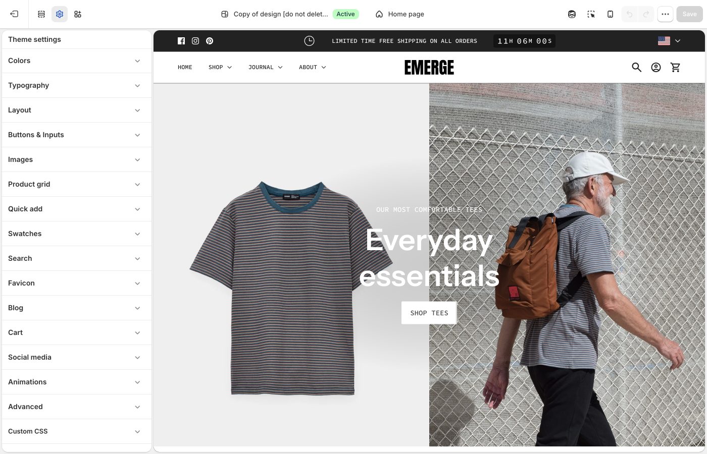
Colors
Storewide palette: three accents, page and text colors, light and dark backgrounds, border opacity, and drop shadows. On each section, Background color, Text color, and Shape color pick from this list. See Colors.
Typography
Heading, navigation, and body fonts; the type size ladder. See Typography.
Layout
Theme settings → Layout sets the Small through Extra large sizes, once under Desktop spacing and once for mobile. On each section, Spacing above and Spacing below dropdowns pick None, Small, Medium, Large, or Extra large. See Spacing and layout.
Reuse the same Spacing above / Spacing below dropdown on adjacent sections: Medium throughout the shop, or Large on a hero and Medium on what follows. Use None when two sections should sit flush. Add a Divider when you need a gap with no content. Keep mobile spacing smaller than desktop, and preview both after you change the scale in Layout.
Buttons & Inputs
Theme settings → Buttons & Inputs defines button styles 1 through 4, input colors, and corner radii storewide. On each section, the Button block picks style 1–4. Button label size is in Typography → Buttons. See Buttons and inputs.
Images
Aspect ratios and corner radius for product, collection, and article images. See Images.
Social media
One place for every platform's icon and link, used by the footer, announcement bar, and other sections. See Social media.
Animations
Four storewide switches to turn off text, image, button hover, or other motion. See Animations.
Product grid
Card labels, hover image, and heading/price type. Text alignment for product cards is set here, not on the collection section. See Product grid.
Cart
Cart type (Page or Drawer), the checkout button style, order notes, and the free shipping progress message. See Cart.
On each section
Open a section in Edit theme, not Theme settings:
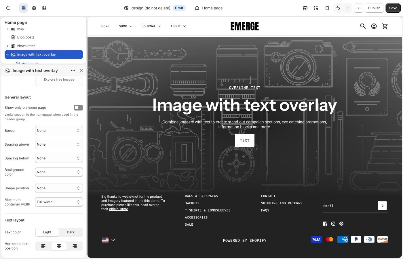
Pick a default Text alignment per template and keep supporting sections on it: left for catalogs and long copy, center for heroes and short announcements, then back to your default. The section's Mobile → Text alignment setting is separate.
Maximum container width is on each section: contained for text-heavy blocks, Full width for slideshows and large photography. A useful rhythm is full-width hero → contained story → full-width collection.
See Alignment and width for more details.
Full-width section shapes with contained copy is a common layout. Set Maximum container width before you pick a shape style. Center short heroes; keep collection pages and long copy left-aligned. If mobile stacks feel long, lower mobile spacing or heading mobile size before you turn the shape off.
- Section shapes: Shape position, Top/Bottom shape style, and Shape color
Sections and templates
Edit theme → Add section, plus menus and page layouts:
Products
Product data lives in Shopify admin. These guides cover how the theme displays it:
- Product grid
- Quick add
- Swatches: Theme settings → Swatches
- Filters (Search & Discovery app)
- Search
Content and store
If something used to work and no longer does, start with Troubleshooting. For what changed recently, see the Emerge release notes.
Want Cafe or Elements instead?
One Emerge purchase includes all three styles. Cafe is a fresh, menu-and-catalog layout; Elements is built for everyday-carry product stories. To switch after install, see What are theme styles?. You do not need to switch to continue this guide. For the exact settings that differ between listings, see the Demo store reference.