Buttons and inputs in Emerge
Buttons work in two steps: In Edit theme → Theme settings → Buttons & Inputs, styles 1 through 4 define how buttons look storewide, including hover colors. On each section, the Button block picks style 1–4. Changing a style in Theme settings updates every button that uses it.
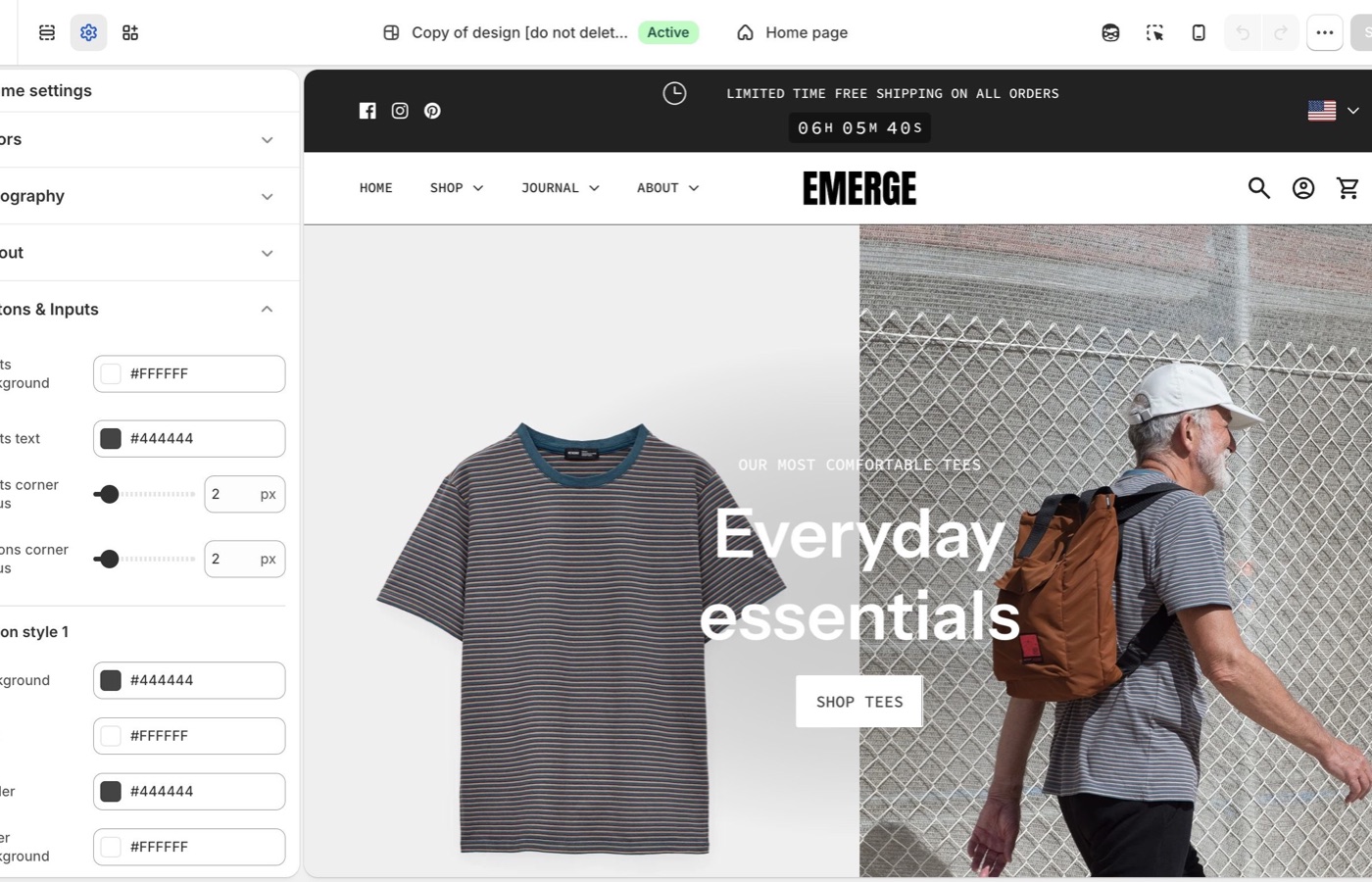
Theme settings → Buttons & Inputs
Four button styles
Each style has Background, Text, Border, Hover background, and Hover text.
- Style 1: primary: solid fill
- Style 2: secondary on light backgrounds
- Style 3: outline on light surfaces
- Style 4: light text and border on dark or image backgrounds
Keep primary actions on style 1. Hover colors should still pass contrast, especially on a colored section shape sitting behind a banner button.
Buttons corner radius: a small radius fits Emerge’s default. Rounder buttons can match a broad wave; square buttons contrast with it.
Inputs
- Inputs corner radius: rounds newsletter fields, contact forms, search, and cart notes
- Inputs background: fill color behind the field
- Inputs text: color of the text customers type
Match input radius to button radius so forms do not look imported.
Buttons on shapes
Preview the hover state on a section that uses a top or bottom shape. If the hover fill matches the shape color, the button disappears into the wave. Change hover, not the whole palette.
On each section
The Button block picks style 1–4 from the set you defined in Buttons & Inputs. Keep primary actions on style 1 storewide. Preview hover on sections with shapes; hover fill can match the shape color.
Ask Sidekick 
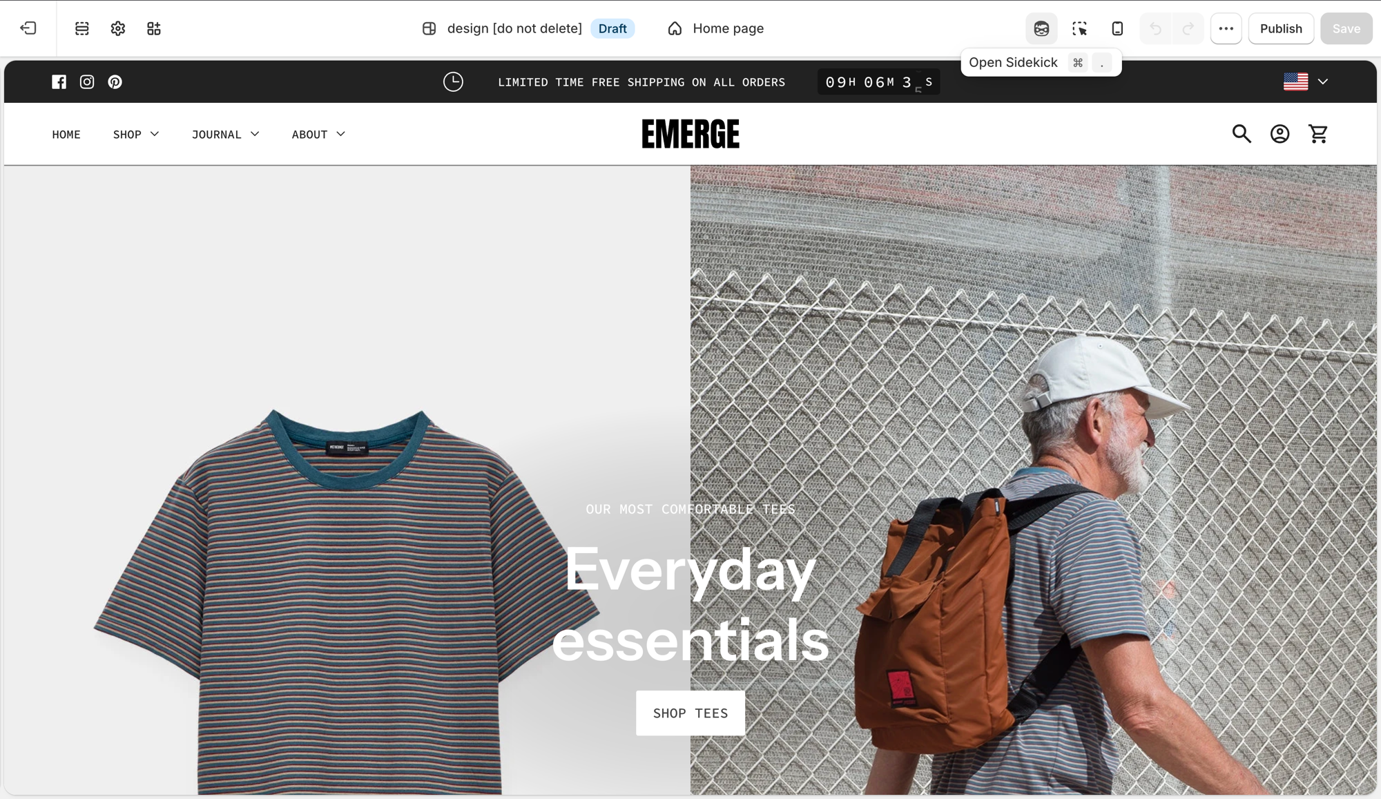
Open Sidekick from the theme editor toolbar (top right, next to the device preview icon), or press ⌘. (Ctrl+. on Windows). Ask it to suggest a button style.
"Suggest Background, Text, Border, Hover background, and Hover text values for Style 1 (primary) and Style 3 (outline) that fit a laid-back, cafe-style brand."
It'll reason through contrast and hierarchy with you before you touch Theme settings → Buttons & Inputs. Useful when you have four button styles to fill in and aren't sure how to differentiate them.
Troubleshooting
- Hover removes button contrast: hover fill matches the shape color or the section background. Change Hover background, not Colors.
- Add to cart didn’t change: confirm Buttons & Inputs and style 1 on the product form.
- Checkout is unchanged: Shopify checkout, not the theme.