Images in Emerge
Edit theme → Theme settings → Images.
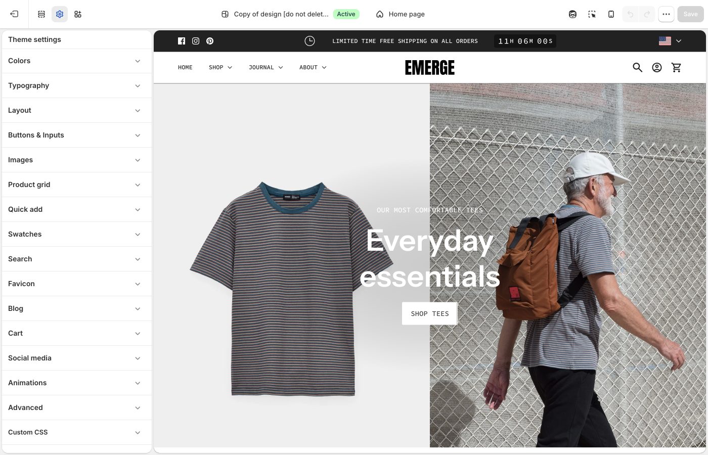
Crops for product, collection, and article images.
Corner radius is storewide. Besides photos, it rounds embedded videos, text blocks with a background color, the newsletter popup, and sections with Outer background off.
Crops and radius
- Corner radius: rounds product and content images, embedded videos, text blocks with a background color, the newsletter popup, and inset sections (Outer background off). Not applied to full-width section images.
- Product image size: Natural, Square (1:1), Landscape (4:3), Portrait (4:5), Portrait (2:3)
- Collection image size: collection lists and thumbnails
- Article image size: blog cards
Natural keeps mixed photos honest. A fixed ratio makes Cafe- and Elements-style grids look catalogued. Export sizes: What image sizes should I use?.
Ask Sidekick 
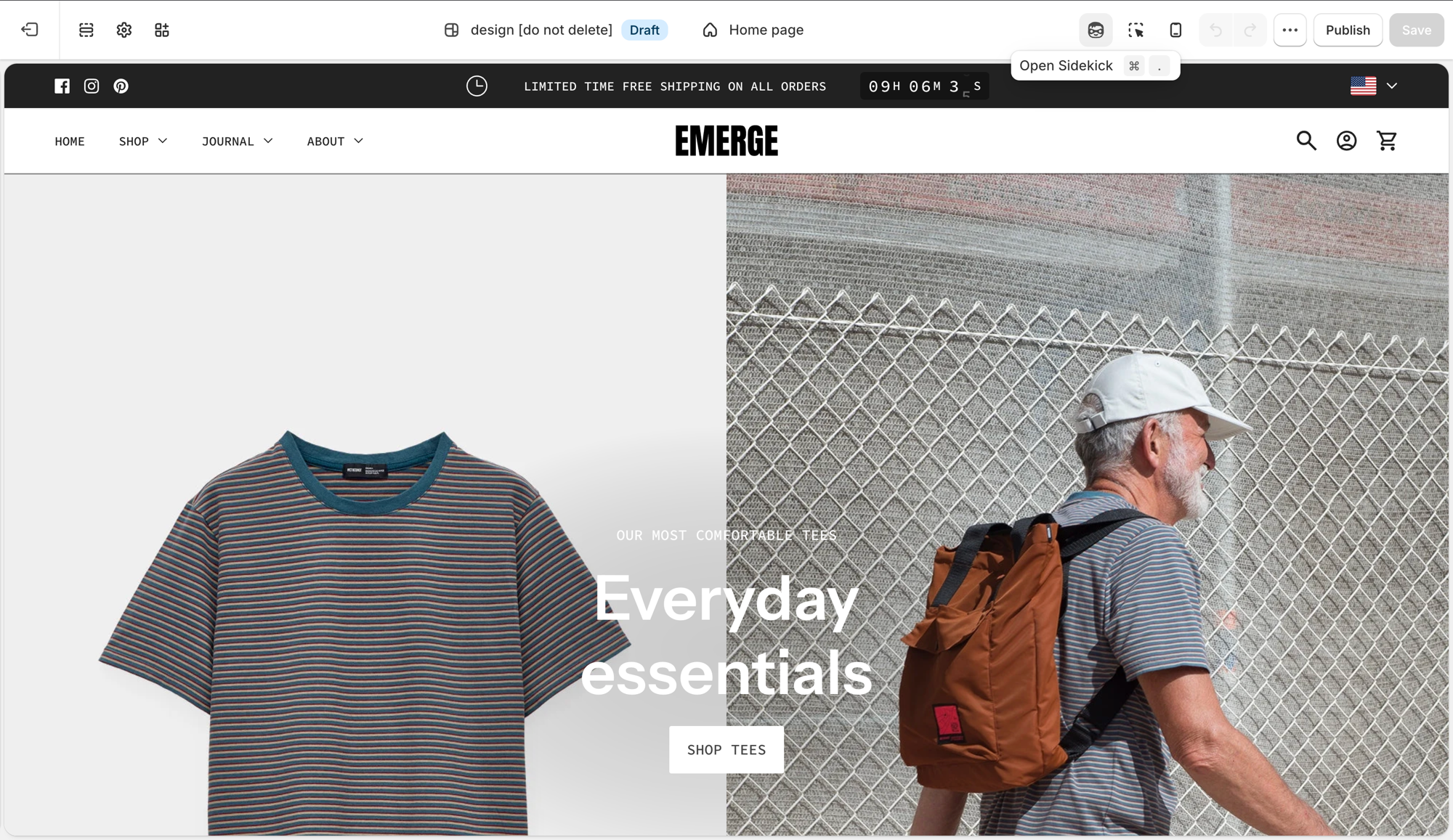
Open Sidekick from the theme editor toolbar (top right, next to the device preview icon), or press ⌘. (Ctrl+. on Windows). Unsure whether Natural, Square, or Portrait crops will suit your product photography, or how consistent your existing photos actually are, describe your catalog.
"My product photos are a mix of studio shots and lifestyle images, what Product image size should I use for the grid?"
It can help you reason through the trade-off before you commit the whole store to one crop, and point you to Shopify's image size guidance if you're about to reshoot.
Troubleshooting
- Images look cropped: Product image size, not a broken file. Switch to Natural or shoot for the ratio.
- Corner radius ignored on a hero: full-width section images are excluded on purpose.