Brand and story sections in Beyond
Edit theme → Add section → Brand statement, About us, or Text menu.
Long-form story sections, not a replacement for the shop or header menu.
Brand statement
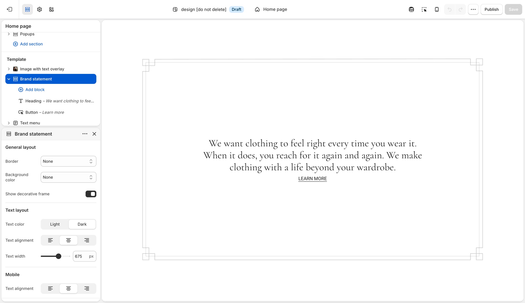
A focused block for a short manifesto: overline, heading, description, optional button or icon.
Do not use this for a photo beside copy, use About us or Image with text.
Useful settings:
- Show decorative frame: a frame around the statement
- Text alignment and Text width: keep the line length short
- Mobile → Text alignment
This is the “one idea” section.
About us
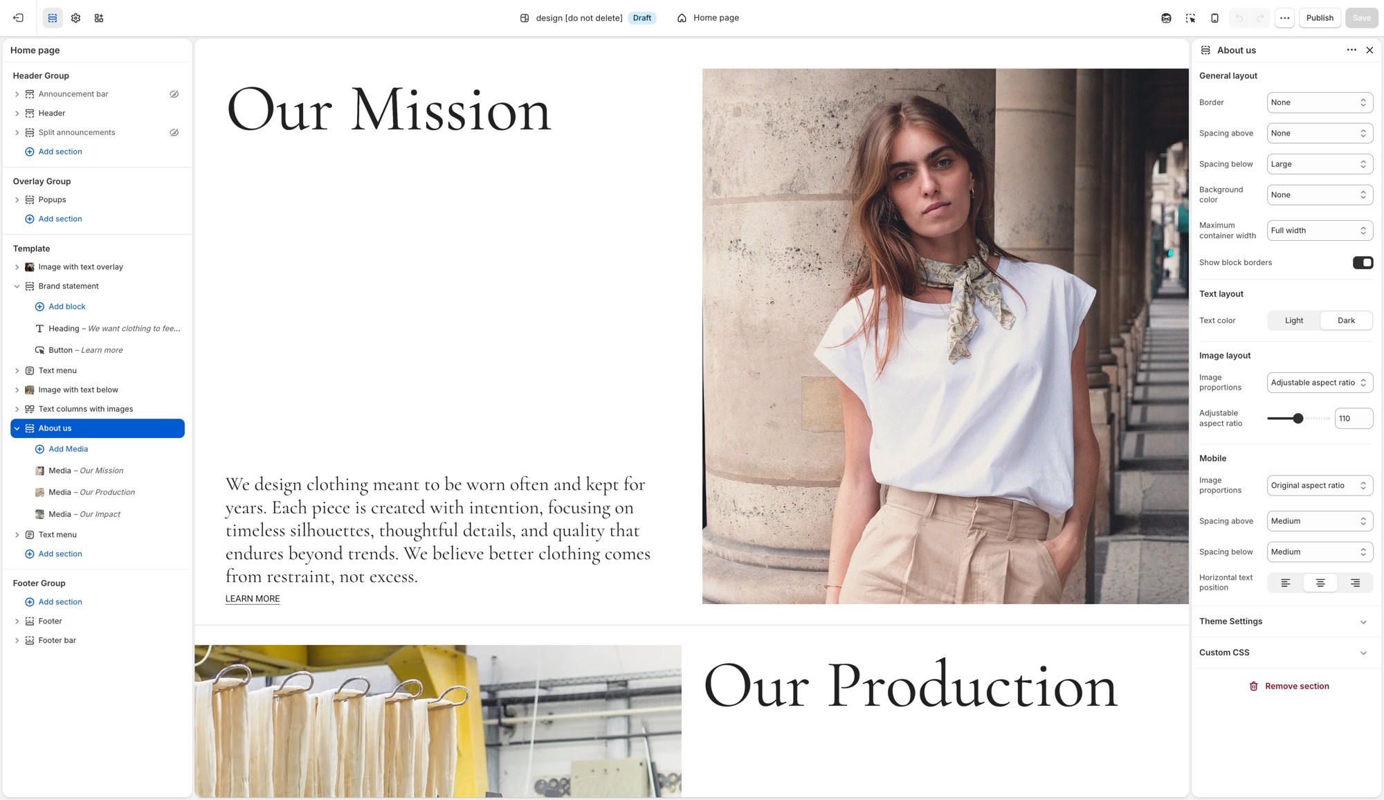
A repeating Media block: image or video with heading, description, and optional button. It is the biography or studio row.
Do not use this as a product grid or as a long FAQ.
Useful settings:
- Show block borders: lines between media blocks
- Maximum container width, spacing, background, text color
- Image display type and aspect ratio (desktop and mobile)
Use two or three blocks, not a dozen. Each block should be one chapter (the studio, the material, the founder).
Text menu
A list of text items, contents, values, services, or a word-led nav that is not the header.
Do not use this as a replacement for navigation. Links in the header still come from Content → Menus.
Useful settings:
- Show block borders
- Block spacing: Small or Large between items
- Horizontal text alignment (desktop and mobile)
Use it when the words are the design (a list of principles, a table of contents for a long About page).
How they sit on a homepage
A clear Beyond/Fleur rhythm:
- Hero or slideshow
- Brand statement (Extra large spacing, contained width)
- Featured collection
- About us (one or two media blocks)
- Text menu or another collection
Do not stack Brand statement, About us, and Text menu with no products. The story sections should support the shop, not replace it.
The full list of sections you can add is in Sections in Beyond.
Same type roles
Headings in these sections use the global type ladder. If Brand statement looks huge, lower Featured heading or Section heading in Typography, not the section’s padding.
Ask Sidekick 
On sections that support it, Add block also includes a Generate option, powered by Shopify's Sidekick. Describe the block in plain language and it writes the Liquid, HTML, and settings for you, previewed in the theme editor before you keep it.
"Add a block with an icon, a short heading, and a line of text for a shipping promise."
It's genuinely useful for a one-off block a Troop section doesn't already offer, rather than paying a developer for something small. Review what it generates, ask it to refine, or discard it, the usual editing risks still apply (see Troubleshooting below). Shopify's guide to generating theme blocks covers eligibility and limits.

Troubleshooting
- Text menu didn’t change the header: it is not the header. Edit Content → Menus, then assign that menu in the Header section.
- Brand statement has too much text: narrow Maximum container width / Text width, and keep one short idea.
- About us has ten blocks: split into two sections or cut to two or three chapters. More blocks read as a blog, not a studio row.
- No products on the homepage: add a Featured collection between story sections.