Alignment and width in Beyond
Open a section in Edit theme, not Theme settings.
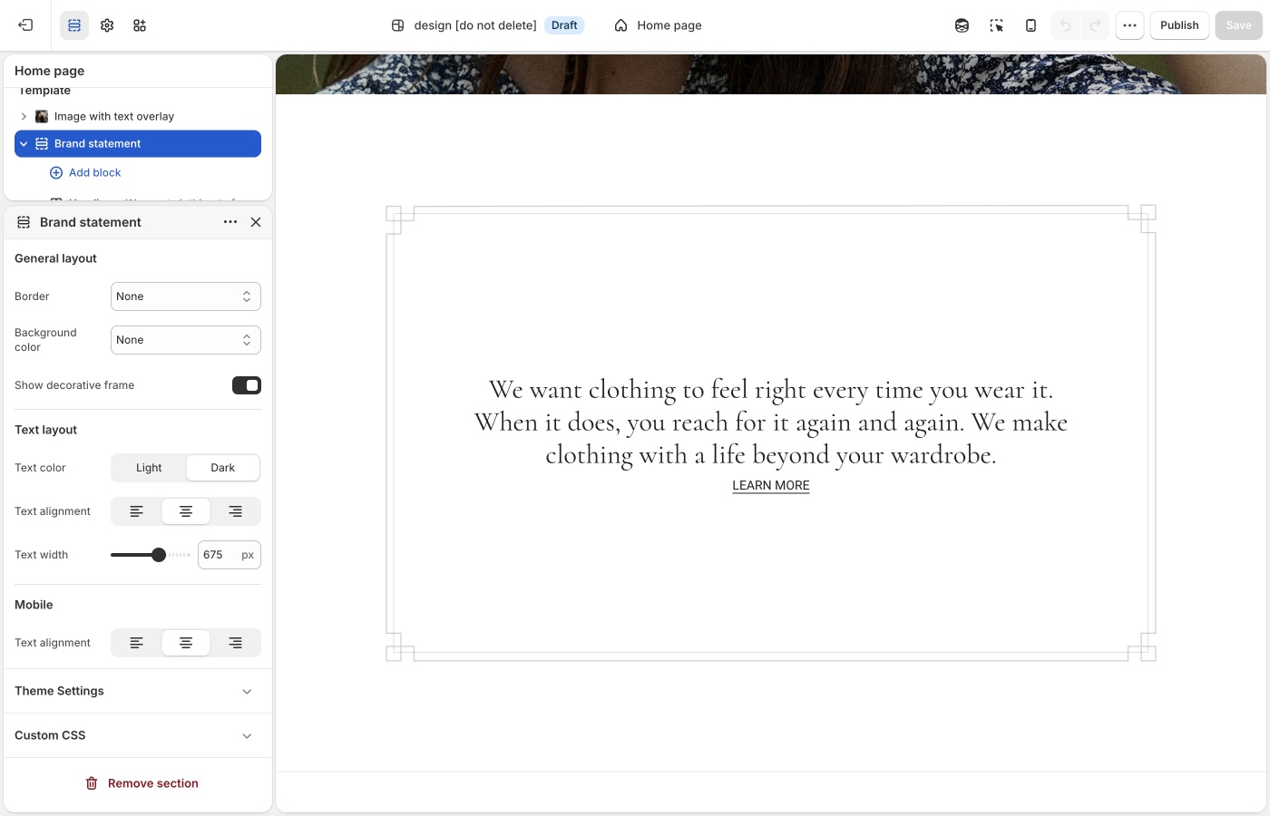
Pick a default Text alignment per template and keep supporting sections on it: left for catalogs and long copy, center for heroes and short announcements, then back to your default. The section's Mobile → Text alignment setting is separate.
Maximum container width is on each section: contained for text-heavy blocks, Full width for slideshows and large photography. A useful rhythm is full-width hero → contained story → full-width collection.
Text alignment
Brand statement and short manifesto lines usually center. About us rows and product grids usually left. Text menu can go either way; left matches a contents-like list, center matches a poster of words.
Product card alignment is global in Theme settings → Product grid. Keep it with the collection template, not with a centered homepage statement.
Maximum container width
Extra small through Full width.
Brand statement often looks right at a narrow max width so a sentence stays a sentence. About us can go wider to hold media beside copy. Full width is for photography and collections.
If Brand statement is full width and the heading is a long paragraph, lines become hard to read. Prefer a contained width for copy-only story sections.
Mobile
Center Brand statement on mobile even when a neighboring About us row is left-aligned on desktop. Check the preview so a left-aligned text menu does not look ragged on a narrow screen.
Width is part of the voice
Fleur-style pages often go narrower on words and wider on images. Beyond-style pages can do the reverse. Stay consistent inside one template.
Product grid
Text alignment for product cards is in Theme settings → Product grid, not the collection section.
Ask Sidekick 
Open Sidekick from the theme editor toolbar (top right, next to the device preview icon), or press ⌘. (Ctrl+. on Windows). Alignment and width choices are easy to second-guess in isolation, ask it how a layout choice reads.
"Should my Brand statement text be centered or left-aligned, and what Maximum container width keeps a short manifesto line reading like a sentence?"
It'll reason through the trade-off with you rather than you flipping the setting back and forth to compare.

Troubleshooting
- Brand statement is a long full-width paragraph: set Maximum container width down (Extra small through Medium) and keep Text alignment centered.
- Product cards centered like the manifesto: change Product grid text alignment, not the homepage section.
- Text menu looks ragged on a phone: set Mobile → Text alignment to center, or shorten the lines.