Spacing and layout in Beyond
Spacing works in two steps: In Edit theme → Theme settings → Layout, the desktop and mobile spacing sizes define what Small through Extra large mean storewide. On each section, Spacing above and Spacing below pick from that scale: None, Small, Medium, Large, or Extra large. Changing a size in Layout updates every section that uses it.
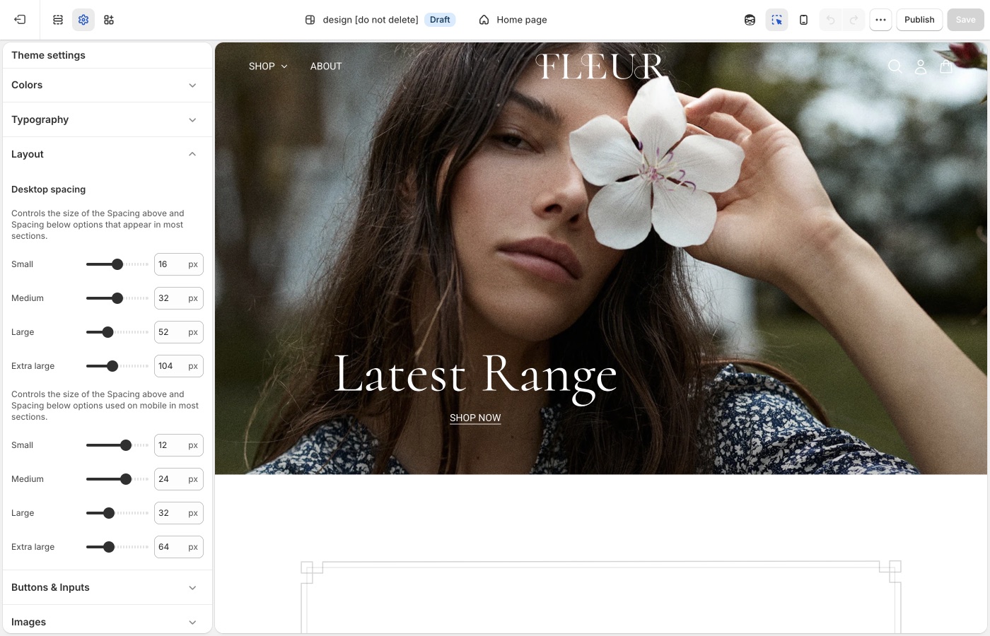
Theme settings → Layout
Small through Extra large
The desktop and mobile spacing sizes each set Small, Medium, Large, and Extra large. In Theme settings → Layout, the first group of sizes is under Desktop spacing. The second group, described as the sizes used on mobile, is the mobile scale. Those settings are what the Spacing above and Spacing below dropdowns use on most sections.
Beyond’s Extra large is for Brand statement, About us, and other pauses. Collection grids and footers usually sit on Medium or Large. A homepage of only Extra large resembles a lookbook with no shop.
Desktop and mobile
Keep mobile Extra large smaller than desktop. Story pages scroll long on a phone; stacked Extra large gaps add up.
Reuse the same Spacing above / Spacing below dropdown on adjacent sections: Medium throughout the shop, or Large on a hero and Medium on what follows. Use None when two sections should sit flush. Add a Divider when you need a gap with no content. Keep mobile spacing smaller than desktop, and preview both after you change the scale in Layout.
Extra large on Brand statement and About us; Medium or Large on collections and the footer.
On each section
Choose None through Extra large from the section dropdowns. Use None between a hero and a brand statement that should read as one moment. Use a Divider when you need a gap with no story content.
Story, then shop
A useful homepage rhythm: Extra large around Brand statement and About us, Large or Medium around featured collections. The scale in Layout stays the same; only each section’s choice changes.
Ask Sidekick 
Open Sidekick from the theme editor toolbar (top right, next to the device preview icon), or press ⌘. (Ctrl+. on Windows). If your pages feel cramped or overly loose and you can't tell which setting is responsible, describe the problem.
"My Brand statement and About us sections feel too tight on mobile, what desktop and mobile spacing values should I use for Small through Extra large?"
It can point you toward the relevant spacing settings and suggest values, rather than you adjusting sliders section by section to find the right combination.

Troubleshooting
- The homepage feels empty: too many sections are Extra large. Keep Extra large on Brand statement and About us; Medium or Large on collections.
- One section didn't move: change Spacing above / Spacing below on that section.
- Mobile story pages never end: lower the mobile Extra large size in Layout.