Images in Beyond
Edit theme → Theme settings → Images.
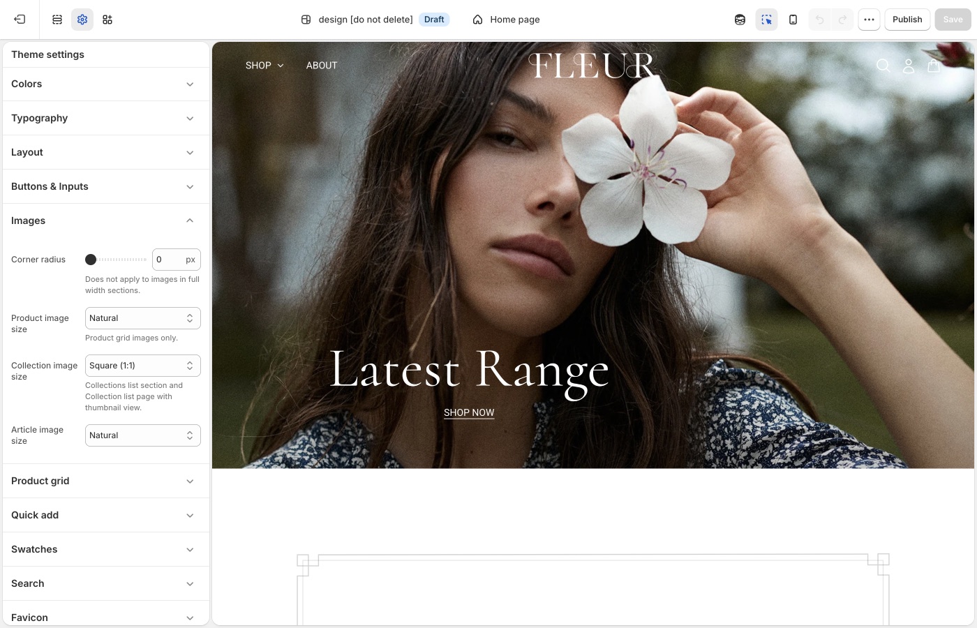
Crops for product, collection, and article images.
Corner radius is storewide. Besides photos, it rounds embedded videos, text blocks with a background color, the newsletter popup, and sections with Outer background off.
Crops and radius
- Corner radius: rounds product and content images, embedded videos, text blocks with a background color, the newsletter popup, and inset sections (Outer background off). Not applied to full-width section images.
- Product image size: Natural, Square (1:1), Landscape (4:3), Portrait (4:5), Portrait (2:3)
- Collection image size: collection lists and thumbnails
- Article image size: blog cards
About us uses its own aspect ratio on the section. Product grid crop is the Images setting above. Export sizes: What image sizes should I use?.
Two photo languages
Lifestyle frames in About us can be messy and human. Product grid shots should still share a ratio and background so the shoppable part of the site feels reliable.
Ask Sidekick 
Open Sidekick from the theme editor toolbar (top right, next to the device preview icon), or press ⌘. (Ctrl+. on Windows). Unsure whether Natural, Square, or Portrait crops will suit your product photography, or how consistent your existing photos actually are, describe your catalog.
"My product photos are a mix of studio shots and lifestyle images, what Product image size should I use for the grid?"
It can help you reason through the trade-off before you commit the whole store to one crop, and point you to Shopify's image size guidance if you're about to reshoot.

Troubleshooting
- Product cards look cropped, About us does not: they use different controls. Grid crop is Images → Product image size. About us ratio is on that section.
- Corner radius ignored on a hero: full-width section images are excluded on purpose.