Designing with image sections in Blockshop
Edit theme → Add section → pick an image section. Don't pick one just because the name sounds close: Image with text, Image with text overlay, and Slideshow each do a different job.
For the full catalog (including product, FAQ, and utility sections), open the section list.
Slideshow
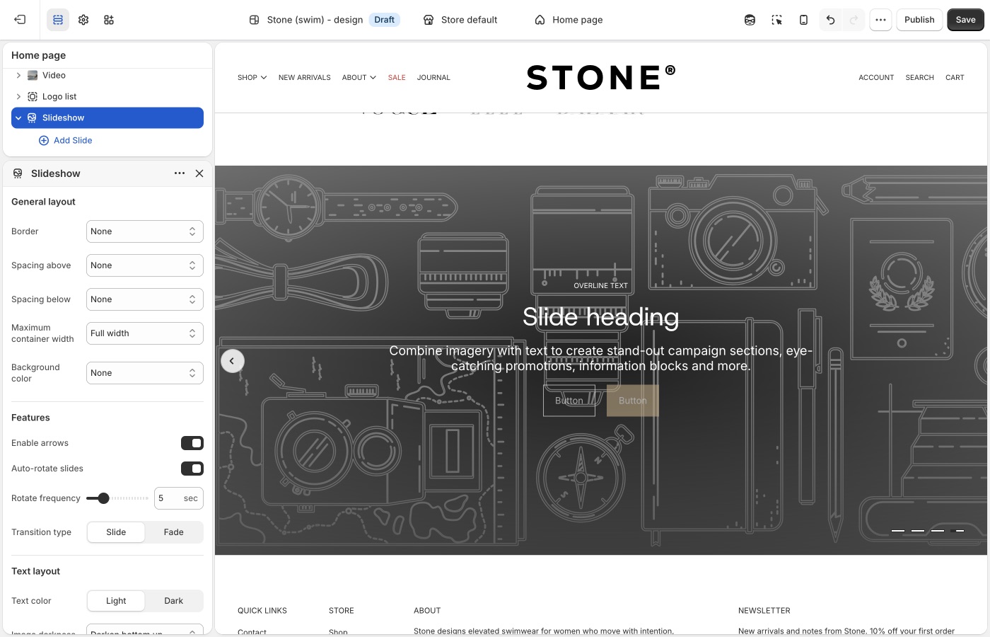
Use the Slideshow section when you want to rotate multiple messages, products, or promotions in a single section.
It is mobile-friendly by default, so customers can swipe through slides on touch devices, while desktop visitors can use drag controls or autoplay.
Each slide can display a single image or video, or two media items side by side. To display multiple media items, set Media 2 type to image or video. To display a single media item, set Media 2 type to none.
Legacy Slideshow
Please see the legacy slideshow features below for versions below 13.1.0.
Use Blocks per slide for desktop to control how many slides appear at once (1 to 4). A value of 1 creates a standard full-width slider, while higher values create a multi-card layout for collections, promotions, or featured content.
For saving images for your slides, read more about image sizes in our What image sizes should I use?.
Image with text overlay
Use the Image with text overlay section when you want to place text and calls to action directly on top of a single image.
This section works well for hero banners, campaign announcements, and brand storytelling where one strong image needs supporting copy. The image can be configured with different widths and aspect ratios to suit your layout:
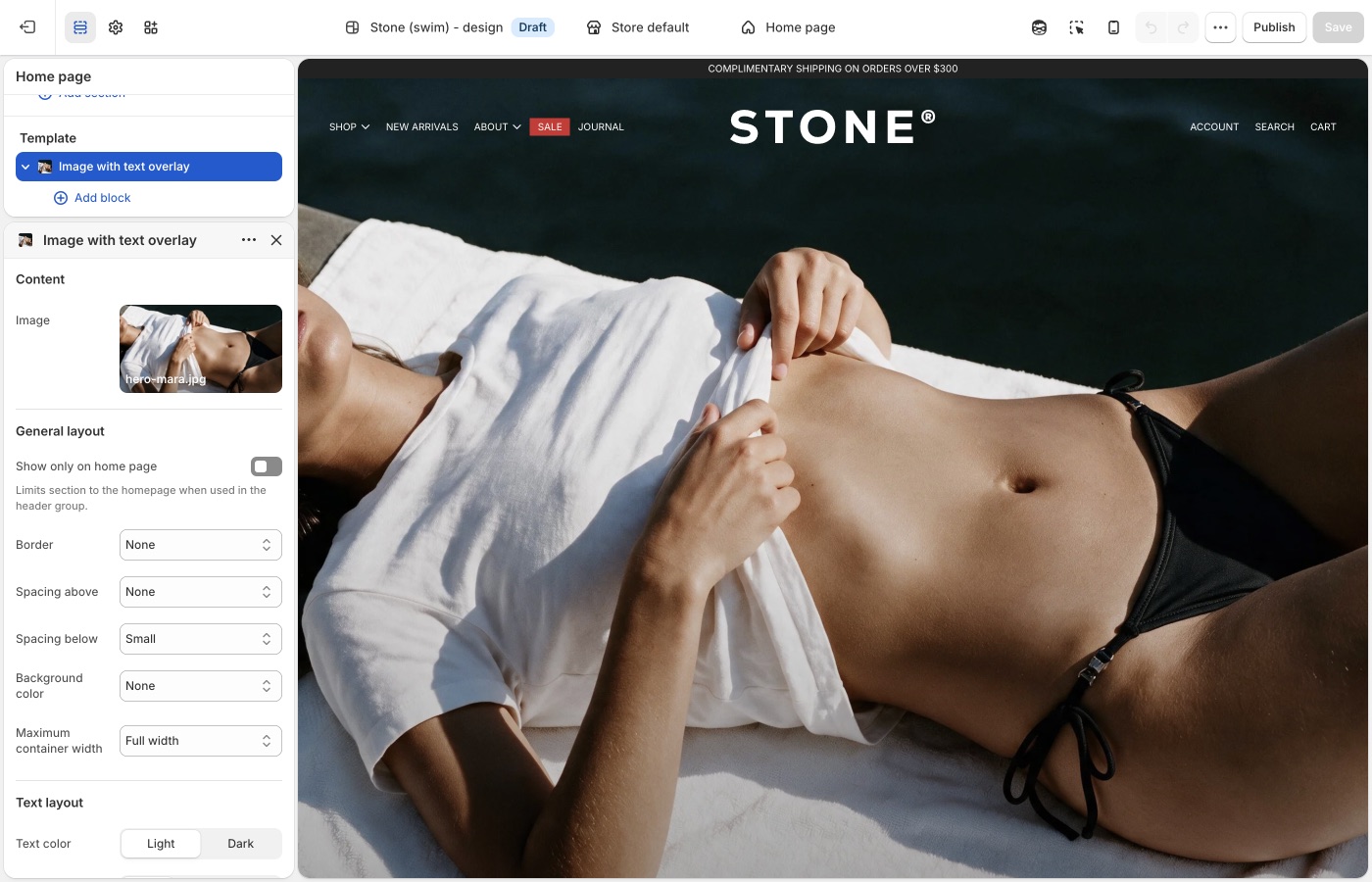
You build the text and calls to action with blocks (headings, descriptions, buttons, and more). For a general overview of blocks and what to expect in the theme editor, see Blocks in image sections.
Use this section when your goal is to combine one image and one message in a single, high-impact banner that can be reused across key storefront pages.
Version availability
Image with text overlay is available in Blockshop versions 12.1.0 and up.
Image with text
Use the Image with text section when you want to pair an image with supporting content in a split layout.
This section works well for featured collections, product storytelling, and campaign moments where the visual and copy should sit side by side instead of stacking in a single banner.
The image can be configured to control presentation across desktop and mobile, and the layout can be reversed to place the image on either side. You can also use the overlap setting to adjust how text sits against the image:
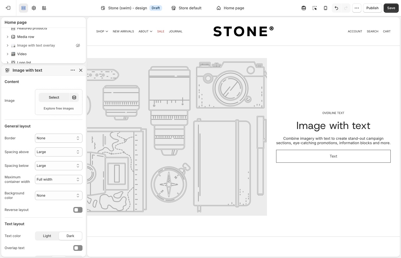
The copy beside the image is built with blocks, which you add and reorder in the section (for example headings, descriptions, and buttons). See Blocks in image sections for a general overview. Use the block list in the theme editor to see what this section includes.
Use this section when your goal is to combine one image and one message in a balanced, side-by-side layout that can be reused across key storefront pages.
Legacy Image with text
Please see the legacy image with text features below for versions below 12.1.0.
The Image with text section allows you to display images in various ratios , full width, three quarter or half width - to establish balance and visual rhythm in your page design.
Parallax scrolling can be enabled for images in this section to add action and depth. Parallax scrolling effects create movement and the illusion of depth by scrolling background elements at a slower pace than foreground elements. For best results, set the text position setting to center.
Featured images
Use the Featured images section when you want to present two visuals together with one shared message and call to action.
This section works well for campaign storytelling, category spotlights, or any moment where two complementary images create stronger impact than one alone.
Each image can be configured for desktop and mobile display, and mobile layout can be adjusted to show one image, stack both, or place them side by side.
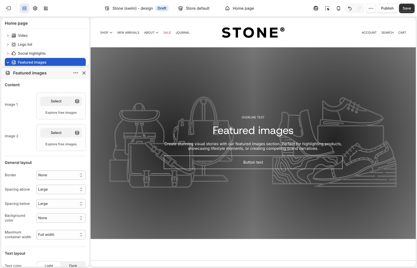
The shared message and call to action are built with blocks for text and related content. See Blocks in image sections for a general overview. Add blocks in the theme editor to see what this section offers.
Use this section when your goal is to tell one clear story across two images in a single, high-impact layout that can be reused across key storefront pages.
Version compatibility
Featured images is available in Blockshop versions 11.1.0 and up.
Grid with overlay
This section allows you to display content in simple fixed-aspect ratio grids, justified grids, or more freeform offset grids.
Configure individual block settings to specify how blocks fall within the grid and section settings to style text overlays to optimize readability.
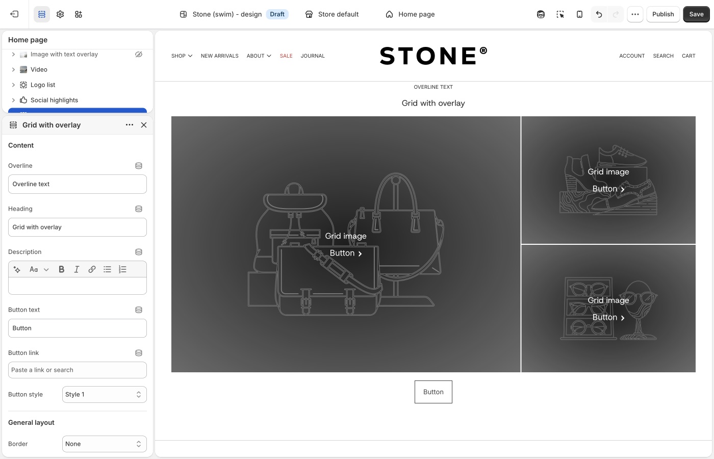
The preserve image aspect ratio block setting will display images at the ratio they're uploaded at, rather than justifying them into the grid. This will allow you to create more free-form, off-set grids with varying image heights.
Text columns with images
This flexible sections allows you to display a combination of image an text elements for a wide variety of uses.
Row of icons
If you want a horizontal row of icons (for example trust marks, shipping icons, or simple pictograms with optional short text), add the Icons row section instead of building that layout in Text columns with images. Icons row is available in Blockshop versions 10.2.0 and up.
Image comparison
Use the Image comparison section when you want customers to interactively compare two visuals in the same frame (for example before/after edits, product variants, material finishes, or renovation stages).
This section is ideal when one image alone cannot communicate the difference clearly. Shoppers can drag the comparison handle to reveal more or less of each image, which makes visual changes easier to understand at a glance.
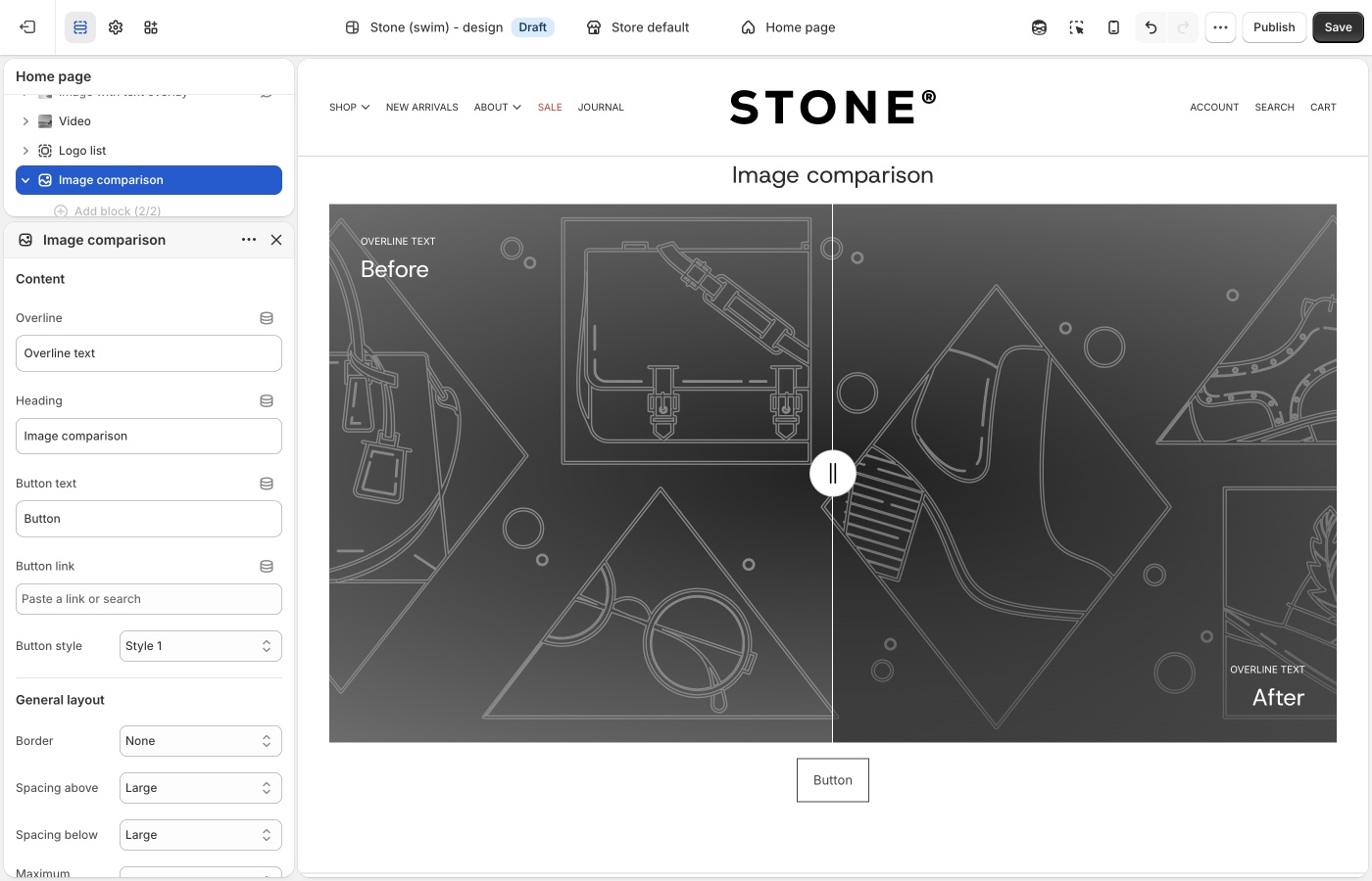
Add one Before block and one After block, then upload an image for each. You can optionally add mobile-specific images per block to improve cropping and composition on smaller screens.
Use this section when your goal is to show change, contrast, or improvement in a way that invites interaction instead of relying on static side-by-side images.
Version availability
Image comparison is available in Blockshop versions 9.2.0 and up.
Shop the banner
Use the Shop the banner section when you want to place clickable product dots on a single image and let customers jump straight from inspiration to product discovery.
This section works well for hero-style campaign visuals where one scene contains multiple products (for example a styled room, outfit, or collection shot). Add product dots to highlight items in context without breaking the visual flow.
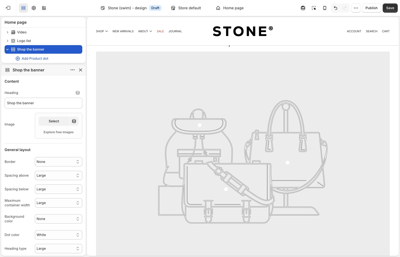
Set your main banner image, then add Product dot blocks and assign a product to each one. You can control dot placement separately for desktop and mobile, so hotspots stay accurate across screen sizes.
Use this section when your goal is to turn one strong branded image into an interactive shopping surface with minimal on-image text.
Version availability
Shop the banner is available in Blockshop versions 11.0.0 and up.
Shop the look
Use the Shop the look section when you want a guided, editorial shopping experience built around one curated image plus an optional call to action.
Like Shop the banner, this section supports product hotspots, but it also includes heading and button settings so you can frame the visual with a stronger campaign message.
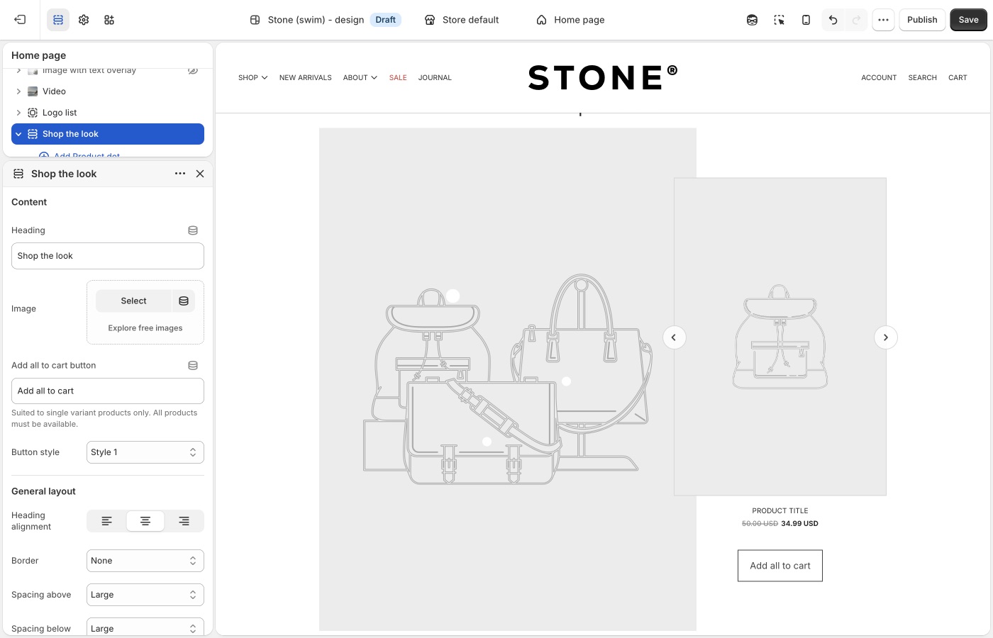
Add your image, create Product dot blocks, and position each hotspot for desktop and mobile. Use the heading alignment, container width, and hotspot style settings to match the section to the rest of your page design.
Use this section when your goal is to combine storytelling and conversion in one curated “look” module.
Version availability
Shop the look is available in Blockshop versions 9.2.0 and up.
Scrolling text on image
Use the Scrolling text on image section when you want animated headline-style text moving across an image background.
This section is ideal for brand statements, promotional phrases, or directional messaging that should feel dynamic and high-energy. You can add multiple text blocks, control scroll direction and speed, set spacing between phrases, and pause movement on hover.
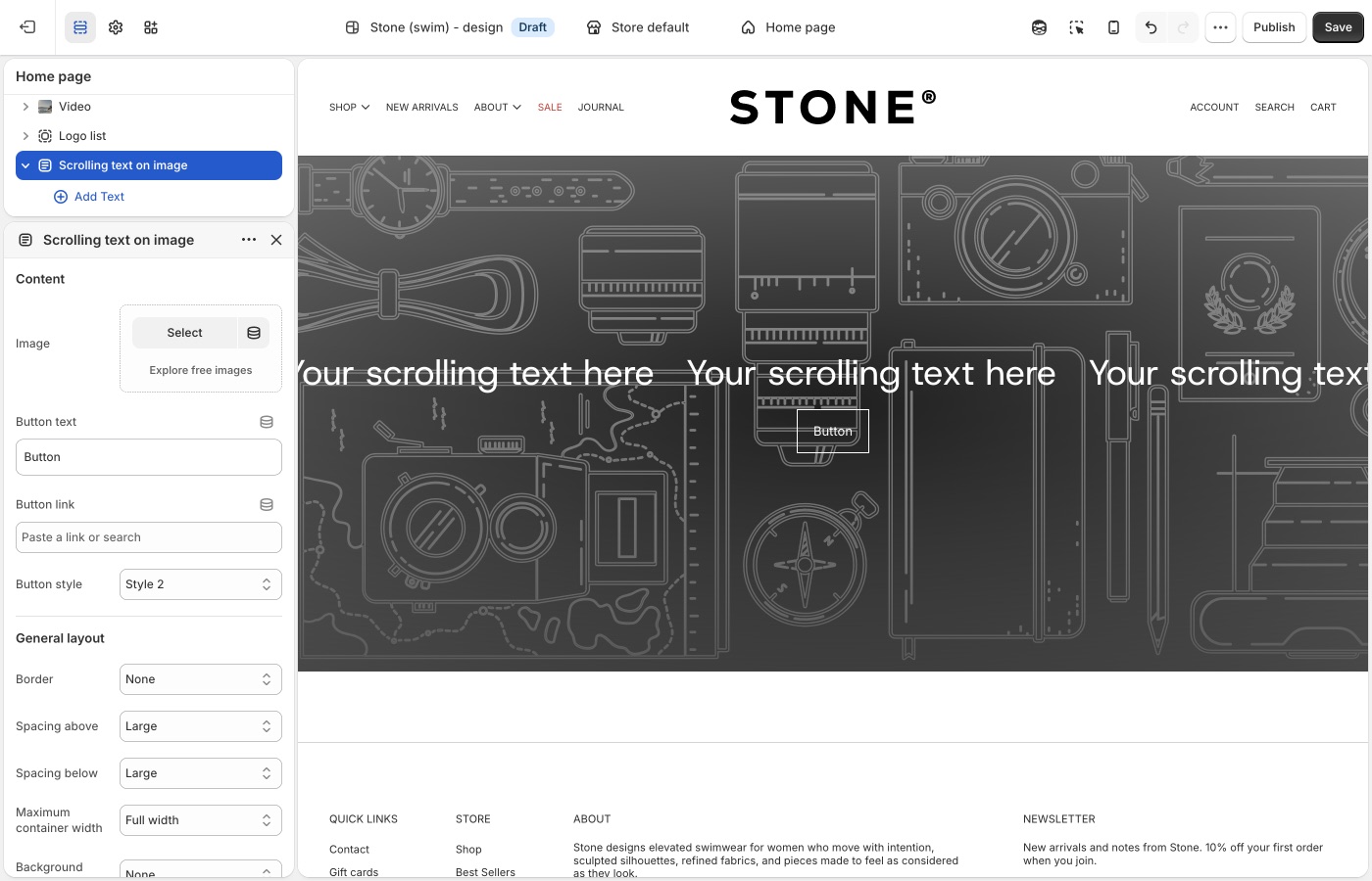
You can also choose whether text should span the full width and configure mobile-specific media to keep composition readable on smaller screens.
Use this section when your goal is to create motion-driven campaign messaging without building a full slideshow.
Version availability
Scrolling text on image is available in Blockshop versions 10.4.0 and up.
Media with highlight
Use the Media with highlight section when you want one primary feature area paired with a grid of supporting media items.
This section works well for launch pages, collection storytelling, and content-first merchandising where you need a lead narrative plus multiple secondary visuals. The main highlight area supports heading and rich text, while blocks can include images or video with optional titles.
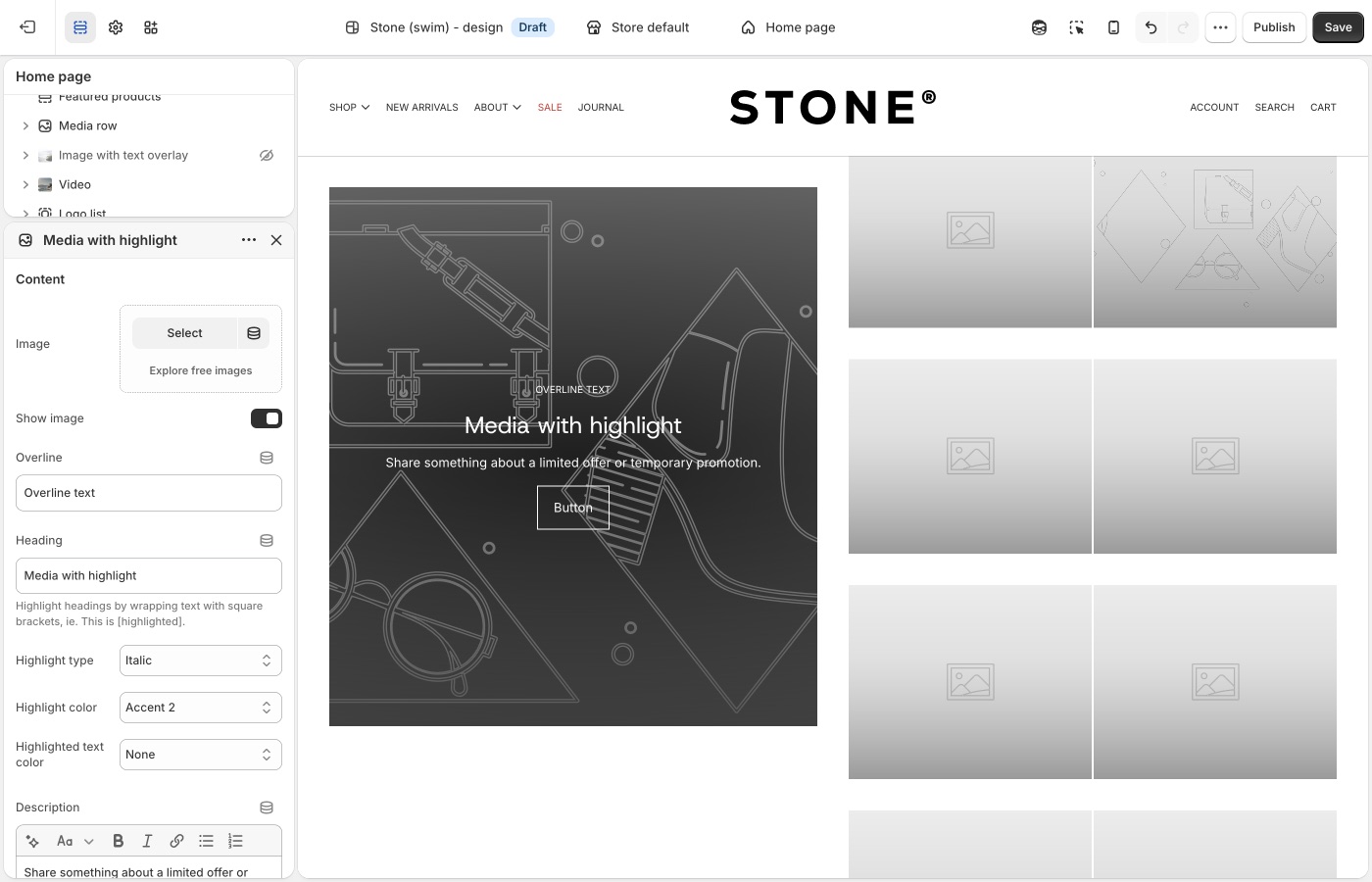
Control layout with blocks-per-row, vertical alignment, reverse layout, and display/aspect settings for both desktop and mobile. Overlay style and text options help maintain readability over busy imagery.
Use this section when your goal is to blend editorial storytelling and media-rich browsing in a single modular section.
Version availability
Media with highlight is available in Blockshop versions 11.0.0 and up.
Media overlay columns
Use the Media overlay columns section when you want a clean column layout where each media tile can carry overlaid text and optional links.
This section is useful for category callouts, campaign modules, or mixed media presentations where each column acts like a mini story card. Blocks can be image or video, with per-block overline, heading, and description content.
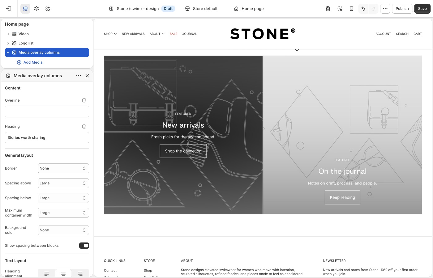
You can adjust spacing, aspect ratio, and text styling to control visual rhythm and readability across the grid.
Use this section when your goal is to present multiple media-driven messages side by side in a structured, scannable layout.
Version availability
Media overlay columns is available in Blockshop versions 13.1.0 and up.
Media row
Use the Media row section when you want up to three images or videos in a single row, with a shared height.
This is for a short, even band of media, lookbook stills, campaign stills, or mixed image/video, not a many-tile grid (Grid with overlay) and not a two-image story (Featured images). Add Image or Video blocks (maximum three). Media height sets the crop (Natural, Square, Landscape, or Portrait). Overlay heading and button are optional on each block.
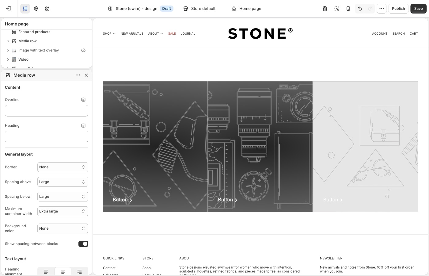
On mobile, choose whether the row stays a grid or stacks, and whether blocks go full width.
Use this section when the job is a simple 1–3 media strip with optional overlay text.
Version availability
Media row is available in Blockshop versions 13.3.0 and up.
Social highlights
Use the Social highlights section when lifestyle photos should send customers to Instagram or another social channel.
Each block is an image plus a platform icon, link text, and button style. Leave the block Link blank to use the matching URL from Theme settings → Social media. Desktop is a multi-column grid (2–4 blocks per row). On mobile, one image shows per slide.
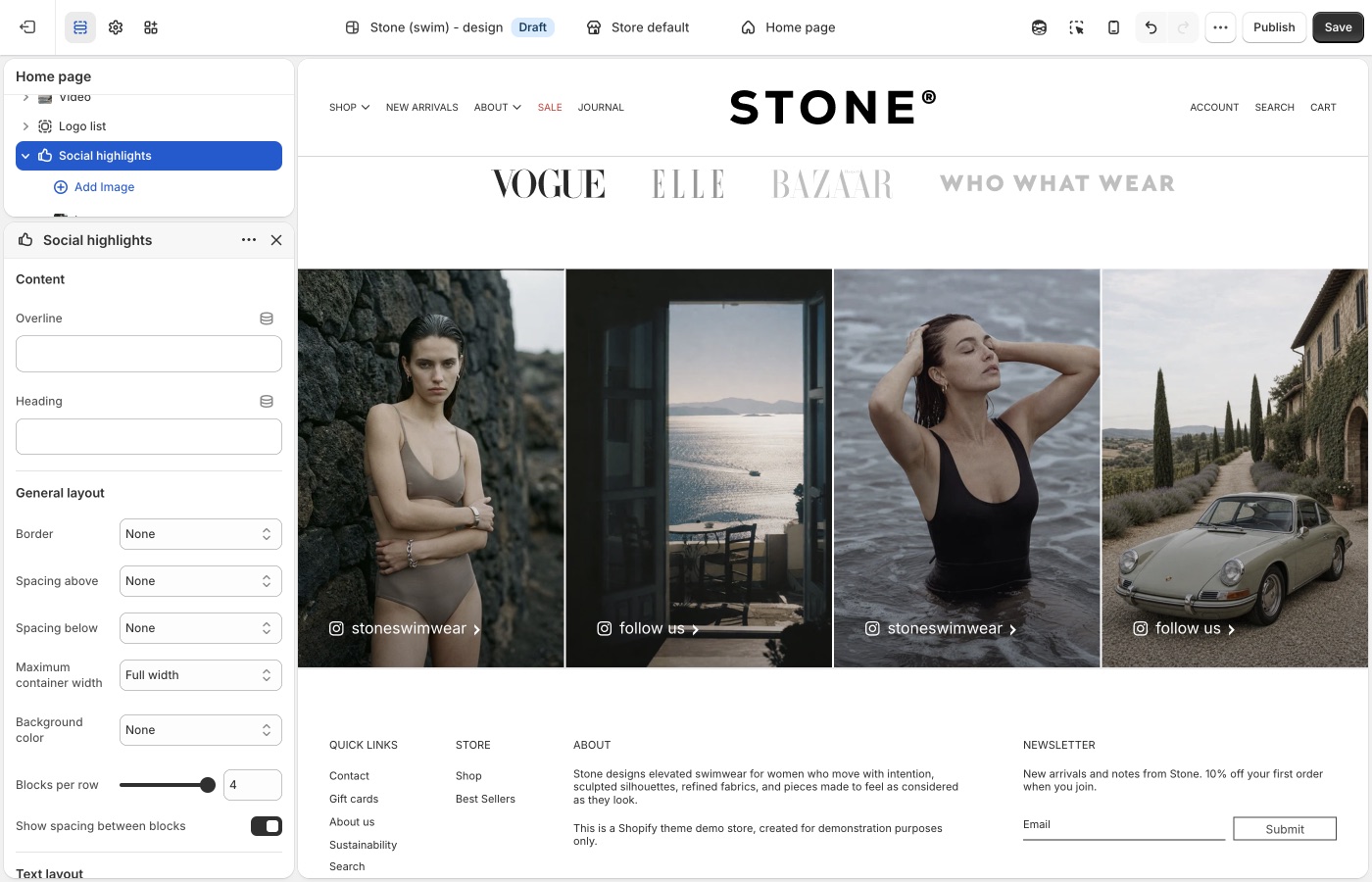
Do not use this for a general image grid (Grid with overlay) or a logo strip (Logo list).
Use this section when the job is a curated social grid, not a product collection.
Version availability
Social highlights is available in Blockshop versions 13.3.0 and up.
Overlapping media
Use the Overlapping media section when you want to layer two media items to create depth and a more art-directed visual composition.
This section works well for brand storytelling, product detail narratives, and campaign moments where a standard side-by-side layout would appear flat. Each media block can be image or video, and you can control overlap amount, animation behavior, and layout direction.
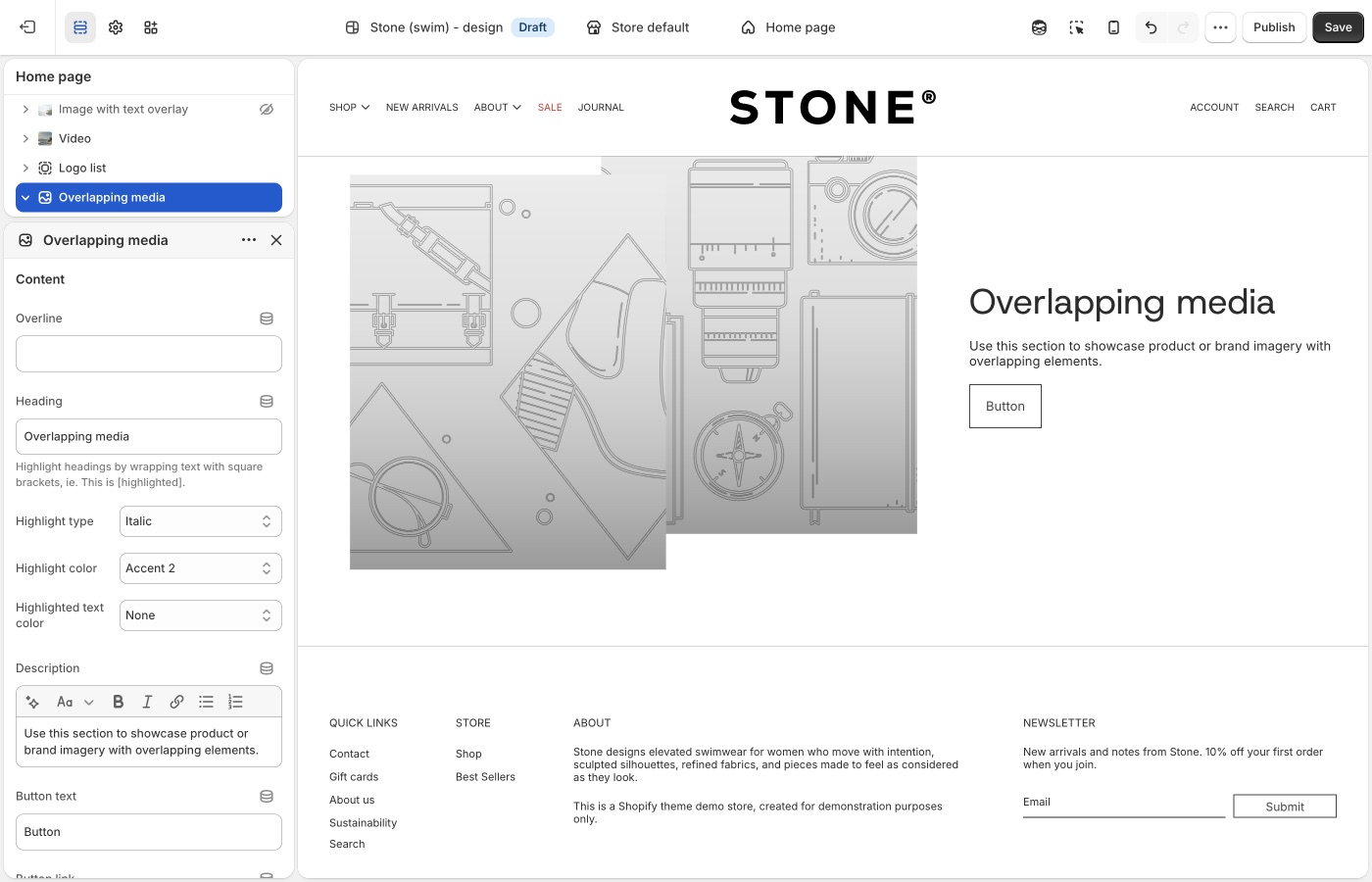
Text settings (heading style, alignment, description, and column width) let you pair the layered media with supporting copy while keeping balance between content and visuals.
Use this section when your goal is to create a premium, editorial look with intentional layering and motion.
Version availability
Overlapping media is available in Blockshop versions 11.0.0 and up.
Blocks in image sections
A section is one area of a page template (for example a hero or image band). Blocks are the pieces inside that section. In other parts of a theme, blocks can be all sorts of things, this guide focuses on image sections, where blocks are mostly for copy: overlines, headings, descriptions, buttons, and similar, paired with the image. The image itself is set in the section (or slide) settings, not as “body text.”
Reorder blocks in the left-hand section list to change the order of that copy on the page. Drag a block up or down to match the story you want (for example, overline, then heading, then button).
Shopify explains the overall model in sections and blocks in the theme editor. For a given section, only the block types in Add block apply; that list changes by section and theme version, so use another image section (or a newer version) if something is missing.
Common copy-related block types often include:
- Overline
- Heading
- Description
- Button
- Icons
- Custom Liquid
Troubleshooting
- You added Slideshow but only have one image: use Image with text overlay. Slideshow is for rotating slides.
- Type sits on the photo and you wanted it beside: use Image with text, not overlay.
- Type sits beside the photo and you wanted it underneath: use Image with text below.
- Images look cropped: that section’s aspect ratio setting, or What image sizes should I use?. Replacing the file in Products does not change a section’s crop.
- You wanted three photos in a row and added Grid with overlay: use Media row (max three blocks, shared height).