Colors in Blockshop
Edit theme → Theme settings → Colors
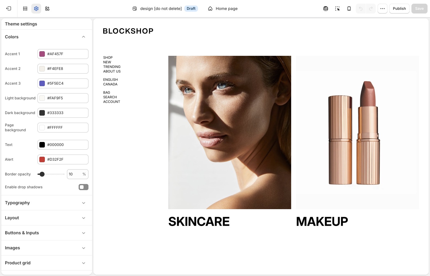
Set accents, page, text, light, and dark once. Most sections pick from this list. Keep the palette small.
Theme settings
Accents
Blockshop has Accent 1, Accent 2, and Accent 3. Set them once. On a section, the background and highlight dropdowns can use those accents instead of inventing a new hex each time.
Accents work well for:
- Section backgrounds that need to stand apart from the page
- Labels, highlights, and other repeating marks
Page, text, light, and dark
- Page background: the default canvas behind most pages
- Text: default body color
- Light background / Dark background: the Light and Dark options in section color pickers
- Alert: error and attention states (for example form errors)
Keep Text dark enough on Page background. If you lighten the page, check buttons, inputs, and overlays too.
Alternating section backgrounds in a 1–2–1–2 pattern creates rhythm without extra fonts or sections, for example page → accent → page → accent, or page → light → page.
Create rhythm with background color
Repeated color is easier to control than a new palette on every section. Alternate the page background with one accent or light background to create homepage visual rhythm.
Borders and shadows
- Border opacity: how strong hairline borders appear
- Enable drop shadows: on or off for the whole theme
When Enable drop shadows is on, shadows appear on:
- The sticky header
- Navigation dropdowns and megamenus
- Drawers (cart, search, mobile menu, filters, and similar panels)
- Popups and the newsletter signup
- Sticky bars (product add-to-cart, quick add, cart checkout, collection filters)
- Quantity buttons on the product form
- Shop the Look cards and Shop the Banner hotspots
- Layered images in Overlapping media
When shadows are off, the theme usually draws a border in their place instead, controlled by Border opacity. A few elements only lose the shadow (slideshow arrows, pagination on hover, country/region dropdowns). Turn shadows off for a flatter, print-like look, then raise border opacity if you want the grid of the page to show.
On each section
Sections include Text color and Background color.
Text color is Auto, Light, or Dark. Auto follows the other settings. For example, a box around text will pick dark type. Choose Light or Dark when Auto is wrong on a specific photo.
The section's Image darkness setting (and the related Image darkness slider in Typography) improves overlay text on pale photography. Prefer darkening the image over painting every heading white by hand.
A color that is not in Theme settings
Use custom CSS only for one-off exceptions. Accents and section pickers should cover storewide color.
Button colors are in Buttons, inputs, and links. Checkout and apps are unchanged.
Ask Sidekick 
Open Sidekick from the theme editor toolbar (top right, next to the device preview icon), or press ⌘. (Ctrl+. on Windows). Describe your brand or the mood you want and it'll suggest colors, previewed before anything is applied to Theme settings → Colors.
"Suggest values for Accent 1, Accent 2, and Accent 3 for a warm, earthy candle store, plus a Page background and Text color that pair with them."
A fast way to get a starting palette, or a second opinion when you're stuck between two options, you still decide what to keep.

Troubleshooting
- One section ignored the new palette: that section has its own Background color. Open the section, not only Theme settings.
- Buttons didn’t change: those colors are in Theme settings → Buttons & Inputs.
- Text disappeared on a photo: set section Text color to Light or Dark, or raise Image darkness in Typography. Auto can select the wrong value on pale images.
- Checkout is still Shopify’s colors: checkout is not a theme setting.