Buttons, inputs, and links in Blockshop
Buttons work in two steps:
In Edit theme → Theme settings → Buttons & Inputs, styles 1 through 4 define how buttons look storewide, including hover colors. Change a style here and every button that uses it updates.
On each section, the Button block picks style 1–4 from that set. Keep primary actions on style 1 storewide so customers can identify the primary control.
Text links are separate: Typography → Buttons.
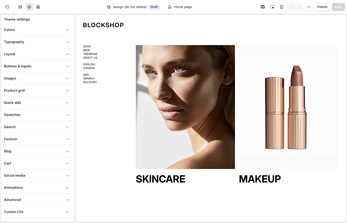
Theme settings → Buttons & Inputs
Four button styles
Each style has Background, Text, Border, Hover background, and Hover text.
A reliable split:
- Style 1: primary action (Add to cart, Shop the collection): solid fill
- Style 2: secondary action on a light background
- Style 3: outline on light surfaces
- Style 4: outline or ghost on dark or image backgrounds (light text and border)
Set hover colors that still contrast. A hover color that matches the page background removes button contrast.
Buttons corner radius: 0px is square; higher values round the pill. A 2px radius is the Blockshop default. A larger radius produces softer corners; 0px produces sharper corners.
Link style
In Typography → Buttons:
- Link style: Underline or Arrow on text links
- Match link size to block heading: optional; keeps text links aligned with card titles
Size and Mobile size on the same panel set button label size. See Typography.
Underline is quieter. Arrow is more directional. Pick one and use it on every text link. Mixing both on one page creates inconsistent link styling.
Text links vs buttons
Use a button style for the main action on a section. Use a text link for a secondary step (Learn more, View all). If every control is a solid button, no single action is clearly primary.
Inputs
- Inputs corner radius: rounds newsletter fields, contact forms, search, and cart notes
- Inputs background: fill color behind the field
- Inputs text: color of the text customers type
Match input radius to button radius so forms and CTAs use consistent corner treatment.
Ask Sidekick 
Open Sidekick from the theme editor toolbar (top right, next to the device preview icon), or press ⌘. (Ctrl+. on Windows). Ask it to suggest a button style.
"Suggest Background, Text, Border, Hover background, and Hover text values for Style 1 (primary) and Style 3 (outline) that fit a bold, confident retail brand."
It'll reason through contrast and hierarchy with you before you touch Theme settings → Buttons & Inputs. Useful when you have four button styles to fill in and aren't sure how to differentiate them.

Troubleshooting
- Add to cart didn't change: confirm you edited Buttons & Inputs, then that the product form is using style 1. App-injected cart buttons will not follow these colors.
- Hover looks fine on desktop, gone on a phone: phones have no hover. The rest state must contrast on its own.
- Text links still underlined after you picked Arrow: some app or custom CSS is forcing
text-decoration. Isolate with Troubleshooting. - Checkout button is unchanged: that is Shopify checkout, not the theme.