Alignment and width in Blockshop
Open a section in Edit theme, not Theme settings.
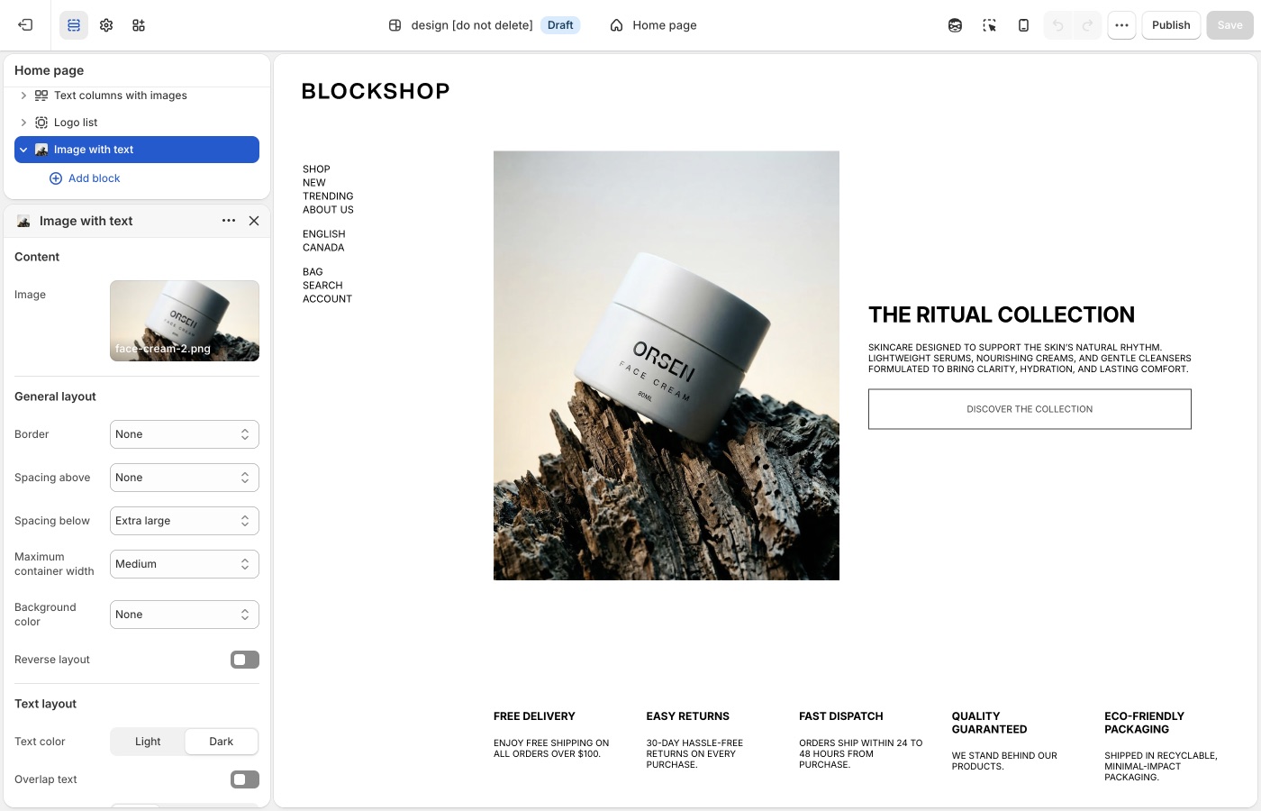
Pick a default Text alignment per template and keep supporting sections on it: left for catalogs and long copy, center for heroes and short announcements, then back to your default. The section's Mobile → Text alignment setting is separate.
Maximum container width is on each section: contained for text-heavy blocks, Full width for slideshows and large photography. A useful rhythm is full-width hero → contained story → full-width collection.
Text alignment
Most sections let you align text left, center, or right on desktop, with a separate control for mobile.
Pick a default and keep it on a given page:
- Left: catalogs, product stories, long copy. Easy to scan.
- Center: heroes, short announcements, logo moments.
- Right: rare; use when a layout is mirrored on purpose.
Do not alternate left and center on every section. Customers notice inconsistent alignment even when they cannot name the cause.
Maximum container width
Options run from Extra small through Full width. They map to Blockshop’s content widths:
- Extra small through Extra large keep copy and media in a centered column
- Full width lets the section bleed to the edges
Use contained widths for text-heavy sections so lines do not run the full screen. Use Full width for slideshows, large photography, and grids that should feel edge-to-edge.
A useful rhythm is full-width hero → contained story → full-width collection. All contained or all full-width is simpler and also works.
Mobile
The section's Mobile → Text alignment setting can differ from desktop, for example a left-aligned split layout that centers on a phone. Check the mobile preview whenever you change alignment. Width on small screens is already narrow; Full width vs Large matters less than whether type is left or centered.
One page, one habit
If the header and product grid are left-aligned, keep supporting sections left-aligned too. Center a single hero if you need a pause, then return to the page’s default.
Product grid
Text alignment for product cards is in Theme settings → Product grid, not the collection section.
Ask Sidekick 
Open Sidekick from the theme editor toolbar (top right, next to the device preview icon), or press ⌘. (Ctrl+. on Windows). Alignment and width choices are easy to second-guess in isolation, ask it how a layout choice reads.
"Should my hero text be centered or left-aligned, and what Maximum container width fits a minimal, editorial look?"
It'll reason through the trade-off with you rather than you flipping the setting back and forth to compare.

Troubleshooting
- Product cards didn’t follow the section: card alignment is global under Product grid, not the collection section’s text alignment.
- A slideshow still edge-to-edge: many heroes default to Full width. Change Maximum container width on that section.
- Mobile is centered but desktop is left: that is Mobile → Text alignment, a separate control. Set both.
- Header links didn’t move: open the Header section, not Theme settings → Layout.