Spacing and layout in Blockshop
Spacing works in two steps: In Edit theme → Theme settings → Layout, the desktop and mobile spacing sizes define what Small through Extra large mean storewide. On each section, Spacing above and Spacing below pick from that scale: None, Small, Medium, Large, or Extra large. Changing a size in Layout updates every section that uses it.
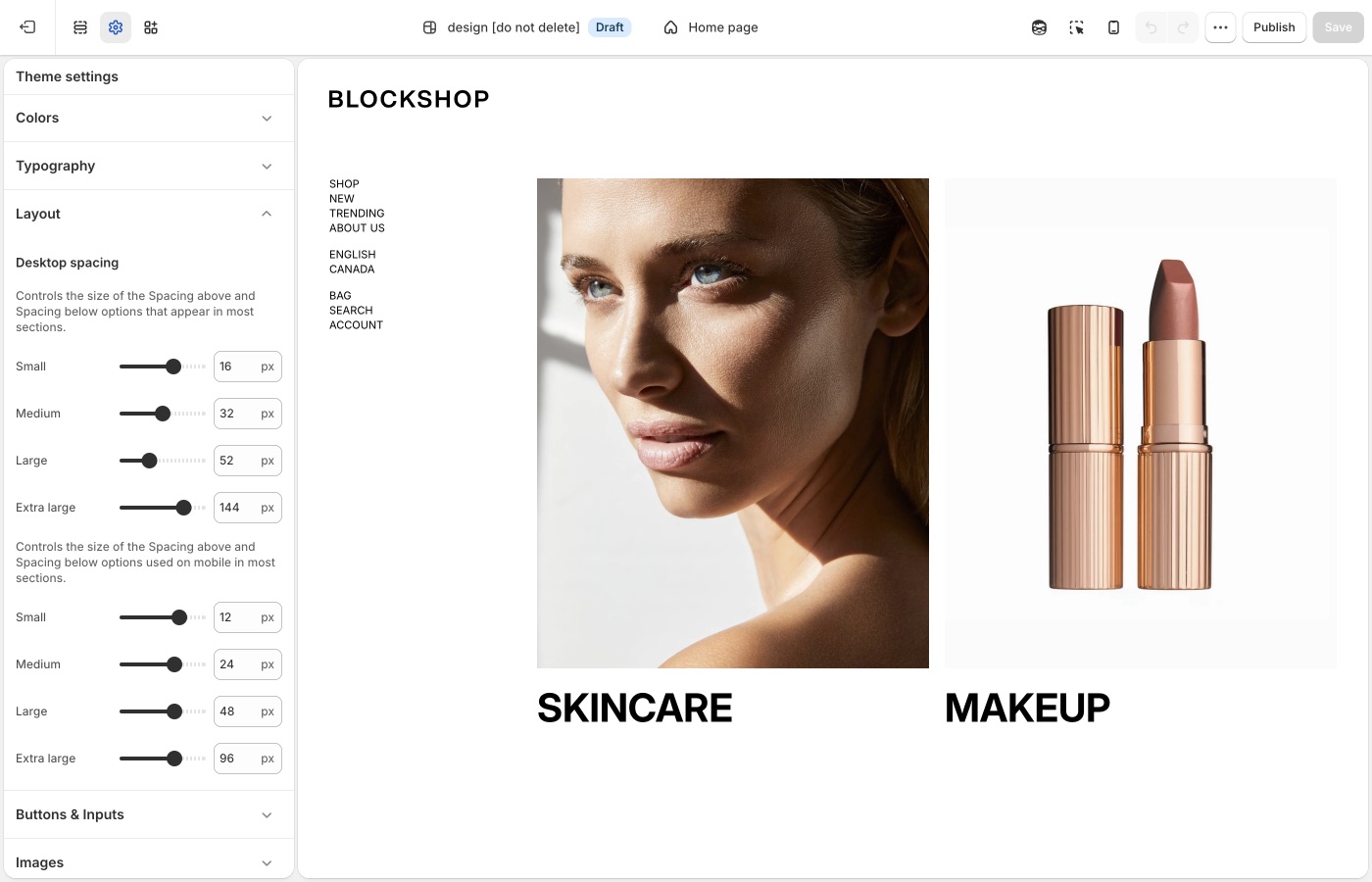
Theme settings → Layout
How the scale works
In Theme settings → Layout, the first group of sizes is under Desktop spacing. The second group, described as the sizes used on mobile, is the mobile scale. Each group sets:
- Small
- Medium
- Large
- Extra large
The note in Layout is literal: these settings are the sizes used by the Spacing above and Spacing below dropdowns on most sections.
If Large is 72px on desktop, every section whose dropdown is set to Large uses 72px. Change a size in Layout and every matching section updates.
Set the scale to match the listing you installed, then reuse the same steps on every page. Do not set one section to Extra large and the next to Small unless you want a hard break.
Small
Small is the tightest named step on the scale. What it measures in pixels is set in Theme settings → Layout, not on each section.
The Stone preset sets Small to 2px on desktop and mobile (the theme default is 16px and 12px). Stone then picks Small on shop sections: the hero’s Spacing below, featured product rows, and collection media blocks. At 2px, those sections sit nearly flush so grids and photography read as one continuous shop flow.
That rhythm works because Stone saves Extra large for editorial pauses. If your catalog appears too airy, lower Small in Layout and set shop sections to Small rather than Medium. Text-heavy pages still need Medium or Large.
Extra large
Blockshop’s Extra large step is for spacious layouts: generous gaps around photography, heroes, and brand stories. The Blockshop and Radiance presets set Spacing below to Extra large on most homepage sections: category columns, featured collections, and story blocks. The Stone preset reserves Extra large for editorial pauses only and uses Small on the shop blocks in between.
Use Extra large as a rhythm, not on every section. A whole homepage of Extra large can feel empty; none at all can feel tight next to a generous listing.
Desktop and mobile
The mobile spacing sizes are a separate scale. A Large gap that looks considered on desktop is often too tall on a phone. Keep mobile values smaller than desktop, and preview both after you change Layout.
Reuse the same Spacing above / Spacing below dropdown on adjacent sections: Medium throughout the shop, or Large on a hero and Medium on what follows. Use None when two sections should sit flush. Add a Divider when you need a gap with no content. Keep mobile spacing smaller than desktop, and preview both after you change the scale in Layout.
Extra large spacing suits heroes and brand-story blocks; collection grids usually sit on Medium or Large.
On each section
Most sections include Spacing above and Spacing below dropdowns (and the mobile pair). That is where you pick a named size, not where you invent new pixel values.
For a gap that is not tied to a content section, add a Divider from the section list. Empty sections and dummy headings are harder to maintain.
None is a setting
Set spacing to None when two sections should sit flush, for example a full-bleed image against a product grid, or a Custom liquid block in the header that should not add height. For custom fonts, that section is documented in Custom fonts.
Ask Sidekick 
Open Sidekick from the theme editor toolbar (top right, next to the device preview icon), or press ⌘. (Ctrl+. on Windows). If your pages feel cramped or overly loose and you can't tell which setting is responsible, describe the problem.
"My homepage sections feel too tight on mobile, what desktop and mobile spacing values should I use for Small through Extra large?"
It can point you toward the relevant spacing settings and suggest values, rather than you adjusting sliders section by section to find the right combination.

Troubleshooting
- One section didn’t move: change Spacing above / Spacing below on that section. Layout only defines what Small–Extra large mean.
- The homepage feels empty: too many sections are set to Extra large. Use Extra large on heroes and stories; Medium or Large on collections.
- A tall gap on mobile only: lower the mobile spacing sizes in Layout. They are independent of desktop.
- You need a gap with no content: add a Divider section. Do not add an empty Rich text section.