Product grid in Blockshop
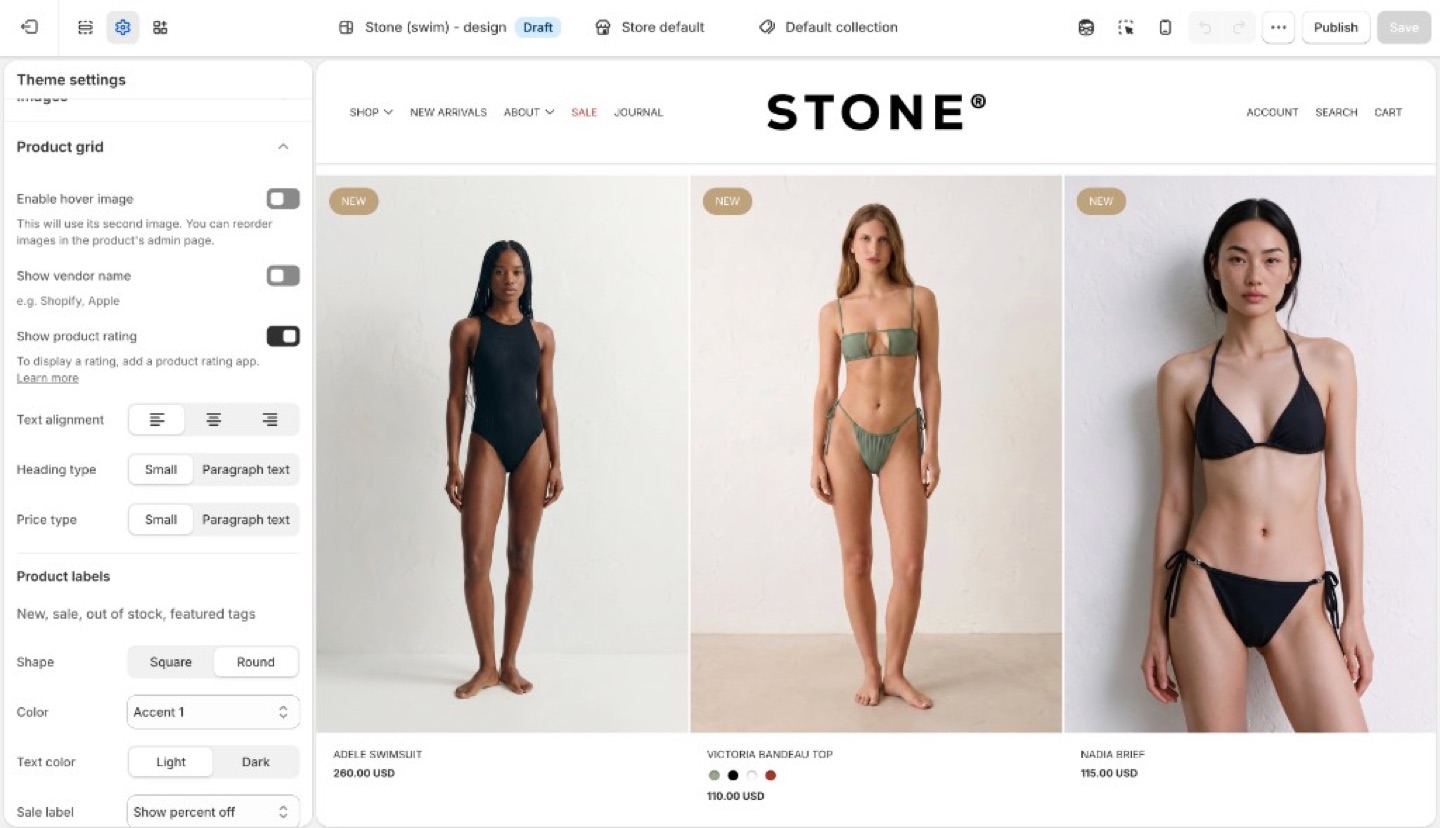
A product card is the tile that represents one product: the image, title, and price, plus optional extras such as vendor name, ratings, and hover effects.
Cards appear inside a product grid, a row-and-column layout of those tiles.
You will find product grids on:
- Collection pages
- Search results
- Product pages that show related or recommended products
- Templates that include Featured collection, Featured products, Recent products, or Collection with highlight
How cards look is set once in Theme settings → Product grid. How many columns the grid uses, and which products it shows, is set on the section or collection template.
Info
Product image size (crop shape) and Corner radius are in Theme settings → Images, not Product grid.
Card layout
- Enable hover image: shows the product’s second image on hover. Touch devices have no hover.
- Show vendor name
- Show product rating: displays star ratings on product cards when a reviews app has added rating data to the product. The theme does not collect reviews. See How do I add product reviews or star ratings?
- Text alignment: left, center, or right on the card
- Heading type and Price type: Small (nav-sized) or Paragraph text
Keep heading and price on the same type role unless you want the price to recede.
Product labels
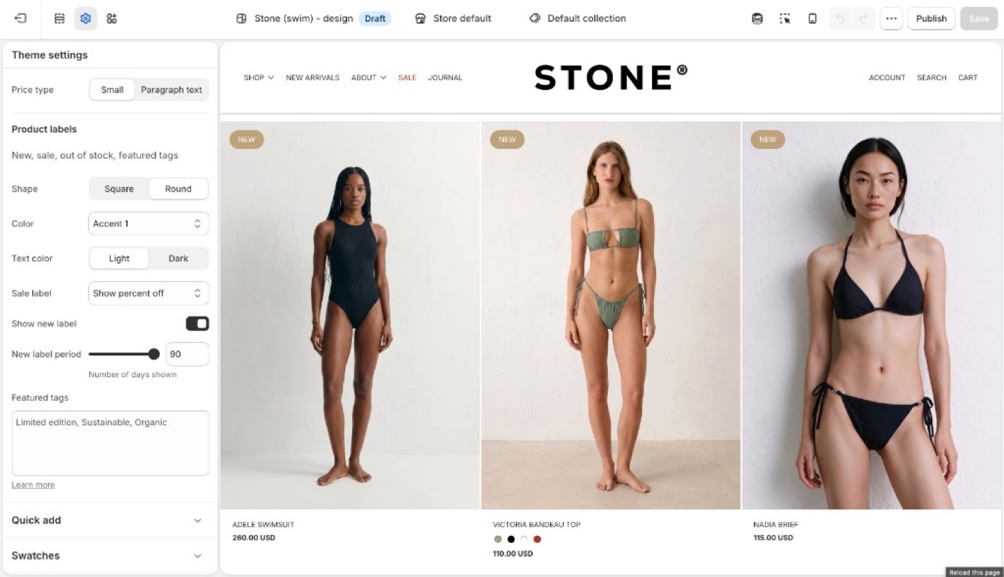
Product labels can show status (new, sale, sold out) on the collection grid. Featured labels add custom copy such as “Organic cotton” or “Limited edition” from tags.
Inventory, discounts, and checkout are unchanged. Labels are card markers, not Shopify discounts.
Under Product labels:
- Shape: Square or Round
- Color and Text color: Light, Dark, or an accent
- Sale label: hidden, text, or percent off
- Show new label and New label period (days)
- Featured tags: tags that render as labels
Sale and new
- Sale: the product needs a Compare at price higher than the price. The label can be hidden, text, or percent off.
- New: enable Show new label and set New label period (days since the product was created).
Featured labels
- On the product in Shopify admin, add a tag (for example
organic-cotton). - In Theme settings → Product grid → Featured tags, type that exact tag. Separate multiple tags with commas.
The tag in the admin and the string in Featured tags must match (including spelling). The storefront can hide the raw tag from other UIs; the label is what customers see.
Ask Sidekick 
Open Sidekick from the theme editor toolbar (top right, next to the device preview icon), or press ⌘. (Ctrl+. on Windows). If you're deciding between a denser grid with less detail or a spacious one with more (vendor name, rating, price emphasis), talk it through.
"Should my product grid show vendor name and rating, and should Heading type and Price type be Small or Paragraph text?"
It can reason through what a customer browsing your specific catalog will actually want to see on the card, rather than you guessing at the combination of card layout settings.

Troubleshooting
- Hover image never appears: the product needs a second image in the admin. Touch devices have no hover.
- Ratings missing: Show product rating only displays data from a reviews app. Products with no reviews stay blank. See How do I add product reviews or star ratings?
- No sale label: there is no compare-at price, or Sale is set to hidden.
- No new label: the product is older than New label period, or the checkbox is off.
- Featured label missing: tag spelling does not match Featured tags, or you tagged a variant in a way the product does not inherit. Tags are on the product.
- Label on the product page but not the grid (or the reverse): Product grid labels are this setting. The product template may have its own badge blocks; check both.