Product grid in Maker
A product card is the tile that represents one product: the image, title, and price, plus optional extras such as vendor name, ratings, and hover effects.
Cards appear inside a product grid, a row-and-column layout of those tiles.
You will find product grids on:
- Collection pages
- Search results
- Product pages that show related or recommended products
- Templates that include Featured collection, Featured products, Recent products, or Collection with highlight
How cards look is set once in Theme settings → Product grid. How many columns the grid uses, and which products it shows, is set on the section or collection template.
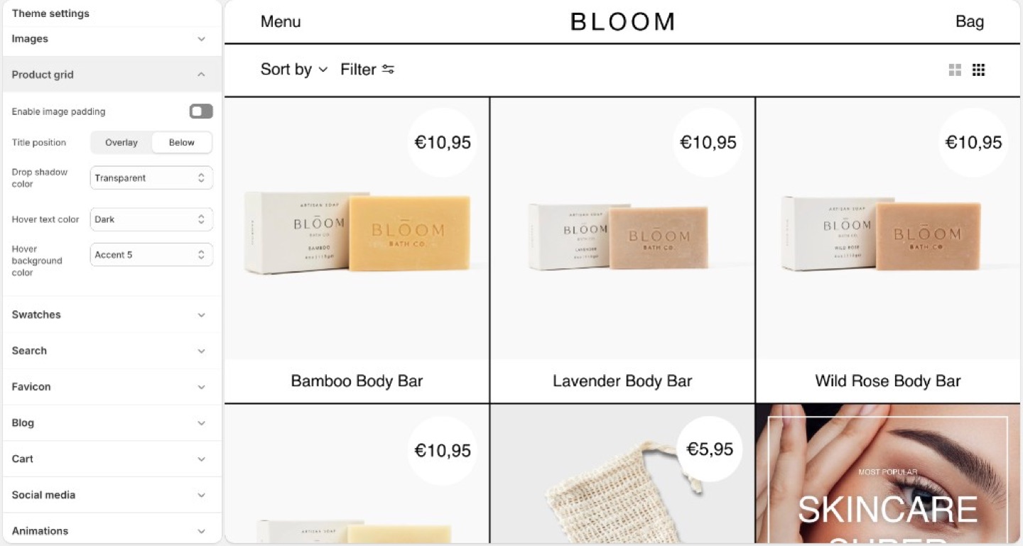
Overlay titles and hover panes are Maker’s default card model.
Info
Product image size (crop shape) is in Theme settings → Images, not Product grid.
Title position
- Overlay: name (and often price) sit on the image. This is Maker’s default attitude.
- Below: classic caption under the photo.
Overlay needs photographs with a clear area for type, or a hover pane that supplies contrast. Below is safer for busy lifestyle shots.
Image padding
Enable image padding insets the photo inside the card so the border grid can frame it. Turn it off when the image should bleed to the stroke.
Hover pane
- Hover text color
- Hover background color
Both can use Light, Dark, Transparent, or any of the seven accents. A hover background is how Maker can recolor a card without a second photo.
If overlay titles are hard to read at rest, do not rely on hover alone; touch devices have no hover. Use overlay plus image darkness, a below title, or a stronger rest-state contrast.
Drop shadow color
Drop shadow color on the card is Maker’s stand-in for a global shadow toggle. Transparent keeps cards flush to the grid. An accent or dark shadow lifts the card off the poster.
Shoot for overlay
Leave sky, wall, or negative space where the title will sit. Centered product-on-white with overlay type will collide unless the hover pane or a gradient is doing the work.
Price badge
On the collection grid, the circular badge is the price. If the product has a Compare at price, that badge shows percent off instead; on desktop hover it swaps back to the sale price.
The badge follows the card: rest colors at rest, Hover text color and Hover background color on desktop hover. Drop shadow color draws the offset on the badge and the title pane.
Ask Sidekick 
Open Sidekick from the theme editor toolbar (top right, next to the device preview icon), or press ⌘. (Ctrl+. on Windows). Maker's card title can sit as an Overlay on the image or Below it, talk through which fits your photography.
"Should my product card titles use Overlay or Below position, and does my photography have a clear enough area for Overlay type to stay readable?"
It can reason through what your specific catalog needs, overlay appears more editorial but needs contrast; below is safer for busy lifestyle shots, rather than you guessing.

Troubleshooting
- Titles unreadable on a touch device: there is no hover. Switch to Below, raise image darkness, or pick photos with empty space. Do not “fix” this with a stronger hover pane.
- Hover never appears: you are on a touch device, or Hover background color is Transparent and matches the photo.
- Padding creates a double frame: turn off Enable image padding, or thin the border.
- No percent off on the grid: there is no compare-at price, or the product is sold out. The badge only switches to percent off when the product is available and on sale.
- Badge color looks wrong: that is the card’s rest and hover colors.