Spacing and layout in Maker
Edit theme → Theme settings → Layout.
One panel sets both the border and the spacing scale for the whole store:
- Border color and Border thickness draw the stroke around every section and block.
- The desktop and mobile spacing sizes in Layout define what Small, Medium, and Large mean storewide.
- On each section, Spacing above and Spacing below dropdowns pick from that scale: None, Small, Medium, or Large.
Changing a size in Layout updates every section that uses it.
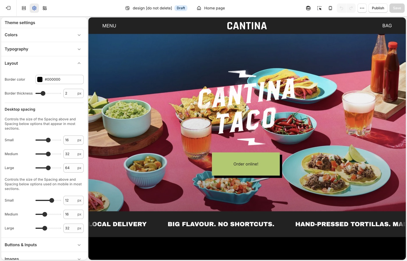
Spacing is the padding above and below a section; the border is the line between them, and often does the gutter's job already.
Theme settings → Layout
Border color and thickness
Border color is the stroke for the grid: section edges, many block divides, and the lines that make Maker look like a poster or catalog. Match it to Text for a structured, editorial store, or to an accent for a louder brand. A pale gray stroke recedes; a black stroke is the default Maker attitude.
Border thickness runs from 1px to 5px.
- 1px: fine, almost hairline; more type, less frame
- 2–3px: the usual Maker voice
- 4–5px: graphic, poster-like; pair with simpler photography
Maker's border-and-grid identity
This pair of settings creates Maker's identity: the same stroke frames every section and block, storewide, for a poster-and-catalog look. Set it first, then tune spacing. Change the Layout border, not each section. Override a section's own border only when it should break the system on purpose, like a full-bleed film still or a newsletter.
Small, Medium, Large
The desktop and mobile spacing sizes each set Small, Medium, and Large. In Theme settings → Layout, the first group of sizes is under Desktop spacing. The second group, described as the sizes used on mobile, is the mobile scale.
Those values are what the Spacing above and Spacing below dropdowns use on most sections. Set Large once in Layout; every section whose dropdown is set to Large uses that size.
Because the border grid already separates blocks, Maker usually needs less vertical padding than a more open theme. Thick borders plus Large spacing can appear over-padded, while thick borders plus Small spacing makes a tight modular grid. Start with the listing's defaults. Increase Large if sections feel glued together; decrease it if the page feels stacked with empty bands.
Desktop and mobile
The mobile spacing sizes are independent of desktop. Keep mobile values smaller than desktop. Preview both after you change Layout.
Reuse the same Spacing above / Spacing below dropdown on adjacent sections: Medium throughout the shop, or Large on a hero and Medium on what follows. Use None when two sections should sit flush. Add a Divider when you need a gap with no content. Keep mobile spacing smaller than desktop, and preview both after you change the scale in Layout.
On each section
Choose None, Small, Medium, or Large from the section Spacing above / Spacing below dropdowns. Use None when two sections should share a border edge-to-edge.
Many Maker sections can also show or hide their own block borders, and some include a section border, independent of the global Layout stroke. Use them consistently: either the homepage is a continuous grid, or only product areas are. Mixing borderless full-bleed photos with a heavy grid on the next section is a valid contrast when it is deliberate, not accidental.
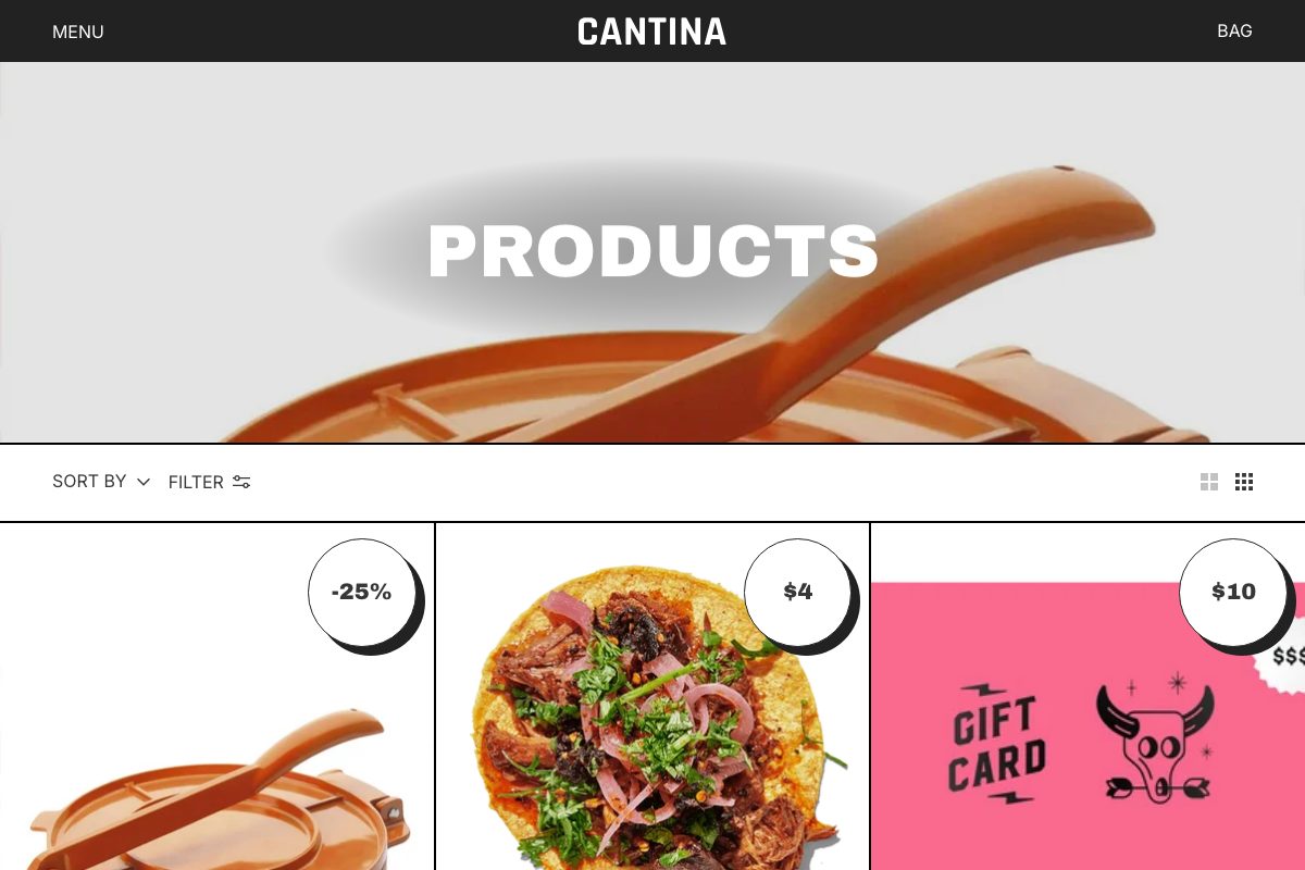
A Divider section adds a break without fake empty content.
Ask Sidekick 
Open Sidekick from the theme editor toolbar (top right, next to the device preview icon), or press ⌘. (Ctrl+. on Windows). Corner radius, border weight, and spacing are small settings with an outsized effect on how "soft" or "sharp" a store appears, and on whether the grid appears open or tight. If your pages appear cramped or you cannot tell which setting is responsible, describe the problem.
"My sections feel glued together on mobile. What desktop and mobile spacing values should I use for Small, Medium, and Large? Should Border thickness change too?"
It can point you toward the relevant spacing and border settings and suggest values, rather than you adjusting sliders section by section to find the right combination.

Troubleshooting
- One section didn't move: change Spacing above / Spacing below on that section. Layout only defines the scale.
- The page feels padded twice: lower Large spacing, or thin Border thickness; thick border plus Large spacing fights itself.
- You need a gap with no content: add a Divider. Do not add an empty Rich text section.
- Lines look doubled: a section is showing block borders and the global stroke is thick. Hide block borders on that section, or lower Border thickness.
- A hero has no line: that section likely has borders turned off. Turn them back on, or leave them off on purpose for a full-bleed break.
- You wanted drop shadows instead: that's set per card, not storewide. Use card Drop shadow color in Product grid.