Alignment and width in Maker
Open a section in Edit theme, not Theme settings.
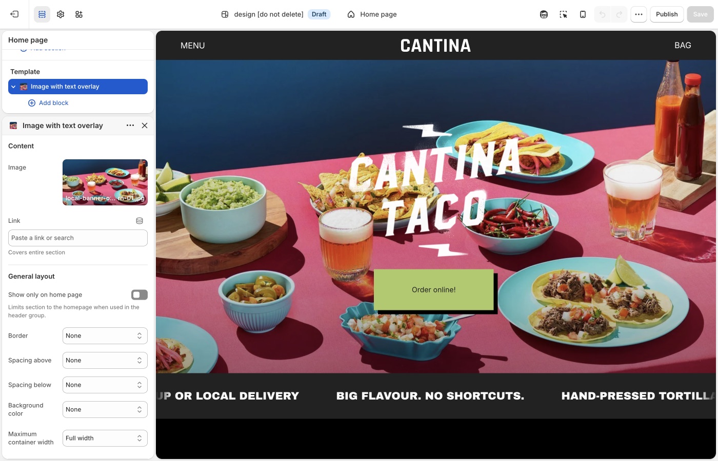
Pick a default Text alignment per template and keep supporting sections on it: left for catalogs and long copy, center for heroes and short announcements, then back to your default. The section's Mobile → Text alignment setting is separate.
Maximum container width is on each section: contained for text-heavy blocks, Full width for slideshows and large photography. A useful rhythm is full-width hero → contained story → full-width collection.
Text alignment
Left, center, or right on desktop, with a mobile override.
Maker product titles can sit on the image (Product grid). Overlay titles are often centered or bottom-aligned in the card; page headings above a grid usually read better left so they share an edge with the border system.
Pick one page habit. A centered hero is fine; centered section titles above a left-edge grid look unmoored.
Maximum container width
Extra small through Full width. Full width lets the border grid run wall to wall, the Maker default. Contained widths inset the whole frame, which resembles a poster inside a margin.
Use Full width for grids, split banners, and collection pages. Use a contained width for long reading (about, FAQ) so lines do not span the monitor.
Mobile
On a phone the grid stacks. The section's Mobile → Text alignment setting controls alignment there. Center short banners; keep product and collection titles consistent with the card setting.
Follow the border
If a section shows block borders, align text to the same side the border emphasizes. Left text on a left-bound grid is the least surprising choice.
Product grid
Title position (overlay vs below) is in Theme settings → Product grid, not the section.
Ask Sidekick 
Open Sidekick from the theme editor toolbar (top right, next to the device preview icon), or press ⌘. (Ctrl+. on Windows). Alignment and width choices are easy to second-guess in isolation, ask it how a layout choice reads.
"Should my section titles be left-aligned to share an edge with the border grid, and does Full width or a contained Maximum container width fit a handmade goods store?"
It'll reason through the trade-off with you rather than you flipping the setting back and forth to compare.

Troubleshooting
- Cards didn’t follow the section: overlay vs below and card hover are Product grid.
- A split banner looks inset: set Maximum container width to Full width on that section.
- Mobile is centered, desktop is left: set Mobile → Text alignment as well as desktop.