Typography in Maker
Edit theme → Theme settings → Typography
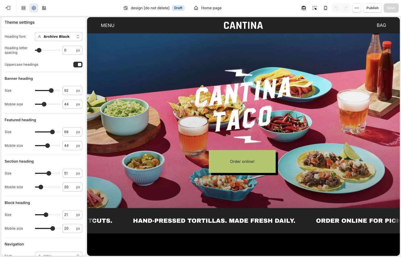
Heading, navigation, and body fonts, plus a type size ladder for each role.
Theme settings → Typography
Fonts
- Heading font: banners, section titles, overlays
- Navigation font: header and menus
- Paragraph font: body copy
One heading family and one body family is enough. A third display face fights Maker’s already-strong borders.
A custom font
To use a font file or a Google Font that the picker does not include, see Custom fonts.
Type roles
Each role has a desktop size. Banner, featured, section, and block headings also have a Mobile size.
- Banner heading: slideshow and hero titles
- Featured heading: large titles below banner size
- Section heading: section titles
- Block heading: card and column titles (including overlays)
- Navigation / Sub navigation: header and dropdowns
- Buttons: button labels
- Overline: small labels above a heading
- Paragraphs: body copy
- Paragraphs → Featured size: copy on media
Keep a ladder: banner > featured > section > block ≈ paragraph. Overlay titles on product cards use this same system, so a huge block heading will dominate the grid.
Check mobile
Maker grids get dense on a phone. Lower banner and featured Mobile size if titles wrap into a stack.
Letter spacing and uppercase
Heading, button, and paragraph letter spacing, plus uppercase checkboxes, change Maker’s voice. Wide-tracked uppercase overlines fit the poster-like grid. Uppercase body copy does not.
Text on images
Image darkness, Text shadows, and Translucent box around text sit at the bottom of Typography. Overlay titles on cards and banners need enough darkness or a box so type remains readable on a pale photo.
Custom fonts
Shopify’s font picker in Theme settings → Typography covers most stores. Add a custom font only when you need a licensed font file or a Google Font that the picker does not include. You must have a license to host the font files. Custom fonts do not change checkout.
A custom font loads from a Custom liquid section at the top of the header group. You can load the font in one of three ways:
- Upload a font file in Content → Files
- Use a public URL to a hosted font file (for example,
.woff2,.woff,.ttf, or.otf) - Use a font from Google Fonts
Set up a Custom liquid section
- In Edit theme, add a Custom liquid section at the top of the header group.
- In that section’s settings, set Spacing above, Spacing below, and the mobile spacing options to None so the section does not add extra space.
Each option below pastes its font code into this Custom liquid section.
Option 1: Upload a font file
- In the Shopify admin, open Content → Files and use Upload files to add your font (for example,
custom-font.woff2). - Note the uploaded file name, including the file extension. You use that exact name in the next step.
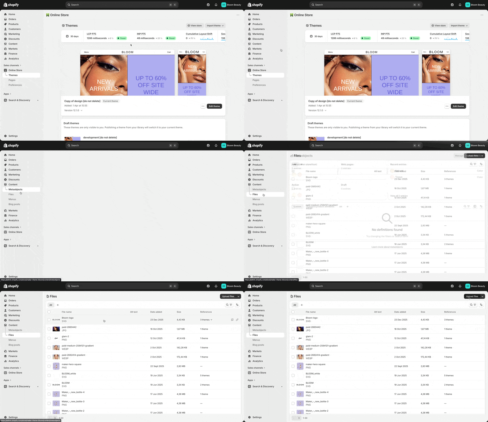
In the Custom liquid section, paste the following code. Set custom_font_family to your font’s name, and set custom_font_file to the uploaded file name (for example, my-font.woff2).
{%- liquid
  assign custom_font_family = 'Merchant Custom Sans'
  assign custom_font_fallback = 'sans-serif'
  assign custom_font_file = 'custom-font.woff2'
-%}

<style>
  @font-face {
    font-family: {{ custom_font_family }};
    src: url('{{ custom_font_file | file_url }}') format('{{ custom_font_file | split: "." | last | downcase }}');
    font-display: swap;
  }

  :root {
    --font--heading--family: {{ custom_font_family }}, {{ custom_font_fallback }};
    --font--nav--family: {{ custom_font_family }}, {{ custom_font_fallback }};
    --font--paragraph--family: {{ custom_font_family }}, {{ custom_font_fallback }};
  }
</style>
Click Save in the theme editor to apply the changes.
Option 2: Use a URL to a hosted font
Use this option when the font file is on a server or CDN and you have a direct https:// link to the file.
In the Custom liquid section, paste the following code. Set custom_font_family to your font’s name, and set custom_font_url to the full address of the file (for example, https://example.com/fonts/custom-font.woff2).
{%- liquid
  assign custom_font_family = 'Merchant Custom Sans'
  assign custom_font_fallback = 'sans-serif'
  assign custom_font_url = 'https://example.com/fonts/custom-font.woff2'
-%}

<style>
  @font-face {
    font-family: {{ custom_font_family }};
    src: url('{{ custom_font_url }}') format('{{ custom_font_url | split: "?" | first | split: "/" | last | split: "." | last | downcase }}');
    font-display: swap;
  }

  :root {
    --font--heading--family: {{ custom_font_family }}, {{ custom_font_fallback }};
    --font--nav--family: {{ custom_font_family }}, {{ custom_font_fallback }};
    --font--paragraph--family: {{ custom_font_family }}, {{ custom_font_fallback }};
  }
</style>
Click Save in the theme editor to apply the changes.
Option 3: Use Google Fonts
On Google Fonts, pick a font, open Get embed code, and copy the stylesheet link. The link has the format https://fonts.googleapis.com/css2?family=...&display=swap.
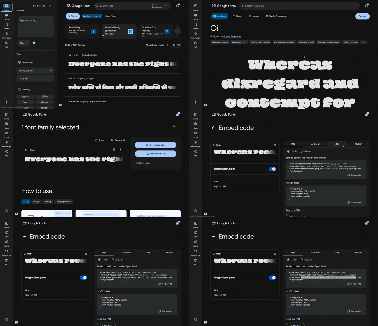
In the Custom liquid section, paste the following code. Set custom_font_url to the stylesheet link, and set custom_font_family to the font’s name as Google Fonts shows it. The example uses the font Oi.
{%- liquid
  assign custom_font_family = 'Oi'
  assign custom_font_fallback = 'sans-serif'
  assign custom_font_url = 'https://fonts.googleapis.com/css2?family=Oi&display=swap'
-%}

<style>
  @import url('{{ custom_font_url }}');
  :root {
    --font--heading--family: {{ custom_font_family }}, {{ custom_font_fallback }};
    --font--nav--family: {{ custom_font_family }}, {{ custom_font_fallback }};
    --font--paragraph--family: {{ custom_font_family }}, {{ custom_font_fallback }};
  }
</style>
Click Save in the theme editor to apply the changes.
Deprecated fonts in Shopify’s library
Shopify sometimes deprecates fonts in its font library. A deprecated font can disappear from the font picker in Theme settings → Typography or stop loading as before. See Deprecated fonts in Shopify’s font documentation for the affected typefaces.
To replace a deprecated font, pick another font from the current library in Theme settings → Typography. To keep the same typeface, load it as a custom font with one of the options above.
Ask Sidekick 
Open Sidekick from the theme editor toolbar (top right, next to the device preview icon), or press ⌘. (Ctrl+. on Windows). Ask it for a font pairing that fits your brand.
"Suggest a Heading font and Paragraph font pairing for a handmade, craft-forward brand, keeping in mind Maker's borders are already a strong visual element."
It previews the pairing before you apply anything to Theme settings → Typography, faster than comparing font libraries by hand. If you're deciding whether a custom font is worth adding at all, it's also a reasonable place to ask.

Troubleshooting
- Overlay titles are huge: lower Block heading, not Banner heading. Cards use the block role.
- Overlay titles are not readable on pale photos: raise Image darkness, switch titles to Below in Product grid, or strengthen the hover pane. Do not rely on hover alone; touch devices have no hover.
- A header label is the wrong words: default theme content, not Typography.
- Custom font did nothing: the Custom liquid section must be first in the header group, with all spacing set to None. See Custom fonts.
- Custom font only changed some text: the snippet sets the heading, navigation, and paragraph font variables together. Remove the
:rootlines for the roles you do not want to change. - Custom font file returns a 404:
custom_font_filemust match the file name in Content → Files exactly, including the extension. - Checkout font is unchanged: this is expected. Custom fonts do not apply to checkout.