Colors in Maker
Edit theme → Theme settings → Colors
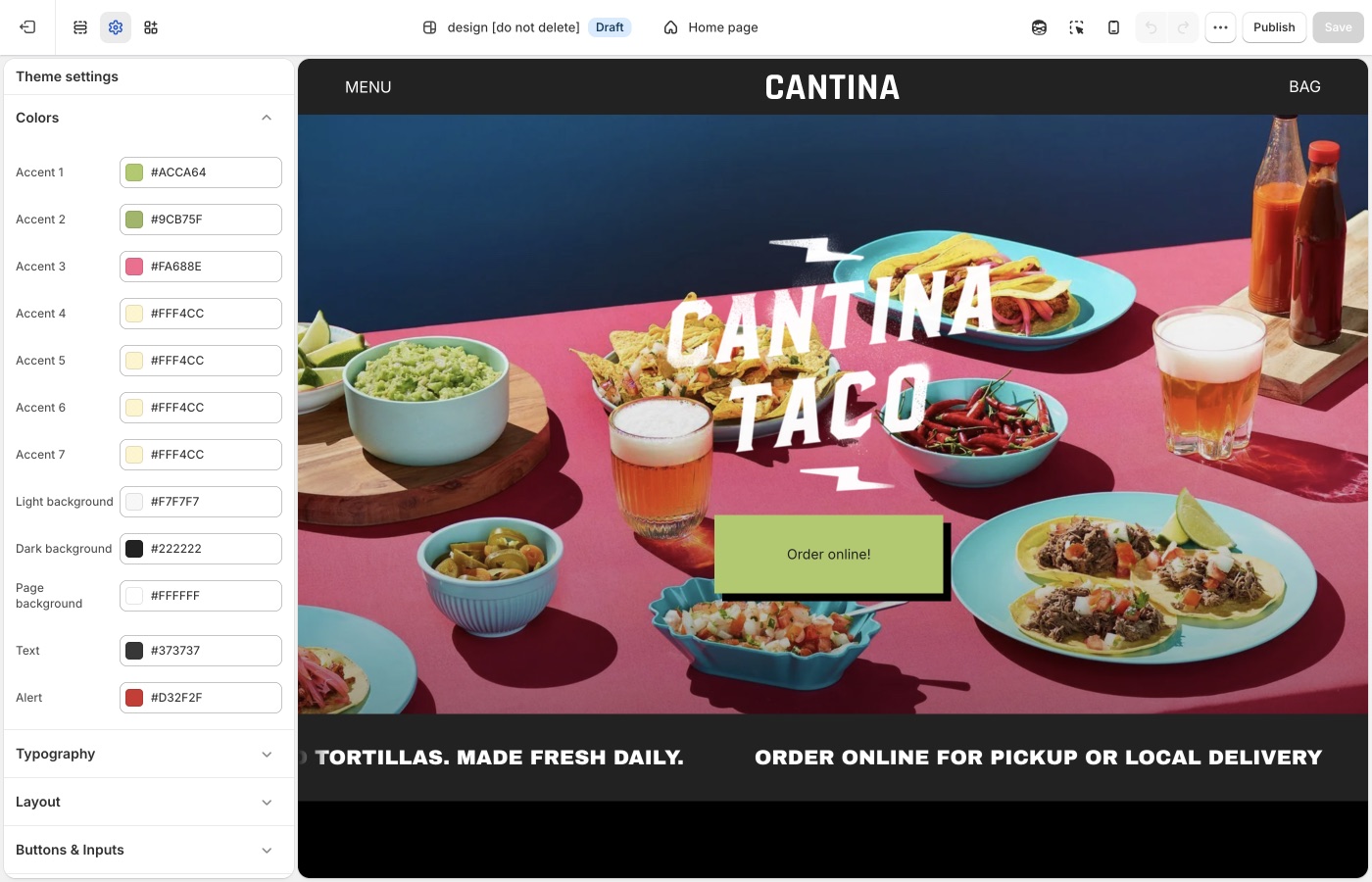
Seven accents for colour blocking, cards, and sections. Use a small core set, not seven unrelated brights.
Theme settings
Seven accents
Accent 1 through Accent 7 appear in section background dropdowns and on product card hover settings.
You do not need to use all seven on the homepage. Set a core of two or three that match the brand, then keep the rest as close cousins for hover panes. Seven unrelated brights will look like a test store.
Assign accents on purpose
Example: Accent 1 = section highlight, Accent 2 = hover pane, Accent 3 = price badge. Write that down. If every accent is “a nice extra color,” the grid loses contrast.
Page, text, light, and dark
- Page background / Text: default canvas and copy
- Light background / Dark background: Light and Dark in section pickers
- Alert: errors and warnings
On each section
Text color is Auto, Light, or Dark. Background color can be the page, light, dark, or any accent.
Auto is the right default. Force Light or Dark when type sits on a photo or a strong accent. Use the section's Image darkness setting (and Typography → Image darkness) for overlay text.
A color that is not in Theme settings
See custom CSS for one-offs. Prefer accents so hover panes and sections stay in family.
Hover pane colors are in Product grid. Checkout and apps are unchanged.
Ask Sidekick 
Open Sidekick from the theme editor toolbar (top right, next to the device preview icon), or press ⌘. (Ctrl+. on Windows). Describe your brand or the mood you want and it'll suggest colors, previewed before anything is applied to Theme settings → Colors. Maker has seven accents, not three, so it helps to ask for a role for each one.
"Suggest values for Accent 1 through Accent 7 for a handmade goods store, a core two or three to lead with and the rest as close cousins for hover panes."
A fast way to get a starting palette, or a second opinion when you're stuck between two options, you still decide what to keep.

Troubleshooting
- Hover pane didn’t change: card hover colors are in Theme settings → Product grid, not Colors. They pick from these accents.
- One section ignored the palette: that section has its own Background color.
- The store looks outlined, not colored: you are seeing border color. Change Layout borders, not only Colors.
- Checkout is unchanged: checkout is not a theme setting.