Buttons and inputs in Maker
Buttons work in two steps: In Edit theme → Theme settings → Buttons & Inputs, styles 1 through 4 define how buttons look storewide, each with its own Shadow for depth. On each section, the Button block picks style 1–4. Changing a style in Theme settings updates every button that uses it.
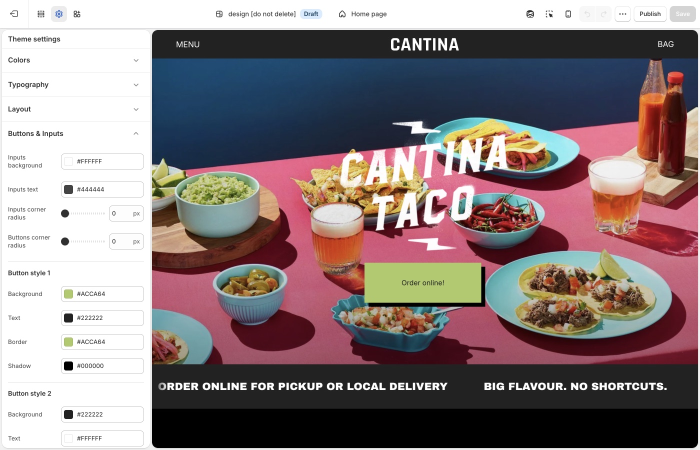
Theme settings → Buttons & Inputs
Four button styles
Each style has Background, Text, Border, and Shadow.
- Style 1: primary (Add to cart, Shop): solid fill
- Style 2: secondary on light backgrounds
- Style 3: outline on light surfaces
- Style 4: light outline or ghost on dark / image backgrounds
Assign the style on the button block in the section. Keep the primary action on style 1 everywhere.
Set Shadow to transparent (or the same as the page) if you want a flush button without depth. A visible shadow adds depth, which can match a thick border grid.
Buttons corner radius: Maker’s default is a small radius. Square buttons (0px) lock to the grid. A large radius fights the straight border system unless the brand is intentionally soft.
Inputs
- Inputs corner radius: rounds newsletter fields, contact forms, search, and cart notes
- Inputs background: fill color behind the field
- Inputs text: color of the text customers type
Match input radius to button radius so forms sit cleanly on the grid.
Buttons vs overlay cards
Product cards can use hover panes and overlay titles (Product grid). Let the card be the shoppable object; keep buttons for cart, filters, and banners so the grid does not fill with competing CTAs.
On each section
The Button block picks style 1–4 from the set you defined in Buttons & Inputs. Keep Add to cart and Shop on style 1 storewide. Shadow is set per style in Theme settings, not on the section block.
Ask Sidekick 
Open Sidekick from the theme editor toolbar (top right, next to the device preview icon), or press ⌘. (Ctrl+. on Windows). Ask it to suggest a button style, each style includes a Shadow setting for depth.
"Suggest Background, Text, Border, and Shadow values for Style 1 (primary) and Style 3 (outline) that fit a handmade, grid-forward brand."
It'll reason through contrast and hierarchy with you before you touch Theme settings → Buttons & Inputs. Useful when you have four button styles to fill in and aren't sure how to differentiate them.

Troubleshooting
- No hover color setting: that is expected, Maker uses Shadow for button depth instead. Phones will not show a hover state anyway.
- Add to cart didn’t change: confirm Buttons & Inputs, then that the product form uses style 1.
- Buttons look round on a squared grid: lower Buttons corner radius toward 0px.
- Checkout is unchanged: Shopify checkout, not the theme.