Working with fonts, colors and preset styles
Theme style or "presets"
Theme styles contain pre-configured design settings that demonstrate the stylistic range of the theme. Each theme comes with three different styles and can be a good starting point build your store design from. To change theme styles, go to the Theme settings > Change theme style.
Colors
Universal color settings can be found in the Theme settings > Colors tab.
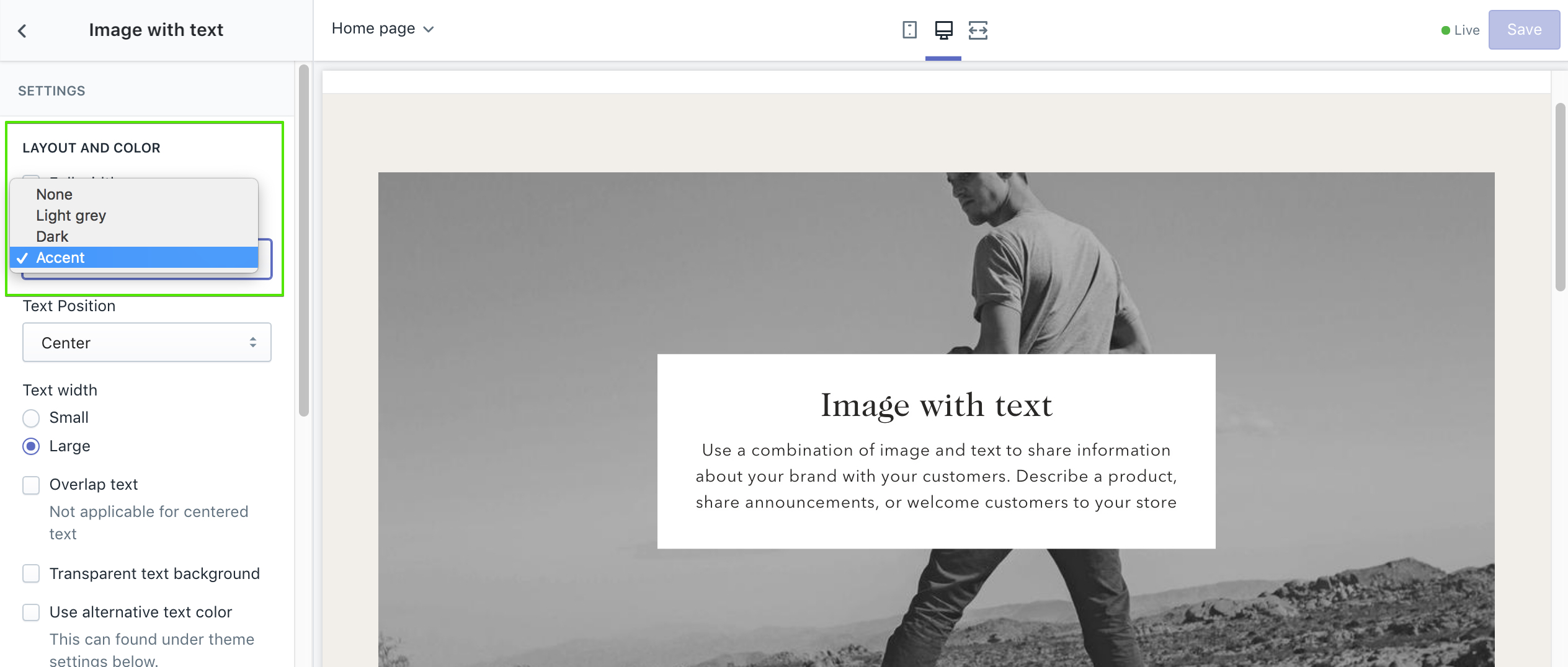
Accent color
In the theme settings you can set an Accent color that can be be used for section background and other elements. Accent colors are great for creating visual contrast while maintaining consistency when adding colors to sections.
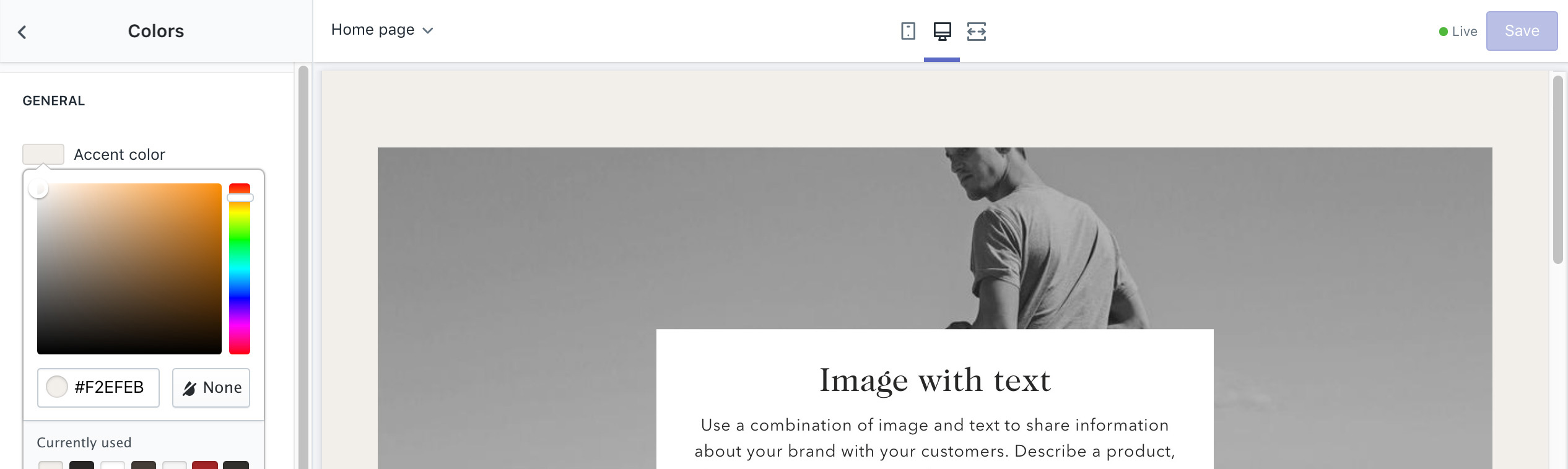
Once the color is set, it can be referenced in a sections color dropdown selector with the other default colors.
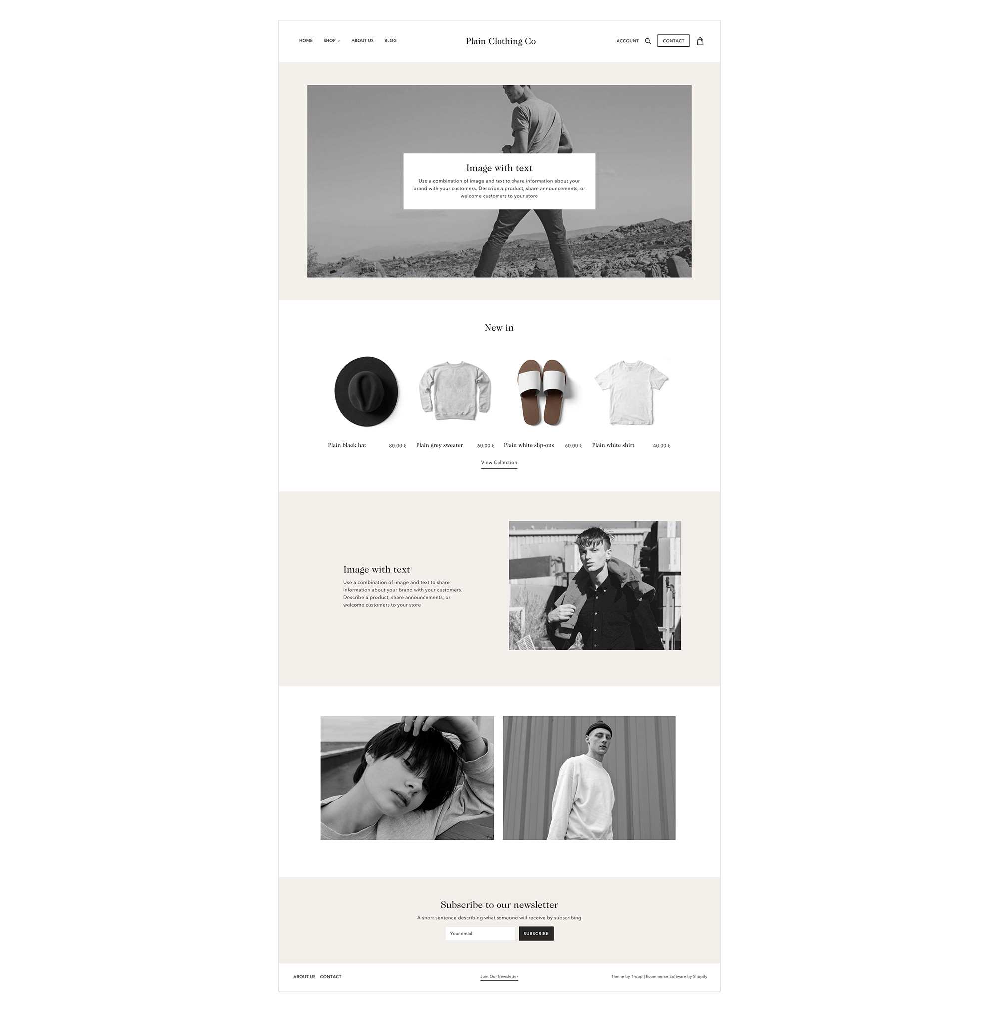
Create vertical rhythm and contrast using accent colors
The use of repeated visual elements is a design technique to create contrast while maintaining a consistent visual experience.
Below shows an example of alternating rhythm with sections using a 1-2-1-2-1-2 pattern for background colors.
Section color settings
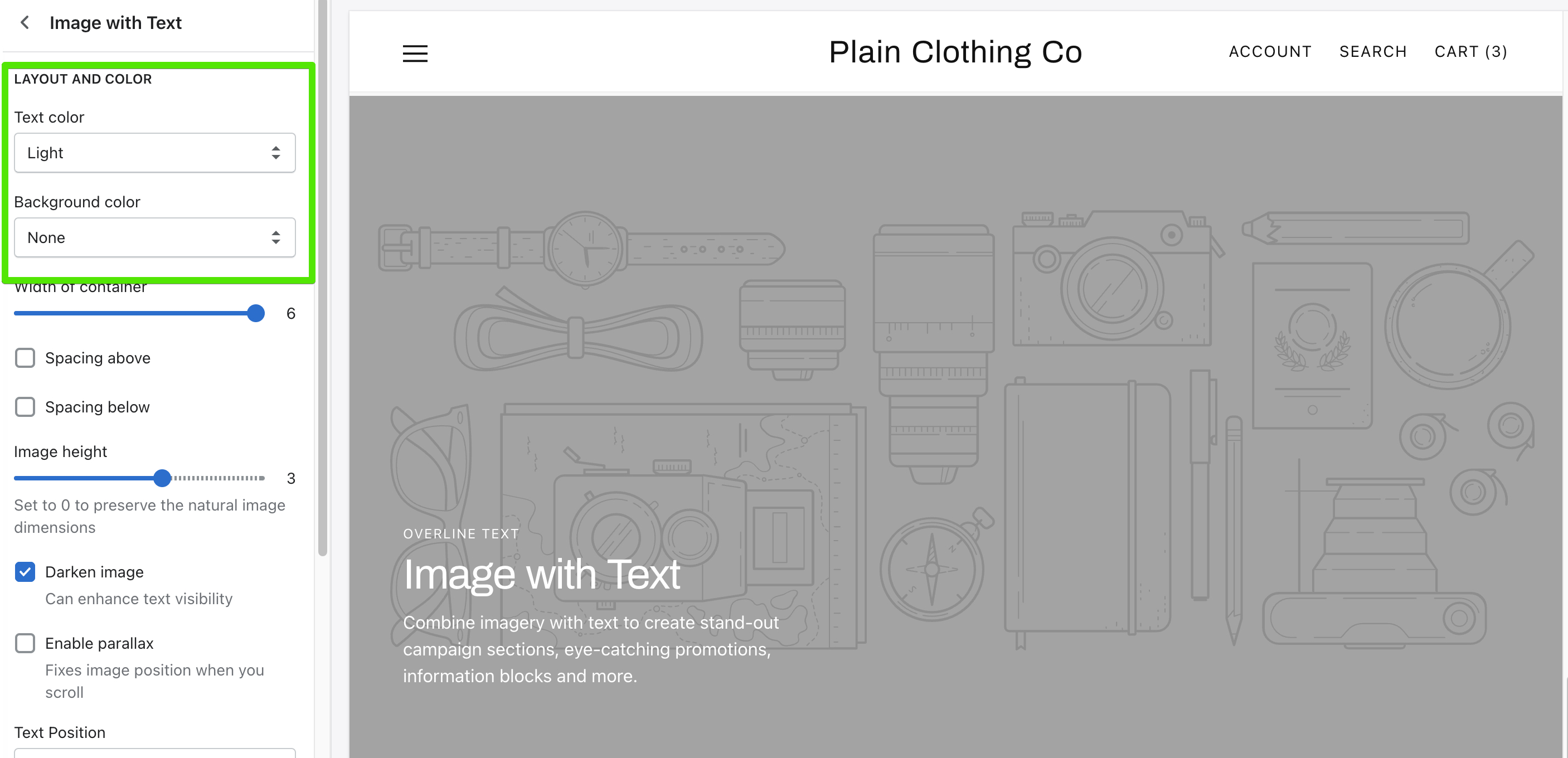
Sections contain text color and background color settings that you can tweak to suit your content.
The text color setting contains an Auto, Light and Dark setting. Auto will adjust the text color based on other settings. For example, if a box around text is set, the dark text color will apply automatically.
Utilise the Darken image setting to enhance text visibility for lighter images.
Further customization
If you would like to customize colors of elements not found in the theme settings, visit our guide on Adding CSS and Editing template files.